Designing for Anxiety
Discover techniques to reduce stress, confusion, uncertainty, and the lack of control that contribute to users' anxiety
Anxiety affects millions of people worldwide, significantly impacting their daily digital interactions. Digital experiences can either trigger or ease anxiety through their design choices, interaction patterns, and feedback systems. From overwhelming notifications to complex authentication processes, seemingly minor design decisions profoundly influence user stress levels. Understanding anxiety's neurological basis helps create interfaces that reduce cognitive load, provide clear expectations, and offer appropriate user control.
Mindful content presentation, predictable navigation patterns, and careful error handling contribute to creating digital safe spaces. Strategic implementation of these elements transforms potentially stressful interactions into manageable, supportive experiences that accommodate users across the anxiety spectrum.
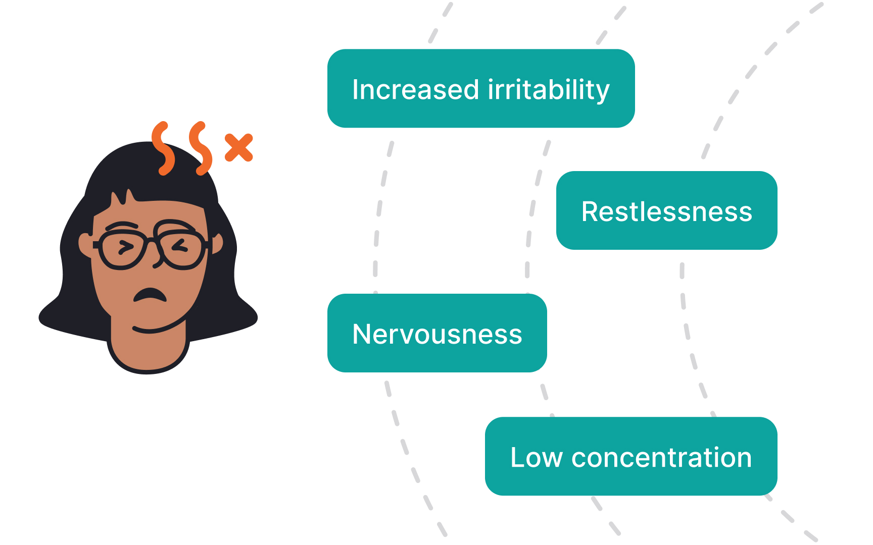
Anxiety is a natural stress response that triggers physical and emotional reactions when facing uncertain or challenging situations. In digital environments, this manifests as heightened alertness, difficulty concentrating, and increased sensitivity to interface elements that create pressure or ambiguity. Users experiencing anxiety may feel overwhelmed by time limits, complex workflows, or fear of making mistakes.
Digital anxiety often appears during high-stakes
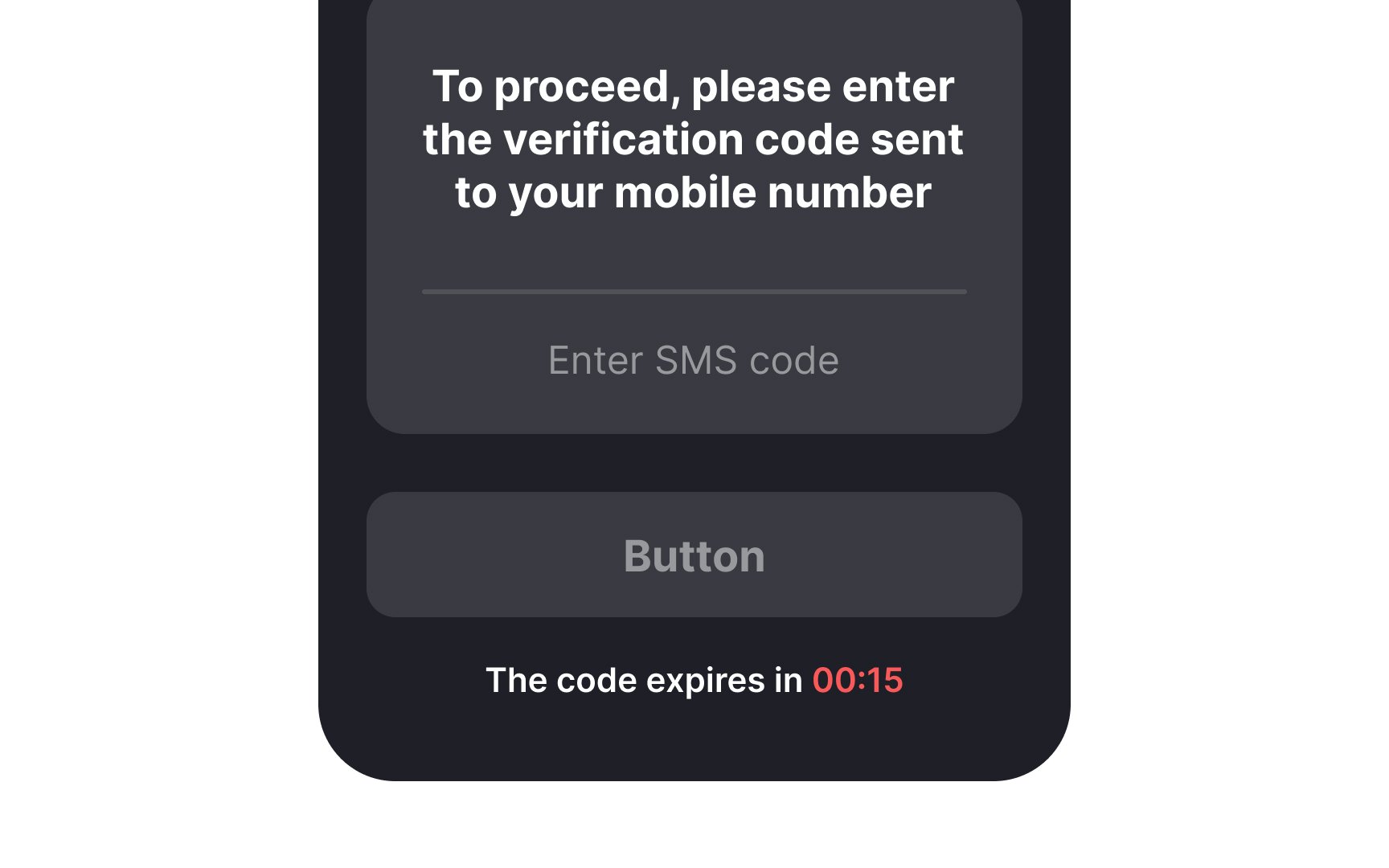
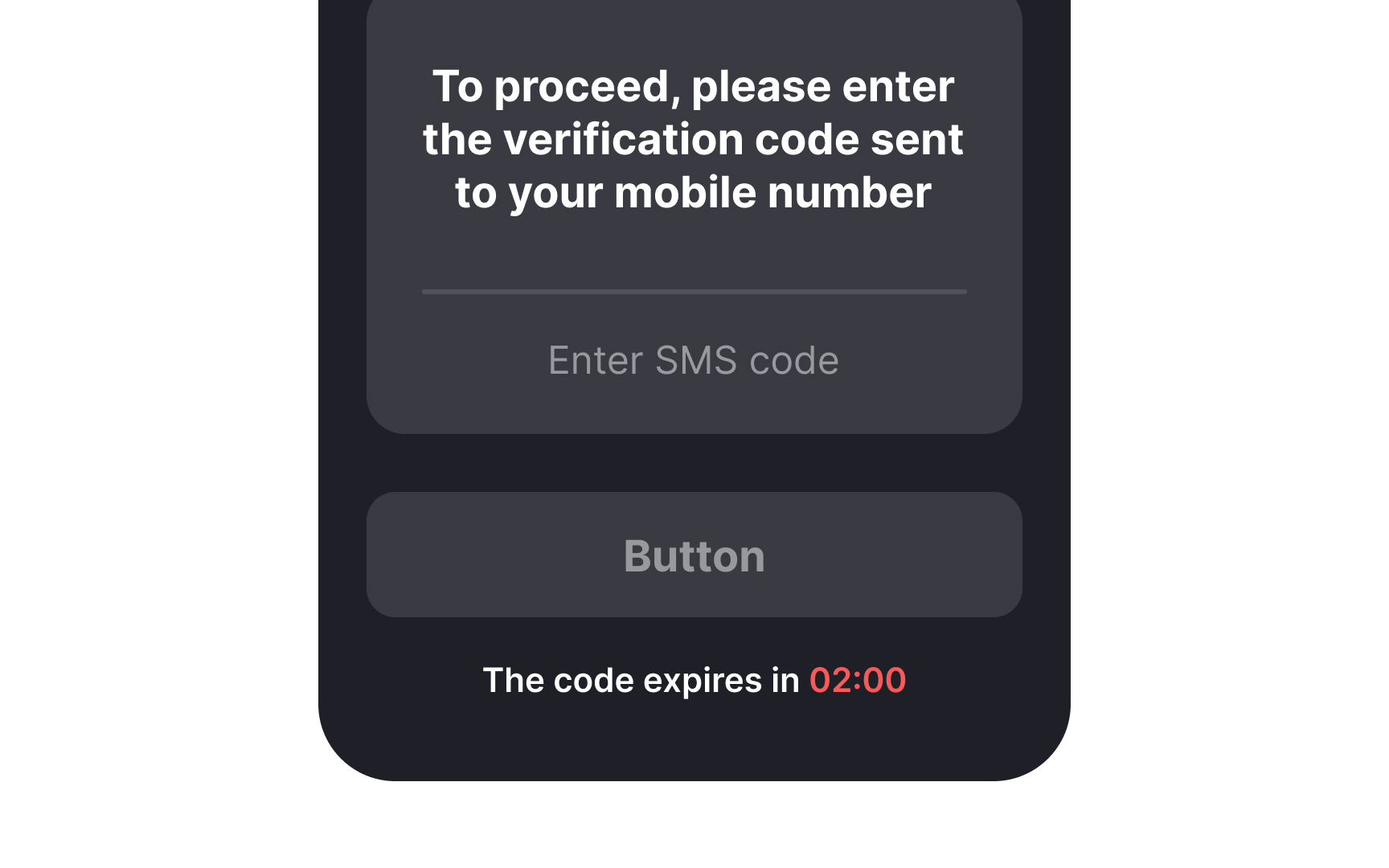
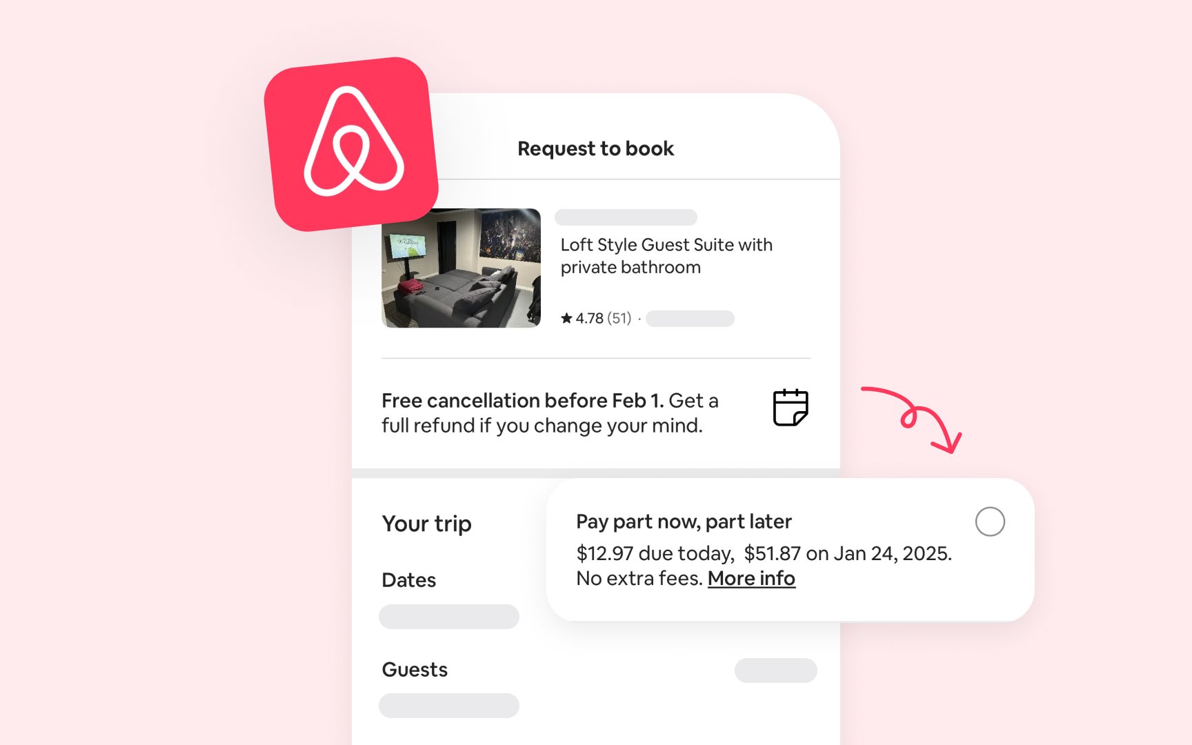
Time pressure is a significant anxiety trigger in digital interfaces, affecting user decision-making and emotional well-being. Countdown timers, limited-time offers, and artificially rushed experiences can create unnecessary stress, particularly for users prone to anxiety. While these tactics might drive conversions for some users, they can alienate others and create negative associations with the product.
Artificial time constraints often appear during checkout processes, booking flows, or limited-time offers. These
Implement flexible timeouts and clearly communicate any genuine time constraints, such as ticket availability or reservation holds. If time limits are necessary, like in the case of entering one-time
Predictability in digital interfaces plays a crucial role in managing user anxiety. Unexpected behaviors, unclear steps, or missing progress indicators can trigger stress responses and disorientation. Clear communication about upcoming actions, time estimates, and process steps helps users maintain a sense of control and preparedness during their digital journey.
Time estimates and progress indicators serve multiple purposes in anxiety-aware design. Reading time estimates for articles, file upload progress bars or step-by-step wizards provide users with concrete expectations. This information helps users plan their
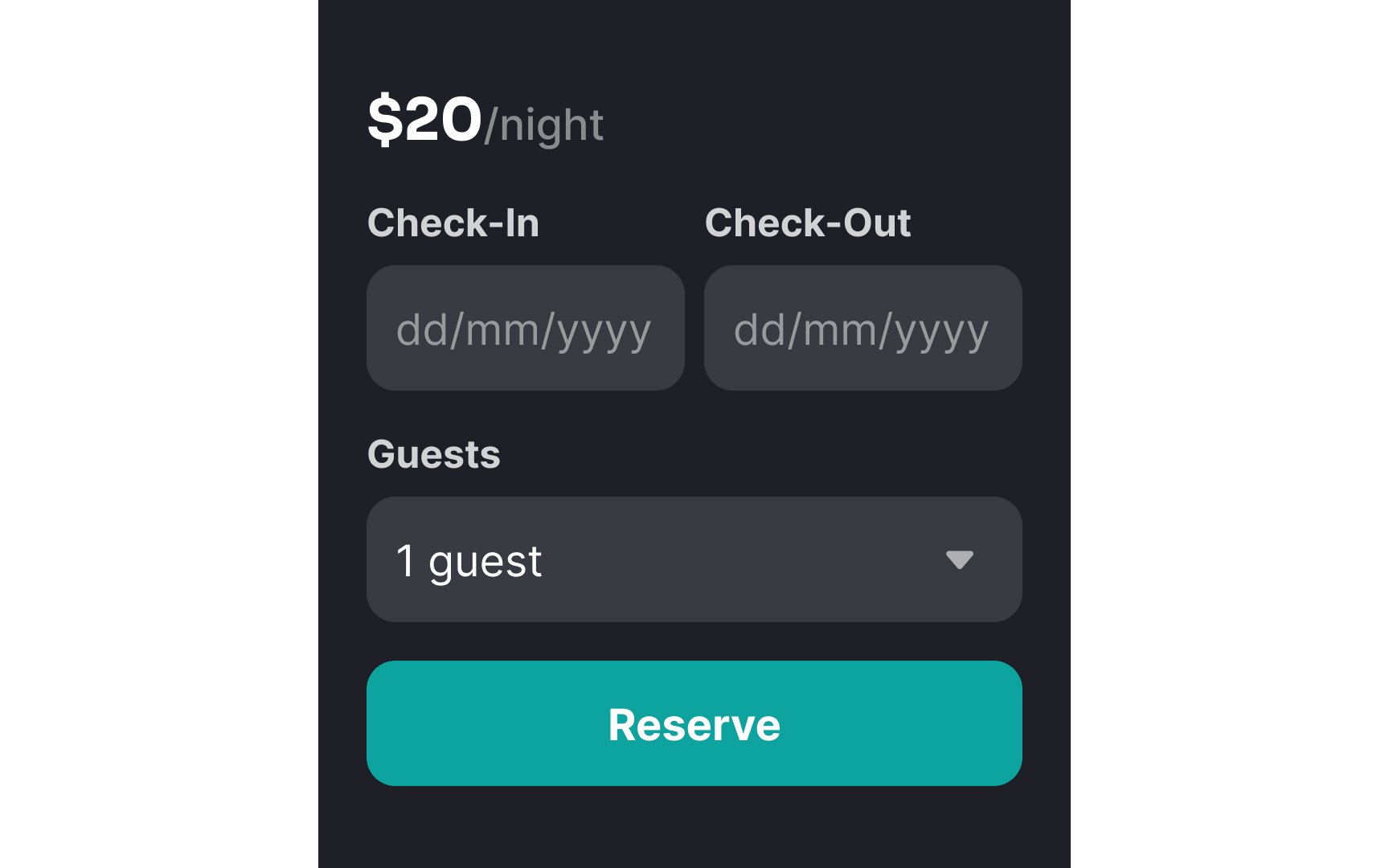
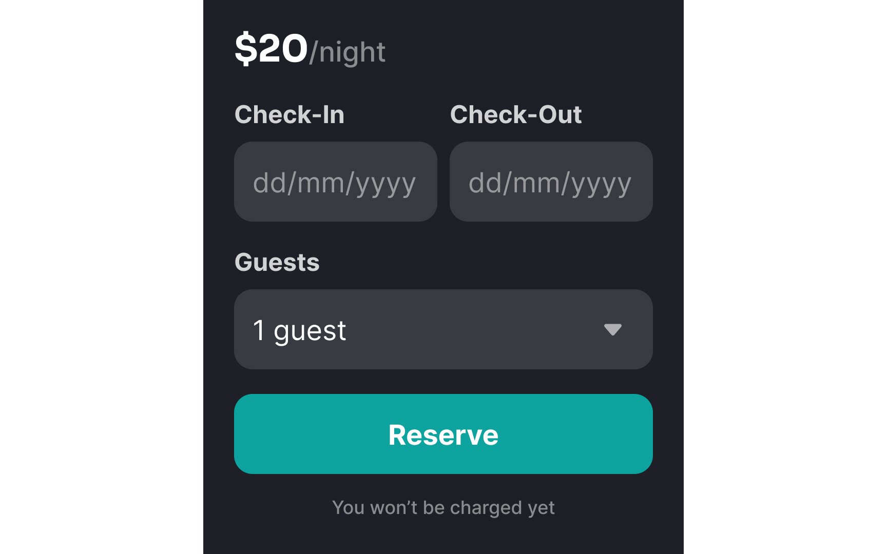
Advance information about system behaviors (for example, will clicking on a Reserve button automatically charge their card?) particularly benefit users with disabilities who rely on assistive technologies. Screen reader users need to know when new
Pro Tip: Before any significant process, provide a brief overview of required steps and estimated completion time — this helps users prepare mentally and decide when to start.
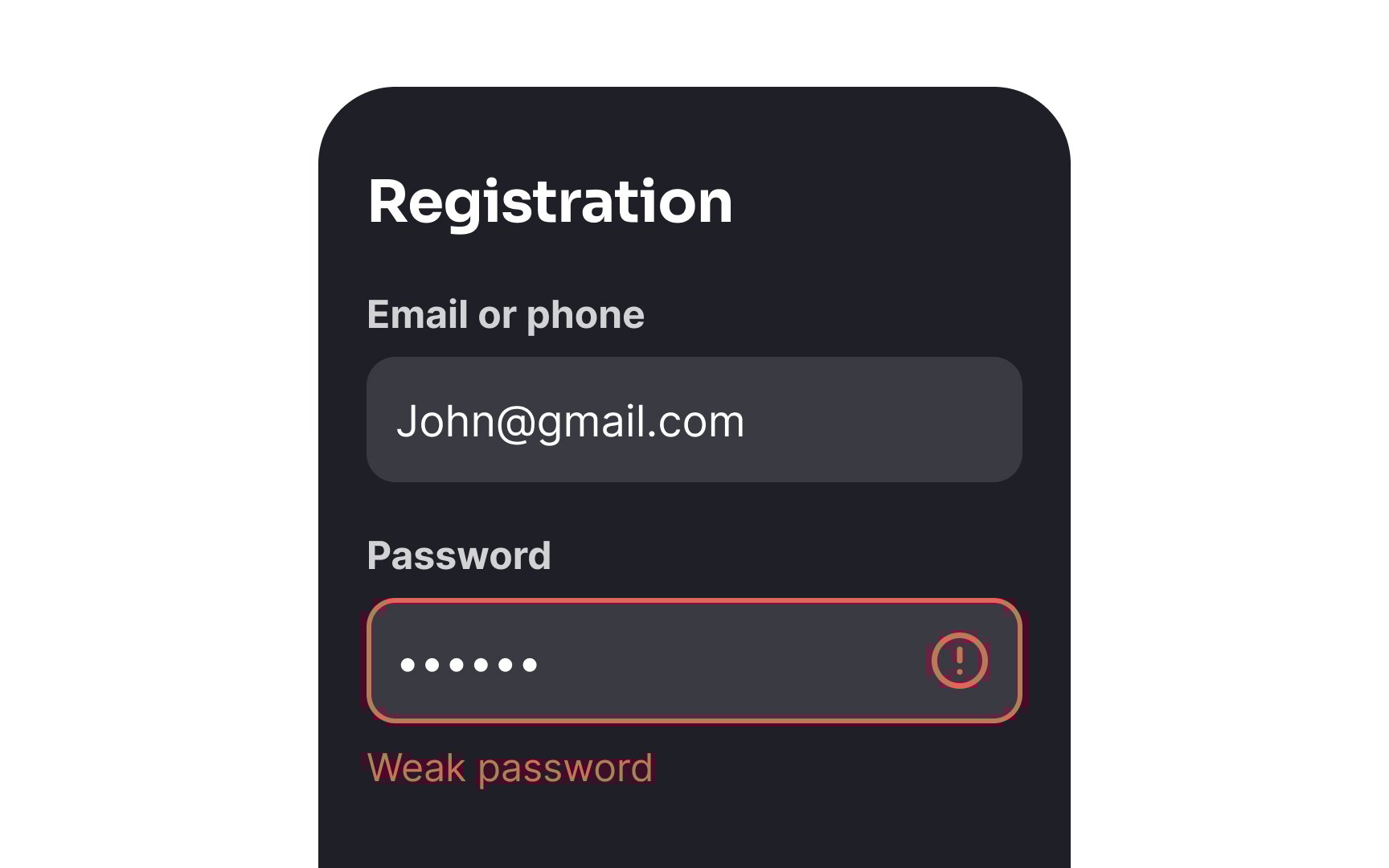
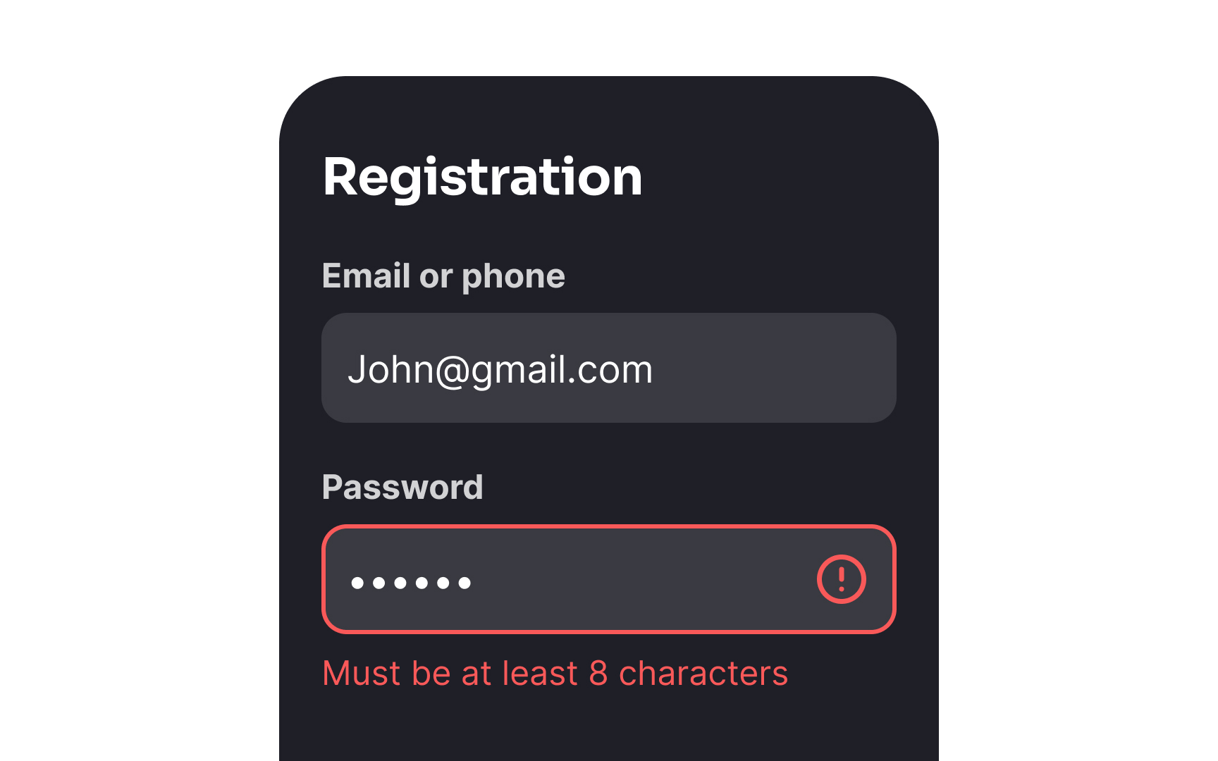
Ambiguous labels, cryptic error messages, or unclear instructions create unnecessary
Simple, direct language helps users understand exactly what's required and what consequences their actions will have. For example, instead of "Submit," a
Clear field labels, input requirements, and success confirmations also create a supportive environment where users feel confident in their actions. For instance, showing
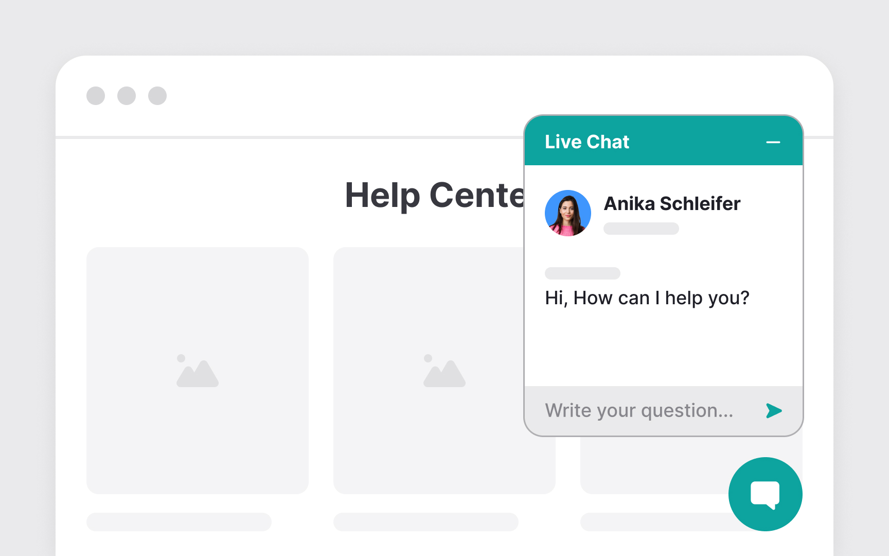
Anxiety often intensifies when users feel stuck or unsure about completing critical tasks in digital interfaces. Multiple, clearly visible support options help users feel more secure, knowing help is readily available when needed.
Contact options should accommodate different comfort levels and communication preferences. While some users may prefer the immediacy of live chat, others might feel more comfortable with email's asynchronous nature. Clear pathways to support should appear contextually where users are most likely to need help. For example, placing chat widgets near complex forms or displaying help documentation alongside technical features reduces the friction in seeking assistance.
Support channels should maintain consistency in tone and accessibility across all touchpoints. Help documentation (like FAQs) should use clear, empathetic language and avoid technical jargon. For phone support, providing expected wait times and callback options gives users more control over their support experience. Including brief descriptions of what each support channel offers helps users choose the most appropriate option for their needs.
When users feel in command of their actions and understand their consequences, anxiety levels typically decrease. This becomes particularly important during critical interactions like form submissions, profile updates, or financial transactions, where mistakes can have a significant impact.
Review steps and confirmation screens serve as crucial anxiety-management tools in digital interfaces. Before finalizing important actions, users should have clear opportunities to navigate back, review their
Pro Tip: Always provide a confirmation screen for important actions, showing exactly what will change and giving users a clear option to modify or cancel before proceeding.
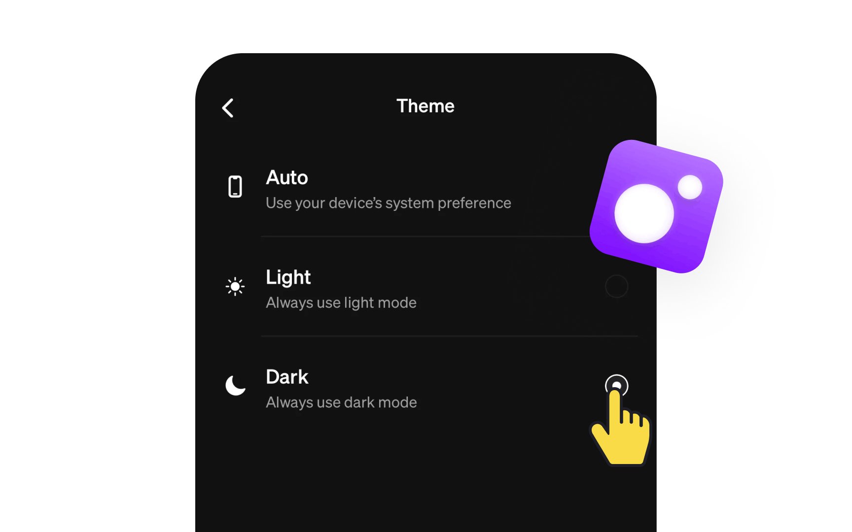
Dark mode significantly impacts visual comfort and anxiety management in digital interfaces. Bright screens can trigger physical discomfort and heighten anxiety, particularly during extended use or in low-light environments. A well-implemented dark theme reduces eye strain, screen glare, and the potential for light sensitivity triggers that can exacerbate anxiety symptoms.
Dark mode implementation requires careful consideration of contrast ratios and color relationships. The interface should maintain WCAG compliance with a minimum contrast ratio of 4.5:1 for normal text and 3:1 for large text. Color choices should avoid pure black backgrounds, instead using softer dark grays (like #121212) with off-white (like #DEDEDE) to reduce eye strain and prevent halation effects. Interface elements need thoughtful adaptation to ensure readability and maintain visual hierarchy in darker contexts.
The option to toggle between light and dark modes should be easily accessible and remember user preferences across sessions.
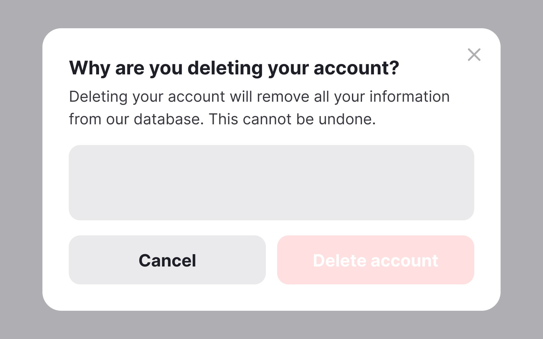
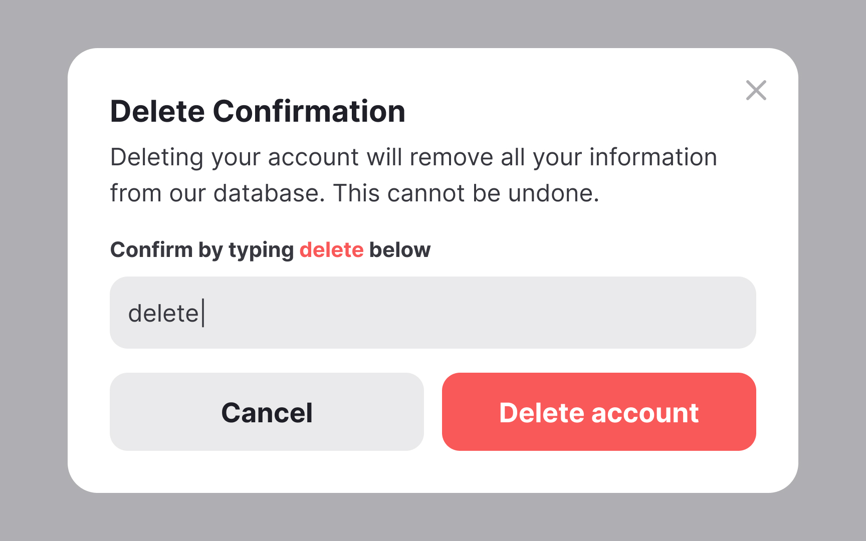
Friction in digital interfaces serves as a double-edged sword in anxiety management. While unnecessary obstacles can frustrate users and increase anxiety, strategic friction plays a vital role in preventing irreversible mistakes and providing necessary moments of reflection. The key lies in implementing friction thoughtfully at critical decision points where users benefit from additional confirmation steps.
Destructive actions like account deletion, subscription cancellation, or permanent data removal require appropriate friction levels to prevent accidental actions and subsequent anxiety. These moments should include clear warnings about consequences and require explicit confirmation. For instance, deleting a project might prompt users to type "DELETE" or the project name, creating a deliberate pause for consideration. This extra step helps users feel more in control and confident about their decisions.
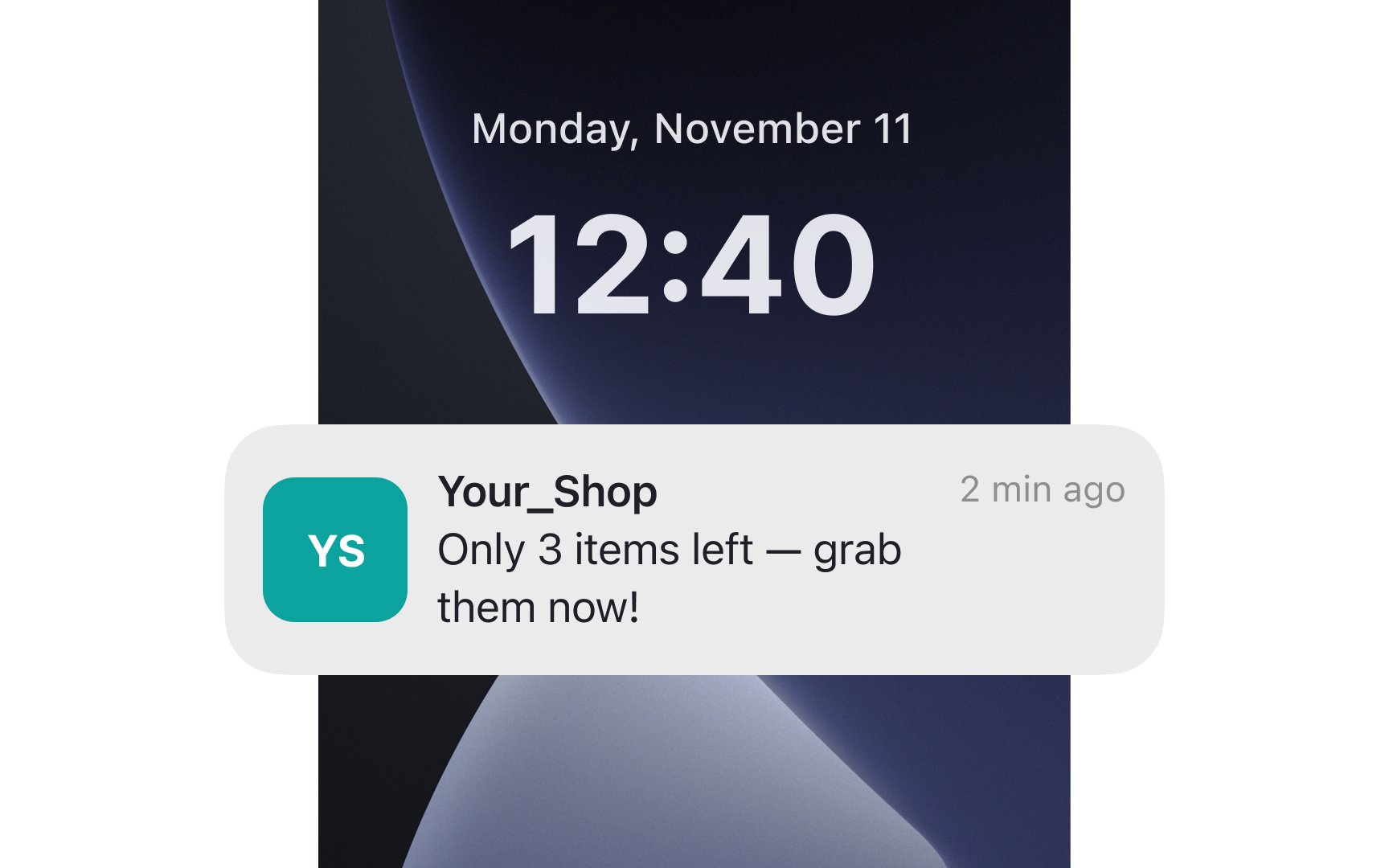
Misleading
Honest, transparent communication builds trust and supports users' emotional well-being. Instead of relying on clickbait, focus on providing clear, accurate information that helps users make informed decisions. For example, provide factual inventory information rather than panic-inducing stock alerts. This approach respects users' intelligence while maintaining their sense of security and control during digital
Pro Tip: When writing notifications or alerts, ask yourself: "Does this message provide genuine value, or does it primarily aim to provoke an emotional response?"
References
- Inclusive UX in an era of anxiety | Medium
Top contributors


Topics
From Course

Images provided by

Share


Similar lessons

Intro to Accessibility

Inclusive Design Basics
