Design Element Properties
Explore the fundamental properties of design elements that play a crucial role in establishing the tone, mood, and visual appeal of digital products
Elements are the basic building blocks of any digital product. The properties of those elements — their shape, scale, color, pattern, texture, and orientation — are some of the most important factors in the tone and mood your design creates.
Learning to apply those properties effectively starts to set your designs apart from the crowd. Figuring out how to create particular moods or tones, how to use properties to influence user behavior, and how to combine them to create visually appealing designs is vital for any designer.
There are various
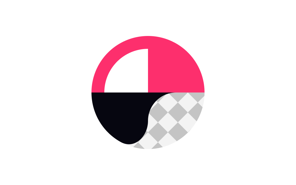
There are three types of shapes: geometric, organic, and abstract.[1] Think of geometric shapes like those we studied in math class, such as squares and circles. Whether simple or complex, these shapes create a feeling of order and control.
As for organic shapes, we can draw them freehand — often, they are the shapes found in nature, like leaves or clouds. Organic shapes produce a natural feel.
Abstract shapes are often pictorial representations of objects, such as traditional "male" and "female" icons for restrooms. They're often used as icons in design. In addition to these, there are primitive shapes that are used in 3D design.
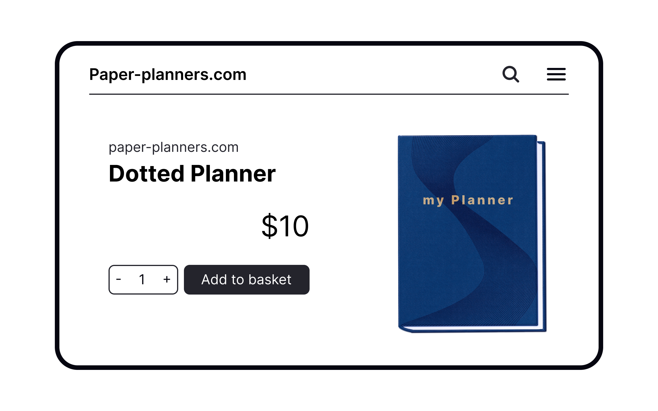
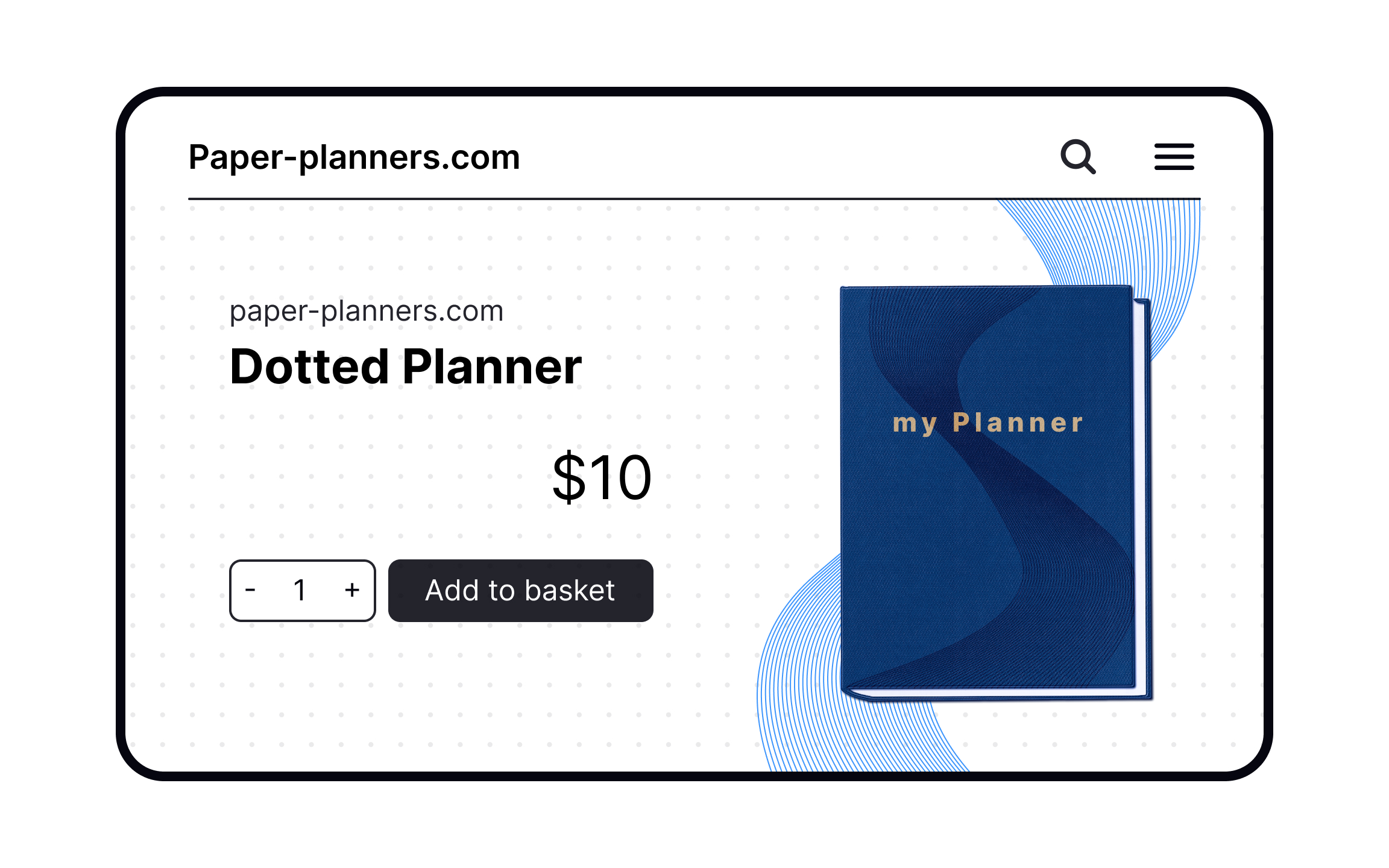
If size is an absolute measurement, like 14px, scale is a comparison measurement, i.e., how large one object is in comparison to another.[2] By playing with scale, we can create dominance, focal points, rhythm, balance, and visual hierarchy.
Textures are all about how surfaces feel to the touch. In design, we can simulate a tactile feeling with visual patterns — the better the
Patterns are similar to texture, but give less of a tactile impression and rely more on visual appeal. Think of wallpaper patterns or the pattern of a tiled floor.
Both texture and pattern can be used to create designs that more closely resemble the physical world. They can also be used to reinforce
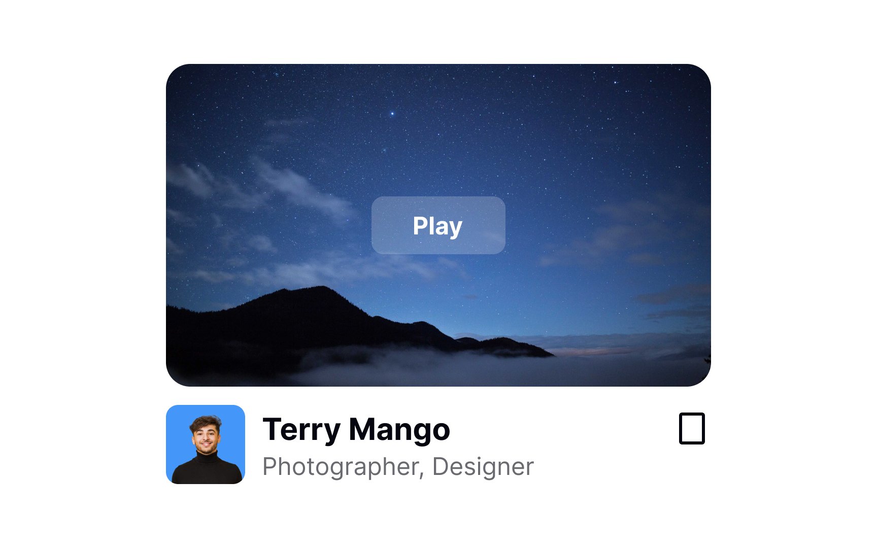

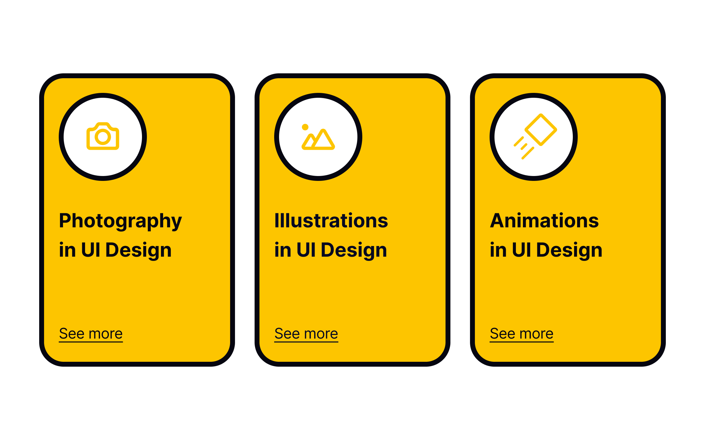
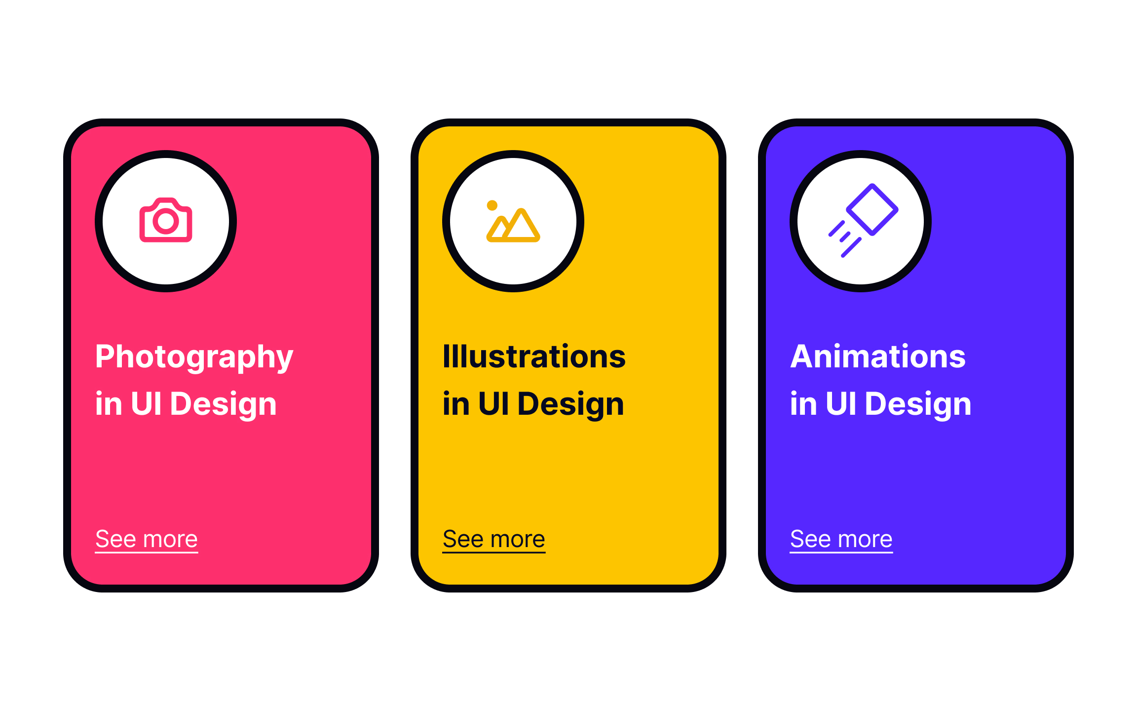
Using recognizable shapes for various functions helps them stand out in your design. For example:
- Rectangles are for buttons, cards, images, or videos
- Circles are for avatars or badges
- Arrows for navigation or Play buttons
Changing the shape of these elements can cause friction and confusion. If you want users to intuitively know how to use your interface, stick to common shapes.
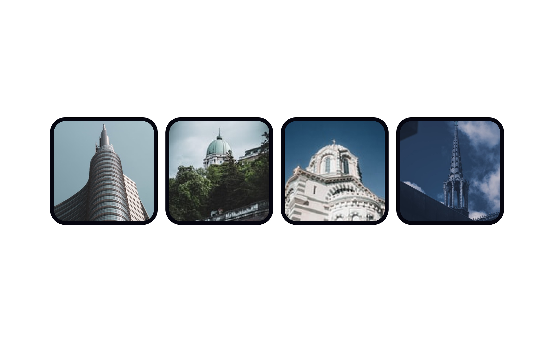
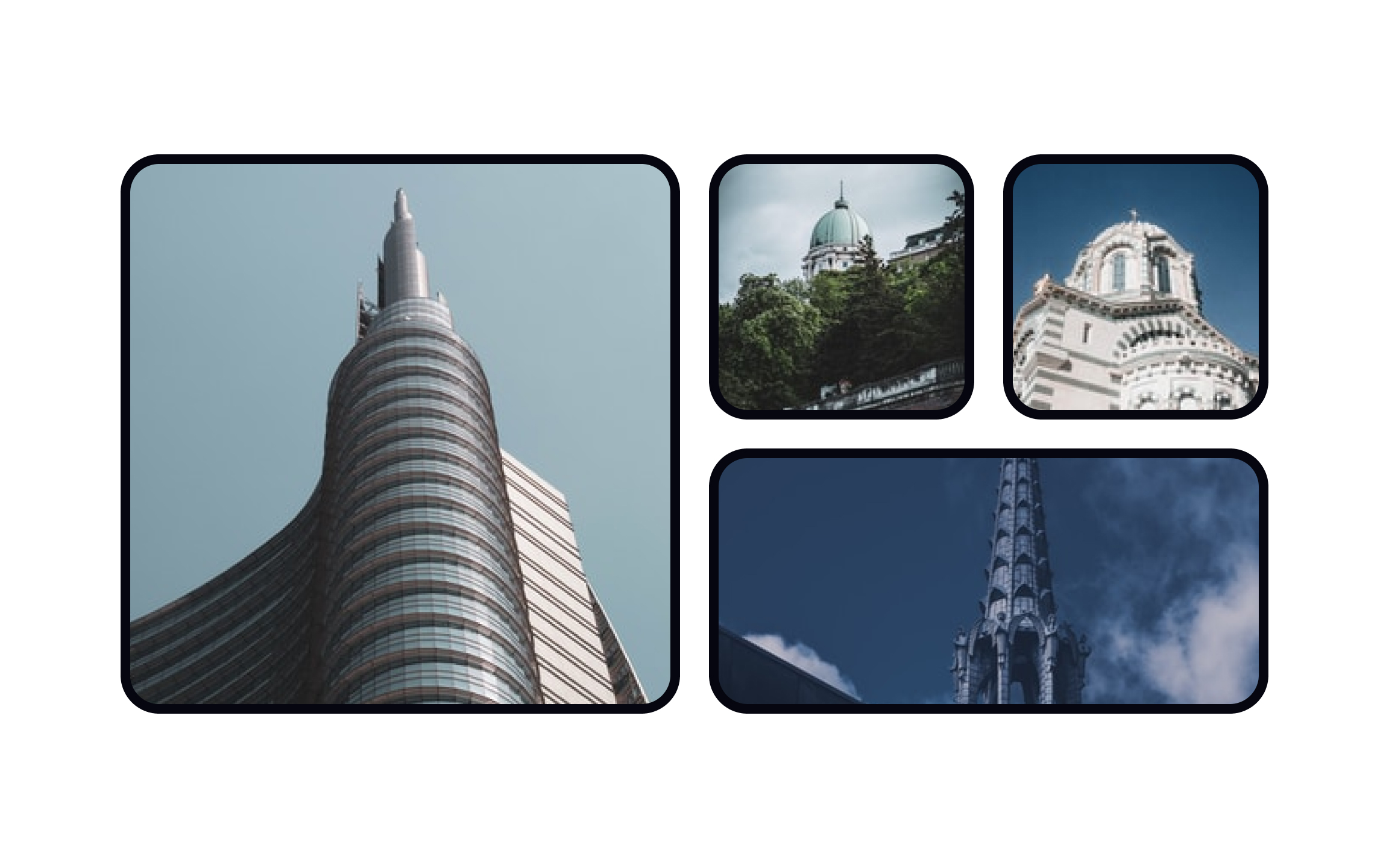
Scale helps establish dominance and create
References
- The Meaning Of Shapes: Developing Visual Grammar - Vanseo Design | Vanseo Design
Top contributors

Topics
From Course

Share


Similar lessons

Intro to Design Layouts

Intro to Design Grids
