CSS Alignment
Master the art of CSS alignment techniques to precisely position and align elements, creating visually harmonious and aesthetically pleasing web layouts
Your website's layout and elements' alignment determine how people read and search for the information they need to achieve their goals.
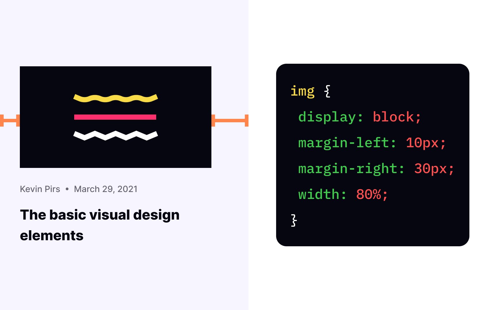
Without the CSS properties responsible for positioning, the browser renders elements from left to right and top to bottom. Like building blocks that you used to play with as a kid, elements stack one over another, and it's known as a normal flow of elements in HTML.
With properties such as text-align, vertical-alignment, float, and absolute position, you can apply styling rules in conjunction with display properties to create more complicated, responsive, and unique compositions.
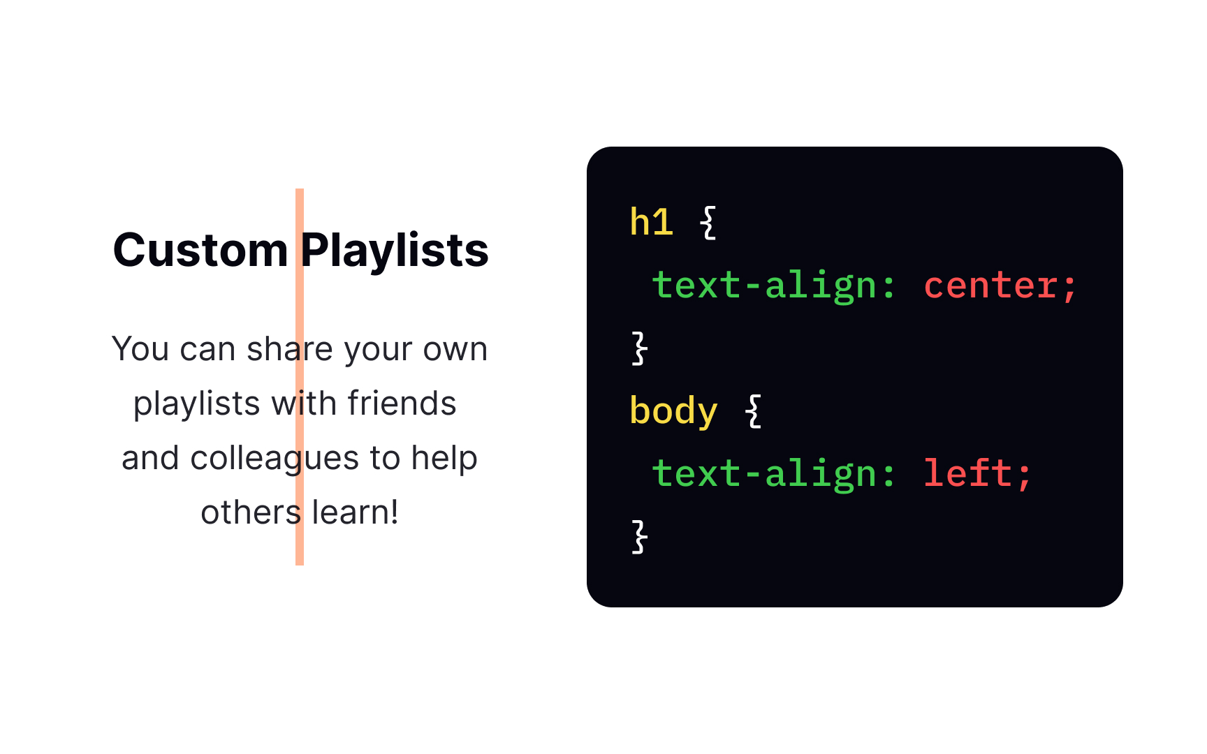
The text-align
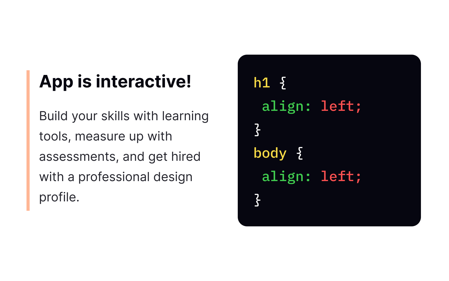
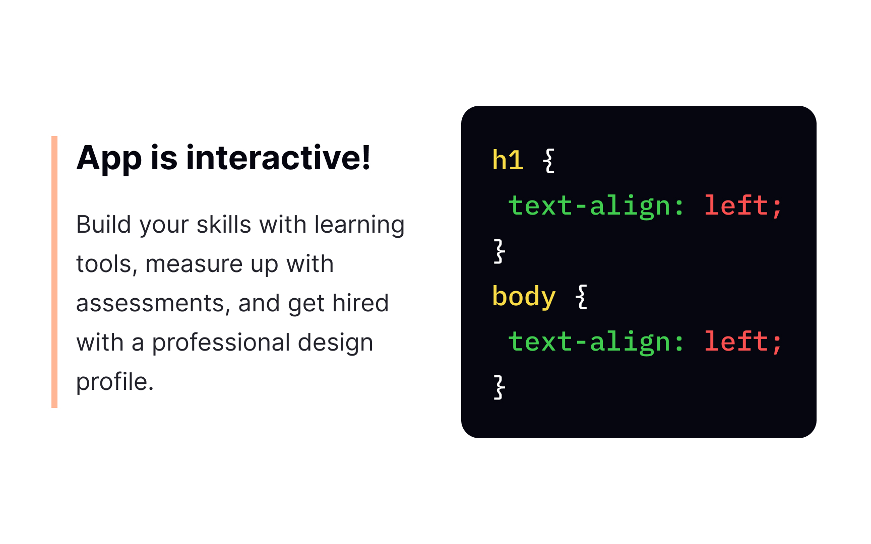
Flush left alignment is the safest and most popular choice for large paragraphs of text as it enhances the readability and feels natural for users who read from left to right.
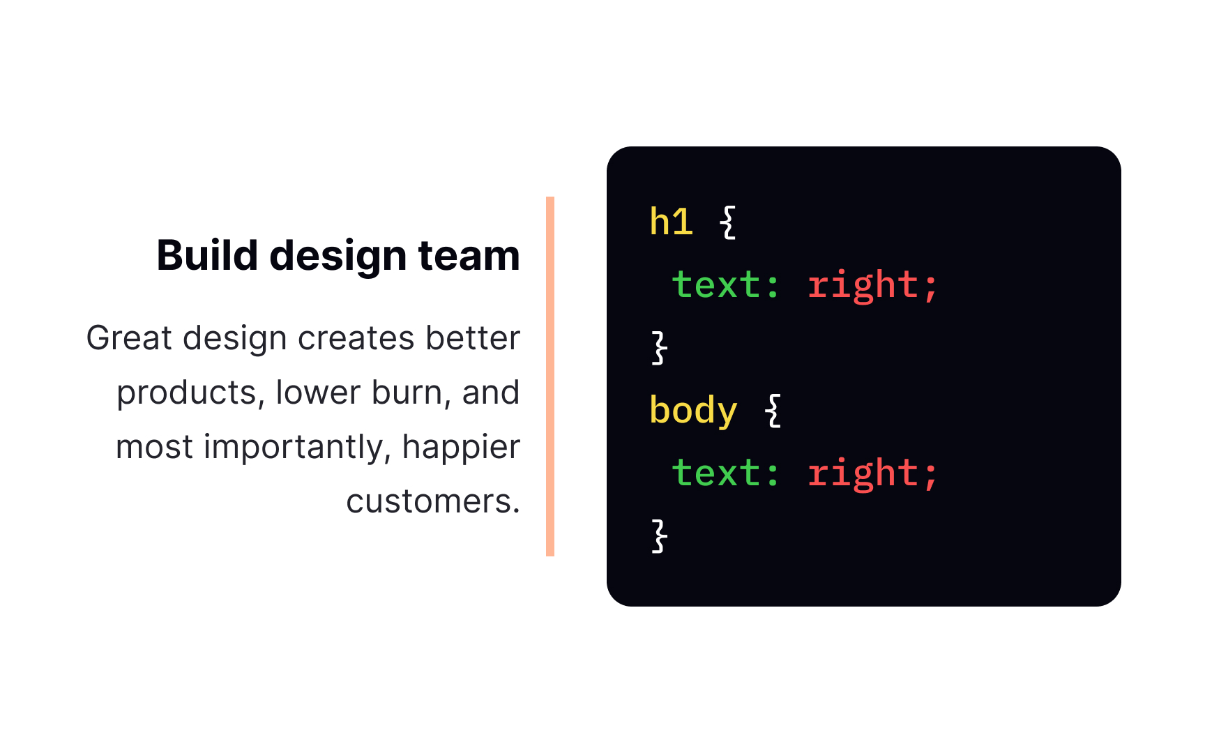
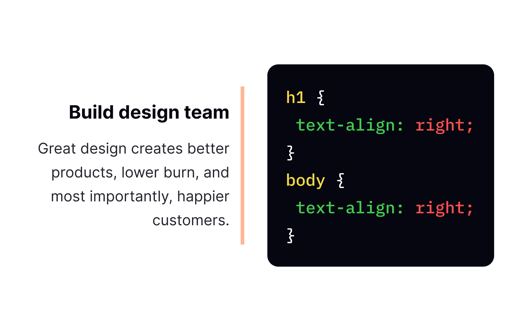
The right-aligned text sticks to the right edge of a page or text-align right value. The most basic syntax goes like this:
{
text-align: right;
}
Right alignment is one of the least common types as it takes too much effort for users to scan and consume.
In turn, it can be helpful for headlines or short messages for creating a unique or "offbeat" look and feel. Indeed, in languages with right-to-left scripts, like Arabic, Hebrew or Urdu, flush right alignment is the first choice to maintain readability.
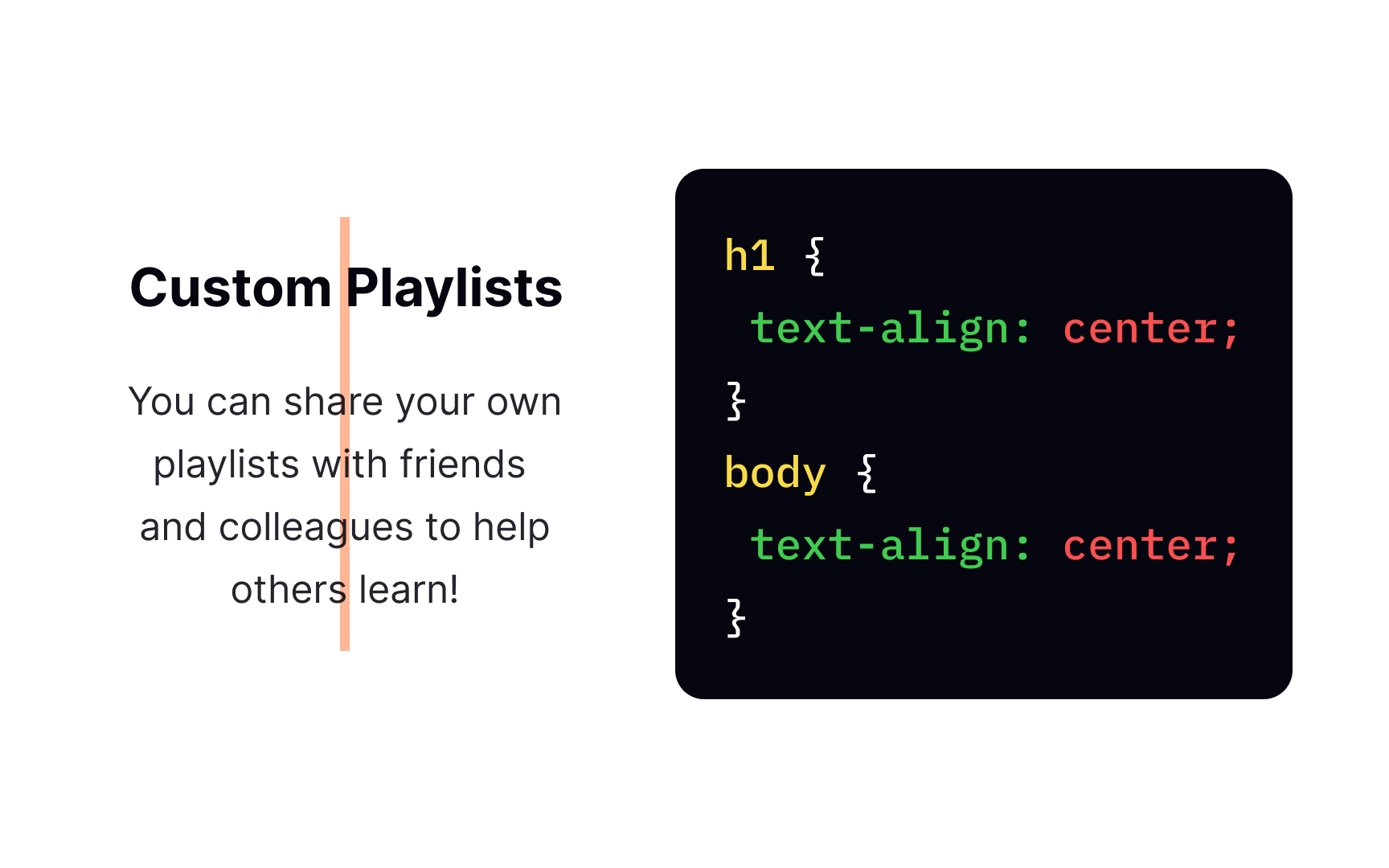
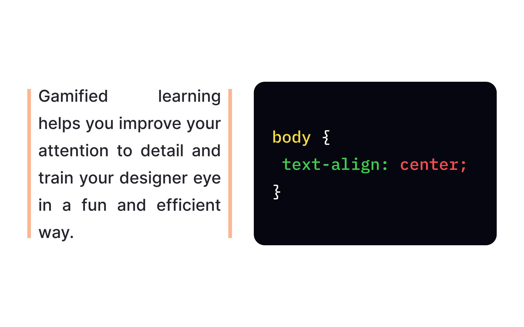
We use the text-align center value for placing text on the center axis of the
Centered alignment is a trap for designers who want to achieve a more organized and symmetrical
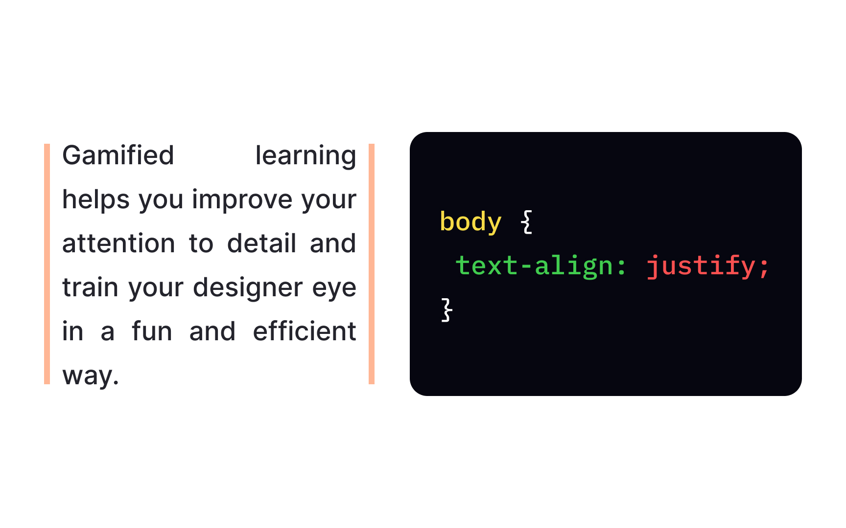
For applying a justified alignment, we use the text-align justify value. It makes lines of the same length, stretching out those with fewer characters and reducing the space for lines with more characters.
This type is generally common for newspapers, books, and other published materials. The only complication here arises when individual words are too long, or the columns are too narrow. As a result, the text ends up having large hideous gaps of blank space. To fix this situation, try making lines longer or words shorter or apply the smaller font.
The vertical-align property controls the alignment of elements placed next to each other on a line. That's why you can apply it only to inline or inline-block elements or elements inside
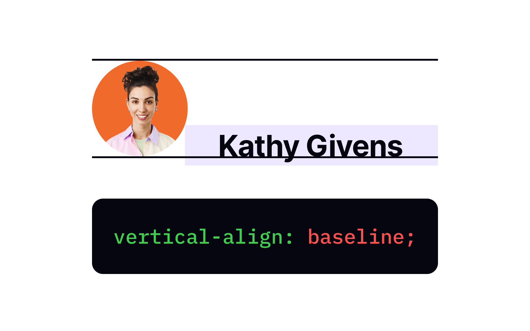
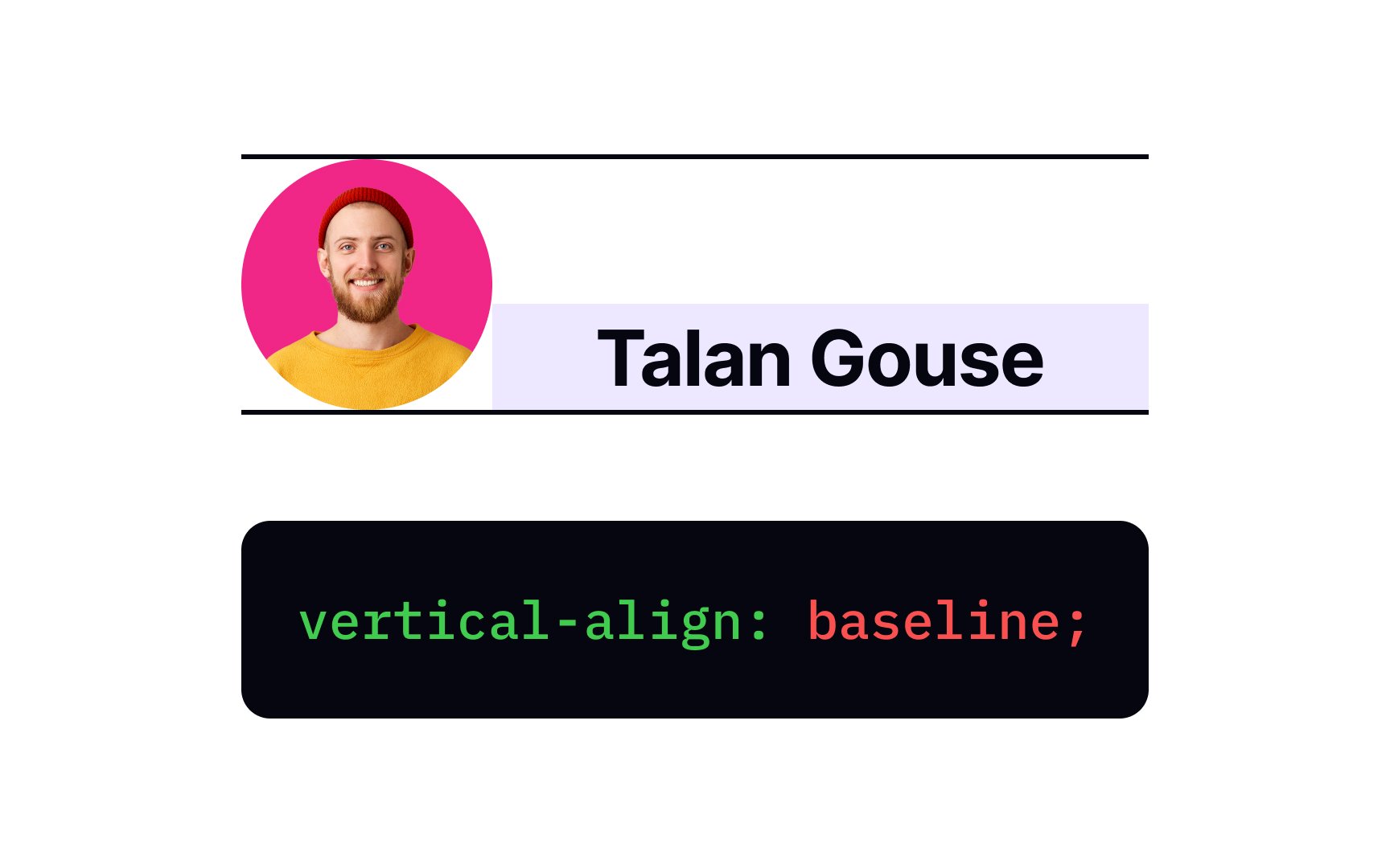
The baseline value is the default alignment of elements. From the typography theory, you might know the baseline is the invisible line the text sits on. So, the vertical-align: baseline; aligns the baseline of the child element with the baseline of its parent.
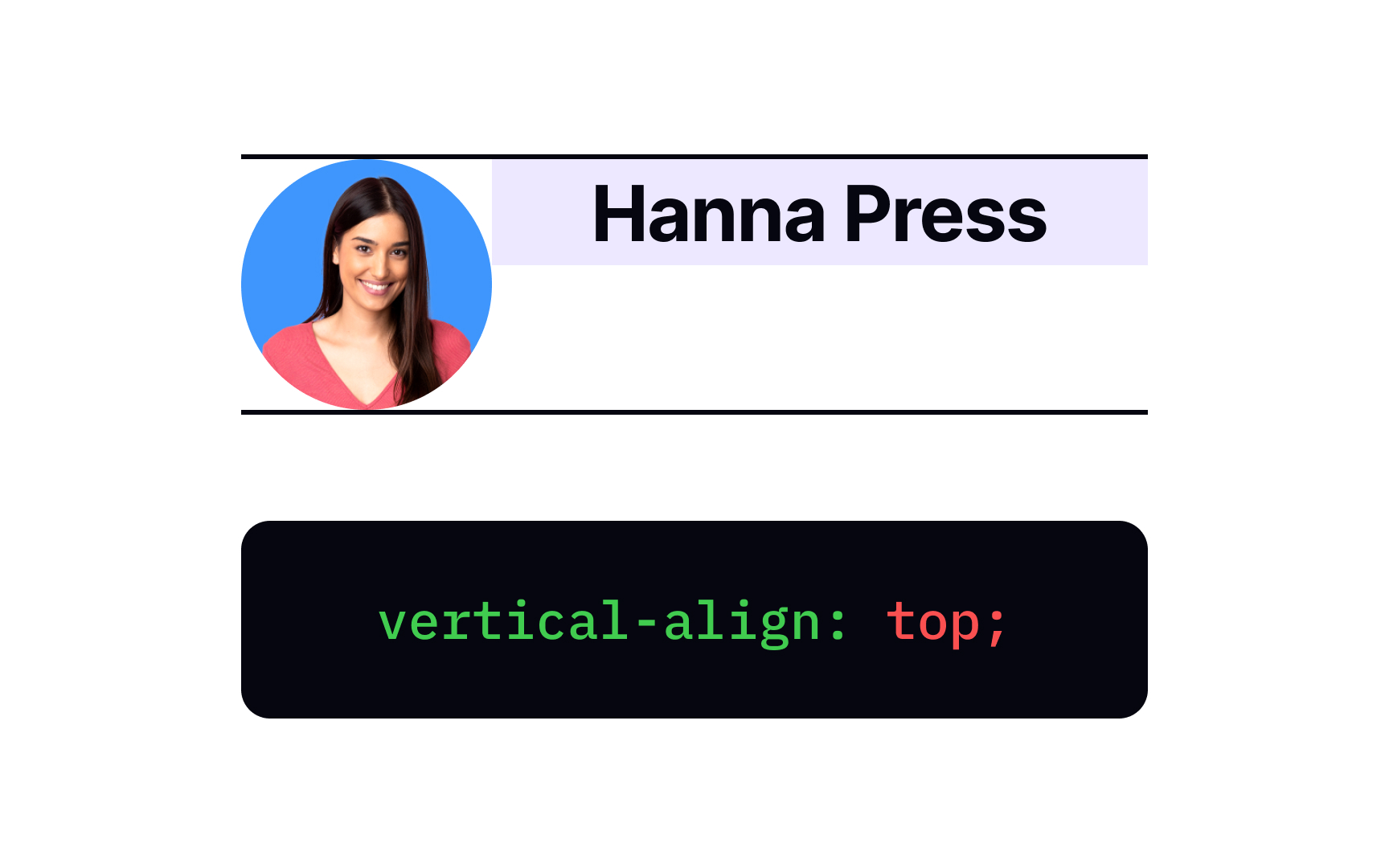
The vertical-align: top; declaration aligns the top of elements with the top of the entire line. Take a note, the top of the line isn't the same as the highest point of text — the line usually includes margin.
Vertical top alignment is a good choice for comparing multicolumn

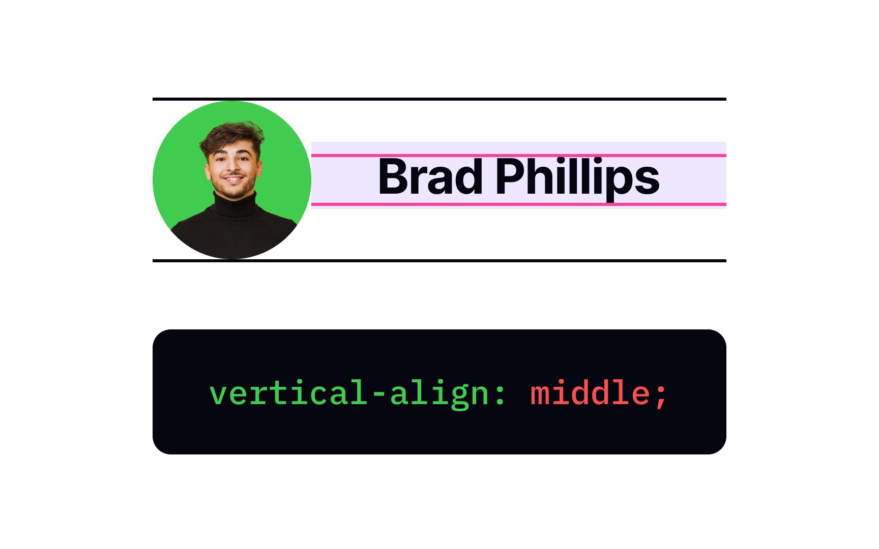
The middle value of the vertical-align
This type of alignment is rather common for aligning avatars with their names.

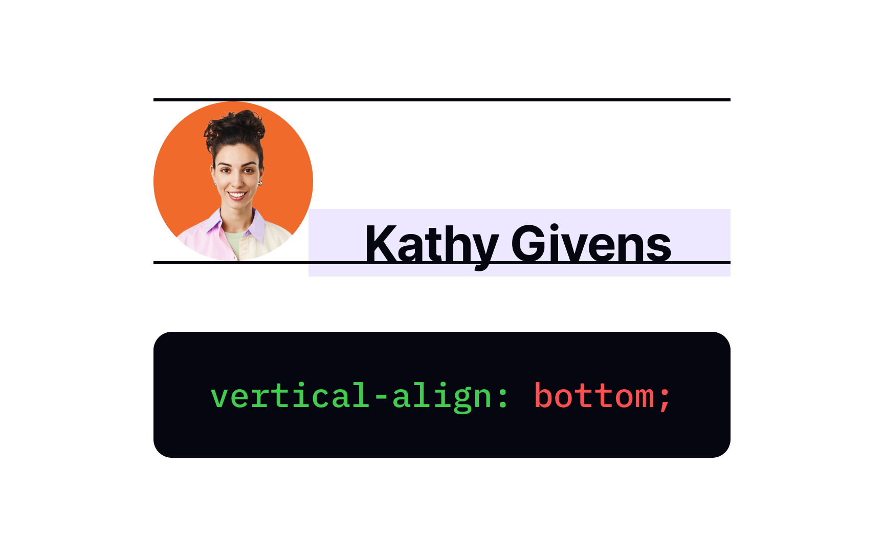
The vertical-align: bottom;
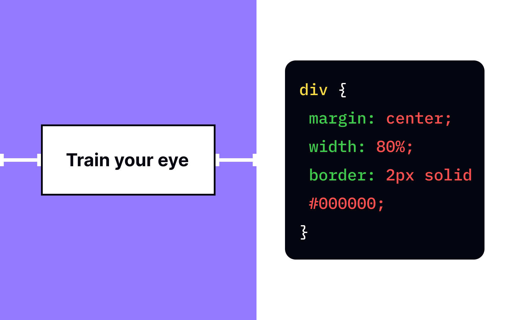
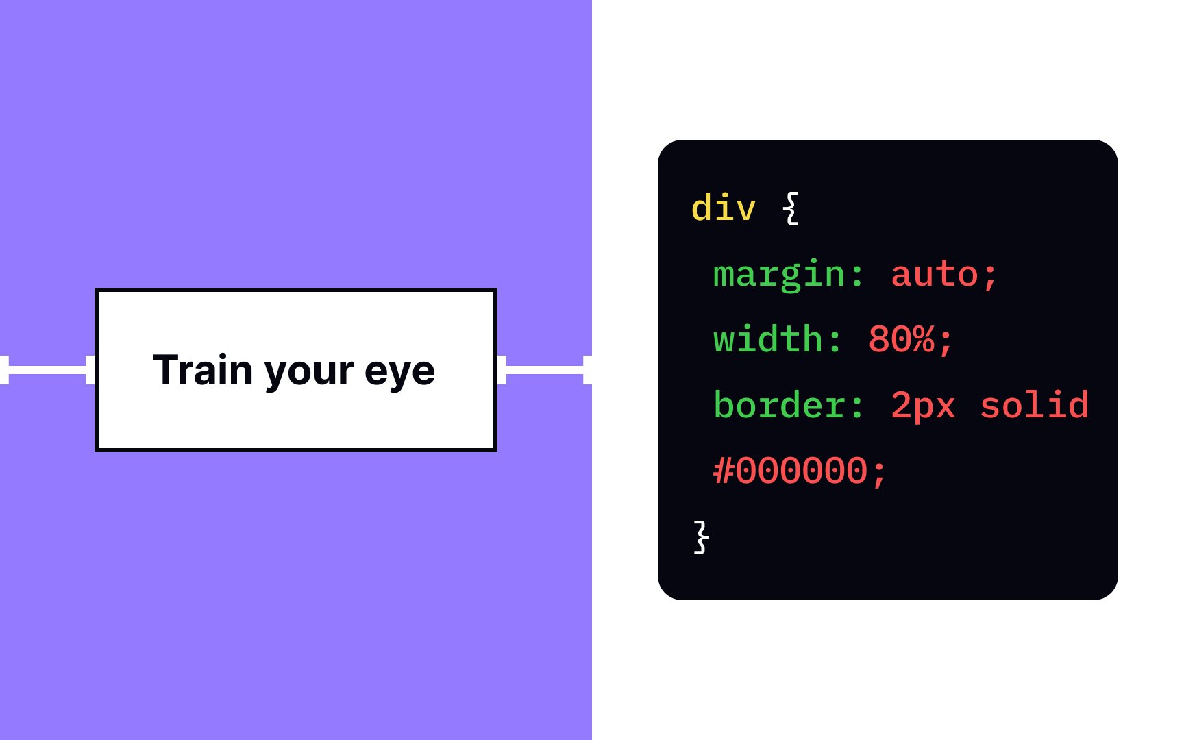
When it comes to centralizing elements, web developers use the margin auto value. The margin:auto; declaration makes the element take up the specified width, while the remaining space gets equally divided between the left and right
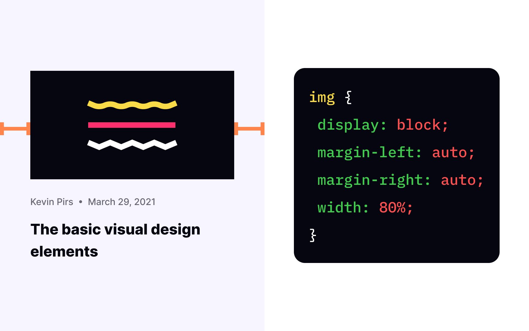
You can center elements, using the margin margin-left and margin-right properties and set them to the auto value. What happens when you apply this value only to the left or right
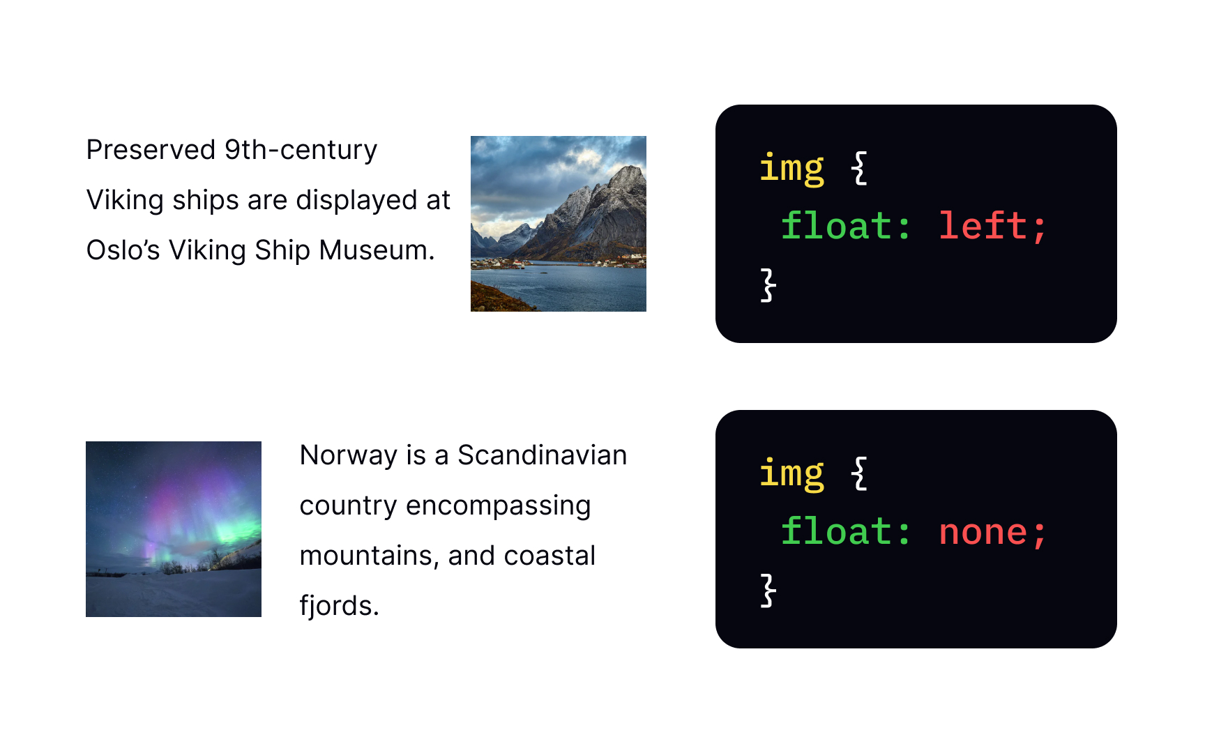

The float property makes a block-level element float on its container's left or right side, while text and inline elements wrap around it. You must have seen such alignment in print float: left;?
Instead of stacking on top of each other like elements of the normal flow, the next element sticks to the left of the previous block until there's room. Then, they would wrap to the next line. It makes the float property a perfect tool for creating traditional multicolumn layouts.
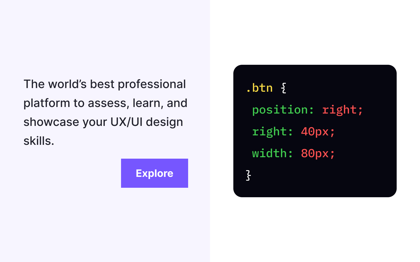
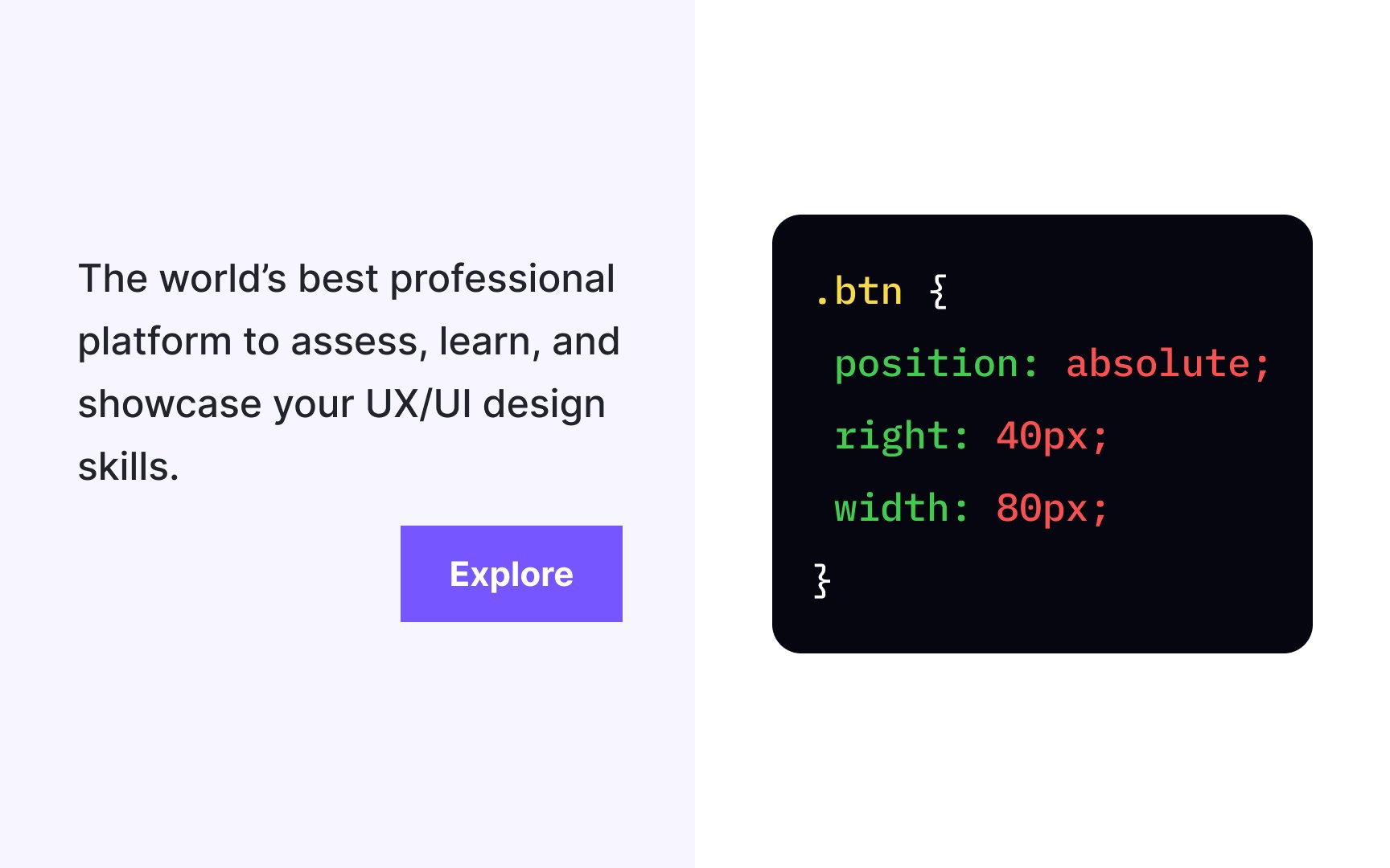
The position: absolute; declaration allows us to modify the position of an element. It removes the element from the document flow so that other elements behave like absolutely positioned elements don't exist and affect them, even when they touch.
The element takes the position relative to its closest positioned parent element, but you can set the element's offsets to specify its position. In the example, a button has the offset right: 40px;, positioning it precisely 40px from the right of the document. As you resize the browser, the button will stay in its place no matter what.
Pro Tip: The absolute position also guarantees the element will scroll with the rest of the content when users scroll a page.
The correct value is middle. This type of alignment is the most common for positioning
The float
The correct answer for applying such alignment is the text-align property with the justify value. Justified text has all lines of the same length. Lines with fewer characters stretch out, increasing the space between words, while those with more characters tend to shrink. The only exception is the last line which doesn't need to be spaced to line up with the right edge.
Top contributors

Topics
From Course

Share


Similar lessons

CSS Basics

Introduction to CSS for Designers
