Intro to UI Breadcrumbs
Learn how to style and use breadcrumbs to enhance navigation
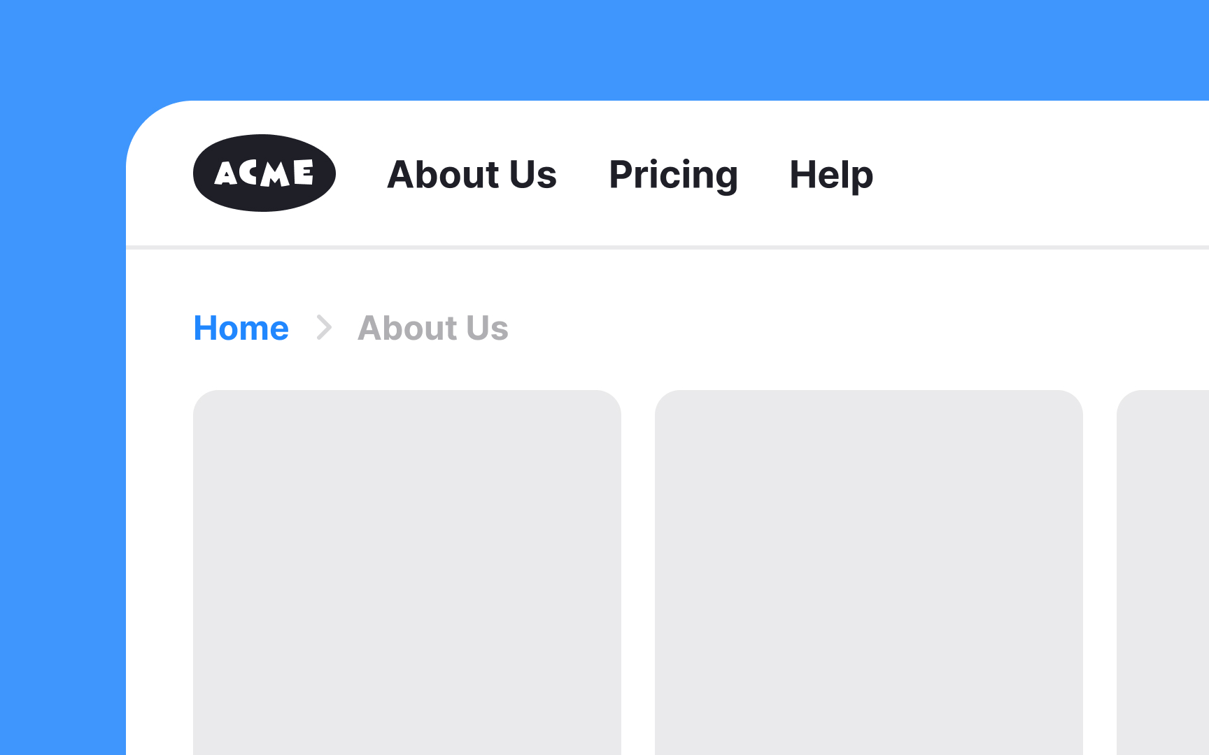
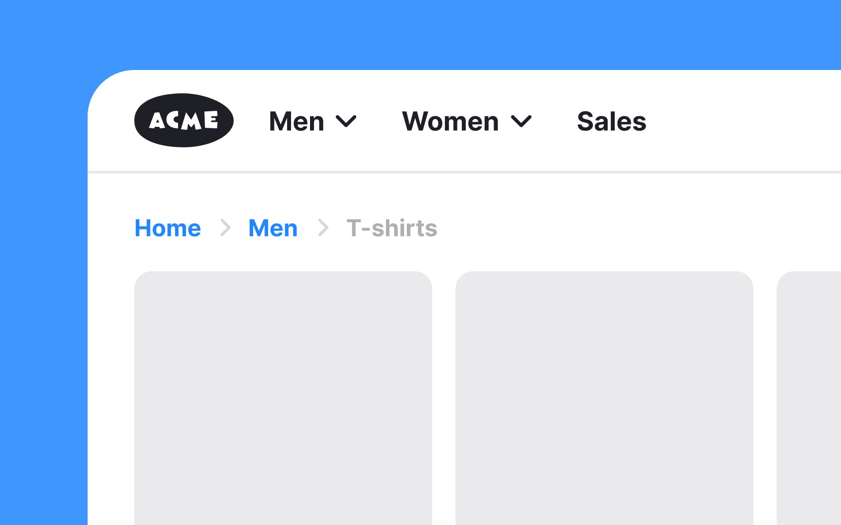
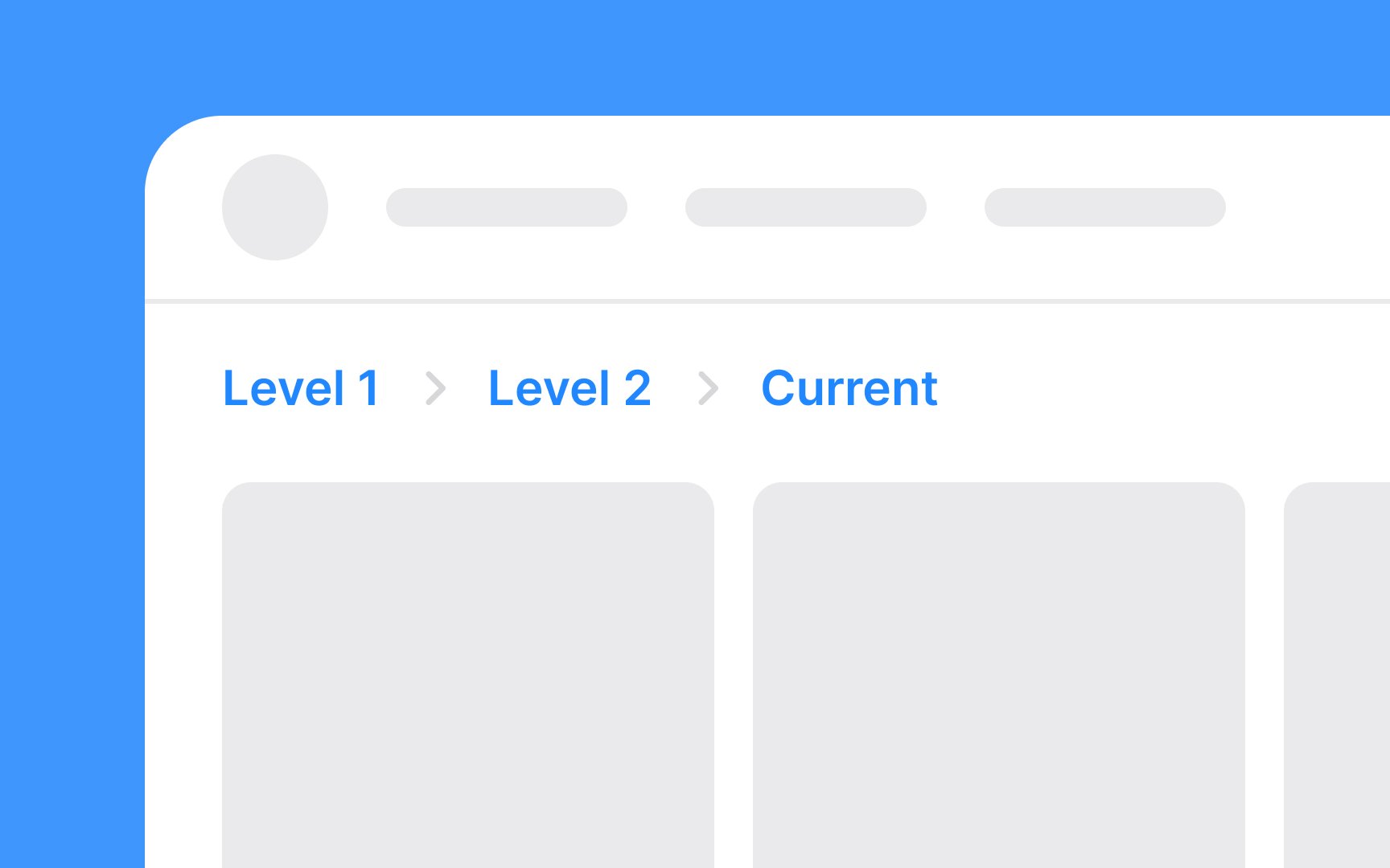
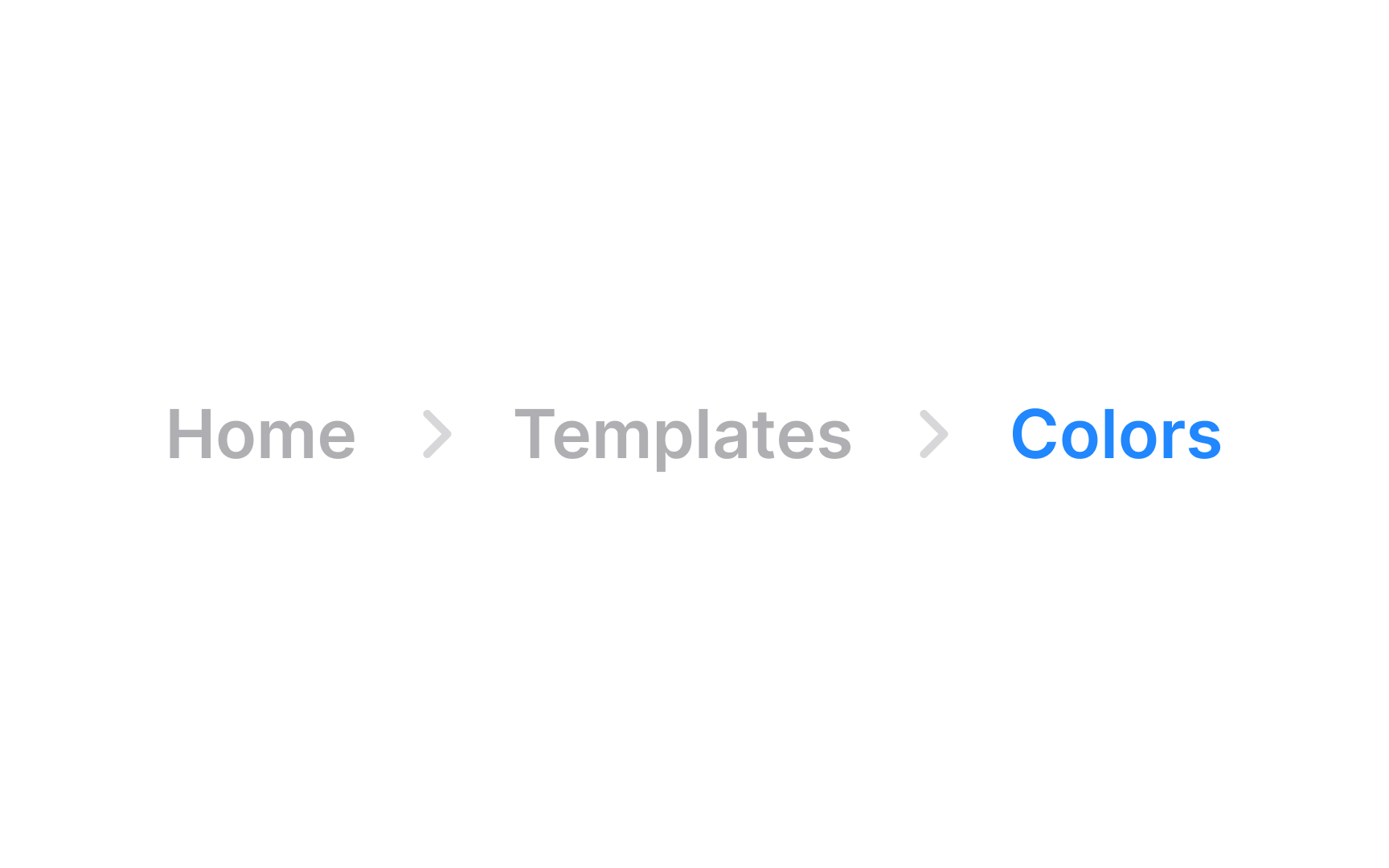
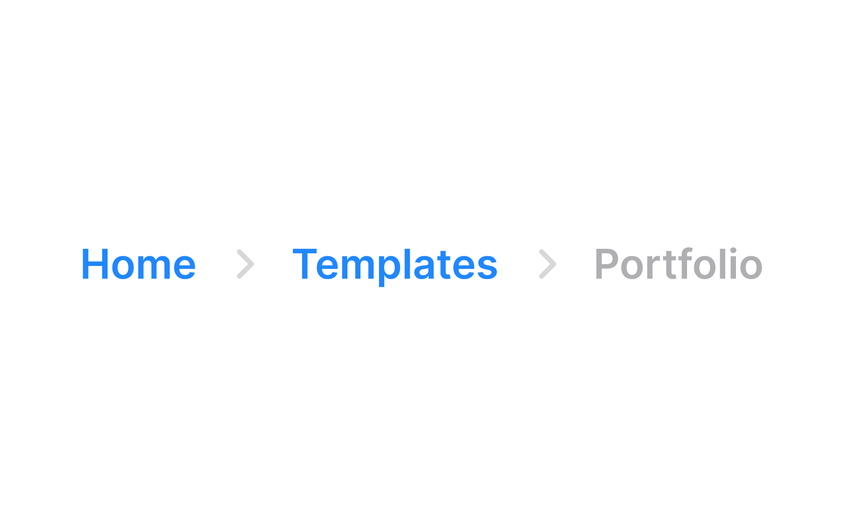
Breadcrumbs or breadcrumb trails refer to a UI element that aids in navigation. This feature displays a horizontal list of hyperlinks, reflecting users' journey through a site. The final link in this list shows users' current location, while the preceding links represent higher-level pages, such as the homepage or main category pages. This setup is beneficial for users who land on a page indirectly, such as through a search engine, as it clarifies the site's structure and users' location within it.
When properly implemented, breadcrumbs serve as an intuitive guide, helping users easily navigate the website and understand its hierarchical layout.
Text
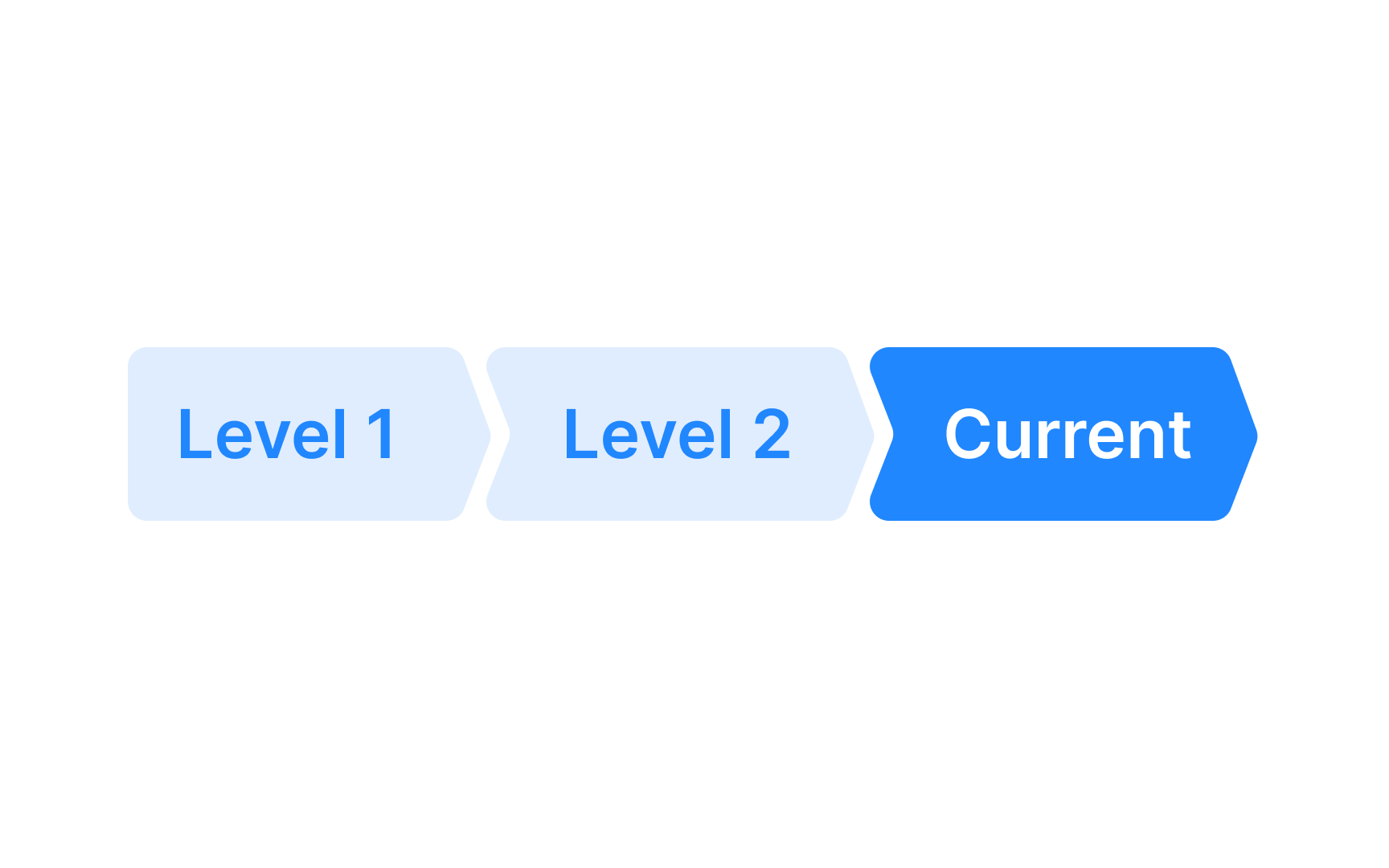
With button breadcrumb trails, each "button" is a clickable
Pro Tip: Breadcrumbs should be visible, but don't go overboard — they shouldn't be the first thing the user notices.
However, for websites with a simple, linear structure and only one or two levels of depth, breadcrumbs are less useful.[1] In such cases, there's no significant hierarchy or complex relationships between pages to display. Instead of breadcrumbs, it's better to use clear
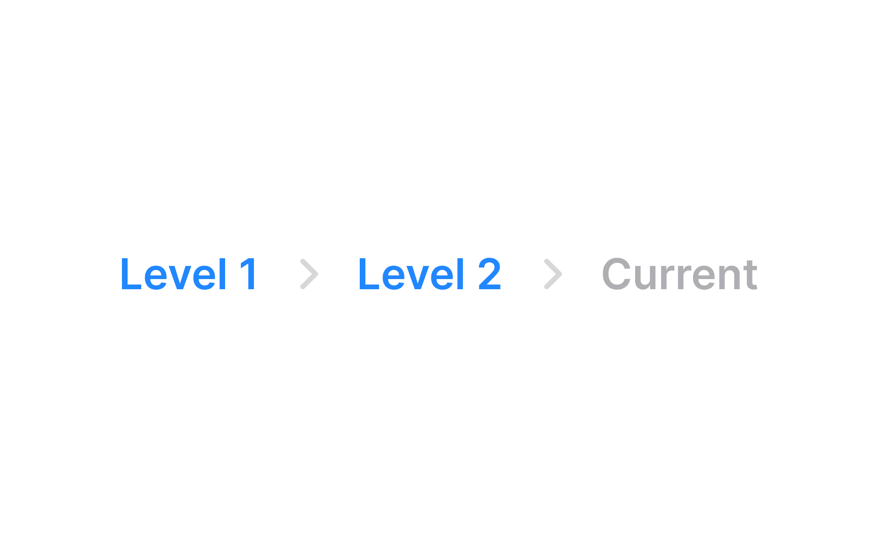
The current
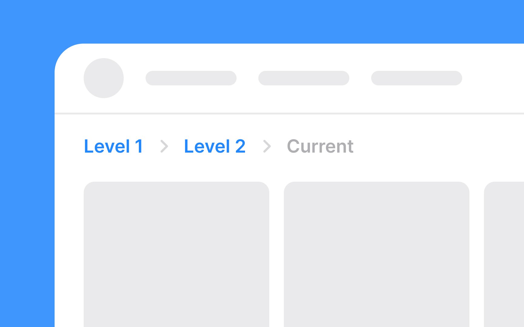
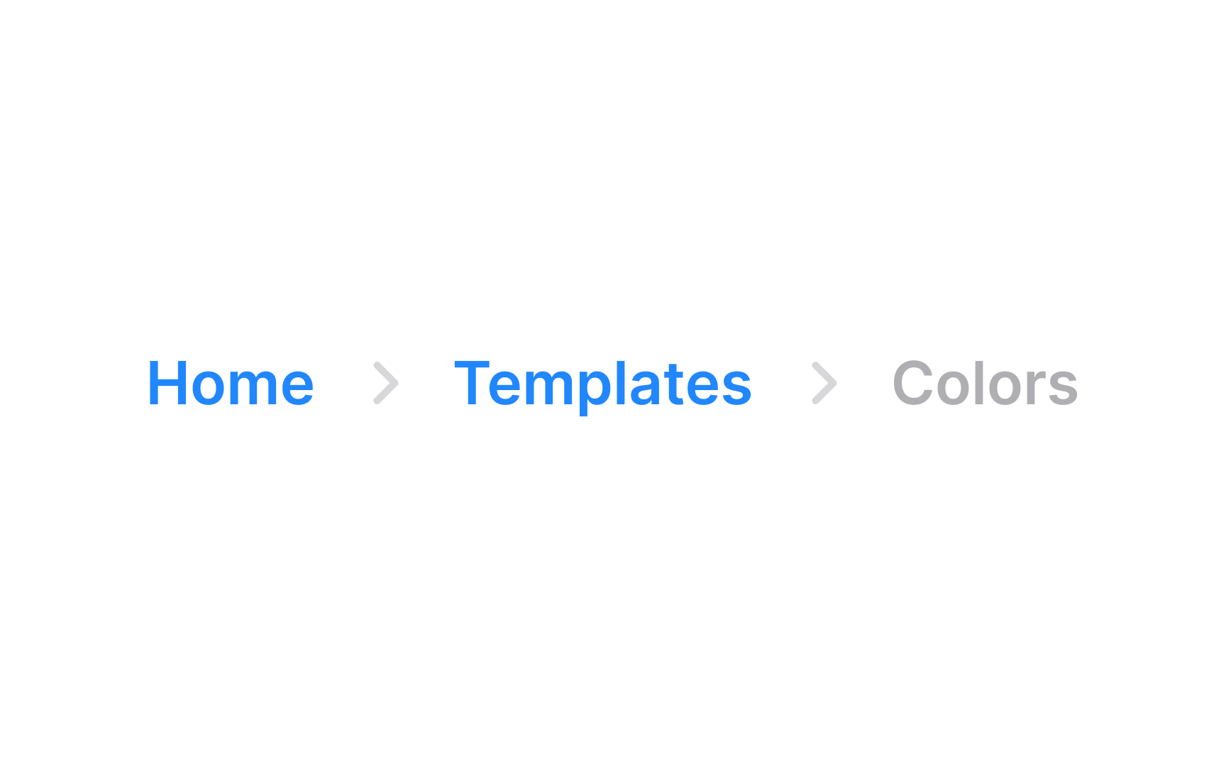
You may use a different font style or weight (e.g., bold) for the current page to make it stand out. Consider employing a color that contrasts with the other breadcrumb links but still fits the overall website color scheme.
Since it's not a
For the previous pages in a
Use a


Ideally,
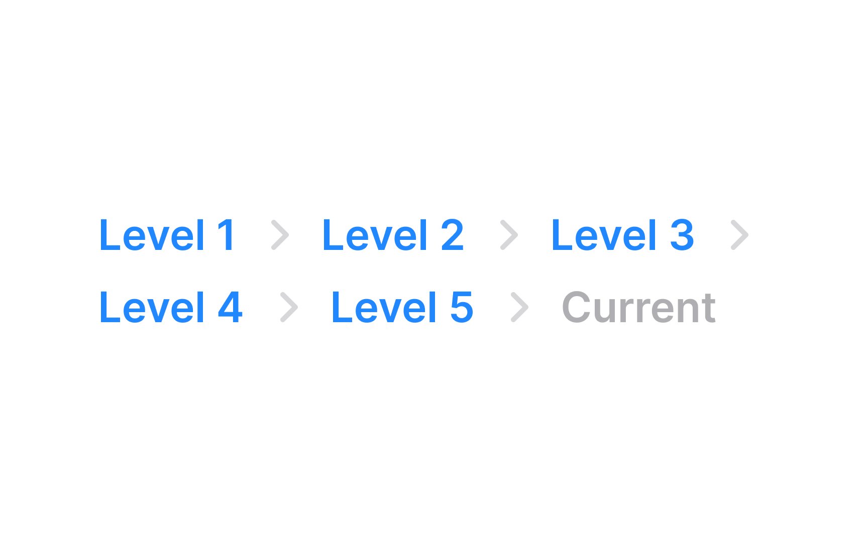
The alignment of breadcrumbs is typically horizontal, following a left-to-right reading direction, which aligns with the natural flow of most languages. This placement also mirrors the website's hierarchical structure, guiding users from left (higher-level pages) to right (current page).

In breadcrumb
Once a specific style of divider is chosen, it should be uniformly applied throughout the site. This uniformity helps in reducing cognitive load for users as they don't have to repeatedly adjust to different navigation styles on different
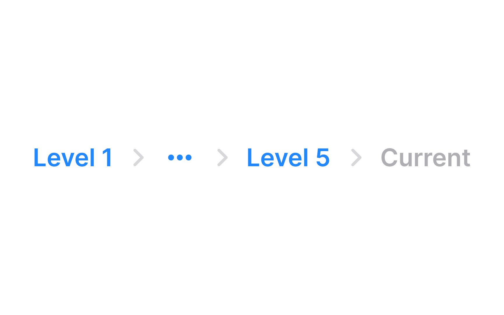
When a
For the truncated links, implementing a
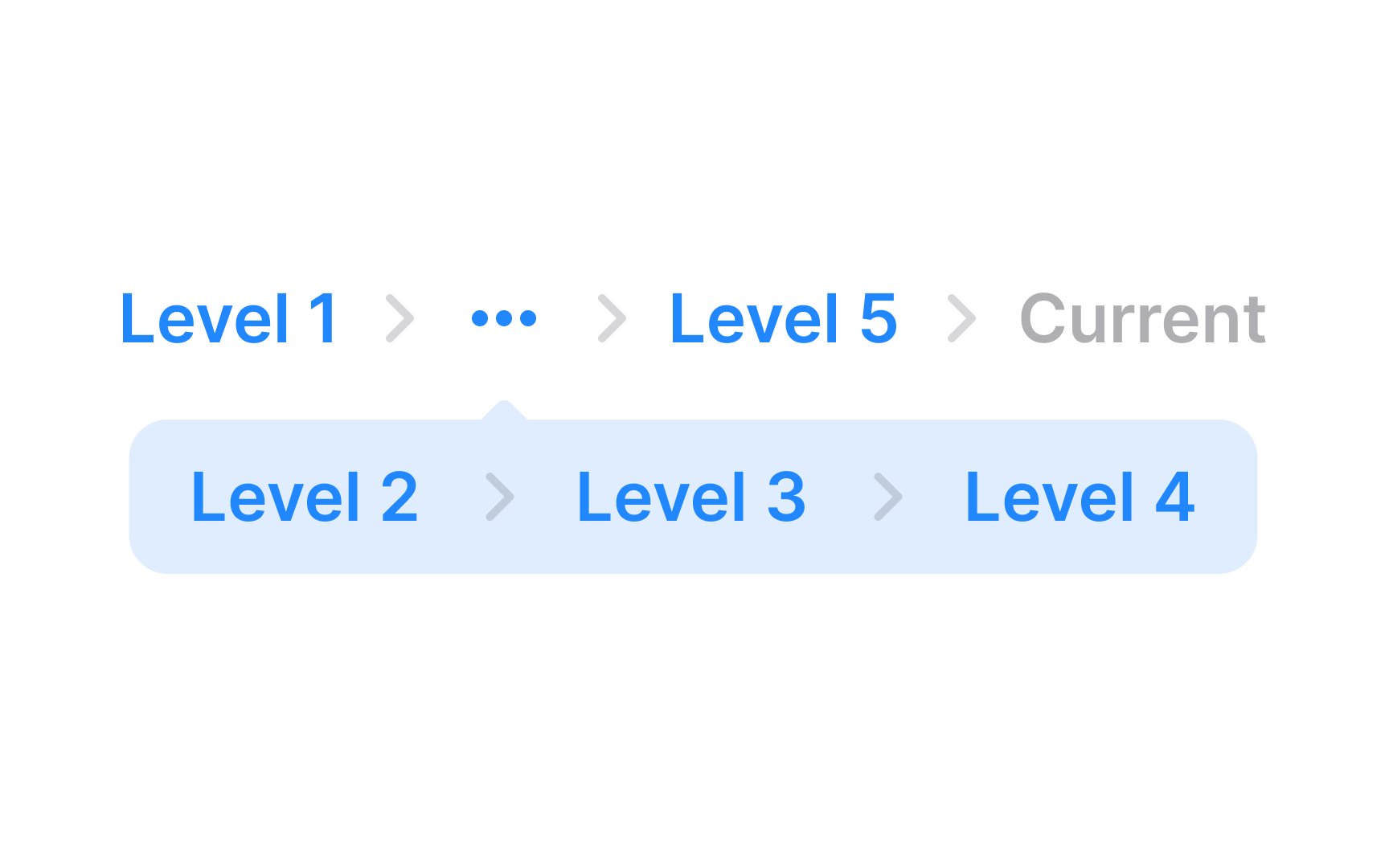
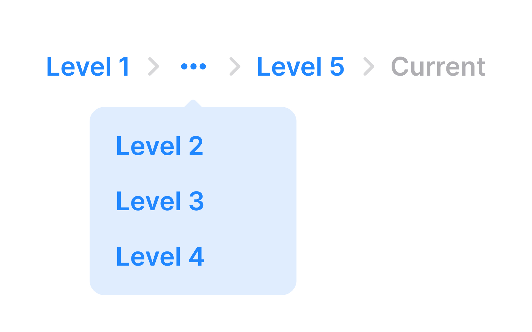
Ensure users have access to hidden

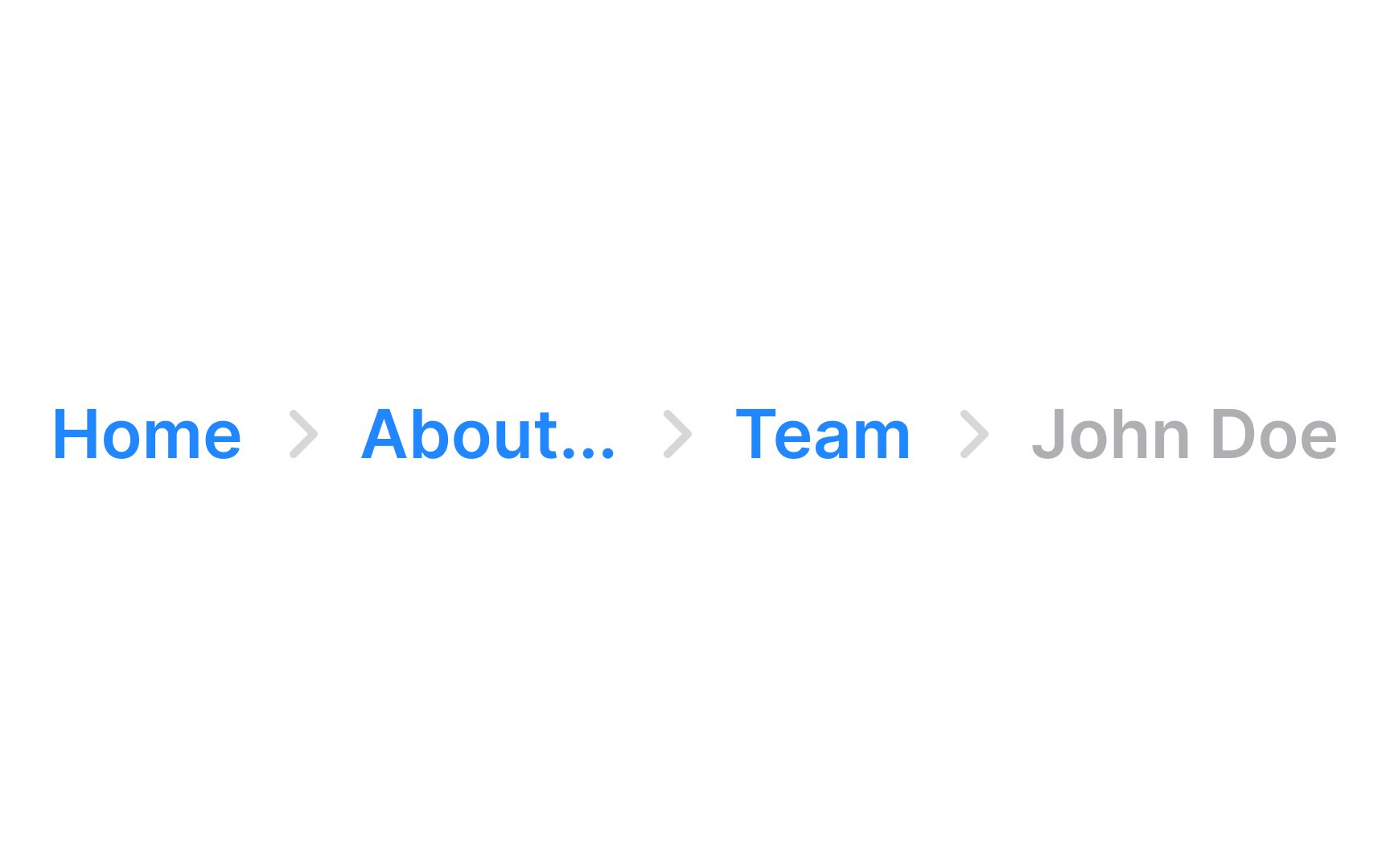
Dealing with long text labels in design, especially in
However, ensure that users can still access the full text. This is where tooltips become useful. When users hover their mouse over a truncated label, a tooltip should appear, displaying the label's full text. This allows users to understand the complete label without overcrowding the design.
Additionally, setting a maximum width for each breadcrumb label is a good practice. It standardizes the size of the labels, contributing to a more uniform and tidy appearance.
References
- Breadcrumbs: 11 Design Guidelines for Desktop and Mobile | Nielsen Norman Group
Top contributors

Topics
From Course

Share


Similar lessons

Common UI Component Definitions I

Image Terminology
