Adding Wireframes to Agile User Stories
Discover the value of incorporating wireframes into Agile user stories, allowing for clearer visual communication, shared understanding, and improved collaboration
User stories are created to represent a product feature's value to users. They focus on users' needs and are told from users' perspectives. After reading a user story, the team knows why they are building what they are building and what value it creates.
The description of a user story contains everything that the team might need to know to design and build the feature. It could be a small explanation of the user journey, a flow chart, use cases — or wireframes.[1] Wireframes are especially helpful to front-end developers who build the user interface.
Looking at examples of how to integrate wireframes into your user stories is a useful exercise in learning to create them for your own projects.
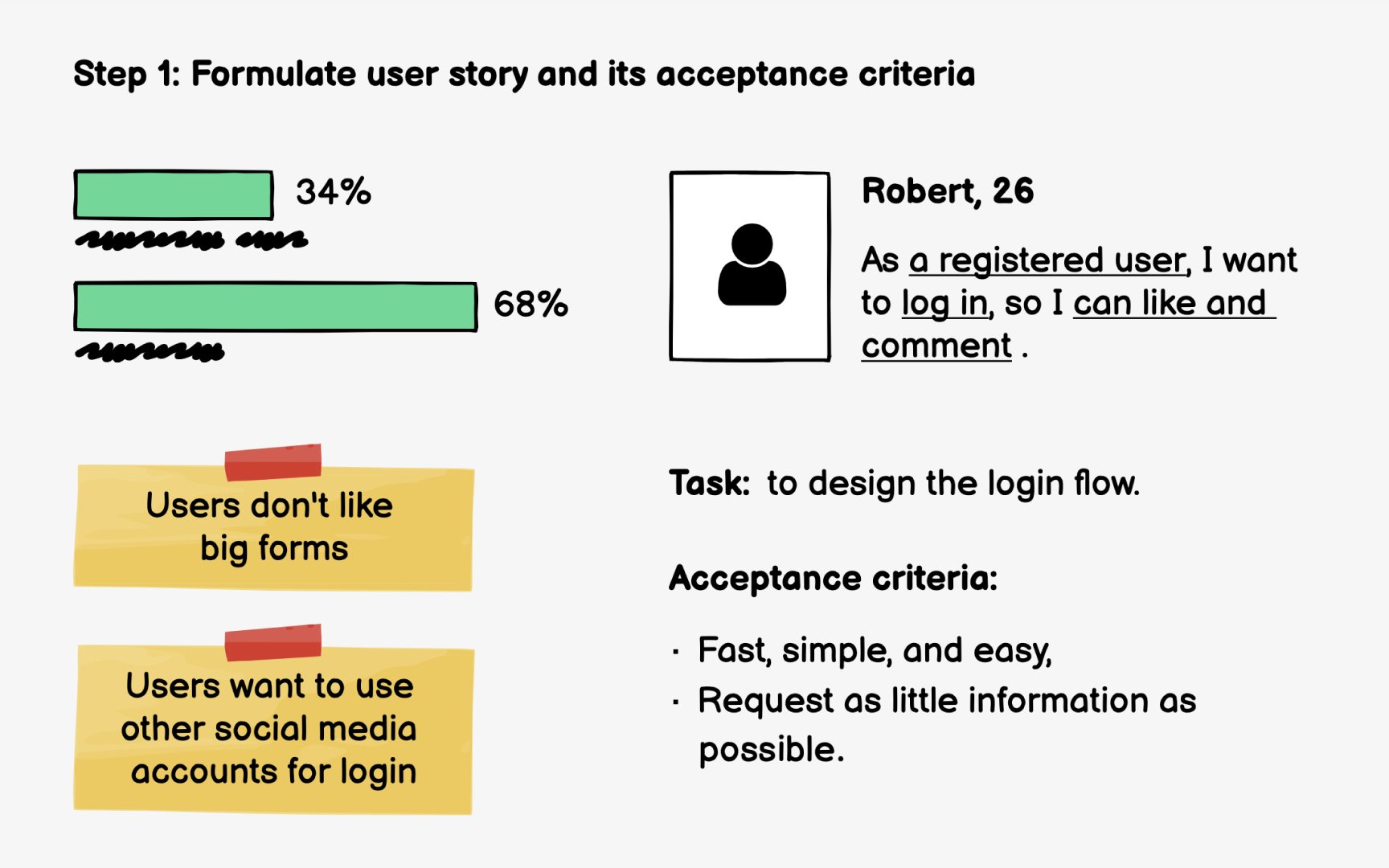
Your client — a news and entertainment website — has decided to collect more information about its users and encourage them to register. The solution is to add Like and Comment options that all users can see but only registered users can interact with.
In this sprint, you're tackling the following
The acceptance criteria:
- Are fast, simple, and easy
- Request as little information as possible
- Don't interrupt the browsing experience
Pro Tip: Talk with clients to outline a user story.
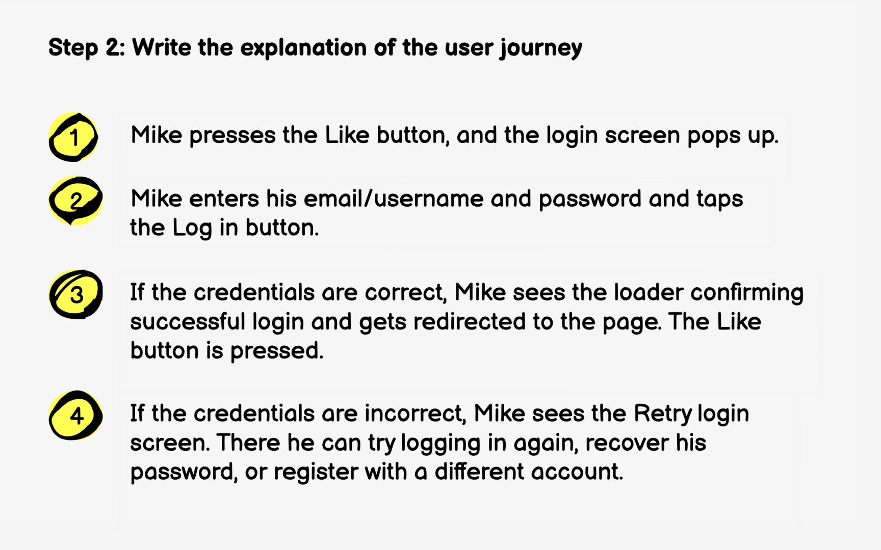
Start with formulating the user journey from a user persona's perspective. Mike, a 26-year old barista, is looking at a funny cat compilation article. One cat is extremely fluffy, and Mike presses the Like button under the photo. What happens next, provided that Mike is a registered user? Write it down.
When writing the user journey, use non-technical language and don't make it too long. Its purpose is to concisely explain the solution offered to the users' problem.
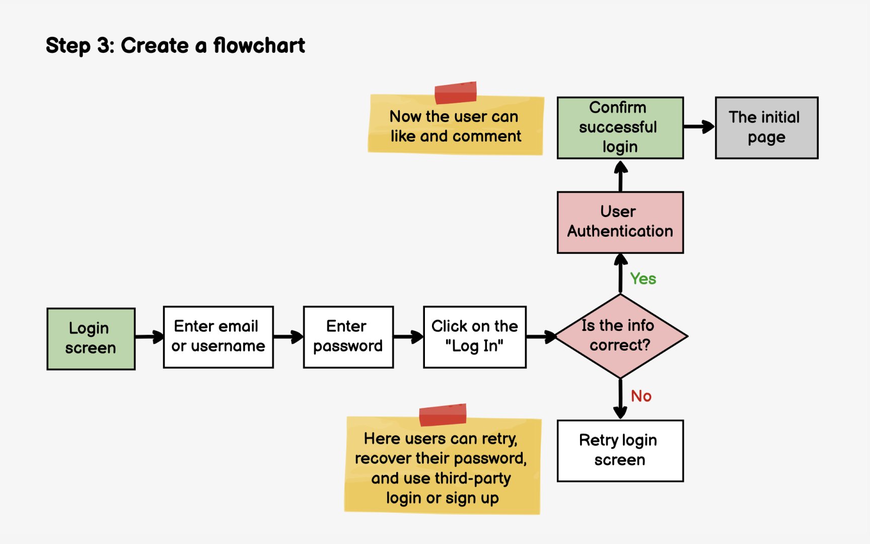
After having written the explanation of the user journey, it's time to map it on a flowchart. You don't need to map the entire Registration/Login flow, but a small chunk that reflects your
Plan how users would move through screens and how their actions and other conditions can influence their user journeys. Having done that, you'll get a pretty clear idea about how many screens you need to
When you know how many screens you need, start by deciding what should be on each
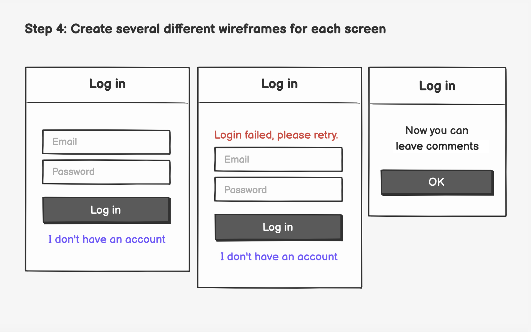
For the login page, some elements you might need are:
- Third-party
login with the most commonly used apps among our target audience - A login form with email/username and password for registered users and a Log In
button - The link to recover the password
- The link to sign up
- The brand's logo
- A meaningful headline
When you have decided what elements must be on each screen, create several
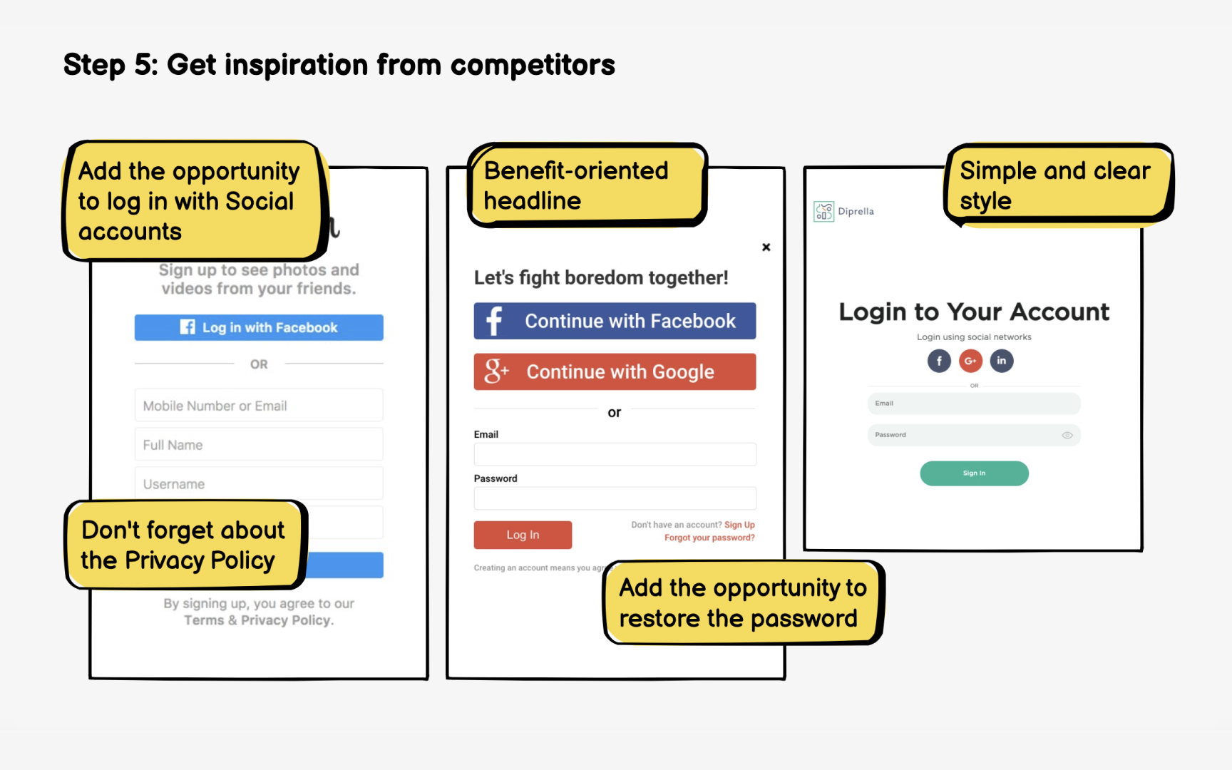
Don't shy away from looking up how other successful companies have solved the problem you're trying to solve.[2] Find products and services that are similar to what you offer and study the competition.
The objective isn't to copy the things your competitors do — it's to check if you are missing anything in your design. For instance, after looking at some examples, you might consider adding
Another thing to look for is better ways to solve your users' problems. You might get inspiration and end up overhauling your design.
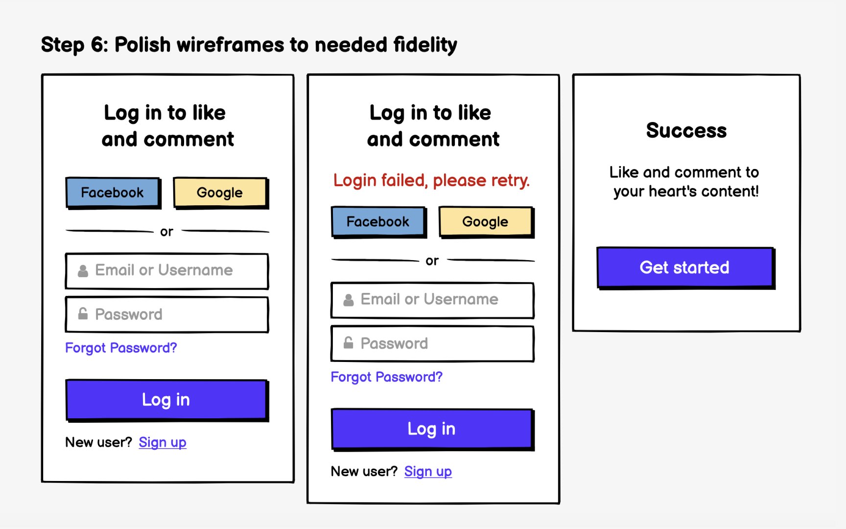
After you have finalized the basic structure and functionality of your screens, you can start adding details. At this stage, the
Now it's time to perfect the layout and hierarchy and add brand colors. You can add actual images instead of placeholders if you have the time and they're available. However, there's no need for polishing the wireframes to high fidelity at this stage. Simply add details that can help people to better understand the
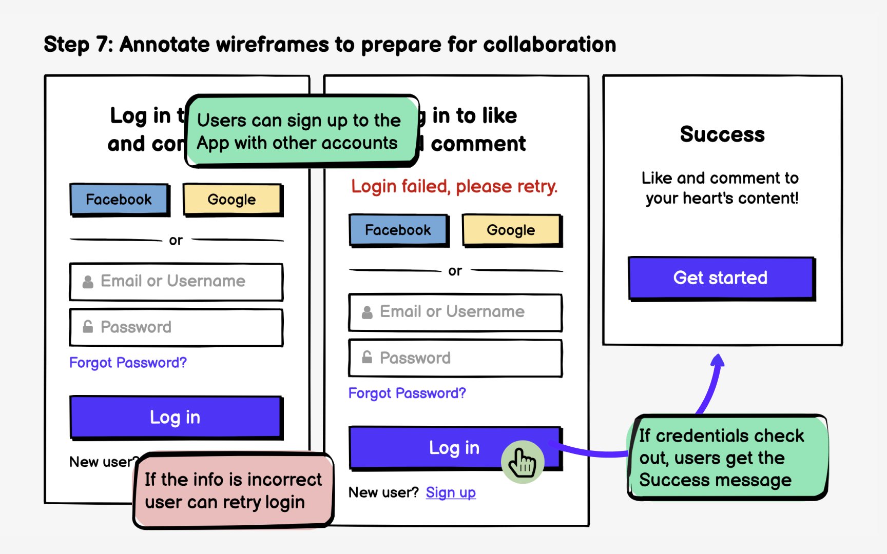
In truth, it's very difficult to add meaningful annotations after you have finalized the
Annotations are there to explain things that are impossible to illustrate with the wireframe, such as design rationale, scenarios, edge cases, or interactions.[3] What happens when users interact with these elements? Is this banner shown to all users or only those who are redirected from certain
References
Top contributors


Topics
From Course

Share


Similar lessons

Intro to Wireframing

Wireframe Fidelity
