Activity Feeds
Learn how to build dynamic activity feeds
Feeds (also known as activity feeds or news feeds) are UI patterns that help share and promote content between users. Feeds are perfect for handling and presenting dynamic and constantly changing information. They are lists of items ordered by a set parameter: time, popularity, frequency, age, or relevance.
Feeds work well on blogs, news outlets, social media sites, and notification screens. Feed length varies from product to product, but they are almost always designed to facilitate scrolling. The best type of feed for your app depends on the content you make. What all feeds share in common is having a UI that makes it easy to consume content.
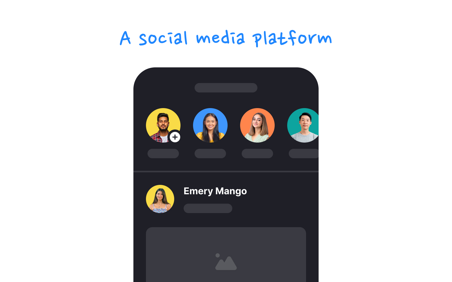
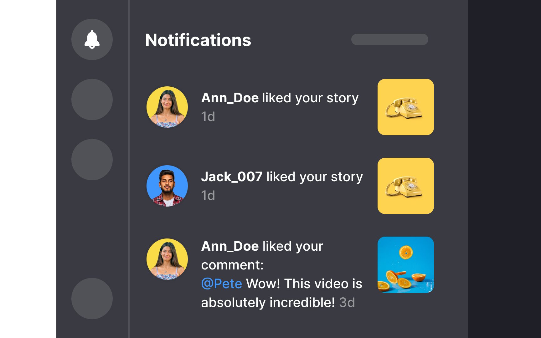
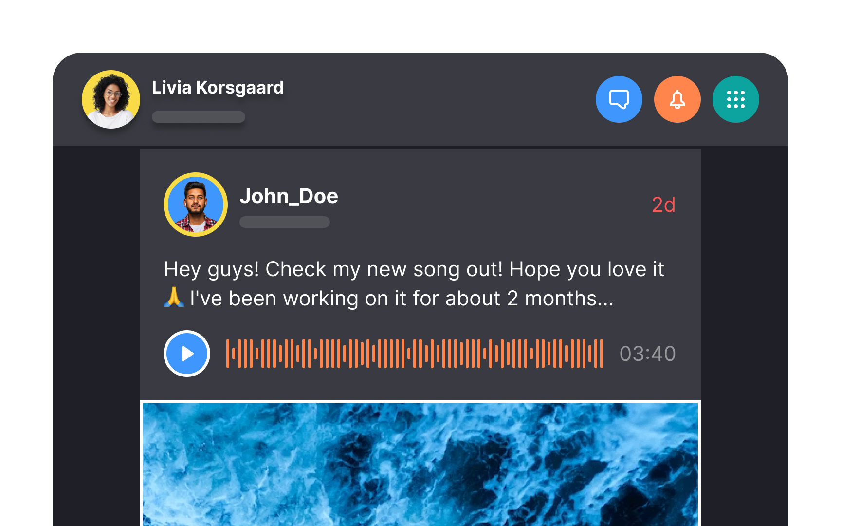
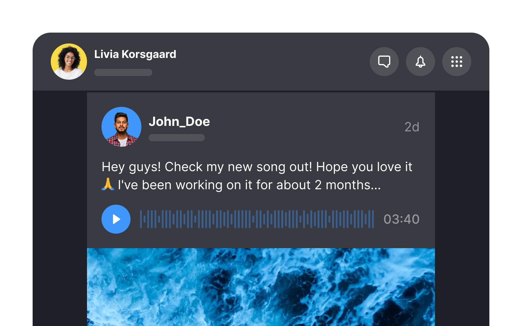
Chronological feed sorts events in order of when they were created, usually from newest to oldest. This is the oldest and most traditional type of feed. The purpose of such a feed is to present a timeline of events.
Nowadays, not many apps use purely chronological feeds. Avoid a chronological feed if you know that you’ll want to eventually replace it with an algorithm-based feed. Sudden changes like that will upset users.[1]
Pro Tip: Chronological feeds are best when real time is a core component of your app. For example, if you want to display users' activities or places they visited during a specific period.
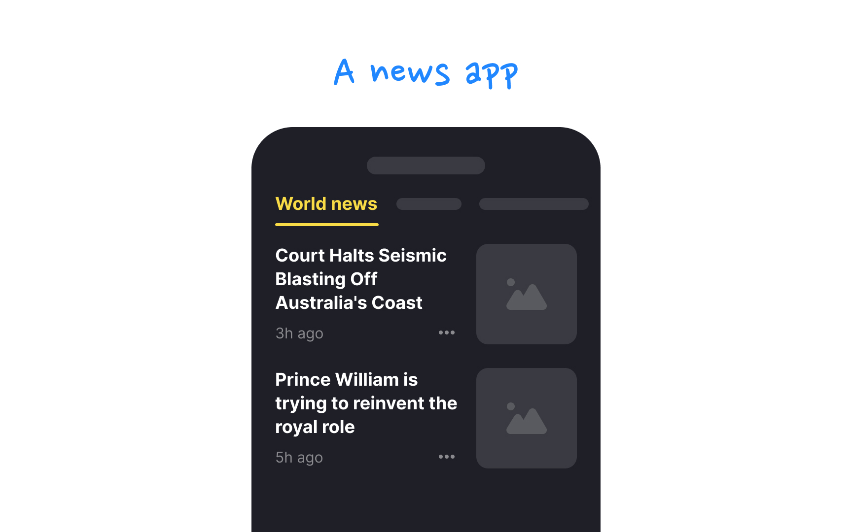
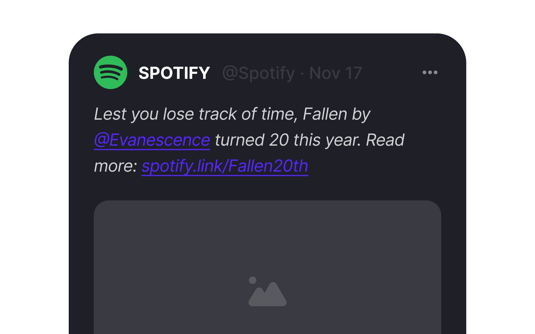
Algorithm-driven ranked feeds curate
This approach suits most apps where the post's timing isn't as crucial to users as the relevance or appeal of the content itself. It's about delivering what users will likely want to see or need to see, like trending topics, sponsored highlights, or editor's picks.
Pro Tip: Use ranking in apps with more than a few dozen activities.
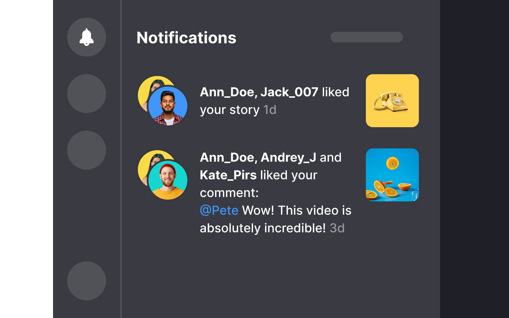
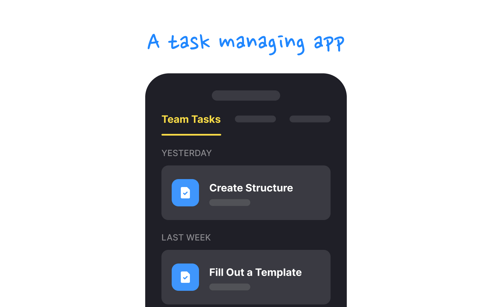
Grouped
For instance, rather than receiving an individual buzz for each new follower, a user could get a single summary notification saying, "256 people followed you today." This method is especially beneficial for power users who juggle numerous notifications daily.
Notifications are typically consolidated by categories such as time received, activity type, or interaction, allowing users to digest information at a glance while keeping their digital space tidy.[2]
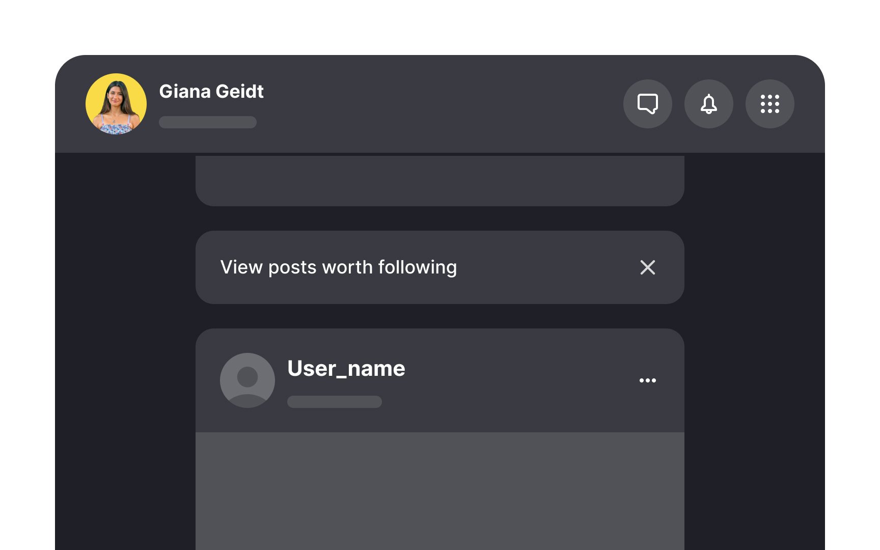
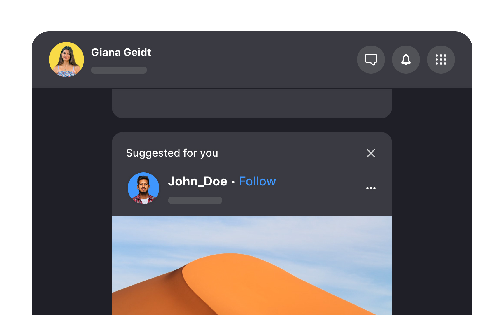
Enhance your users' experience by tailoring their feed with profile suggestions to follow. Not only does this personalize their journey, but it also motivates exploration within your app. To craft these personalized recommendations, consider incorporating:
- Profiles connected to people users may already know, or that their friends follow
- Profiles that align with users' interests
- Profiles that have a significant following and influence within your user community
Balance personalized recommendations with diverse
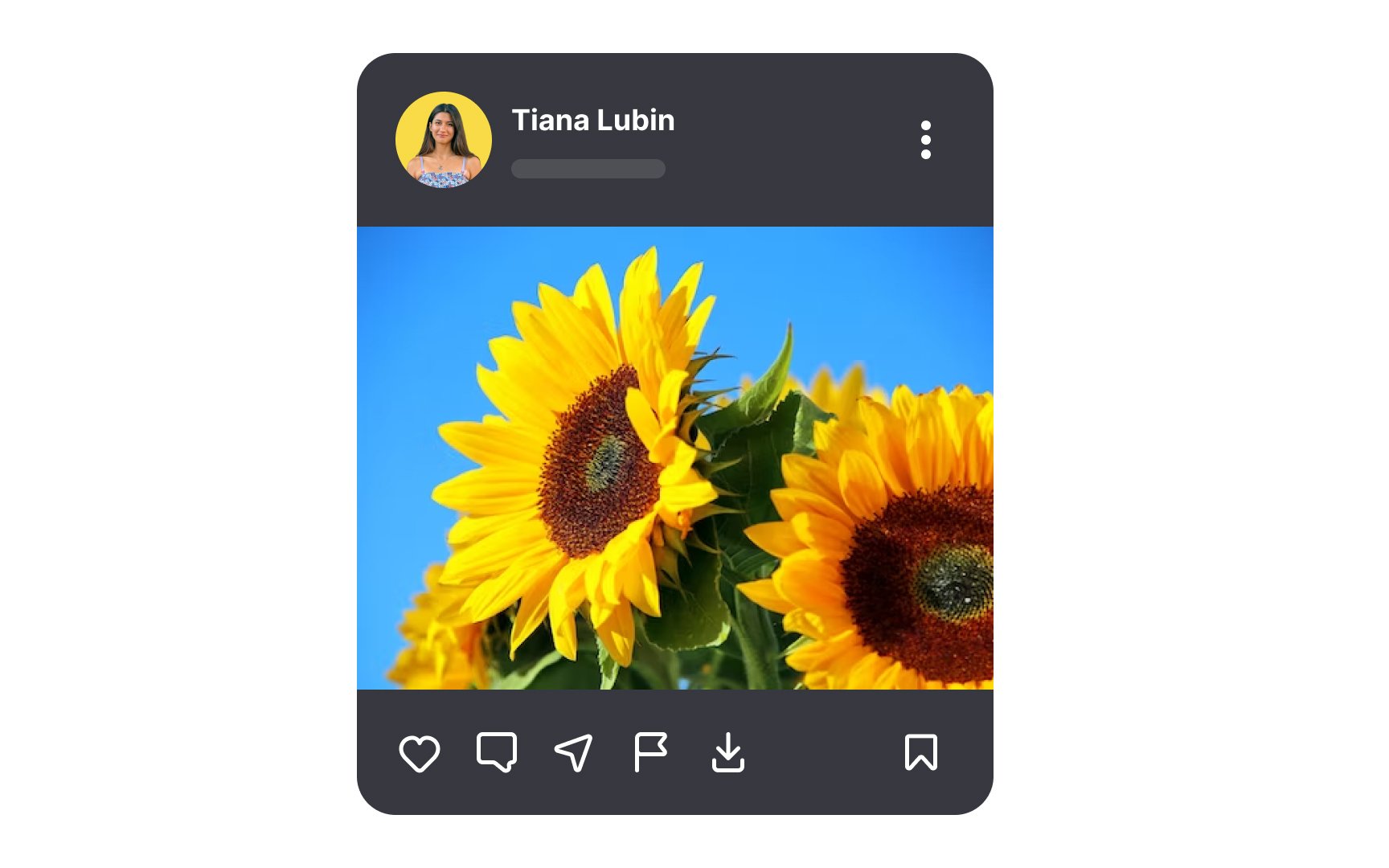
In feed design, opt for minimalism and clarity to steer clear of visual chaos. Users need to swiftly navigate through
With each feed entry potentially holding extensive custom data, it's your role as a designer to curate what's essential, presenting only what's needed for users to make informed decisions without the clutter.
Pro Tip: Simplicity isn't only about the visual appeal — it reduces the cognitive load on users.
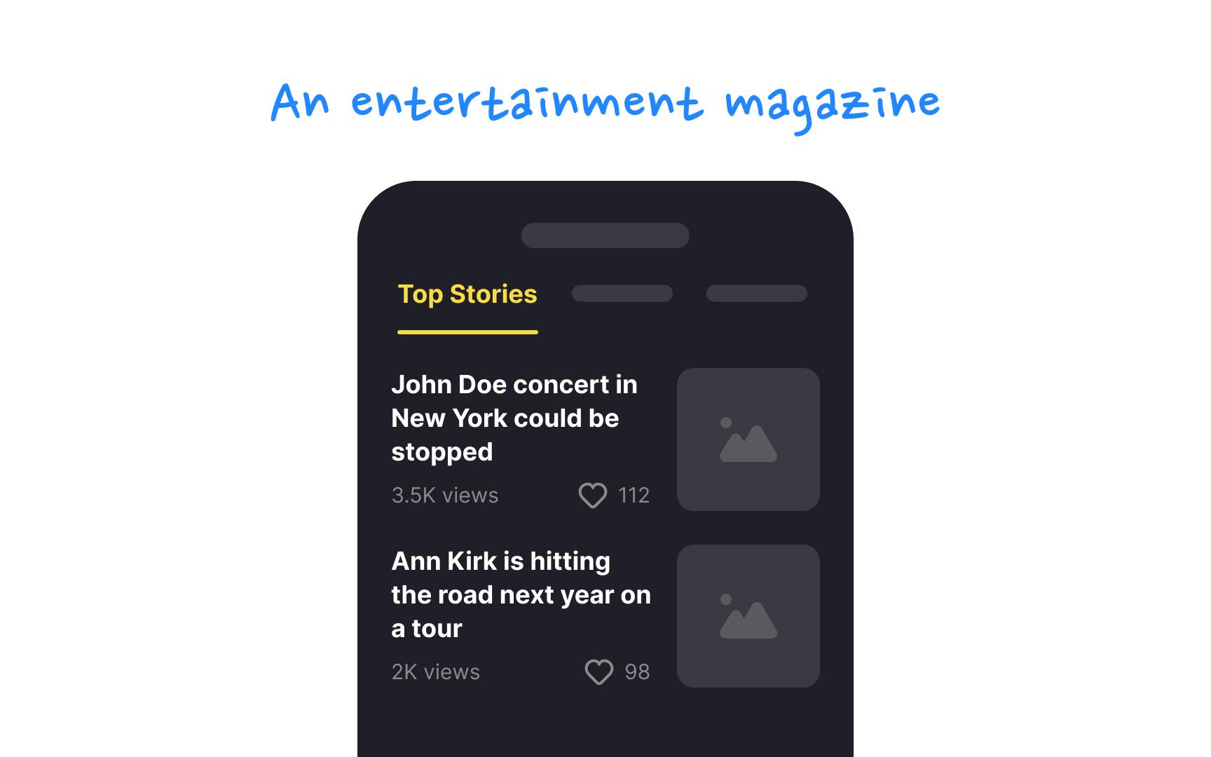
The main goal of any feed is to present

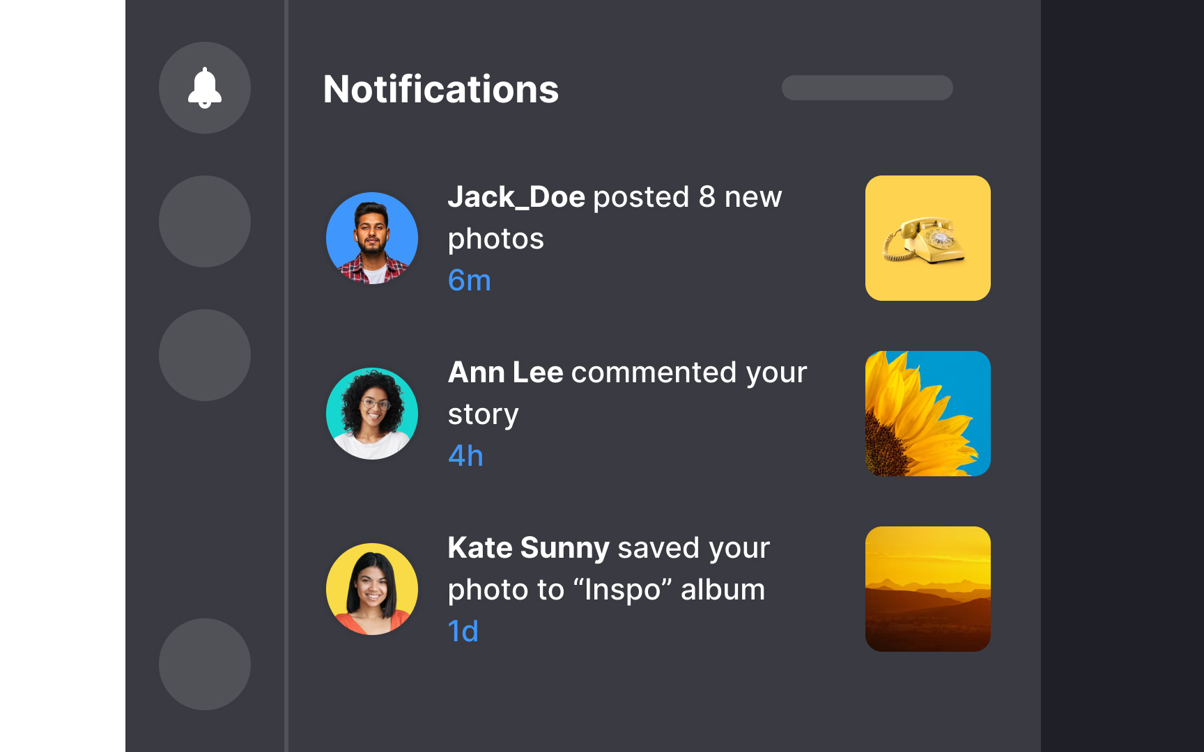
Abbreviate timestamps to the bare minimum. Their role is not to provide an exact time. Instead, consider them a broad indicator of how long ago the activity occurred. Timestamps are a tertiary feed feature, so avoid emphasizing them too much.
Pro Tip: In most cases, you can omit "ago" — users will understand what "3h" means.
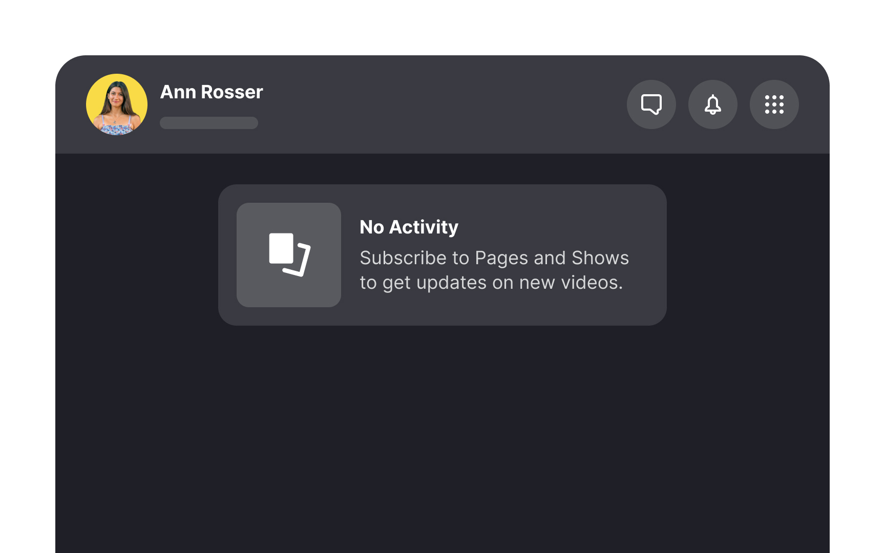
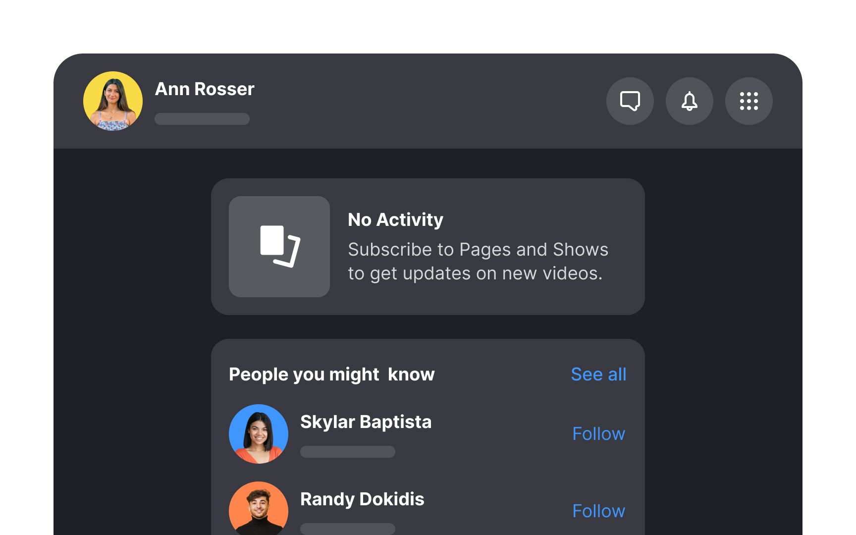
To keep user engagement high, avoid presenting users with an empty feed. Ankit Jain, ex-director of engineering at Google, notes that the window to captivate users post-installation is typically 3-7 days.[3] Empty feeds might confront new users who haven't yet made connections or when there's a lull in activity.
Tackle this by incorporating "suggested users to follow" during the onboarding process. Alternatively, encourage users to discover popular
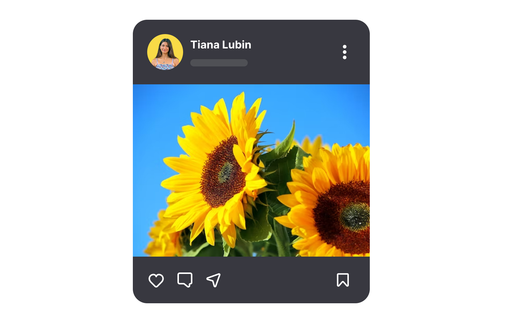
In designing your app's
This selective approach prevents user overwhelm and keeps the interface clean, promoting a more intuitive and engaging user experience. Consider each control's value and whether it enhances or complicates the user journey.
Pro Tip: If additional options are necessary, tuck them away under an expandable menu icon, like a kebab menu.
When users refresh their feeds, often to pass time during waits or meetings, displaying a clear loading indicator is crucial. Adhering to Nielsen's heuristics, an engaging animation like a spinning circle provides not just visual comfort but also keeps users informed about the system's status.
References
Top contributors


Topics
From Course

Share


Similar lessons

Login & Signup Flows

User Onboarding
