Text Accessibility
Discover the steps to make sure any text on your product is readable and legible to all users
Text is a powerful tool that provides information and encourages visitors to act on your website. Text is everywhere, from articles to button labels, and that's why its accessibility is so vital to user experience.
Font choice, vocabulary choice, font size, color contrast, spacing, and headings' structure affect users' perception of text. If something is off and users fail to read and scan content, they leave. Not only does compliance with WCAG recommendations make the copy readable and legible for sighted users, but it also enhances the accessibility for visually impaired users, older people, or people with temporary impairments, like eye surgery.


Text is core to any interface, so it must be accessible to everyone, no matter their ability or education level. Write in a manner that can be easily understood by individuals with a secondary education level. The goal is not to dumb things down but to use simple words to explain complicated concepts.
Keep your message clear and concise. Avoid long sentences. A good rule of thumb here is "one sentence, one idea." If a sentence requires a semicolon, it most likely can be split in two. Use simpler vocabulary; for example, words like "affluent" and "fortuitous" are more difficult to understand than "rich" and "lucky."
Complex
People with language comprehension difficulties or learning disabilities may find phrases with double meanings confusing. This includes idioms, puns, and figurative language that can create barriers to understanding your
Idioms are expressions where the combined meaning differs from the individual words. When someone reads "couch potato" in a productivity article, they might be confused by the seemingly random mention of vegetables on furniture. The intended meaning of "lazy person" isn't apparent from the words themselves, especially for those learning the language or using translation tools.
Figurative language and cultural references can be equally challenging. A phrase like "my lobster" (referencing the TV show "Friends" to mean "soulmate") will confuse many users who aren't familiar with that specific cultural context. Keeping language literal and direct ensures your message reaches the widest possible audience.
When designing for everyone, it's important to make sure that your text looks clear and legible. Choose typefaces that:
- Look good regardless of the
font size - Have a large x-height — the size of flat lowercase letters — as they are comfortable to read even at a smaller font size
- Have consistent letter shapes but clear distinctions between similar letterforms like 0 and O or 1, I (i), and l (L)
- Support all of the characters and
font styles that you need
Refer to the U.S. Web Design System for open-source typeface recommendations that emphasize legibility.
Our vision naturally changes as we age, making text readability increasingly important. Research shows that by age 60, only about one-third of the light reaches the retina compared to age 20.[1]This physical change makes smaller text significantly harder to read for older adults, who form a growing segment of digital users.
To accommodate these natural vision changes, use font sizes that work for everyone. While specific recommendations may vary slightly depending on the
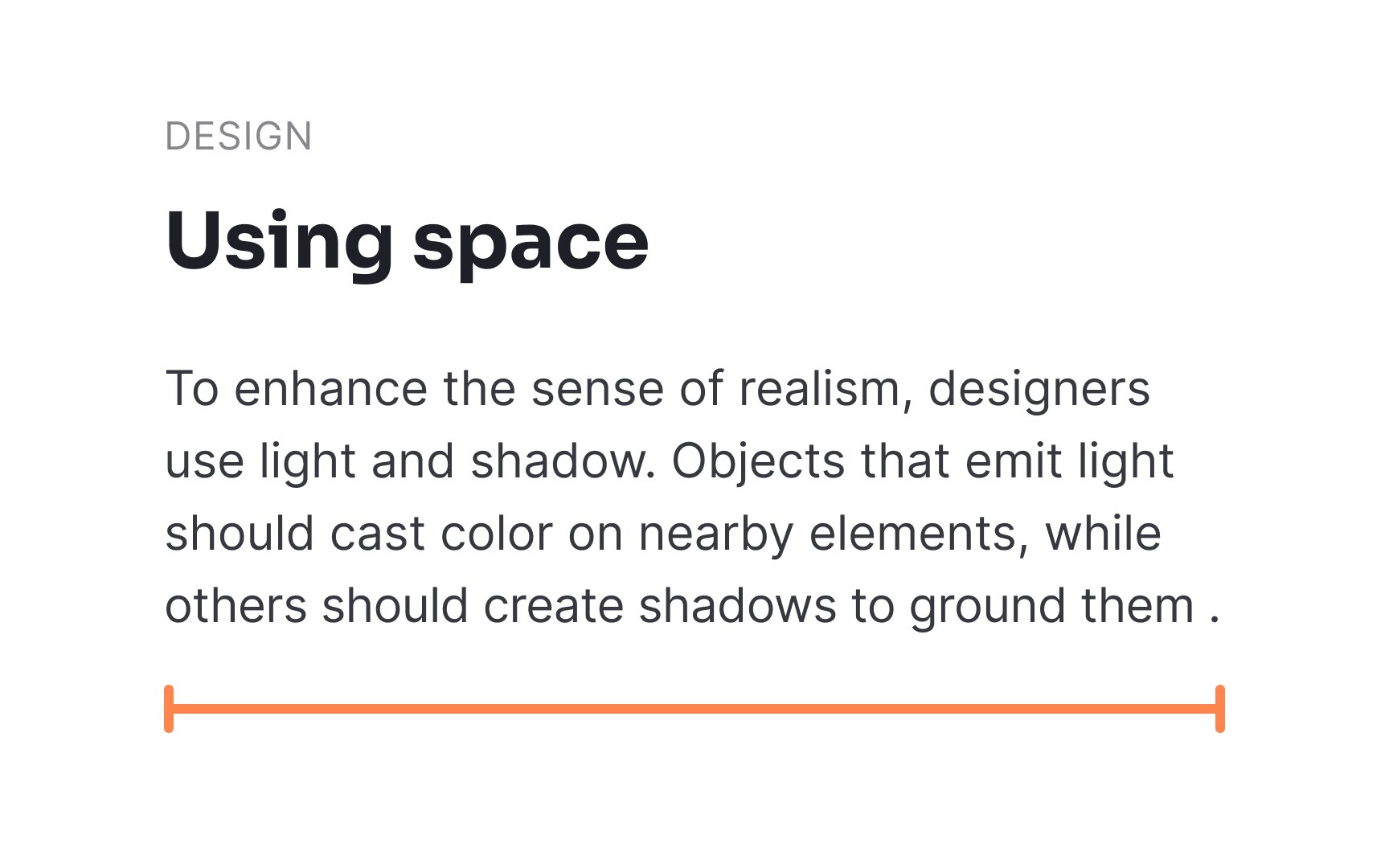
Reading happens through a series of small visual jumps, with our eyes capturing about 5-10 characters in each movement. When lines are too long, readers struggle to track their position and often lose their place when moving to the next line. Conversely, extremely short lines force frequent eye movements and line transitions, causing unnecessary strain and slowing reading speed.
For optimal readability, aim for 45-75 characters per line, including spaces.[3] This range allows readers' eyes to make approximately 6-12 comfortable stops per line, creating a natural reading rhythm. You can use shorter line lengths for specific elements like captions, forms, or side notes where brief, scannable text is appropriate.
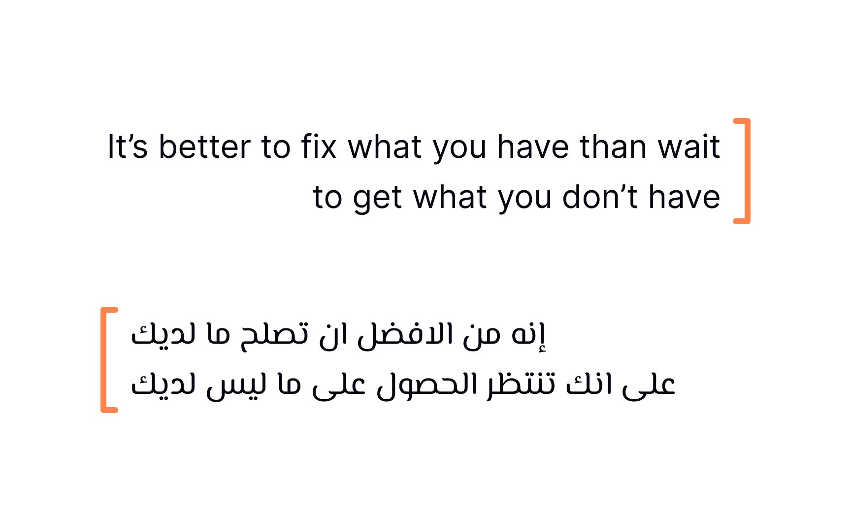
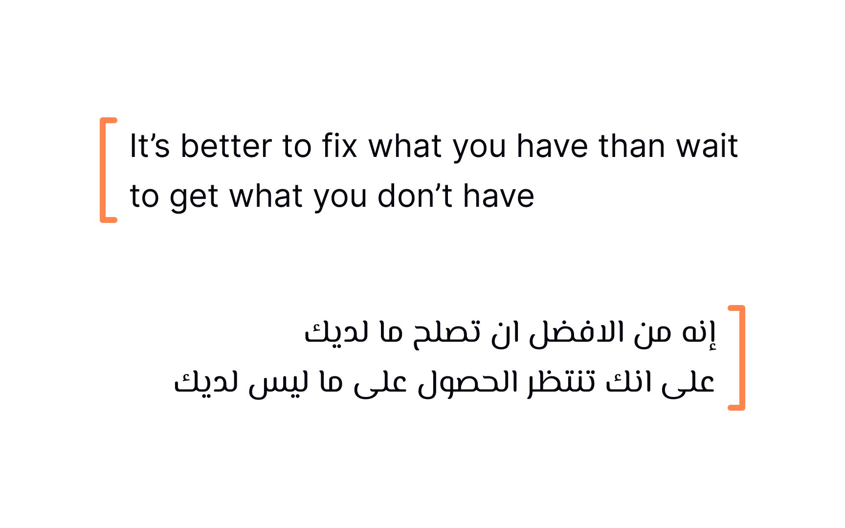
Text alignment should follow the natural reading direction of your
Most languages use left-to-right (LTR) scripts, making left alignment the default standard for English and many other Western languages. This alignment creates a consistent starting point for each line, helping readers track their position within the text. For languages that use right-to-left (RTL) scripts, such as Arabic and Hebrew, content should be aligned from right to left to match their natural reading pattern.
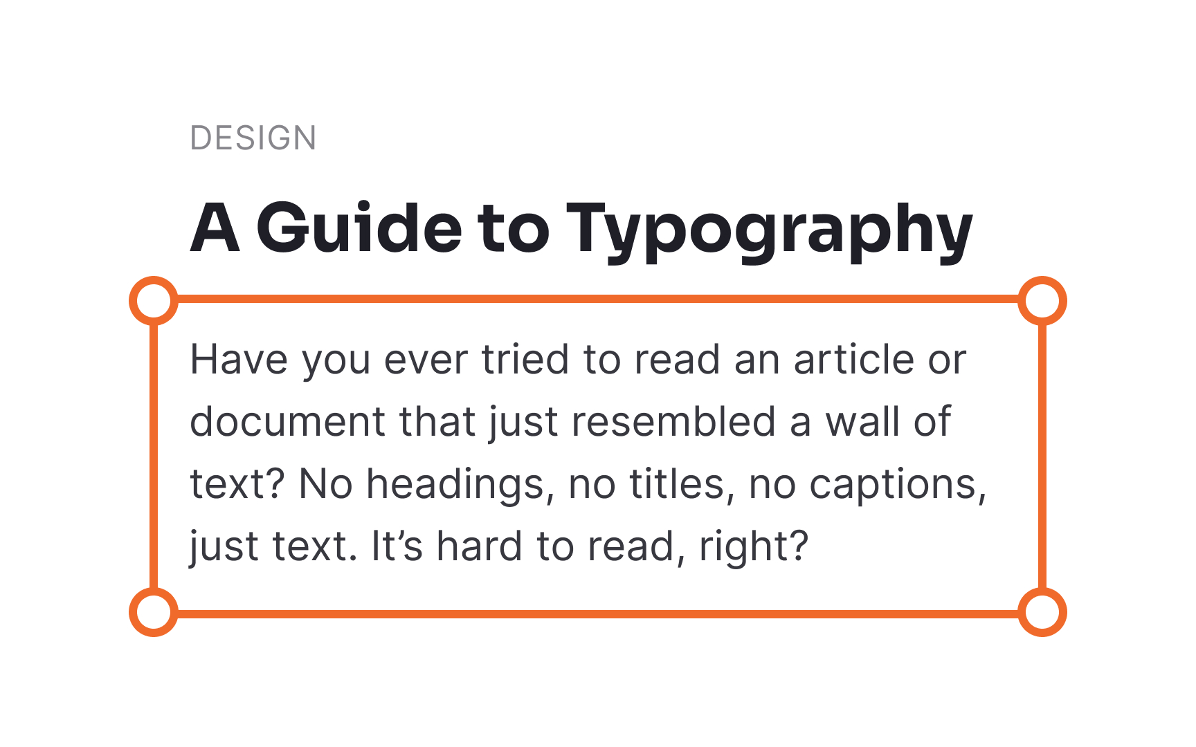
Headings organize your
Visual distinction helps sighted users scan content quickly. Using larger
The technical implementation of headings is equally important for <h1> through <h6>) rather than just styling text to look like headings. Screen readers and other assistive technologies rely on these semantic tags to announce headings and allow users to navigate between sections. Without proper heading markup, people using assistive technology miss the structure that visual users can see.
The
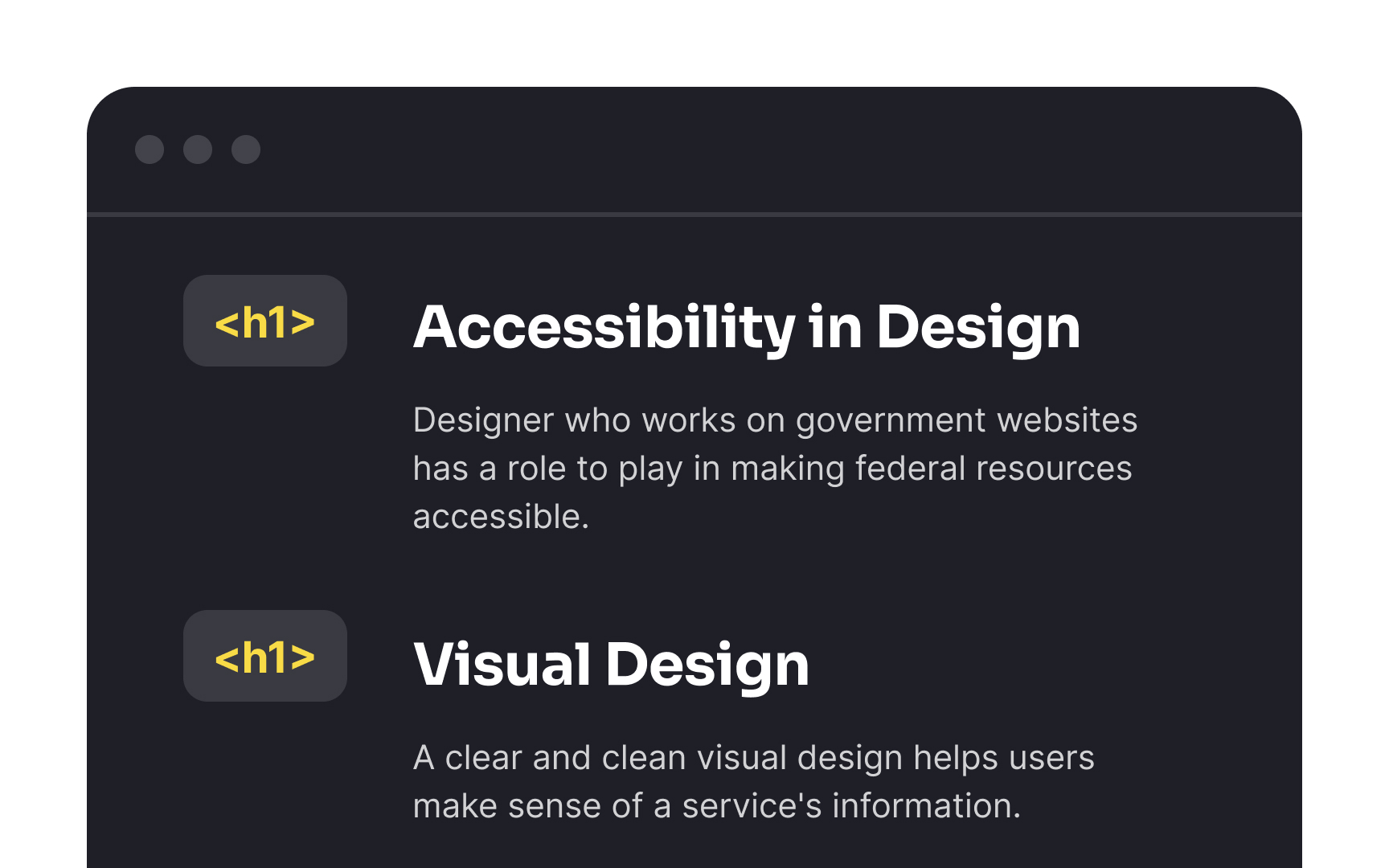
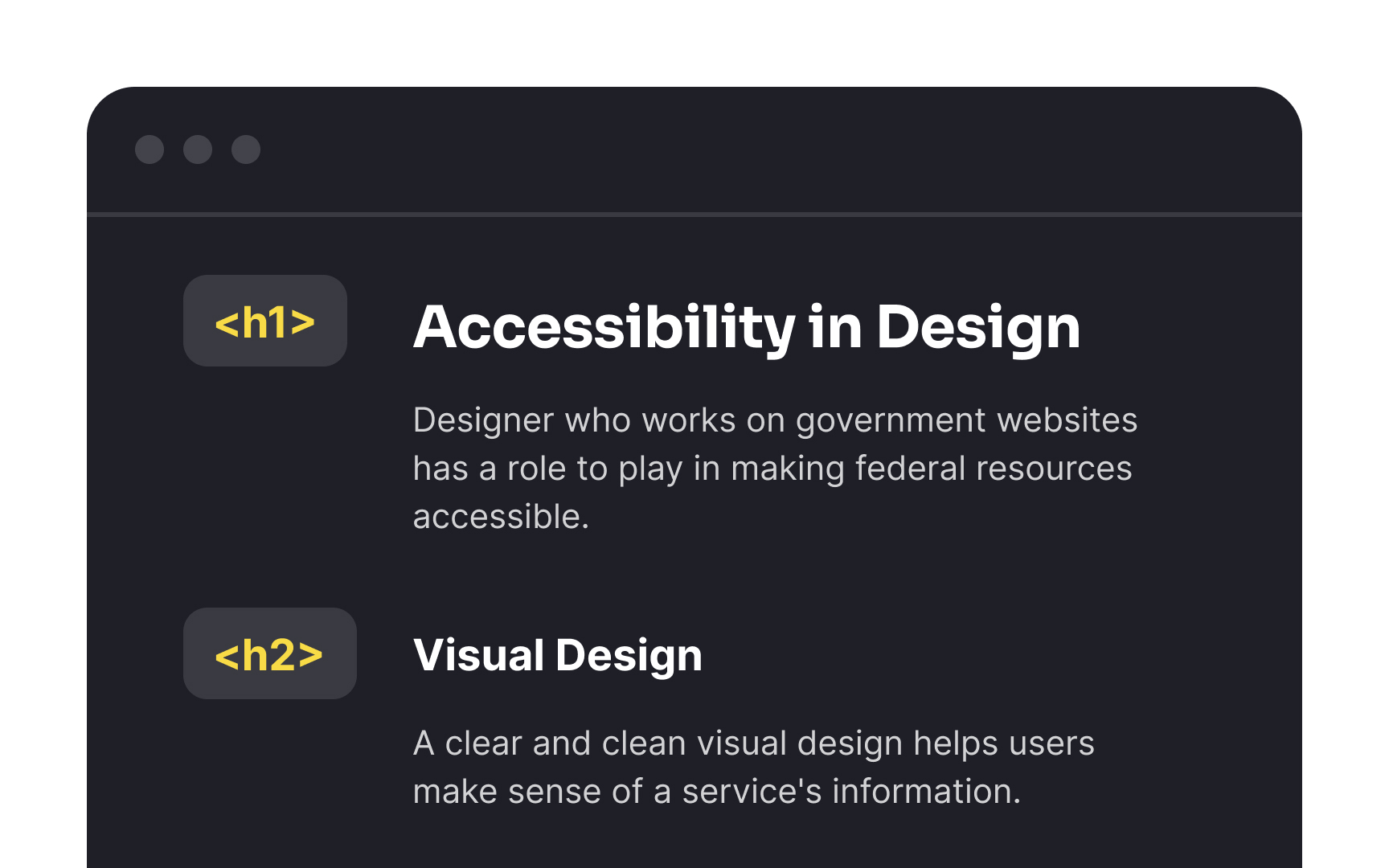
The <h1> tag represents the most important heading on the page and should contain your page title. Think of it as the main subject of your content—what the entire page is about. Since each page should have only one main topic, use only one <h1> element per page. This single top-level heading helps users immediately understand the page's purpose.
Your page title should be descriptive and meaningful. When someone encounters your page, the <h1> heading should clearly communicate what information they'll find there. Screen reader users often navigate through headings, making the <h1> their first major landmark when exploring your content. Search engines also give special weight to this heading when determining what your page is about.
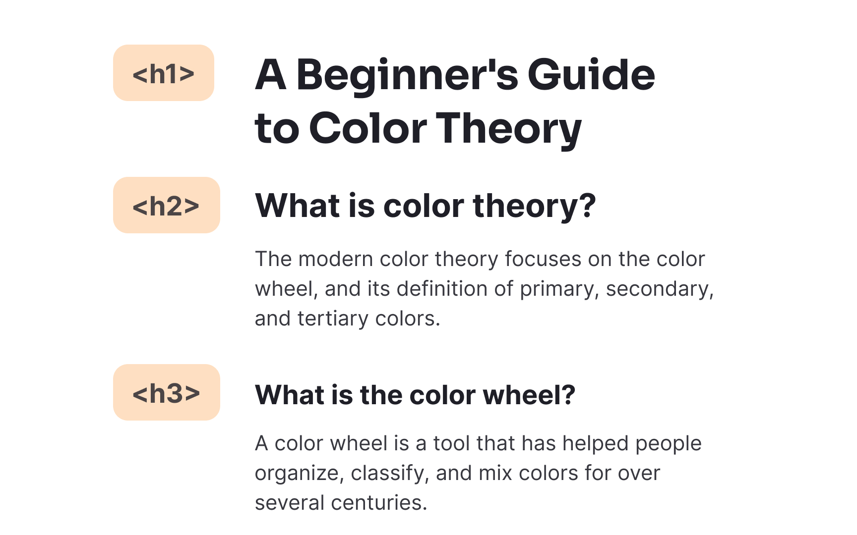
After using <h1> for your <h2> <h3> through <h6> for progressively smaller subsections within those main sections, creating a nested outline structure.
This hierarchical approach helps users understand how information is organized on your page. Visual users can quickly scan the page and grasp the relationship between different content sections. For people using screen readers, proper
Pro Tip: Outline your content structure before writing to plan your heading hierarchy. This ensures your headings follow a logical progression rather than being assigned arbitrary levels.


Screen reader users frequently navigate websites by jumping from <h1> directly to <h3>), you create gaps in this
Sometimes design considerations might tempt you to skip heading levels. For instance, a section might be visually distinct enough that it doesn't need an <h2> for sighted users, while subsections use <h3> <h2> with appropriate styling to make it visually hidden while keeping it available to screen readers. This maintains the proper heading hierarchy for all users without disrupting your visual design.
Pro Tip: Think of your heading structure as an outline or table of contents. If it wouldn't make sense in document form, it probably doesn't work as a heading hierarchy either.


Similar lessons

Intro to Accessibility

Inclusive Design Basics
