Multimedia Accessibility
Understand how to make sure multimedia usage in your designs is accessible and doesn't distract or cause confusion to users
We interact with videos, audio, and interactive media constantly in our digital lives, but many people can't fully experience this content due to disabilities. Making multimedia accessible isn't just about checking boxes; it's about connecting people with your content regardless of how they experience the world. Think about someone who can't hear your podcast, see your video tutorial, or process information at the typical pace. Good multimedia accessibility bridges these gaps with thoughtful captions, transcripts, audio descriptions, and intuitive controls. The best part? These features often help everyone, not just those with disabilities. Captions help people watching in noisy environments, transcripts make content searchable, and clear navigation benefits users with slow connections or those in a hurry. By building accessibility into your multimedia from the start, you create content that's more flexible, more usable, and ultimately reaches more people.
Images and graphics enhance
Alt text serves multiple purposes beyond
Alt text can be presented in two ways:
- Within the alt attribute of the <img> element
- Within a visible image caption or on a separate page
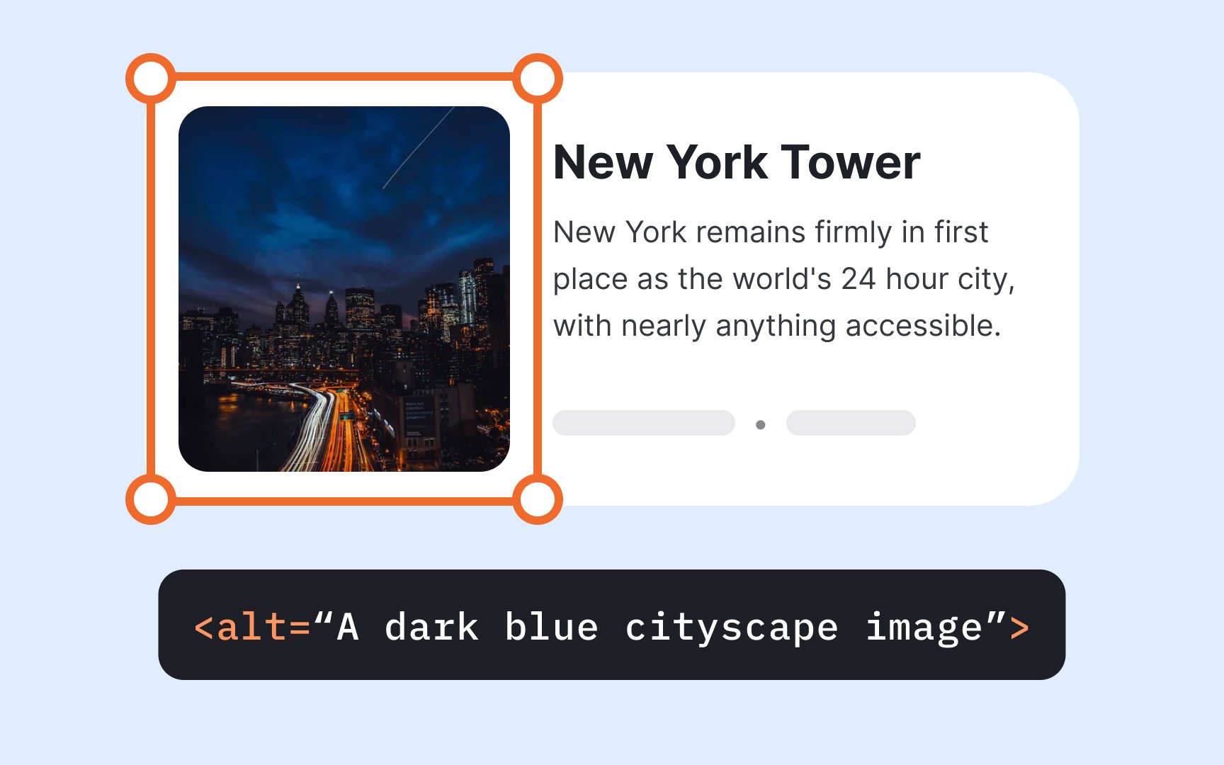
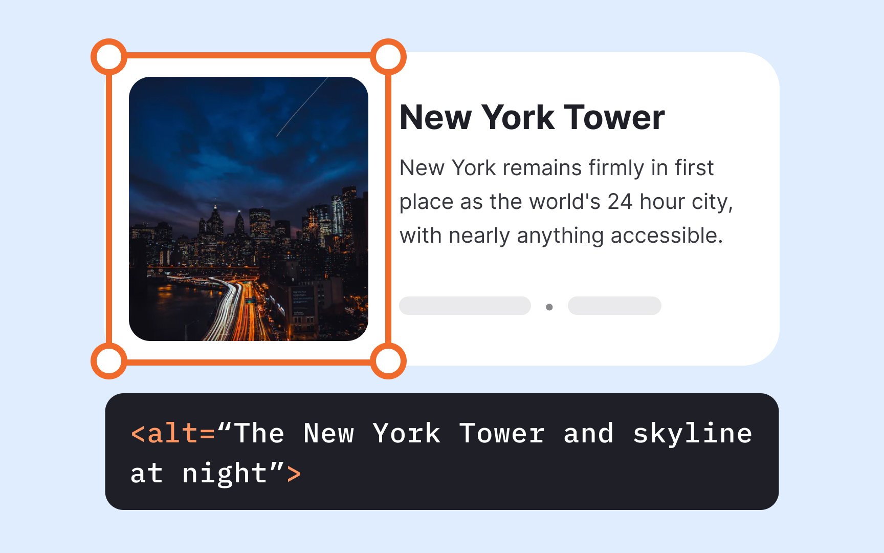
Focus on describing the image's purpose and function rather than its visual details. Only mention colors or visual elements when they're essential to understanding the content's meaning.[1]
Pro Tip: Don't make the alt text longer than 125 characters, as screen-reading tools often cut off wordy descriptions.
Not all
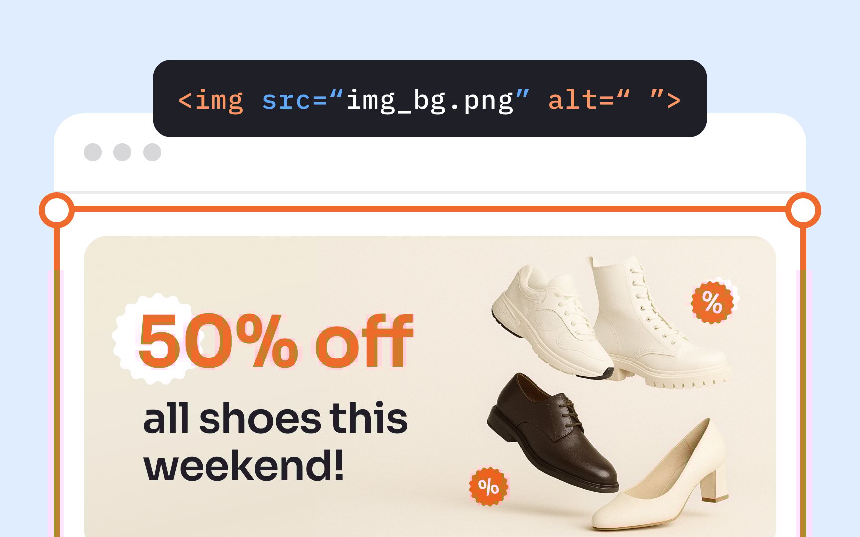
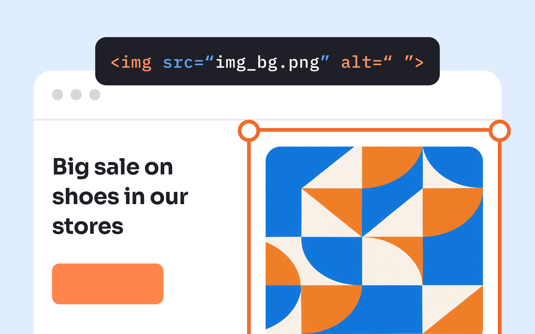
Adding a null alt attribute (alt="") explicitly tells screen readers and other assistive technologies to skip the image. This prevents unnecessary interruptions in the user experience for people relying on text-to-speech tools. Without null attributes, assistive technology might attempt to interpret or announce decorative images, creating confusion and diminishing usability.
Determining whether an image is decorative requires careful consideration. Ask yourself: "If this image were removed, would the user miss any important information?" If the answer is no, a null alt attribute is appropriate. This thoughtful approach helps create cleaner, more efficient experiences for all users, particularly those with cognitive or visual disabilities.
When
Screen reading technologies rely on these alt attributes to verbally describe images to people with visual impairments. The alt text creates a verbal equivalent of the visual
Keep your alt text concise and focused on the essential message. Avoid redundant phrases like "picture of" or "image of" since screen readers already announce the element as an image. This streamlined approach creates a more efficient and less frustrating experience for users relying on assistive technology.
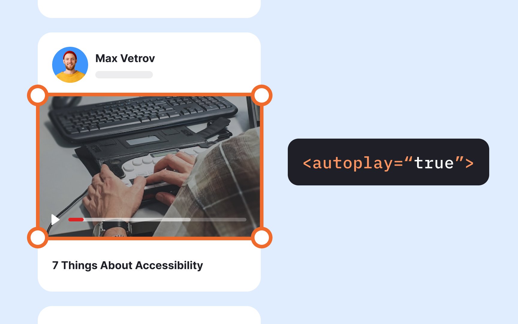
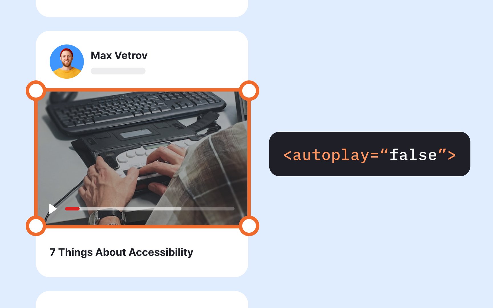
Automatically playing videos and audio files creates
Always give users control over when multimedia
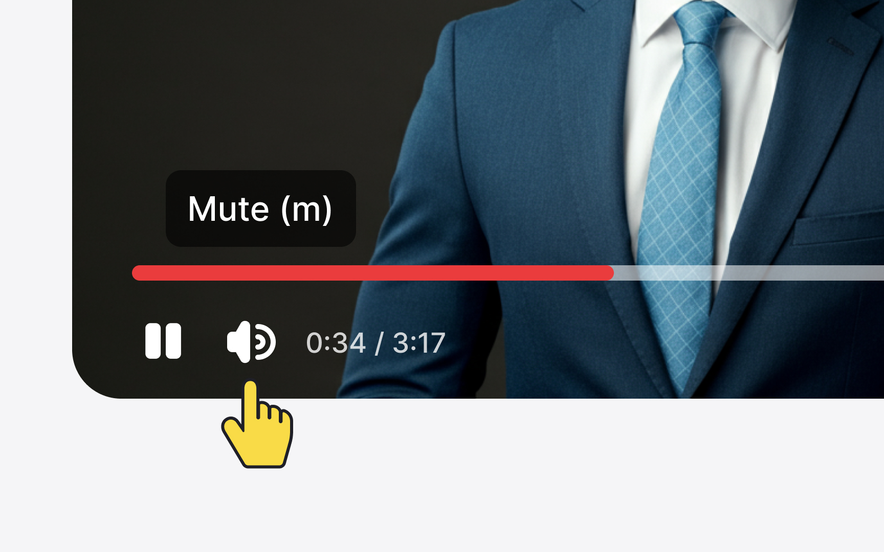
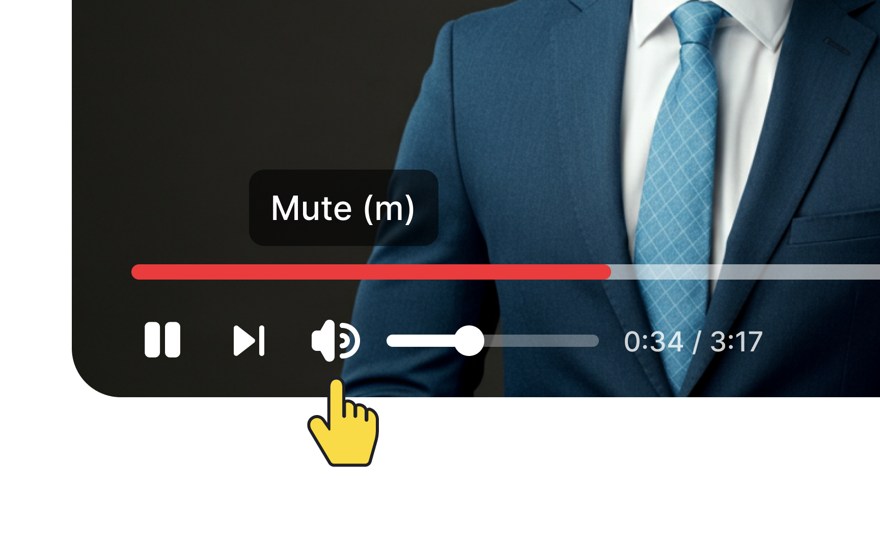
Media players need comprehensive, accessible controls that work for all users. At minimum, include options to pause, play, stop, rewind, adjust volume, mute, and toggle captions.[2]
These controls should be clearly visible and usable with both mouse and keyboard. They should also have sufficient size, contrast, and clear labeling. Consider keyboard shortcuts for common functions and ensure that controls work with assistive technologies like screen readers.
Remember that these controls benefit everyone, not just users with disabilities, as they allow all people to customize their experience according to their preferences and environment.

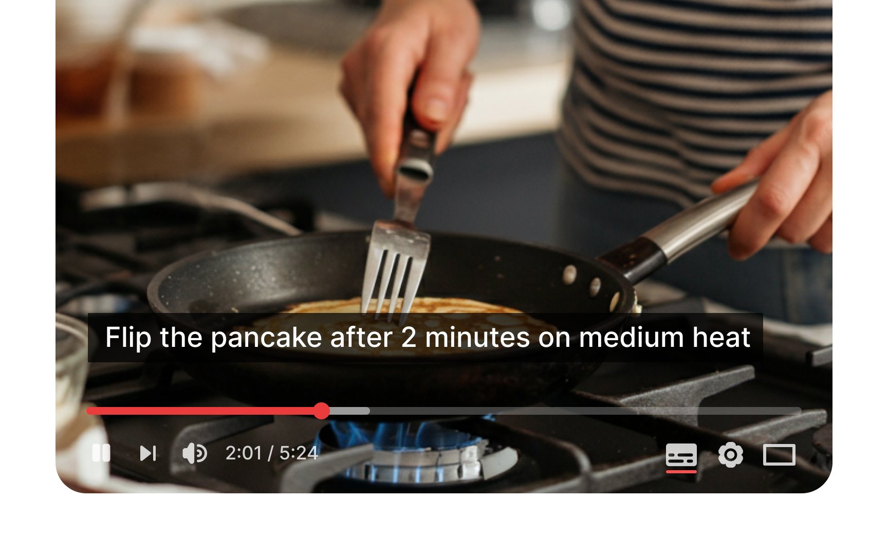
Captions refer to text versions of the speech. Furthermore, captions not only provide the dialogue but also identify the speaker and incorporate sound effects for a more realistic environment. They allow users who experience hearing loss or have cognitive and learning disabilities to reach the audio or video
However, captions benefit all users, not just those with disabilities. When people start learning a new language, captions are like crutches — they assist and support users when watching a movie or educational channel.
These are also useful when users can't hear the audio due to noisy environments (like a crowded bar or subway) or if they don't want to disturb others (like a library).[3]
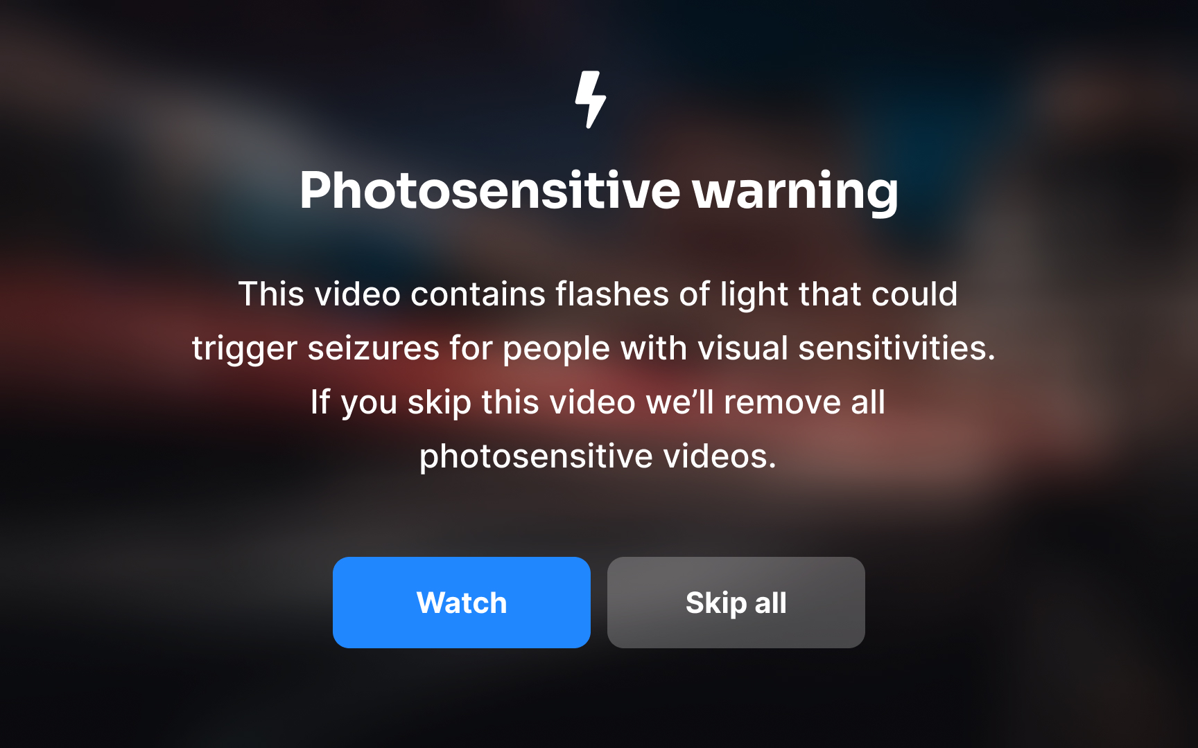
Web animations in videos, GIFs, PNGs, SVGs, and JavaScript can create engaging user experiences. However, strobing or flashing elements create serious
Flashing
If your design absolutely requires flashing content, never expose users to it without warning. Implement clear opt-in mechanisms with explicit warnings about potential risks.[4] Better yet, consider alternative design approaches that achieve similar engagement without relying on potentially harmful visual effects.
Use specialized testing tools like the Photosensitive Epilepsy Analysis Tool (PEAT) or the Harding Test to evaluate animations before implementation.
Pro Tip: When animation is necessary, use subtle transitions and movements that flow at a steady pace rather than rapid flashing or strobing effects to create a safer, more inclusive experience.
Transcripts convert audio
Users benefit from transcripts in various scenarios beyond
You have flexibility in how you present transcripts. You can place them directly on the same
Icons serve as visual shorthand for actions and concepts in digital interfaces. When thoughtfully implemented, they enhance
The most effective icons pair with clear text labels rather than standing alone. This combination prevents ambiguity and supports users with diverse needs. People with cognitive disabilities benefit from the dual coding of information, while those with partial vision impairments can use icon shapes as additional navigational landmarks even when they can't see fine details.
Choose icons that follow established conventions whenever possible. A magnifying glass for
Swipe gestures are often designed to follow a left-to-right or right-to-left motion. But if a gesture only works from one edge, like swiping from the left to open a menu, it may feel awkward or even unreachable for left-handed users holding a phone in their left hand. This friction adds up when gestures are tied to essential actions like
To make gestures more accessible, avoid relying on single-direction swipes for key features. If an action is tied to an edge, ensure it can be triggered from either side or provide an alternate way to access it. This approach supports both hand preferences and improves
A few more considerations:
- Check edge-based gestures: Test actions like opening menus or dismissing screens—do they work for both swipe directions?
- Provide tap alternatives: Ensure all gestures have a visible, touchable equivalent on screen.
References
Top contributors


Topics
From Course

Images provided by

Share


Similar lessons

Intro to Accessibility

Inclusive Design Basics
