Toasts
Toasts are small, non-intrusive notifications that briefly appear on a screen to inform users about actions or system feedback without interrupting workflow.


TL;DR
- Temporary notifications that fade automatically.
- Provide feedback on user actions or system events.
- Do not block interaction with the interface.
- Common in apps, websites, and operating systems.
Definition
A toast is a lightweight, temporary message that appears on screen to confirm an action, display feedback, or inform users of an event, disappearing after a short duration without requiring interaction.
Detailed Overview
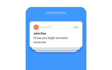
Toasts are a popular UI pattern for delivering quick, contextual feedback. They appear momentarily at the edge of a screen, typically the bottom or top corner, to confirm that an action has been completed or to share minor system updates. Their temporary and unobtrusive nature distinguishes them from modals or alerts, which demand more user attention and often block interaction until dismissed.
A frequent question is when to use toasts instead of other notification patterns. Toasts are best for low-priority information that requires acknowledgment but not immediate action. For example, a toast might confirm that a message was sent, a file uploaded, or settings saved. By contrast, errors that prevent progress or actions requiring a decision call for more prominent alerts.
Another query involves timing. Toasts must remain visible long enough for users to read them comfortably, but not so long that they clutter the interface. Research suggests durations between 3–7 seconds, depending on message length. Designers often allow users to manually dismiss longer toasts, striking a balance between persistence and unobtrusiveness.
Teams also ask about placement. Consistent placement helps users know where to look. Many systems use the bottom center or bottom right, as these positions minimize obstruction of primary content. On mobile, placement often shifts to the top or bottom depending on thumb reach and screen space.
Accessibility is another concern. Toasts must be readable, provide sufficient contrast, and be announced by screen readers. Without accessibility support, some users may miss important system feedback. Including descriptive text, appropriate contrast ratios, and proper ARIA roles ensures inclusivity.
Finally, toasts play a role in user confidence. Immediate feedback through a toast reassures users that their action succeeded, reducing uncertainty. Thoughtful use of toasts builds trust in the product by confirming actions and keeping users informed without overwhelming them.
Learn more about this in the Toast Exercise, taken from the Intro to UI Notifications Lesson, a part of the UI Components II Course.
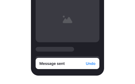
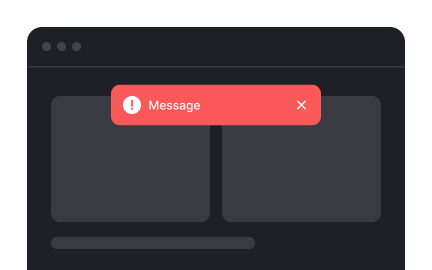
Toasts are appropriate for low-priority updates or confirmations, such as “Message sent” or “File saved.” Alerts are better for blocking issues, errors, or critical warnings that require user action.
This distinction prevents overloading users with intrusive notifications.
Toasts should last between 3–7 seconds, depending on content length. Short confirmations may fade faster, while longer messages may remain longer or allow manual dismissal.
The goal is to ensure readability without creating clutter.
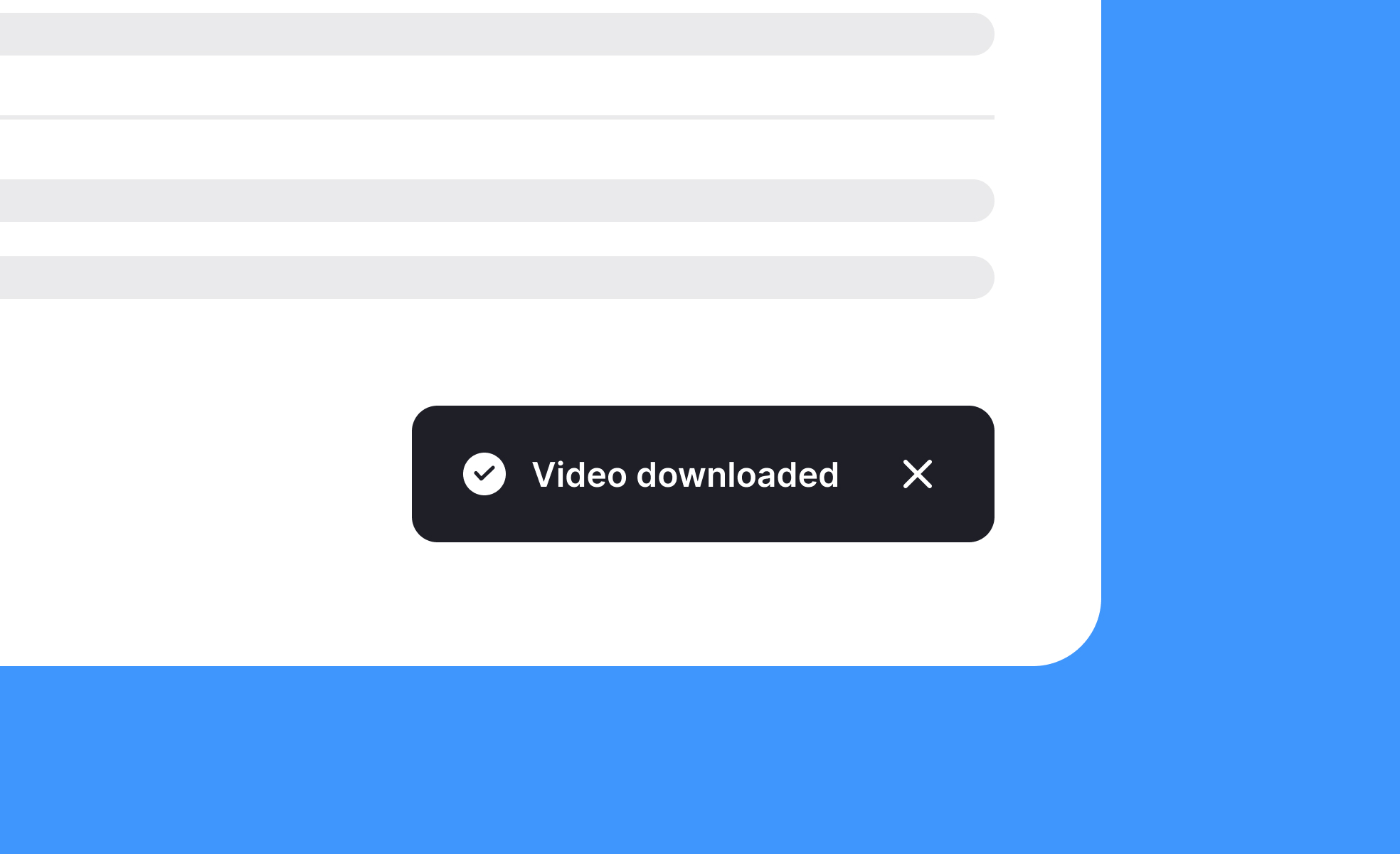
Common placements include the bottom center or bottom right of the screen. Placement should remain consistent throughout the product so users know where to expect them.
On mobile, placement often adjusts for visibility and ease of reach.
Toasts should have strong color contrast, be announced by screen readers, and include descriptive text. Accessible design ensures all users, including those with impairments, receive system feedback.
Inclusive toasts improve usability and build trust with diverse audiences.
Toasts reassure users that actions are complete, providing immediate feedback without interrupting flow. This reduces uncertainty and improves overall satisfaction.
By balancing visibility with subtlety, toasts enhance usability while keeping experiences smooth.
Recommended resources
Courses

UX Design Foundations


UI Components I


Design Terminology