Progressive Disclosure in UX
Harness the art of presenting information to users without causing overwhelm through the technique of progressive disclosure
User interfaces often need to balance information without overwhelming users. That’s where progressive disclosure comes in! This design technique shows only essential details upfront, while allowing users to access more in-depth information as they need it.
Think of it like peeling layers of an onion — the deeper content is only shown when the user is ready, helping prevent confusion and keeping things simple. Knowing when and how to use progressive disclosure effectively can help create interfaces that feel clean, easy, and intuitive for users.
Users appreciate a wide range of options but also crave simplicity — they don’t want to overthink tasks.
Here are the advantages of progressive disclosure in design and UX writing:
- It doesn’t intimidate novice users and helps them prioritize
content . - It saves screen space and enhances scannability for all types of users.
- It only shows what's relevant to users and de-emphasizes infrequently used features or information.
- It reduces cognitive load.
- It simplifies the process of learning a new interface.
- It decreases the number of errors when users accidentally activate an option they aren't familiar with.
Are there any dangers of using
When should you consider using progressive disclosure?
- For information-rich websites, like e-commerce websites with tons of information about each product or service.
- For applications with multiple commands, features, and options of different priorities that may confuse or even intimidate new users when exposed to them all.
Don't confuse
The most common and relevant features you show users are called the primary features of
How do you decide what information the initial level of progressive disclosure should contain? Don't assume you know your users down to the tips of their fingers. The most rational solution is to rely on research data. If it's a new product, analyze the findings of
The border between primary and secondary features should be easy to spot. Additionally, users should have no doubts about how to transition from the primary to the secondary disclosure levels.
Here's how to ensure this:
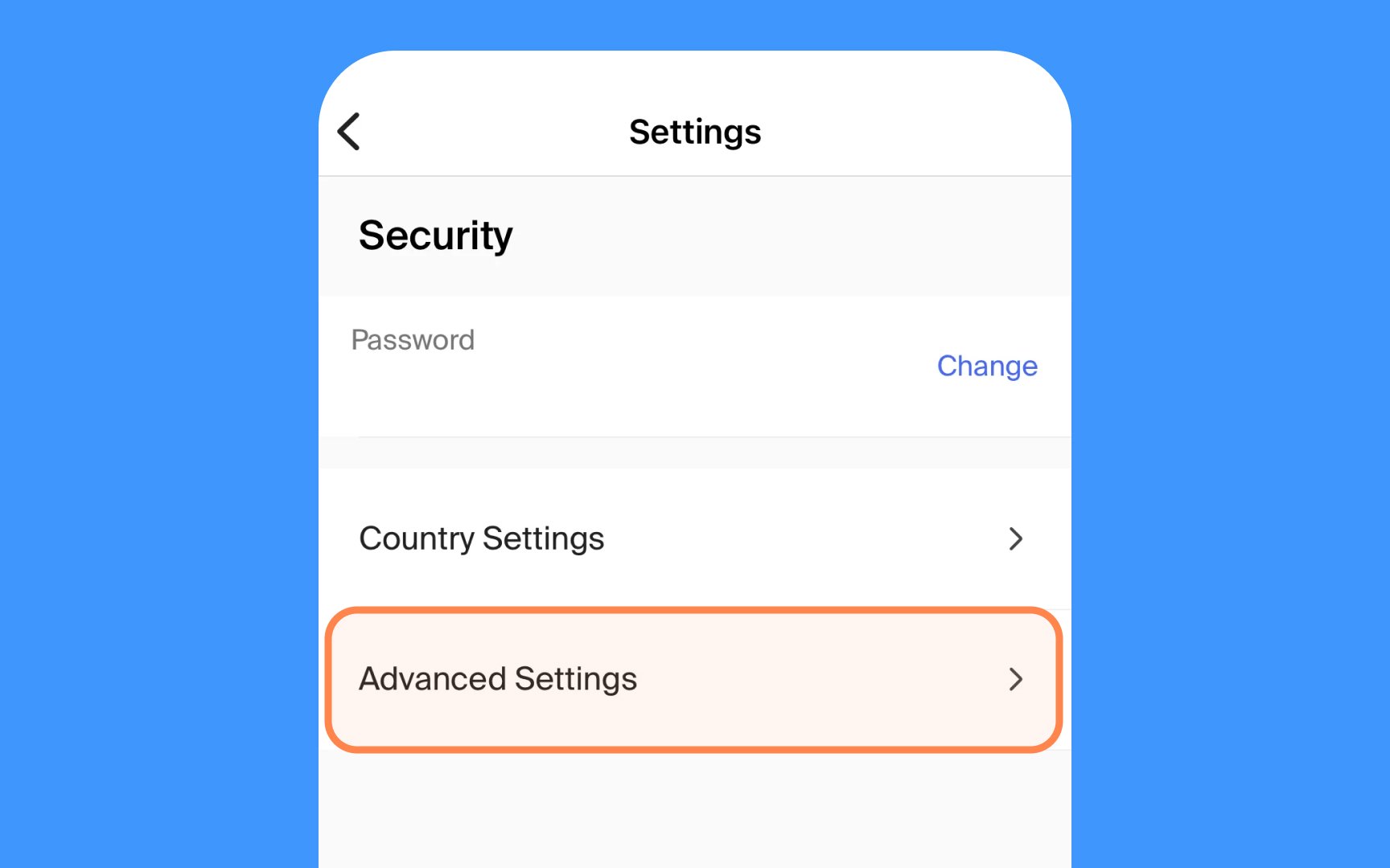
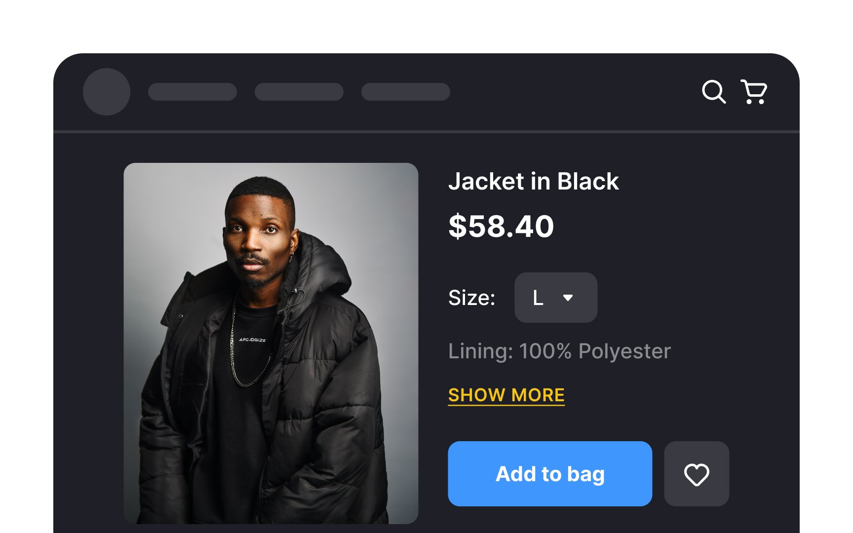
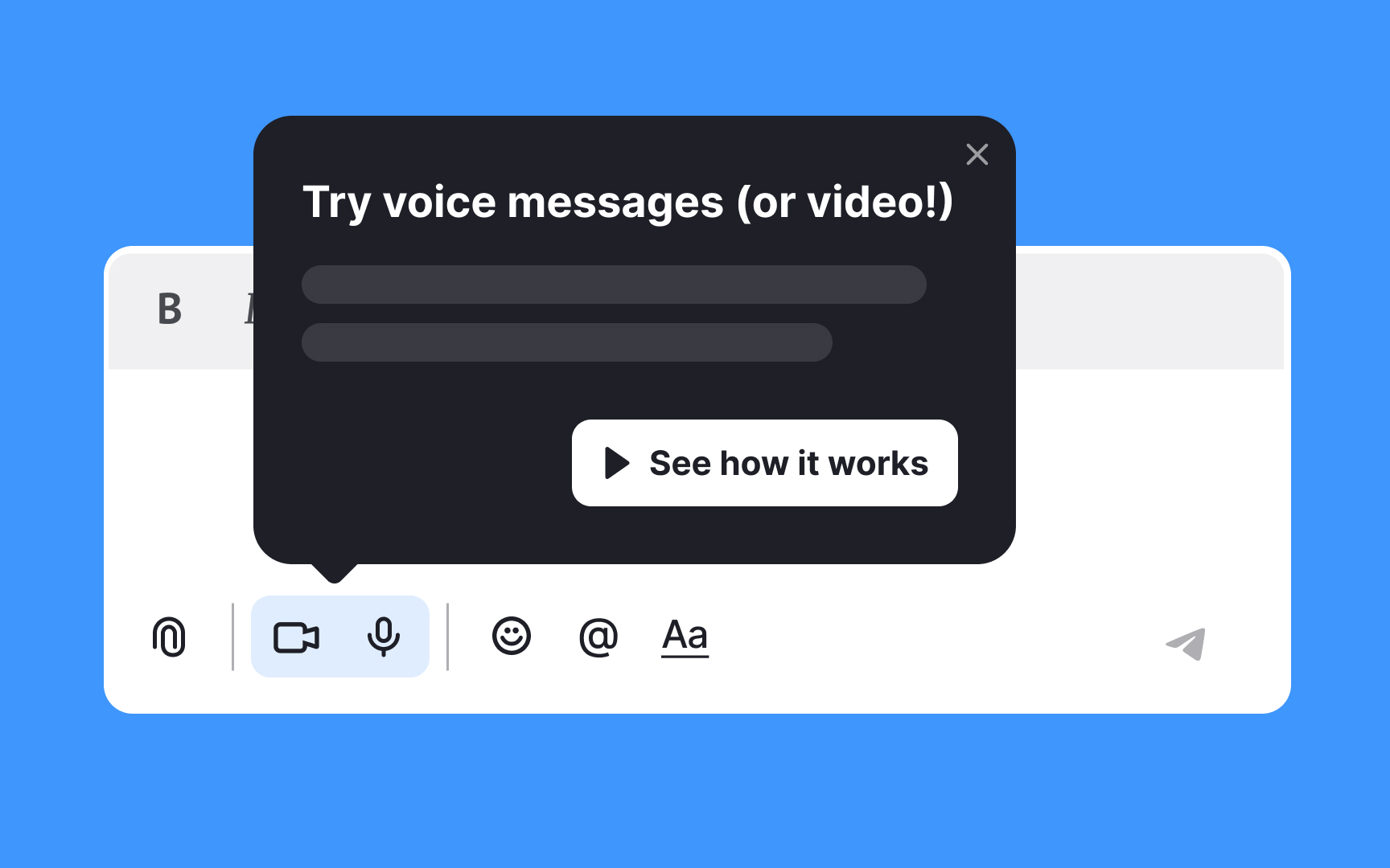
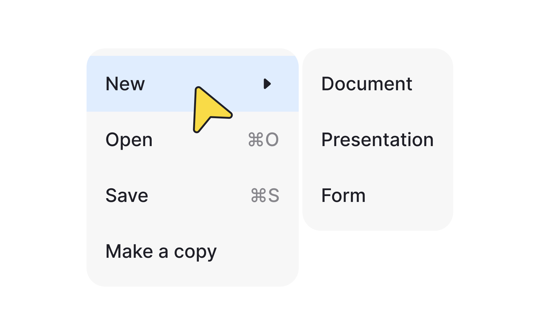
- Use hyperlinks or
buttons with informativelabels to indicate secondary features. For example, the AdvancedSettings or Related Topics labels clearly notify the audience of what users will find when they click or tap it. Conversely, the ambiguous Learn More isn't that straightforward about the benefits users can get from interaction. - Make sure the button or link leading to secondary features looks clickable and sits in a visible position. Users should have no trouble finding a way to explore more advanced interface functionality.
How many levels of
Interfaces that include more than two levels of disclosure have low usability because users often get confused and may get lost when moving between levels of complexity.
How can you avoid adding extra levels of complexity?
- Reconsider your advanced features. Smart sorting and regrouping can do wonders and make the interface easier to navigate. When in doubt, talk to your users and observe whether they see the difference between levels and experience any trouble navigating between them.
- Consider adding 2 levels of secondary disclosure. It may prevent adding the third level, but it's still not the best idea from the usability perspective since multiple controls for advanced options can disorient users.
When you add a third level of disclosure or two secondary levels, you should give
User onboarding implies the acquaintance of users with a new product or a feature. People will have a positive experience if you introduce new features at the right pace and prioritize them appropriately. Here's how you can use the principles of
- Focus on primary needs. Start by highlighting features that address users' main goals on your app or website. Introduce new features simply and reveal more only if users express interest.
- Analyze early behavior. Study user actions within the first 1-3 days of launch to identify popular initial features. Highlight these in early onboarding for a smoother introduction.
- Cater to different user groups. Recognize that some users explore all features, while others want a direct path to specific tasks. Tailor onboarding to accommodate both.
- Be concise. Keep descriptions brief and direct, focusing on essentials to maintain user engagement.
- Minimize steps. Limit onboarding to 4-5 clear steps, reducing guesswork to retain attention.
- Use familiar language. Speak in terms that users already use and understand about your product for better clarity and connection.
Beyond user
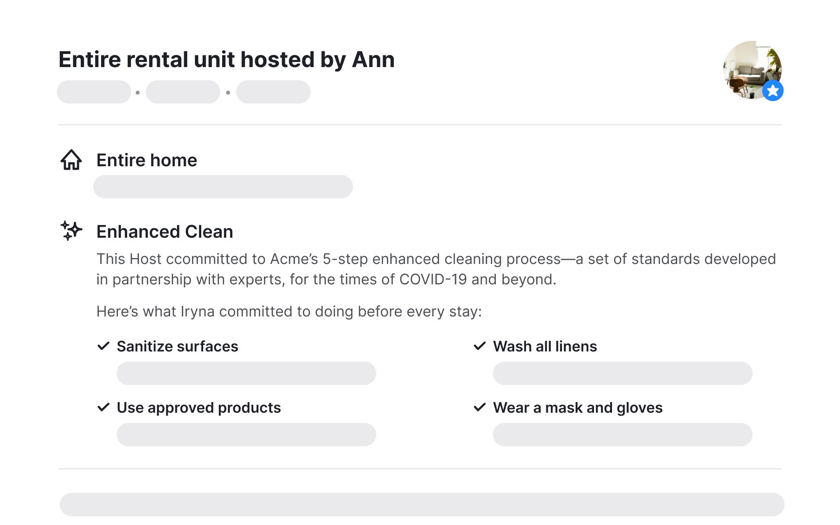
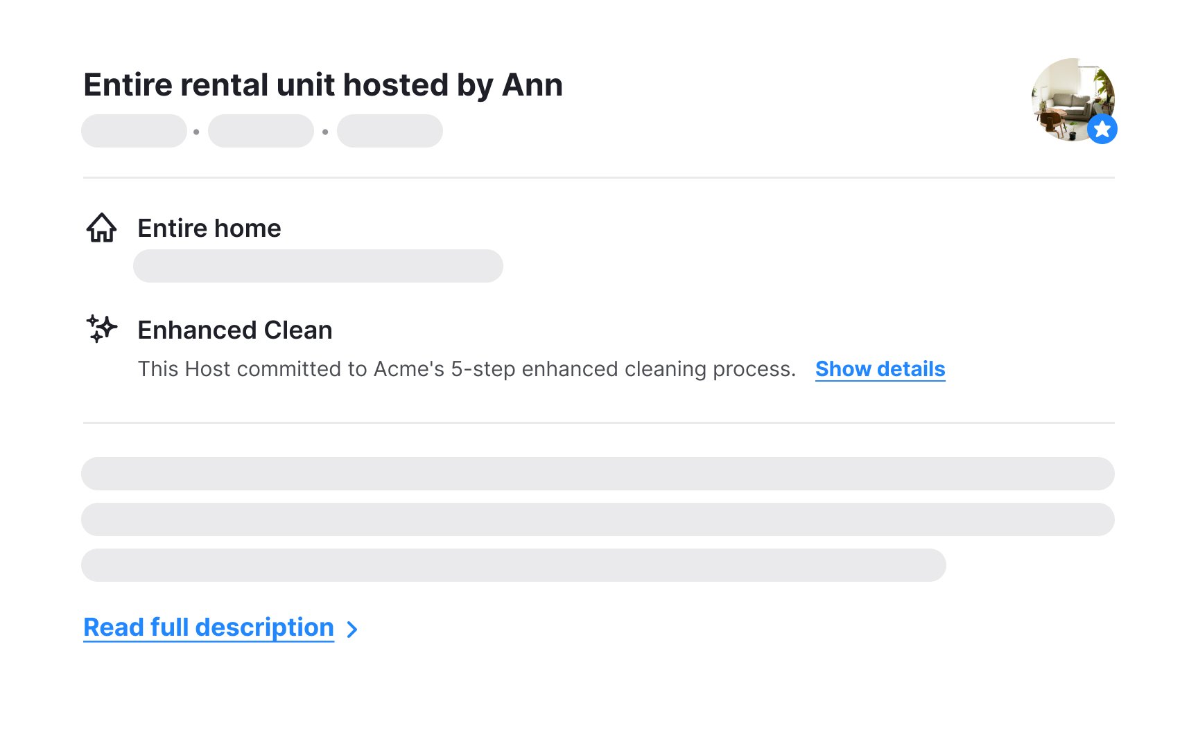
- Content previews or snippets: You typically see snippets on blogs and news websites. They provide just enough preview for users to decide if they want to dive deeper and read the full
content or move on to the next topic. - Accordions: Help centers and FAQ
pages often contain accordions to show multiple sections containing information that might be relevant only to a certain group of users. - Dropdown menus and mega menus: Dropdown and mega menus help large, complex websites to save space and not overwhelm users with tons of options.
- Image sliders: Image sliders are often seen at e-commerce websites presenting the most popular or recommended items, so users don't always need to explore the whole catalog.
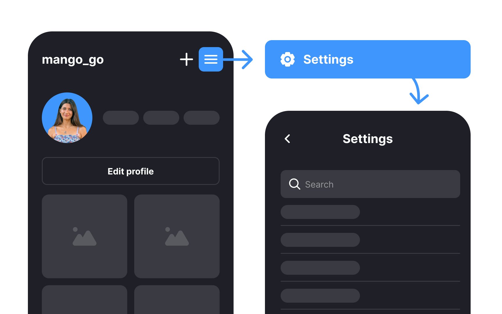
- Hamburger menus: Designers often use hamburger menus to hide navigation options that users use more rarely than others, like
settings , the log-out option, about the app, request a feature, etc. - Lazy loading: Lazy loading prevents overwhelming users and reduces
interaction costs. All they have to do is to keep scrolling down if they want to explore more content.
What testing methods can help you evaluate the efficiency of
- Moderated and unmoderated usability testing: This technique involves observing users in their natural environment or laboratory conditions. A moderator usually doesn't ask any questions unless users get stuck and need help. While users are performing a task on their devices, the moderator searches for friction points — areas that can be improved.
- Contextual inquiry: It's a combination of observation and user
interviews . Firstly, a moderator interviews participants about their experience with a product/feature. Then, users perform a task on their devices in their natural habitat and context of use, while the moderator observes and asks questions along the way. It's a fantastic method to test what users say about a product and what they actually do when using it. Commonly we conduct contextual inquiry during the early discovery stages for a new feature or product. - A/B Testing: This type of testing is about comparing two or more versions of a page/screen to see which is most effective and less confusing.[3]
Other less expensive methods include guerilla testing, session recording, phone interviews,
References
- Progressive Disclosure | The Interaction Design Foundation
- Progressive Disclosure | Nielsen Norman Group
Top contributors


Topics
From Course

Share


Similar lessons

Intro to UX Copy

What is UX Writing?
