Best Practices for Vertical Navigation
Explore the benefits of vertical navigation and the nuances of incorporating it effectively into an interface
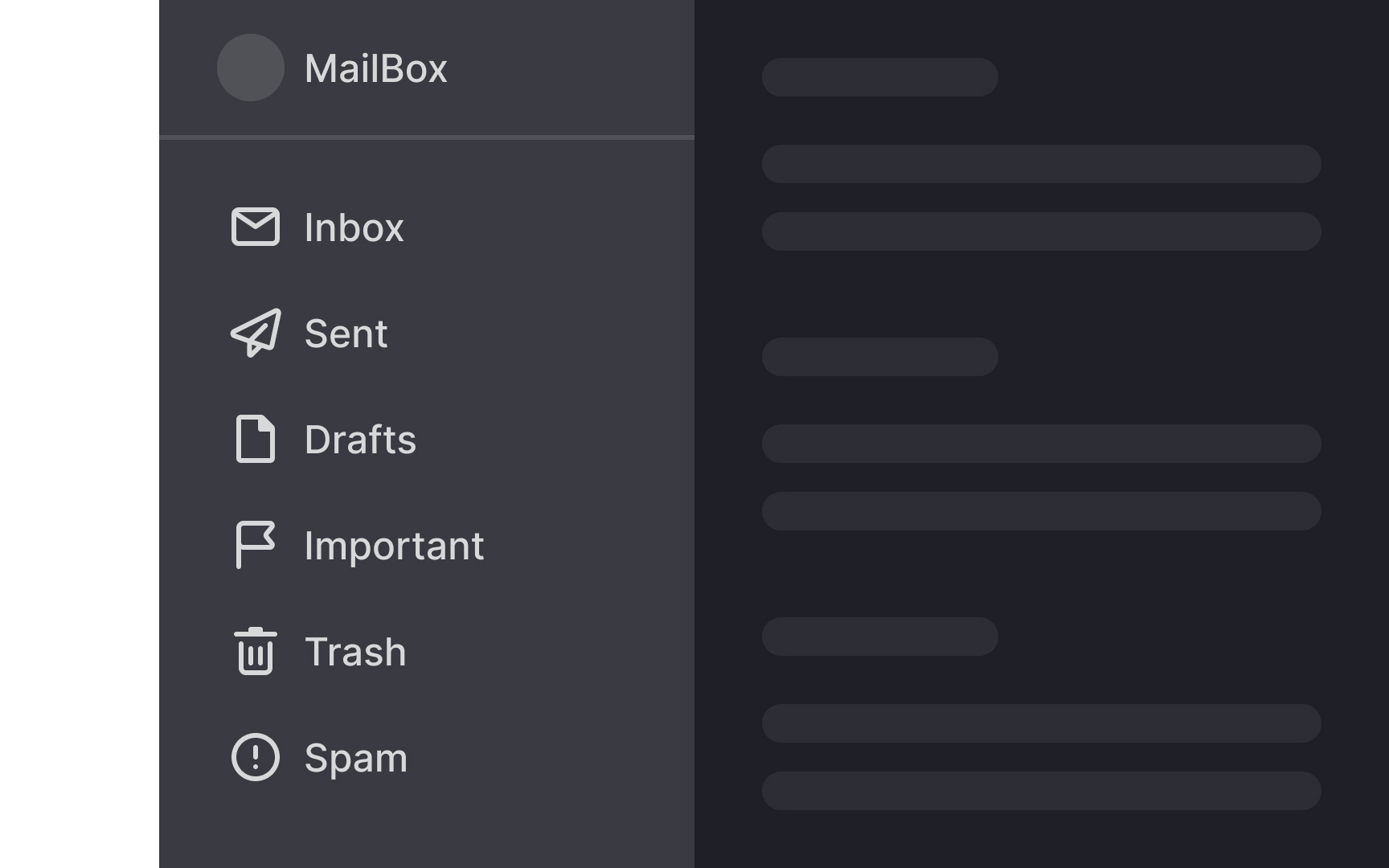
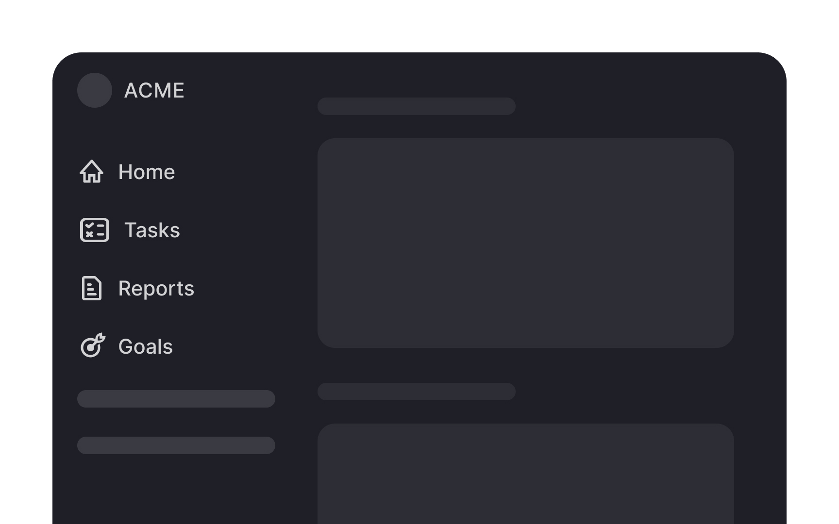
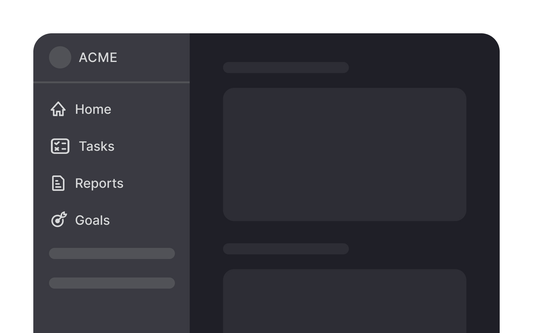
Vertical navigation offers distinct advantages over horizontal navigation, especially for content-rich or rapidly growing sites. Unlike horizontal menus, which can become crowded and challenging to expand, vertical navigation provides ample space for a wide range of categories. Vertical navigation also transitions seamlessly to mobile, maintaining a consistent user experience across devices. While vertical navigation does take up more screen space, the trade-off can be worth it for improved usability and ease of navigation.
However, the choice between vertical and horizontal navigation depends on a project's specific needs. Vertical navigation isn't a one-size-fits-all solution. Designers should consider criteria such as the amount of content, the expected growth of the site, the importance of screen space, and user behavior patterns. For example, a blog with limited categories might benefit more from horizontal navigation, while a large e-commerce site would likely find vertical navigation more effective. Ultimately, understanding the project's goals and user needs will help you make the best navigation style choice.
Vertical
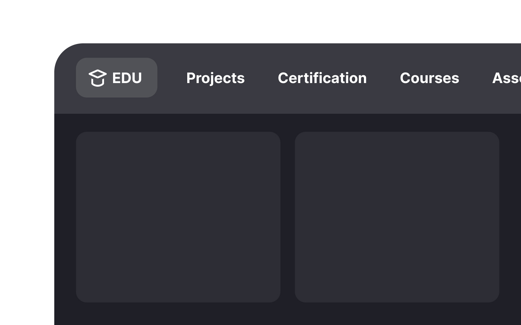
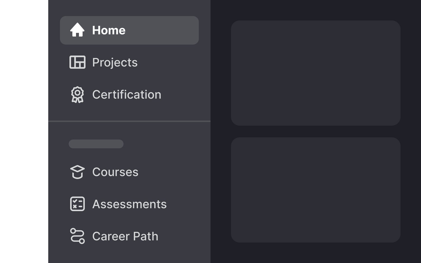
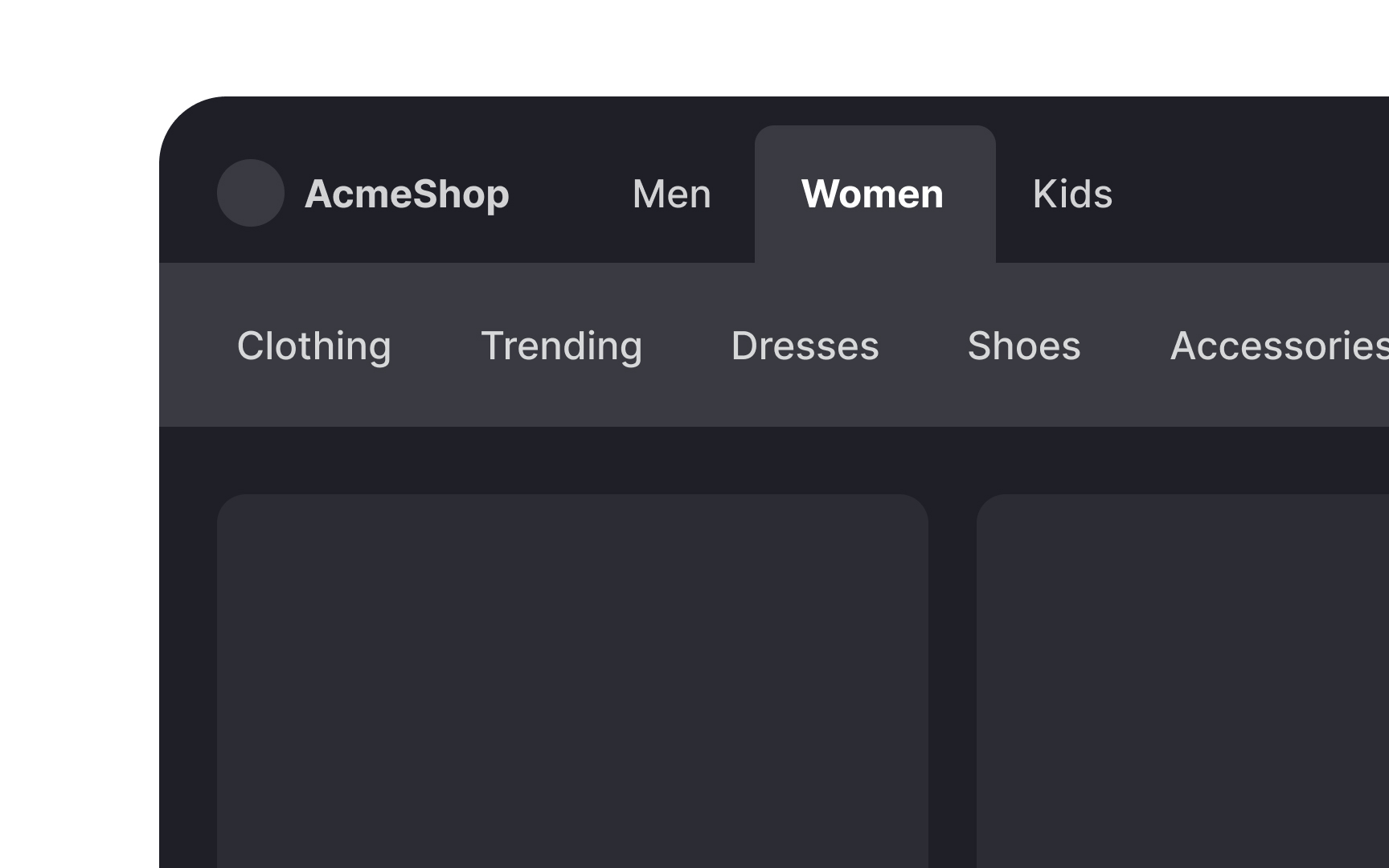
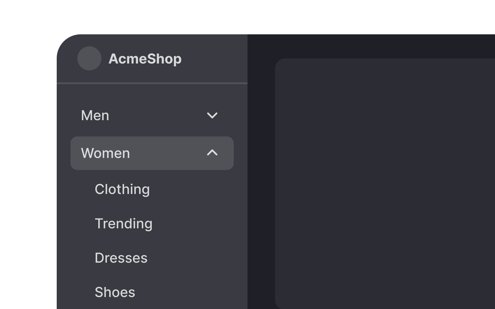
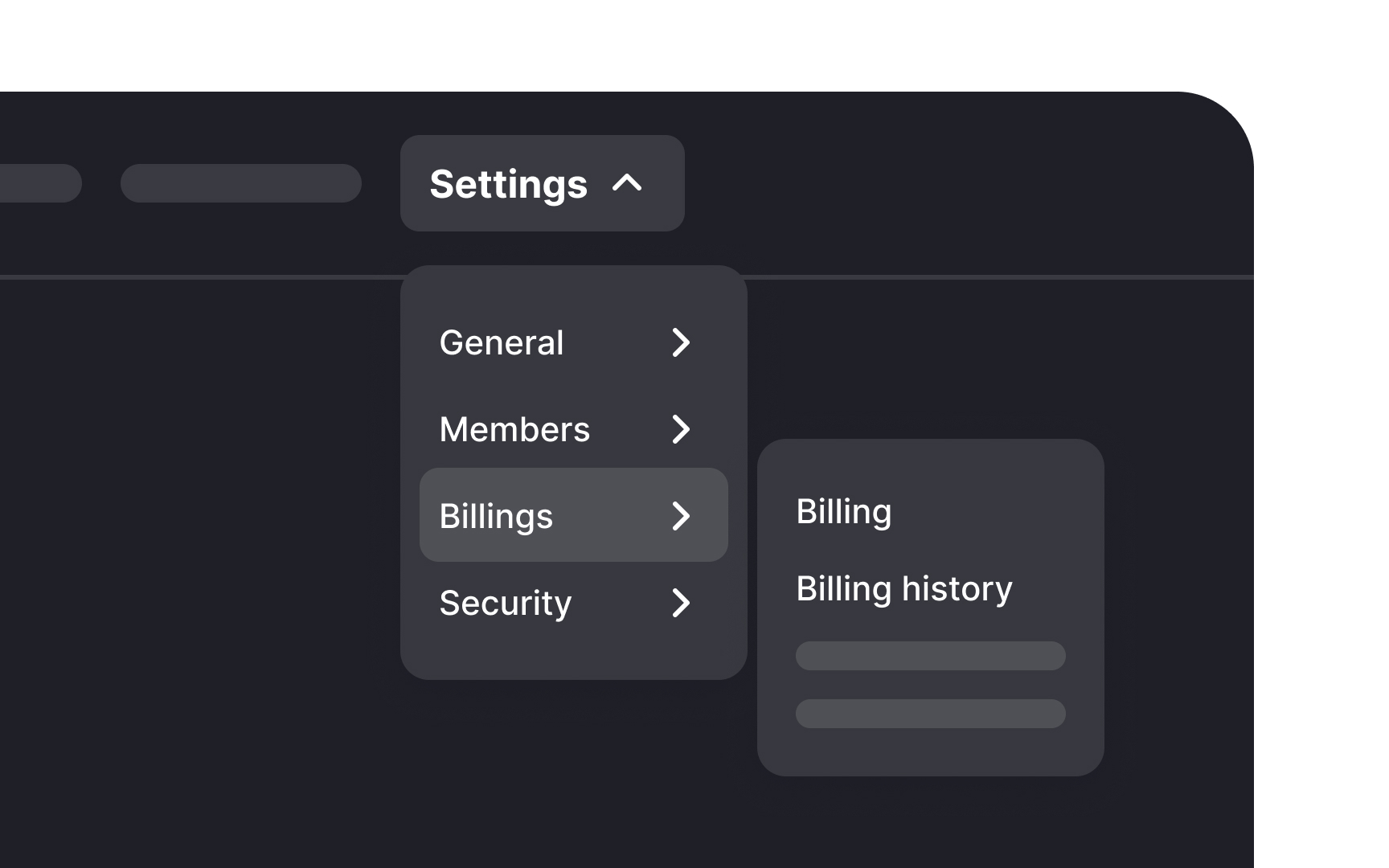
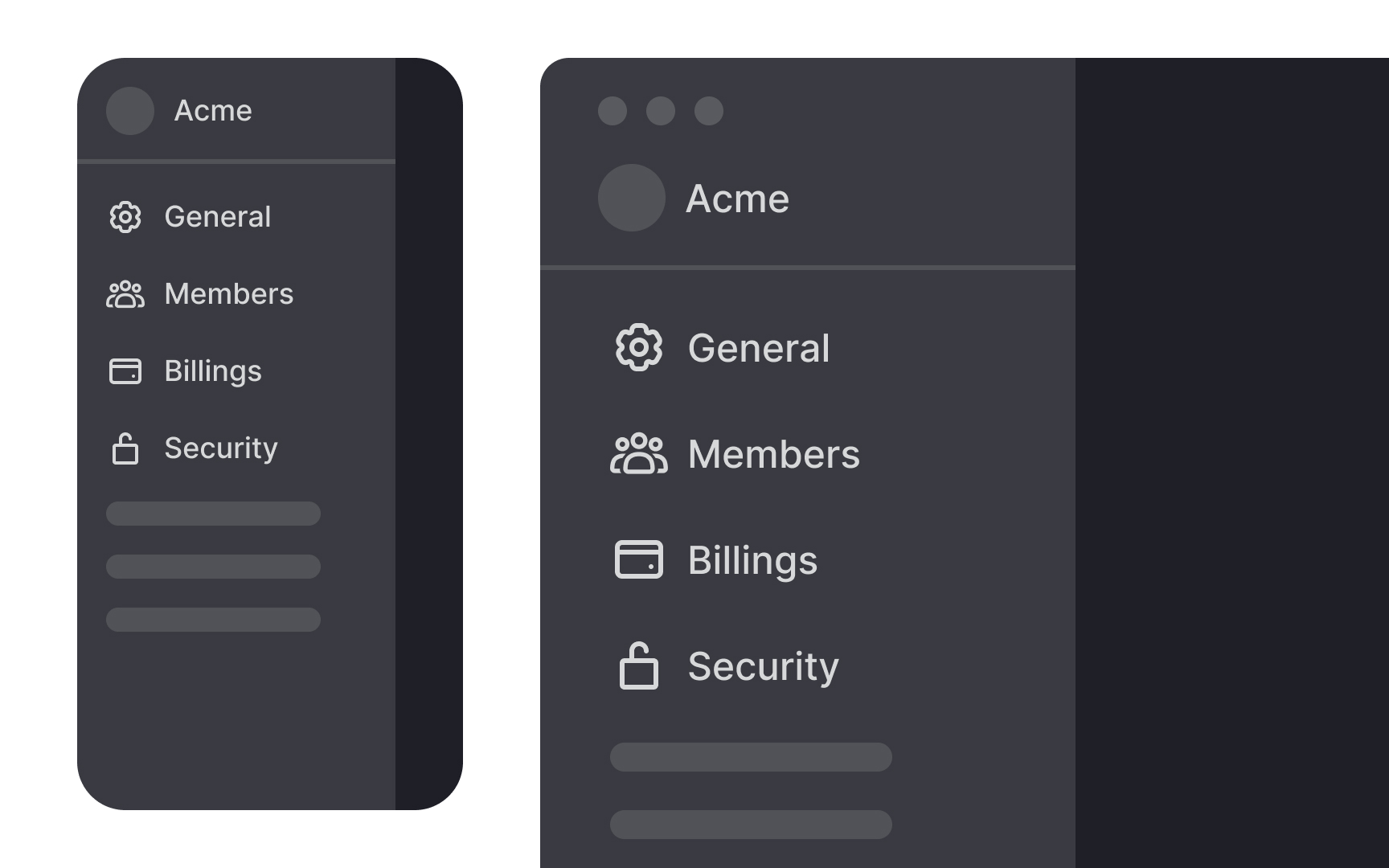
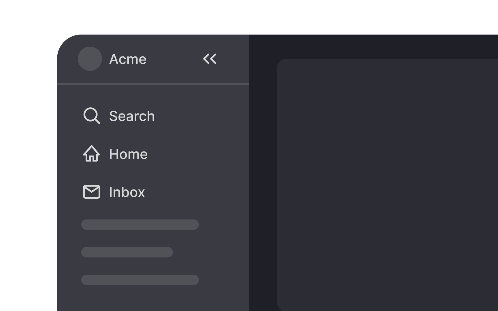
Vertical navigation allows for easy expansion without needing a complete redesign. New categories can be seamlessly integrated into the existing structure, maintaining a coherent and user-friendly interface. For example, an enterprise software company can easily add new product lines or services without disrupting the overall
Vertical
This approach not only enhances the
Vertical
Research also shows that vertical lists are easier to search than horizontal ones.[3] Users can find what they’re looking for with fewer eye movements because they can see more information at once.
Vertical
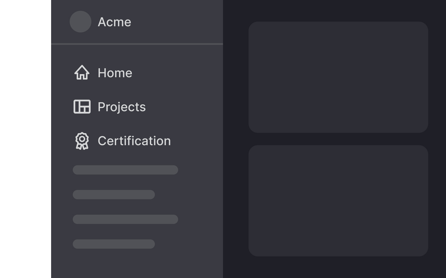
Many websites also use vertical local navigation to display related pages within the same category, enhancing the sense of coherence and structure.
Familiar patterns reduce the learning curve, making users feel more at ease and improving overall satisfaction. Vertical navigation not only simplifies site exploration but also builds a stronger connection between users and the interface.
Vertical
One drawback of vertical
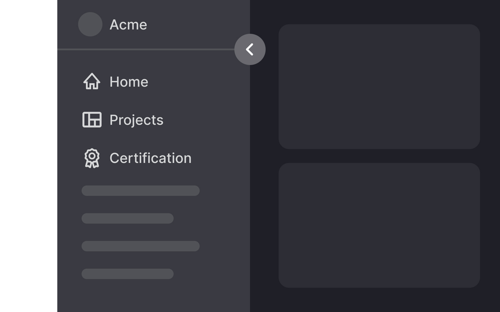
Designers working with responsive designs need to carefully consider how vertical navigation impacts different screen sizes and decide on the best UI for various breakpoints. For instance, on a smartphone, vertical navigation might take up too much space, making it hard for users to view content without excessive scrolling. In such cases, you might opt for a collapsible menu or a different navigation style.
Conversely, on large monitors, vertical navigation is less intrusive as the extra screen space can accommodate both navigation and content without issue. Weigh these considerations when choosing vertical navigation, ensuring it enhances rather than hinders the
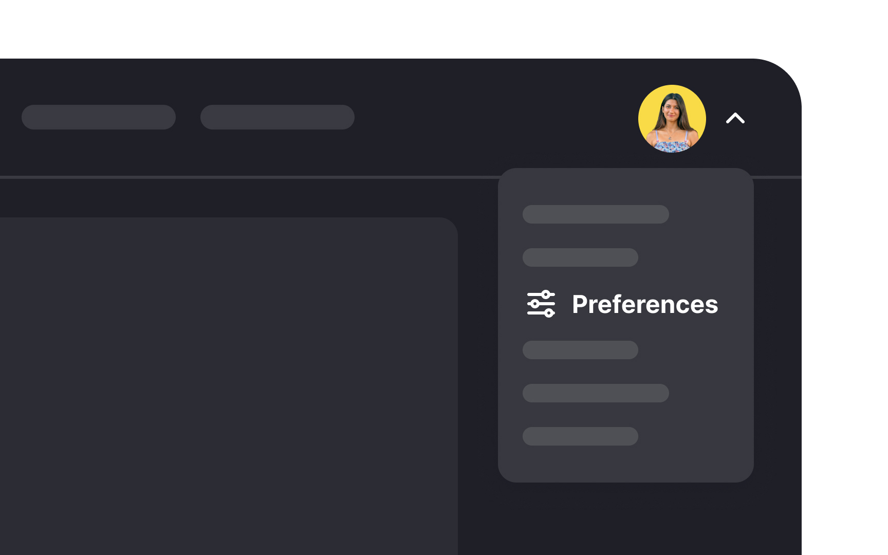
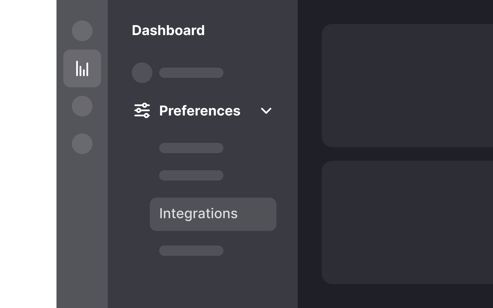
When placing vertical
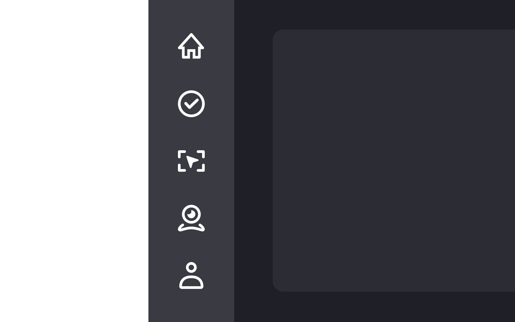
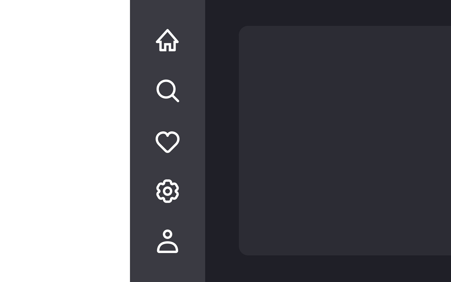
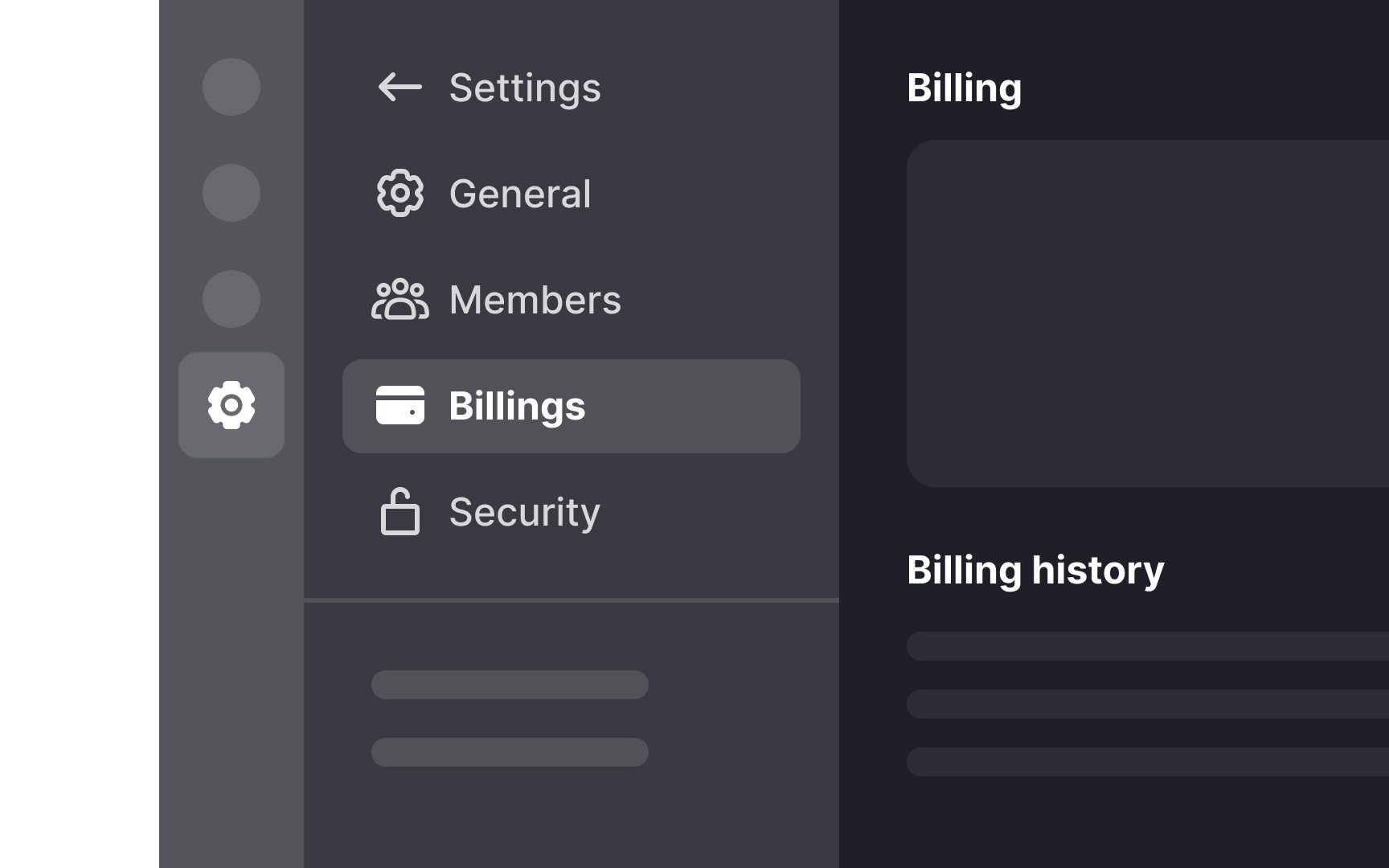
Adding labels to
When users don't have to decode the meaning of each icon or hover/click to reveal hidden labels, it streamlines their
However, for websites visited occasionally, relying on icon-only navigation is less effective. Users are less likely to remember the meanings of the icons, leading to increased interaction costs and a higher likelihood of abandoning the site.
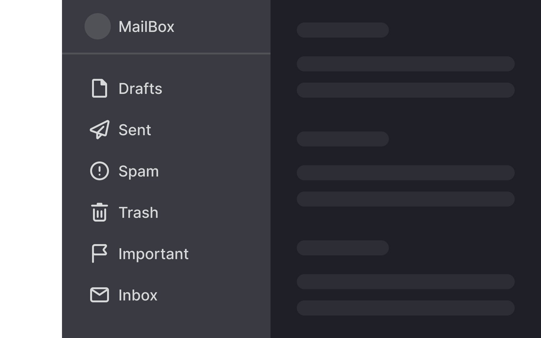
When designing a vertical
By organizing the menu this way, you can accommodate users using different screen sizes and ensure a smoother
To ensure the vertical
- Colors: Different text or background colors can make the navigation stand out.
- Borders: Adding borders around the navigation can help separate it from the main
content area. - Typography: Using bold or distinct fonts for navigation items can make them more noticeable.
- Icons:
Icons can quickly convey the purpose of each navigation item, making it easier for users to understand and remember. - Spacing and padding: Adequate spacing and padding around navigation items can prevent clutter and make the
menu easier to scan. - Hover effects: Implementing hover effects, such as changing the background color or adding an underline when users hover over navigation items, helps provide immediate visual feedback.
References
- Left-Side Vertical Navigation on Desktop: Scalable, Responsive, and Easy to Scan | Nielsen Norman Group
- Attention Leans Left on Websites (Video) | Nielsen Norman Group
- Left-Side Vertical Navigation on Desktop: Scalable, Responsive, and Easy to Scan | Nielsen Norman Group
- Material Design | Material Design
Topics
From Course

Share


Similar lessons

Intro to Information Architecture

Intro to Search Functionality in UI
