Responsive interface patterns
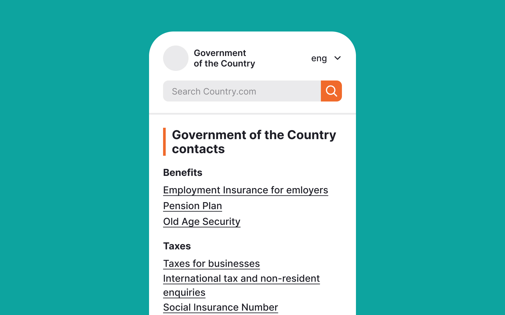
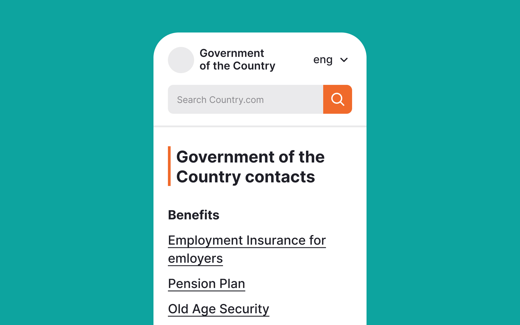
Government interfaces must work on all devices, from desktop computers to mobile phones. Responsive design ensures content remains accessible regardless of screen size or orientation.
Basic responsive design principles include:
- Flexible grid layouts
- Scalable images
- Adjustable text size
- Adaptable navigation
- Touch-friendly targets
- Maintainable spacing
- Consistent hierarchy
Interface elements should adjust smoothly across different screen sizes. Navigation menus might change from horizontal to vertical layouts, while maintaining easy access to all functions. Touch targets need sufficient size and spacing for reliable interaction on small screens.
Content readability remains crucial across all devices. Text should scale appropriately without breaking layouts or requiring horizontal scrolling. Tables and complex content need special consideration to remain usable on smaller screens.
