Best Practices for Filtering & Sorting Design
Build filtering systems that help users narrow results quickly without getting lost
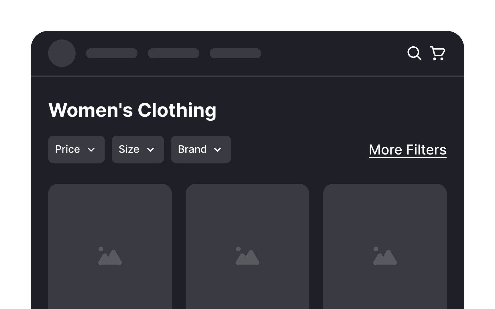
More options should mean better outcomes. In practice, it often means no decision at all. Users facing hundreds of products without a clear path forward don't browse methodically. They leave. Filtering and sorting exist to transform overwhelming abundance into manageable choice. But filters themselves can become overwhelming. Too many options paralyze rather than help. Poorly labeled categories confuse rather than clarify. Hidden filters go unused while prominent ones get applied unnecessarily.
The goal is surfacing the filters that actually matter for how real users shop and search. Result counts show impact before committing. Clear buttons undo mistakes. Applied filters stay visible so users remember what they've narrowed. Each pattern reduces the friction between wanting something and finding it.
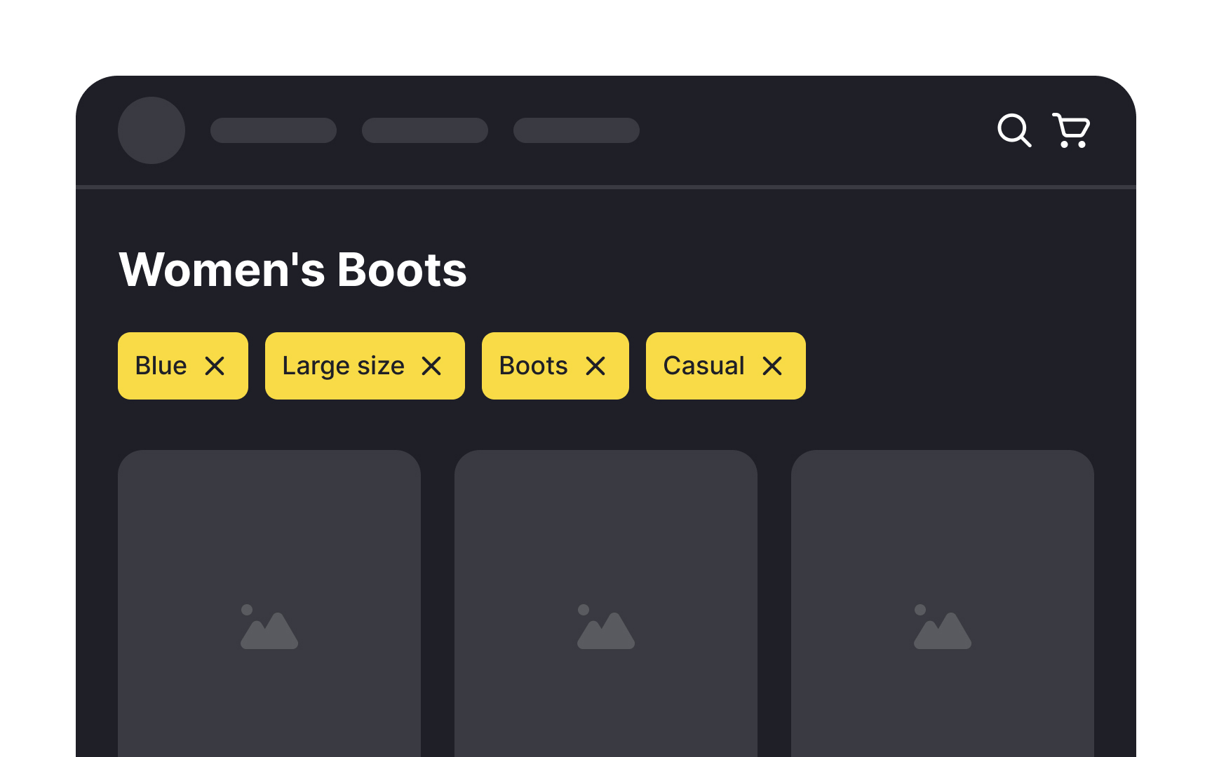
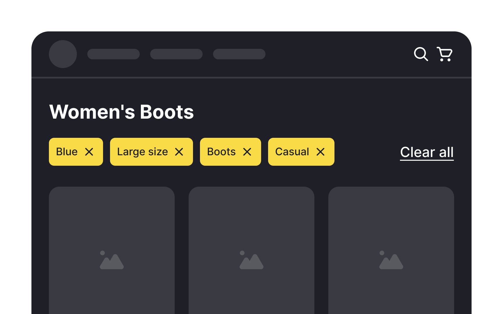
It's quite common for users to apply multiple
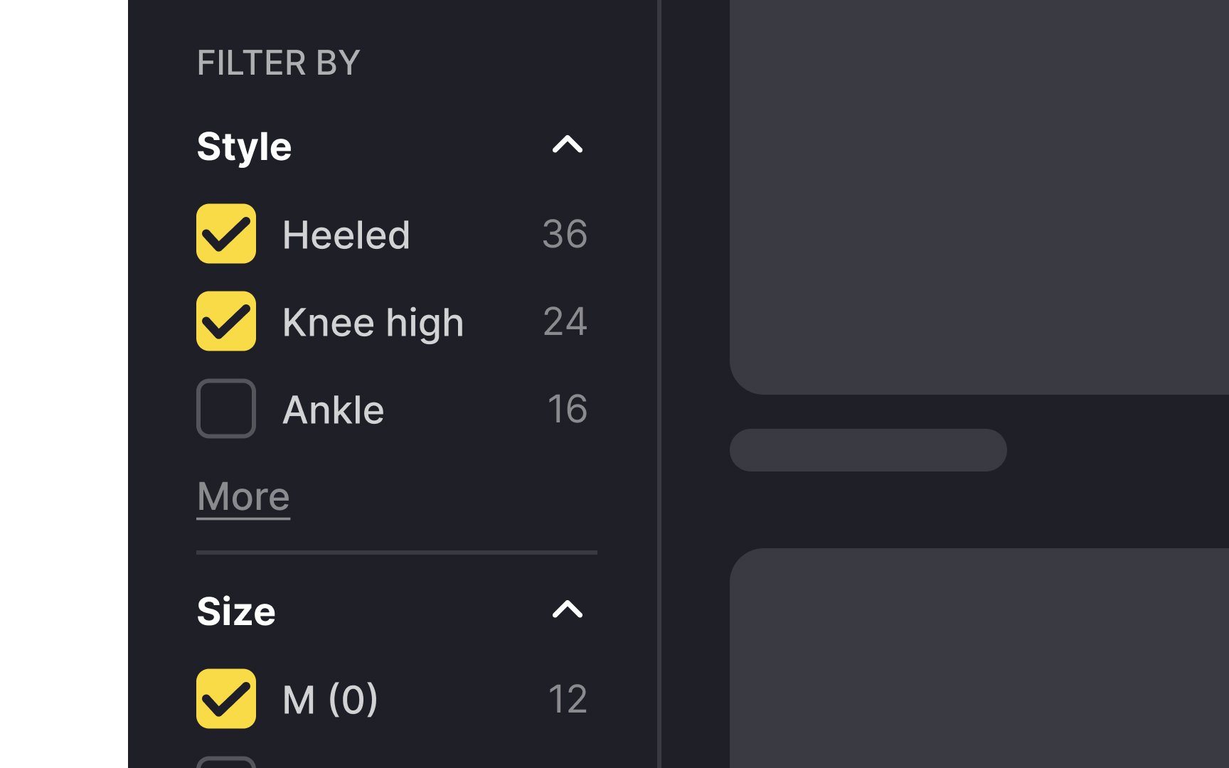
While it's helpful to be able to remove filters one by one, it can be quite laborious and time-intensive to go through and remove each applied filter individually. Providing a feature that allows users to clear all filters with a single click can be a significant time-saver and convenience, especially for those shopping on mobile devices.
Pro Tip: The Clear All button should appear subtle but not look disabled. Make sure the button changes state on hover or click so users know they can interact with it.

Many users confuse the terminology for filtering and
According to the Baymard Institute's studies, users often are more inclined to use sorting. This is because:
- Users are afraid to lose relevant products that fall just outside their defined filter range.
- Users may not know the product's domain or technical characteristics well enough to set the filtering criteria.
- Users may not be so sure about their budgetary limitations, compatibility requirements, usage conditions, etc., and prefer browsing until they find out what they like.[1]
Ultimately, users need both filtering and sorting functionalities to find relevant
Pro Tip: Provide the most popular options to sort — by the highest and lowest price, rating, recency, and popularity.
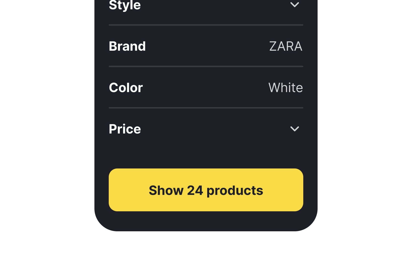
Displaying the number of available
By doing so, you effectively reduce the interaction cost for users by limiting the steps users take to achieve their desired outcome, such as finding a specific product.[2] For instance, when the number of items found is too small or even zero, users might not proceed to click the Apply button immediately. They may first remove a few filters in an attempt to broaden their search and potentially see more results. This additional step can be a significant factor in user satisfaction and ultimately lead to more successful searches and purchases.
Pro Tip: When no filters are selected, the button should read “Show all [total] products” by default.
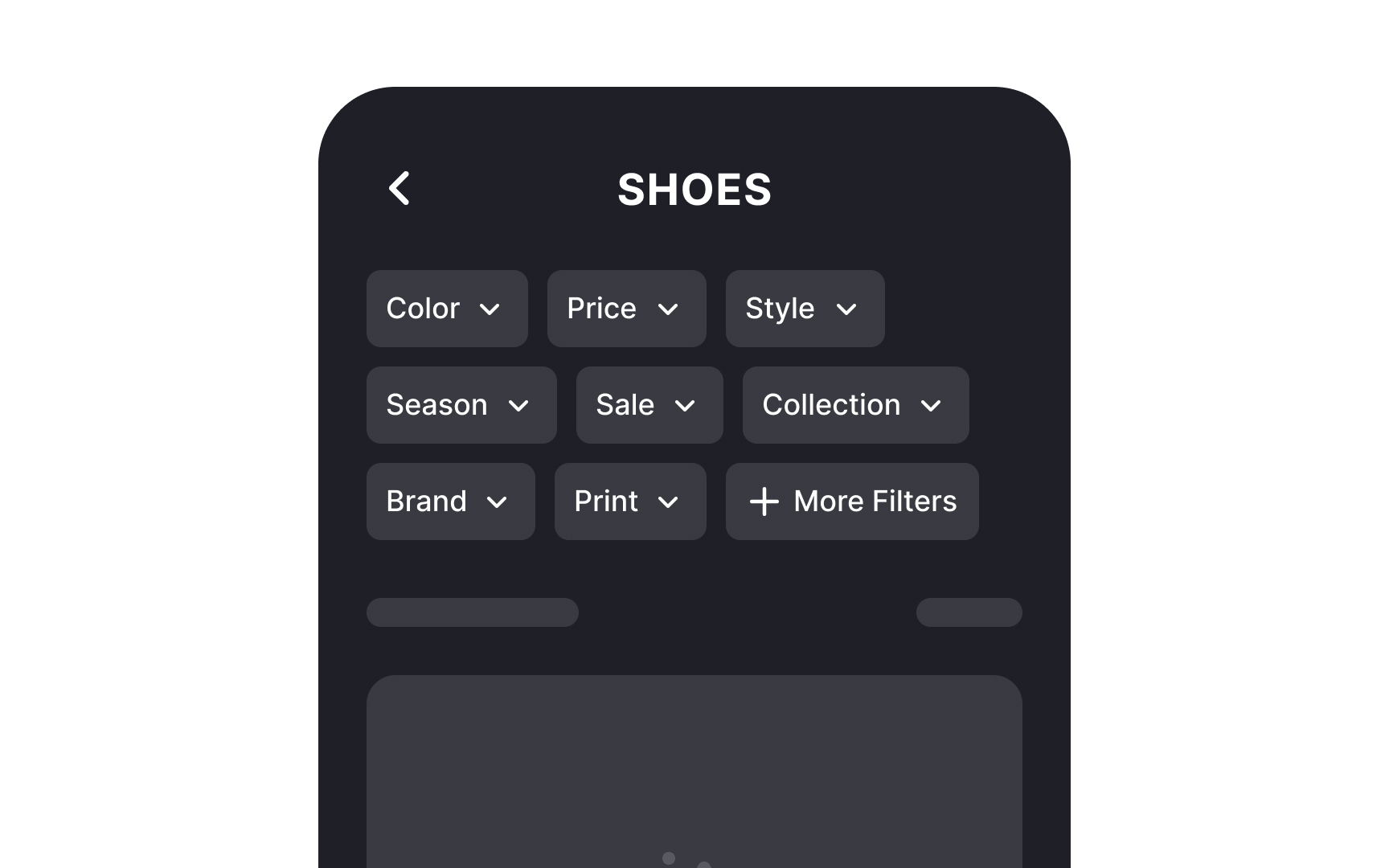
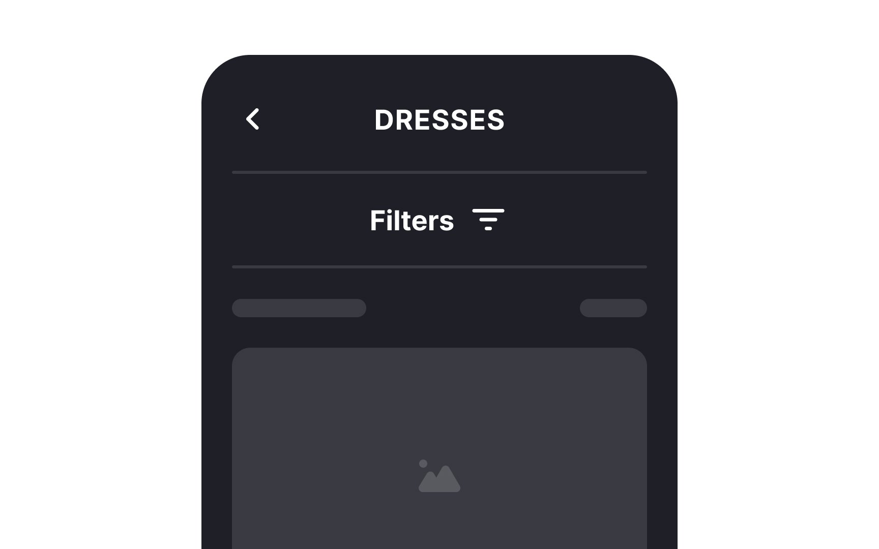
When it comes to mobile apps, displaying all available
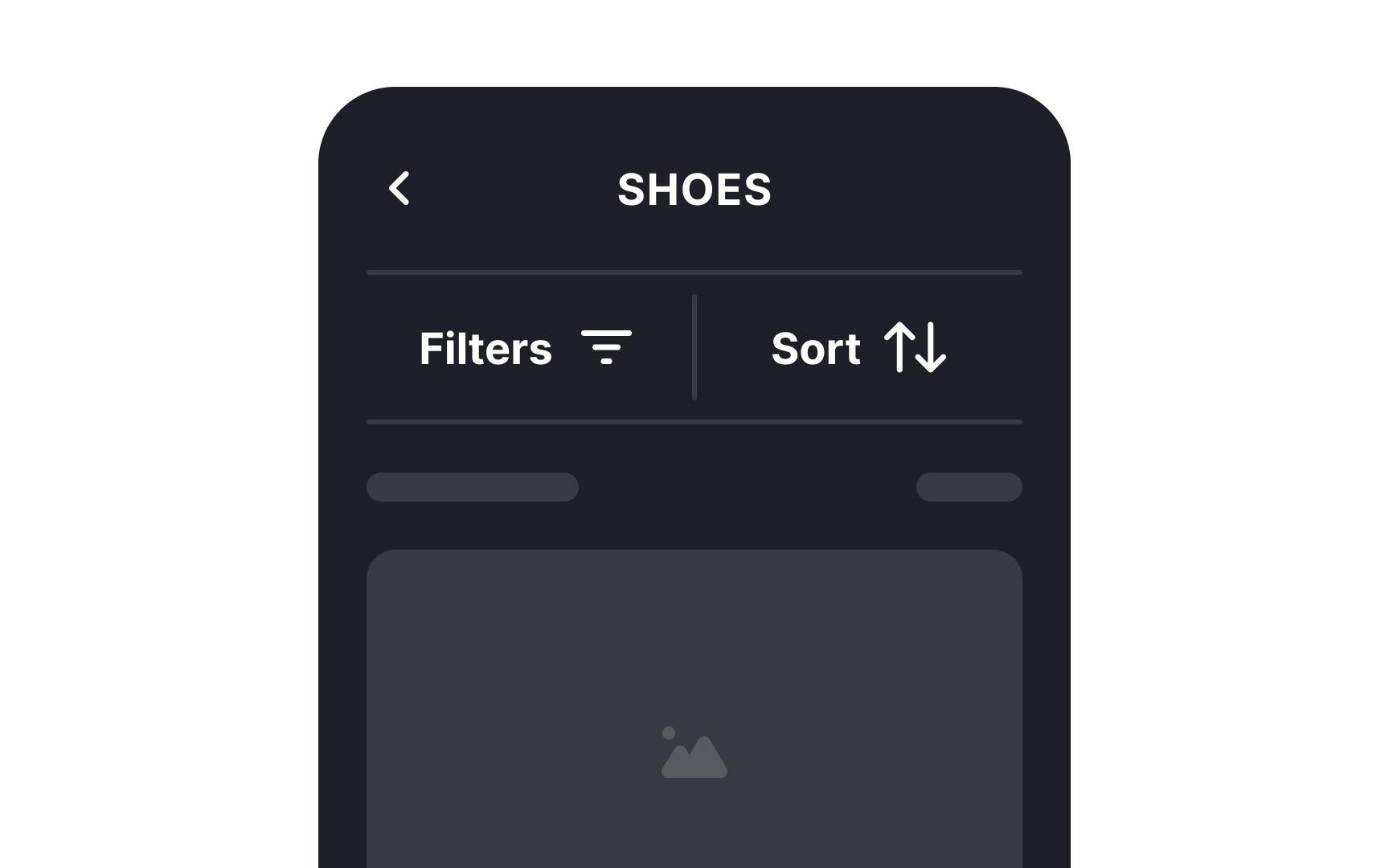
Upon clicking the Filter button, users can then access the filter options. This action expands the menu or directs them to a separate
When users are on the lookout for specific items, they often apply numerous
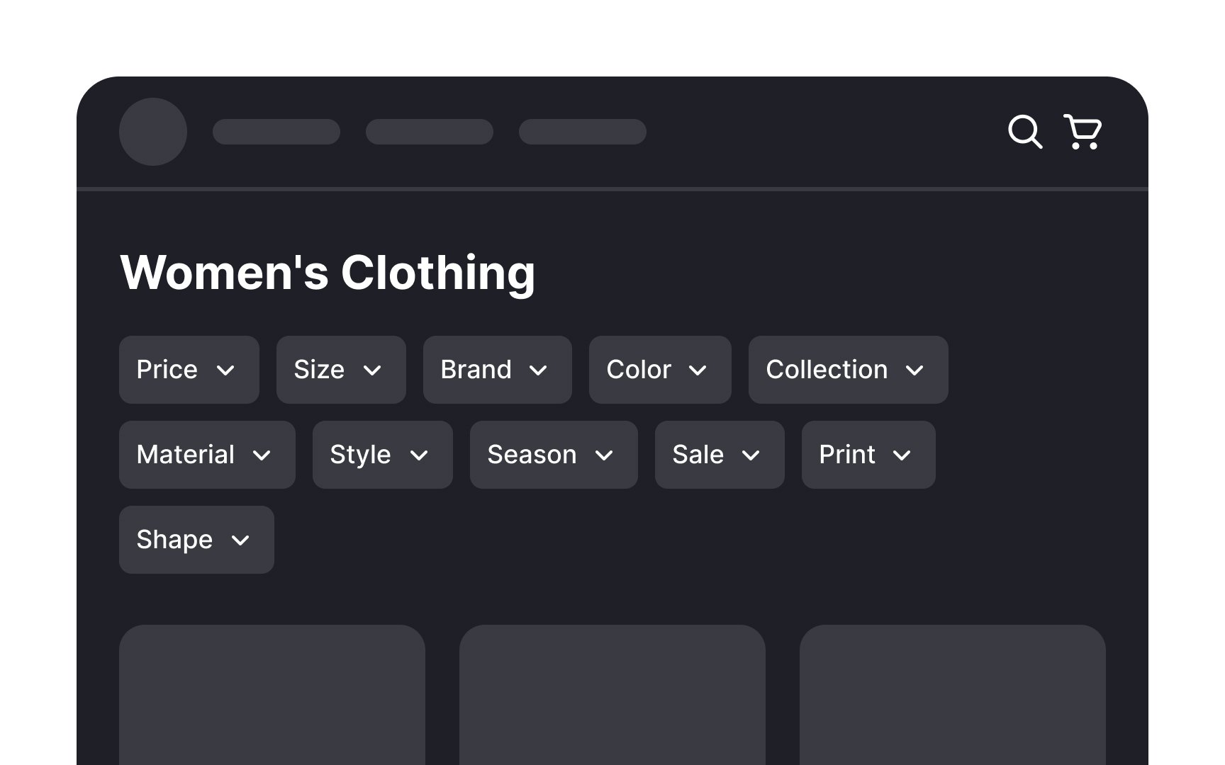
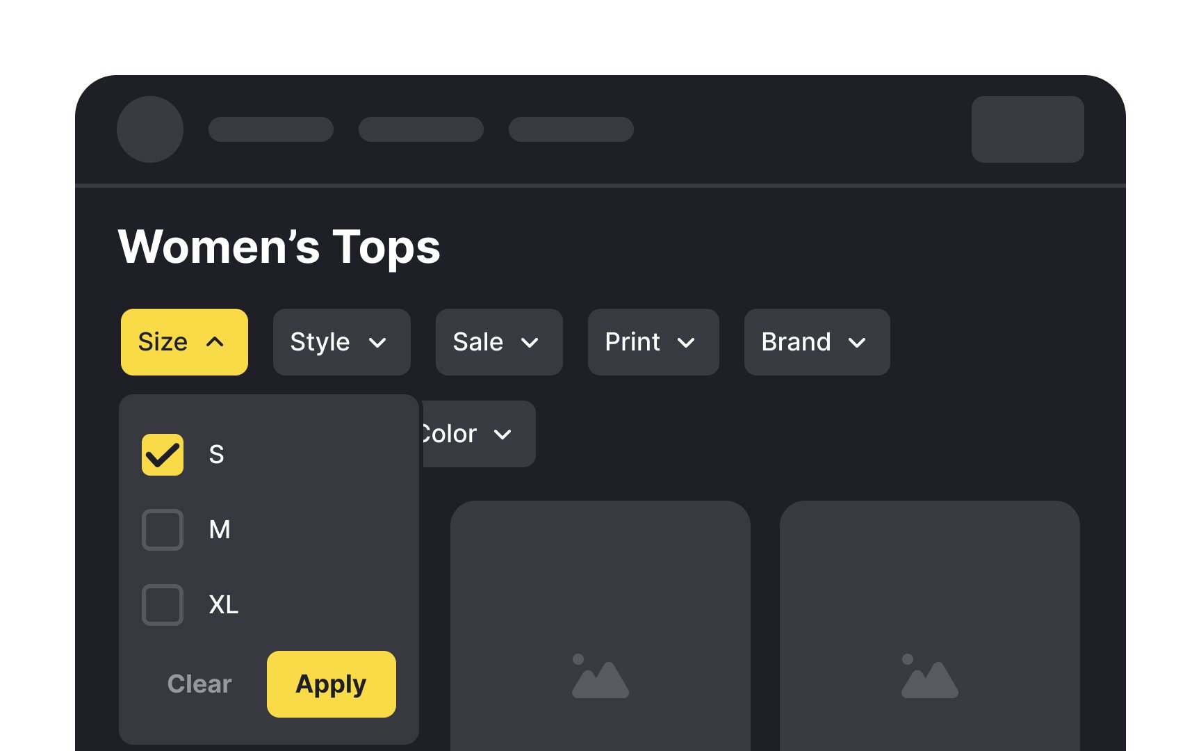
Unlike the sidebar, horizontal panels are more attention-grabbing. However, it's worth noting that horizontal filtering does have a limitation — space. If your website hosts multiple filters, expanding them horizontally may consume a substantial portion of the screen, necessitating users to scroll to view the results.[3]
To mitigate this, prioritize essential filters like price and brand, keeping them visible, while the others can be tucked away. This ensures a balanced approach, offering necessary filtering options without overwhelming the user interface.
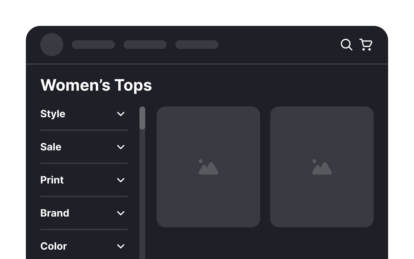
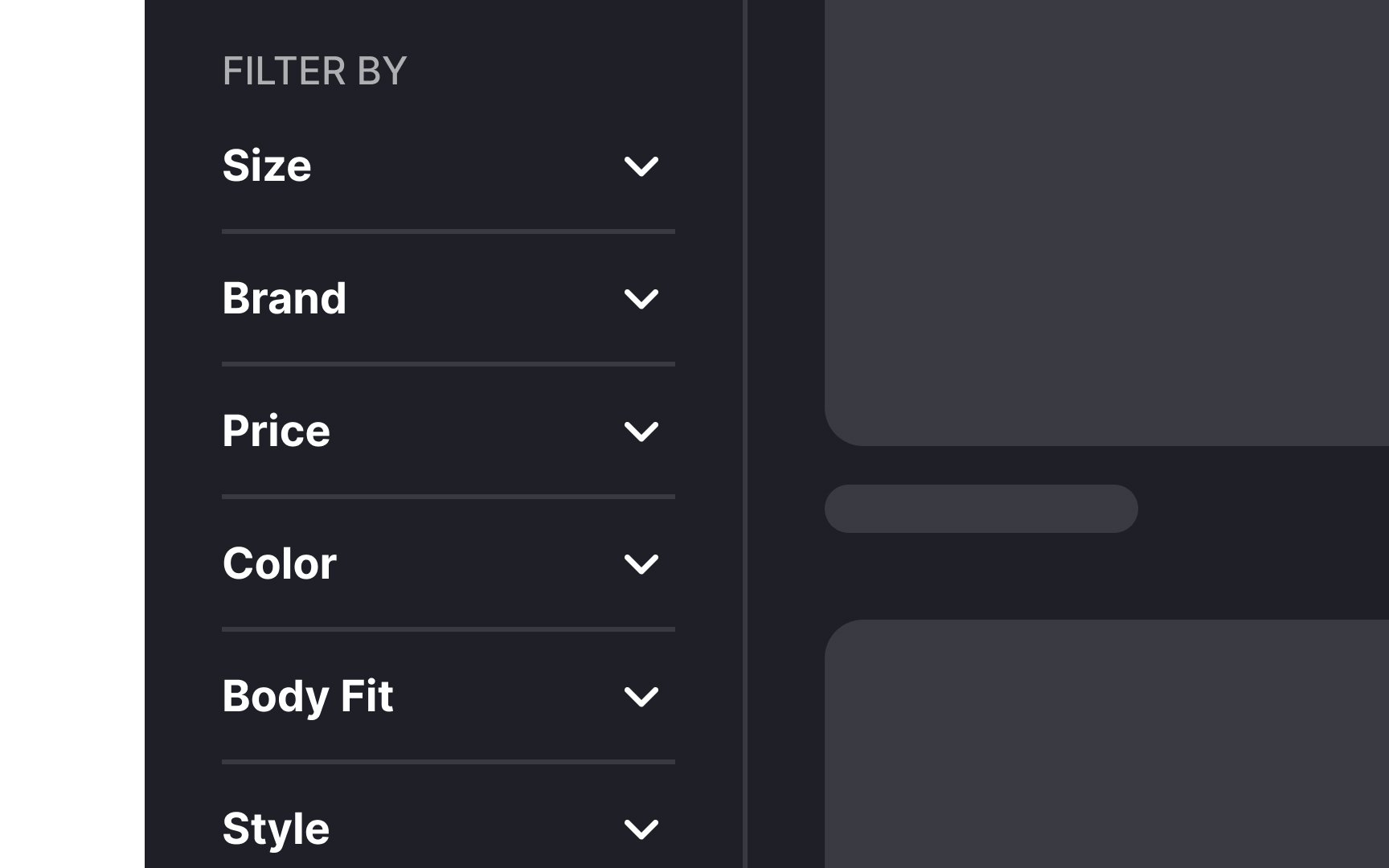
Vertical
However, vertical filter panels take up valuable horizontal space, and research from the Baymard Institute shows that users sometimes overlook them entirely[4]. On the other hand, horizontal panels can leave more space for product cards in a row, but they also tend to push the product grid lower on the
Space efficiency is therefore not measured only by the number of items that fit in a row. It is also about composition, balance, and visibility. The choice of filter panel type should depend on your requirements, the space available, and the number of filter options you need to support.
Showcasing the most popular filter options upfront in
- Regularly review user
interaction data to identify trends and preferences. - Gather direct feedback through user testing or surveys, gaining valuable insights into the filters users find most useful.
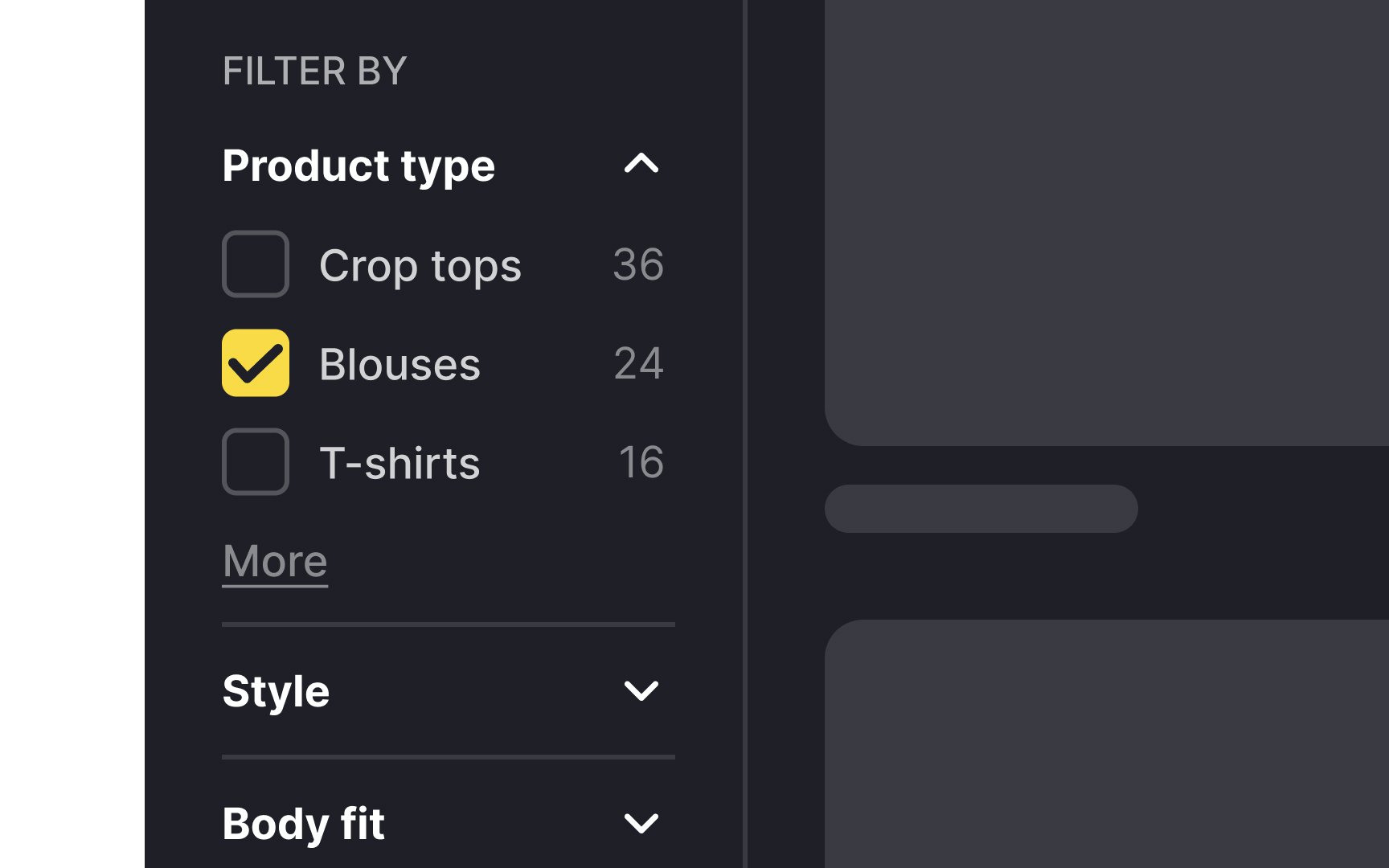
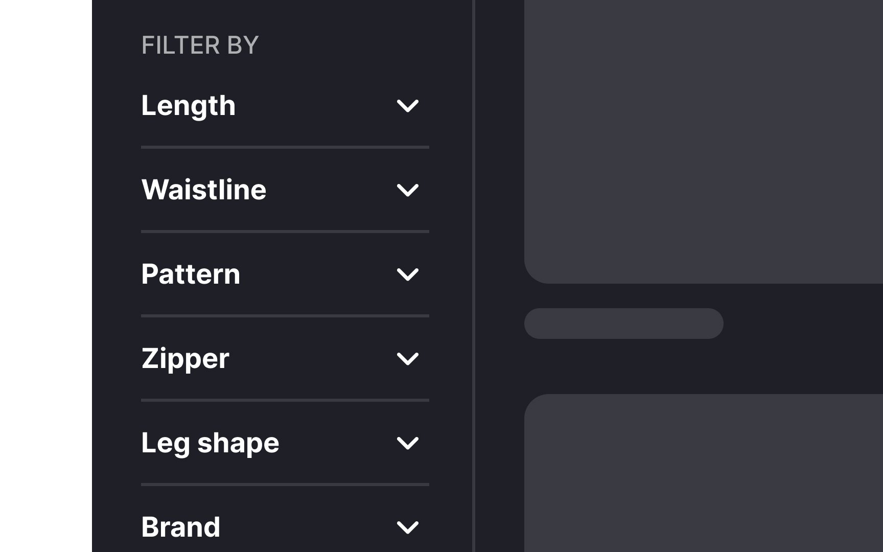
Imagine you're on an e-commerce website looking for a new pair of sneakers. If you're presented with a long, unorganized list of
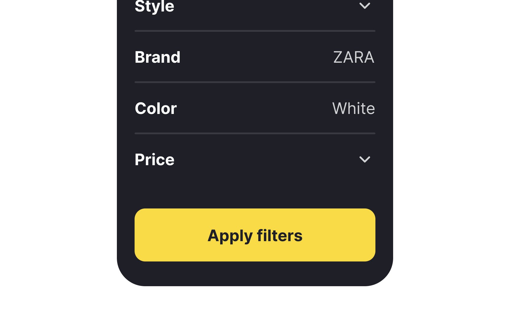
This is where the concept of grouping filters comes into play. Instead of displaying all the filters in a single, overwhelming list, you can organize them based on common features. For example, in the case of sneakers, you might have filters like size, color,
Pro Tip: Use negative space and dividers to create visual separation between groups.
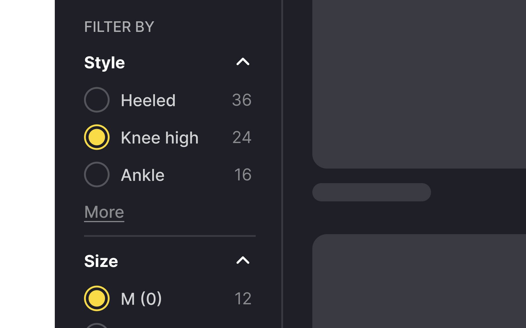
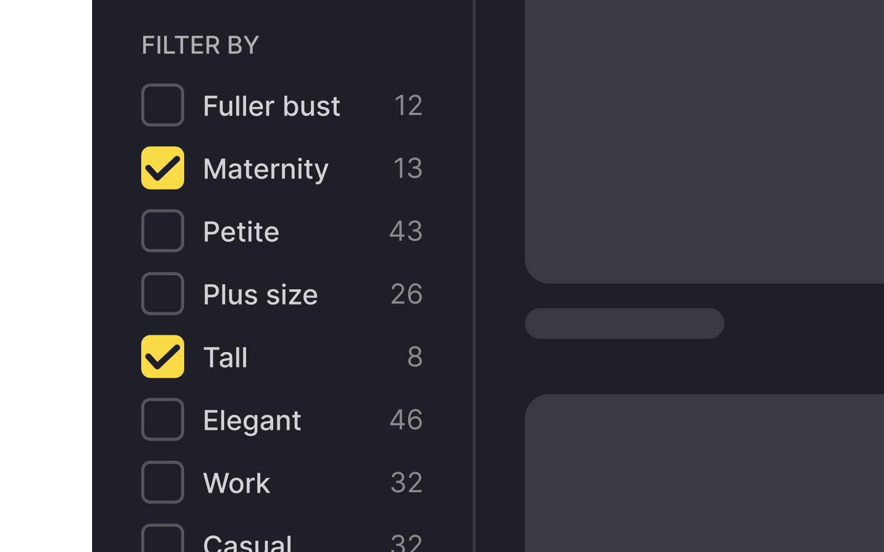
When searching for specific criteria, like vacation lodging for a large group, there's often a need for multiple selections within a single filter category. For instance, you might require multiple beds, pet-friendly, smoking allowed, wifi, air conditioning, breakfast, and nearby dining options.
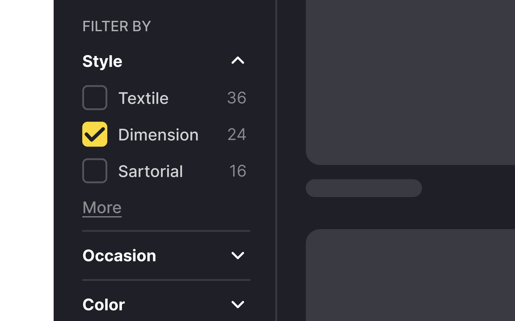
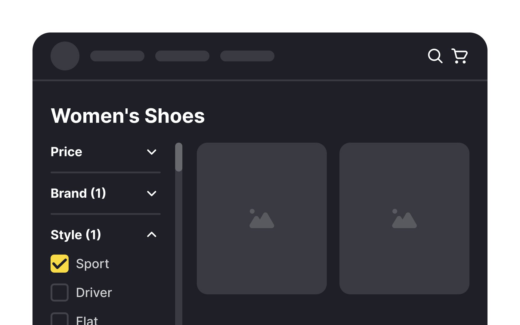
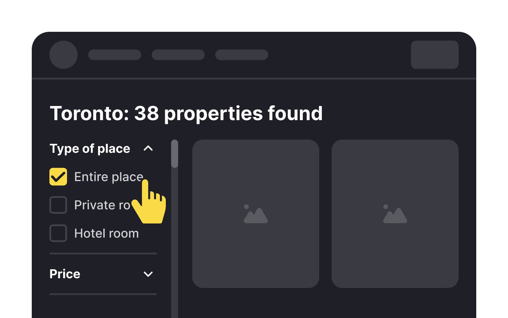
Functionally, radio buttons allow only one selection. Unless the options eliminate each other, checkboxes provide a more flexible
Pro Tip: Use visually standard checkboxes — a small square with a checkmark or an (X) when selected.
Using appropriate terminology for
Engaging with users or conducting
Pro Tip: Look through product reviews or conduct short interviews to learn words your users actually use in conversation about products or categories.
Utilize tags to present applied filters in a clear overview. They summarize the chosen criteria, offering users a quick reference for their selections. This enhances user awareness of their active filters and facilitates easy removal or adjustment, streamlining the browsing experience.
People have diverse ways of processing information. For swift scanning of numerous options, a list view is effective. It allows users to quickly skim through. On the other hand, the
When designing filter panels, try to minimize the
However, auto-updating filters may not be suitable for complex tasks involving extremely large data sets, pagination, or heavy server load. In such cases, an explicit Apply button can prevent performance issues and poor user experience.
References
- Category-Specific Sorting: A New Way to Sort Products | Baymard Institute
- Interaction cost: Definition | Nielsen Norman Group
- Filter UI Design: A Horizontal Toolbar Can Outperform the Traditional Sidebar | Baymard Institute
- Filter UI Design: A Horizontal Toolbar Can Outperform the Traditional Sidebar | Baymard Institute
Top contributors


Topics
From Course

Share


Similar lessons

Best Practices for Designing Login & Signup Flows

Best Practices for User Onboarding Flow Design
