Neumorphic Banking App


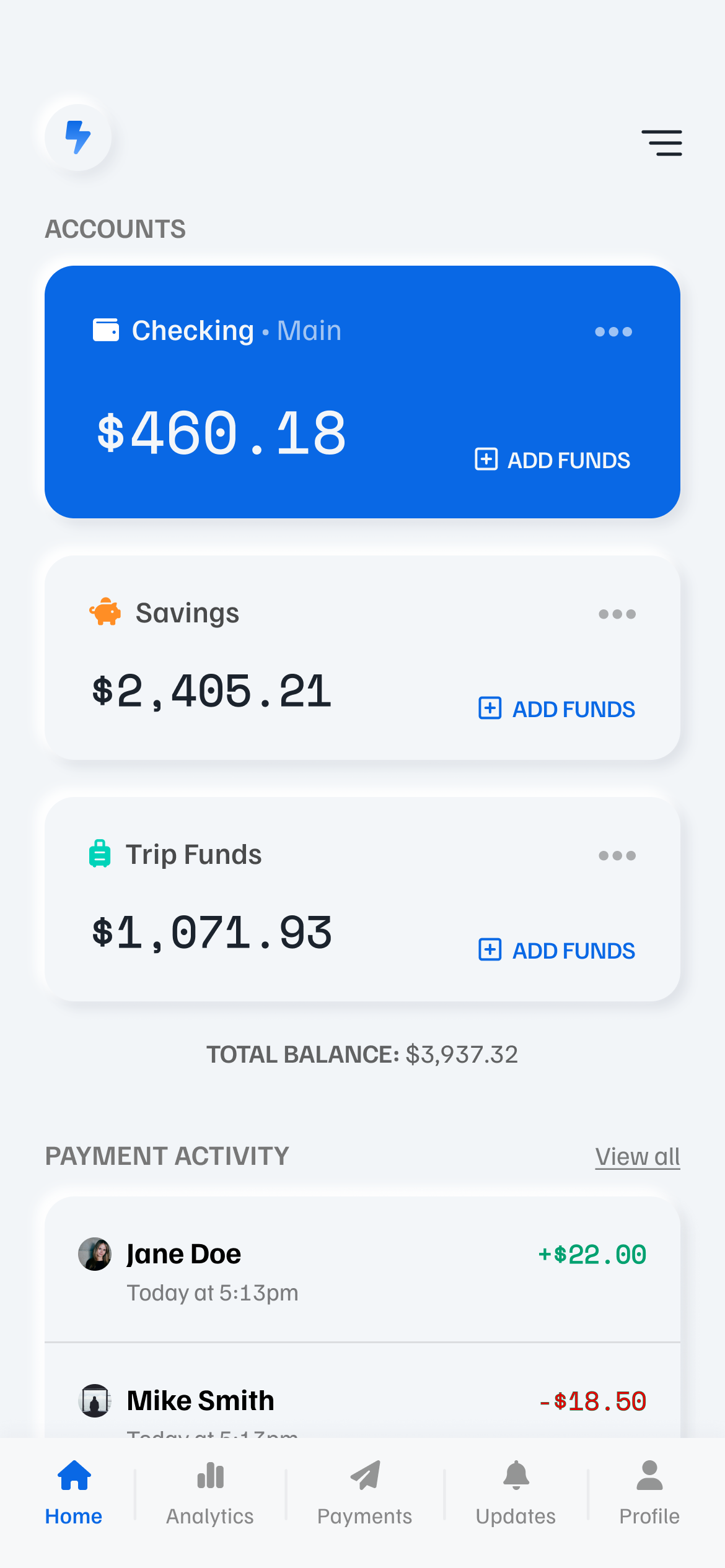
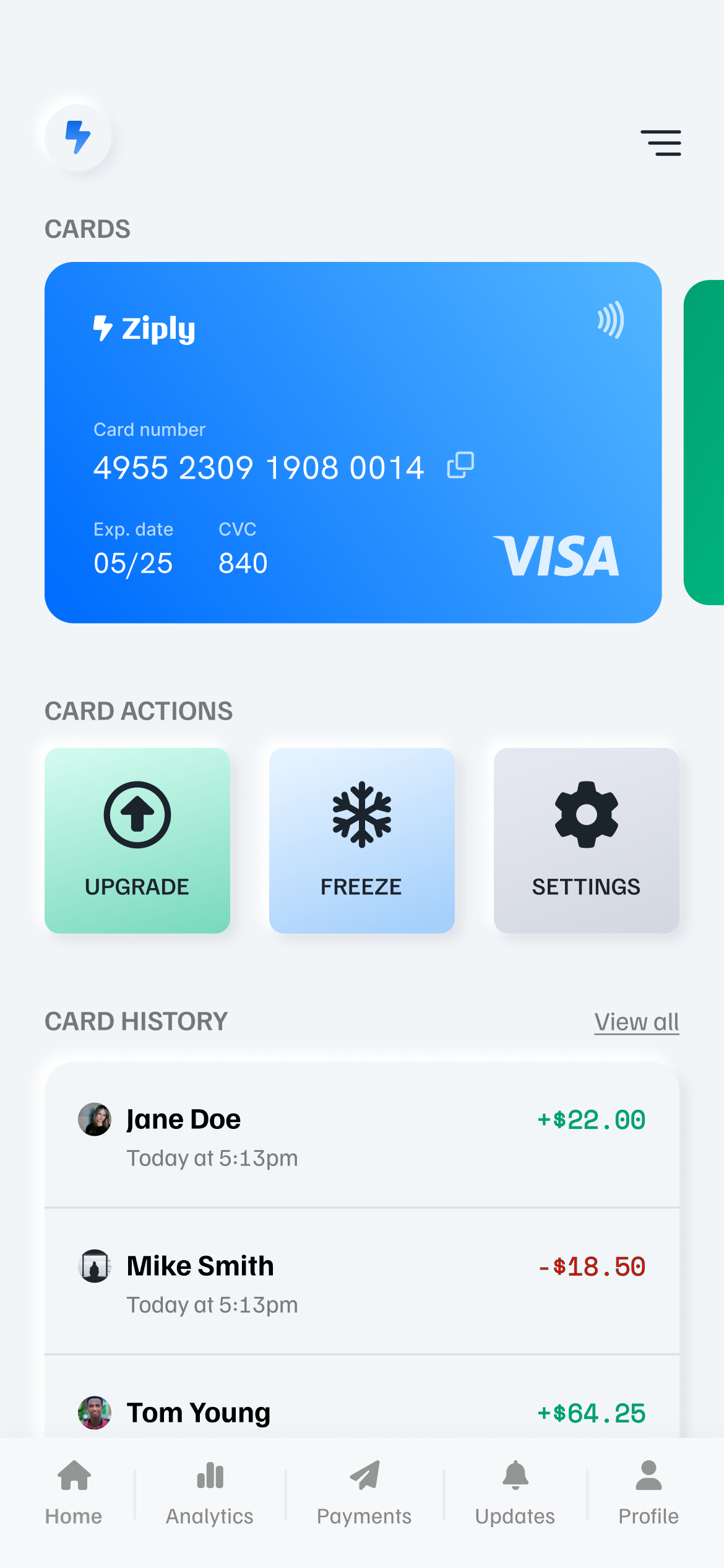
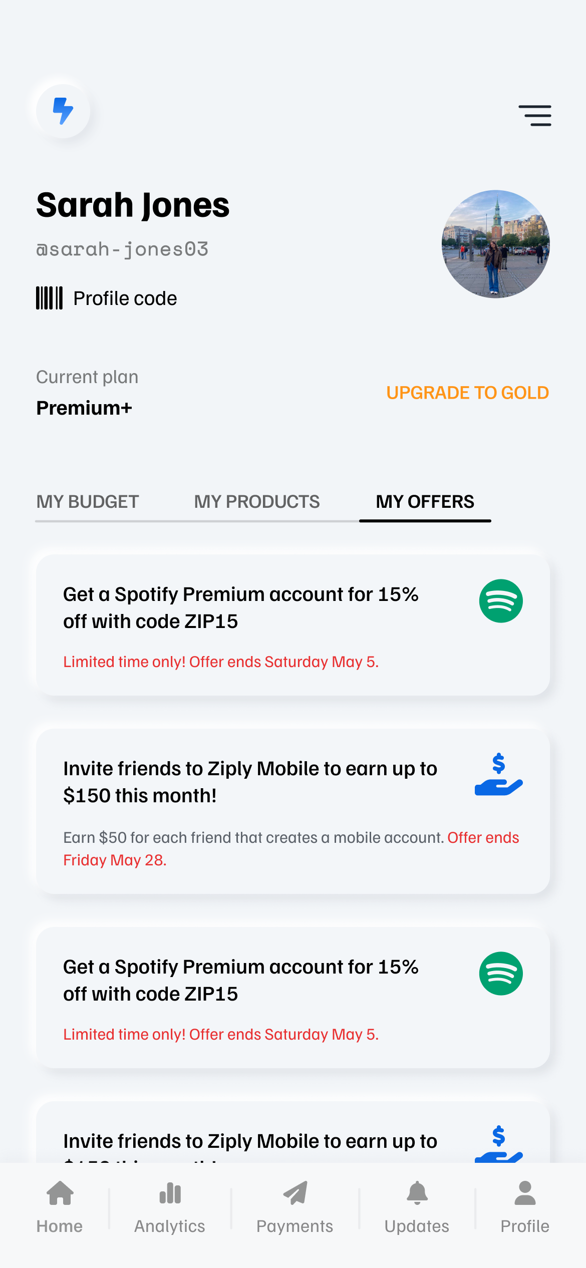
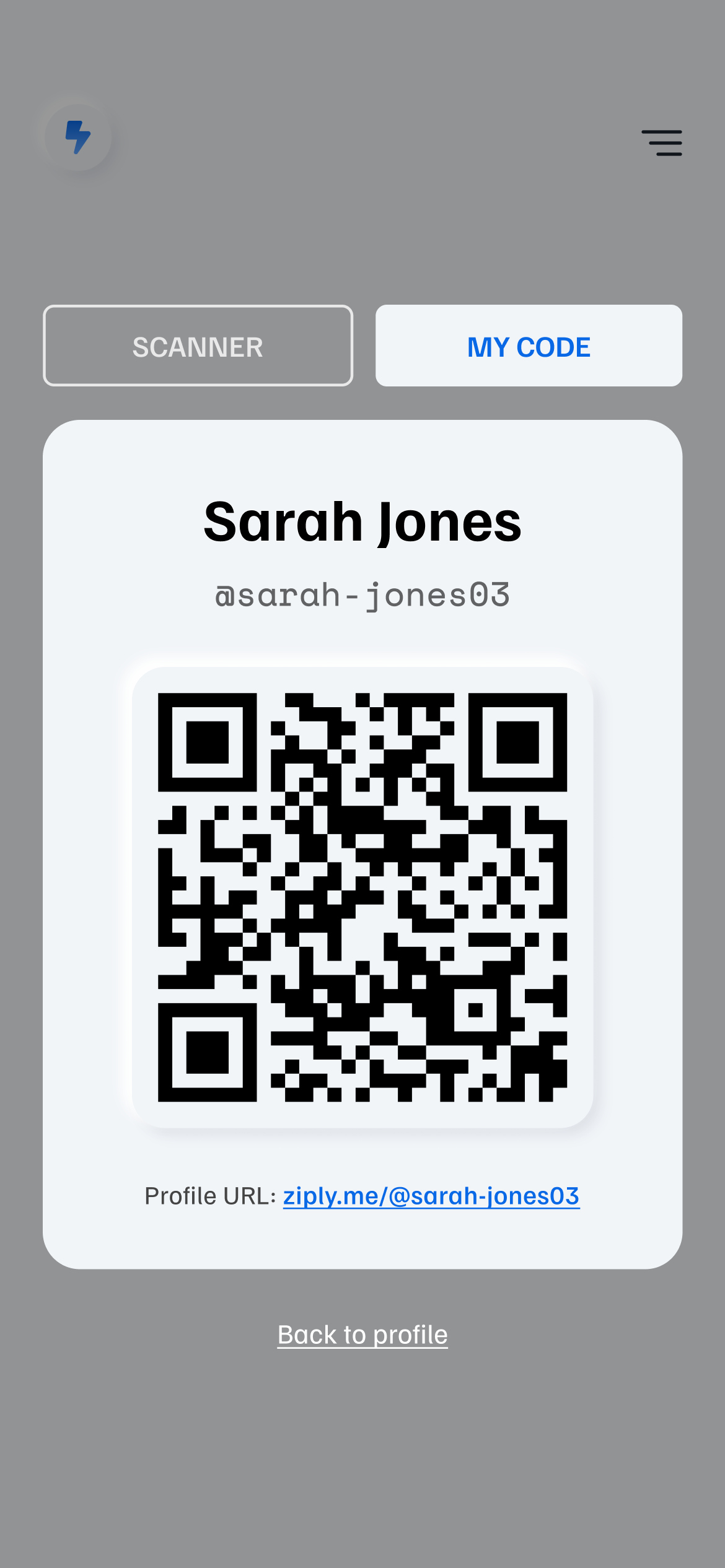
I conceptualized a neumorphic banking app tailored for young professionals called Ziply. I began by researching this target audience, identifying their preference for minimalistic and modern interfaces. I then designed wireframes to map out a seamless user flow, ensuring easy navigation between key features like account overview, transaction history, and card management.
I implemented a mostly muted color palette, saving color for the CTAs and important elements, to which I applied a primary color of Sky Blue or a secondary color of Mint Green. I also created a typography system to enhance the minimalist aesthetic.
The four screens—Profile Code, Dashboard, Account Cards, and Profile Overview—utilize neumorphic elements to create a unique, tactile feel.
Tools used
Topics
Share
Reviews
1 review

Hey Annie,
Awesome job with this project! I love this style of design, so it was a pleasure to review your work.
With skeuomorphism and neumorphism, the execution success often depends on interactions. Being able to view this as a prototype would really help in understanding how the interface behaves—but I know sharing prototypes isn’t always possible.
Here are some points that might help elevate your already great work:
- Typography: There are quite a few different typefaces in use—standardising them will create a more consistent experience and is a great opportunity to reinforce your brand identity.
- Text casing: Consider standardising text casing across the platform for a more cohesive look.
- Bank card design: Providers typically don’t allow full card details to be shown like this—also, for user privacy, consider a "tap to reveal" or hashed-out feature. Love the copy feature, though! Just wondering if relying on user intuition here is safe, might be able to remove the icon to reduce visual complexity and show a tooltip for "copied" confirmation.
- Action slider cards: The contrast between icon and bg colours feels off—are there two colours that would complement each other better? Black feels a bit heavy, love the card colour!
- Card history list items: The feature icon/image and price are sitting too high—centering these vertically would improve balance. Also, the feature image could be larger.
- Accounts section: The "Add Funds" button alignment with the amount seems slightly off.
- My Offers cards (Profile section): Using red on every card reduces its impact—it works best when used sparingly to draw attention.
- Tab navigation bar: It should extend to align with the width of the card below and the content above for better grid alignment.
- Offer cards: The icons would be more effective on the left, as we read left to right—quickly communicating where the offer is from and leaving the right side open for longer offer names.
- Bottom navigation bar: Needs more negative space—referencing default iOS nav bars could help with sizing. Also, some extra space underneath is needed for the home indicator. If spacing is right, the dividers may not be necessary and could reduce visual complexity.
Really great work—pleasure to review!
You might also like

Smartwatch Design for Messenger App


Bridge: UI/UX Rebrand of a Blockchain SCM Product


Pulse Music App - Light/Dark Mode


Monetization Strategy


Designing A Better Co-Working Experience Through CJM


Design a Settings Page for Mobile
Popular Courses

Introduction to Figma


Design Terminology


Core UI Components
