Auction

1. Clear visual hierarchy
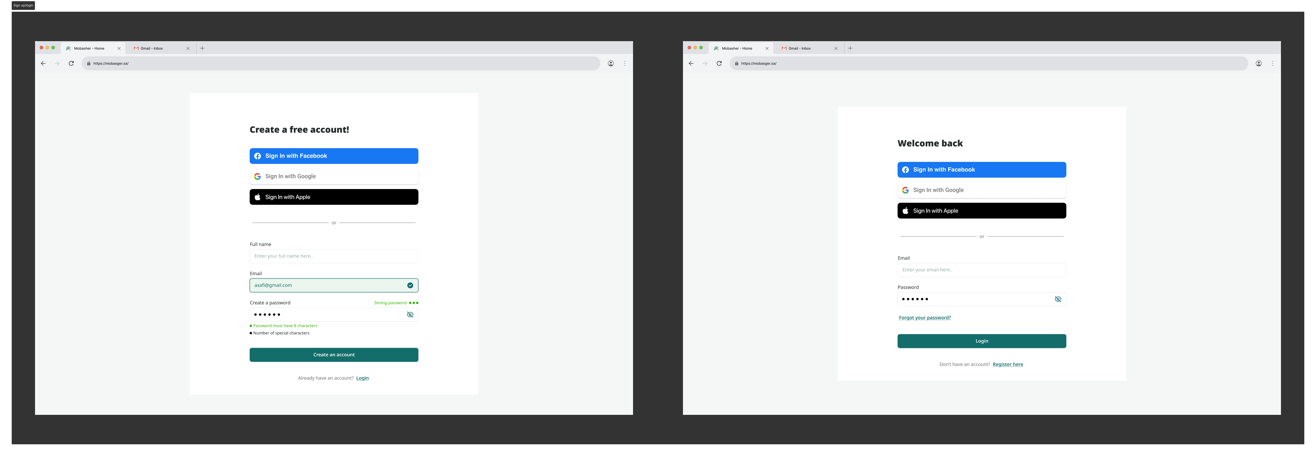
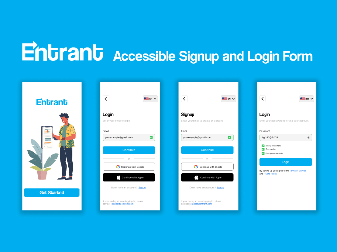
Signup Screen: “Create a free account!”
Login Screen: “Welcome back”
- Using clear H1 titles instantly orients the user on what task they’re completing.
- Helpful for:
- Cognitive accessibility
- Screen readers (logical heading structure)
- Reducing confusion for new users
2. Social login buttons placed first
Why this matters:
- Most users prefer one-click login → less cognitive load and avoids typing.
- Buttons use official brand colors (Facebook blue, Google white, Apple black).
- High contrast → great for low-vision users
- Large tap targets → WCAG 44×44 requirement
3. Divider “OR” with a horizontal rule
- A simple separator helps distinguish between quick login and email login.
- For accessibility:
- Clean visual separation
- Screen readers can interpret it as a logical structure break
4. Form fields with labels above (not placeholders only)
Both screens use:
✔ Visible labels
✔ Hint text
✔ Icons for email/visibility
This improves:
- Accessibility: Screen readers can interpret form fields accurately.
- Usability: Placeholders disappear, but labels always remain visible.
- Error prevention: Users don’t forget what the field was.
5. Password field behaviors
Signup:
- Shows password strength meter
- Shows checklist of password rules
- Green indicators = “Success”
- Eye icon toggles visibility
Login:
- Eye icon for visibility
- “Forgot password” link provided
Accessibility impact:
- Color + text (not color alone) → WCAG compliant
- Visibility toggle helps users with cognitive or visual issues
- Real-time feedback reduces repeated failed attempts
6. Button design (Contrast + Size)
Primary action buttons:
- Signup: “Create an account”
- Login: “Login”
- Color: your brand #136d6b → good medium-dark tone
- Width: full width → easy tap on mobile
- Height: accessible (≥44px)
Accessibility benefits:
- High contrast ratio between text and button
- Clear primary action (no ambiguity)
- Large touch area reduces fatigue
7. Secondary navigation text
Signup → “Already have an account? Login”
Login → “Don’t have an account? Register here”
These:
- Improve orientation
- Work for keyboard-only users
- Help new users understand whether they are in the wrong screen
8. Clean white space + centered layout
Why this works:
- Minimal distractions
- Reduces cognitive load
- Focus is only on essential tasks
- Works well for low-literacy or non-tech-savvy users (very common in KSA/Jordan region)
9. Inline validation for signup
Signup screen displays:
- Green border for email
- Success icon
- Password rule indicators
This helps:
- Users with anxiety around errors
- Preventing full-page reloads
- Users with language challenges who rely on visual cues instead of text
10. Keyboard + Screen Reader Accessibility
These screens are structured so that:
- Tab order is logical:
- Page title
- Social logins
- Divider
- Fields
- Button
- Secondary link
- Inputs have clear focus states (must be visible for WCAG)
- Icons have clear aria labels (email icon, password visibility)

Reviews
1 review

Hi Alaa, great job on the hierarchy and the visuals. Very neat UI.
Some thoughts on the UX copy: for the "Create account" screen, it would make more sense to write "Create account with Facebook / Google / Apple", rather than "Sign in with X", as you have it now. I keep seeing this in real apps now and again, and the copy is really misleading because the user doesn't have an account yet, which is why they are trying to create one.
You might also like
Accessible Signup Form

Entrant - Analytical Dashboard

Transit Cairo — Digital Mobility Redefined

Babylon Balance - Designing Financial Clarity Through Constraint

Entrant Accessible Signup and Login Forms
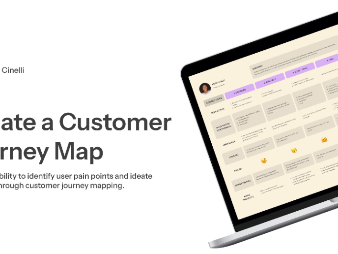
CJM x Mindspace case study - Ester Cinelli

Visual Design Courses

UX Design Foundations


Introduction to Figma

Design Terminology
