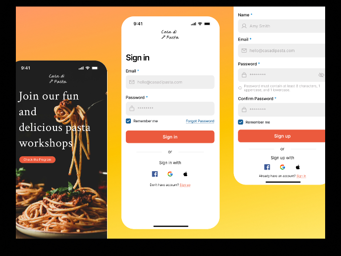
Cosmet+-beauty appointments website


The sign-up page has been designed with accessibility and usability at its core, adhering to WCAG guidelines to ensure inclusivity and a seamless user experience. Key features include:
- High Contrast for Readability: All text and interactive elements maintain a minimum contrast ratio of 4.53:1 to ensure visibility for users with visual impairments.
- Accessible Touch Targets: Buttons and interactive elements are appropriately sized to meet touch target standards, enabling ease of use on both desktop and mobile devices.
- Clear Form Alignment: The form fields are aligned in a single column, optimizing readability and reducing cognitive load.
- Error and Text Field States: Fields include clear visual feedback for errors, ensuring users can easily identify and resolve input issues.
- Password Best Practices: A toggleable visibility feature (open/closed eye) is provided for password entry, along with real-time feedback when the password criteria are not met.
- Concise and Intuitive Wording: The language used is simple, clear, and action-oriented to guide users effortlessly through the sign-up process
Thank you for reviewing!
Tools used
From brief

Topics
Share
Reviews
1 review

Hi Lorena, first off, fantastic job on your design, write-up, and prototype—bonus points for going high fidelity! It’s clear you put a lot of effort into presenting the work in a digestible and professional way, which is awesome. I’d love to help you elevate this even further.
Here are a few points to consider:
- Title & Subtitle Differentiation: Adding more contrast between the title and subtitle text (e.g., through color or weight) could improve readability and create better visual hierarchy. While this might be a personal preference, it can make the text easier on the eyes.
- Field Spacing: The vertical spacing between fields feels slightly too large. Reducing it could help improve the visual flow and make scanning more efficient for users.
- Placeholder Text: While optional, placeholder text can guide users effectively and add a touch of polish to the design.
- Password Icon & Logic: The vertical alignment of the "show/hide password" icon feels a bit off—it could be raised slightly. Additionally, the "show" icon seems a bit hard to see. For clarity, an open eye icon when the password is hidden (to indicate the option to show) and a closed eye when the password is visible (to hide it) is a more logical approach.
- ToS Fine Print: The Terms of Service fine print looks slightly small. Even though 14px may be standard, increasing it a bit to improve proportion and readability relative to other elements would be beneficial.
- Sign-In Buttons: Ensure your "Sign in with Google/Apple" buttons follow their respective branding guidelines. Official media kits are easily accessible online, and adhering to them can prevent issues during app store reviews.
- Password Requirements: Displaying password requirements before users attempt to sign up is definitely crucial before clicking signup. This prevents frustration and reduces inefficiencies in the user experience.
- Feature Image Size: When viewing the prototype on a 14-inch MacBook (responsive, fit-width), the image touches the bottom of the page and cuts off slightly. Adjusting the layout to account for browser bars and ensuring the image doesn’t extend beyond the viewport would enhance the experience.
Overall, you’ve done an amazing job, and these refinements can help push your design even further. I hope this feedback is helpful—great work!
3 Claps
Average 3.0 by 1 person
You might also like
Project
Mobile Onboarding: Casa di Pasta

🍝 Project Overview: Casa di PastaThis project is a mobile registration and login flow for a pasta workshop app. My goal was to create a fri
Project
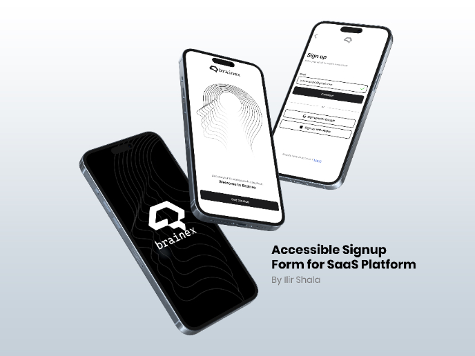
Accessible Signup & Login Experience — Brainex

Accessible Signup & Login Experience — Brainex Brainex is a modern and accessible authentication experience designed for a SaaS platform. T
Project
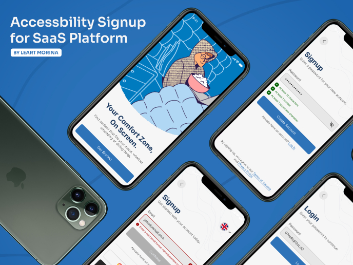
Accessible Signup Form

This project is an app which helps users to consume content based on their mood and it explores the design of an accessible, inclusive signu
Project
Auction

1. Clear visual hierarchySignup Screen: “Create a free account!”Login Screen: “Welcome back”Using clear H1 titles instantly orients the user
Project
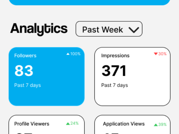
Entrant - Analytical Dashboard

Entrant is a job-seeking platform built specifically for students and fresh graduates, helping them connect with internship and entry-level
Project
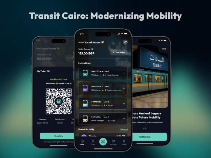
Transit Cairo — Digital Mobility Redefined

Transit Cairo is a mobile-first digital ticketing experience designed to reduce congestion and improve daily commuting across Cairo’s metro
Visual Design Courses

Course
UX Design Foundations

Learn the essentials of UX design to build a strong foundation in core principles. Gain practical skills to support product development and create better user experiences.

Course
Introduction to Figma
Learn essential Figma tools like layers, styling, typography, and images. Master the basics to create clean, user-friendly designs

Course
Design Terminology

Learn UX terminology and key UX/UI terms that boost collaboration between designers, developers, and stakeholders for smoother, clearer communication.