Color System for Monday.com


In this project, I did a hypothetical color redesign of the monday.com mobile app to make it more visually appealing and user-friendly.
My goal was to create a unique look that stands out from other apps and helps reduce user anxiety. I followed a clear process of research, choosing colors, testing their usability, and applying them to the app. Here’s a step-by-step look at how I approached the redesign.
1. Research and Project Selection
Context: I conducted a quick research on work management softwares, analyzing their visual identities and screens. I chose monday.com due to its relatively generic color palette and its similarity to Trello’s blue, identifying an opportunity for innovation.
2. Color Definition
Objective: I looked for a primary color that would neutralize the anxiety associated with work management softwares while creating a visually appealing and non-intrusive palette.
Process: After defining the primary color, I developed the color palette, ensuring the colors were not dull but still attracted attention in a balanced way.
3. Usability and Compliance Testing
Process: I conducted extensive usability and contrast tests to ensure all colors met WCAG standards.
Decision: The neutral colors were designed to be applicable in a dark mode as well, but I opted to create only a light mode due to accessibility guidelines.
4. Color Application
Implementation: I applied the colors to the example screen, maintaining the app’s clean look. I demonstrated the application of the primary colors and provided an example of how system messages would appear.
5. Project Presentation
Consistency: I completed the design phase and created the presentation using the selected colors, ensuring visual consistency and reinforcing the product's identity.

Reviews
1 review

Hi Beatriz!
I think the colour palette is beautiful and the Lime colour feels energising and fresh. I feel a bit confused why some colours presented with the boarders and some are not. Would be also interesting to see, how these colours work for dark and light mode, maybe there is a way to show them in the presentation. More examples using more of the presented colours would add better sell point.
You also mentioned, that you have tested colours during the usability testing and on the accessibility. However, on the last example the purple link looks not really contrasting on the light-green background.
Great work!
/Yuliia
You might also like

Entrant - Analytical Dashboard


Transit Cairo — Digital Mobility Redefined


Entrant Accessible Signup and Login Forms

CJM x Mindspace case study - Ester Cinelli

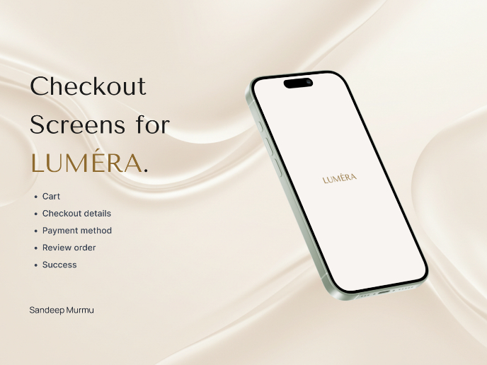
LUMÉRA - Checkout Flow

A/B Testing for Bumble's Onboarding Process

Visual Design Courses

UX Design Foundations


Introduction to Figma

Design Terminology
