A/B Testing for Bumble's Onboarding Process

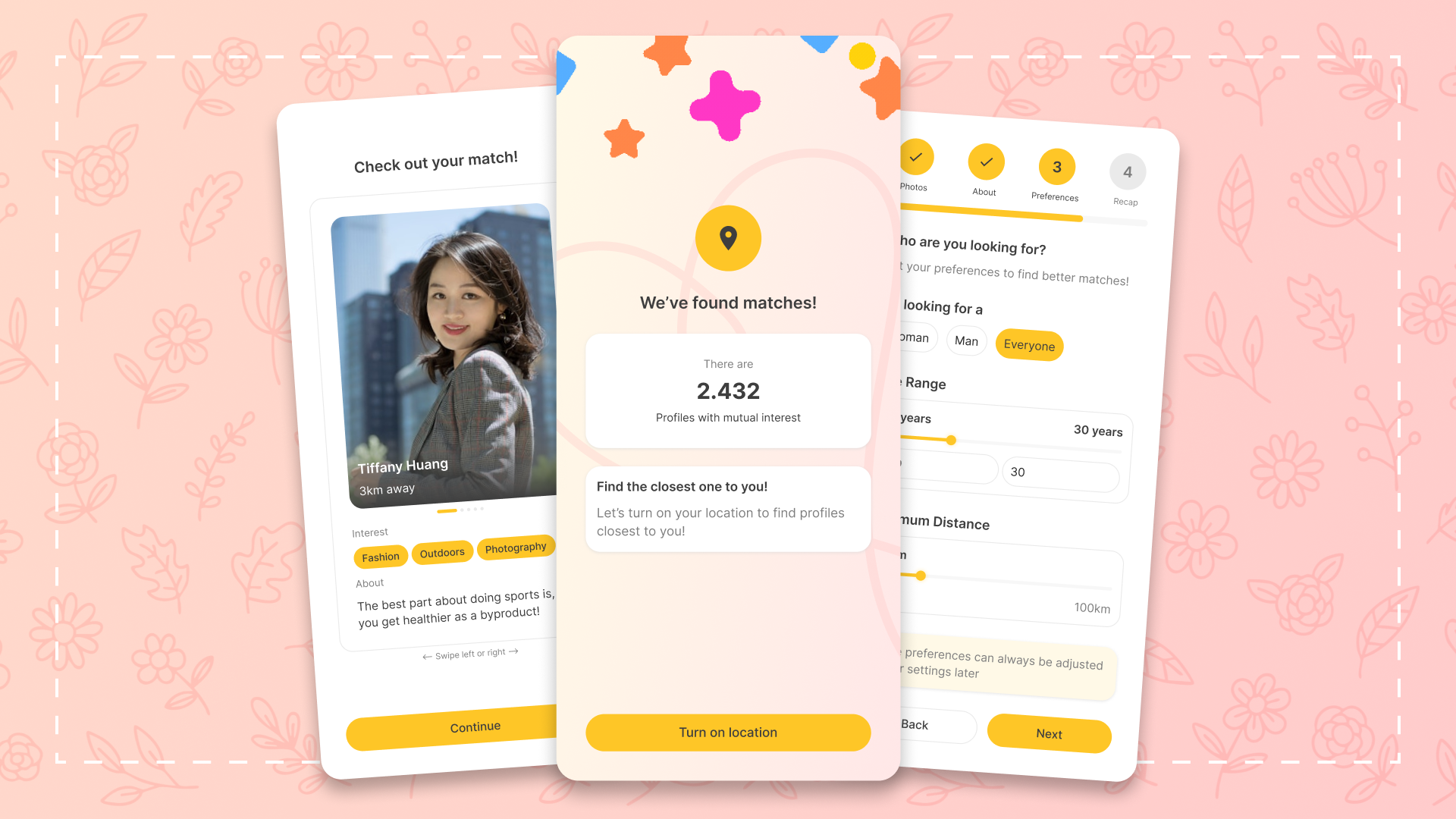
This hypothesis project is made with the purpose of improving Bumble's onboarding process with gamification, early reward system, and interesting designs. The treatment (Variation B) carries the spirit of what a dating app is supposed to be, vibrant, energetic, and fun. Additionally, the treatment hopes to increase the profile creation rate by 20% for developer's side, and to bring fun to the profile creation process for user's side.
Tools used
From brief

Topics
Share
Reviews
5 reviews

This project was relatively recent. I remember it.

Hi Darth!
What I like here is that you approached onboarding from a hypothesis-driven mindset rather than jumping straight into visuals. Framing it as an A/B test shows product thinking you’re not just redesigning, you’re validating assumptions. That’s a strong instinct.
It also feels grounded in behavior. Onboarding for an app like Bumble is highly sensitive small friction points can impact activation and retention significantly. Thinking about variations and measuring impact shows you understand that UX decisions should connect to metrics, not just aesthetics.
If I were to guide you further, I’d encourage you to articulate the expected behavioral shift more clearly what exact user action improves, and why? Making that cause-and-effect sharper would elevate this from a good exercise to a compelling product case study. Overall, this demonstrates analytical maturity.
Overall the A/B test plan for onboarding Bumble is well-structured taking into detail consideration of the success metrics.
And here are some of my considerations:m
- It would improve the plan readability if onboarding screens of variation A could be presented as well.
- It would be interesting to share your insights on the target of 90% profile completion rate for Variation B.
- In the new design, it might be more motivative for new users if they could decide which step/what data to take for completing their profile. That said, the current design looks like pushing users to give all the data the App requests, otherwise they could not complete the profile.
All in all, a great job.

Good job overall! I like how clearly the goals, hypothesis, and test plan are structured.
The segmentation and guard-rail mindset show strong product thinking, and the flow logic in Variation B feels well thought through.
One thing I’d be curious to challenge is the hypothesis around the 90% completion rate, it feels quite ambitious for a dating onboarding. It might be interesting to clarify the baseline and expected uplift to make the success criteria more grounded.
Also, you might consider describing Variation A more neutrally, as a baseline flow, to keep the A/B framing unbiased.
Overall, the solid case has clear thinking behind the decisions.

Hey Jack.
I really like the redesign you did. It’s great how you clearly set expectations upfront by showing users what will be filled in, and how you continuously motivate them to complete each section.
One thing I’m curious about is the CTA behavior. Since the “Next” button is always active, does that mean users can skip each step even if it hasn’t been completed? If that’s the case, did you think about how users are motivated at that moment? Are there any minimum validations in place, for example requiring at least one image, or is everything optional? I’d love to understand the thinking behind that decision.
Looking forward to seeing the results. Great work overall.
You might also like

Smartwatch Design for Messenger App


Bridge: UI/UX Rebrand of a Blockchain SCM Product


Pulse Music App - Light/Dark Mode


Monetization Strategy


Designing A Better Co-Working Experience Through CJM


Design a Settings Page for Mobile
User Research Courses

Ethical & Responsible Product Design


Product Management Foundations


The Product Development Lifecycle & Methodologies
