Intro to UI Buttons
Discover the different types of UI buttons and their use cases
Buttons are one of the most important and ubiquitous interactive elements in any user interface. They can come in various shapes and sizes and are used for forms, calls to action, sign-up forms, log-in links, and elsewhere on a website or app.
There are 3 main categories of buttons based on how users are expected to interact with them: primary, secondary, and tertiary. Visual hierarchy defines different application use cases, and designers should have a solid understanding of when to use these variations.
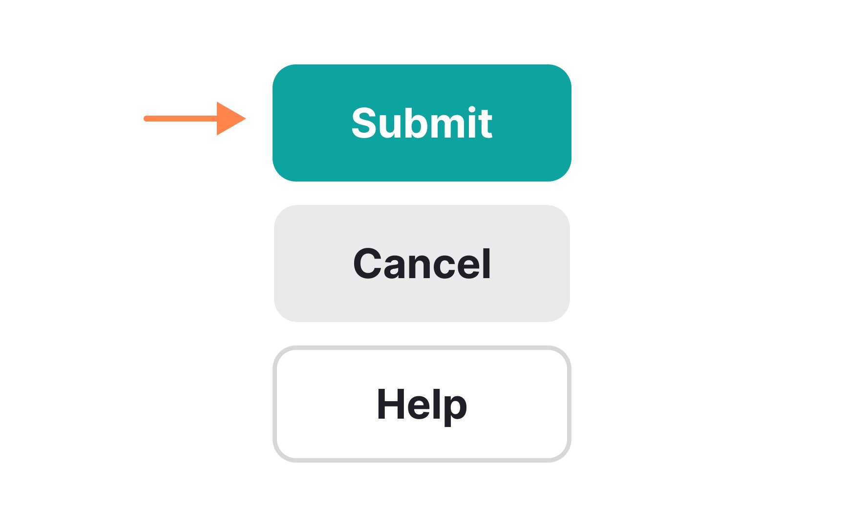
Primary
When styling primary buttons, use more saturated colors to make them eye-catching. Using a color that contrasts with the rest of the interface is especially useful when it comes to call-to-action buttons.
Pro Tip: Avoid having too many primary buttons per page to prevent overloading and confusing users.
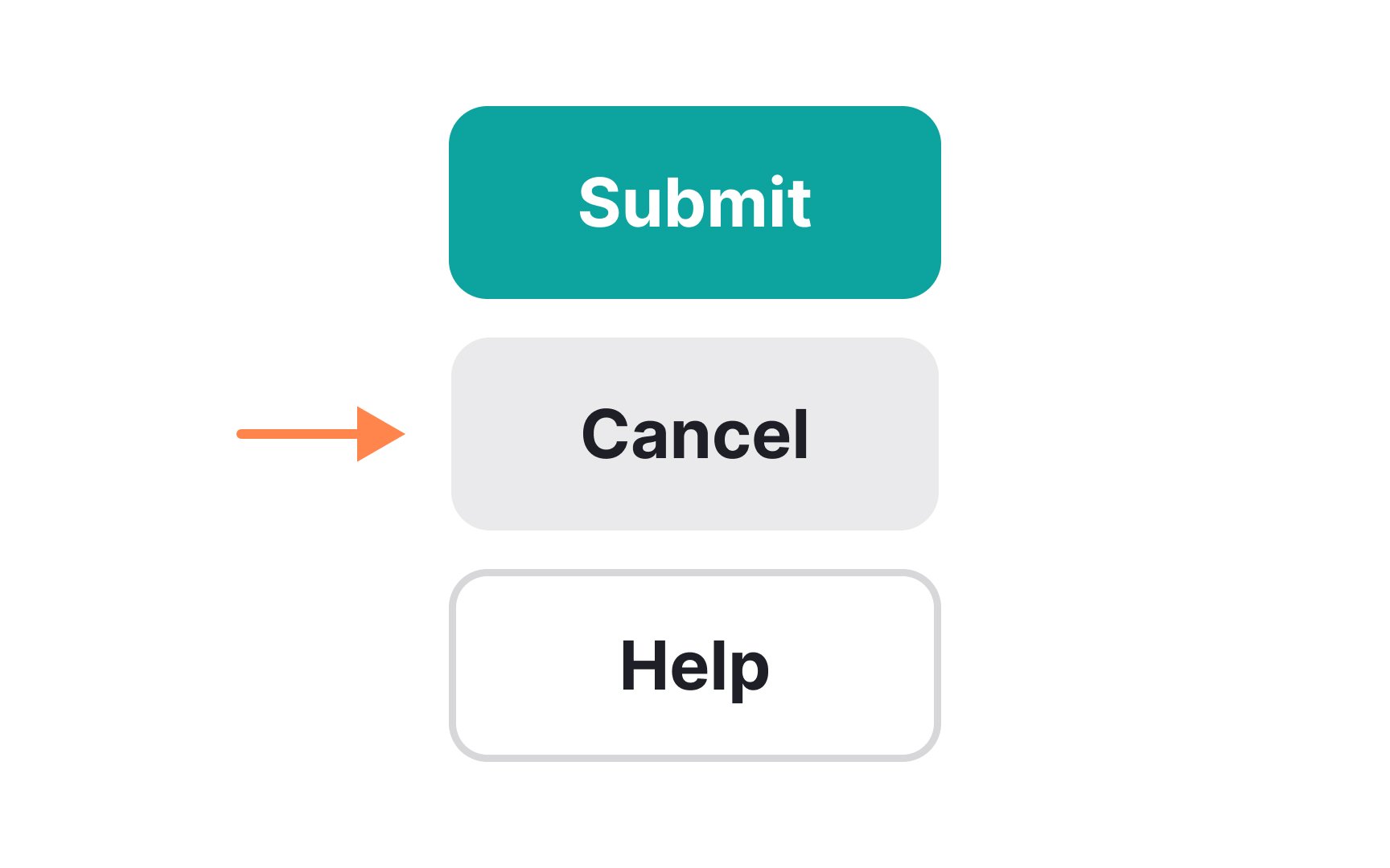
Secondary
Ghost buttons are one way to style secondary actions. They use an outline with no fill, which keeps them soft and easy to separate from primary buttons. Ensure enough contrast, since ghost buttons can be hard to see if the outline is too weak.
When you use secondary buttons, make sure each state — enabled, disabled, hover, and focus — stays clear.
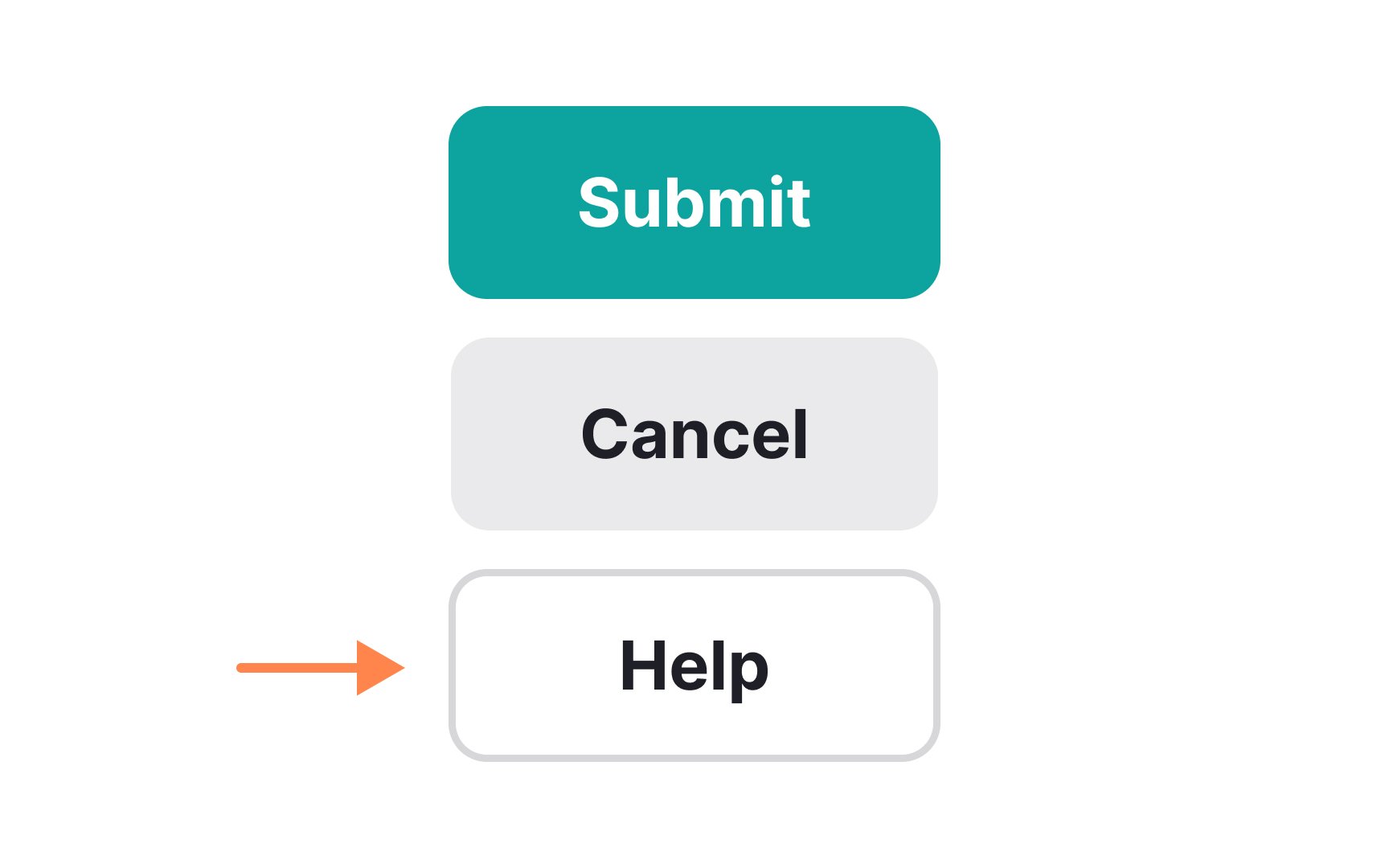
Tertiary
Icon
From the accessibility side, icon-only buttons aren't meaningful enough for users of assistive technologies. There are several ways to make such buttons more accessible. For example, you can accompany the icon with text or define the button's name in the <button> element.
In
You don’t want to use a text-only button as a

Outlined
If you want a button with a little more visual weight, consider a raised button. Raised
In
Since they lack the characteristic look and feel of raised buttons, there is a risk that they will be missed by users. Be sure to make them look distinguishable from other interface elements so that users will not be confused.
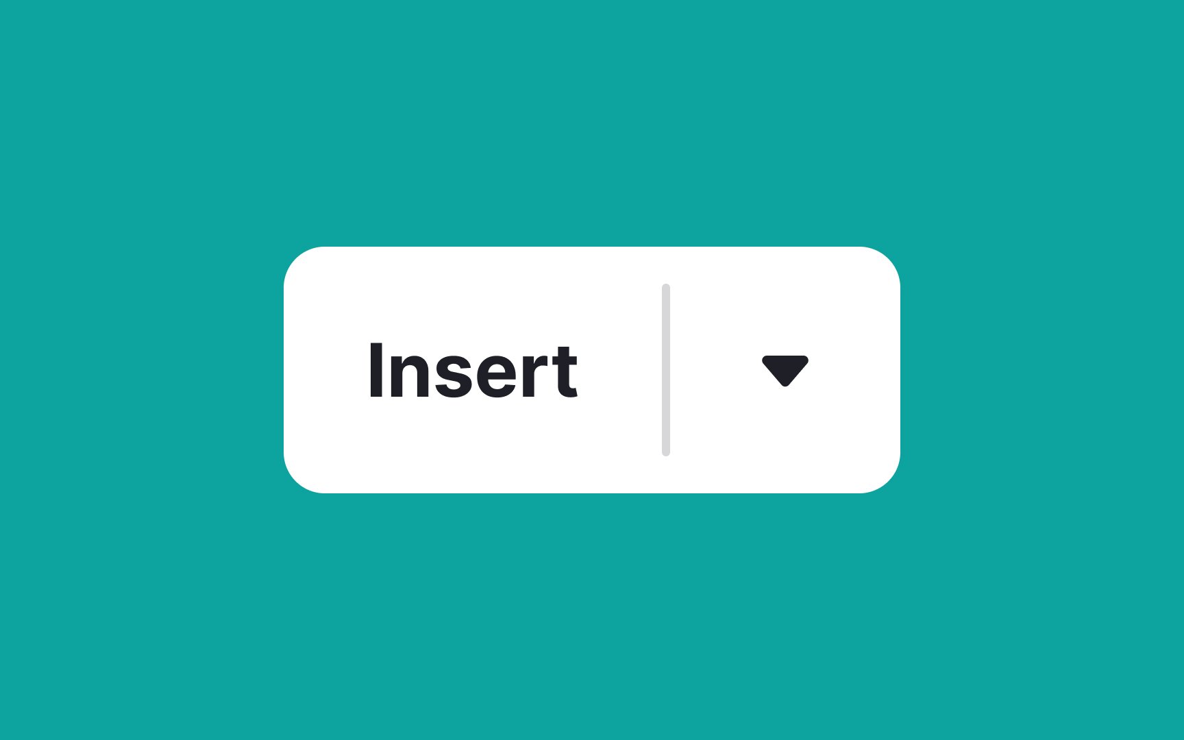
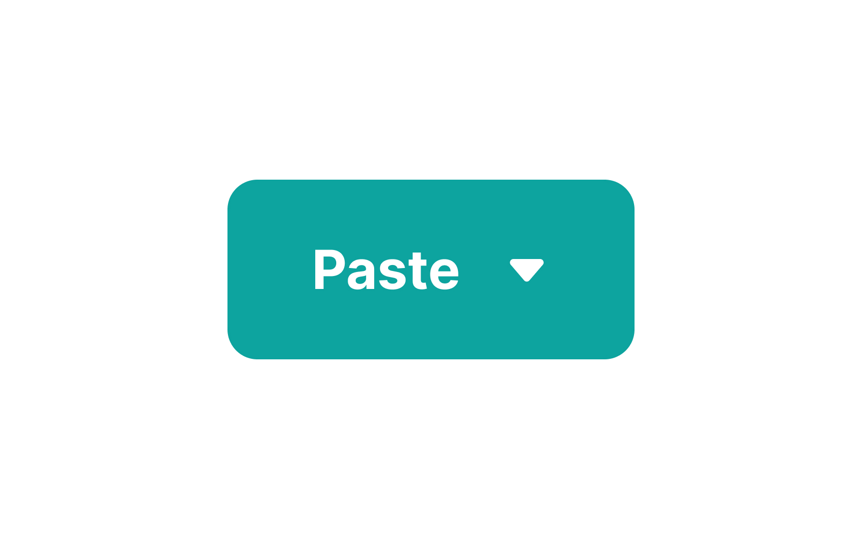
A split button is a variation of a menu button. However, it does more than just its primary action.[3] Split
The only thing differentiating split buttons from regular menu buttons is some kind of visual separator between the button's primary function and the dropdown function. It prevents users from assuming the entire button will expose the dropdown.
Pro Tip: Limit the number of choices to prevent choice paralysis. Keep it within 10-12 options for desktop and even fewer for mobile.
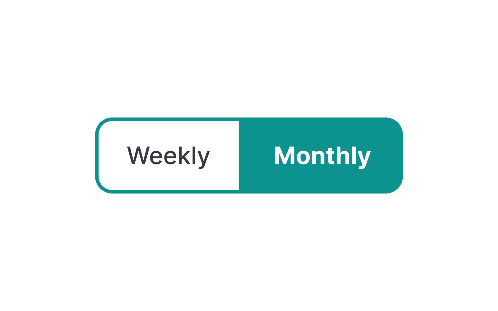
If you want to group multiple functions (usually 2 or 3) into a single button while keeping all of them visible, toggle
Pro Tip: Make sure to clearly convey which option is selected using colors or overlays.
If you need to group similar actions of equal importance, but don’t want to show them side by side with a toggle button, consider using a
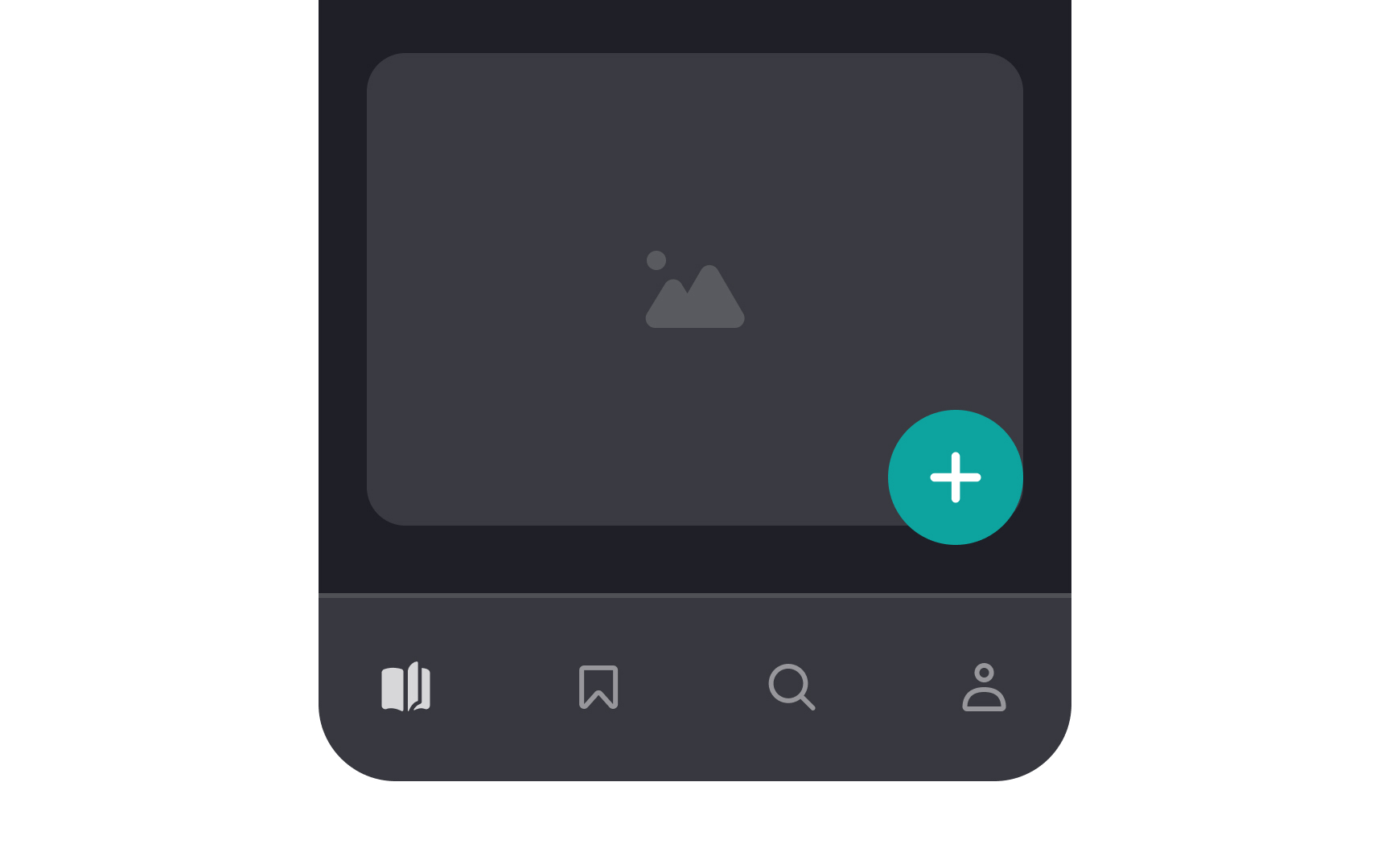
Floating action
You should use only one FAB per page for constructive primary actions like creating, adding, or sharing.
References
- Material Design | Material Design
- Split Buttons: Definition | Nielsen Norman Group
- Material Design | Material Design
- Material Design | Material Design
Top contributors


Topics
From Course

Share


Similar lessons

Anatomy of UI Components

Atomic Design by Brad Frost
