Quantitative UX Research Methods
Discover the power of quantitative UX research methods and uncover actionable data-driven insights to optimize user experiences effectively
Quantitative user research methods collect numerical data about your product's user experience. Some designers find quantitative methods intimidating as they require a larger sample size and more effort to organize. As a result, they lean toward qualitative methodologies and view them as more effective, specific, and insightful.
This approach is misleading, and you might miss out on a lot of valuable information. To avoid this:
- Be more persuasive when presenting data to stakeholders by converting real numbers into graphs and charts
- Compare your product to competitors or your previous product versions
- Validate ideas, company goals, and UX improvements by relying on rock-solid evidence, i.e., changes in key performance indicators
Your quantitative research method choice should be based on your needs and available resources. These methods can be adjusted to your specific circumstances and even provide qualitative data.
A/B testing is a quantitative user
When you decide to test several design elements such as typefaces, button placement, and alternative icons at once, it's called multivariate testing.
What makes A/B testing effective?
- Choose a variable(s) to test. It can be a CTA, hero image, or other UI elements that can drive significant improvements.
- Define a goal. Choose one metric to analyze and create your hypothesis about possible outcomes.
- Split your audience equally and randomly. Avoid splitting page traffic between different groups by gender or age — you won't get the insights you're looking for.[2]
A/B testing is cost-effective, simple to implement, and perfect for resolving any differences of opinion among team members.
Pro Tip: Make sure to run the tests long enough to produce useful data. It’ll prevent your team from making rash decisions based on small numbers.
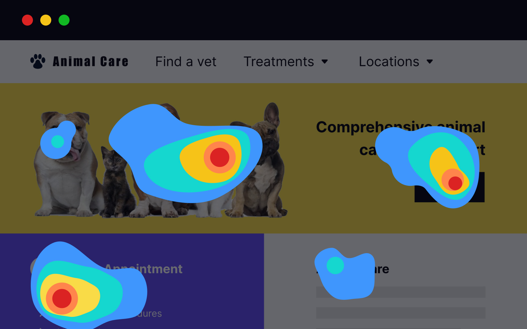
Eye tracking is a costly quantitative user
Aside from the high equipment price, one of the key disadvantages of this method is that researchers often ask users to think aloud while navigating a page. It may lead to dangerous misinterpretations. Users may spend more time on a page explaining what they see and look at some content longer than they would in real life because of the think-aloud task. As a result, a heatmap won't reflect an accurate picture. The NN Group recommends analyzing each participant's session replays to better understand user behavior.[3]
Several factors can affect an eye-tracking study as it requires users to:
- Sit relatively straight in the chair
- Not fidget or move too much
- Not drink from a cup
- Not lean back or forward in a chair
- Not wear glasses
Taking such measures will help you obtain accurate eye tracking results but won't provide insight into real-world user behavior.
Pro Tip: Consider eye tracking studies only after you’ve conducted a series of regular usability tests and need to dig deeper.
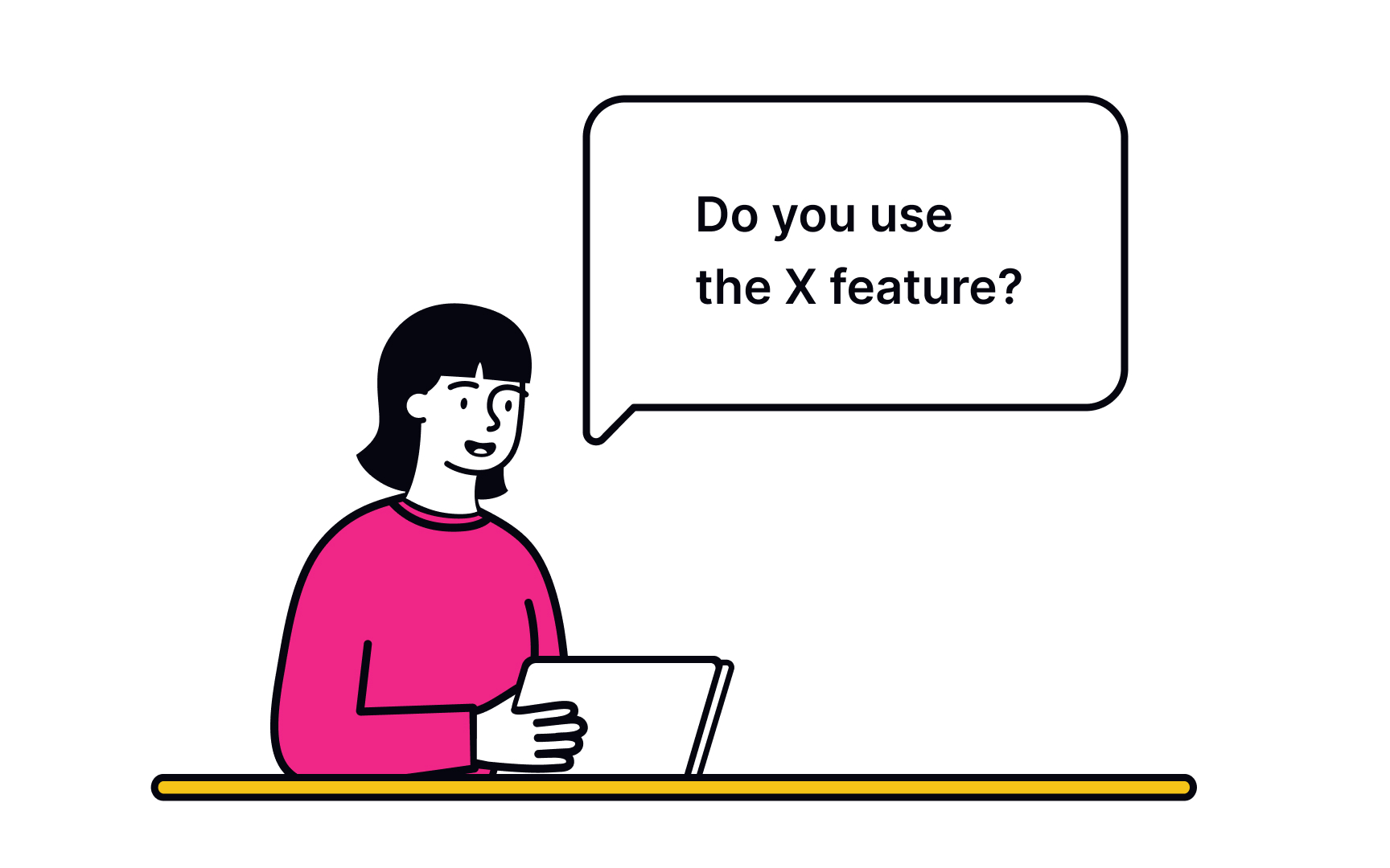
A survey is a cheap, flexible user research tool for gathering information about participants' preferences, attitudes, characteristics, and opinions on a given topic. Surveys consist of a set of questions and can be inserted on a live website, within an email body, or after user interviews or usability testing.
The simplicity of running a survey is misleading and often leads to bad surveys and useless data that don't give insights into users' problems.
What makes a survey effective?
- Define the goal. It's important to decide what you want to know and why a survey is the best way to obtain that information.
- Logically structure questions. Group related questions and separate them from other groups to help users navigate the form.
- Write questions in plain language. If users don't understand a question, they're likely to skip it or give answers that don't reflect their experience truthfully.
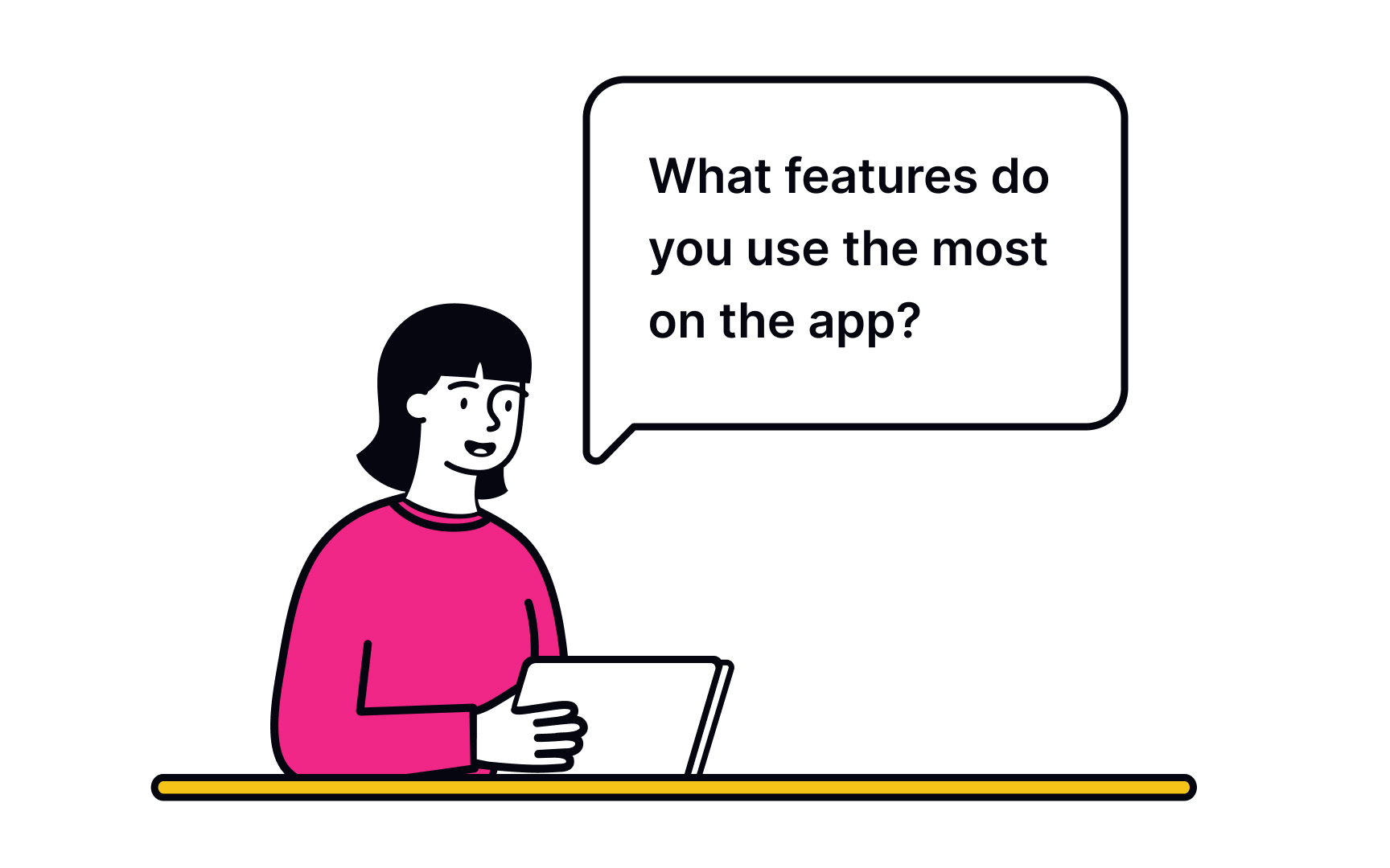
- Include open-ended questions. Open-ended questions provide more insight into users' thoughts. Also include multiple-choice questions to simplify the form completion process. While asking a direct 'Why?' might yield limited responses, taking a more layered approach can provide richer information. Consider supplementing multiple-choice questions with open-ended ones such as 'Could you describe a situation where this feature was particularly helpful?'
- Be short. Long forms are tedious and likely to be abandoned before users even start.[4]
Surveys help better understand users and minimize the risk of designing ineffective solutions. However, surveys are based on what users say and might not accurately reflect or explain user behavior. Thus, they should never be used to replace usability studies and interviews.
Pro Tip: Avoid using point scales to ask users how likely it is that they will use a product or recommend it to a friend in the future. People are bad at making predictions, and this type of question doesn't reflect reality.
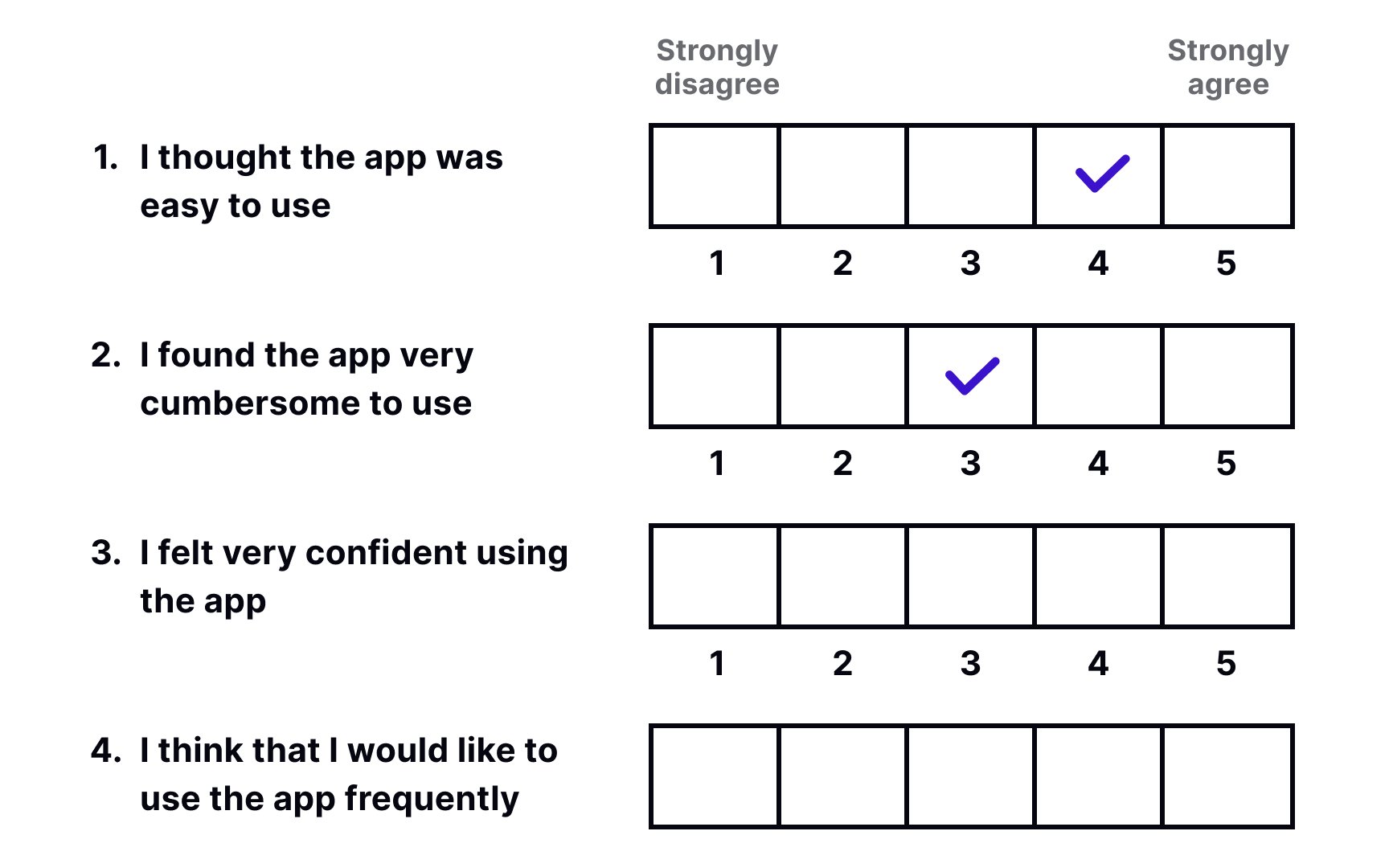
The System
One of the main disadvantages of using SUS scores is that it has a complicated scoring system that is hard to interpret. The final score (which can vary from 0 to 100) reflects how good or bad the usability of your product is. The average score is 68, and everything below this number indicates serious issues that users encounter when interacting with your product. However, it doesn't tell you which specific issues require your attention and doesn't give any insights into user behavior on your website or application.[5]
SUS can be used as the first step of usability evaluation but shouldn't be considered the only reliable source.
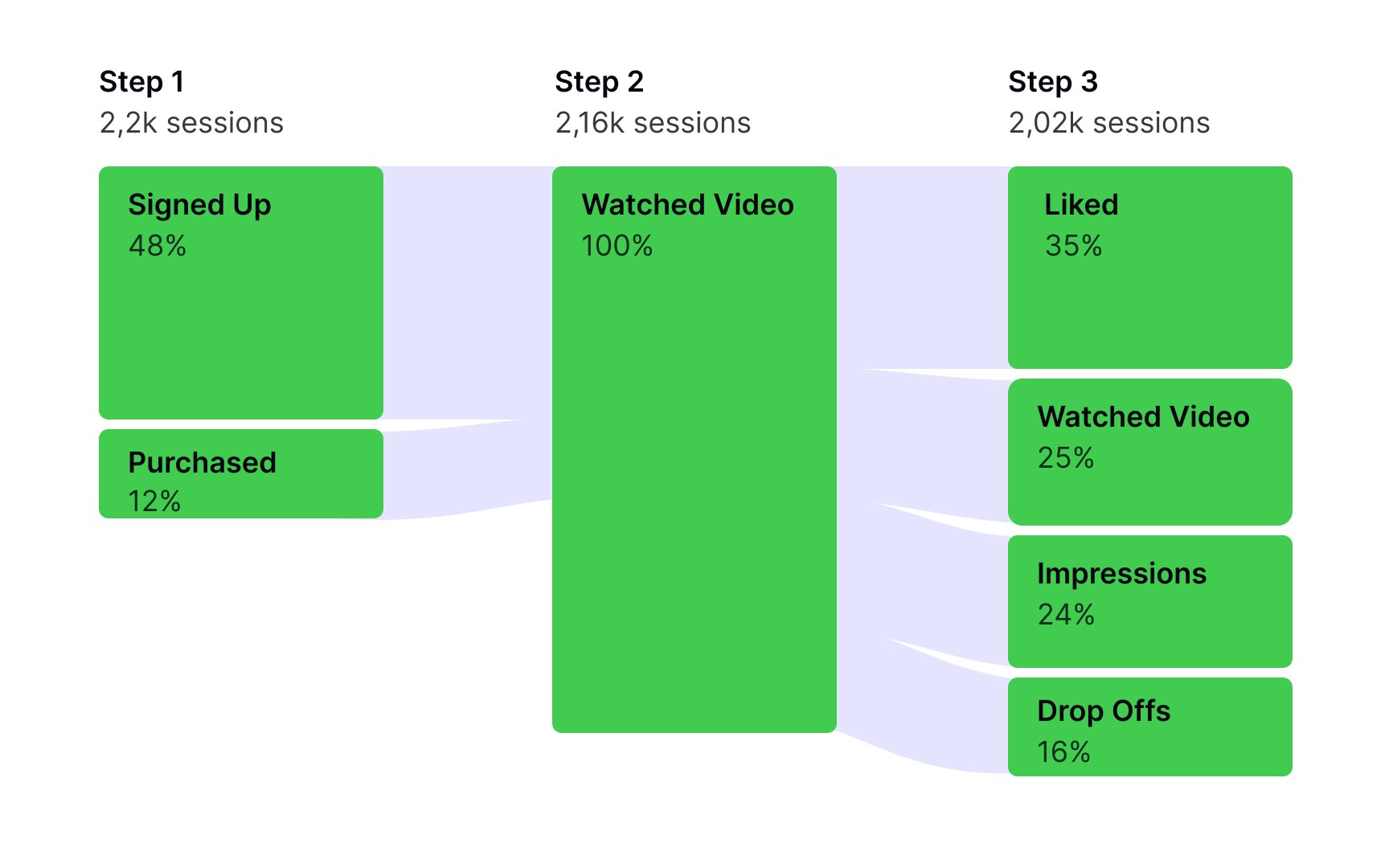
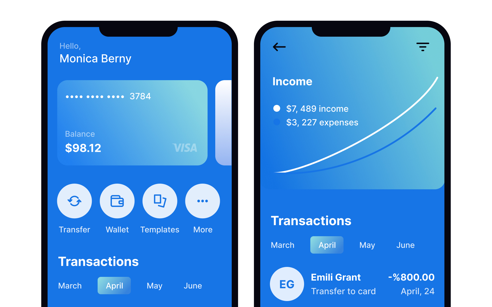
Analytics data demonstrates how people use your live product — a website or an application. Google Analytics is one of the most popular tools that comes with a free version. If you know how to use it correctly, you can get amazing insights by exploring:
- Standard pageview data: You can see pages where users entered and exited your product, paths they've taken, or the device they've used.
- Behavior flow report: This allows you to analyze users' behavior at a particular flow point or see which steps in your scenario fail most often.
- Goals and funnels: You can set different goals for the same website, like user registration, completing a purchase, or
email subscription, and see the steps users take to reach that goal. - Event tracking: You can evaluate how successfully users interact with any element on a
page , like creating a folder, uploading a file, or clicking the Settingsicon . - Time tracking: This method can tell how much time users spend on reaching a goal or which actions take longer to complete or process.
Analytics data provides hard facts about a user's experience and allows you to see what users actually do compared to what they say. Using this quantitative method helps persuade data-oriented stakeholders and gives more information for driving additional
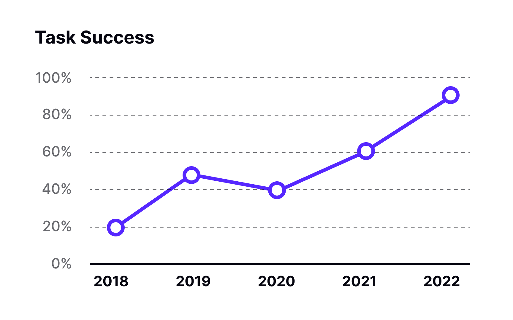
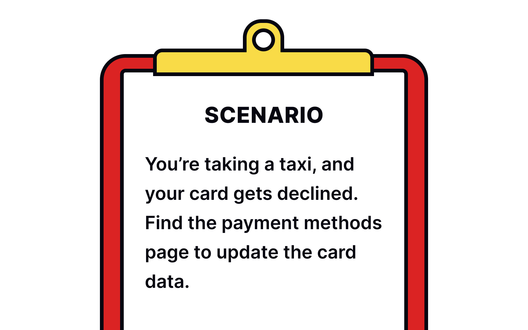
Like qualitative usability testing, quantitative usability testing asks users to perform tasks in a system. The only difference is that in quantitative usability testing, researchers focus on collecting metrics, like time on task or success rate. During qualitative usability testing, moderators observe and pay attention to usability issues that users encounter when performing a task.
Depending on your goals and budget, usability testing can be facilitated in person or held remotely with or without a moderator. The NN Group recommends inviting at least 40 participants for a quantitative usability testing study.[6]
The findings collected during usability benchmarking can be used for:
- Tracking the progress of a product or service over time
- Comparing your product's usability to a competitor, an industry benchmark, or a stakeholder-defined goal
- Demonstrating the value added by the
UX work done by you and your team[7]
Tree testing is a method for evaluating your product's information architecture and findability of
Tree testing is the perfect tool for:
- Evaluating findability, labeling system, and information architecture
- Validating your ideas before designing them
- Getting insights into your users’ mental models[8]
To write good tree testing tasks, avoid giving leading instructions and using matching keywords in the tree.
Pro Tip: Combine tree testing with card sorting methods to better understand information architecture, logical grouping, and labels.
A desirability study is a user
Usually, participants are presented with product images or are asked to use prototypes or a live product. You can also use different versions of the same interface to find the best solution. Then, they are asked to describe the product using adjectives or descriptive phrases from the list. With the large group of representatives, clear trends will emerge. You can learn, for example, that a significant number of respondents find a green palette calming and relaxing for a yoga app. In contrast, a dark blue version may evoke mixed emotions.
Desirability studies are a valuable tool for determining the right design direction and resolving conflicts involving subjective opinions within a team. The disadvantage of this method is that you can't predict real-world user behavior. During the study, you can only learn what users say, but it's impossible to find out how they'd behave and feel when interacting with a product.[9]
References
- Quantitative User-Research Methodologies: An Overview | Nielsen Norman Group
- How to Conduct Eyetracking Studies | Nielsen Norman Group Report | Nielsen Norman Group
- 7 Steps to Benchmark Your Product’s UX | Nielsen Norman Group
Top contributors


Topics
From Course

Share


