Paragraphs in Typography
Learn how to style well-formatted paragraphs that make text content easier to read and scan
People don’t like reading on the web. They’re often multitasking, switching between tabs, their phone notifications, and work responsibilities. If presented with a huge block of text, most will skip right over it in search of content that’s easier to digest.
Well-formatted paragraphs make text content easier to read and more digestible for users. They’re the building blocks of writing, presenting one idea at a time and giving content organization and structure. They’re vital in maintaining readability and making a digital product accessible for all users.
Various paragraph formatting techniques aim to improve readability and scannability to help users spend less effort finding the information they need.
According to the guidelines developed by the U.S. Technology Transformation Services (TTS), the recommended line length should be between 45-75 characters, including spaces. From an accessibility standpoint, lines longer than this range are hard to follow in large blocks of text. On the other hand, short lines are also not the best solution. Due to their abrupt endings, users' eyes have to move back and forth too often. Eventually, users get tired, and their attention wanes. To avoid this, stick to the suggested range.
Note that headlines, captions, and labels don't need to adhere to the same line length considerations and can be shorter.
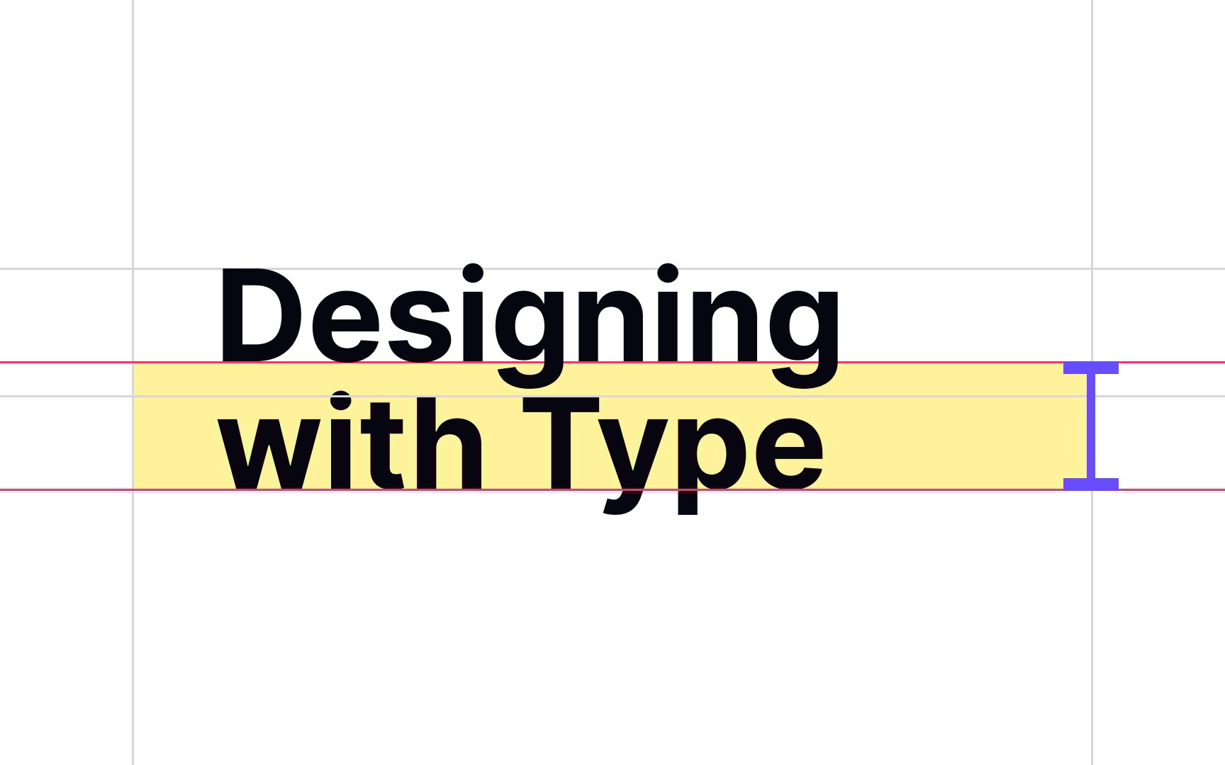
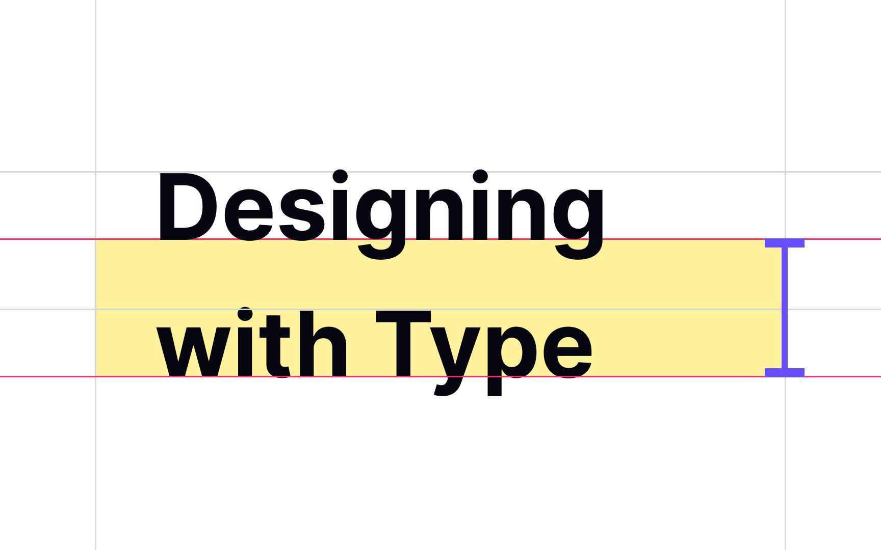
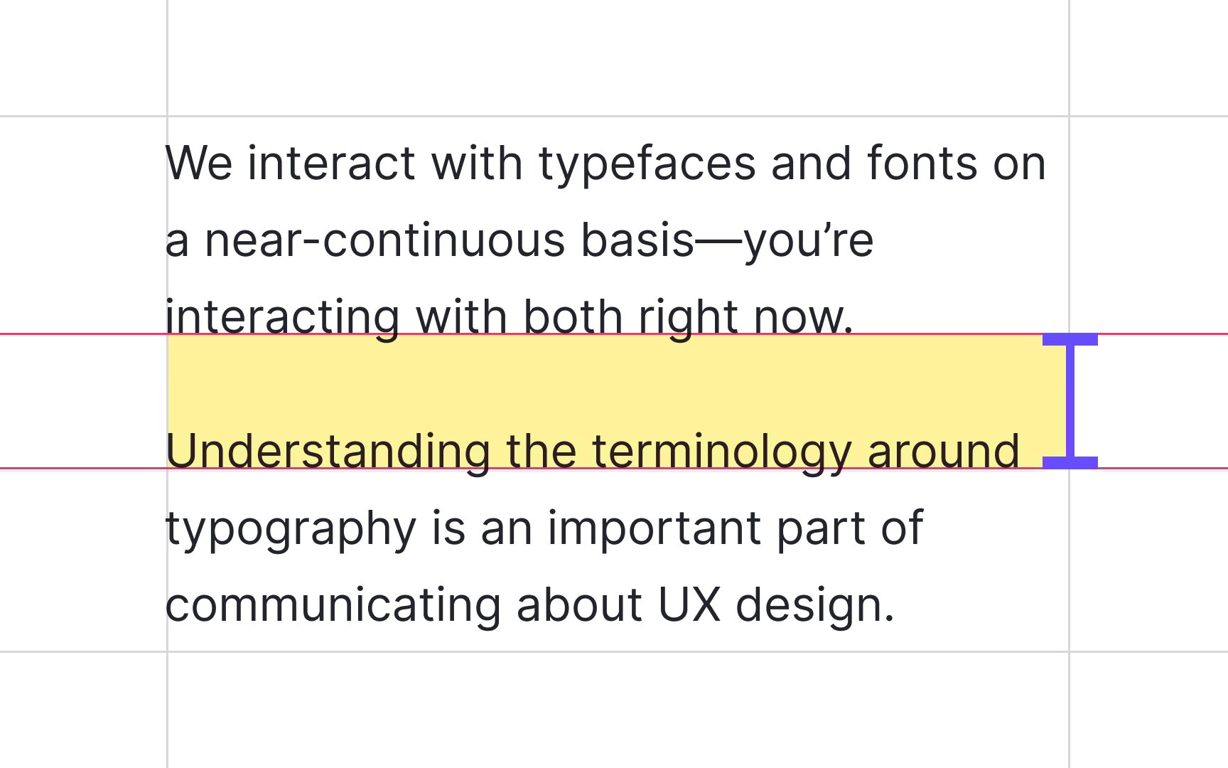
Line height or line spacing is the vertical distance between lines within a paragraph. Generally, it depends on the size and the font itself. The larger font size and line width require a larger line height.[1]
The percentage of the font size defines the line height, and the optimal value should be around 150% of the chosen font size. For example, if the font size is 16px, a line height of 24px is a good starting point.
A 150% line height creates enough space between lines and makes text readable, preventing letters on adjacent lines from bumping in each other. However, a large line spacing of 250% makes the text look unnatural and harder for users to follow the lines.
Pro Tip: You can use the GRT Calculator to calculate optimal line spacing and font size.
Paragraphs don't appear out of thin air. It's our job as designers to add spaces and format paragraphs in a way that breaks indigestible
The WCAG recommends that paragraph spacing should be at least 1.5 times larger than the regular line spacing. In other words, there is a blank line between paragraphs that's easily distinguished from a regular line break.[2]
In English and most European languages, people read and write from left to right. This is why left alignment or "flush left" is one of the most common alignments on the web. It feels natural, mimicking the flow of our eyes, and guarantees better readability for large pieces of writing.
This rule doesn't apply to right-to-left languages, such as Arabic, Hebrew, Persian, or Urdu. In those cases, right-aligned (flush right) text is more readable.[3]
Pro Tip: Headlines and captions may use other alignment types, but body text should remain left aligned.
While center alignment makes a page look symmetrical, it slows down the reading process, especially for users with cognitive or visual impairments. When applying center alignment, the text creates abrupt, uneven edges, forcing users to start each new line at a slightly different point.
Save center alignment for headlines, subheads, block quotes, call-to-action buttons, and other elements that are supposed to break the flow of the text to capture users' attention.[4]
The same way that left alignment is the most common type for left-to-right languages, right alignment is natural for right-to-left languages. Globally, there are 12 right-to-left languages, including Arabic, Hebrew, Urdu, Persian, South Azeri (spoken in the Azerbaijan region of Iran), Aramaic (spoken in Northern Iraq, Southeast Turkey, Northeast Syria, and Northwestern Iran), Dhivehi/Maldivian, and Fulani (common in West Africa, Central Africa, and Sudan).
In turn, right alignment is the most unnatural type for left-to-right languages, since it contradicts the way people read and write. Like center alignment, it creates uneven edges of text paragraphs, making it difficult to scan.
Right alignment is suitable for languages read left-to-right for:
Twitter, with its short bite-size messages (Tweets), became popular for good reason: brief blocks of text are more user-friendly. Concise but fully developed paragraphs are much simpler to read and skim, especially if the text uses headlines and subheads to guide readers through the
But what paragraph length is best? Although there's little consensus on optimal paragraph length, as a starting point, try a range of 2-3 sentences per paragraph.[5] However, you shouldn't focus on this limit. Instead, include no more than one idea per paragraph and keep your eye on page structure. Paragraphs should help you create a nice, balanced composition and appear as navigation anchors that lead users and don't confuse them.
Paragraphs are not a natural feature of text. Early printed books marked breaks with symbols like two horizontal lines (||). By the 17th century, publishers introduced indents and line breaks to signal pauses and structure longer passages.[6]
Today, designers use indents, line breaks, and paragraph spacing to break
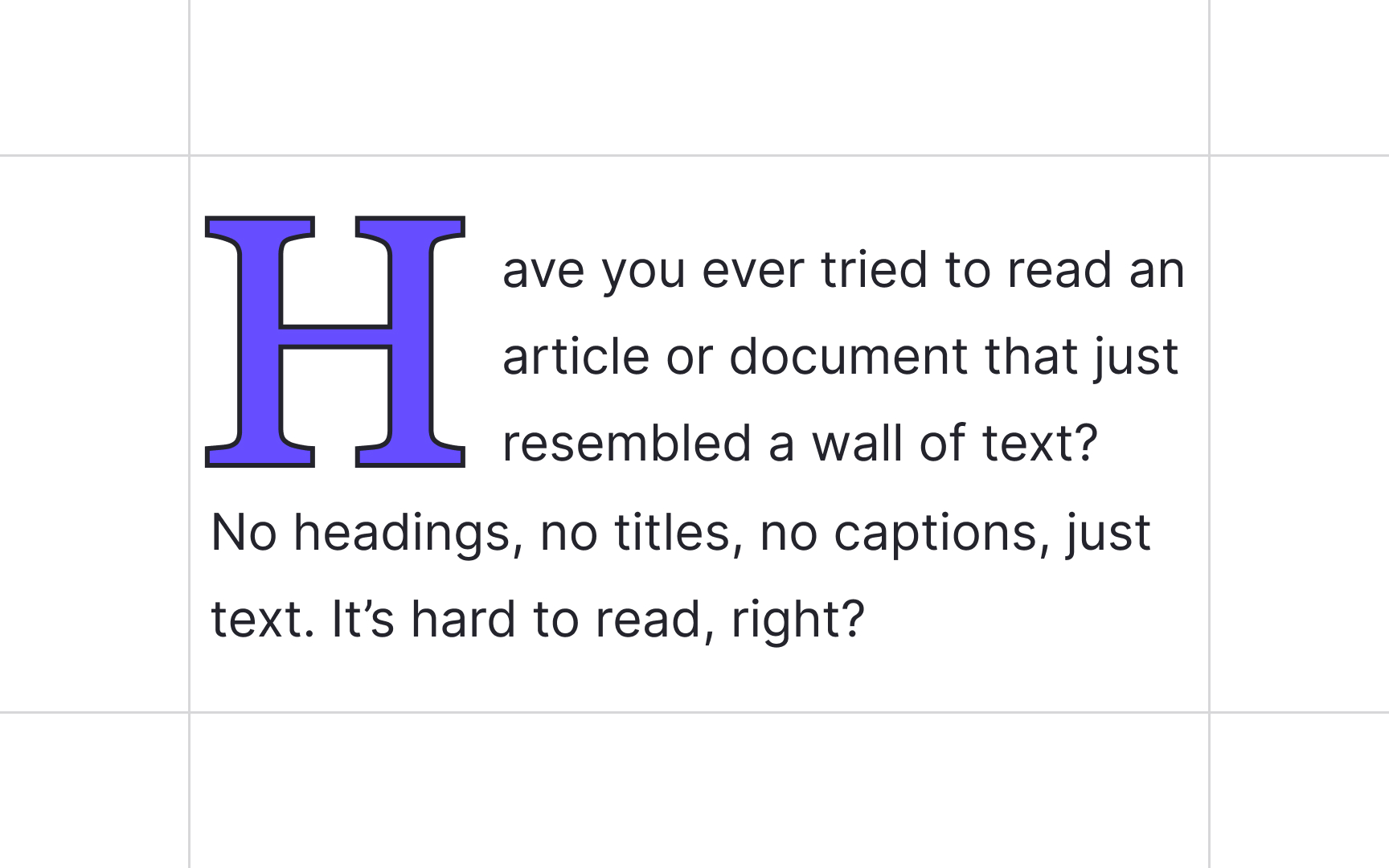
Before printed books were invented, manuscript writers used drop caps or versals — large, decorative initial letters — to mark the beginning of a new chapter or section. With the birth of printing, publishers continued adding hand-drawn drop caps to resemble hand-written manuscripts and increase the value of books.[7]
Nowadays, typographers and designers use drop caps to create an elegant, classic, and bookish look. Users encounter those enlarged decorative letters at the beginning of the first paragraph of an article, a book chapter, or a new section.
There are a few ways to place your drop caps so that they won't break the page structure:
- Place the drop cap on the same baseline as the text, setting the first words of the text block in small capitals to smooth the transition.
- Cut the drop cap into the text, allowing it to wrap around the letter.
- Place the drop cap beside the text, allowing it to hang out on the left margin without flowing into the text block.
Pro Tip: Don't use drop caps to mark each new paragraph. Instead, stick to indents, line breaks, or other visual cues.
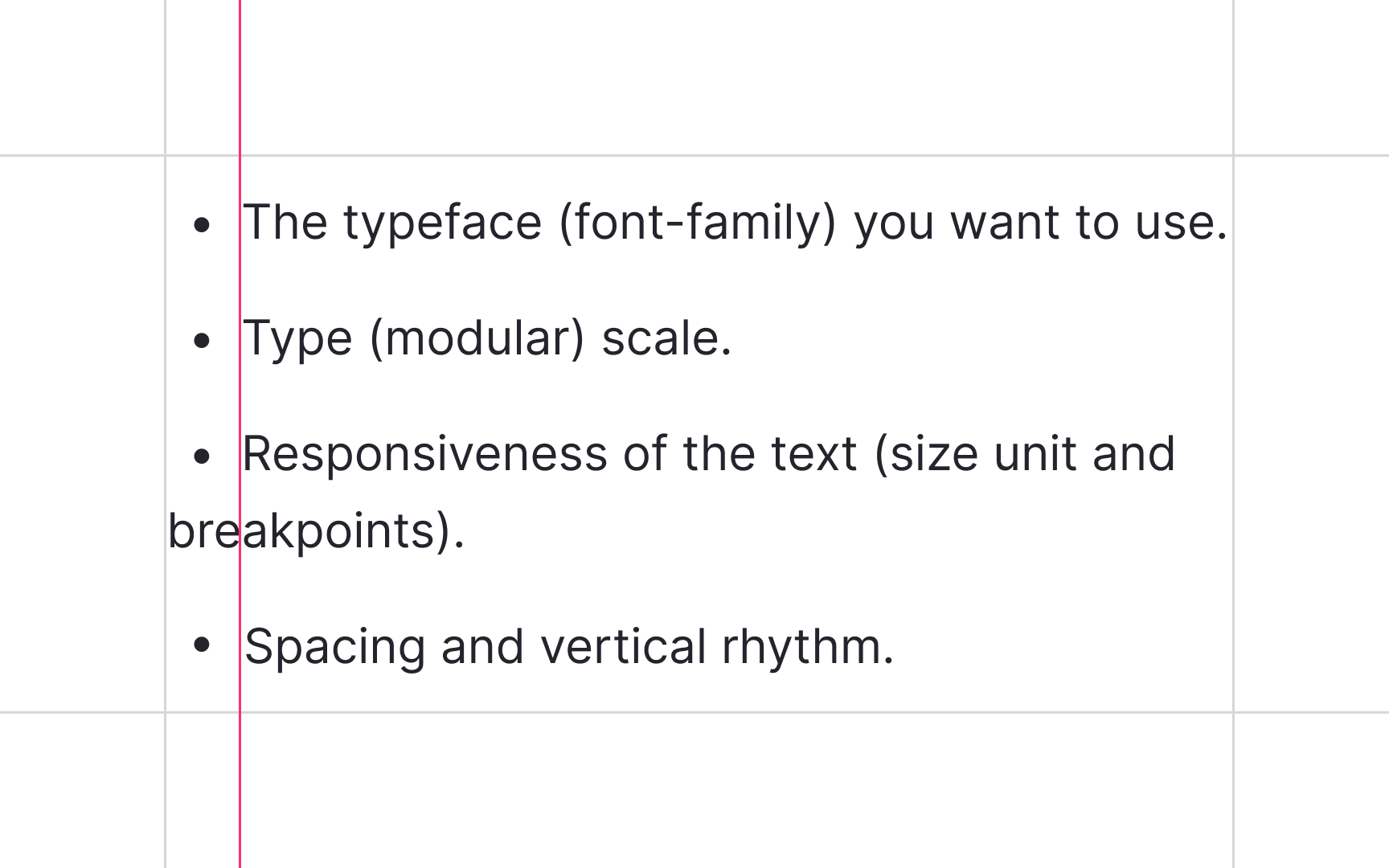
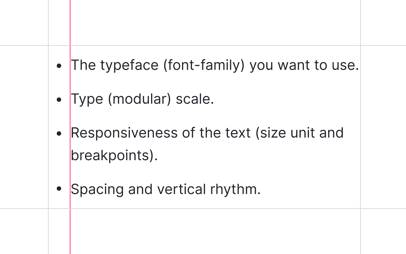
Designers use lists in a text to arrange information and allow users to navigate options faster and more effectively. When we provide visual formatting of a list, we must ensure that users with cognitive or visual impairments receive the same kind of experience.
Make sure the screen reader can jump between list options and distinguish sublists by:
- Using bullets, dashes, or asterisks for unordered lists
- Using numbers for ordered lists
- Using indents (along with bullets or numbers when necessary) for sublists
- Avoiding manual formatting
- Ensuring each list item is properly formatted with a <li> tag[8]
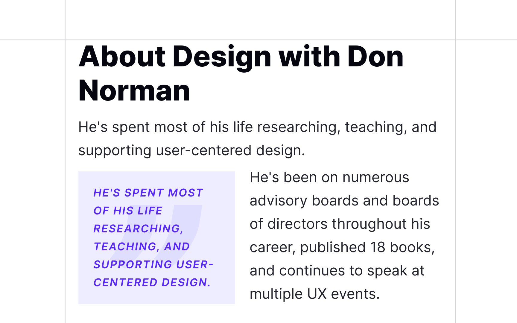
As the name suggests, a pull quote is a key phrase, quotation, or excerpt pulled from an article and inserted into a
Typically, pull quotes use a different typeface, size, and styling to stand out against the body text. As to their placement, pull quotes are often set on the side of content.
Pro Tip: If you use color to highlight pull quotes, make sure the text/background color contrast is sufficient.
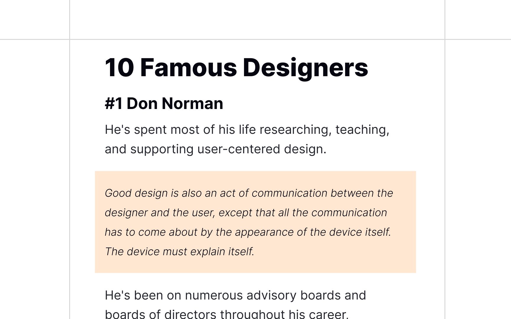
Block quotes, also called extracts, set-off quotations, long quotations, or display quotations refer to direct quotations that are set off from the main text because they're too long to be placed in quotation marks inside the text. They literally look like blocks. The paragraph begins on a new line and is indented from the left
In
Block quotations can usually be distinguished from the surrounding text by using a different
When should you use a block quote instead of including the quote within the regular
References
- Business Writing For Dummies | Google Books
- Thinking with Type | Google Books
- 3. Use Bullet & Number Feature to Make Lists | User Experience Office
- How to Use Block Quotations in Writing | ThoughtCo
Top contributors


Topics
From Course

Share


