Best Practices for Designing Tab Navigation
Discover the best practices for ensuring simple and consistent tab navigation
Tabs, though small, play a vital role in empowering navigation within an interface. When used correctly, they help organize content efficiently, saving space and reducing user overwhelm by logically grouping related content. Users can anticipate what to expect behind each tab, making the interface straightforward and user-friendly.
However, missteps in tab design can significantly hinder the user experience. Issues like unclear distinction between active and inactive tabs, overcrowding with too many categories, lengthy and complex labels, or inconsistent design can lead to confusion and complicate the user journey. Additionally, it's important to recognize that tabs may not be the ideal navigation choice for every interface. Thoughtful consideration is needed to determine when and how to effectively implement tab navigation to enhance, rather than detract from, the overall user experience.
Navigational
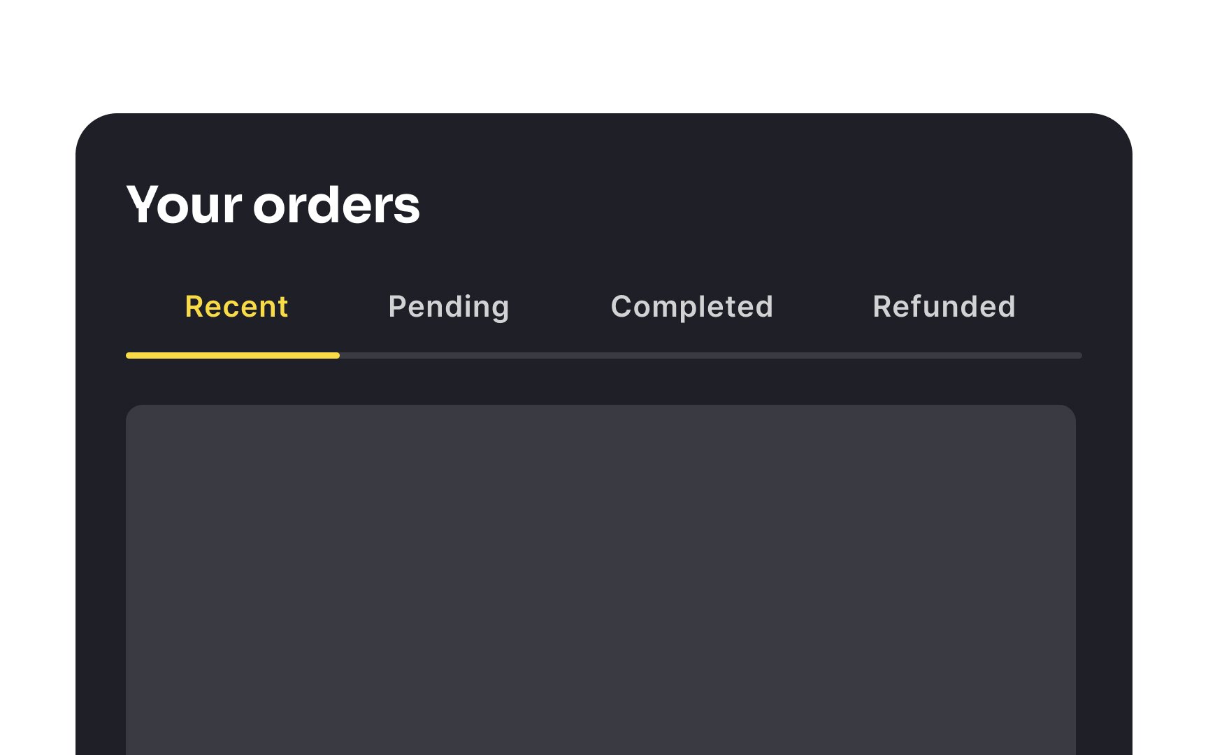
It is a good idea to use tabbed navigation in your interface when:
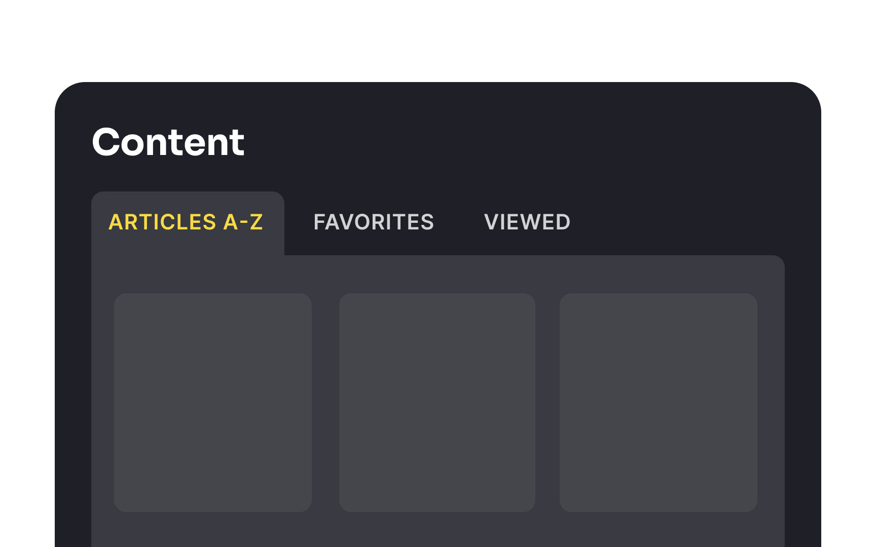
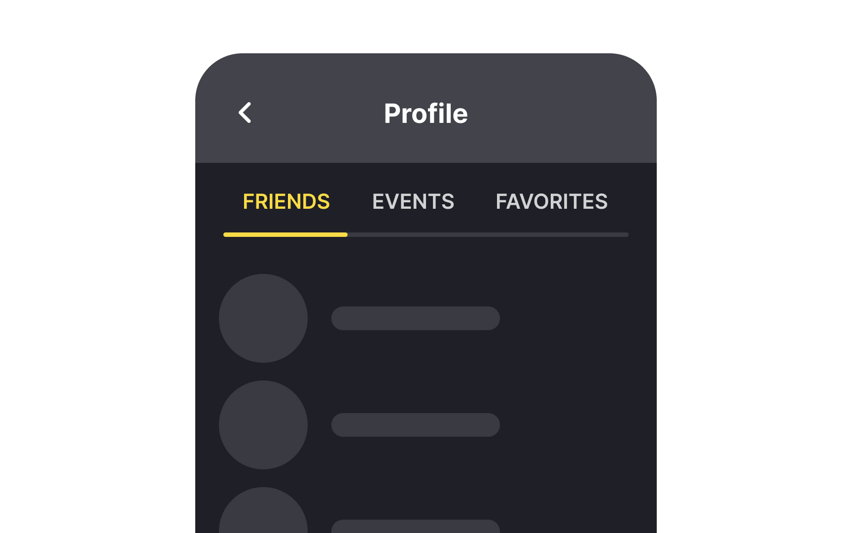
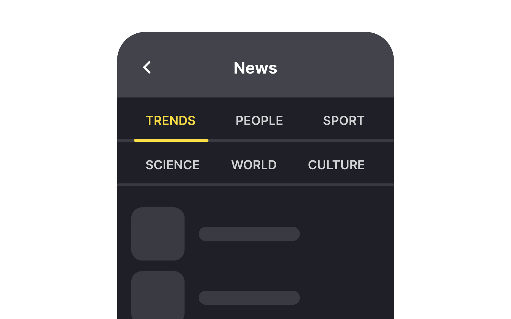
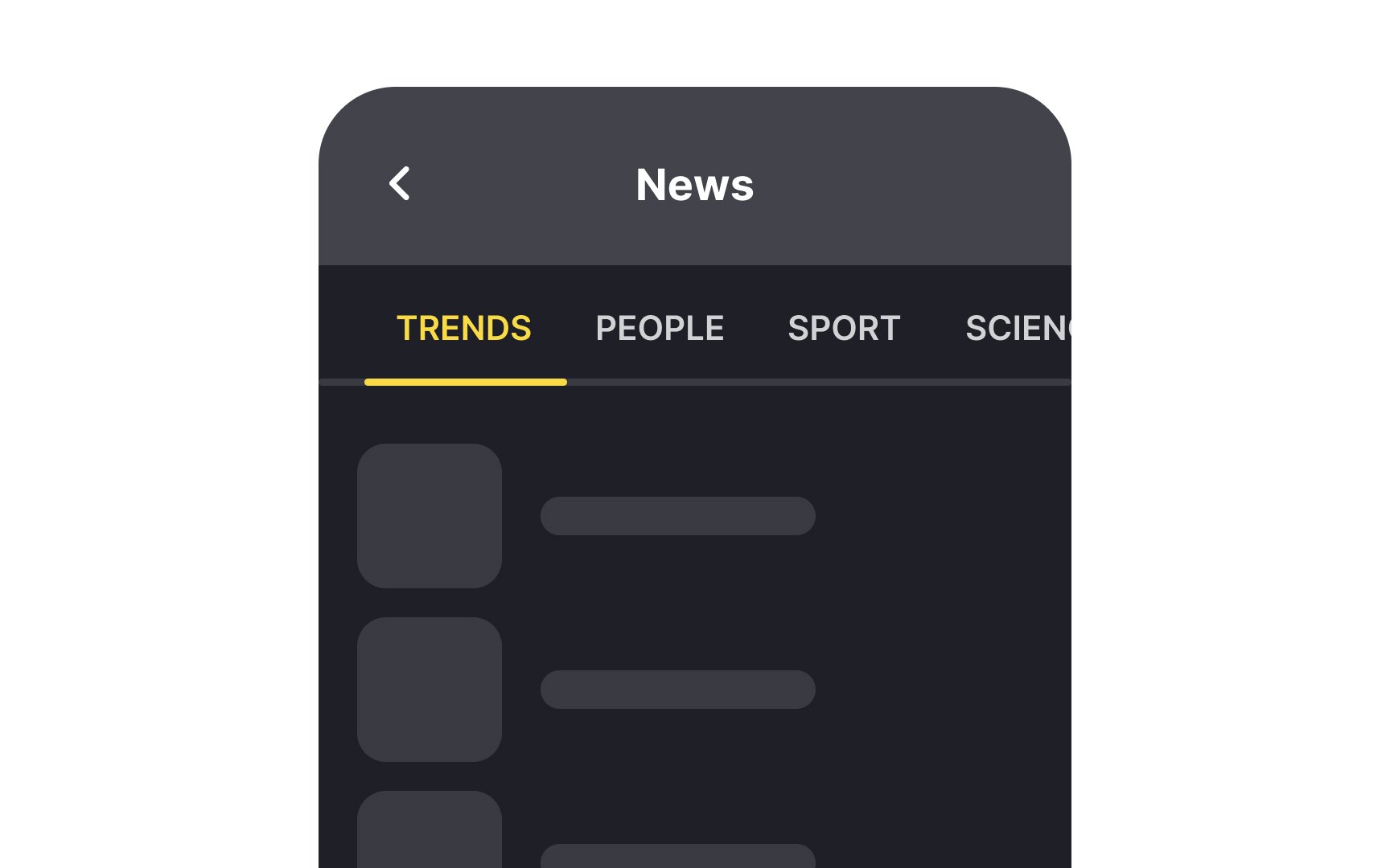
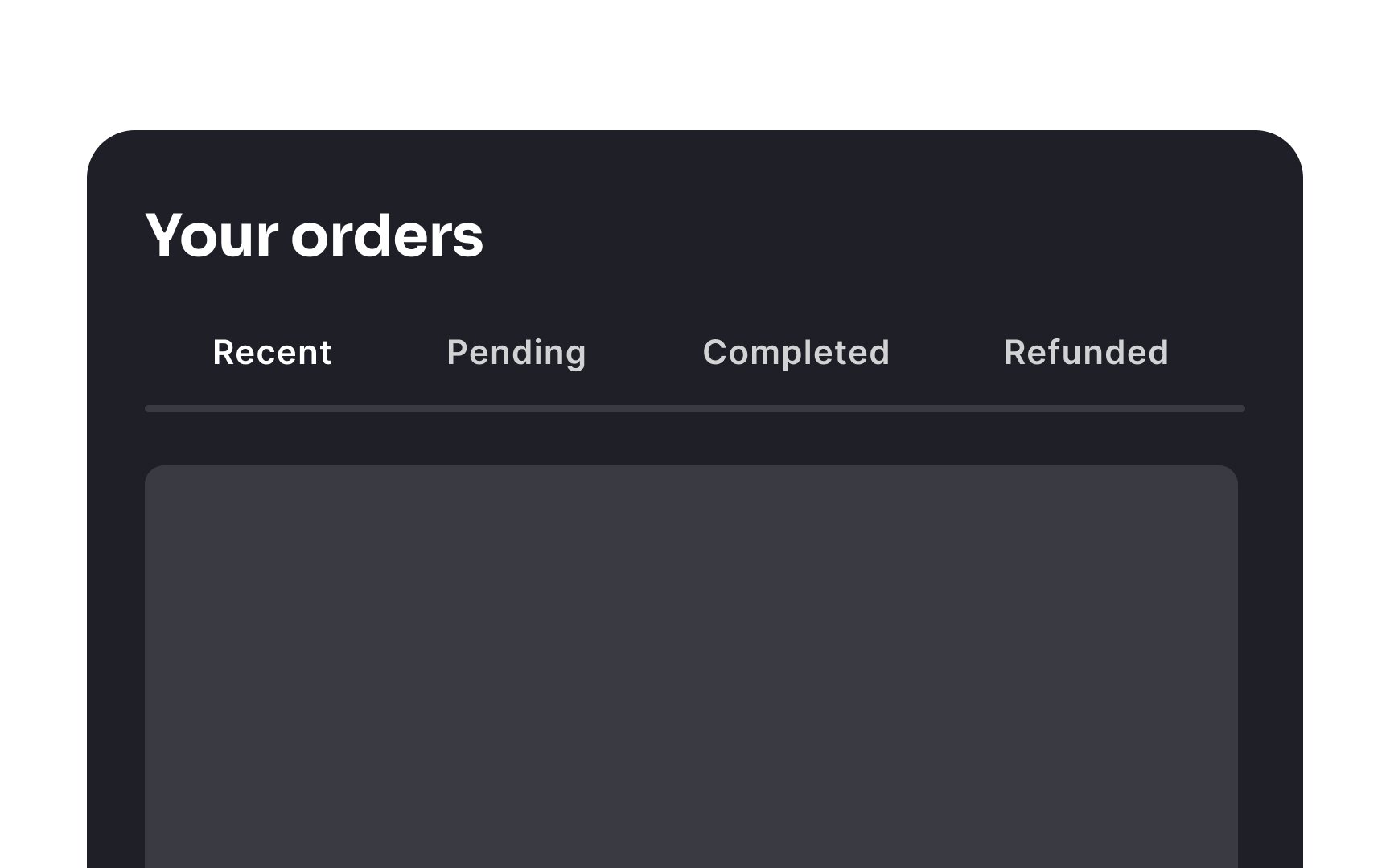
- You have between 2 to 9 different categories of content
- Category names are relatively short but meaningful
- The number of categories is fixed
- The categories are similar in nature and won't be perceived as site
navigation - The categories fit in a single row[1]
You shouldn't use navigation tabs if users need to compare multiple content groups simultaneously. It strains their short-term memory and increases cognitive load.
Horizontal menus that use vertical
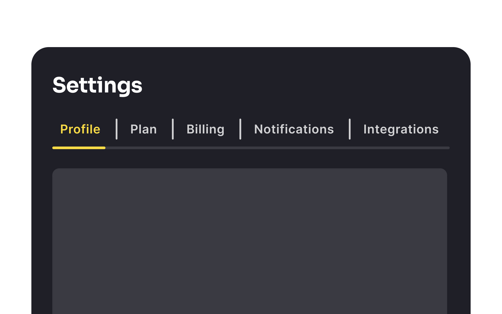
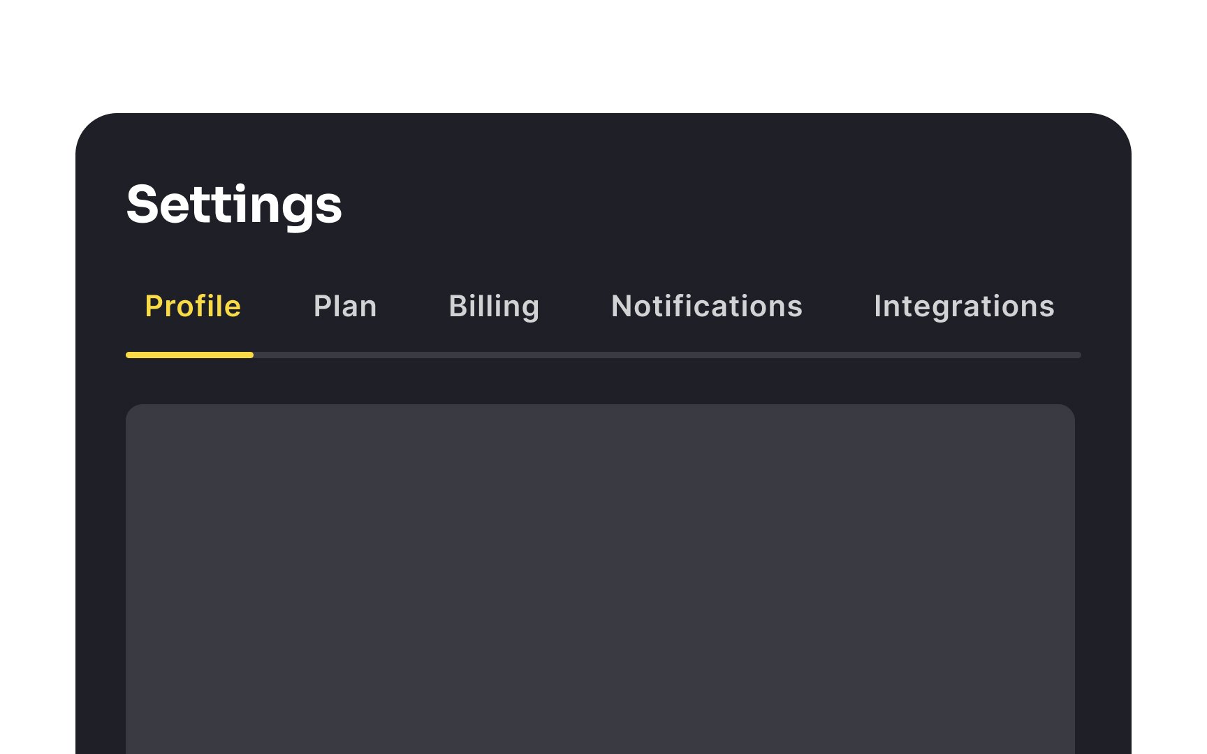
In designs where tabs are fewer and more spread out, leaning on white space for separation is usually more aesthetically pleasing. It creates a cleaner, more streamlined look, avoiding the heavy and cluttered appearance that vertical dividers can sometimes cause.
Being inconsistent in design diverts users' attention and creates unnecessary visual noise.
Additionally, the behavior of the tabs should be consistent. For example, if clicking on one tab reveals
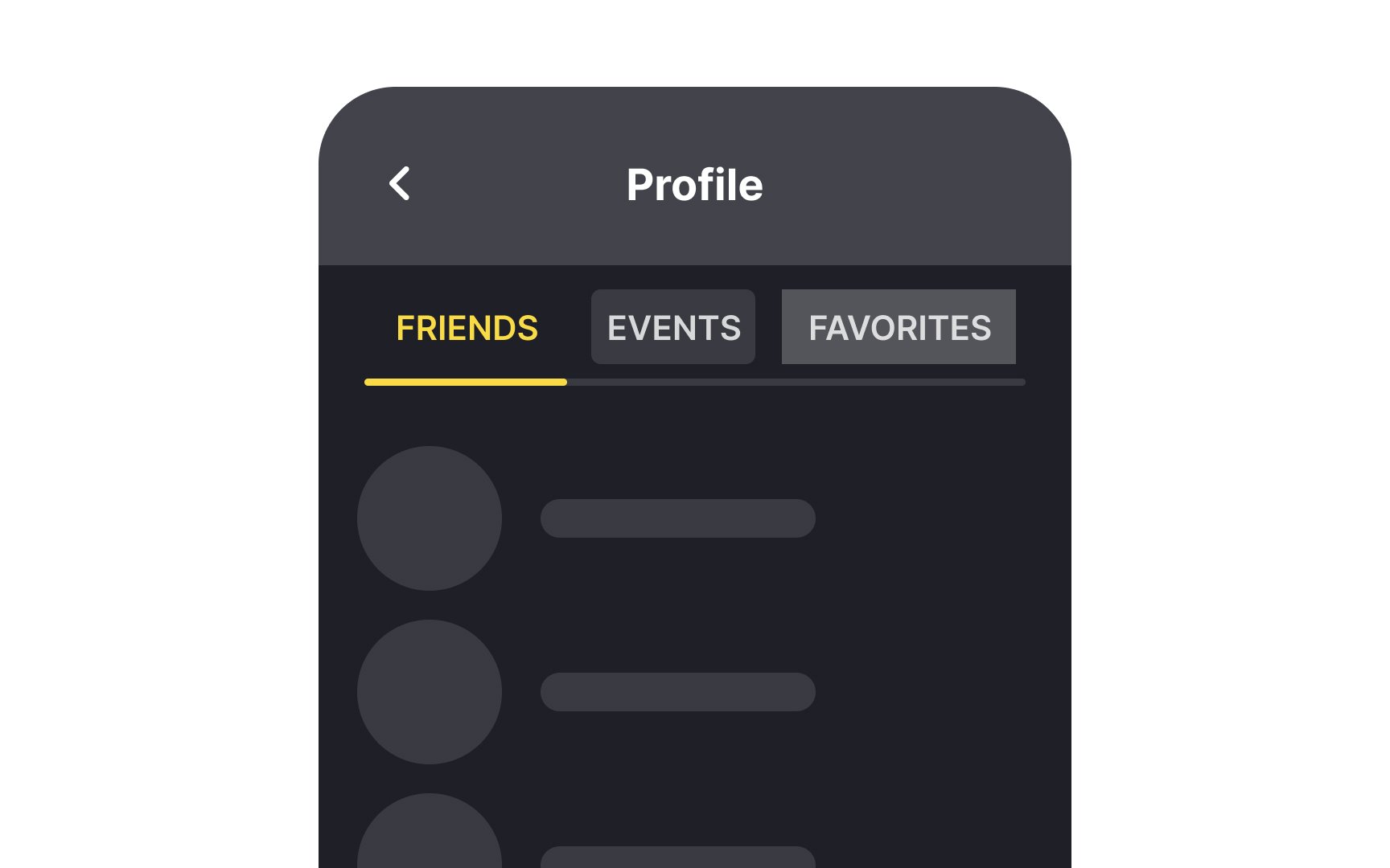
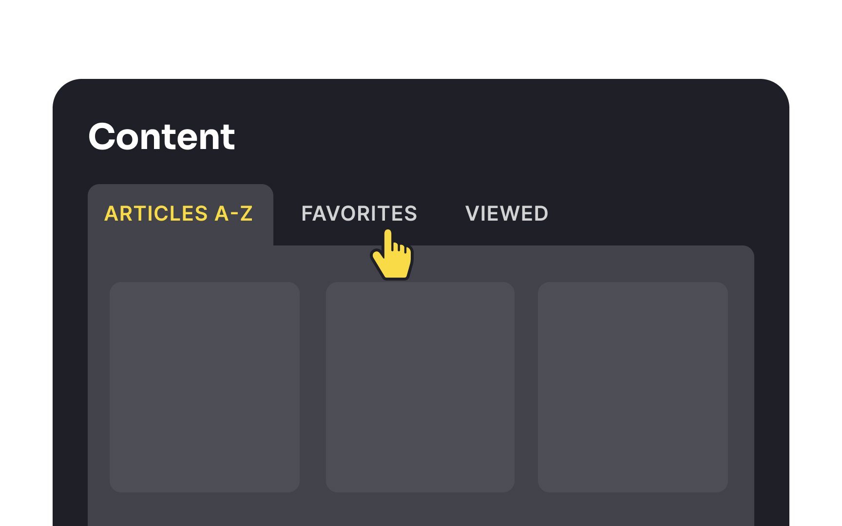
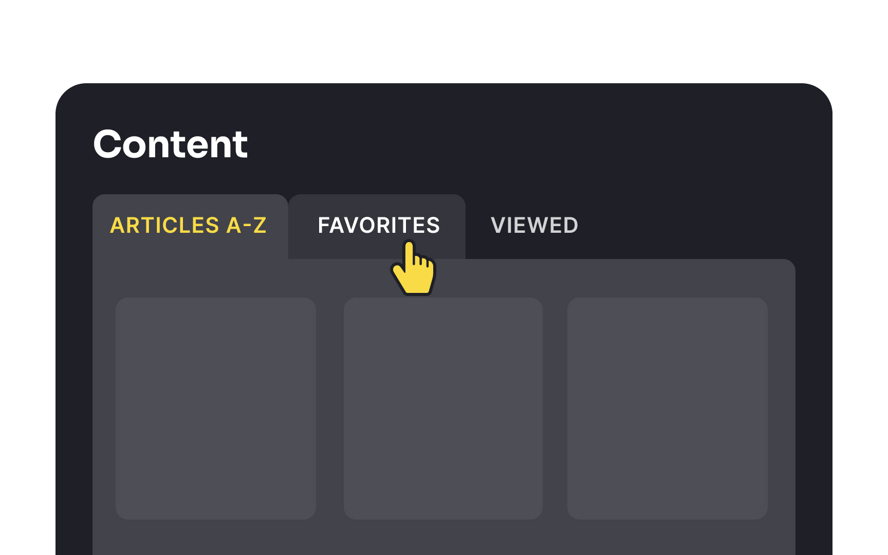
Unselected
It's important to strike a balance where the active tab stands out, perhaps with a bolder
When designing horizontal tab
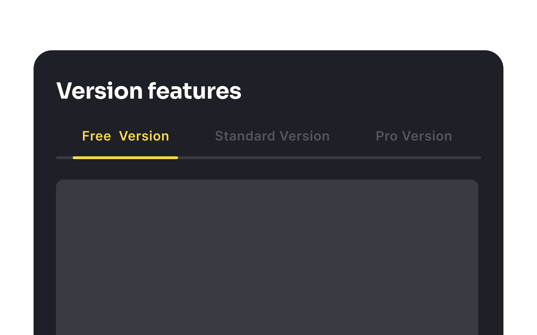
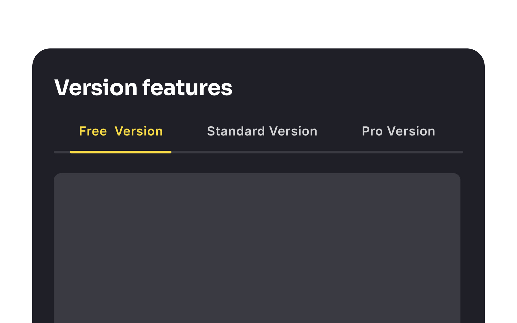
To maintain a clear and efficient navigational experience, aim for a concise, well-organized tab structure that conveys all necessary categories in a single, streamlined row.
In design, "parenting" signifies establishing a hierarchy between objects, ensuring that parent and child elements maintain a consistent relationship. This principle is crucial in
When users switch between
Apart from providing feedback, the hover effect makes each tab and the entire interface appear more interactive and adds a pinch of delight to the
For optimal user
Moreover, the selected tab should visually appear connected to its
When users scroll up and down through
- Fixed tabs remain visible at the top as users navigate through the content. This approach keeps
navigation options readily accessible, making it easy for users to switch between sections without having to scroll back to the top. For example, a news app might use fixed tabs to allow users to easily switch between "Headlines," "Sports," and "Entertainment" while reading articles. - Scrollable tabs can scroll off the screen with the content. In this case, the tabs disappear as users scroll down, but reappear when they scroll back up. This method maximizes screen space for content, which can be particularly useful for content-heavy pages. For instance, on a product
page in an e-commerce app, scrolling tabs might allow users to focus on product details and images, with the tabs reappearing when they need to navigate to related products or reviews.
References
- Tabs, Used Right | Nielsen Norman Group
- Module Tabs in Web Design: Best Practices and Solutions — Smashing Magazine | Smashing Magazine
Top contributors


Topics
From Course

Share


Similar lessons

Intro to Information Architecture

Intro to Search Functionality in UI
