Best Practices for Designing UI Inputs
Reduce form errors and user frustration with smarter input design patterns
Inputs are where users hand over their information, and friction here costs conversions. A confusing date format, a truncated error message, or a dropdown with 200 options all slow users down or push them away entirely. Good input design anticipates mistakes and prevents them. Masks format phone numbers and credit cards automatically. Auto-suggest filters long lists as users type. Error messages appear inline, right where users need them, with clear instructions for fixing the problem. These details aren't glamorous, but they directly affect whether users finish a form or abandon it. Designing inputs well means respecting users' time and reducing the mental effort required to complete a task.
Encountering an
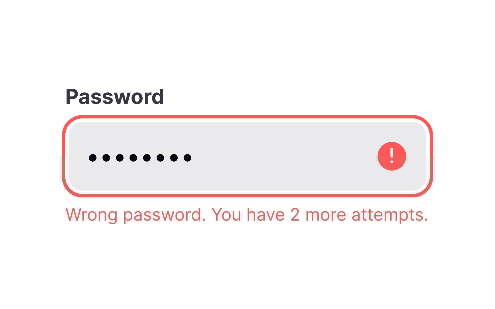
When designing error messages, ensure that they are easily scannable at a quick glance. Ideally, aim to keep the message within a single line to maximize visibility and avoid overwhelming users with too much text.
If the message cannot fit within one line without compromising clarity, it's acceptable to extend it to a second line. However, ensure that the message remains complete and coherent without any truncation, as cutting off essential information can lead to further user confusion.
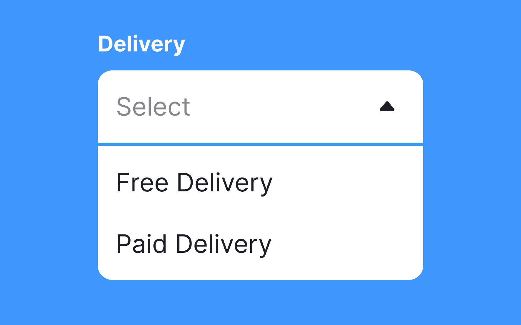
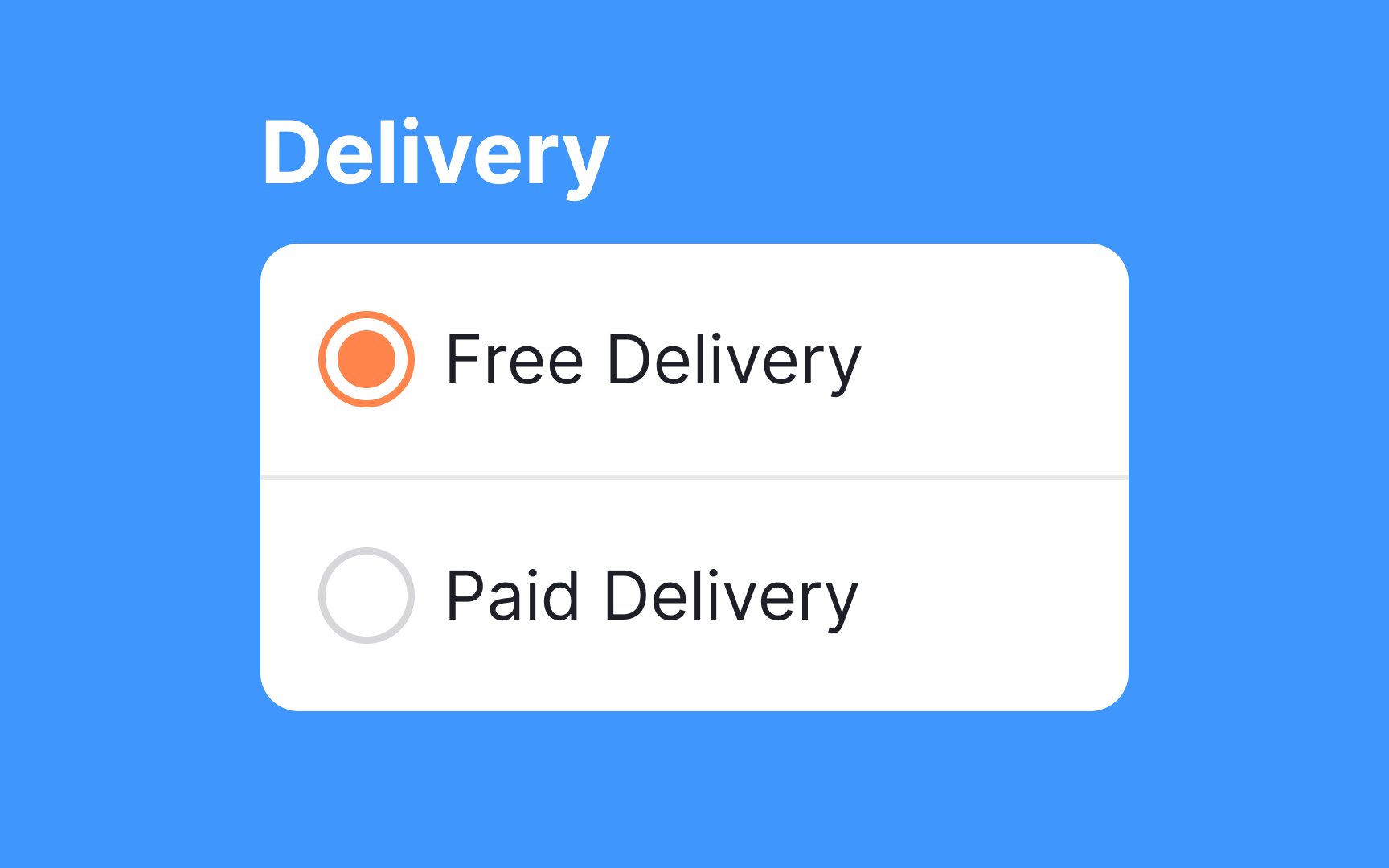
Selection controls allow us to pick an item or a few items and move on with a task.
Radio buttons work much better in cases when you need to make a single selection, as they're more straightforward and require fewer clicks. If you allow users to make multiple choices, consider using checkboxes.
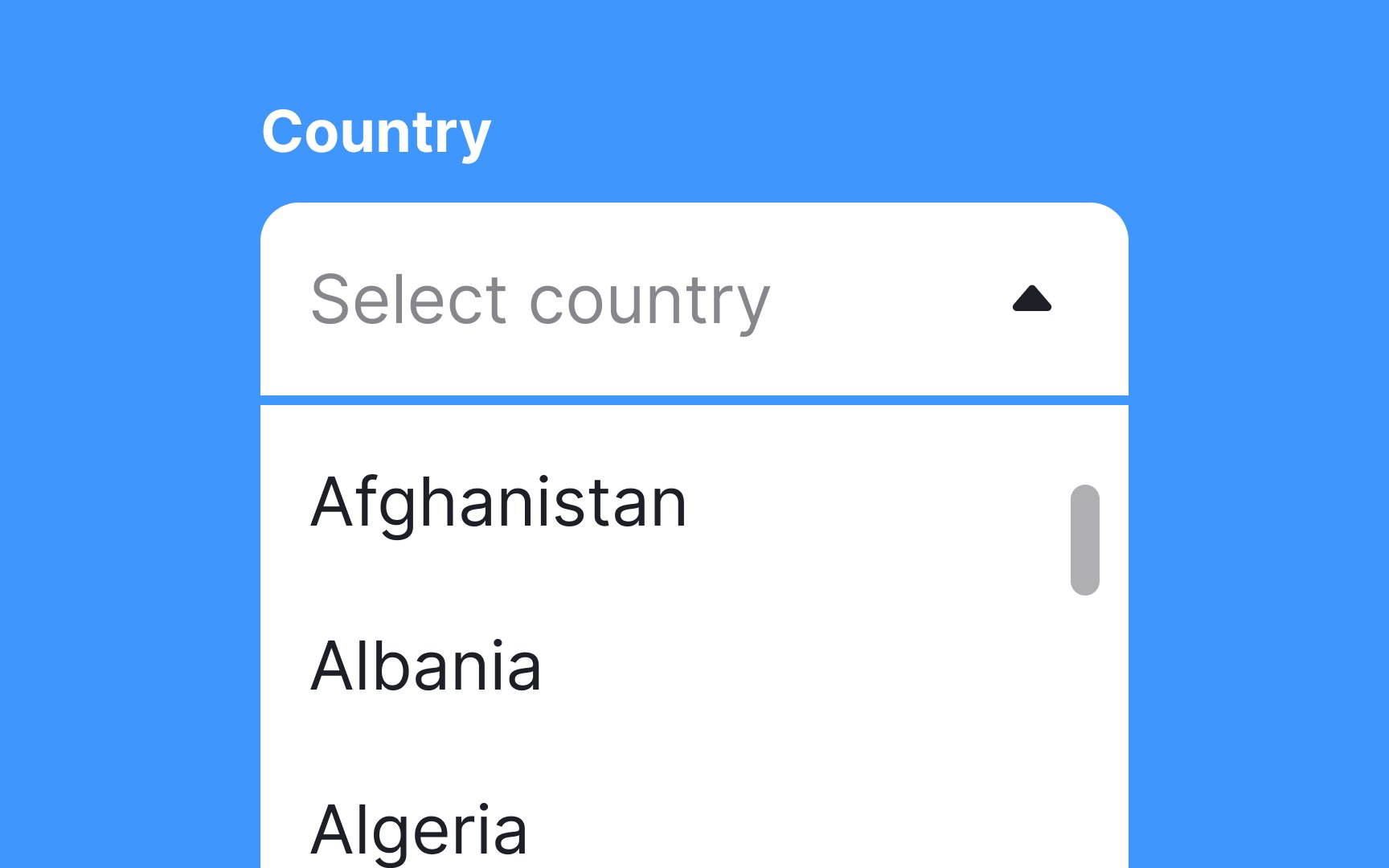
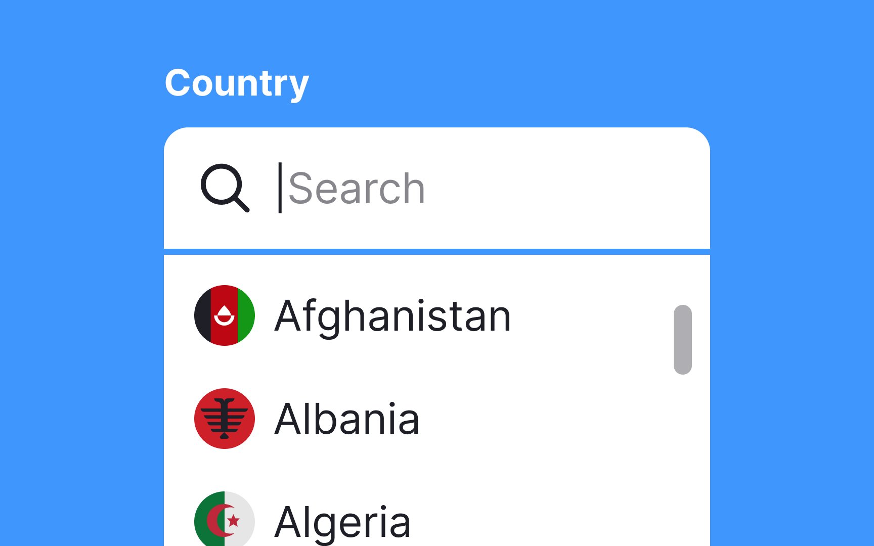
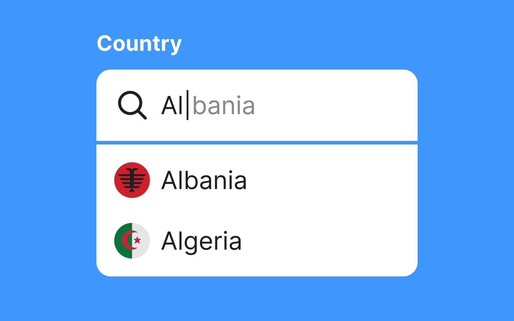
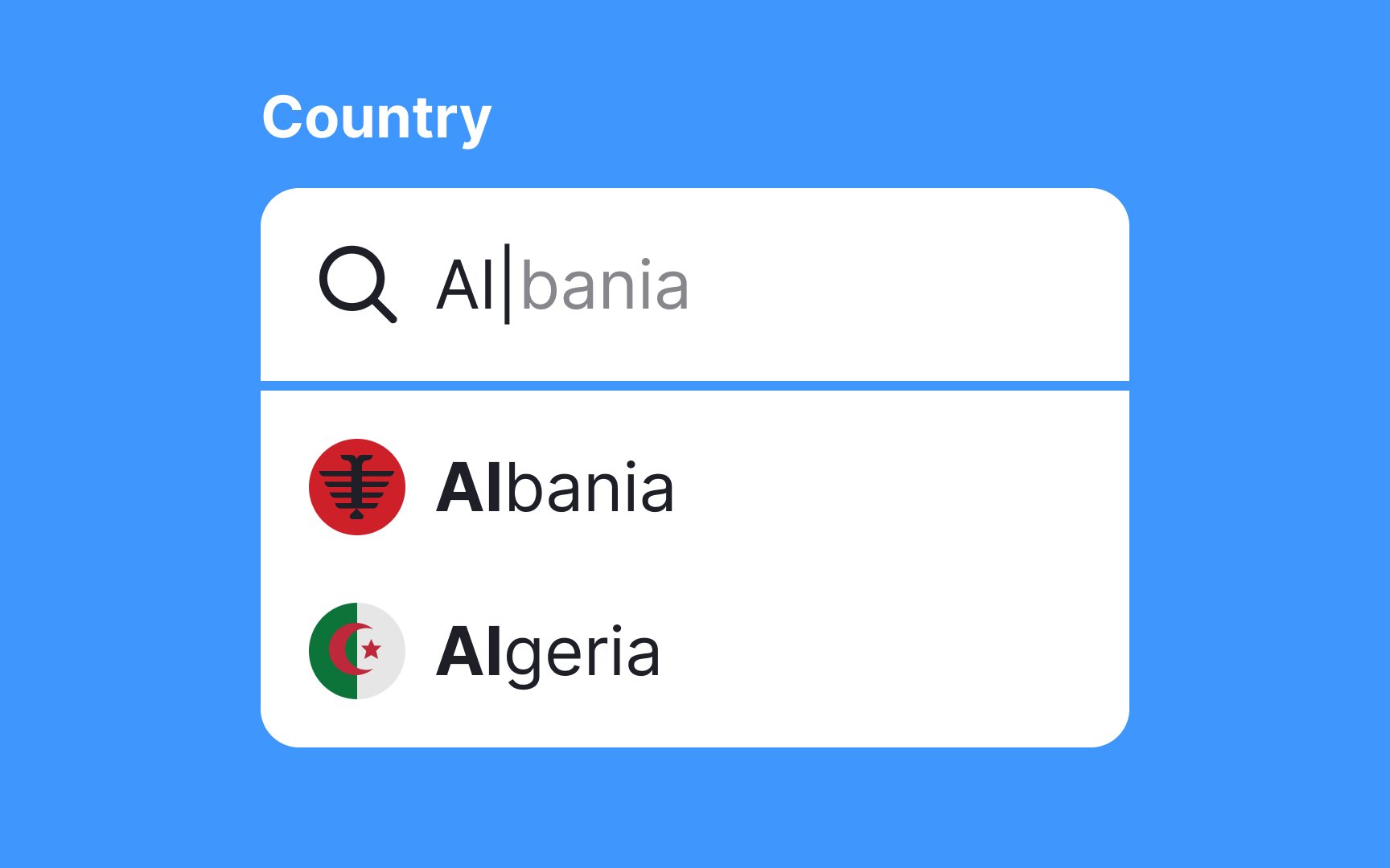
There are nearly 200 countries worldwide, and finding yours in the
Country lists aren't the only
Fields with incremental
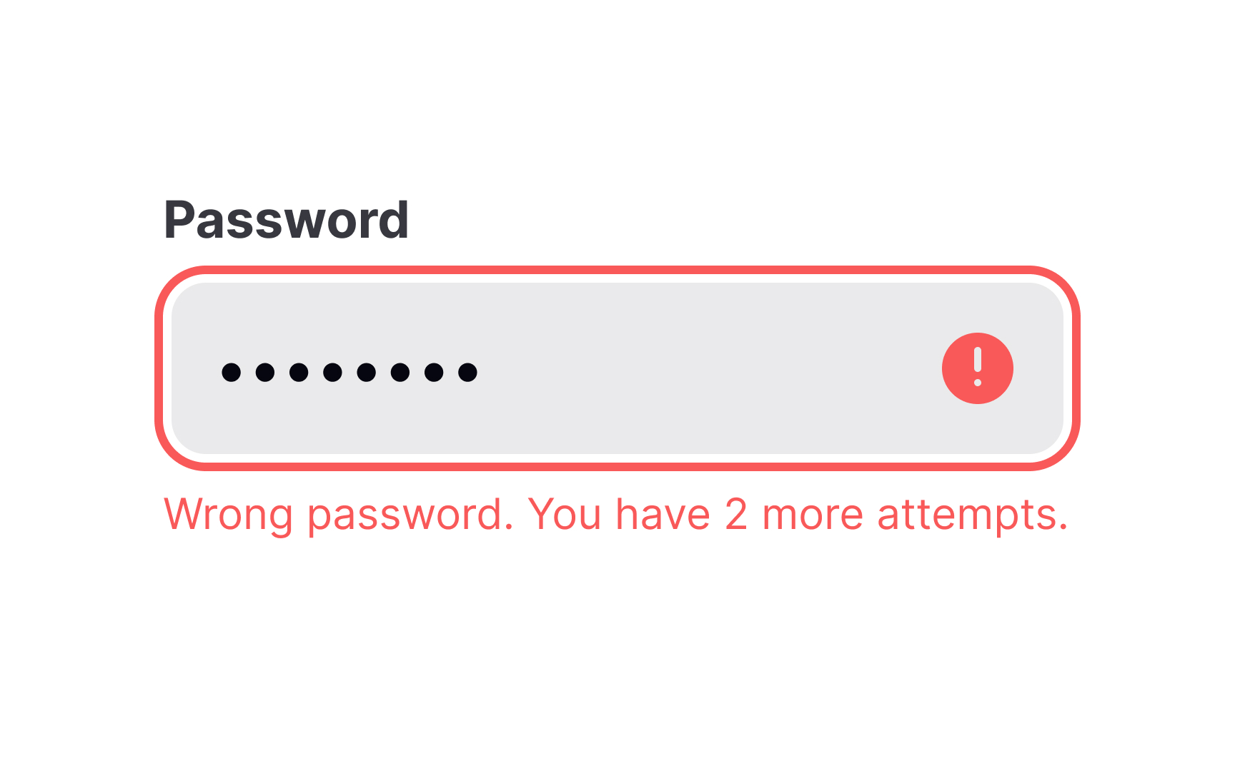
Placing error messages near input fields improves usability. Users quickly associate the error with the specific field, reducing frustration and speeding up correction. The best placement is to the right of the input or directly below it.[1]
For accessibility, errors should be programmatically linked to
There are plenty of ways users can
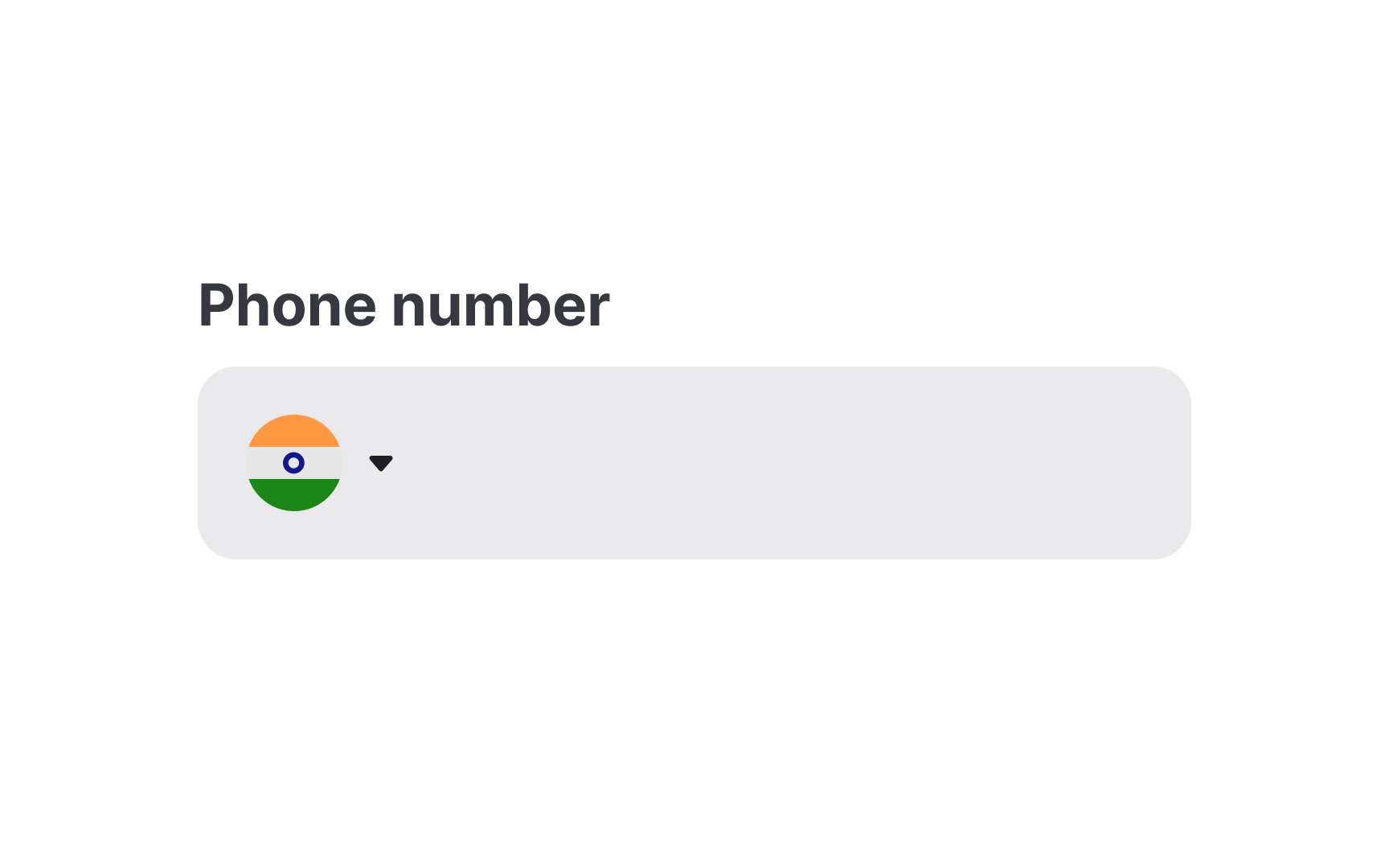
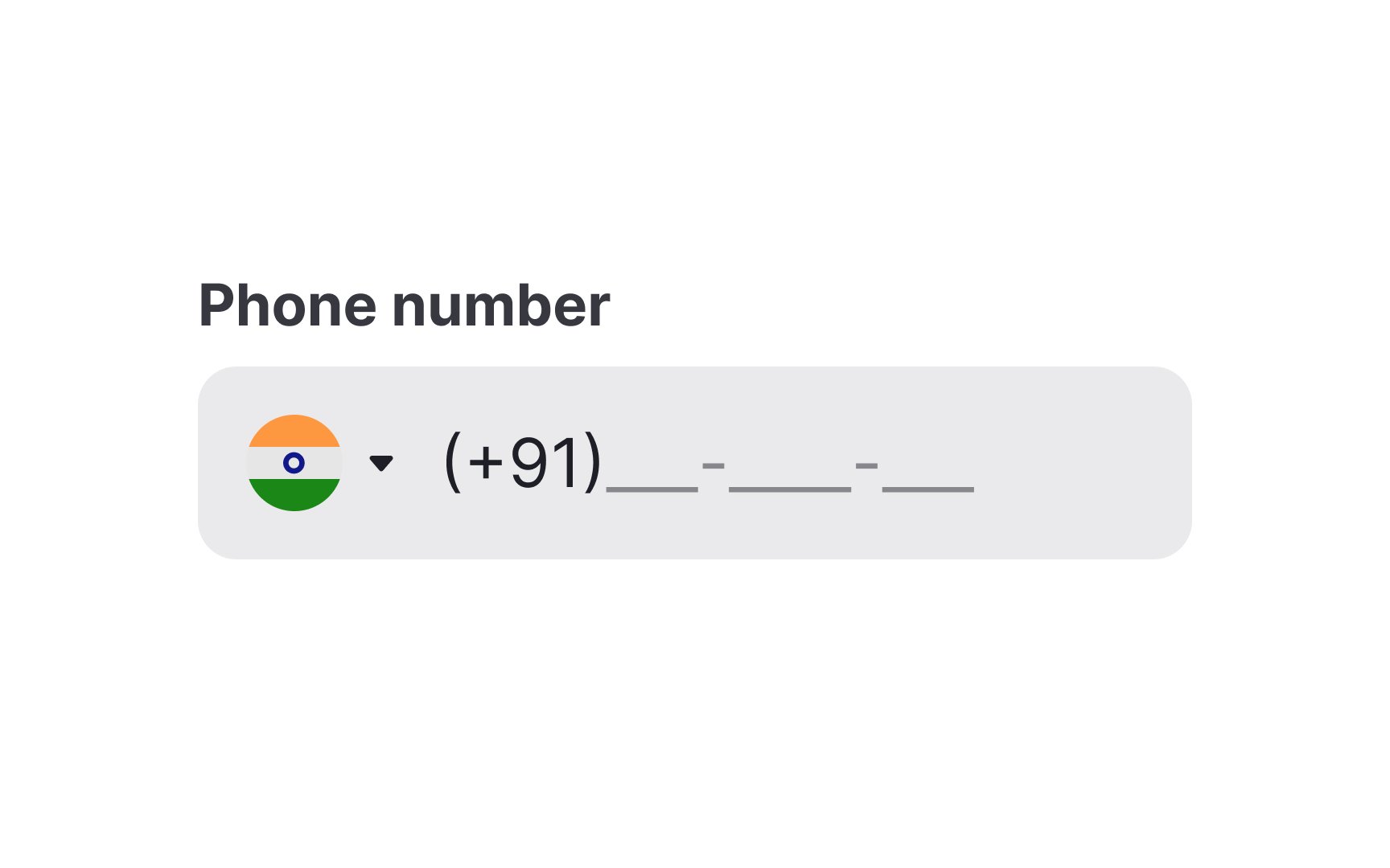
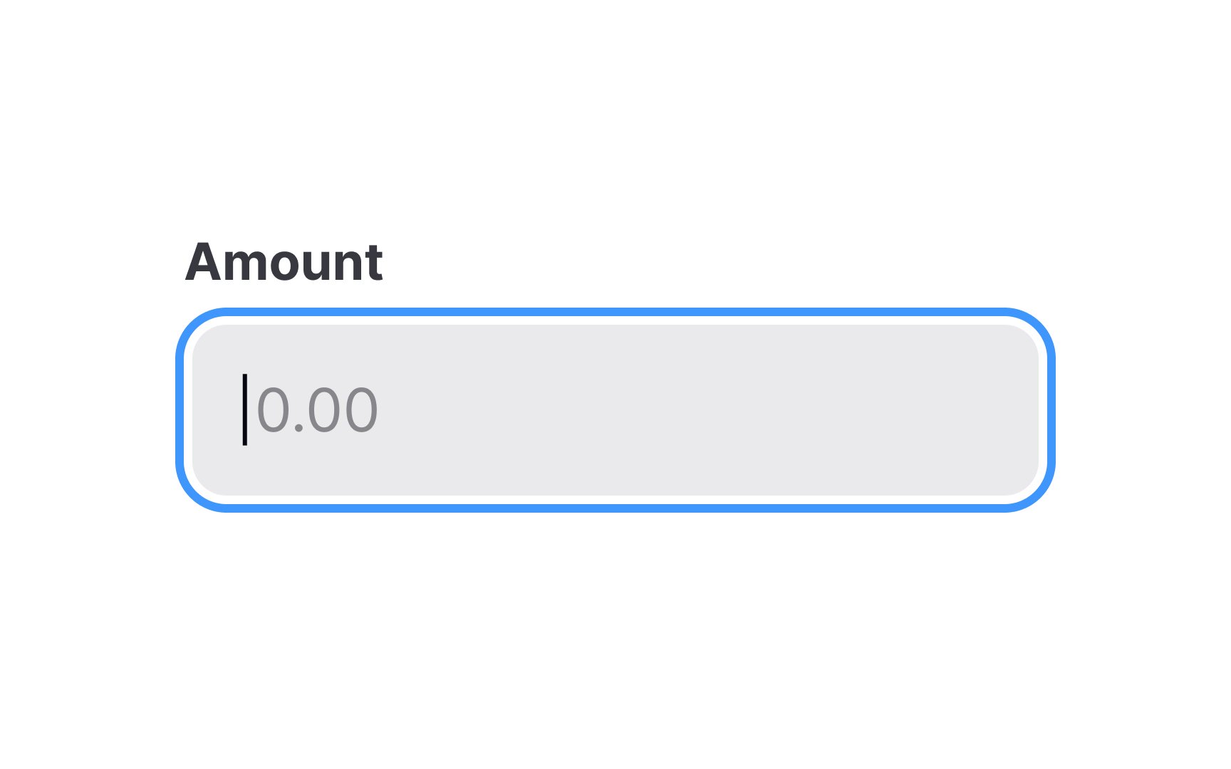
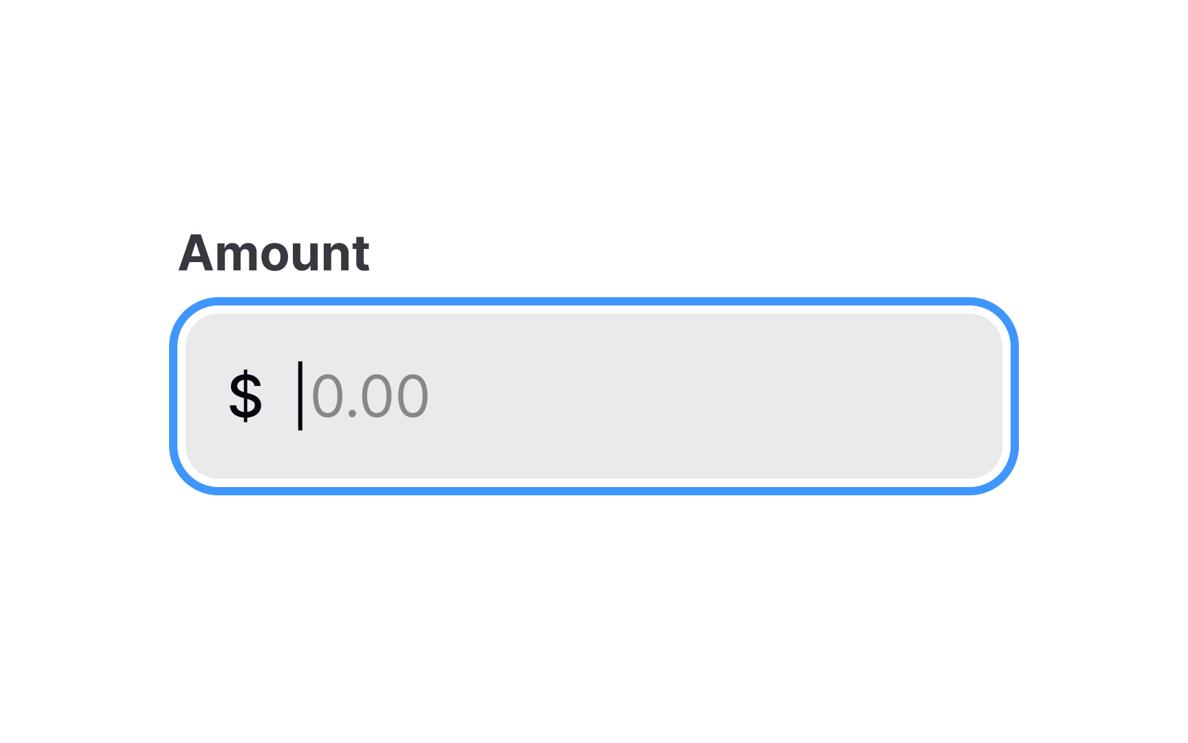
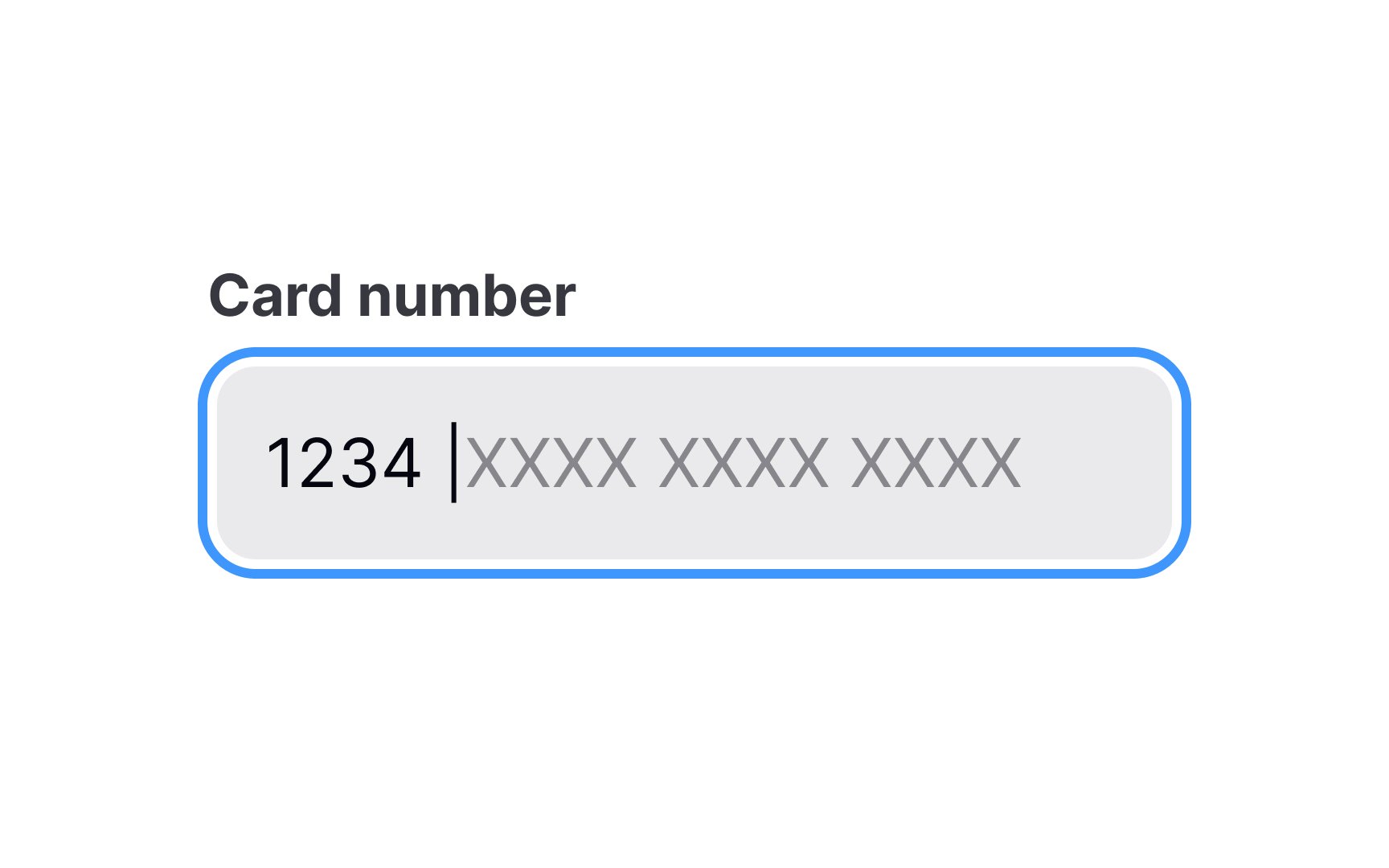
Remember that input masks aren't placeholders. They appear only on focus and as users start typing. Placeholders, in fact, can be remarkably misleading, looking like automatic defaults and making users think the data is already filled.
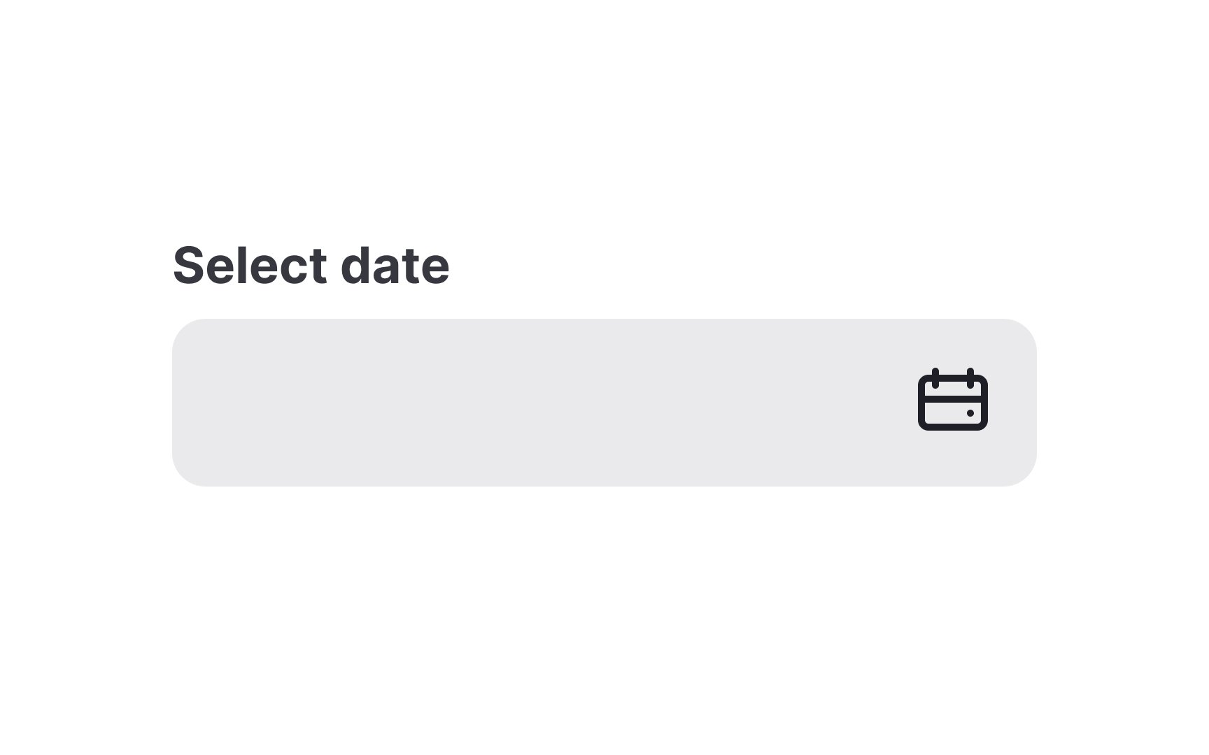
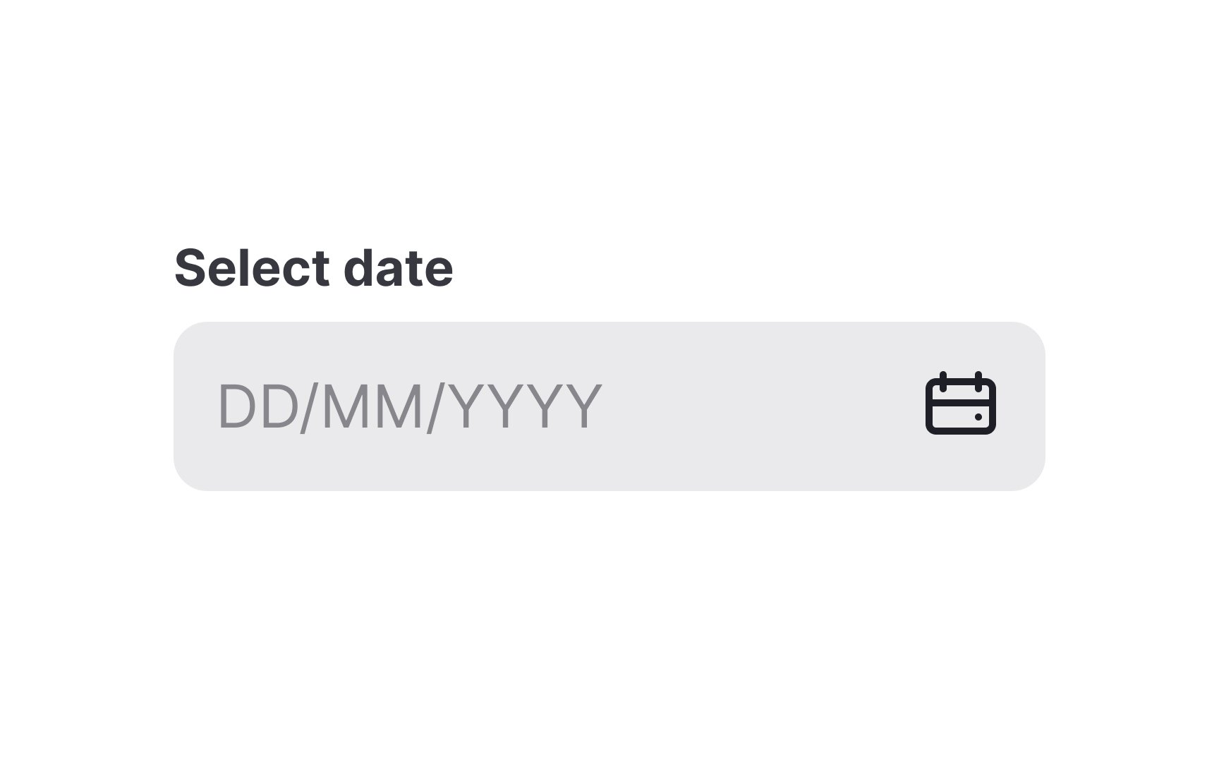
Considering the fact that users in different countries format dates differently,
Pro Tip: If possible, use the default date and time format according to each user's location and settings.
When your product is accessible to users around the world, it's important to inform those who typically use a different currency in their daily transactions about the currency your website or service accepts. This information becomes particularly relevant when users need to convert currency or
Any time users are making a purchase, remove as many potential stumbling blocks as possible. The more a user has to think about the process, the more chances they have to change their mind entirely.
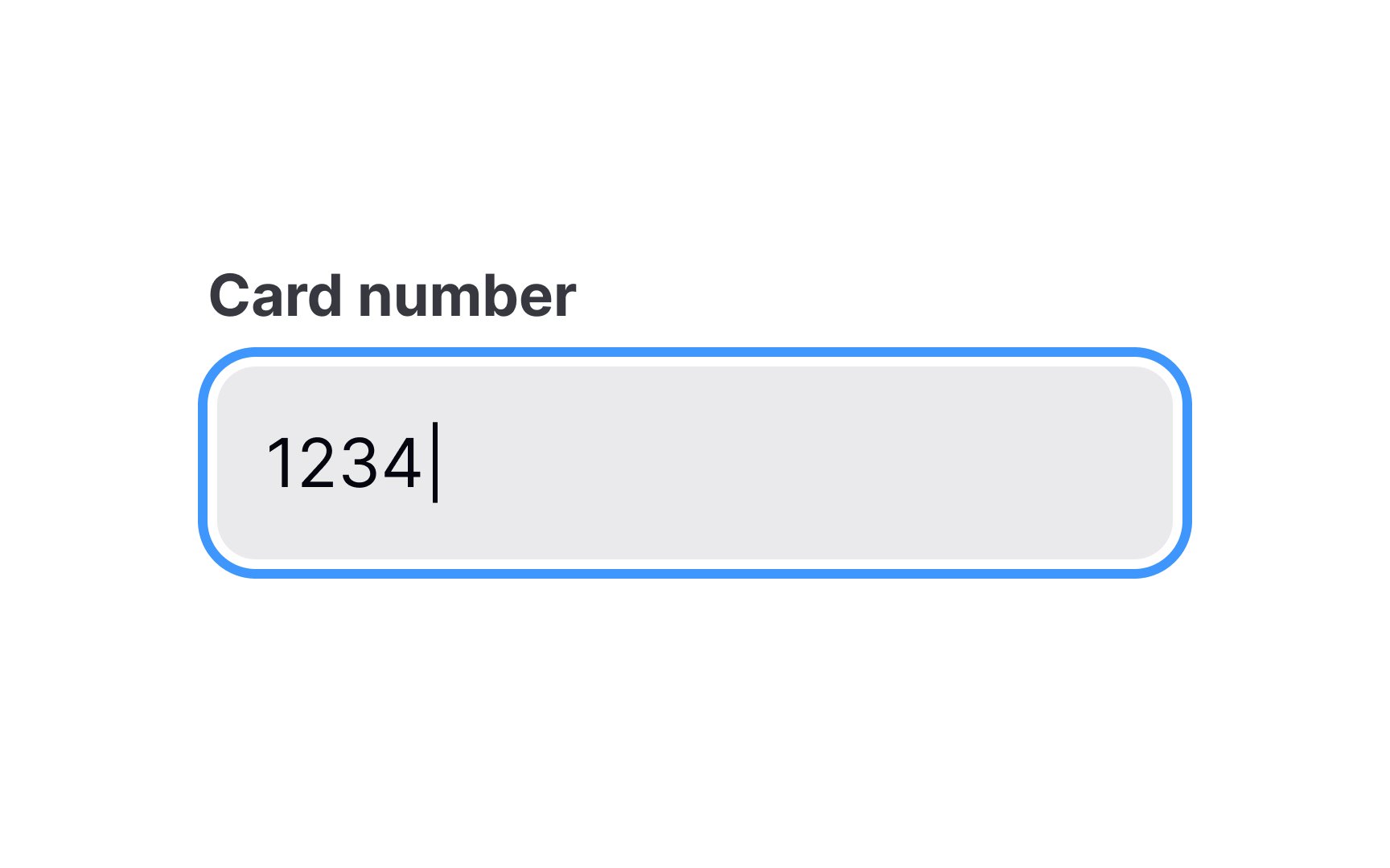
One effective way to reduce these uncertainties and enhance the user experience is by incorporating a credit card
When users fill up forms while making a purchase or booking a flight ticket, they want to stay informed about what's happening in the system.
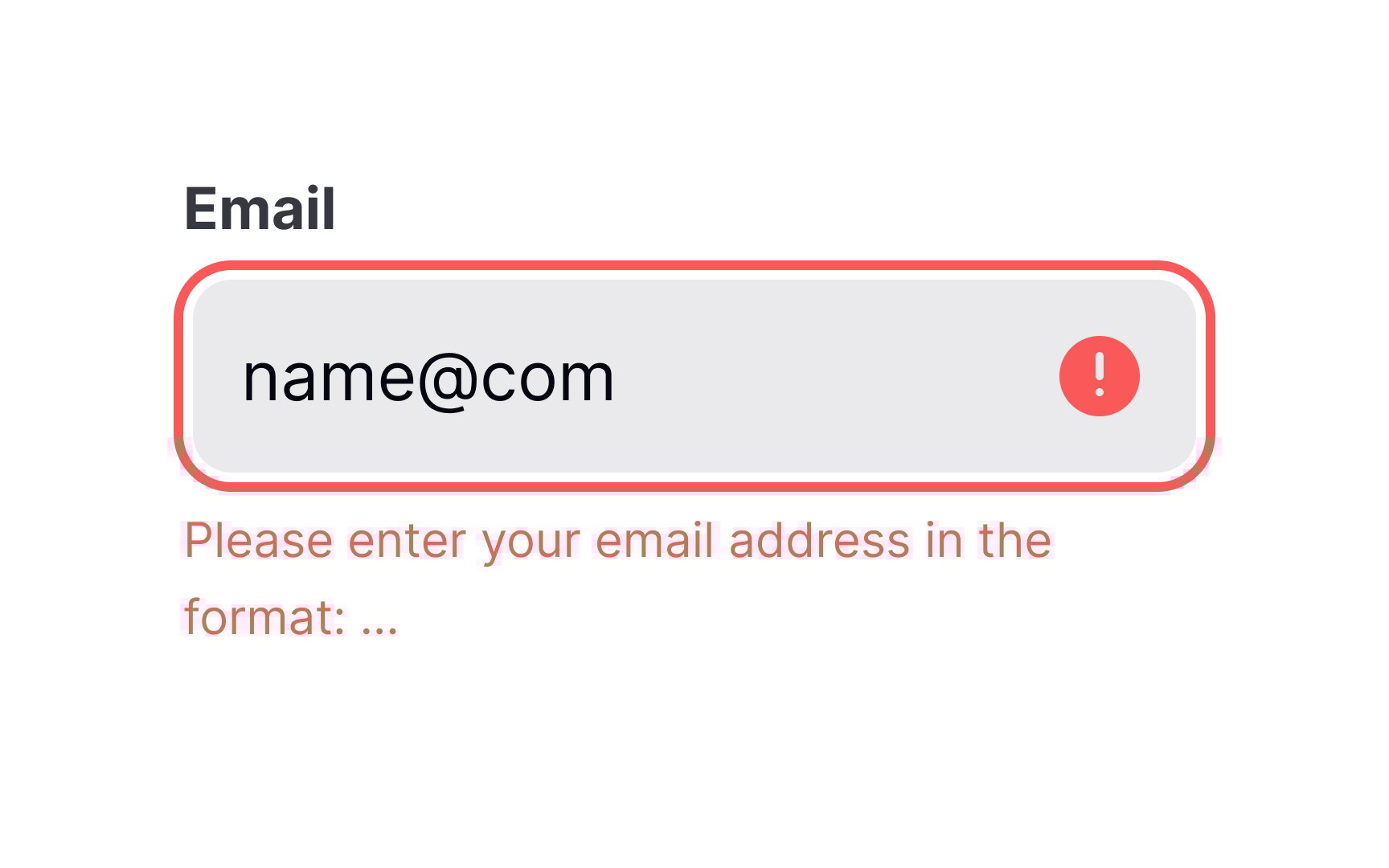
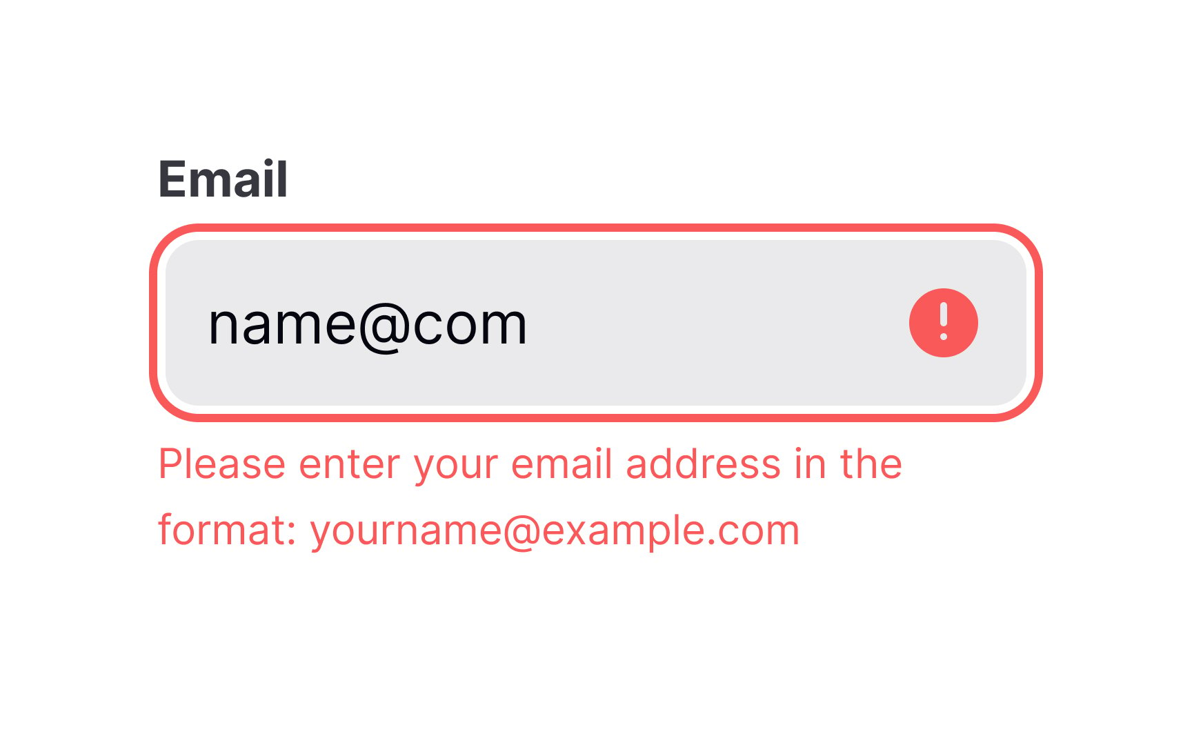
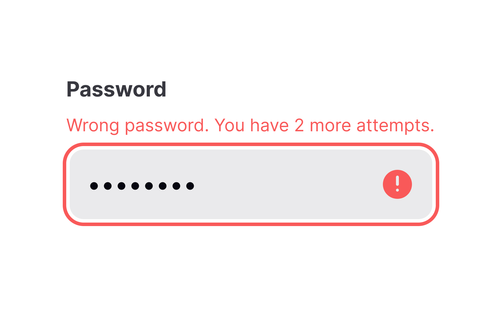
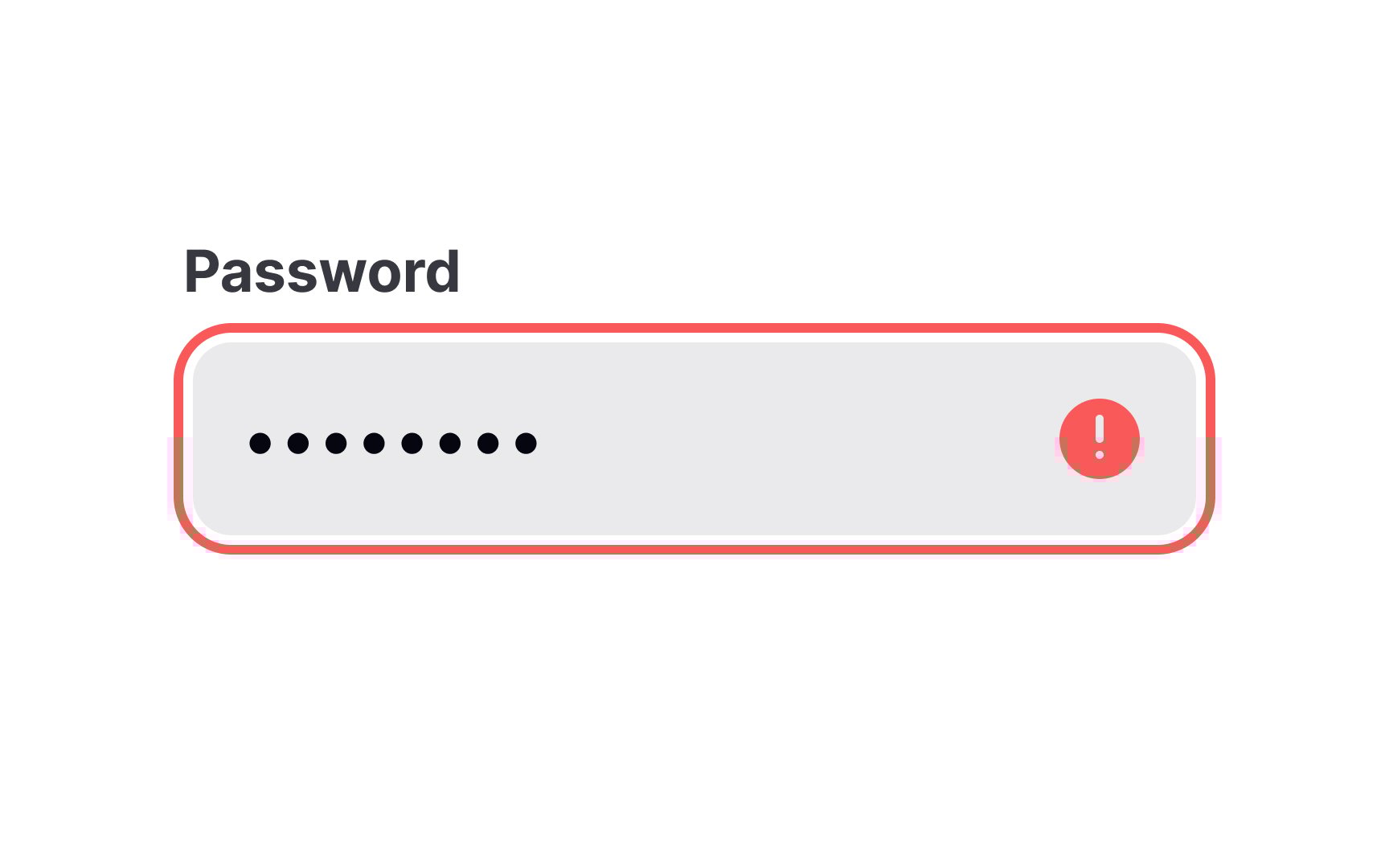
To make the error inputs easy to notice and understand:
- Indicate error
inputs using a prominent,contrasting color (usually red) and a relevant icon. - Politely describe what happened and what users should do to fix the problem.
- Apply real-time, inline validation rather than submit-time modals. The latter breaks the flow and distracts users.
Errors that appear immediately allow users to correct their answers before moving on.[3]
References
- The Best Place for Error Messages on Forms | UX Movement
- How to Report Errors in Forms: 10 Design Guidelines | Nielsen Norman Group
Top contributors


Topics
From Course

Share


Similar lessons

Common UI Components Part I

Image Terminology
