HTML Forms
Learn how to create dynamic and user-friendly input forms on your web pages with HTML
Forms are crucial for collecting user information — names, email addresses, phone numbers, credit card information, etc. HTML and CSS allow us to create the visual part of a form, while data processing is done with other programming languages. In this lesson, learn about the essential HTML form elements and their attributes.
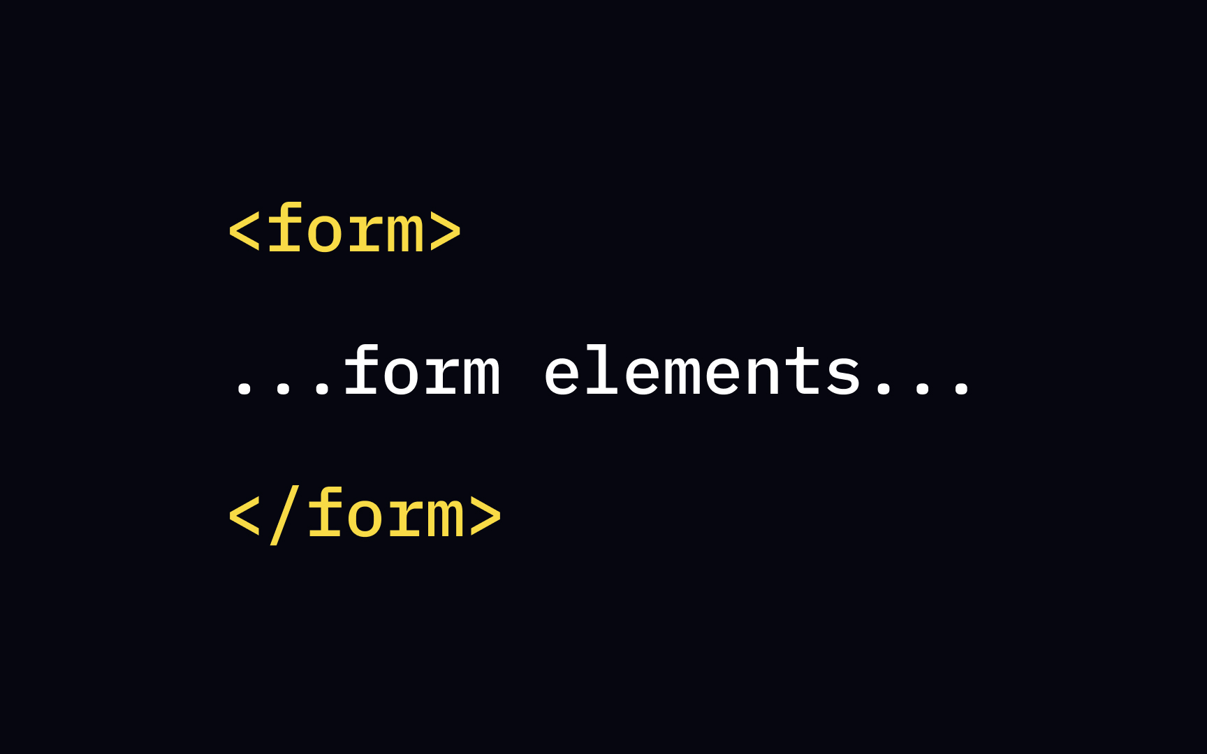
The <form> element defines a document section containing interactive controls for submitting information — the form itself. It's a container element inside which we place all other elements: inputs, checkboxes, radio-buttons, submit buttons, etc. These elements are called "controls."
Users interact with the form by modifying its controls — entering text, selecting items, and submitting the information to a server for processing.
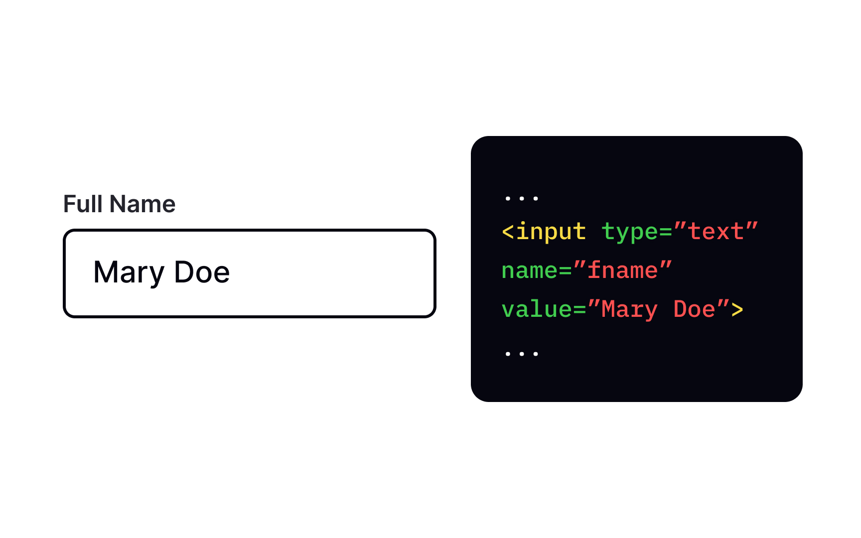
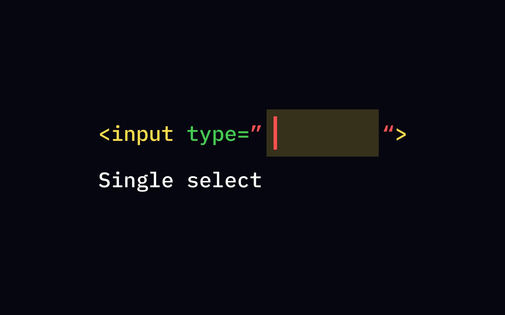
The <input> element is the most commonly used element within type attribute allows you to specify the type of
The <input> element is one of the most powerful and complex in HTML because of the number of combinations of input types and attributes. The most common of them are text fields, password fields,
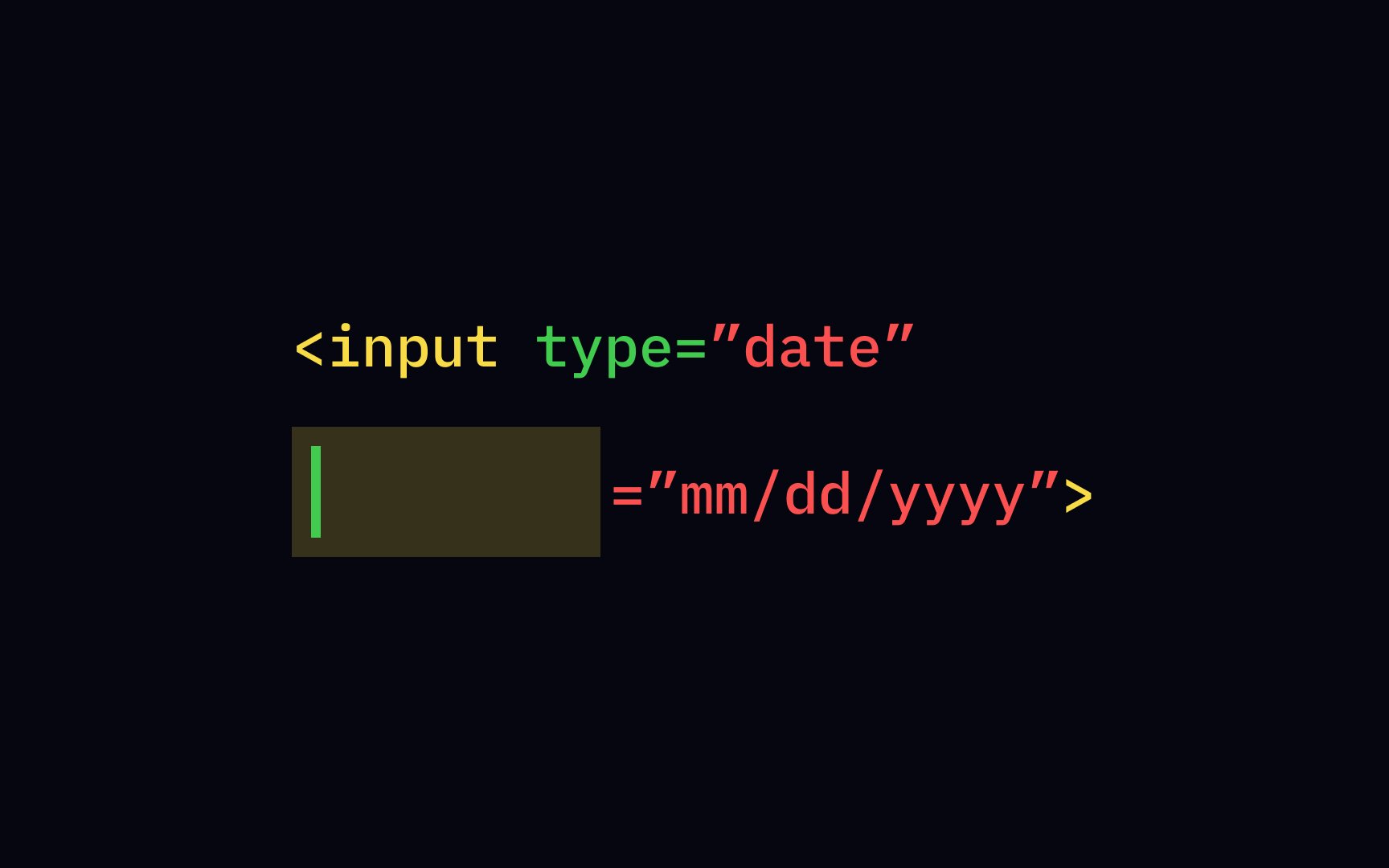
The attribute of an type with the value "text" to the <input> start tag.
Use text fields when you want users to enter short textual information like a name or address. For more specific types of data like dates, URLs,
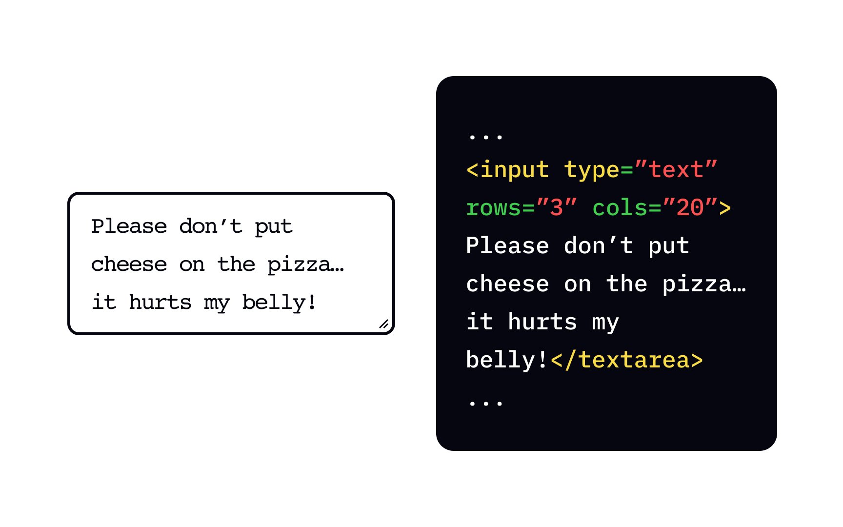
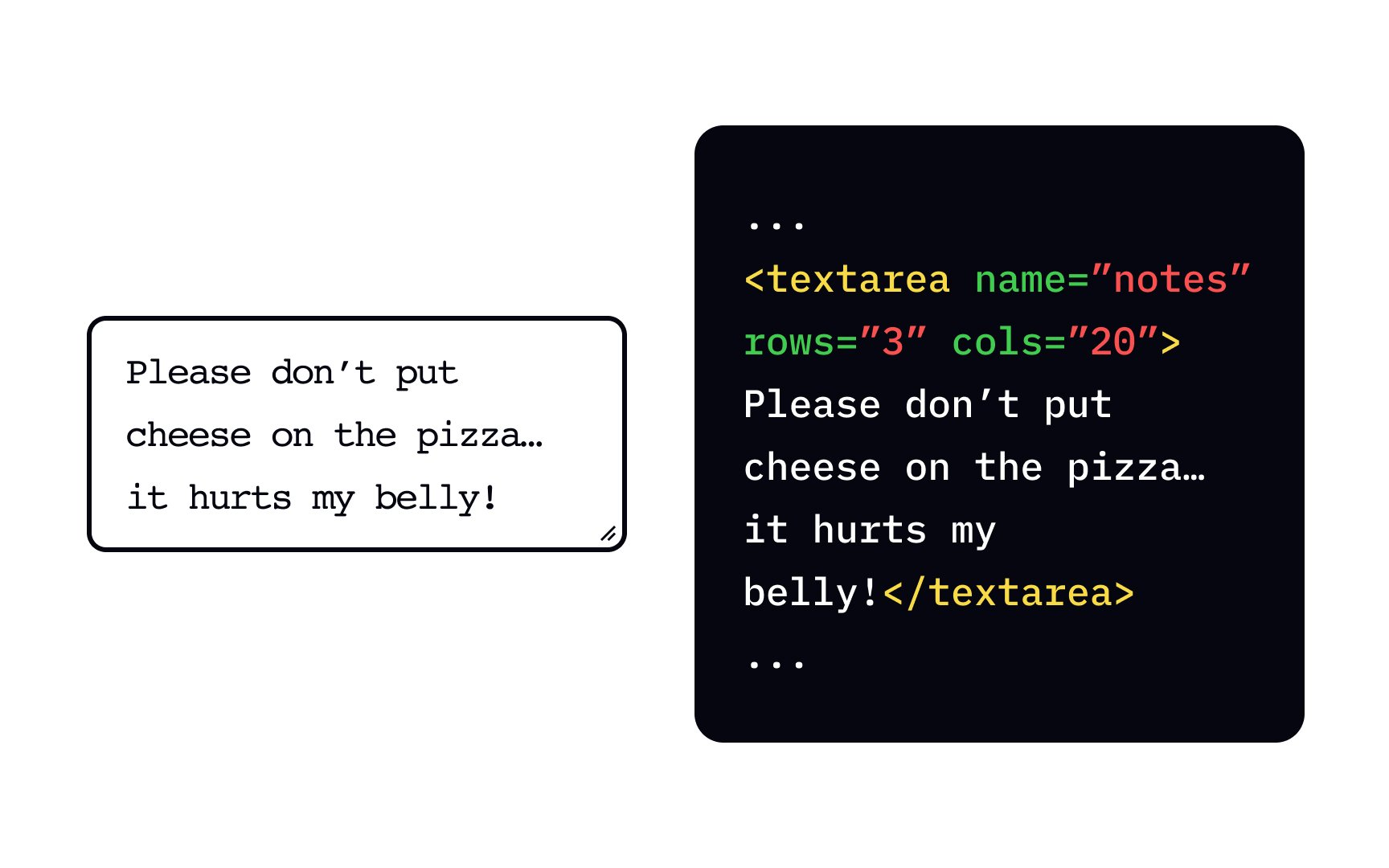
Sometimes we need users to enter a larger text — for example, when asking for comments or reviews. <input type="text"> isn't a good choice as it automatically removes line breaks — also, it's not possible to see a long text at once. In these cases, use the <textarea> element to allow users to enter more than one line of text.
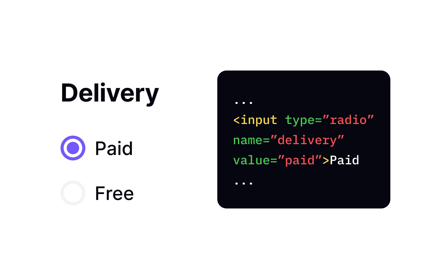
Use the <input type="radio"> to add
Pro Tip: To make a checkbox selected by default, add the checked attribute directly inside the <input> tag you want to preselect.
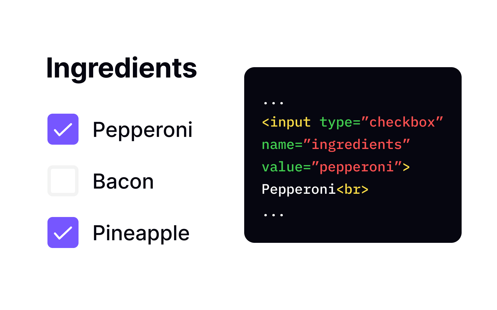
The type="checkbox" attribute of the <input>
Pro Tip: Same as with radio buttons, use the checked attribute if you want to select a checkbox by default.
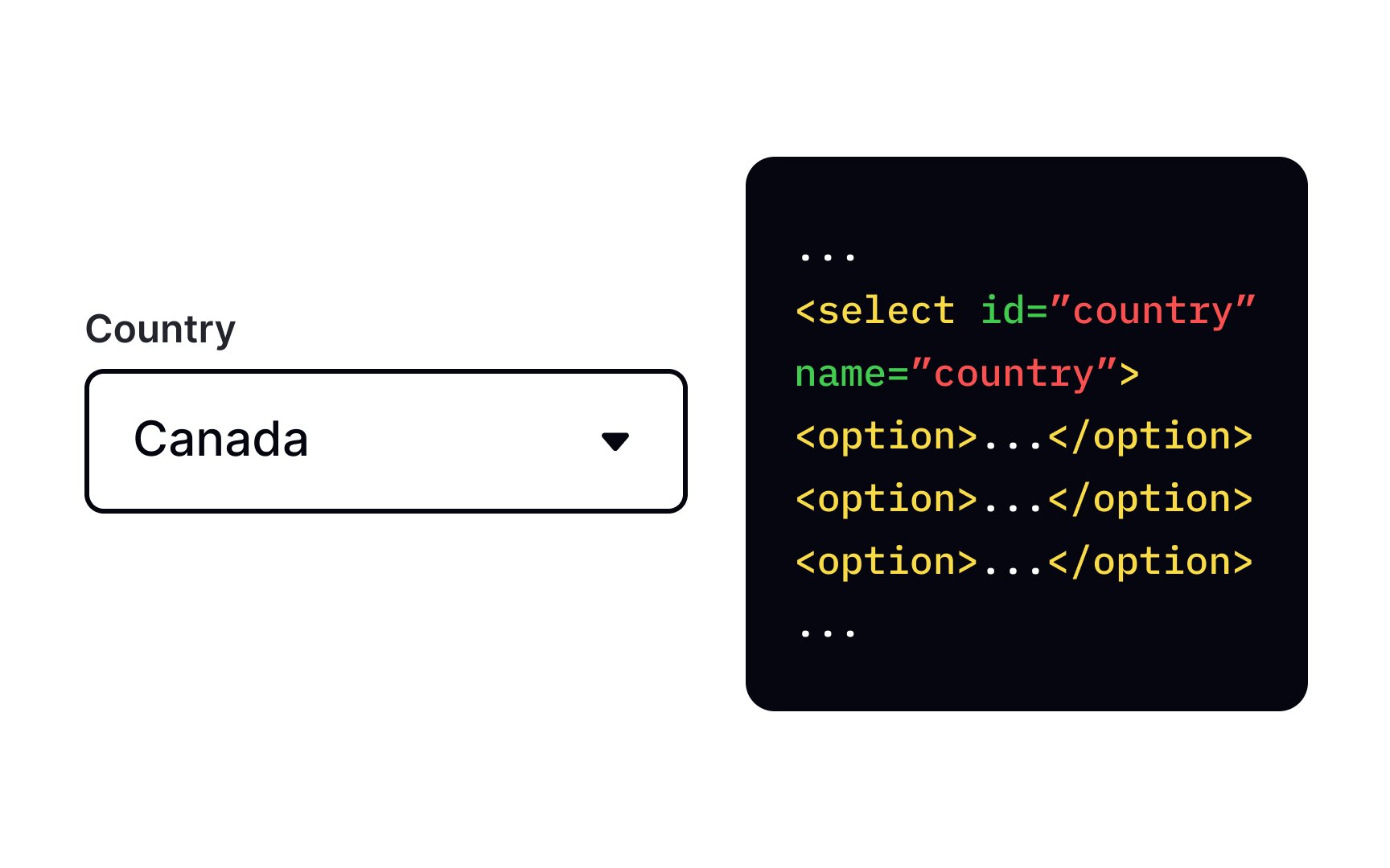
To create a selection menu, use the <select> element. It's a dropdown element that allows users to pick a single option from a list, similar to <option> element inside the <select>
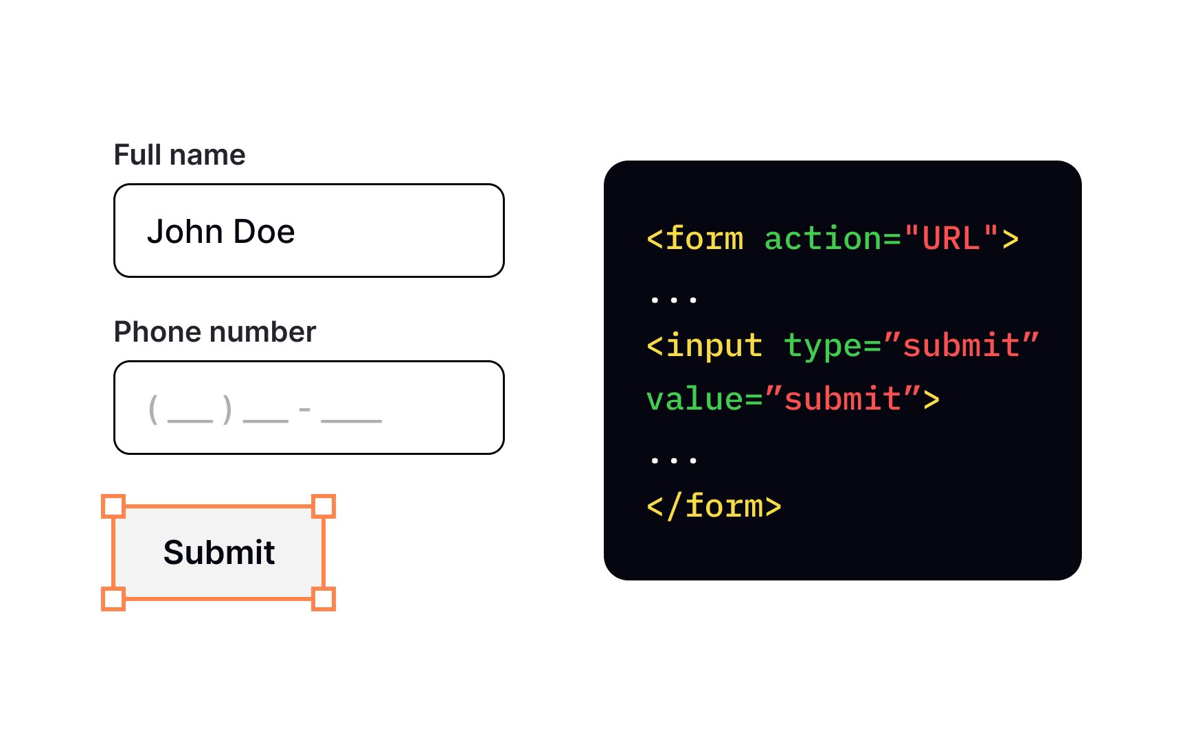
There are several ways of letting users submit their information to the server. One way is to add the <input> element with the attribute type="submit". Browsers render this element as a
When users click on the button, the browser sends the form data to the file in the form's action attribute. What happens to the data later has less to do with design and more with data processing. If you're interested, you can read more about it on MDN Web Docs.[3]
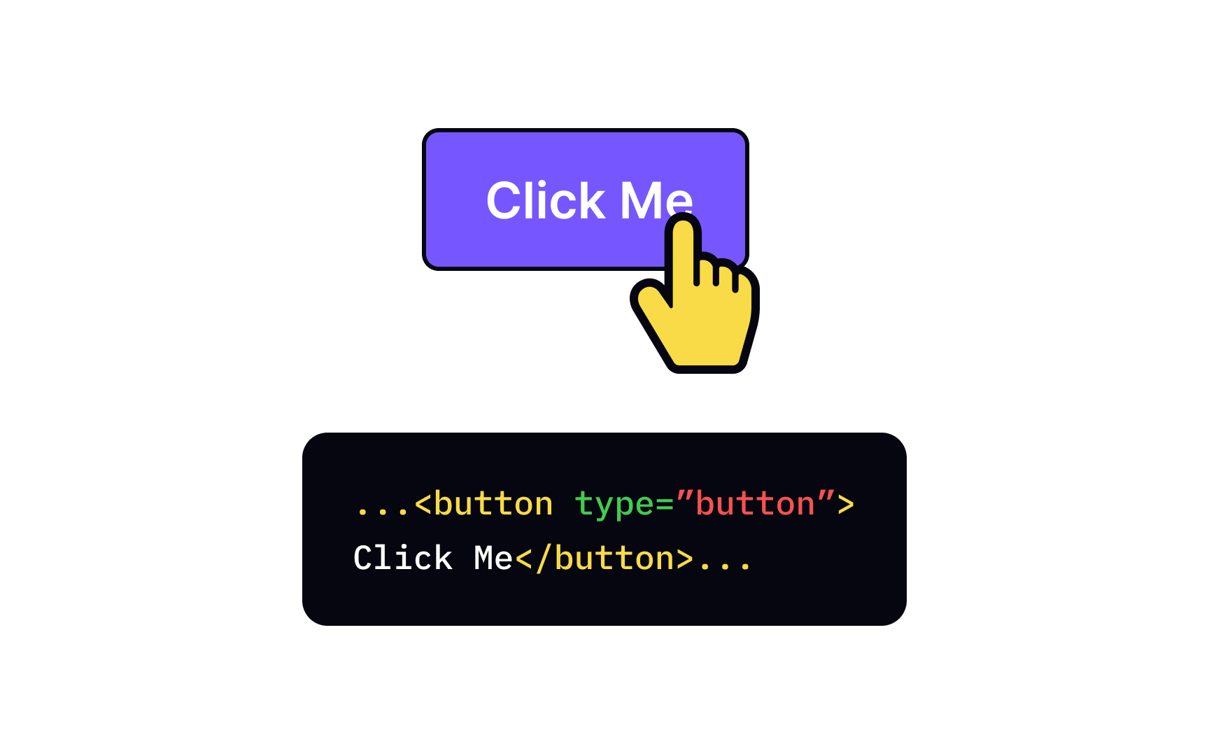
One of the ways to create <button> element. Button elements allow more possibilities as they can have content because it's a <input>, on the other hand, is a null element — it means that you can't add a markup to the text or insert a picture. The <button> element offers all of these possibilities, and it's easier to style in

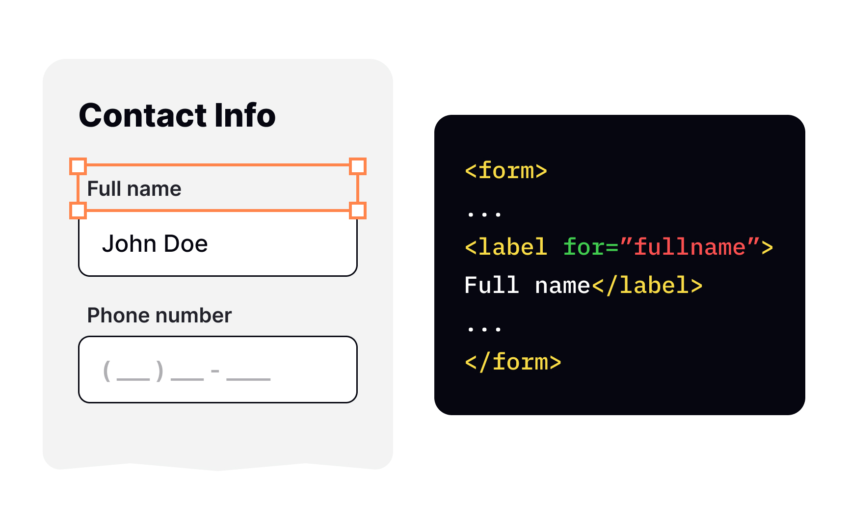
Labels are no less important than
Create labels with the <label> for attribute along with the value of the input's id, or by nesting the <input> directly inside the <label> (read more about that on MDN Web Docs).[4]
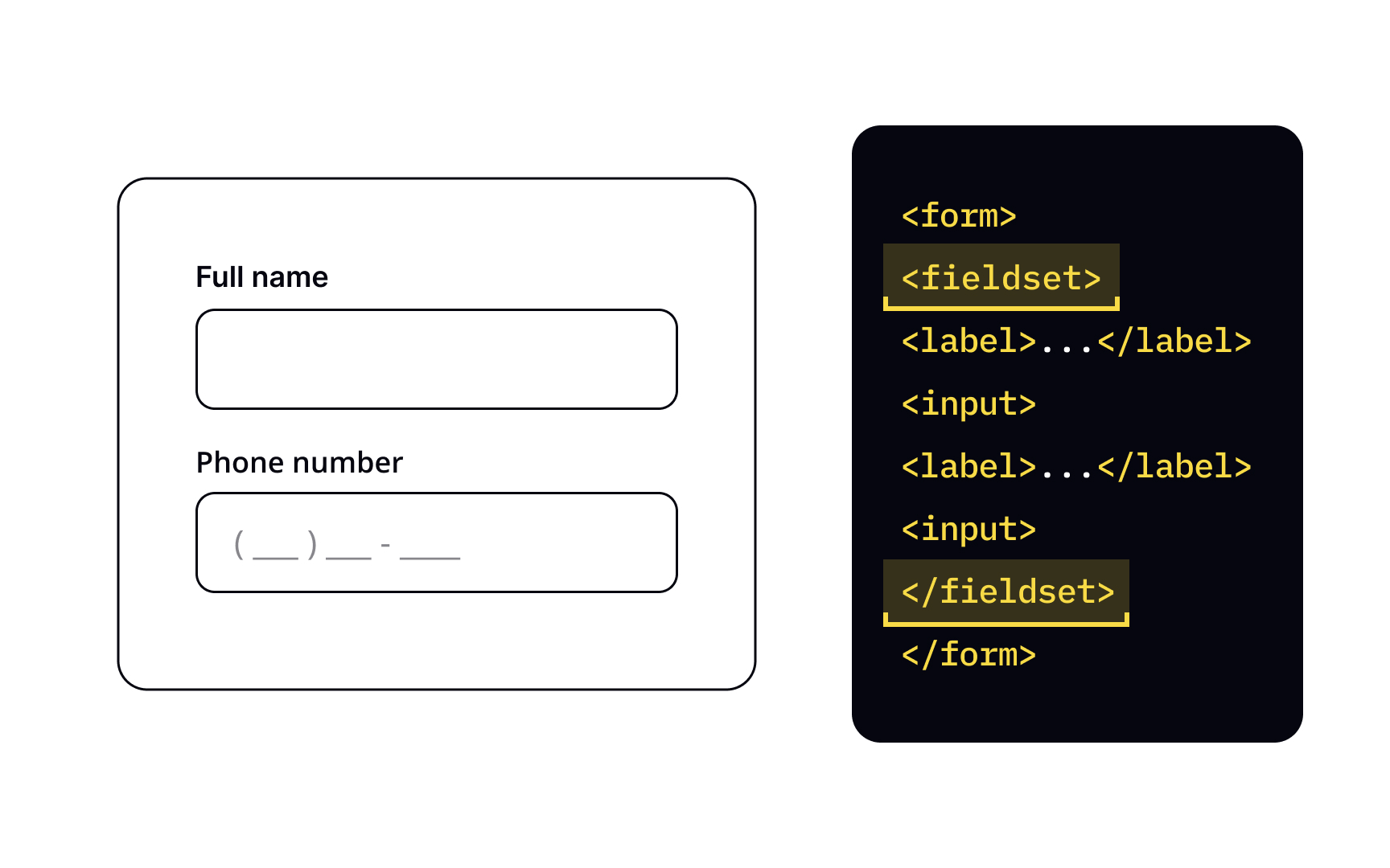
Filling out forms can sometimes get really tedious. What can help with that is dividing forms into sections — basically, grouping similar controls together depending on the type of information they ask. For example, when asking for employees' information, an employer can put the fields Full name and Phone number into the Personal info section, and Job title and Start date into Job information section.
To group controls and their <fieldset>
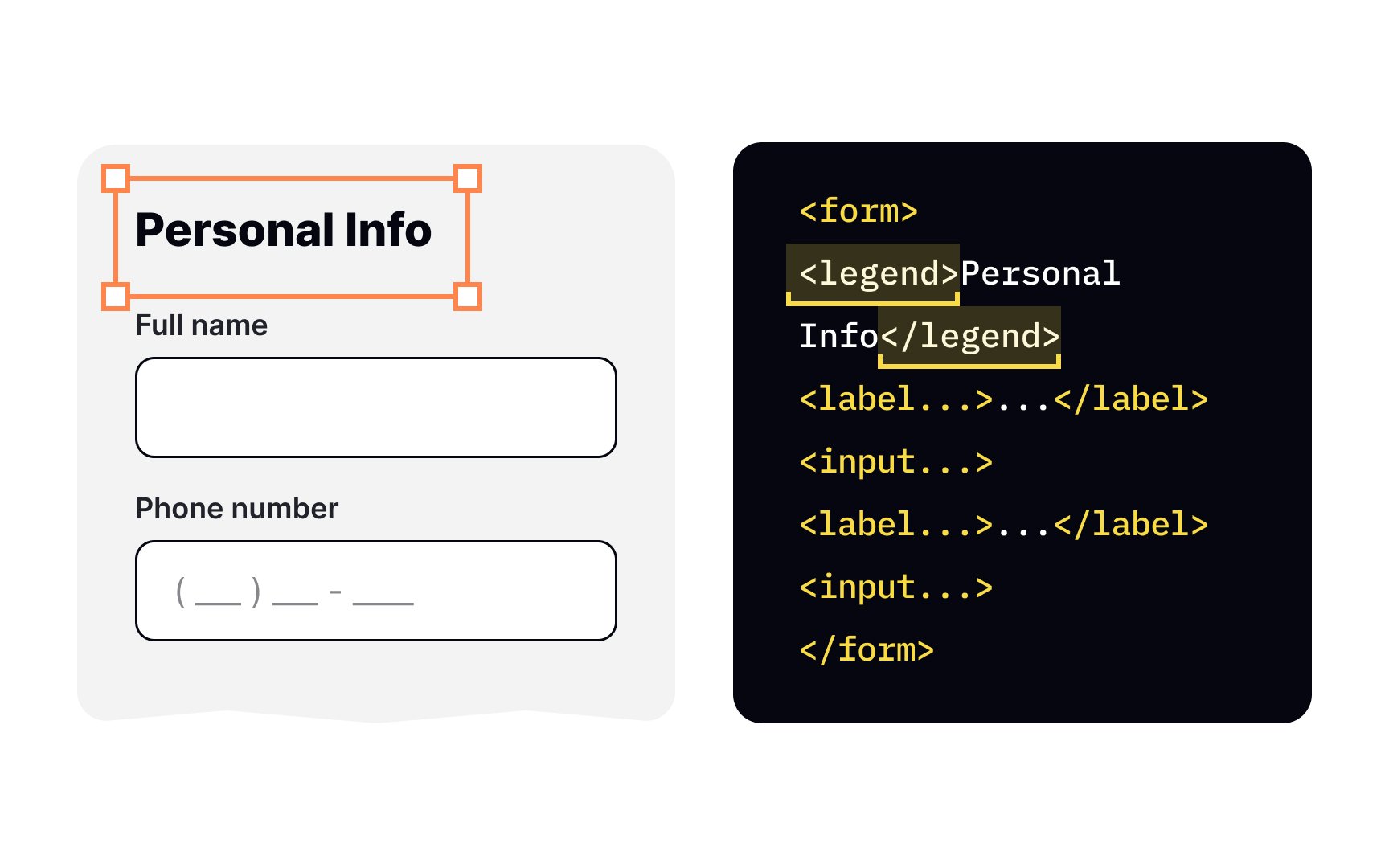

The <legend> element is nested inside the <fieldset> element and provides a caption for the section <fieldset> start tag and put the caption between its start and end
Generally, grouping controls is a good idea as it makes it easier for users to locate a control they need and looks more user-friendly. Just make sure your grouping makes sense and use descriptive and concise
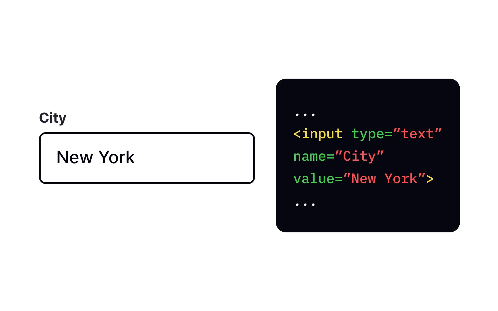
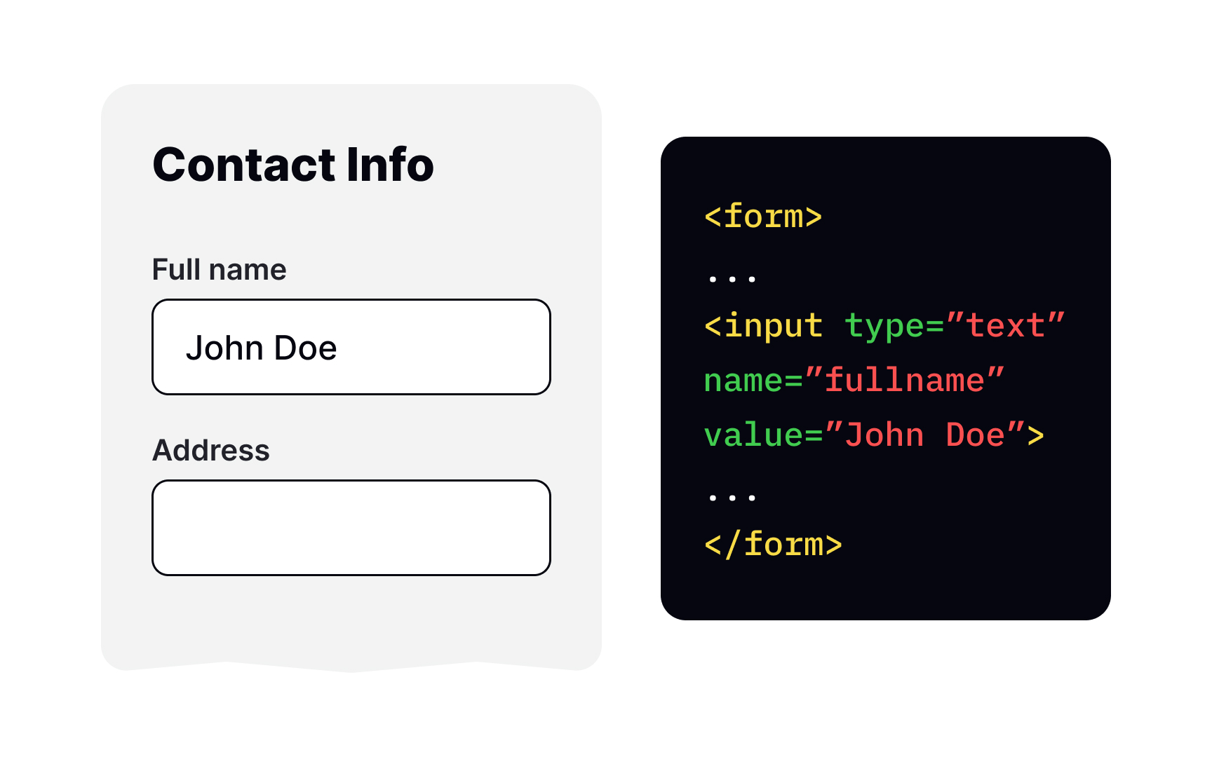
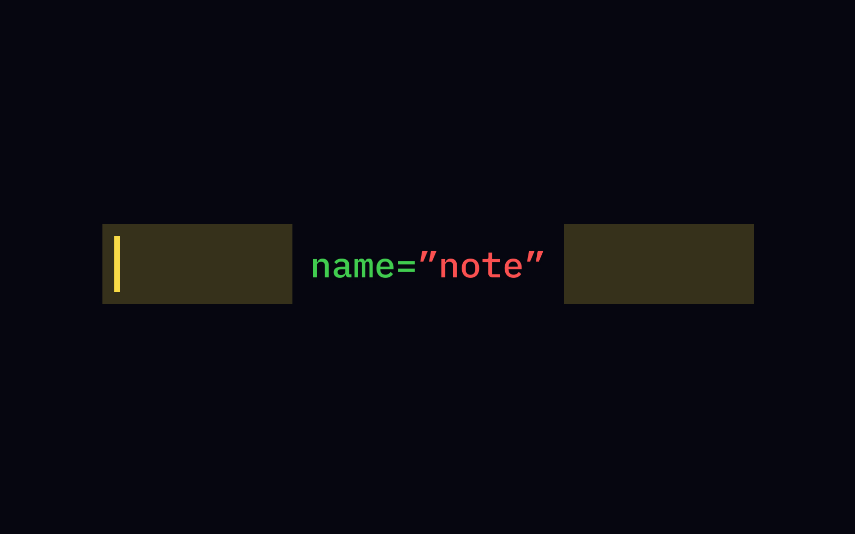
So users fill a field, but where does this information go afterward? The point of forms is to collect data, of course. For a server to correctly identify the data in the fields, each <name> attribute. For example, set the name attribute's value to "email" for a field that collects users'
JavaScript requires the name attribute to be unique among the forms in a document and not be an empty string.
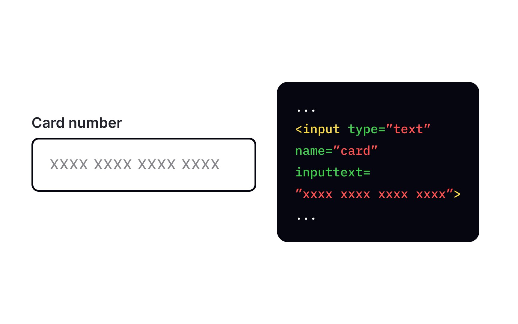
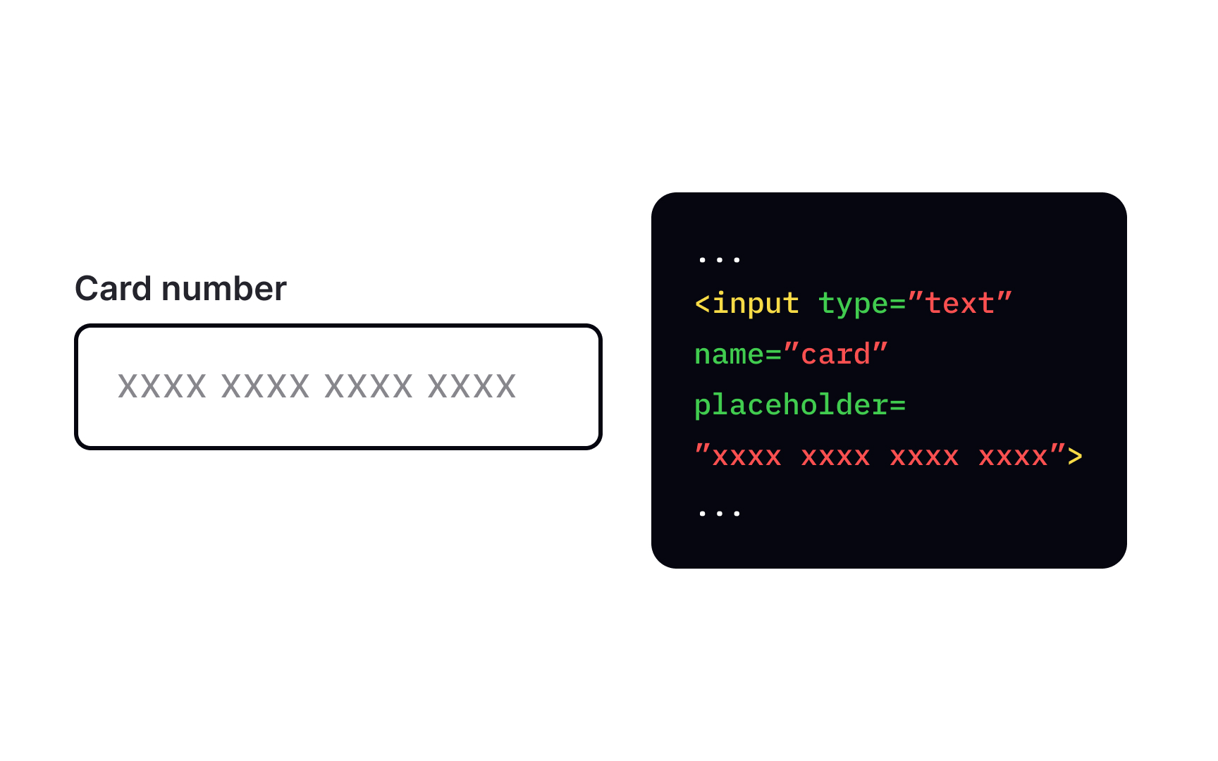
placeholder attribute inside the <input> placeholder="Jack Sparrow" in a Full Name input to give users an example of a full name.
Browsers will display placeholders in faded text inside the input. Ensure it's not the only information users need to fill in a field — assistive technologies can't read placeholders, and they are highly problematic for low vision users.
If you want to ensure users fill in a particular field, add the required attribute to that field. It won't let users submit the form before they specify a value for the
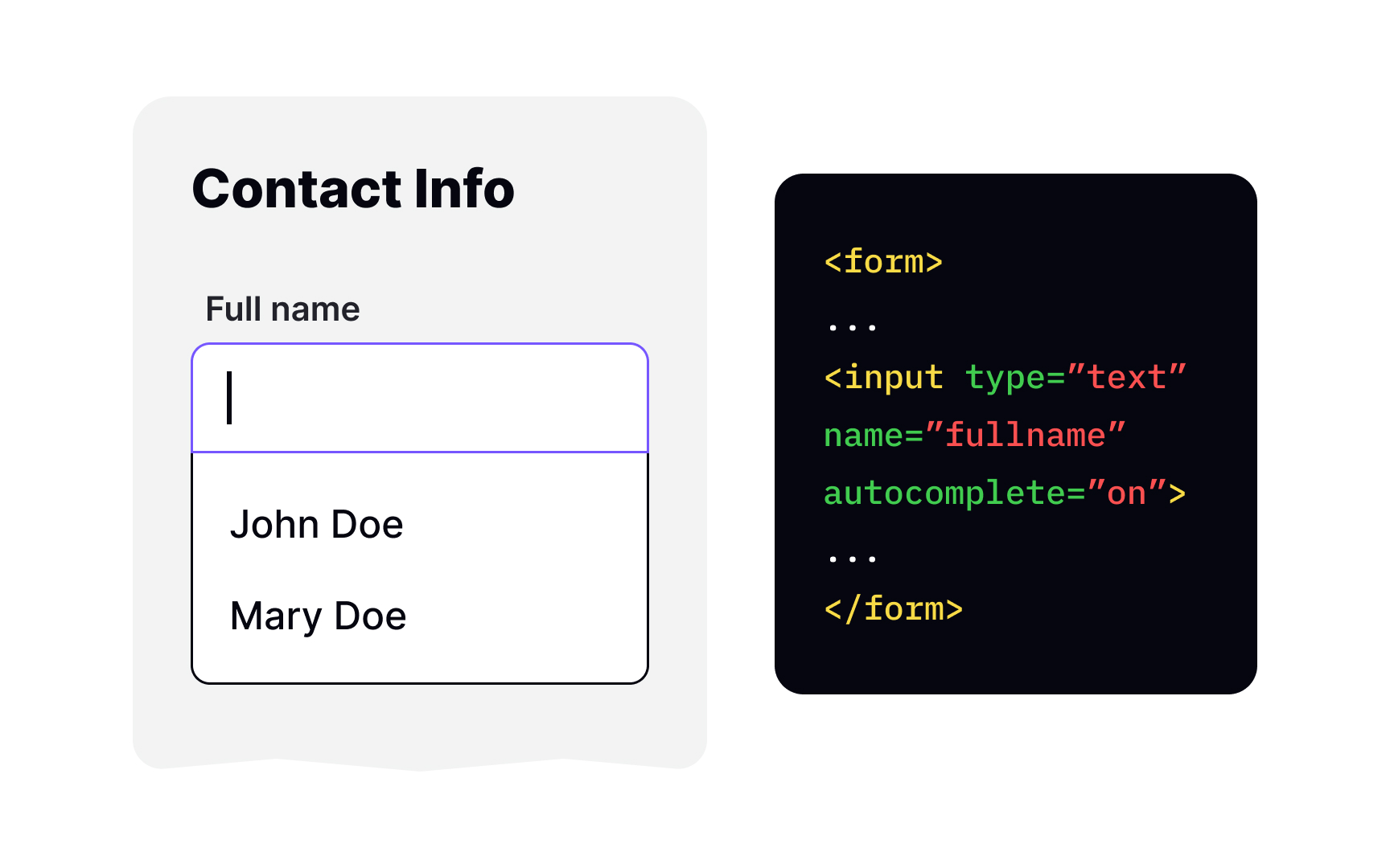
Many forms ask for the same information — name, address, phone number, etc. Allowing autocomplete can make your users' lives much easier — instead of typing all this information anew, they can just choose from the list of predictions.
You can add the autocomplete attribute to <input>, <textarea>, <select>, and <form> elements to enable autocomplete. The value "on" allows the browser to automatically complete the
Set the type of the input element to "radio" to create a radio button. Remember that
To create an <textarea> element. This element also accepts several attributes common to the <input> element, for example, autocomplete, placeholder, and required.
In most browsers, <textarea> is resizable — you'll notice the handle in the right corner that users can drag to change the input size. This is because the resize CSS property is enabled by default. If you want to disable it, add the following rule to your style sheet:
textarea {
resize: none;
}
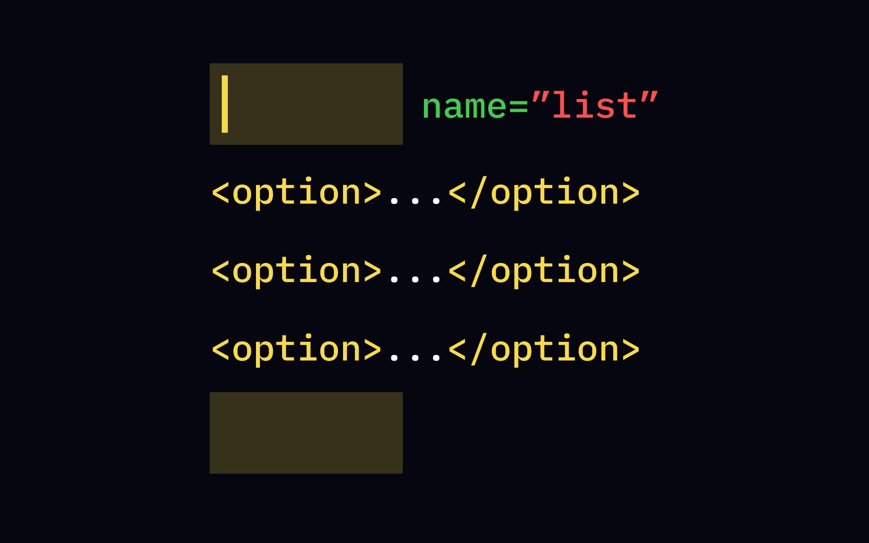
Use the <select> element to create a control with a <option> tag inside the <select> selected attribute in the <option> element to make it selected by default when the page first loads.
The placeholder attribute provides a brief hint to users about what kind of information they need to enter into the field. Avoid writing lengthy prompts and explanations — the best
When designing a form, make sure that users can fill it out even if they can't read placeholders.
References
Top contributors


Topics
From Course

Share


Similar lessons

Basics of HTML Attributes

Guide to CSS Selectors
