Applying Composition Grids in Design
Learn how to incorporate composition grids into your design process
Quoting a Canadian designer, typographer, artist, illustrator, and writer Marian Bantjes, "design and typography are like a well-tailored suit." Composition grids help designers craft exquisite designs that feel like a genuine masterpiece.
Users may overlook intricate details and delicate work, but when it's done professionally, they can tell "it looks like a million bucks."[1]But what type of grid should you use?
Content is a king, and your choice of a grid should, first of all, rely on what content your product provides. Some grids have a structure that perfectly fits large pieces of text, while others are designed for websites with various types of data. Some grids are more organized and traditional, while others can help you bring a streak of creativity. Understand the pros and cons of various grid types to make the right choice of grid for your project.


Traditional column grids are common for products with a large range of material types, like magazines or newspapers. Those grids are flexible and allow to organize
Pro Tip: Traditionally, if the gutter size is X, the margin size is 2X. Such measurements help guide users' attention inward and make reading more comfortable.


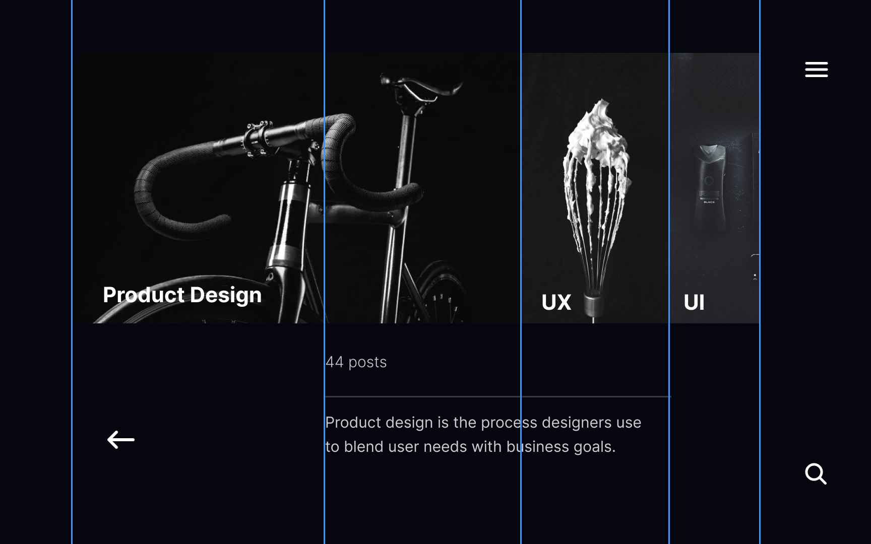
Three-column grids provide a uniform solution — they're standard and can be applied to many websites.
Three-column
Selecting a

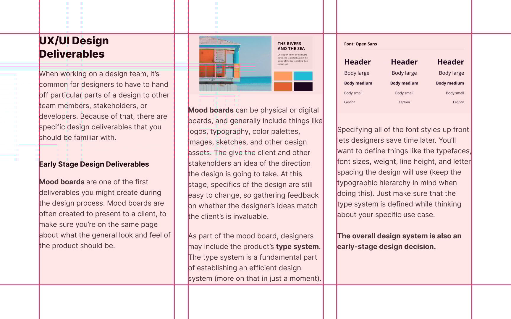
Modular grids, apart from
Integrated grids are for designers who love challenges and want to add more variations to a


Traditionally, column grids use equally-sized
Pro Tip: Be cautious as interfaces with symmetrical grids may look monotonous and lack vibrancy.


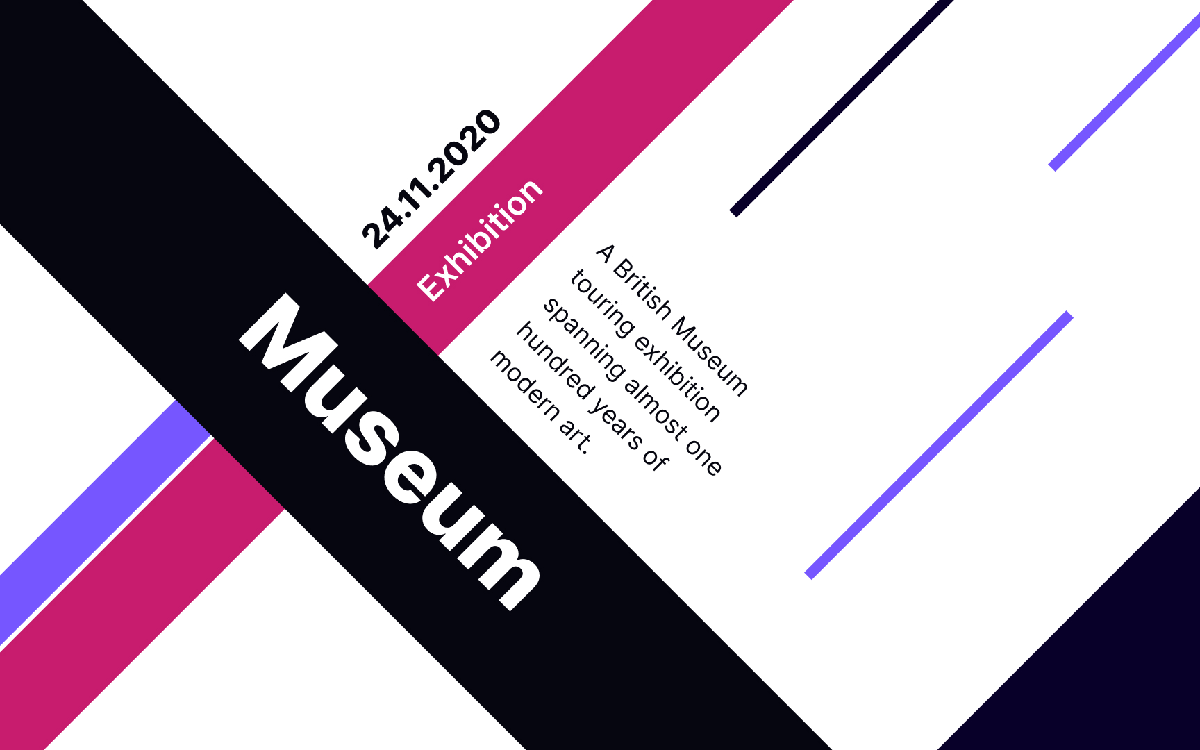
Asymmetrical grids have more visual interest and feel less monotonous. You can use asymmetry to create contrast between
Make sure asymmetry doesn't create chaos on a
Manuscript grids are classic grids for printing, especially for continuous blocks of text, like in books, essays, or manuscripts. However,
Pro Tip: To prevent a page from looking like a monotonous block of text, designers should add enough white space to margins.

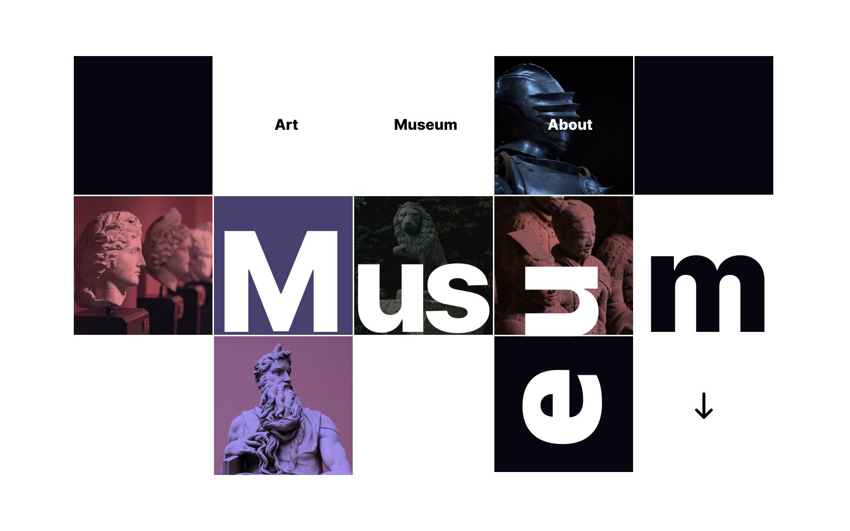
Although hierarchical grids may look a bit chaotic, lack regular structuring, and don't contain repeated intervals, the
Hierarchical grids place elements intuitively — the content itself defines the logical alignment and overall composition. Designers can adjust
This grid type helps navigate users through the information in the desired way, from the most vital elements to the less important ones.
Pro Tip: You can apply a more precise approach and use math calculations to define the content arrangement.
References
- Layout Essentials Revised and Updated | Google Books
- Layout Essentials | Google Books
- Best Practices for Graphic Designers, Grids and Page Layouts | O’Reilly Online Learning
Top contributors


Topics
From Course

Share


Similar lessons

Intro to Design Layouts

Intro to Design Grids
