Creating a Color Palette
Learn how to put together a color palette from scratch based on your goals
Creating a color palette that meets a product's needs is a challenging task. Colors shape the brand identity and evoke emotions about the product. If the palette misses the mark, you risk losing your target audience.
A basic understanding of color theory isn’t enough to put together a winning color palette. You also need practice and an eye for aesthetics. Start with simple schemes like monochromatic or analogous, and then experiment by adjusting different colors. Keep tweaking until you find a combination that works.
If you're struggling or new to this, look for inspiration on websites like Coolors. Study existing palettes, paying attention to parameters like saturation and value. Use what you learn to create your own color palette.


Imagine you've been tasked with creating an eye-catching
- Evaluate competitors: Check out the color palettes of existing brands in the fashion industry.
- Find inspiration: Browse platforms like Dribbble or Behance for fresh ideas.
- Compile your ideas: Create a mood board with images and illustrations that reflect the brand's vibe.
- Consider color psychology: Think about the emotions and associations you want users to connect with the brand.
For this project, bright purple could work as the base color since it symbolizes creativity, luxury, individualism, and mystery. While it can have a spiritual feel, it also brings positive and vibrant energy.[1] Ensure that the base color isn’t too saturated or dark, as this might evoke the wrong emotions or turn users away.


When creating a personal
A split-complementary color scheme offers a less intense alternative. Instead of using the direct opposite hue, it uses the colors on either side of it. Triadic and tetradic schemes are more challenging to balance but can produce striking results. Triadic harmonies consist of 3 colors equally spaced around the color wheel, like blue, yellow, and red. Tetradic schemes, also known as double complementary, use two pairs of complementary colors.


Analogous and monochromatic schemes are among the simplest and safest options to create. They offer less contrast than complementary harmonies. Monochromatic schemes focus on different tones,
An analogous scheme takes a slightly different approach by using 3 colors of similar chroma that are placed next to each other on the
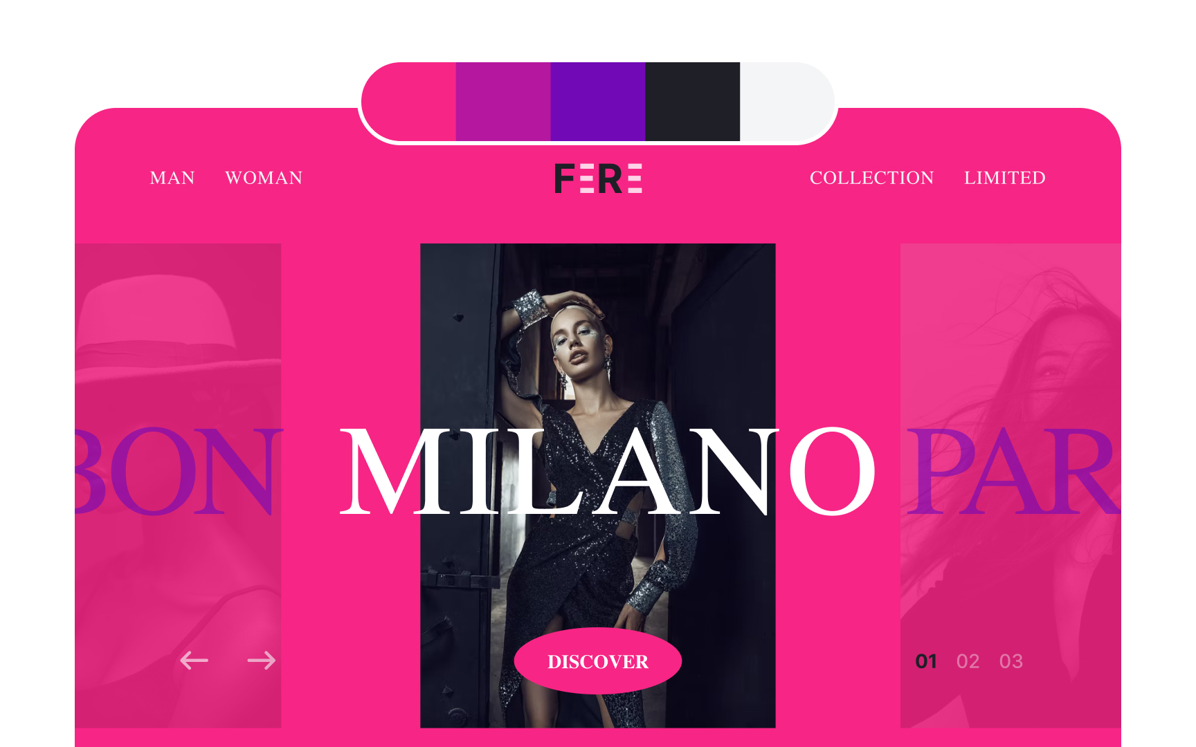
In this example, the analogous color scheme is an ideal base. It’s vibrant, bright, and eye-catching, and with a few adjustments, it can perfectly align with the


To add more interest to this example, you'll need to tweak the current analogous


While browns, tans, and off-whites can create a warm and cozy feel, they aren't ideal for a luxury fashion
When paired with purple and pink, black enhances the elegance and sophistication of the palette, while white adds a refreshing and crisp
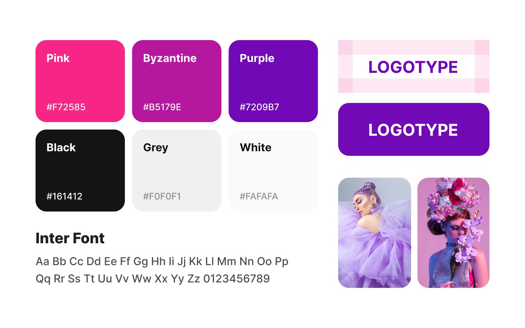
As a project grows, maintaining
Key elements of the brand style guide include the logo, typography,
Once your
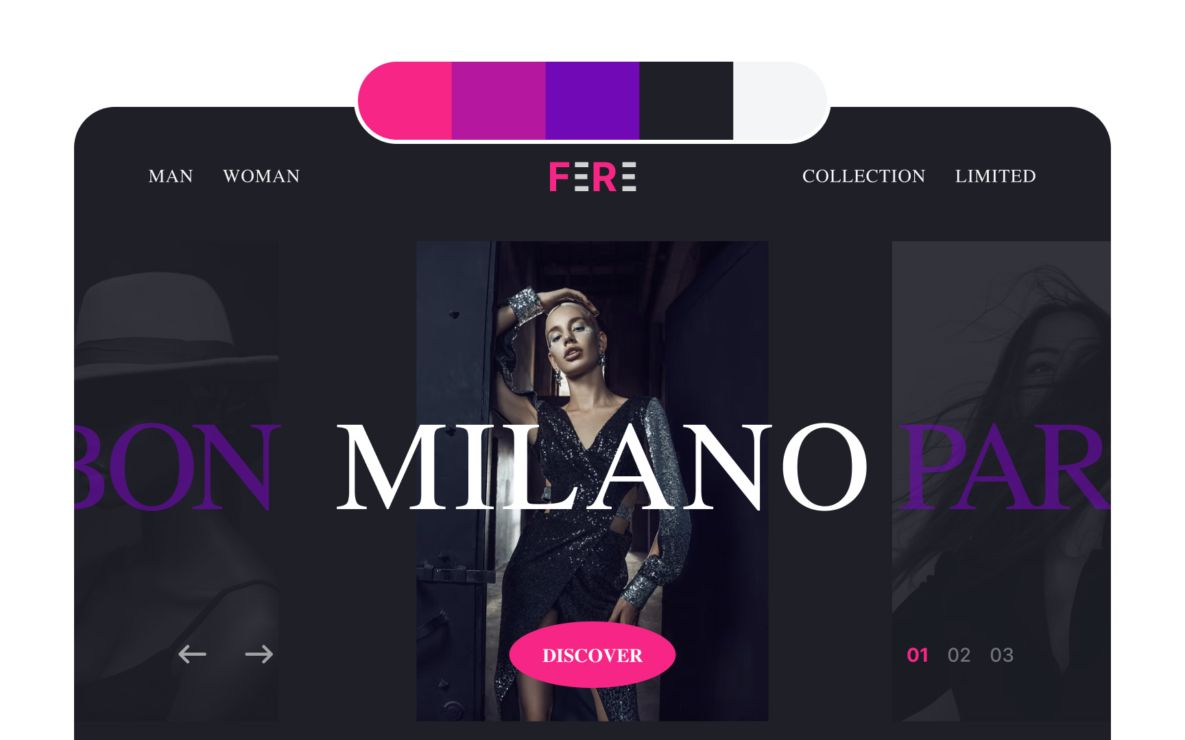
Accents are typically applied to elements that need to stand out, such as CTA buttons. The primary and secondary colors should be relatively neutral to enhance readability and ensure the design is accessible to all users.[3]
By following the 60-30-10 guideline, you can avoid visual clutter and create aesthetically pleasing designs.
Pro Tip: Don't forget about consistency — if you use red as a warning color, don't use it for the CTA button or elsewhere.
References
- Effects of the Color Purple on Mood and Behavior | Verywell Mind
- Using Color to Enhance Your Design | Nielsen Norman Group
Top contributors

Topics
From Course

Share


Similar lessons

Intro to Color Theory

Color Properties
