Intro to Search Functionality in UI
Understand the basics of designing a search functionality that helps users find specific data
In today's digital environment, integrating search functionality into user interfaces is vital. It allows users to effortlessly find what they're looking for, whether on intricate websites with extensive data or in specialized apps for specific needs like flight bookings, hotel reservations, or car rentals.
By embedding a search feature in your UI, you enable users to quickly locate necessary information, bypassing the need to navigate through numerous menus. Consider, for instance, the challenge of exploring a content-rich site like Wikipedia without a search tool! The presence of search functionality not only enhances user efficiency but also significantly streamlines the experience, ensuring quick and easy access to relevant content or specific items.
Search functionality isn't the only navigational feature. Depending on users' level of knowledge, expertise, and goals, they choose different techniques for finding what they need. For example, visitors of an e-commerce website may browse the catalog, go to their wish lists, and recommendations, or use a search input to find the specific item.
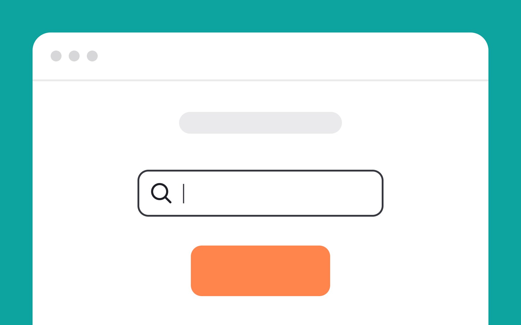
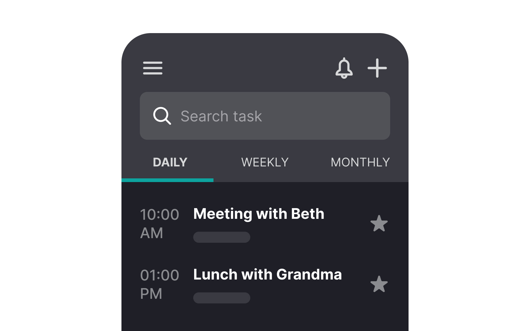
There are a lot of options for implementing search functionality, but the most expected variant is a simple text input wide enough to contain a word or phrase users search for. When they hit "Enter" on their keyboard or click the search button, they should receive a list of results matching their search query.

Don't make users
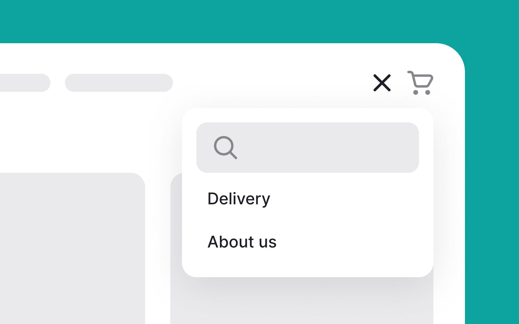
Hiding the search functionality behind the hamburger menu or placing it somewhere else makes users feel frustrated and eventually leads to higher abandonment rates.
The
Ensure that the icon is interactive — designed to be clicked or tapped. When users enter a search term and click or tap the magnifying glass icon, it should trigger the search process, displaying the results based on their query.
Pro Tip: Don't overdo the icon design and use the simplest version — excessive graphic details slow down recognition.


The
The Nielsen Norman Group recommends using 27-character-long search inputs as it makes search requests easier to read and interpret for users.[2]


To enhance
However, use placeholders judiciously. They can be mistaken for pre-filled information, leading users to think no input is needed. Their often low contrast can also make them hard to read, posing accessibility challenges. Not all screen readers or assistive technologies interpret placeholders effectively, potentially hindering some users from accessing the hints.[3]
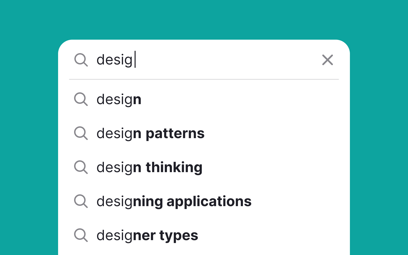
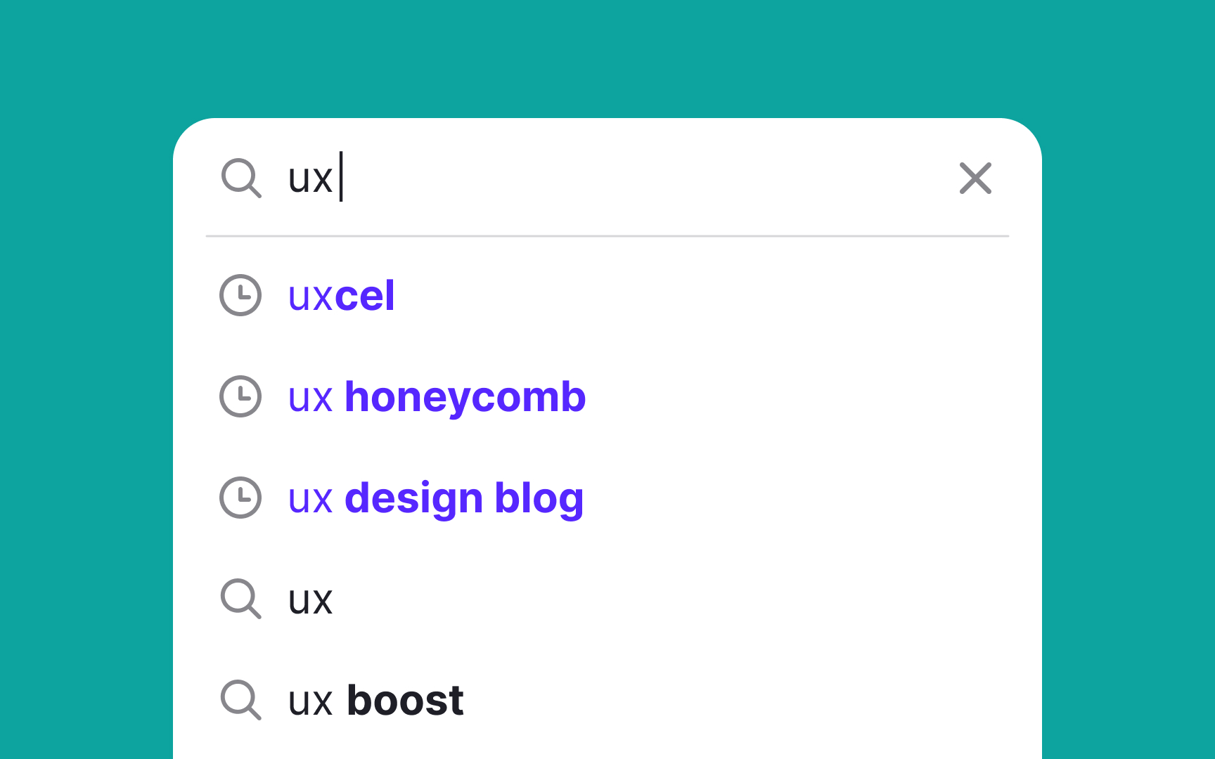
Auto-suggestions, or autocomplete, enhance site
When implemented well, auto-suggestions reduce the effort users must put into typing, lower the chance of typos, and decrease the cognitive load by allowing users to recognize and select the correct terms quickly.[4]
Pro Tip: To make the auto-suggest feature even more helpful, implement autocorrection, word prediction, and related words recognition.
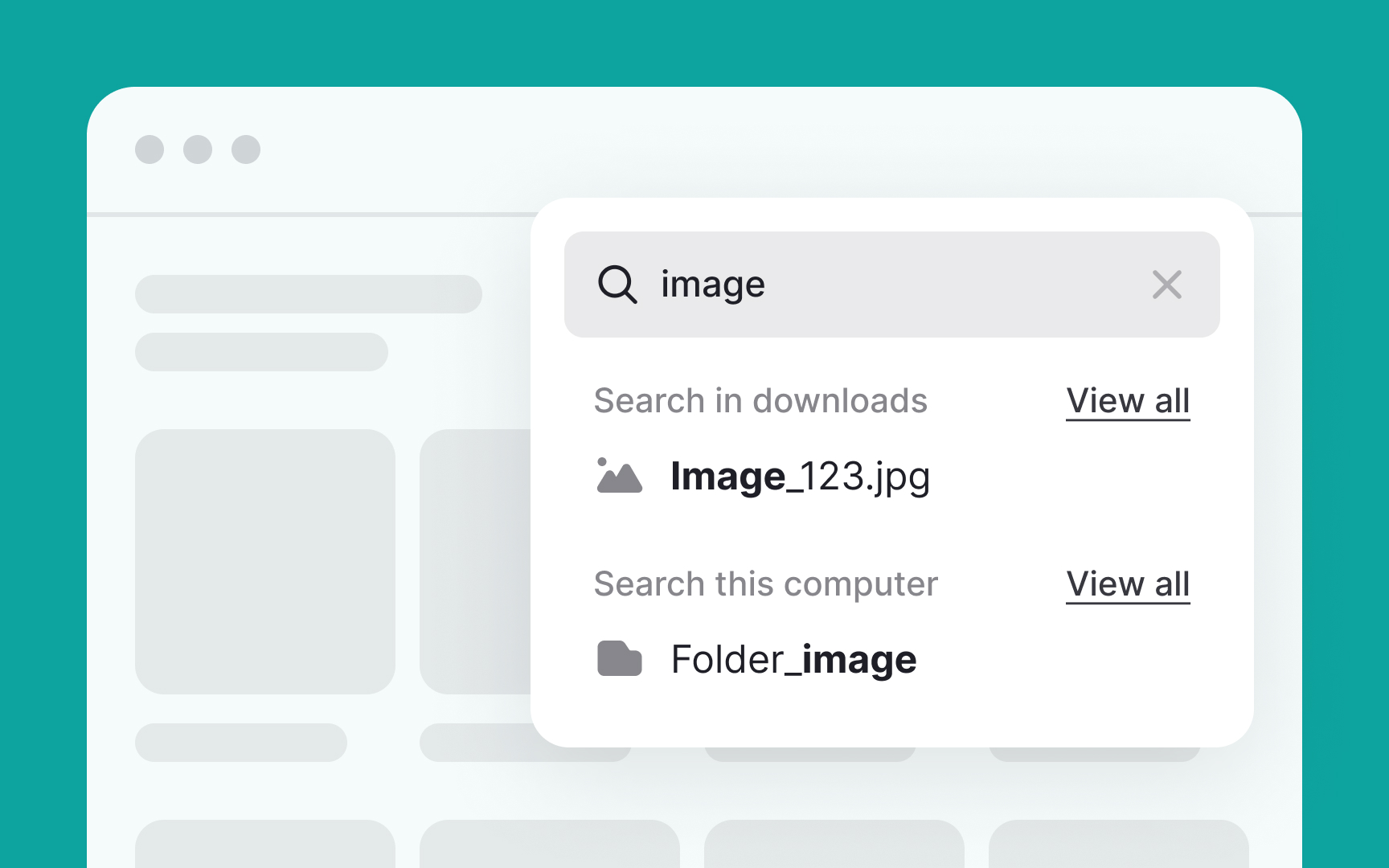
Rich auto-suggest not only offers relevant queries but also includes links to related
Ensure that the suggestion
Pro Tip: When adapting these rich search suggestions for mobile, strip off distracting visuals and keep the text queries only.
In search-focused mobile apps, using persistent
Additionally, it can offer suggestions based on popular or previously entered searches, aiding users in formulating their queries. For example, in a book-finding app, tapping the search bar could expand it to fill the screen, while also displaying popular book titles or genres as suggestions. Users then simply tap the Search
On mobile apps where
Similar to persistent search, expandable search can also offer suggestions, drawing from past searches or popular queries.
Regardless of the type of
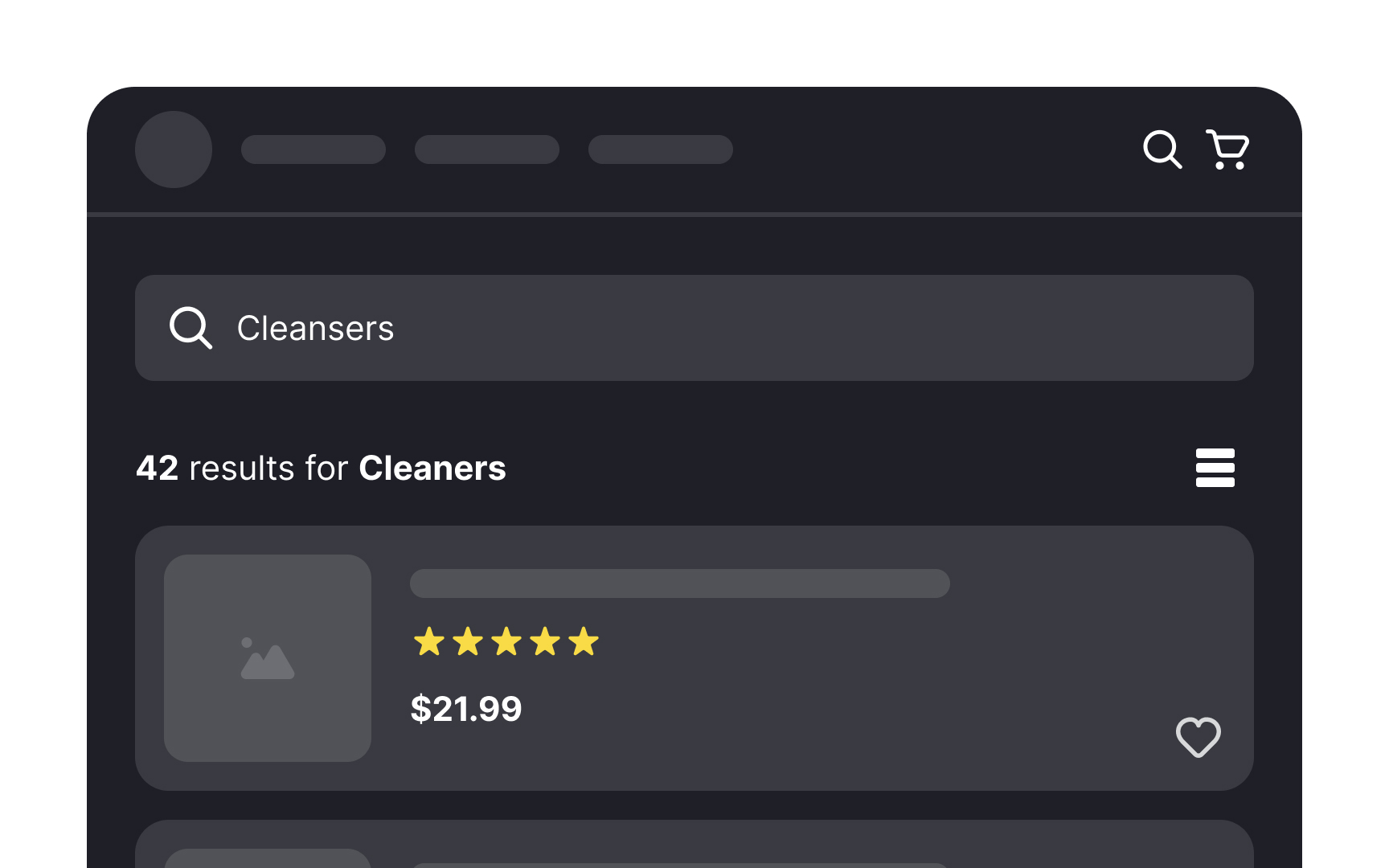
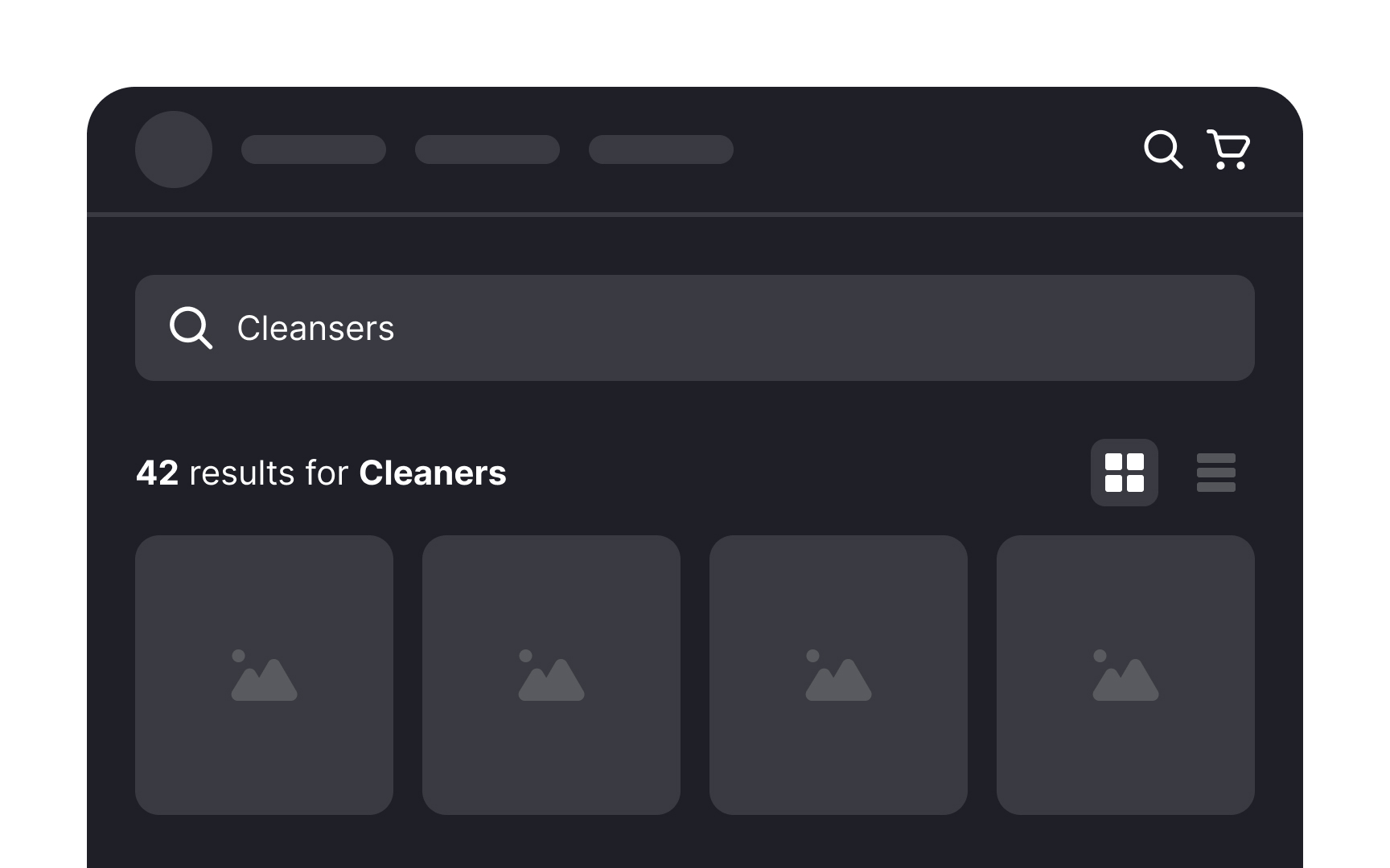
The selection between a list view and a grid view depends on how much information users need for comparing products and choosing between them. A list view makes more sense for items where details like model numbers, ratings, and dimensions matter. This layout is also a good fit for text-only results.
A grid view layout is usually used when the product's appearance is more vital for making a final decision to purchase the item than its text description.[6]
Pro Tip: Offer users the freedom to choose between layouts and view results the way they want.

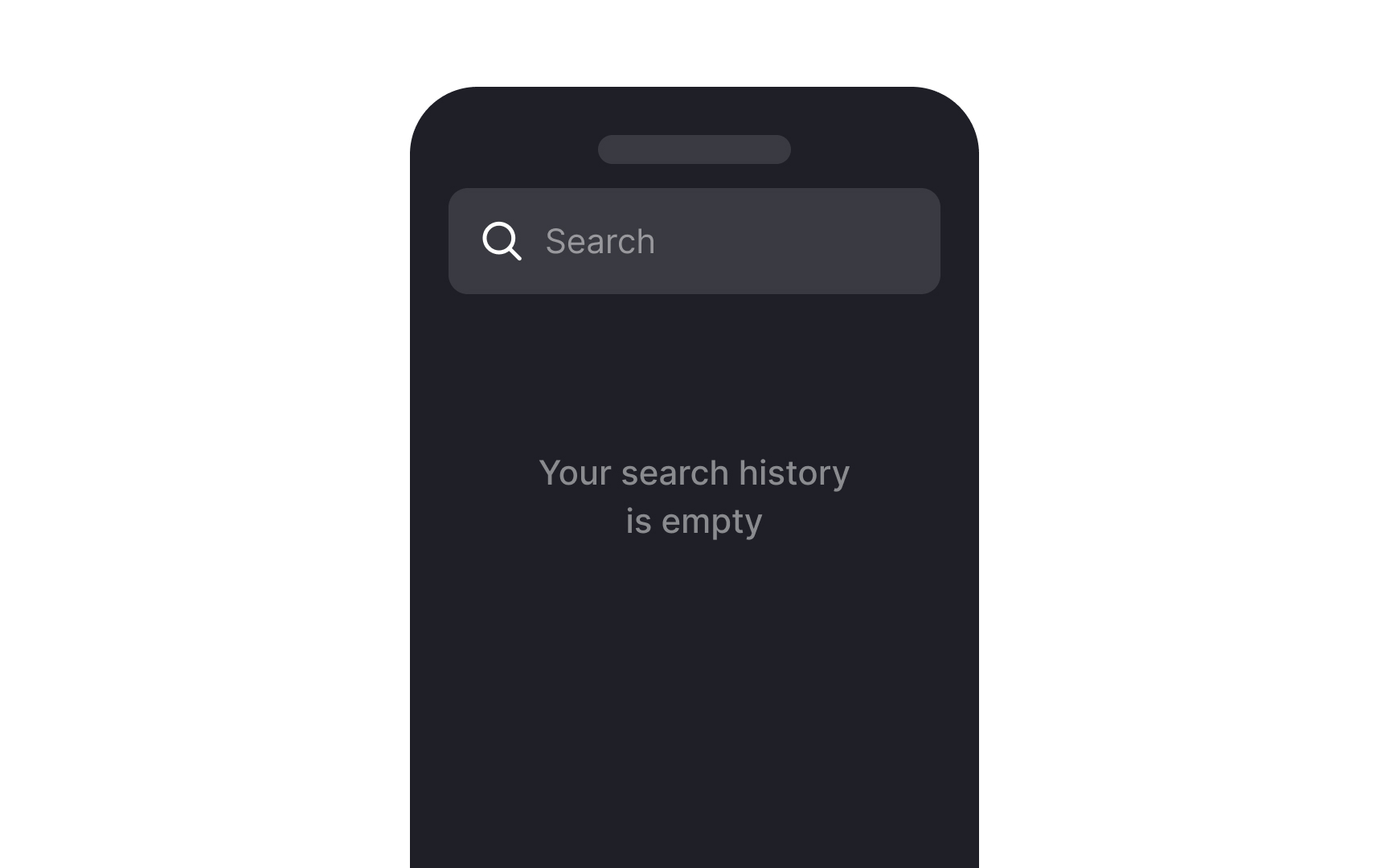
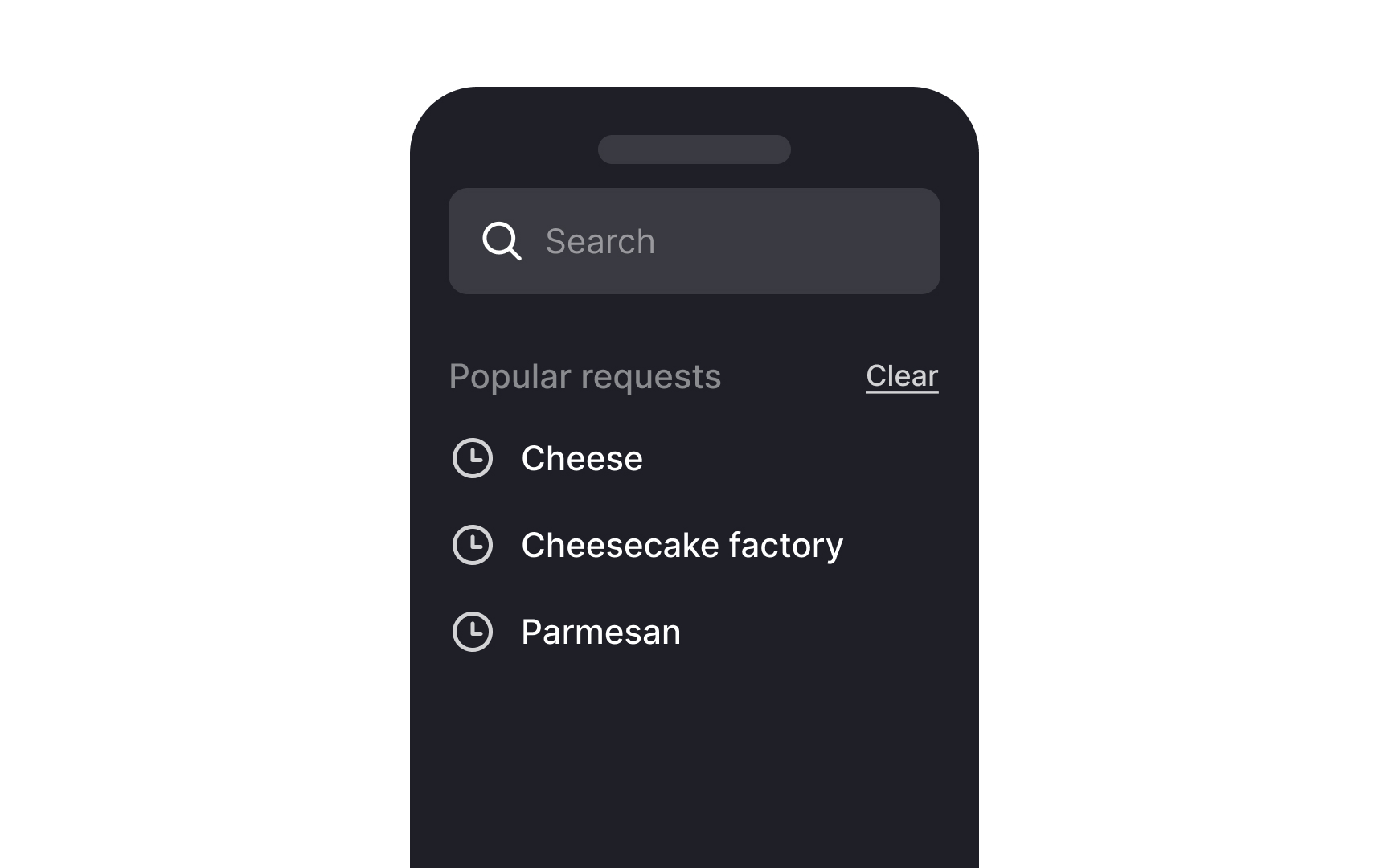
Incorporating recent
This approach significantly reduces the mental effort required from users. Instead of having to recall past searches or formulate entirely new queries, users can simply recognize and select from the list of recent searches provided. This is especially helpful in scenarios where users frequently return to search for similar items or information.
Displaying related or trending
This strategy not only simplifies the search process but also introduces users to options they might not have considered, enhancing their experience and potentially leading to increased

Globally, more than half of all web traffic comes from mobile devices and this presents unique challenges.[7] The smaller screen size demands that the
This recommendation makes sense primarily for search-oriented apps. For platforms like Instagram and Pinterest, where browsing is the main activity and search isn't the primary focus, the search function isn't as noticeable.
References
- Top 10 Guidelines for Homepage Usability | Nielsen Norman Group
- Form Instructions | Web Accessibility Initiative (WAI)
- Site Search Suggestions | Nielsen Norman Group
- Material Design | Material Design
Top contributors


Topics
From Course

Share


Similar lessons

Intro to Information Architecture

Pagination Best Practices
