Walkthrough
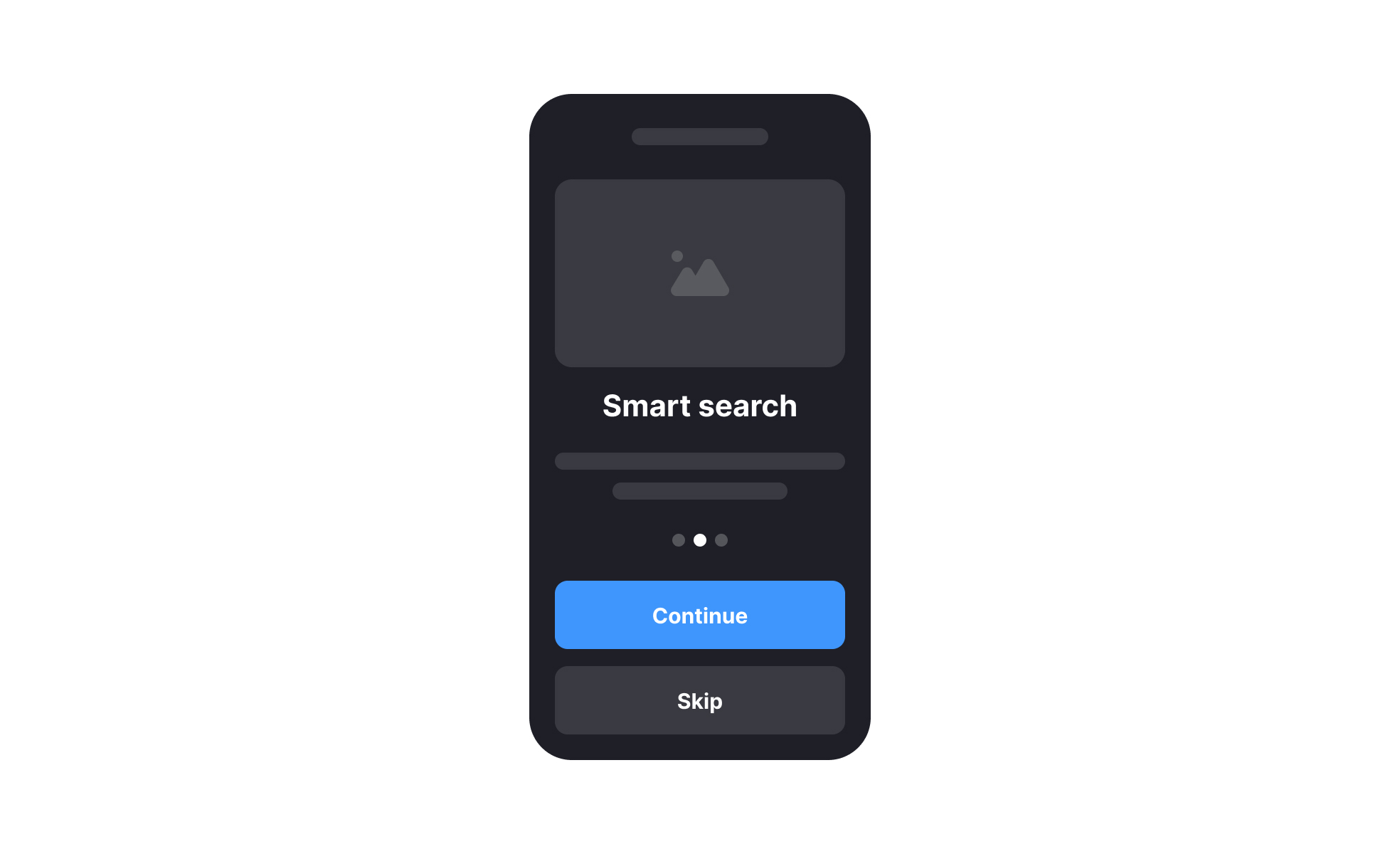
A walkthrough is an interactive guide that leads users step by step through a product’s features or tasks, helping them learn quickly and reducing friction.


TL;DR
- Guides users through features or workflows.
- Often interactive and built into products.
- Reduces onboarding time and confusion.
- Improves adoption and confidence.
Definition
A walkthrough is a structured guide that introduces users to a product or feature, explaining steps and interactions to support learning, onboarding, and task completion.
Detailed Overview
Walkthroughs are commonly used to introduce users to digital products, especially when the product has complex features. Instead of expecting people to explore blindly, walkthroughs provide clear, step-by-step guidance. For example, a project management tool might highlight where to create a new task, assign teammates, and set deadlines during a first-time setup.
A frequent question is how walkthroughs differ from tutorials. Tutorials are often longer, and external resources such as videos or written guides. Walkthroughs, on the other hand, are embedded directly into the interface. They respond to user actions in real time, showing relevant steps within the product itself. This context makes learning smoother and more efficient.
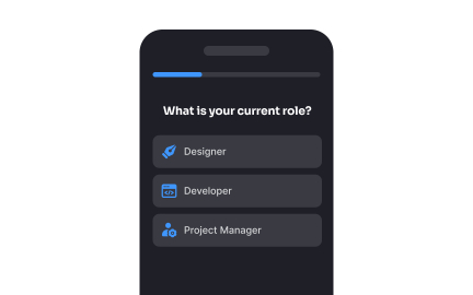
Another common query is whether walkthroughs should be mandatory. Some teams worry that forcing all new users through a guide can create frustration. Best practice is to make walkthroughs optional, with the ability to skip or revisit them later. This respects user autonomy while still offering help to those who need it.
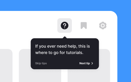
Walkthroughs also play a role beyond onboarding. They are valuable for introducing new features, especially in mature products where existing users already know the basics. Highlighting what changed and how to use it prevents confusion and ensures that improvements are noticed and adopted.
From a business perspective, walkthroughs reduce support costs by answering common questions in advance. If users can learn directly within the product, they are less likely to open support tickets or abandon the experience. Walkthroughs also improve retention, as users who understand how to succeed early are more likely to continue using a product.
Finally, accessibility should be considered when creating walkthroughs. Interactive guides should be compatible with screen readers, keyboard navigation, and varied cognitive needs. This ensures that walkthroughs help all users, not just those who engage visually or interact with a mouse.
Learn more about this in the Walkthroughs Exercise, taken from the User Onboarding Lesson, a part of the Common Design Patterns Course.
Walkthroughs are interactive and built into the product, guiding users in real time. Tutorials are external resources like articles or videos.
Walkthroughs focus on contextual learning within the interface.
Mandatory walkthroughs can frustrate experienced users. It is better to make them optional, with options to skip or return later.
This approach balances guidance with user autonomy.
They introduce new features to existing users, ensuring changes are noticed and adopted. This keeps experienced audiences engaged and informed.
Walkthroughs support ongoing learning as products evolve.
They reduce support requests by answering common questions before they arise. Clear guides help users learn independently, lowering reliance on help desks.
This improves efficiency for both users and support teams.
Walkthroughs should work with screen readers, keyboard navigation, and other assistive tools. Clear, concise instructions make them accessible for a wider audience.
Inclusive design ensures walkthroughs benefit all users equally.
Recommended resources
Courses

UX Design Foundations


Design Terminology


Common Design Patterns
Lessons


Projects

Medilert - Smartwatch App


Bookly - Onboarding Assignment

EduFlux.netlify.app