Digging into Data
Learn to spot real patterns in your data and turn numbers into experiments that improve your product.
Data tells stories, but only if you know how to read it properly. The challenge is figuring out which patterns matter and which ones are just random noise. When you learn to spot the difference, you can find real opportunities to improve your product.
Good data analysis starts with finding where users get stuck. Look for the places where people drop off or abandon your product. These bottlenecks show you exactly where to focus your attention. But numbers alone never tell the whole story. They show you what happened, but not why it happened. This is where talking to users becomes essential. When you combine data analysis with user interviews, you get the complete picture.
This powerful combination helps you move from guessing to knowing. Instead of building features based on assumptions, you can run experiments based on real patterns you've discovered. Every insight becomes a hypothesis you can test, leading to products that truly solve user problems.
Think of data analysis like tuning a radio. The music you want to hear is the signal, while the static is the noise. In product data, noise consists of random variations that don't represent meaningful patterns. These might be temporary spikes from unusual events or fluctuations that happen by chance.
Real signals show consistent trends over time. They represent actual changes in user behavior or market conditions. To find them, look for patterns that repeat across different time periods or user segments.
Moving averages help smooth out daily fluctuations to reveal underlying trends. Statistical methods like standard deviation can help determine if a change is significant or just random variation. The key is patience. Don't react to every small change in your metrics. Wait for patterns to establish themselves over weeks or months before making major decisions.
One effective technique is to examine data points on a rolling basis over the past 30, 90, or 365 days, then break them down by geography, device, or other dimensions. This makes it easier to see if a meaningful signal consistently comes through. Tools like decomposition can further split data into trend, seasonal, and residual components, highlighting what truly matters.[1][2]
Pro Tip: Use a 30-day moving average to filter out daily noise and see real trends in your key metrics.
Every user journey has critical moments where people decide to continue or abandon your product. Funnel analysis reveals these decision points by tracking how many users complete each step. The biggest drops show where your product creates the most friction.
Start by mapping out your key user flows. For an e-commerce site, this might be: landing page, product view, add to cart, checkout, purchase. Calculate the percentage of users who move from each step to the next.
Break down your funnel by different dimensions to find hidden insights. Mobile users might drop off at different points than desktop users. New visitors might struggle with steps that returning customers breeze through. Traffic source and user demographics can all reveal different patterns. Remember that not all drop-offs are problems. Some filtering is natural and even desirable. Focus on unexpected drops or places where competitors perform significantly better.[1]
Pro Tip: Set up automated alerts for when funnel conversion rates drop below historical averages.
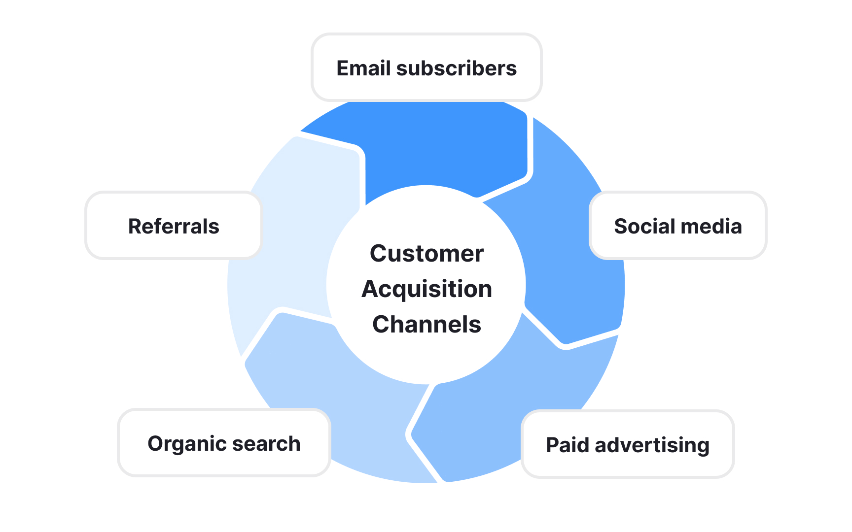
Users from different sources arrive with different expectations and behave in unique ways. Someone who finds you through a Google search has different intent than someone who clicks a social media ad. Understanding these differences helps you optimize each channel and allocate resources effectively:
- Organic search users often have high intent. They're actively looking for a solution to their problem. They might convert at higher rates but could also have higher expectations.
- Paid advertising brings users who might be earlier in their journey. They need more education and nurturing before they're ready to commit.
- Social media traffic tends to be more casual and exploratory.
- Email subscribers have already shown interest and trust.
- Referral traffic quality depends entirely on the referring site's audience and context.
Each channel tells a different story about what users want and how they'll engage with your product. Track metrics beyond just volume. Conversion rate, retention, lifetime value, and support costs all vary by channel. A channel that brings lots of users might not be worth it if those users churn quickly.[3]
Pro Tip: Calculate customer acquisition cost and lifetime value for each channel to guide investment decisions.
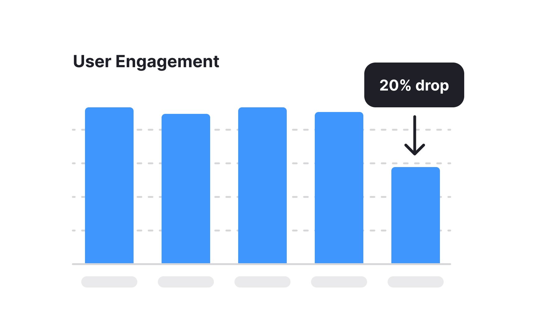
Numbers show what happened, but they rarely explain why. A 20% drop in engagement could mean anything from a technical bug to a competitor's new feature. Finding the story requires detective work that goes beyond spreadsheets.
Start with timing. When exactly did the change occur? Look for correlations with product releases, marketing campaigns, holidays, or external events. A gradual decline suggests different causes than a sudden drop. Patterns that match school schedules, paydays, or seasons provide important context.
Examine related metrics for clues. If engagement drops but session length increases, users might be struggling to find what they need. If new user activation improves while
Don't forget about external factors. Competitor launches, economic changes, or shifts in user behavior across your entire industry matter. What looks like a product problem might actually be a market trend affecting everyone.
Pro Tip: Keep a changelog of all product, marketing, and external events to help explain metric changes.
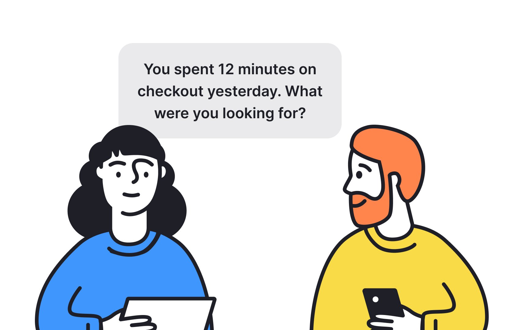
Quantitative data tells you what users do. Qualitative research reveals why they do it. The most powerful insights come from connecting these two types of information. Numbers point you toward areas worth exploring, while conversations help you understand the reasons behind them.
Use your data to identify who to talk to. Look for users who represent interesting patterns, such as those who almost converted but didn’t, power users who suddenly stopped engaging, or new users who quickly became strong advocates. These edge cases often reveal more than average users. Let data inform, not dictate, your
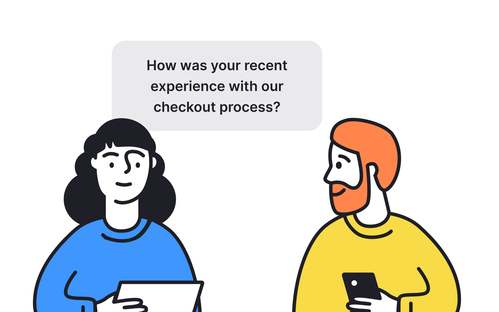
After gathering qualitative insights, return to your data to validate what you heard. If users describe a feature as confusing, check whether the usage data shows high drop-off or low adoption. Sometimes what people say and what they do do not match, and that disconnect itself can be a powerful finding.[4]
Pro Tip: Schedule weekly 15-minute calls with 2-3 users to maintain constant qualitative input.
Raw data rarely persuades anyone. The story your data tells determines whether stakeholders support your recommendations. Effective data storytelling combines numbers, visuals, and narrative to create compelling arguments for change.
Start with the problem, not the data. "Revenue is down 10%" is less compelling than "New users can't find our core feature, costing us $50,000 per month." Frame insights around user needs and business impact. This approach helps stakeholders understand why they should care.
Choose visualizations that clarify rather than impress. A simple line chart showing a trend often communicates better than a complex dashboard. Highlight the key insight by removing unnecessary elements. Use color and annotation to direct attention to what matters most.
Build narrative tension. Present the current situation, show what's at stake, then reveal your discovery. This structure keeps audiences engaged and helps them remember your key points. End with clear recommendations tied directly to the data you presented.
Good data analysis requires recognizing common pitfalls that lead to wrong conclusions. These traps catch even experienced product managers who let excitement or pressure override careful thinking:
- Survivorship bias hides failures from view. You analyze successful users without considering those who left. This makes your product seem better than it is and blinds you to serious problems. Always ask who's missing from your data.
- Correlation confusion strikes when two things happen together. Suppose mobile app usage goes up at the same time as push notifications increase. It might look like the notifications caused the growth, but both could actually be linked to a holiday season campaign. Correlation alone cannot prove cause. Always test whether one factor truly drives the other. Look for plausible mechanisms that explain relationships. Test your assumptions with experiments.
- Sample size seduction happens when random variation looks like a pattern. A feature that shows 50% improvement with 10 users might show no difference with 1,000. Wait for sufficient data before declaring victory. Small samples lie more often than large ones.
- Data selection bias happens when you only use facts that support what you want to believe. Decide on success metrics before looking at results. Document all analyses, not just the ones that support your hypothesis.
Consistent data analysis beats sporadic deep dives. Building regular habits ensures you catch problems early and spot opportunities others miss. A personal playbook creates structure that makes analysis efficient and effective. Here's how to create your own data discovery playbook:
- Schedule weekly data reviews. Block 90 minutes to examine your key metrics, investigate anomalies, and generate hypotheses. Start with the same
dashboard each week to spot trends quickly. Then dig into one or two areas that show interesting patterns. Document what you find, even if it seems unimportant. - Create a toolkit of go-to analyses. Build queries for common questions like cohort
retention , feature adoption, and funnel conversion. Save usefulcharts or dashboards for reuse. If writing SQL feels too complex, try using tools like ChatGPT to draft sample queries or ask your data team for support. - Develop relationships with data partners. Whether it's analysts, engineers, or tools vendors, these allies help you move faster. They can validate your interpretations, suggest new approaches, and build custom solutions when needed.
- Share what you learn. Regular data insights emails or presentations spread analytical thinking across your team. Teaching others reinforces your own understanding.
References
- Identifying Bottlenecks And Gaps - FasterCapital | FasterCapital
- Identifying Bottlenecks And Gaps - FasterCapital | FasterCapital
Topics
From Course

Share


Similar lessons

UX Research Analysis

Affinity Diagrams in UX Research
