Data-Driven Roadmapping
Transform product decisions into strategic outcomes by mastering data-driven roadmapping techniques
Product roadmaps are essential strategic tools that communicate the vision and direction of a product. However, creating effective roadmaps requires more than just intuition and guesswork. By leveraging data and analytics, teams can make informed decisions about what features to prioritize, how to allocate resources, and when to launch new initiatives. Data-driven roadmapping involves collecting and analyzing key metrics such as user engagement, customer feedback, market trends, and business goals. This data-informed approach enables product teams to validate assumptions, identify opportunities, and adapt to changing needs. With data at the core of the roadmapping process, organizations can align their products with user expectations and market demands, ultimately driving growth and success.
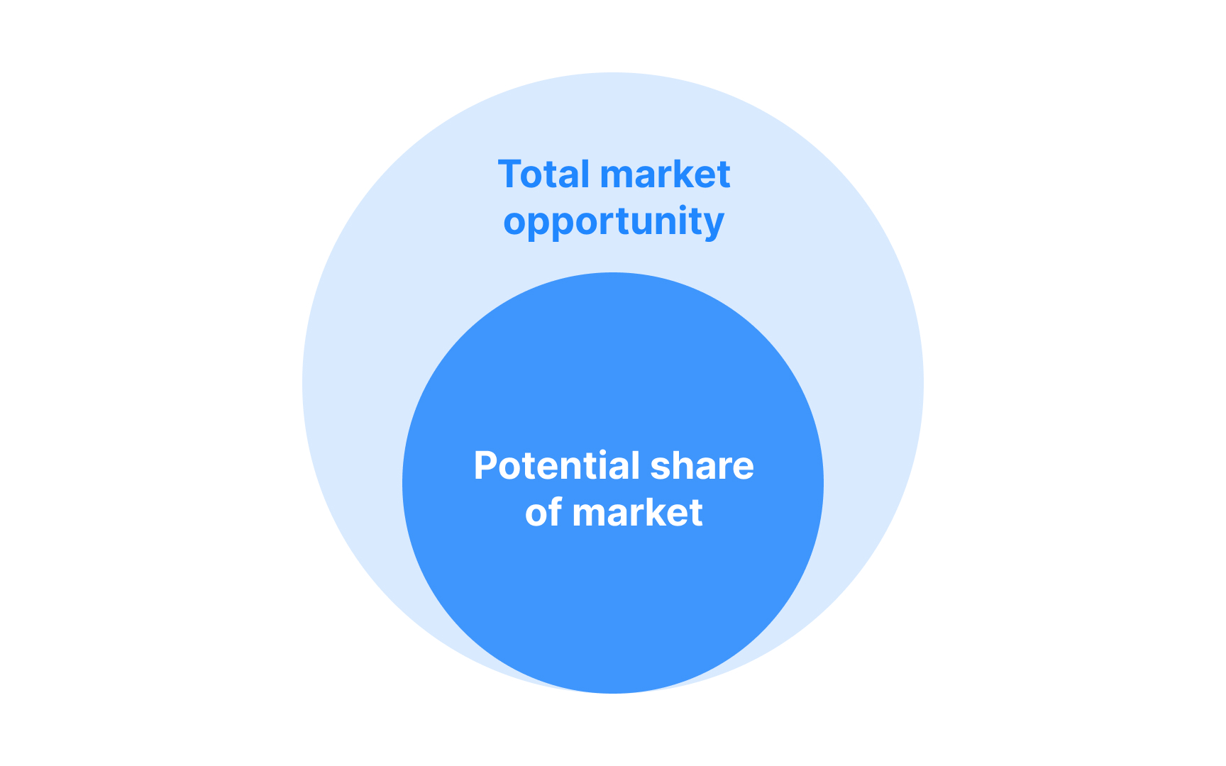
Opportunity sizing helps product teams measure the potential value of new features or improvements. The process starts with identifying the total market size and narrowing it down to realistic targets. This includes counting potential users and estimating how many might actually use the feature.
Product teams use basic metrics like current user numbers, market growth rates, and competitor data to make these estimates.[1] For example, if a product has 100,000 users and similar features typically see 30% adoption, teams can expect around 30,000 users for the new feature.
Revenue estimates combine user numbers with expected pricing or value per user. Teams also factor in costs like development time and ongoing maintenance to understand the complete financial picture of any given opportunity.
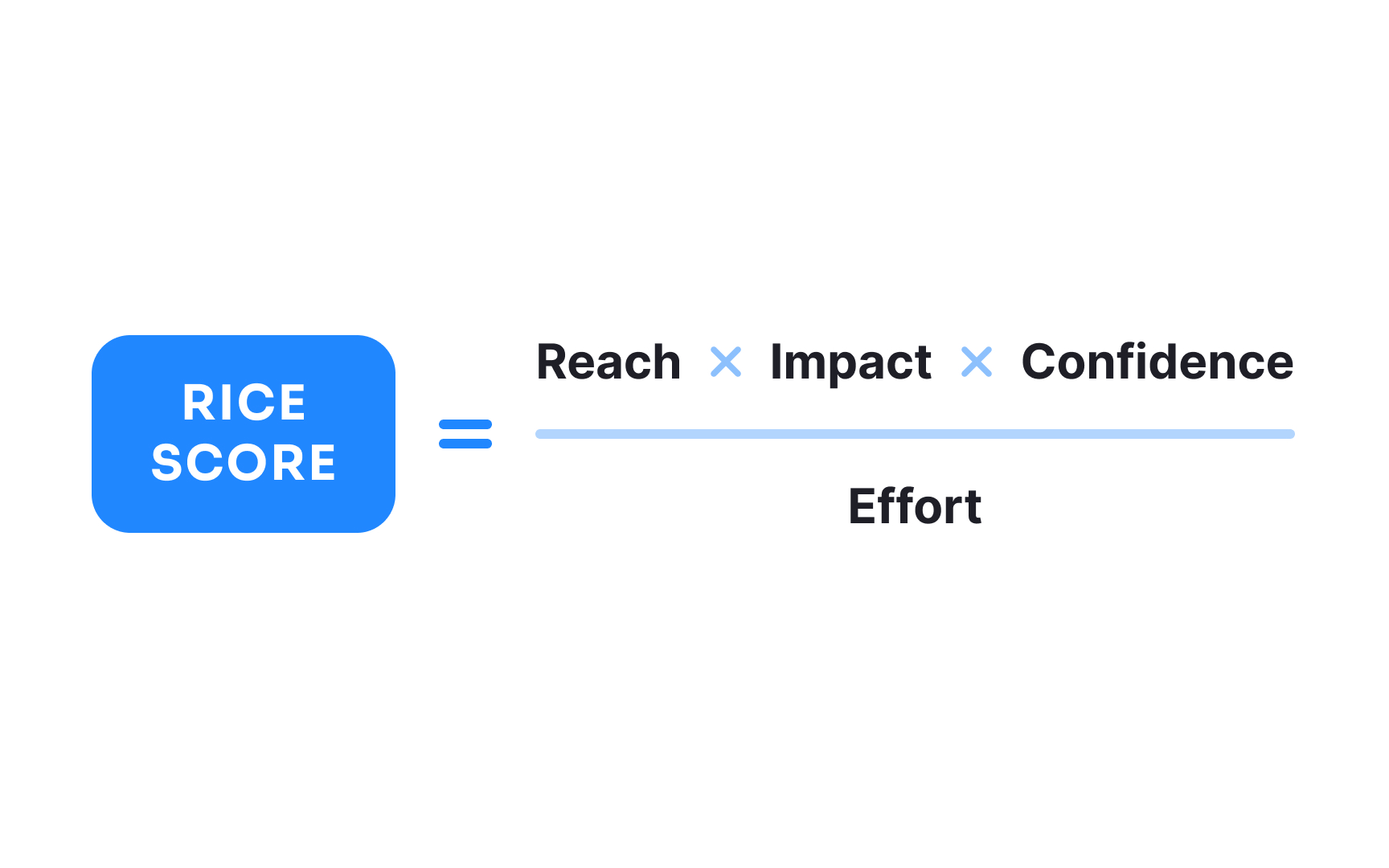
Product teams use various frameworks to decide which features to build first, with RICE being one of the most structured approaches.
This framework uses 4 key factors:
- Reach counts the number of users a feature will affect in a set time period, like "500 users per quarter."
- Impact measures how much it helps those users on a scale of 0.25 (minimal) to 3.0 (massive).
- Confidence represents your certainty in estimates, ranging from 20% (low confidence) to 100% (high confidence).
- Effort represents the total work required, typically measured in team weeks (e.g., one team member working for 4 weeks = 4 weeks of effort) or standard development story points.
- The final RICE score comes from multiplying reach, impact, and confidence, then dividing by effort. Higher scores suggest higher priority. For example, a feature reaching 1000 users (reach) with medium impact (1.0), high confidence (100%), and 2 weeks of effort would score: (1000 × 1.0 × 1.0) ÷ 2 = 500.
Other popular prioritization frameworks include ICE, Kano model, the MoSCoW method, and weighted scoring. Each method helps teams move from gut feelings to data-backed decisions.[2]
While opportunity sizing looks at potential market and user reach, impact estimation focuses on measuring the depth of change a feature will create. Impact estimation answers "how much will this feature improve specific metrics?" rather than just "how many users might use this feature?"
Here’s how to do it:
- Start by identifying current performance metrics. For example, your app's checkout has a 60% completion rate, takes 2 minutes on average, and generates $50 per transaction. These numbers become your baseline for measuring impact.
- Next, analyze similar past improvements — if a previous checkout optimization increased completion rates by 10-15%, you can use this as a benchmark.
- To estimate impact, apply expected improvement rates to your baseline metrics. If you predict a 15% faster checkout time, that means reducing time from 120 to 102 seconds. With 10,000 monthly transactions, saving 18 seconds per checkout equals 50 hours of total user time saved per month. Combined with a 10% higher completion rate, this could mean 1,000 additional completed purchases monthly.
Pro Tip: Break down your impact calculation into small, measurable steps — this makes it easier to explain and validate your estimates.
Analytics data helps teams create realistic product timelines by revealing how long similar features took to reach success metrics. Historical data shows typical time periods for user adoption, performance stabilization, and measurable business impact.
Past analytics reveal important timing patterns. For instance, if data shows users take an average of 3 weeks to adopt new navigation features, teams can plan appropriate timeline phases for similar projects. If A/B test data indicates 4 weeks minimum to reach statistical significance, teams know how long to run experiments.
Feature success metrics often follow consistent timelines. Analytics might show that successful features typically reach 40% adoption in month one, 60% in month two, and plateau at 75% by month three. Teams can use these patterns to set realistic milestone targets and adjust plans based on early performance indicators.
Product analytics helps teams identify and quantify potential risks in product development. By analyzing historical product data, teams can spot patterns that indicate where things might go wrong and how severe the impact could be.
User behavior analytics also highlight adoption risks. If historical data shows that complex features see 40% lower adoption rates in certain user segments, teams can plan extra onboarding support or phased rollouts.
Success thresholds define the minimum metric values that indicate a feature is performing well. Analytics data from past features helps teams set realistic and achievable thresholds based on historical performance patterns. Historical metrics reveal typical improvement ranges. If past UX improvements show 15-25% faster task completion, setting a 20% threshold for a new feature makes sense. Similarly, if successful features typically reach 40% adoption within their first month, this becomes a reasonable baseline threshold for new launches.
Teams can use segmented data to set appropriate thresholds for different user groups. For example, mobile users might show consistently lower engagement rates than desktop users, requiring separate thresholds. Enterprise customers often have different usage patterns than small business users, needing distinct success criteria.
Pro Tip: Set both minimum viable thresholds (that you must achieve) and stretch targets (that you aim to achieve) to better gauge feature performance.
Stakeholder alignment uses product analytics across 3 key stages:
- During planning, teams share baseline metrics to justify feature investments. For example, showing that 40% of users abandon complex workflows helps stakeholders understand why simplification matters. Usage trends and competitor benchmarks help align on priority and scope. Key metrics at this stage include current performance data, market size, and expected impact ranges.
- During development, weekly or bi-weekly metric updates track progress toward goals. Teams can share early testing results, like "25% faster load times in initial tests" or "15% higher completion rates in beta." These interim metrics help stakeholders decide if development is on track or needs adjustment.
- Post-launch metrics focus on actual vs. expected impact. At this stage, stakeholders need clear dashboards showing adoption rates, user behavior changes, and business impact. If a feature aimed for 30% adoption in month one but reaches 40%, stakeholders can confidently support expanding the rollout.
References
Topics
From Course

Share


Similar lessons

Analytics Strategy & Planning
Data Collection & Tracking
