Saving Changes
Learn about different methods and techniques for conveying system feedback to users
Users often need to change their details, either to update their email address, fix a typo in their name, or add a payment method. It's important to let them know what's going on at any point in their interaction with the system while they do so. Showing system feedback informs users that their work is saved and makes them feel in control. Seeing that changes have been accepted also gives them a sense of accomplishment.
Methods you use to inform users about what's happening in the system can depend on the stage of the process. The action button states, loaders, toast notifications, and banners are the most common ways to do that.
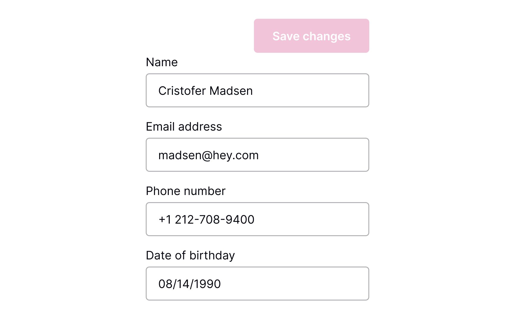
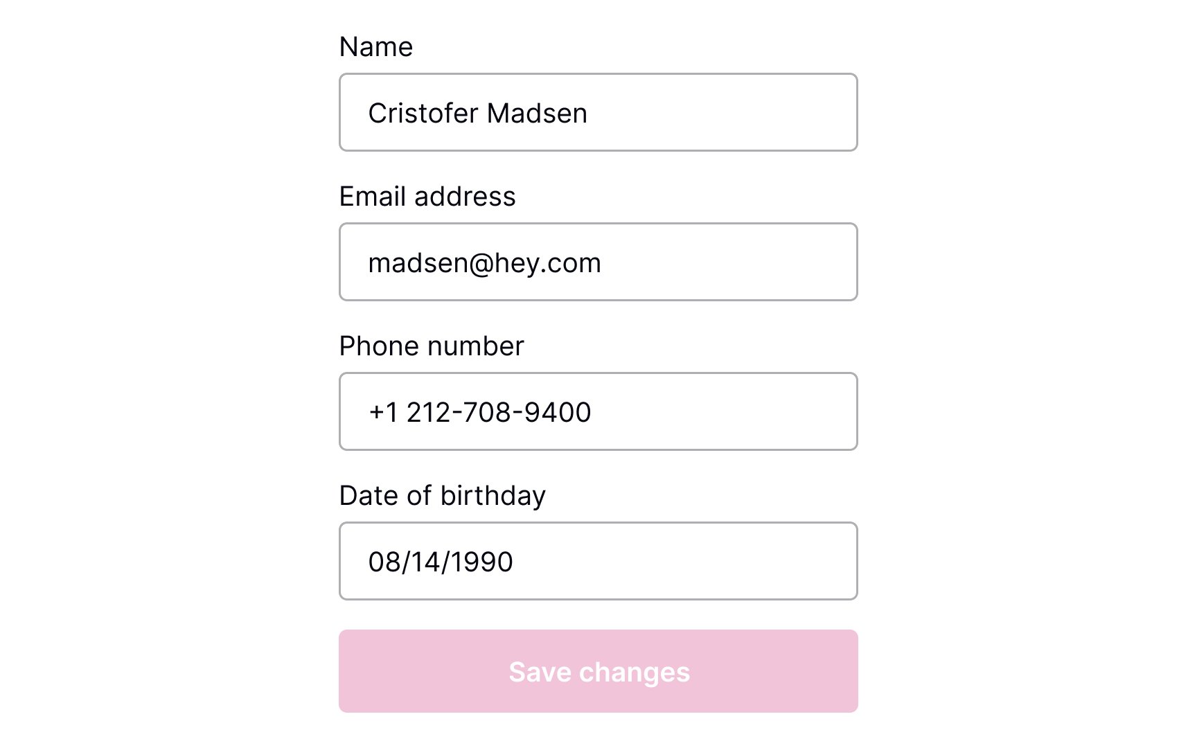
Where should the Save Changes button be placed? As users scan the content, their eyes move from the top half of the screen toward the bottom. When the content ends, they look for a call to action — so place the CTA button at the end of the content.
For browsers, make sure that the button is above the fold. Another option is to place the button right below the end of all the editable content. In apps, you can make the button stick to the bottom of the screen so that it's always visible.[1]
Users who understand what's going on in the system feel more confident and trust it more.[2] This is especially important while they're making changes.
The state of the Save Changes
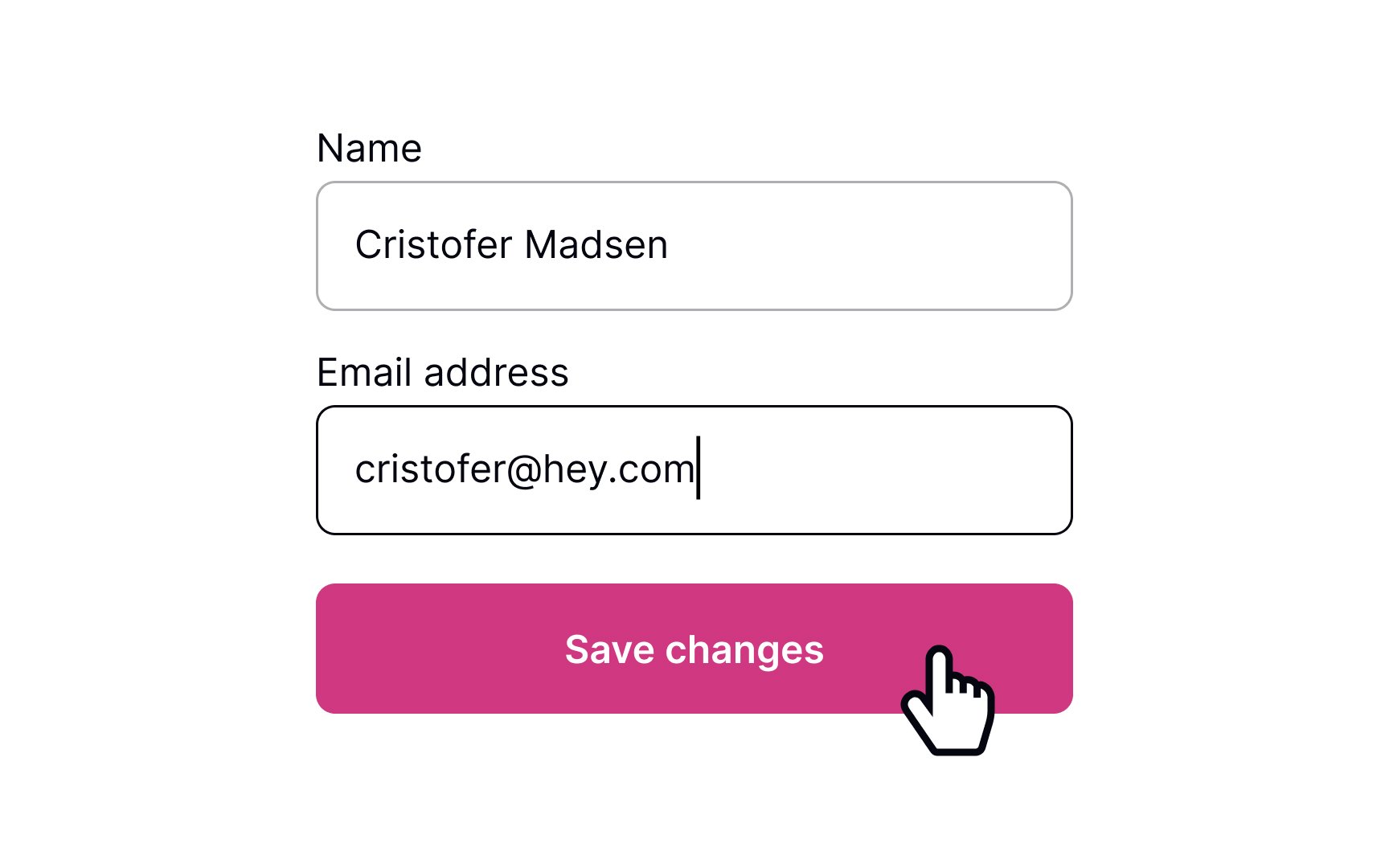
Keep users in the loop about what's going on in the system. After users change their information and press the Save Changes
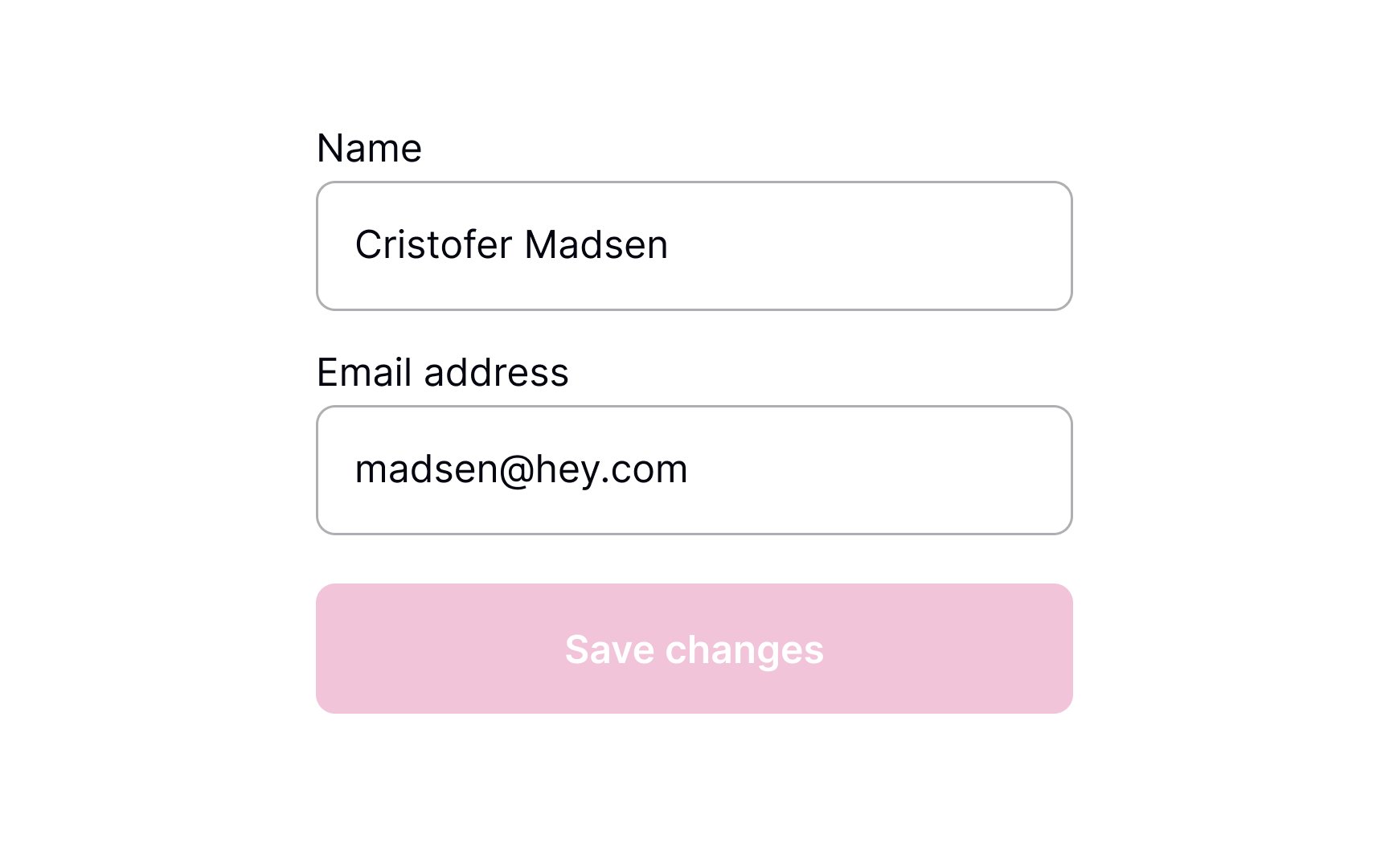
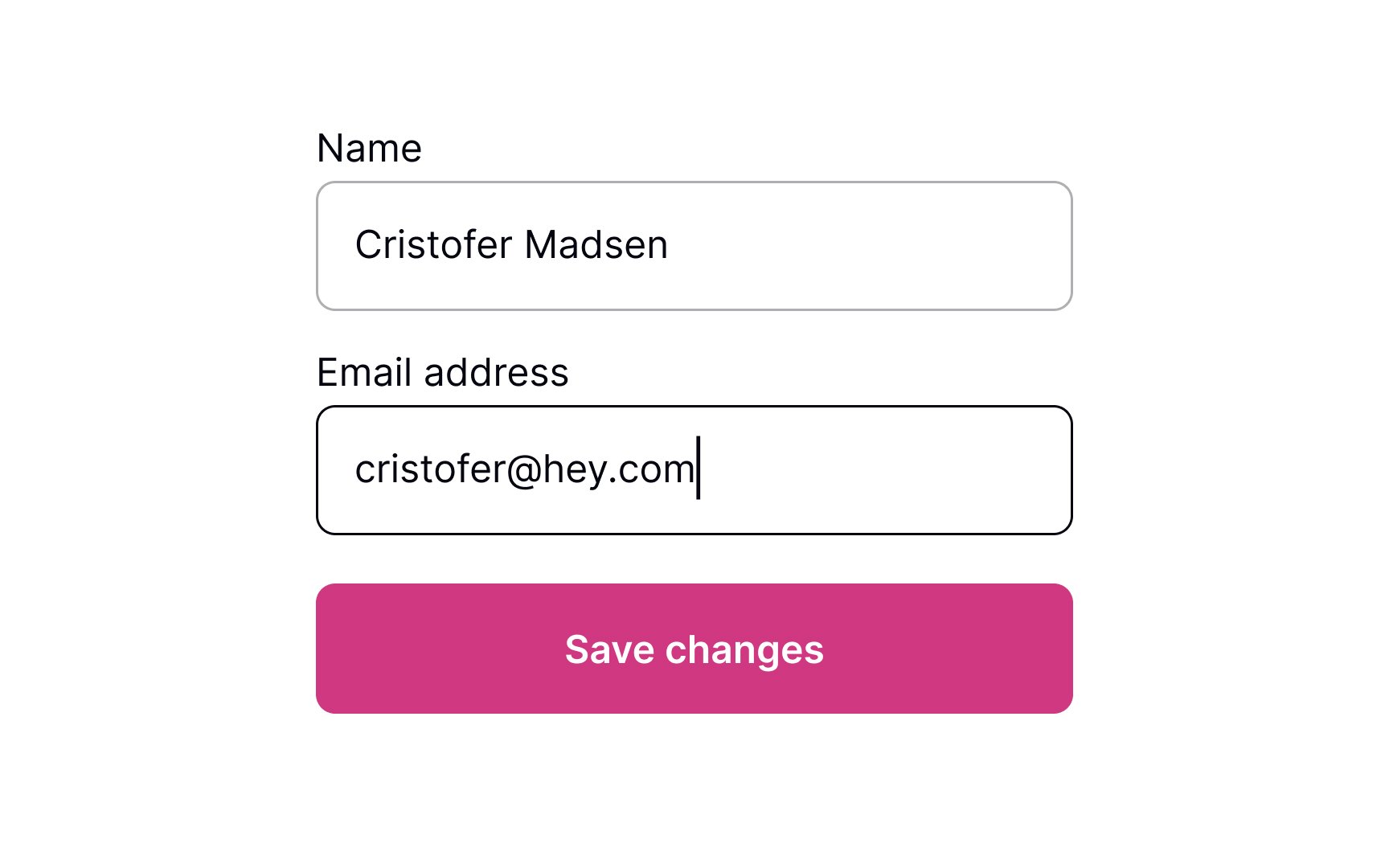
A common way to show that changes are being saved is by using a
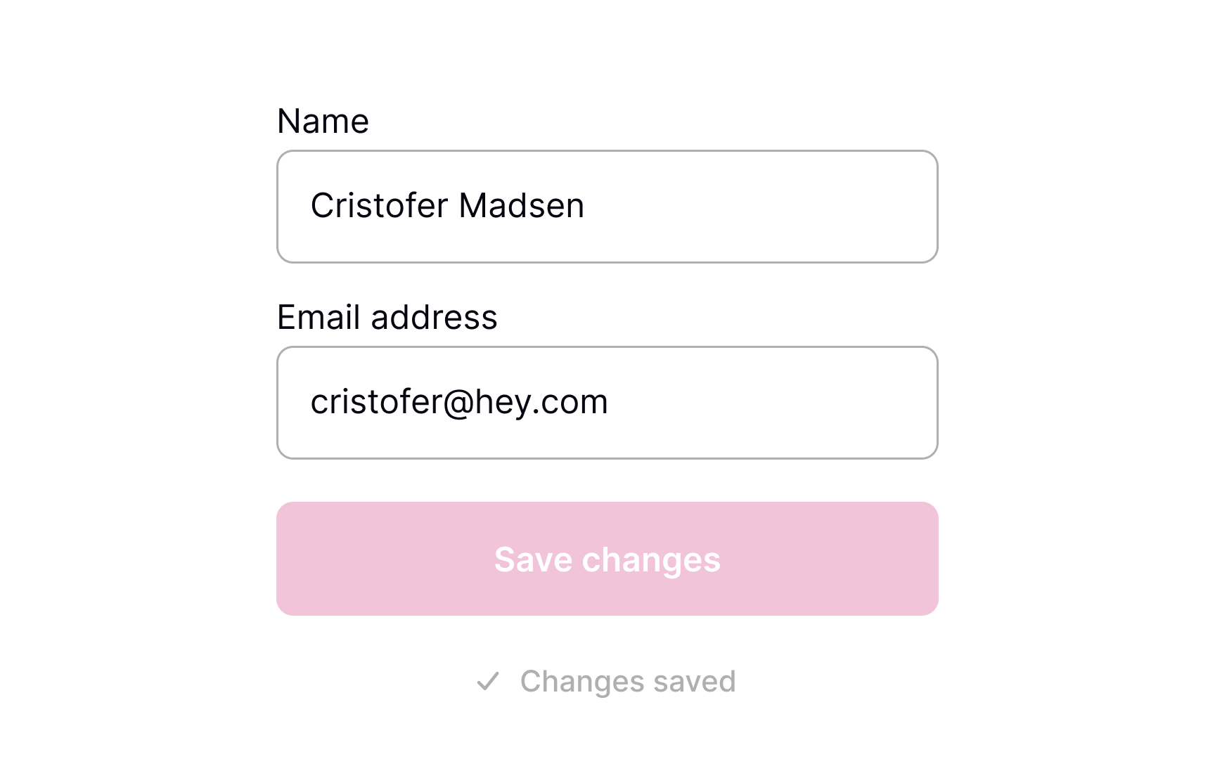
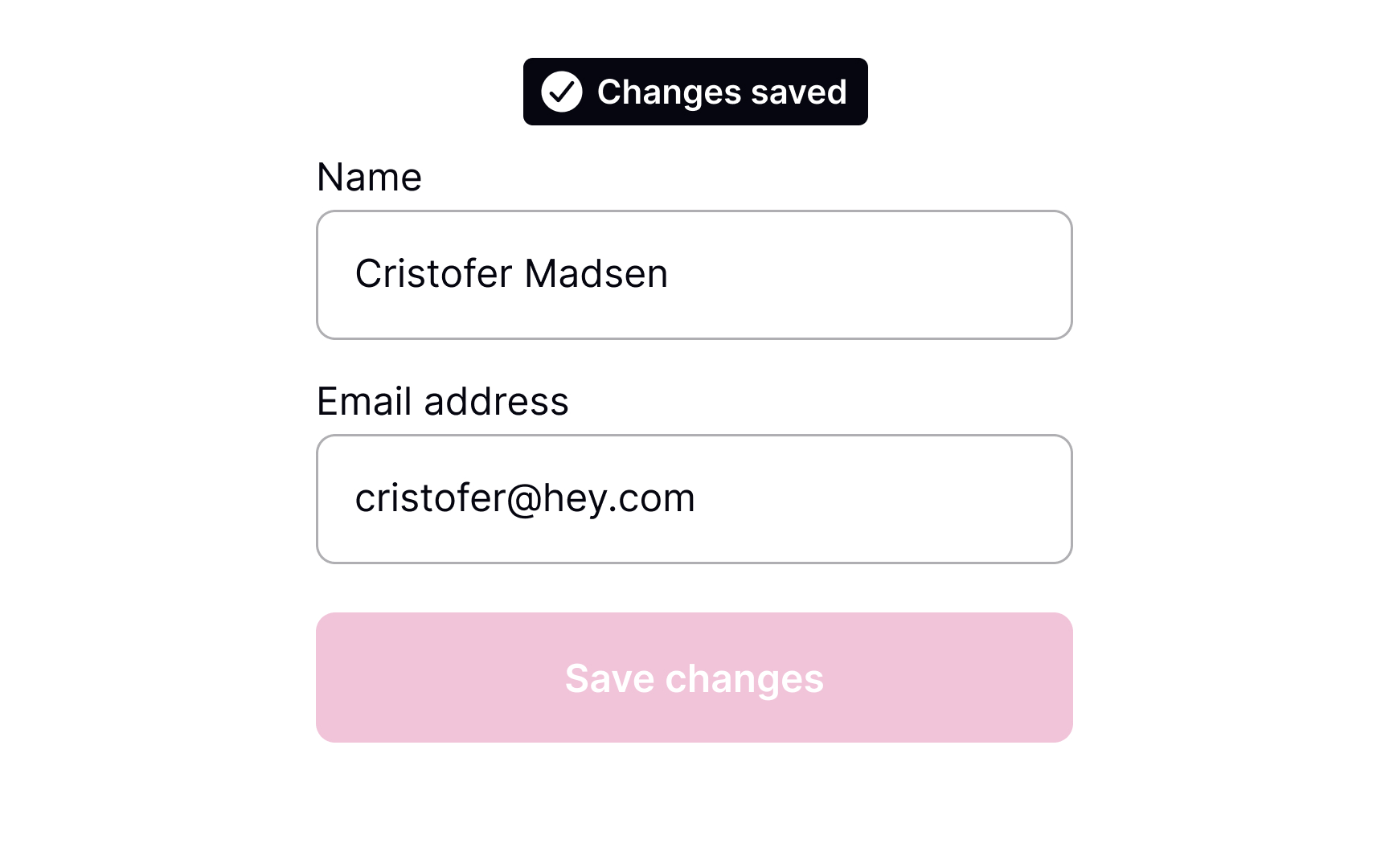
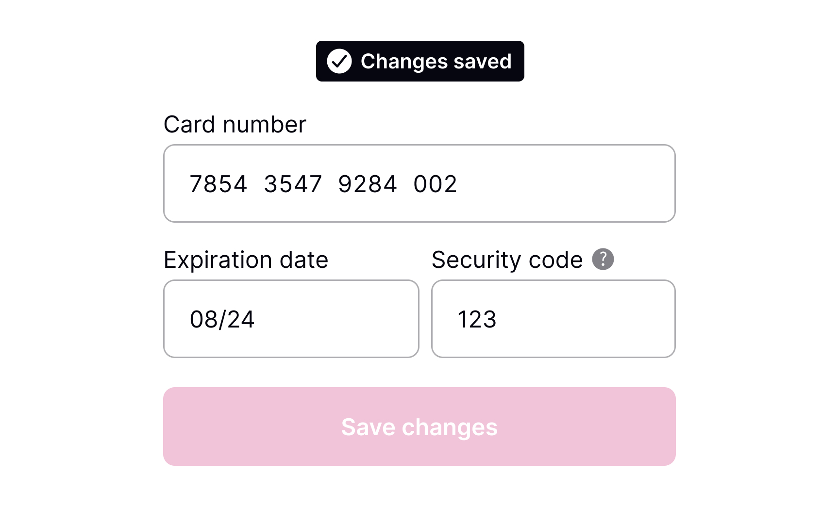
Once the system has saved the changes, the page will reload or update. Informing users about this ensures that they know their work wasn't lost. Use a success
Success messages should be visible but not intrusive. In the message, be sure to include a short description of what has happened.
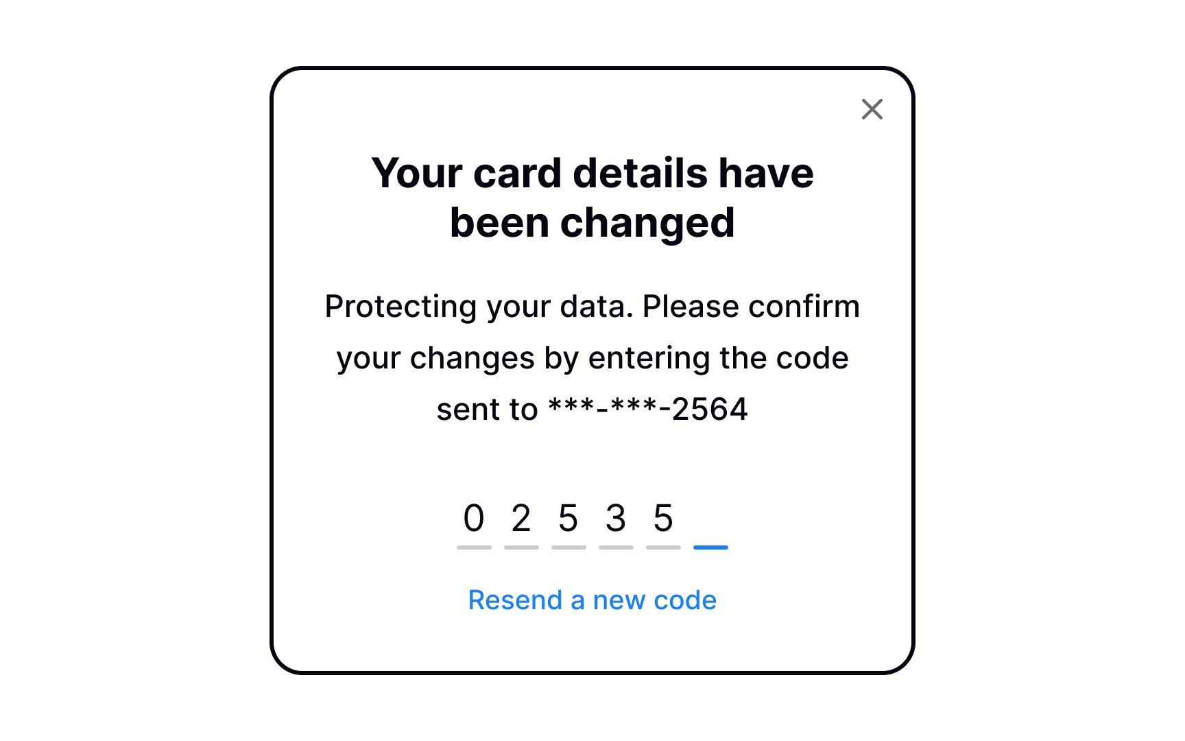
If your product requires users to share sensitive information — like their credit card details — it most likely already has two-factor authentication. It's a security process in which users need to verify themselves twice, most commonly with:
- A login and password
- A security token (e.g., one-time passwords)
- A biometric factor (a fingerprint or facial scan)[4]
Consider adding two-factor verification when changing important information, such as an
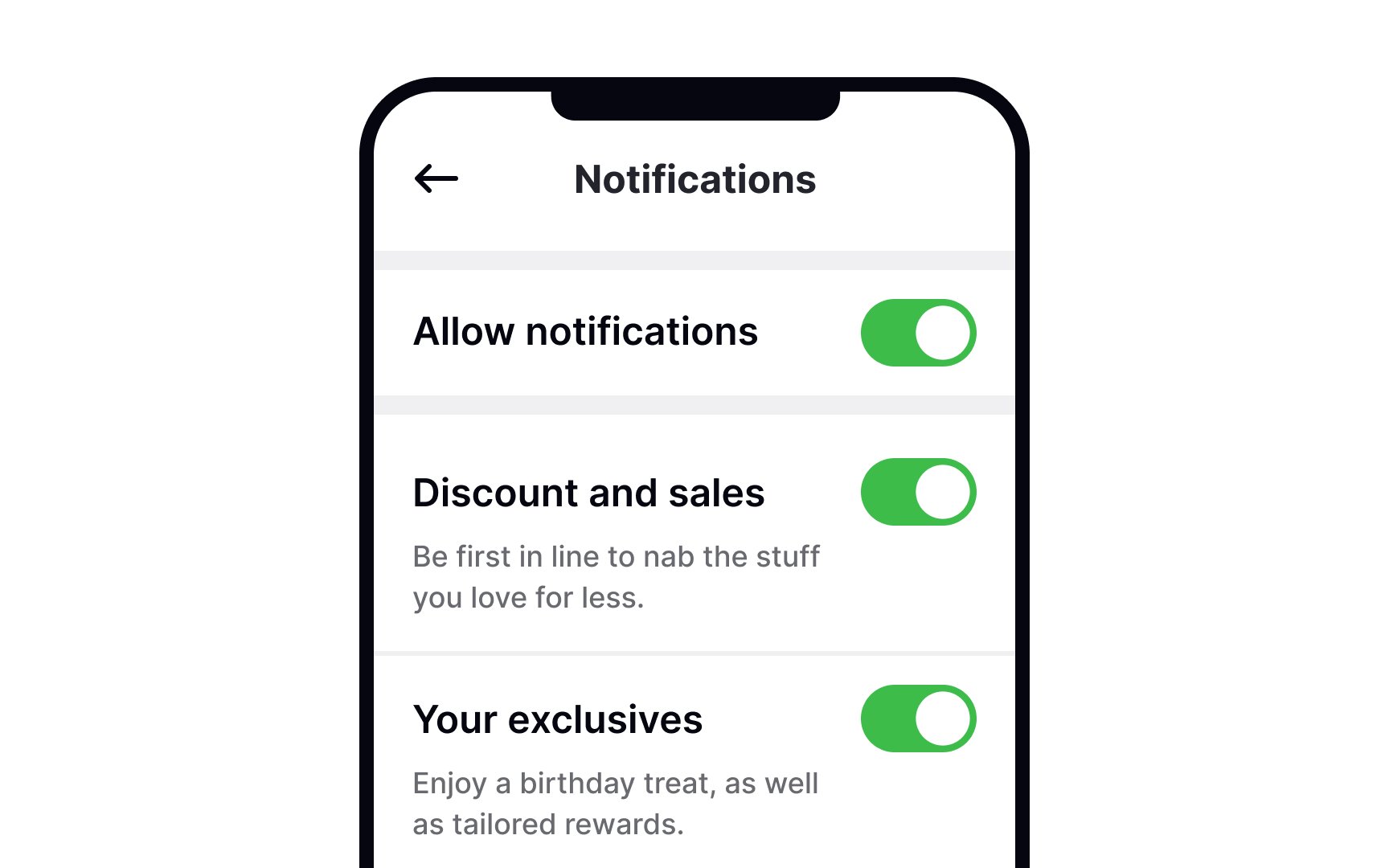
Autosave is now common in many products. When done right, it reduces effort and speeds things up. Autosave works best for simple settings that are easy to undo, such as toggles and checkboxes. Each change is a complete action. For example, in an
Users can switch something on or off without checking other fields. The result is immediate and clear. Because of this, instant saving feels normal. Users expect the change to apply as soon as they interact with the control.
Still, autosave should not remove user control. A Save Changes
Platform habits also matter. macOS users are familiar with autosave and expect changes to persist right away. Windows users are more used to explicit Save or Apply actions. Designing with these expectations in mind helps avoid confusion.
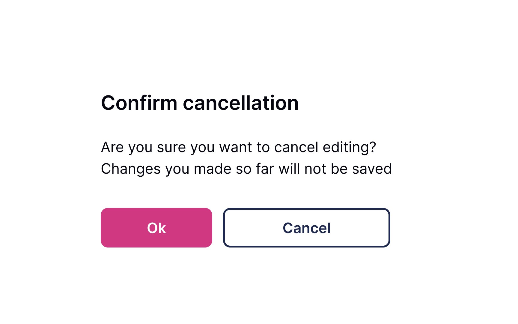
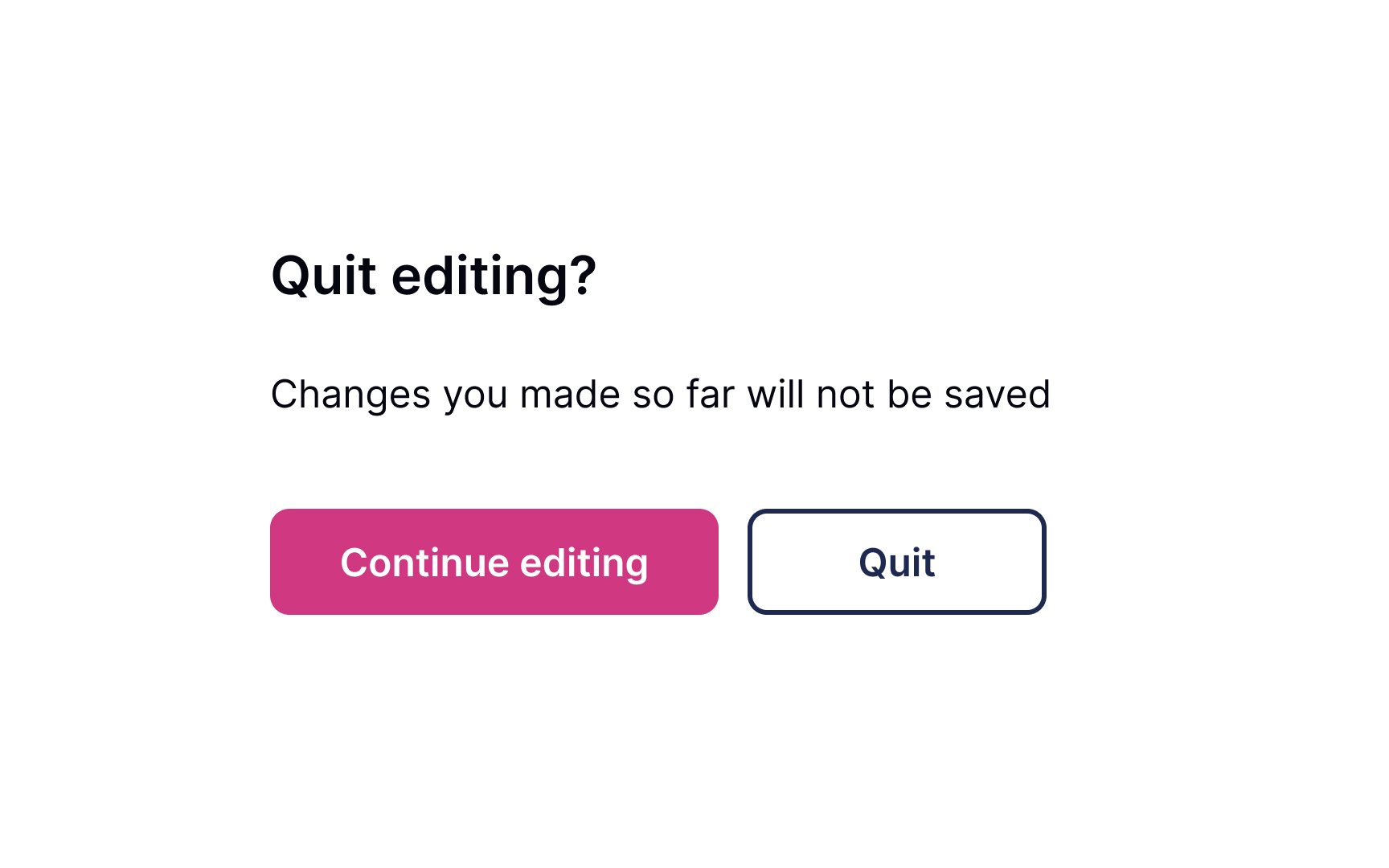
Allow users to leave without making changes. Most users expect the changes not to be saved when they close the window or press the Back button, so avoid tying autosaving to these functions.
You can use a confirmation dialogue when users modify important information such as an
Use unambiguous
References
- Optimal Placement for Mobile Call to Action Buttons | UX Movement
- What is Two-Factor Authentication (2FA) and How Does It Work? | SearchSecurity
Top contributors


Topics
From Course

Share


Similar lessons

Login & Signup Flows

User Onboarding
