<?xml version="1.0" encoding="utf-8"?>

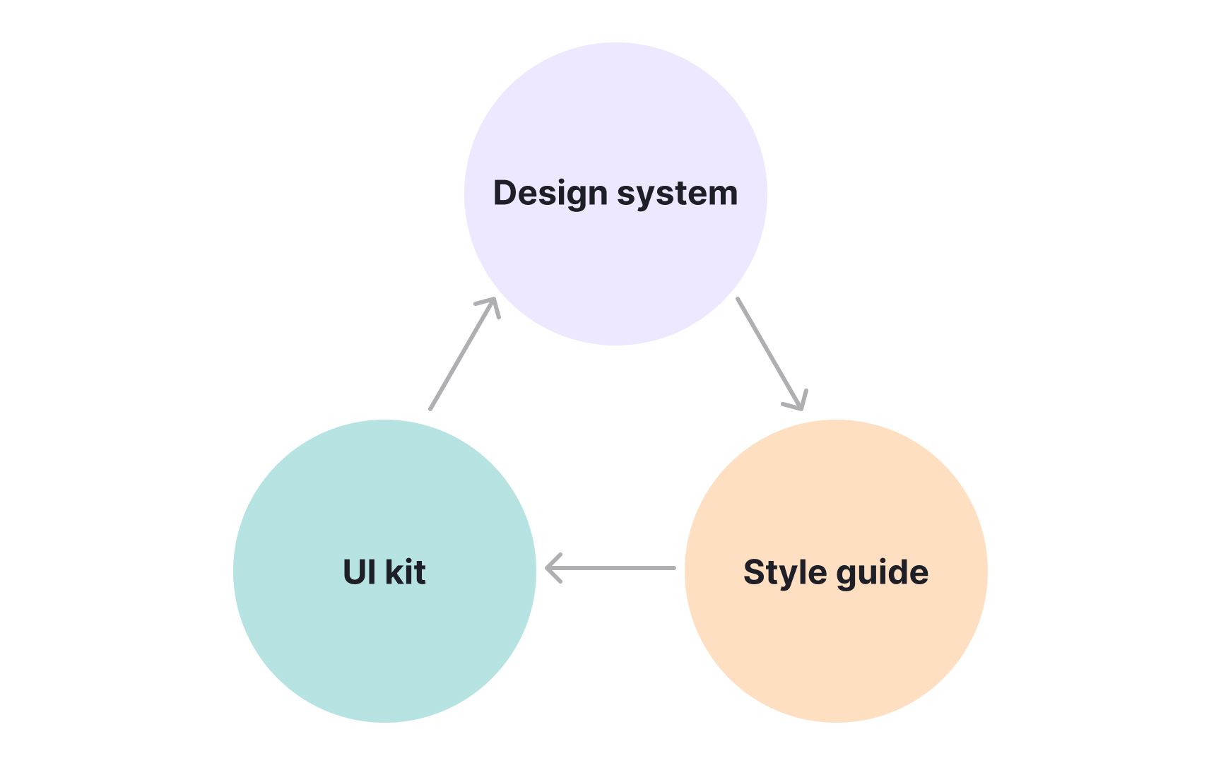
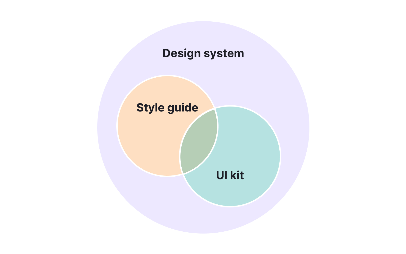
Design systems, UI kits, and style guides all support consistency, but they operate on different levels of depth. A design system is the overarching framework, a living collection of standards, patterns, and coded components that guide how interfaces look and behave. It ensures that every part of a product, from typography to interaction, follows a shared logic across teams.

Style guides focus on the rules behind the visuals. They define the tone, color palette, typography, and brand or content principles that shape a unified voice. While essential, they are only one part of a larger system.

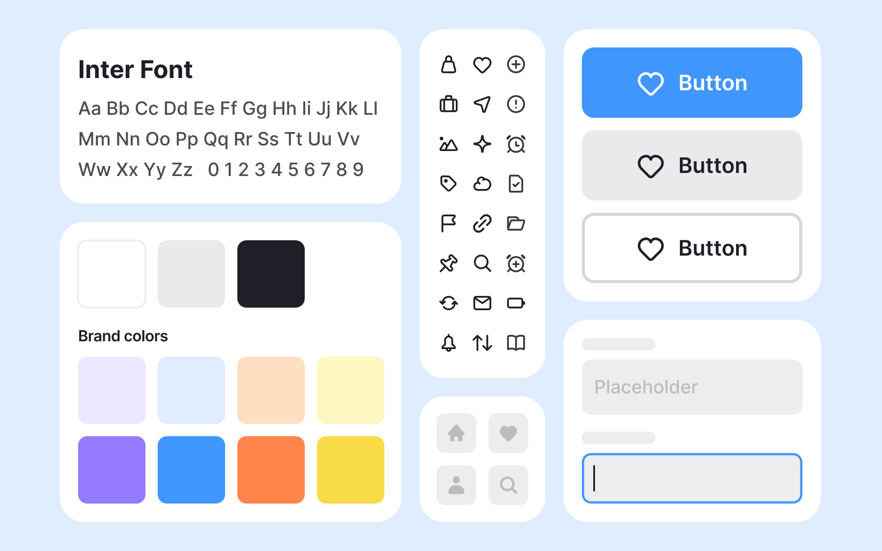
UI kits, in contrast, are practical toolsets filled with pre-made visual elements like buttons or icons that speed up design work. They help designers prototype quickly but lack the governance and scalability of a system.

Understanding where each fits helps teams choose the right level of structure. For a small prototype, a UI kit may be enough. For a mature product serving multiple teams, a design system is indispensable. Together, these layers bridge creativity and consistency.

Exercise #1

Seeing the layers of consistency

Seeing the layers of consistency Bad Practice
Seeing the layers of consistency Best Practice

Consistency in digital design depends on several layers working together. Style guides, UI kits, and design systems each strengthen this consistency but on different levels.

A style guide defines the visual and verbal identity of a product. It sets rules for typography, color, tone of voice, and branding so that every element aligns with the same standards. These guides create visual unity but focus on documentation rather than implementation.

A UI kit adds a practical layer. It contains ready-made design elements such as buttons, icons, and forms that designers can reuse when building interfaces. This speeds up work and ensures visual harmony, though it does not include detailed guidance or code.

A design system connects these layers into a single structure that unites design and development. It includes style rules, coded components, and reusable patterns that teams can apply directly in real products. Together, these tools form a hierarchy: style guides define the rules, UI kits make them usable, and design systems integrate everything into a scalable framework.[1]

Pro Tip: Start small: define visual rules, create reusable UI pieces, then connect them into a system that supports growth.

Exercise #2

From style to system

Style guides and design systems serve related but distinct purposes in the design process. A style guide describes how a product should look and sound. It focuses on colors, typography, and brand or content tone, helping maintain a consistent identity across materials. However, its scope ends with written and visual guidance.

A design system builds on that foundation by turning static design rules into coded, reusable parts. Instead of defining a button’s appearance on paper, the system contains the actual button component that designers and developers can both use. When changes occur, like updating color or spacing, the system applies them everywhere automatically.

This structure improves speed, accuracy, and collaboration between teams. Designers no longer have to re-specify elements, and developers avoid rebuilding them from scratch. The system ensures that every update or fix is applied once and distributed across the product, keeping the entire experience consistent and efficient.

Pro Tip: Style guides describe the design language, but design systems make it operational across products and teams.

Exercise #3

What UI kits really offer

What UI kits really offer

A UI kit is a designer’s shortcut to building interfaces faster. It contains pre-made interface components such as buttons, icons, input fields, or navigation bars that can be adapted to different screens and devices. These elements act as building blocks, allowing teams to design and prototype efficiently without starting from zero.

UI kits are especially useful in the early stages of design, when teams need to visualize concepts quickly or maintain visual harmony across mockups. They save time and help ensure that screens share a consistent look and feel.

However, UI kits are not complete systems. They lack governance rules, interaction logic, and code integration. This makes them ideal for small projects or prototypes but less effective for maintaining large-scale consistency. Relying only on pre-made elements can lead to generic results if not customized to reflect a brand’s unique identity. Each component should be adapted to the project’s goals, tone, and visual language to maintain originality and usability.[2]

Exercise #4

The role of documentation

Documentation is the thread that connects style guides, UI kits, and design systems into a single, usable resource. It explains how elements should look, behave, and be implemented. Clear documentation ensures that designers and developers interpret design decisions consistently, reducing confusion and duplicated work.

A style guide documents visual and content principles, outlining tone of voice, typography, color rules, and imagery standards. This helps teams maintain a coherent identity across all touchpoints. A design system expands that documentation by describing not only visual rules but also coded components and usage patterns. For example, it specifies how a button behaves in different states and provides the code snippet that developers can use directly.

When teams keep documentation updated and accessible, it becomes a shared language between disciplines. It also helps new members onboard faster and make consistent design decisions. Without it, even the best system can lose coherence and reliability over time.

Exercise #5

When to use a UI kit, style guide, or design system

Choosing between a style guide, a UI kit, and a design system depends on the scale, maturity, and goals of a project. Each serves a different stage of design growth:

  • A UI kit fits best when speed and simplicity are key. It helps small teams or short-term projects design quickly without setting up complex infrastructure. UI kits allow fast experimentation and are ideal for prototypes, early startups, or one-time campaigns that need a cohesive but lightweight design base.
  • A style guide is suited for maintaining brand and communication consistency across multiple channels. It works well for organizations that already have an established identity but do not yet need coded components. A clear style guide ensures that every designer and writer follows the same visual and verbal tone.
  • A design system becomes essential once products grow in complexity or scale. It provides not just visual standards but also coded, reusable parts and documentation. This makes it indispensable for large teams or organizations managing multiple platforms. Choosing the right approach depends on how permanent, scalable, and collaborative the project needs to be.

Exercise #6

Maintaining systems over time

Design systems and style guides both require attention after creation, but their maintenance needs differ greatly. A design system is a living product that evolves with the organization. As new components, platforms, or design rules emerge, the system must be updated to stay relevant. This often requires dedicated teams responsible for reviewing contributions, ensuring accessibility, and maintaining alignment between design and code.

A style guide, in contrast, is more static. Once defined, its visual and tone-of-voice rules usually remain stable unless the brand undergoes a redesign or rebranding. It may not need continuous updates, but it still benefits from periodic reviews to ensure consistency with evolving digital standards.

Maintaining these resources prevents outdated rules or unused components from cluttering the design process. Regular audits, clear ownership, and transparent communication keep them useful and reliable.

Exercise #7

Avoiding generic design traps

Avoiding generic design traps

UI kits can be powerful accelerators, but using them without customization often leads to predictable and impersonal design. Pre-made elements like buttons, cards, and icons create a convenient starting point, yet they are built for general use, not for a specific product’s identity. When teams rely too heavily on these assets, they risk losing originality and coherence with the brand’s tone.

To prevent this, designers should adjust colors, typography, spacing, and component behavior to fit the product’s style and user expectations. A strong visual identity is not only about aesthetics but also about how design elements communicate personality and purpose. Customization ensures that even standard components feel distinct and aligned with the brand.

Using a UI kit as a foundation rather than a finished product encourages creativity while maintaining efficiency. It allows teams to enjoy the speed of pre-built assets without falling into uniformity.

Pro Tip: A good UI kit is a starting point, not a final design. Ensure to customize every detail to reflect your brand’s unique character.

Complete lesson quiz to progress toward your course certificate