L = Layers
Learn to map customer experiences through strategic layers that reveal actions, emotions, and opportunities
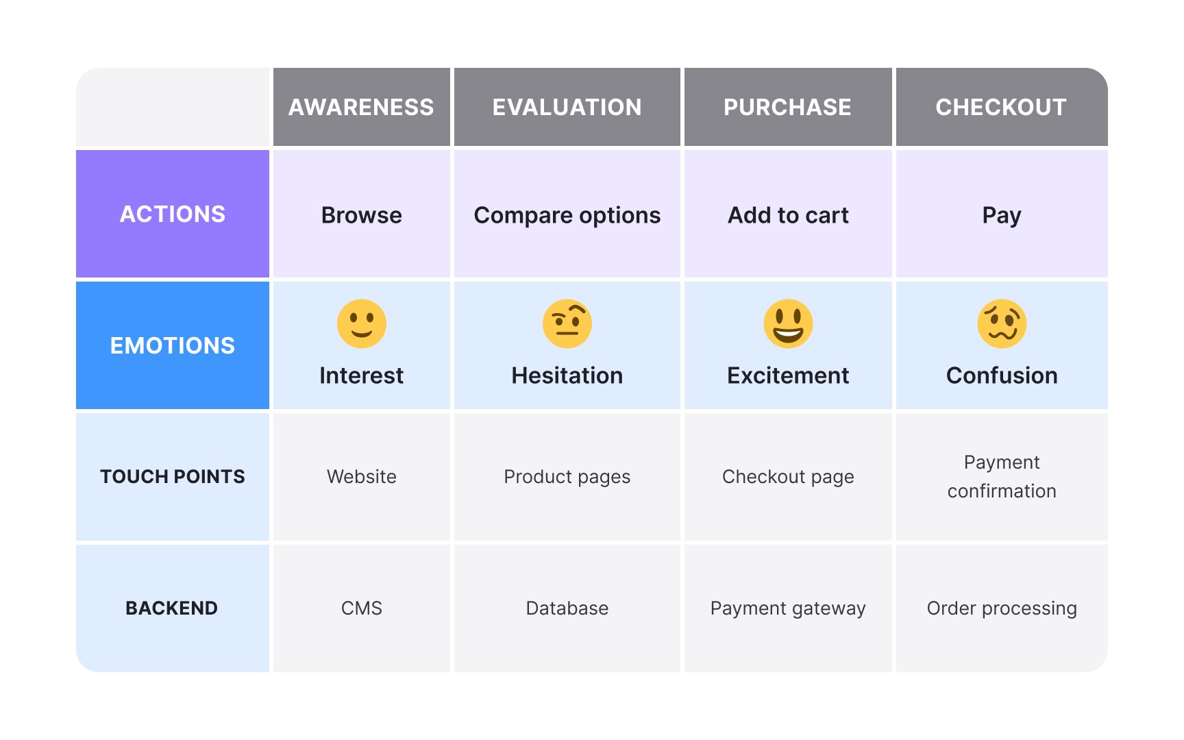
Customer journey map layers or swimlanes are horizontal bands of information that run across your map, each revealing a unique perspective of the customer experience. Think of them as different lenses through which you examine the same journey. Common layers include actions (what users do), emotions (how they feel), touchpoints (where interactions occur), and thoughts (what customers think). Each layer serves a distinct purpose. Actions provide the narrative structure, showing the sequence of steps customers take. Emotions create empathy by visualizing feelings throughout the journey. Touchpoints identify all interaction channels, from websites to physical stores. Backend processes reveal the invisible systems supporting each customer interaction.
The power of layers lies in their relationships. When a spike in negative emotions aligns with a complex backend process, you've found an improvement opportunity. Effective journey maps typically use 4-6 layers, balancing comprehensive insights with visual clarity. Too many layers overwhelm viewers, while too few miss critical connections. Choosing the right layers depends on your objective. If you're trying to reduce drop-off, you might need analytics data and emotional responses. If you're exploring cross-channel service gaps, touchpoints, and backend processes become more important. Since journey maps are a form of storytelling, the layers you include should help you tell that story clearly.
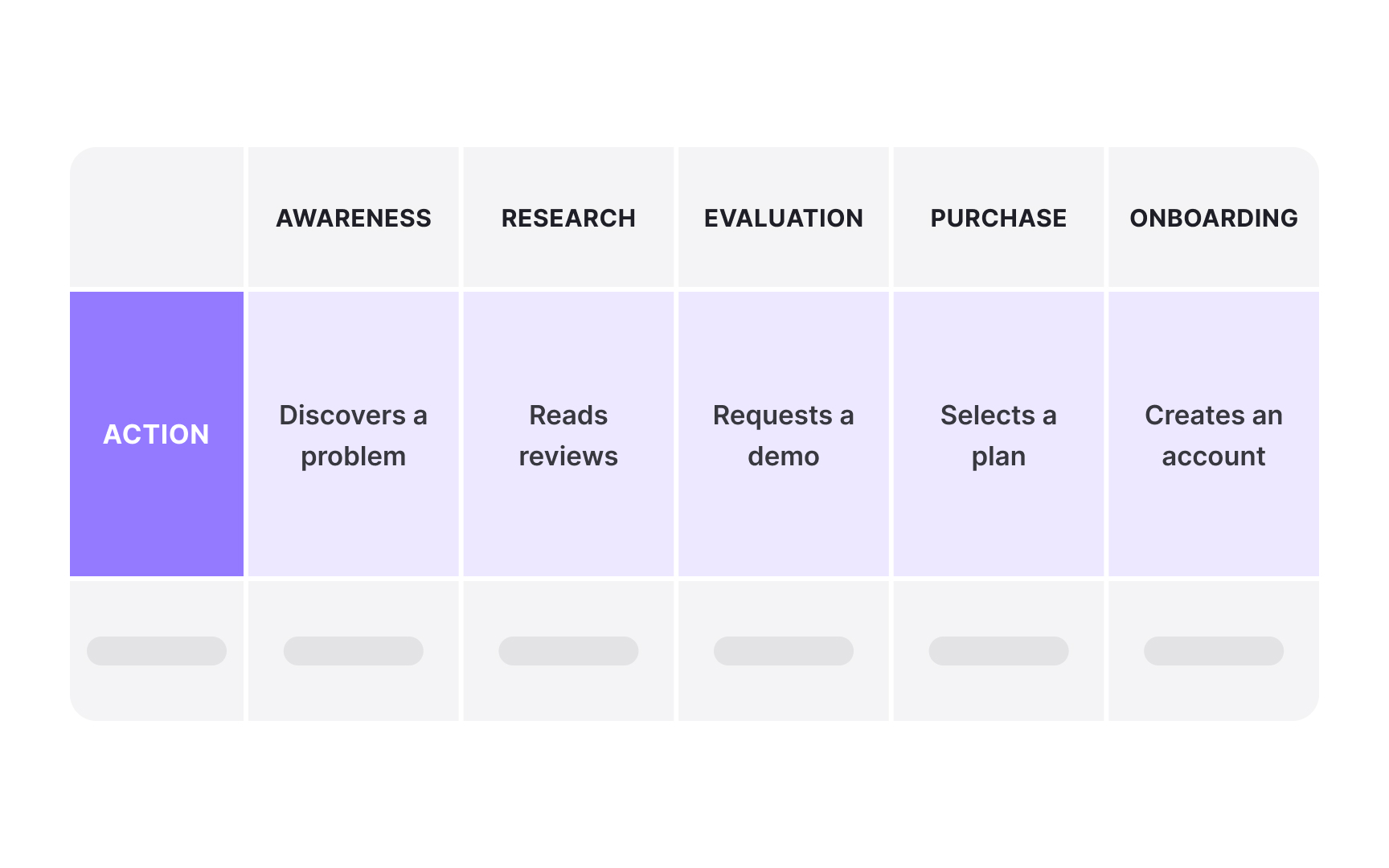
The actions layer forms the backbone of every
Effective action descriptions use present tense and active voice to create immediacy. Instead of "Payment was processed," write "Processes payment." Keep each action concise, typically 3-5 words, making them scannable at a glance. Group related actions into logical stages that reflect natural breaks in the customer journey.
The granularity of actions depends on your map's purpose. Macro maps, used for strategic planning, might show broad actions like "Researches solutions." Micromaps, meant for operational fixes, break this down into steps like "Reads blog posts," "Downloads comparison guide," or "Watches demo video." Match the granularity to your audience and the decisions they need to make.
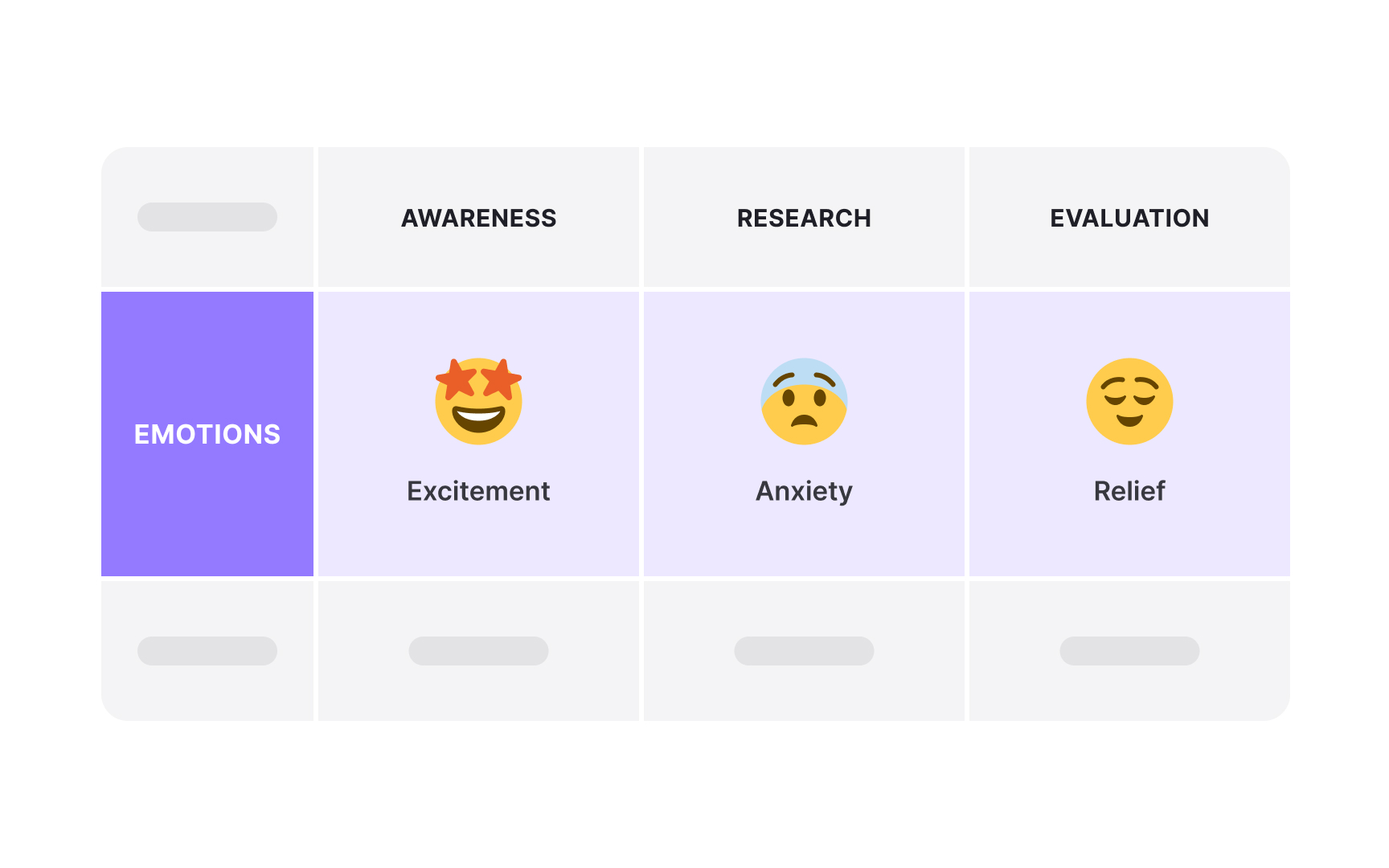
The emotions layer transforms
Capture emotions through direct research methods: customer interviews, surveys, and observation. Ask participants to describe their feelings at specific moments, not just their actions. Use emotion wheels or scales during research sessions to help customers articulate complex feelings. Avoid assumptions about how customers "should" feel based on your intended experience.
Visualize emotions using consistent scales and clear indicators. Common approaches include line graphs showing emotional highs and lows, emoji or face icons indicating mood states, or color gradients from red (negative) to green (positive). The key is making emotional patterns visible so teams can quickly identify where experiences need improvement and where positive moments can be amplified.
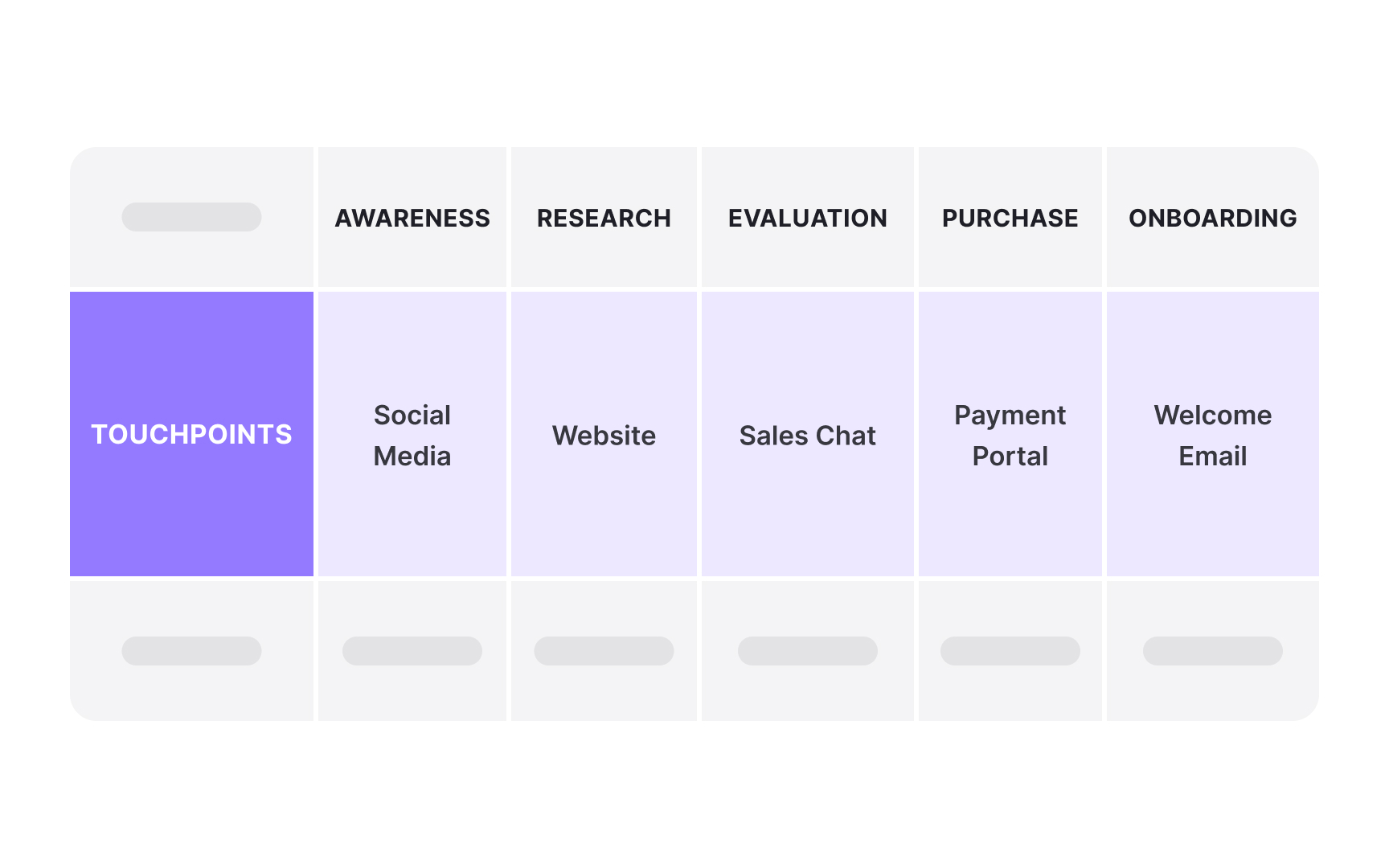
The touchpoints layer maps every
Analyze touchpoint transitions carefully. Customers often struggle when moving between channels, like starting on mobile then switching to desktop, or beginning online then calling support. Mark these handoffs clearly and note any information loss or friction. The most successful organizations design seamless transitions that maintain context and reduce customer effort across all touchpoints.
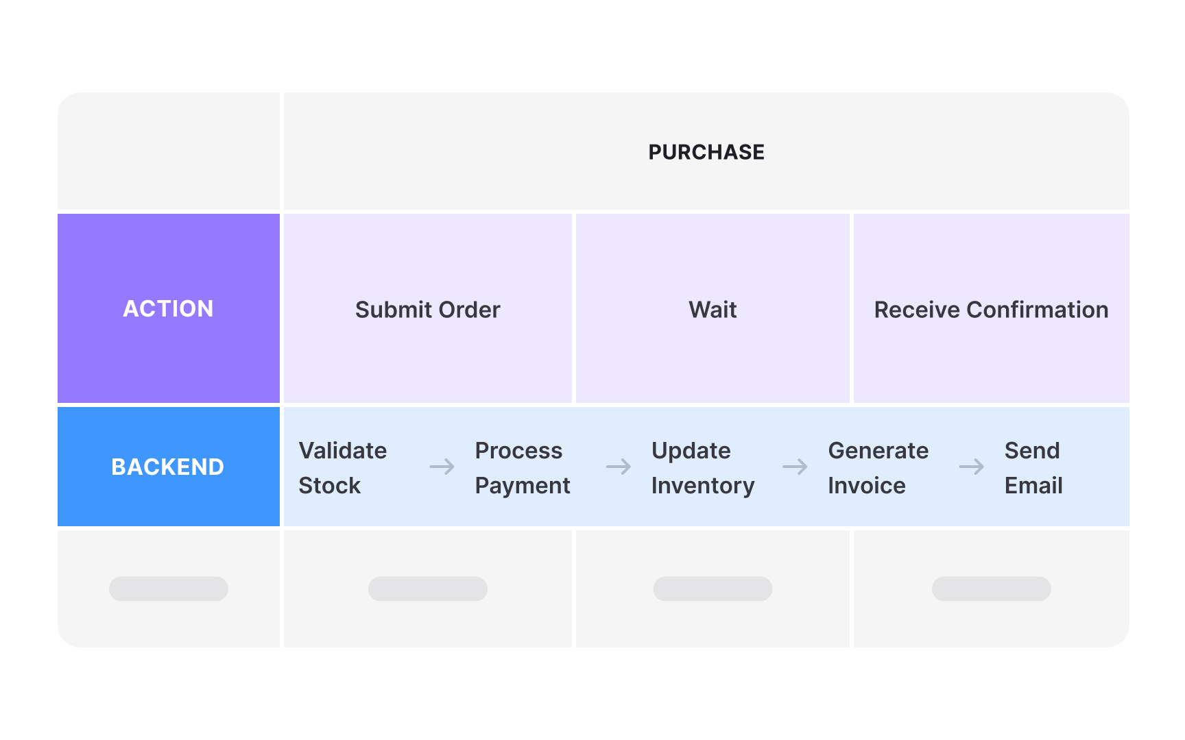
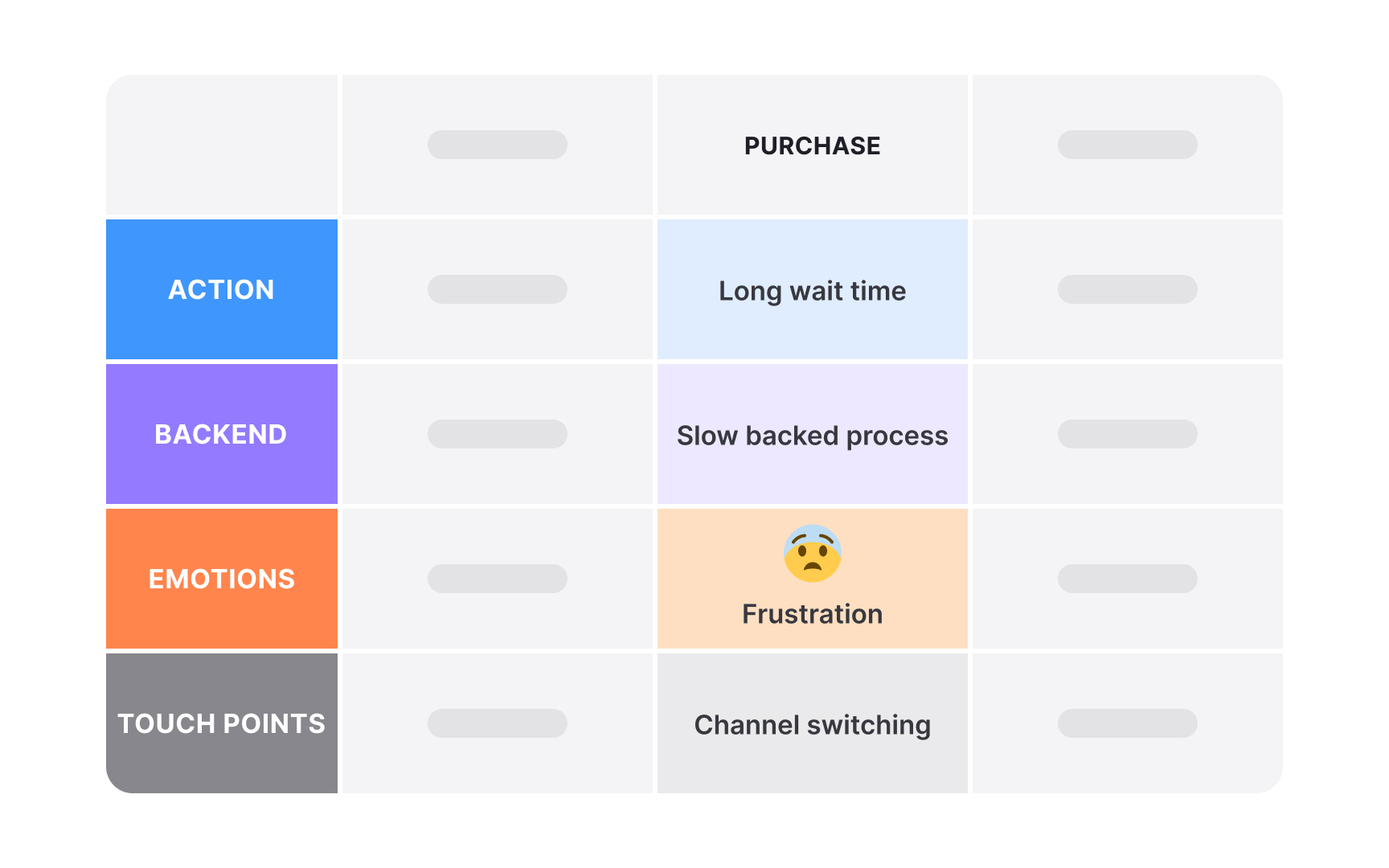
Backend processes reveal the invisible machinery supporting each customer
This layer also shows which internal teams, systems, or documents are involved at each step. For example, during the support stage, the backend might reveal the call center team using specific training materials in a helpdesk system.
Connecting backend activity to customer-facing pain points (like delays or errors) lets teams trace emotional spikes back to real causes. A simple action like “reset password” might span multiple systems: authentication, email, security checks, and audit logs. When that backend chain breaks or slows down, frustration spikes. This layer helps you find where fixing operations will make the biggest difference to how customers feel.
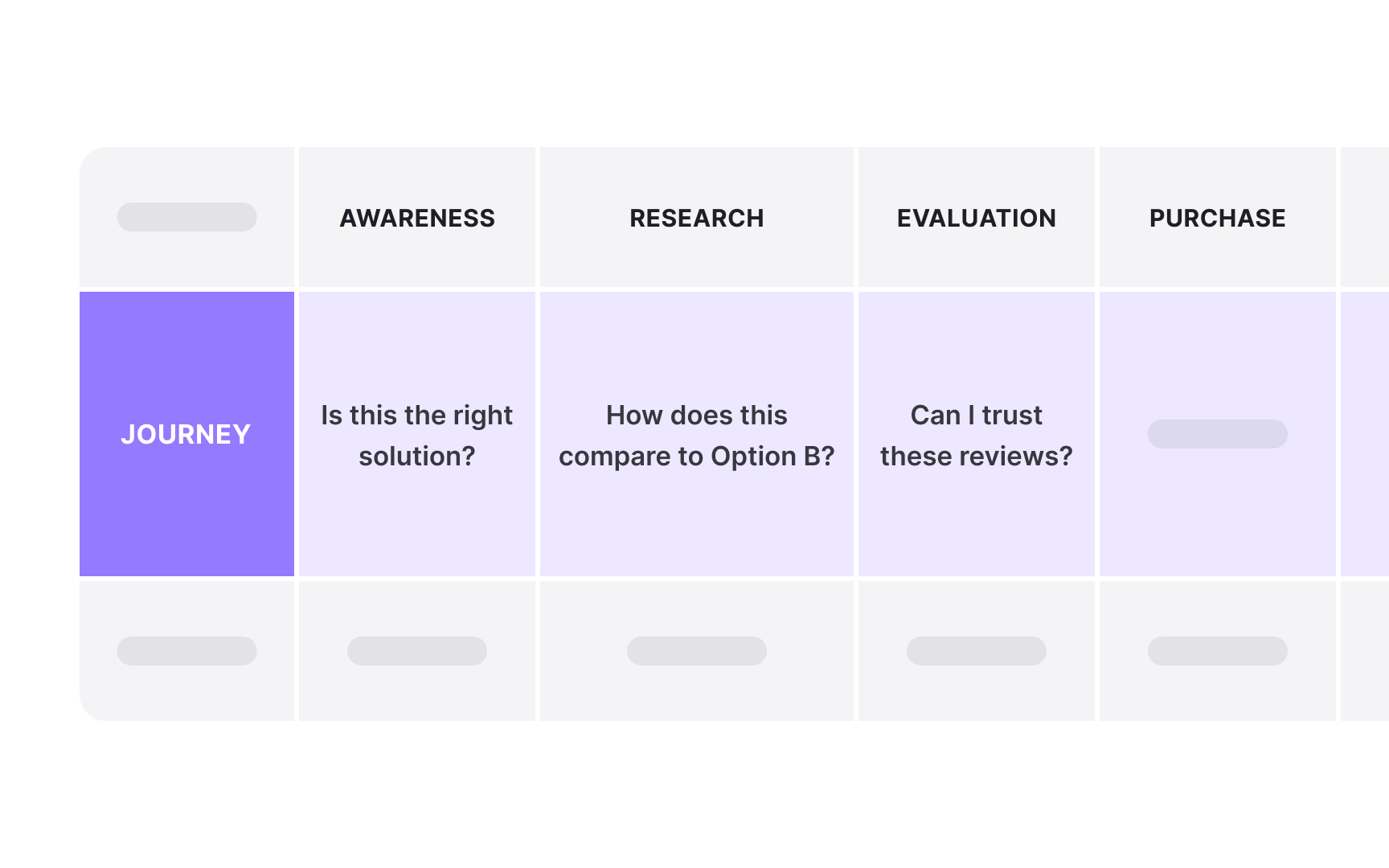
The thoughts layer reveals the invisible mental dialogue running through customers' minds during their journey. This layer captures questions ("Can I trust this company?"), concerns ("What if I need to return it?"), assumptions ("This will probably be complicated"), and decision-making logic ("I should compare
Capture authentic thoughts through think-aloud protocols during user research. Ask participants to verbalize everything crossing their minds as they move through each stage. Listen for uncertainty markers like "I wonder..." or "I'm not sure..." Document both positive thoughts ("This looks professional") and negative ones ("They're probably hiding fees"). Avoid paraphrasing and instead use customers' exact words to preserve authenticity and nuance.
Display thoughts using speech bubbles, quote boxes, or italic text beneath the actions layer. Group similar thoughts to identify patterns: multiple customers wondering about security signals a trust issue. Position thoughts to align with specific actions and touchpoints so readers understand what triggers each mental response. The thoughts layer often reveals why customers hesitate, abandon, or choose competitors, insights that actions alone can't provide.
Pro Tip: Questions in the thoughts layer are golden opportunities - each one represents a chance to provide clarity.
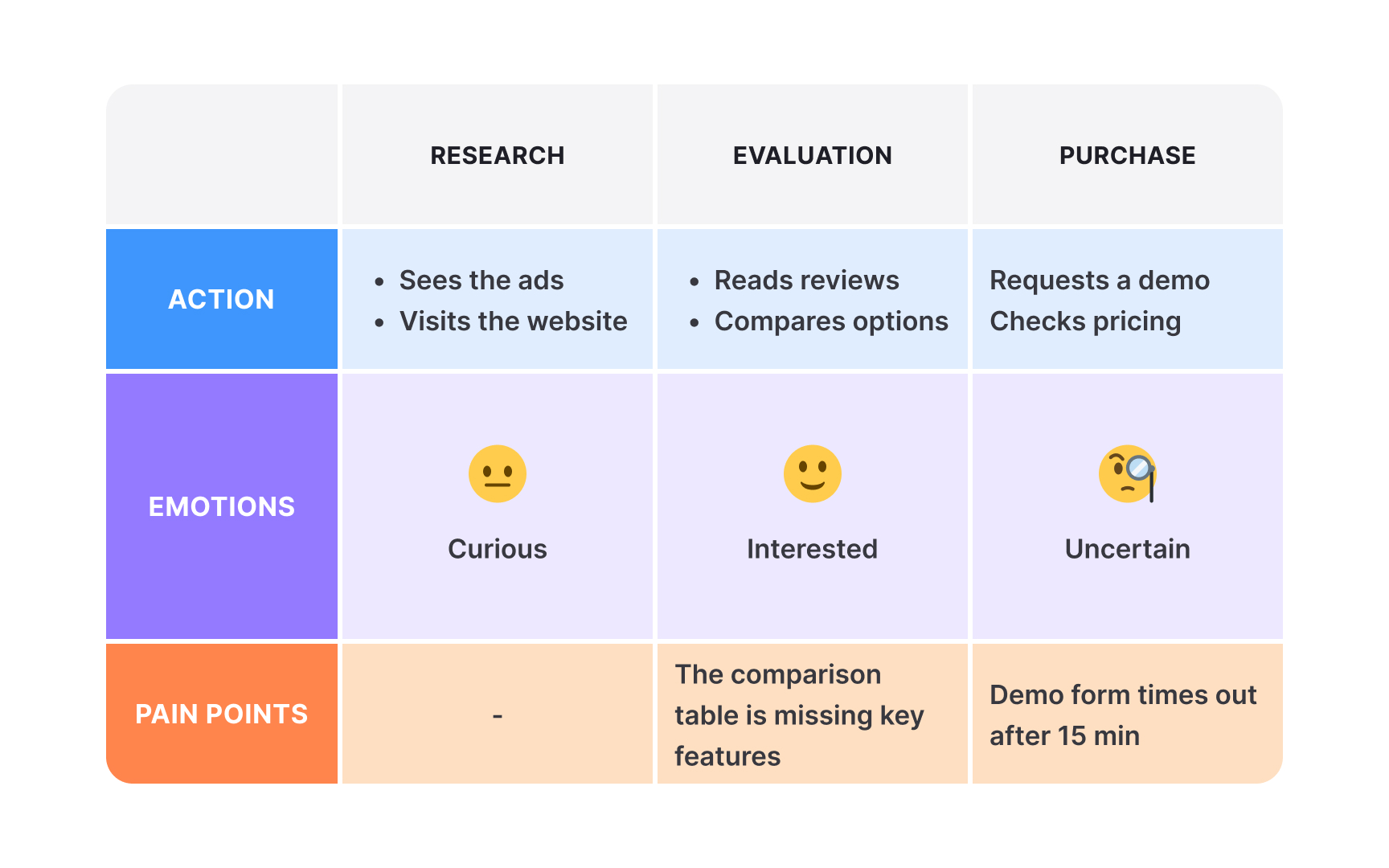
The pain points layer pinpoints exact moments where experiences break down, frustrate customers, or create barriers to progress. Unlike general dissatisfaction, pain points are specific problems: "3-minute wait for page load," "Can't find return policy," or "
Identify pain points by looking for convergence across other layers. When negative emotions spike, thoughts reveal confusion, and actions stall or repeat, you've found a pain point. Categorize them by type: functional (system doesn't work), cognitive (unclear information), emotional (lack of trust), or procedural (too many steps). Severity matters too - distinguish between annoyances that users tolerate and blockers that cause abandonment.
Visualize pain points using consistent iconography like warning triangles, red dots, or lightning bolts. Include brief, specific descriptions and severity indicators. Some teams use size to show impact: larger symbols for critical blockers, smaller for minor friction. Position pain points precisely where problems occur, not where symptoms appear later. Connect each pain point to supporting data when possible: "67% drop-off rate" or "Average 5 support tickets per day."
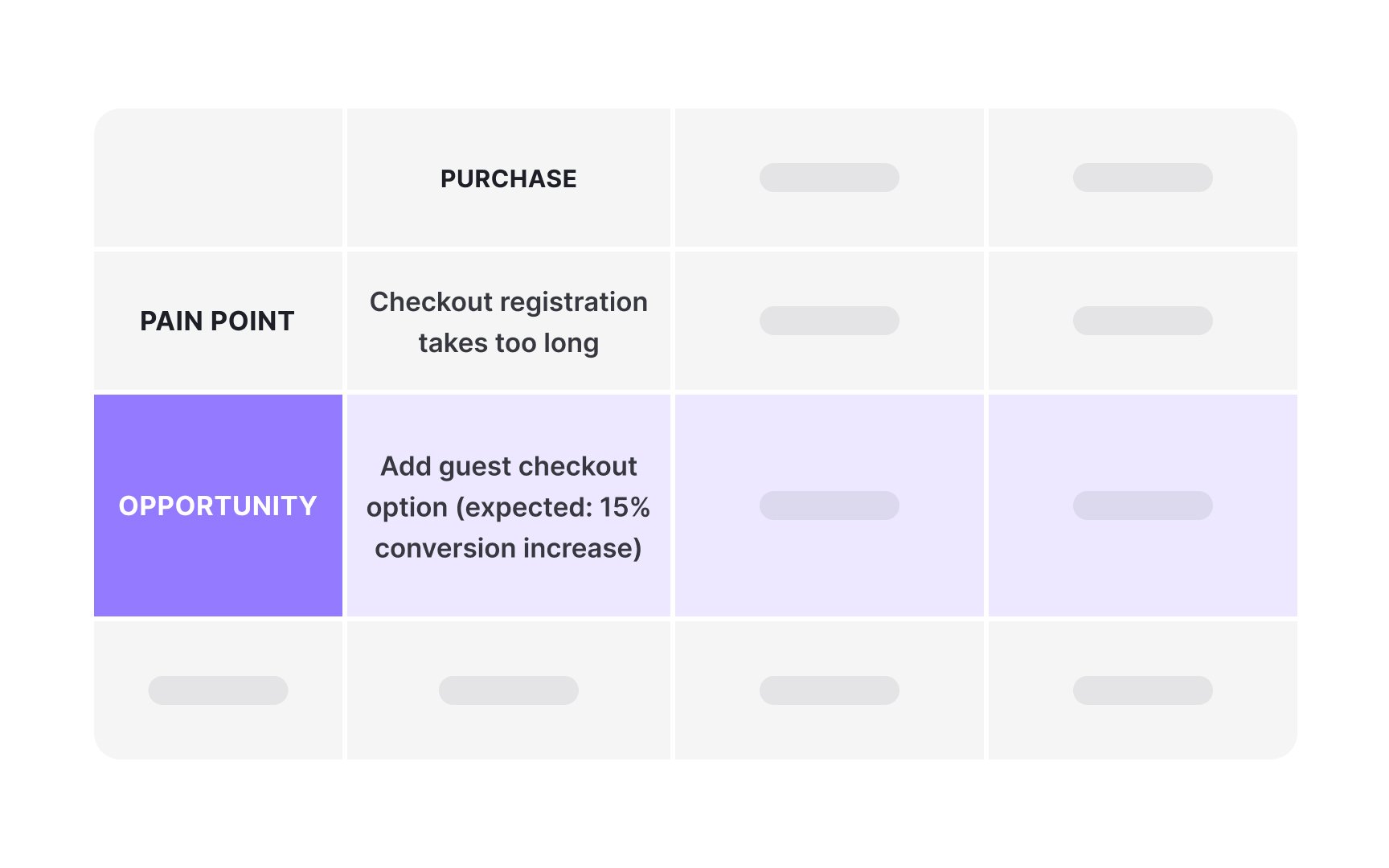
The opportunities layer transforms identified problems into potential solutions, marking where improvements could create the most value. Unlike pain points that show what's broken, opportunities showcase what's possible: "Add progress bar to reduce upload anxiety," "Introduce express
Generate opportunities by directly addressing pain points and unmet needs revealed in other layers. When thoughts show confusion, the opportunity might be clearer information architecture. When emotions dip during waiting periods, consider adding engagement elements. Strong opportunities are specific, feasible, and measurable. Instead of "Improve checkout," write "Reduce checkout steps from 5 to 3" with expected impact metrics.
Visualize opportunities using positive imagery like stars, plus signs, or light bulbs. Color-code by implementation effort: green for quick wins, yellow for medium effort, red for major initiatives. Include brief solution descriptions and expected outcomes. Some teams add opportunity scores combining factors like user value, business impact, and technical feasibility. Position opportunities adjacent to their corresponding pain points to show clear problem-solution relationships.
Choosing the right layers determines whether your journey map drives action or collects dust. Start by clarifying your map's purpose and audience.[1] A map for executives improving customer satisfaction needs different layers than one for developers fixing technical issues. Executive maps might emphasize emotions and business metrics, while technical maps focus on systems and data flows.
Consider your organization's maturity and readiness. Teams new to
Match layers to actionable outcomes. If your goal is reducing support calls, include a questions layer showing the most comment enquiries from customers at each stage. For conversion optimization, add a barriers layer highlighting obstacles. For digital transformation, map current versus future state in parallel layers. The best journey maps use only layers that directly inform planned improvements.
Pro Tip: Test your layer selection by asking: "What decision will this layer help us make?”
Align layers to expose cause-and-effect relationships. When negative emotions spike, look directly above and below to understand why. Perhaps a complex backend process creates delays, causing frustration during a critical action. Or multiple touchpoint changes confuse customers trying to complete a simple task. These layer intersections reveal root causes that single-layer analysis would miss.
Use visual techniques to strengthen cross-layer storytelling. Color-code related elements across layers, draw vertical lines connecting linked items, or highlight critical moments that appear in multiple layers. Some teams add annotation layers that explicitly call out insights discovered through layer relationships. The goal is making complex interconnections immediately understandable to stakeholders.
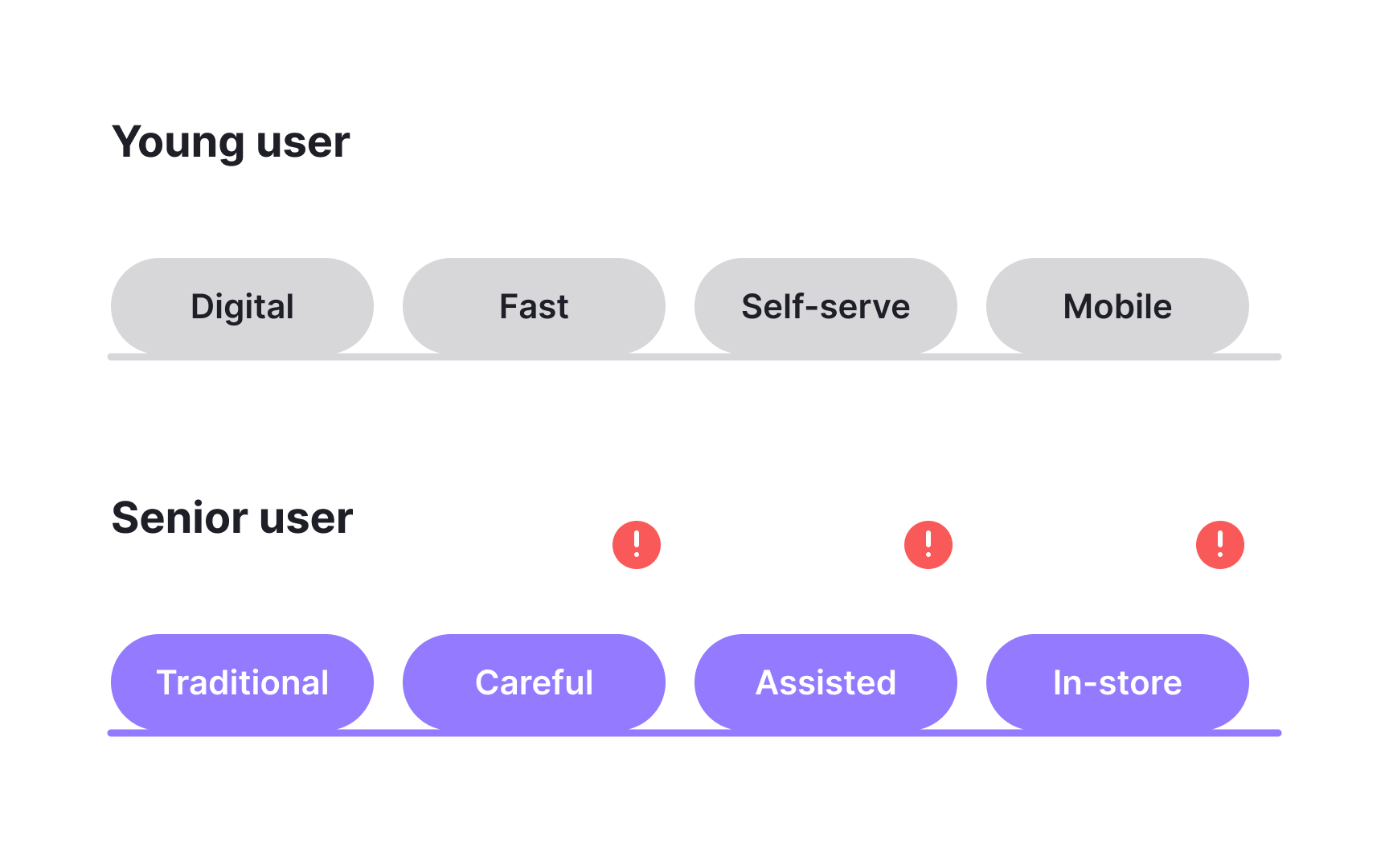
Different customer personas experience journeys uniquely, requiring tailored layer selections. A tech-savvy millennial and a traditional senior citizen navigate the same service through different touchpoints, harbor distinct emotions, and face unique barriers. Generic
Select layers based on persona-specific behaviors and needs. For digital natives, emphasize app features and self-service options. For relationship-focused personas, highlight human touchpoints and trust-building moments. Business buyers need layers showing approval processes and ROI considerations, while individual consumers focus on
Consider creating parallel maps or persona-comparison layers. Side-by-side journey maps reveal where experiences diverge and converge across personas. Some teams add a "persona delta" layer showing differences at each stage. This approach helps organizations avoid one-size-fits-all solutions and instead design flexible experiences that adapt to diverse customer needs and preferences.
Pro Tip: Start with your most valuable persona, then adapt layers for others rather than starting fresh.
Layer hierarchy determines which information viewers see first and what stories dominate the narrative. Primary layers should directly support your map's core purpose, while secondary layers provide supporting context. This visual hierarchy guides stakeholders through complex information without overwhelming them. Position your most critical layers at eye level, typically starting with actions and emotions.
Establish hierarchy through visual weight and positioning. Use larger fonts, bolder
Also consider your audience when building hierarchy. Executive viewers might need emotions and business metrics prominently displayed, while technical teams require backend processes and system touchpoints emphasized. Create layer templates for different audiences, maintaining consistent information while adjusting visual prominence. The right hierarchy ensures viewers quickly grasp key insights without missing important supporting details.
Pro Tip: Test hierarchy by asking viewers to describe the journey after a 30-second glance - they should catch primary insights.


Similar lessons

What is Journey Mapping?

Types of Journey Maps
