Settings
Explore the best practices to follow when designing a Settings section that is free of any ambiguity
In the settings section of your product, users can customize the way the app behaves to their liking. While it doesn’t get all the attention that other parts of the product might get, it’s vital that it works well to provide an optimal user experience.
From the way your settings screens are organized to how you display information within them, following best practices will create a better experience for users. The goal is to make it as painless as possible for your users to change settings at will without any confusion or frustration.
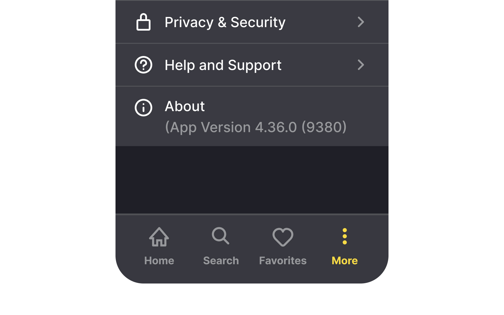
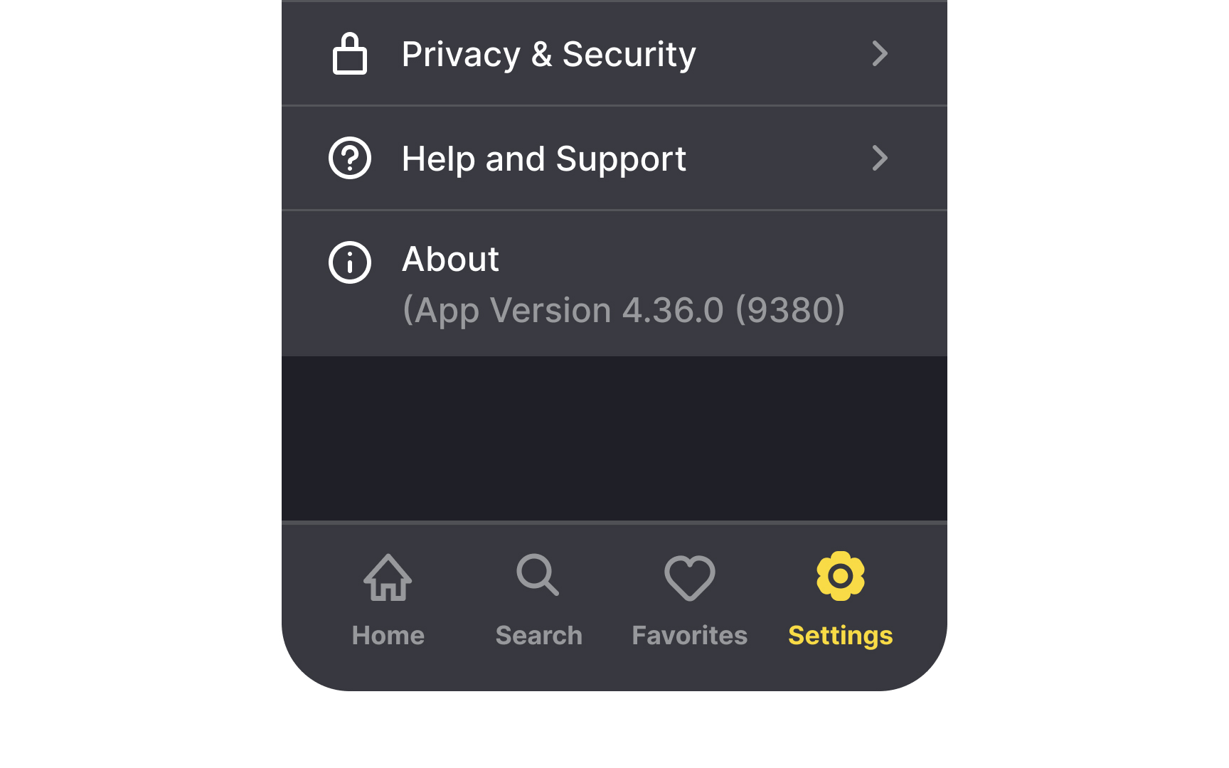
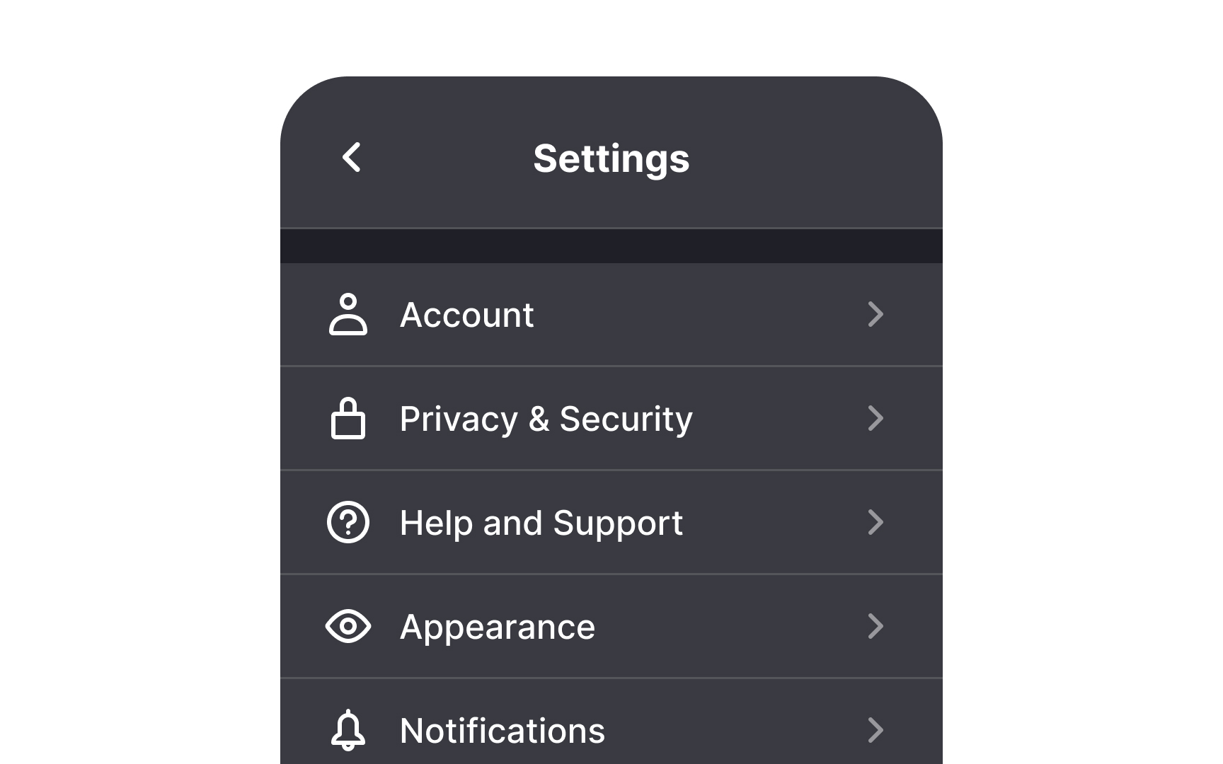
The Settings page is a very common pattern, and users know what to expect when they go there. They can turn off notifications, manage the profile privacy, or change page appearance.
It may be tempting to use the
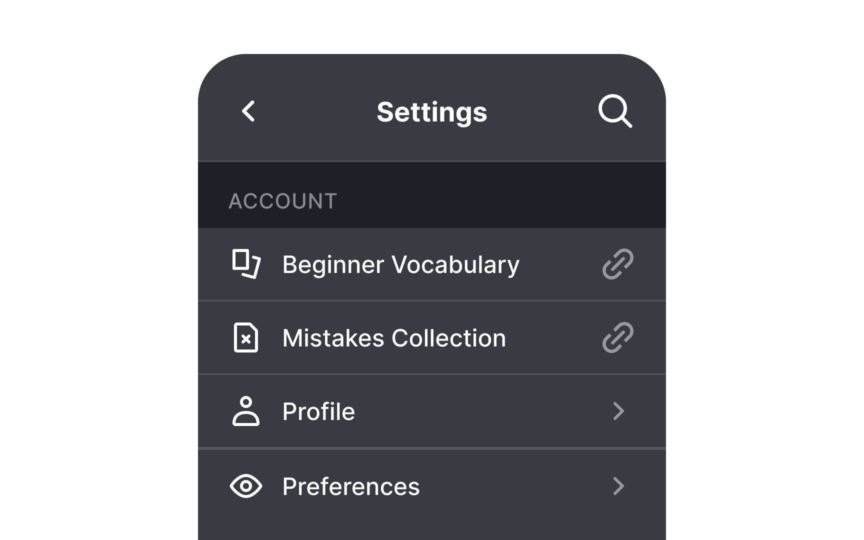
Prioritize the order of settings' controls according to how often users actually use them. User research can help you learn the frequency and decide on the right order of parameters on a
The controls that users adjust often should sit on top of the list and be notably visible. In turn, the controls that users change rarely should be secondary and should be placed at the bottom of the list. If secondary options are for advanced users only, you can hide them under the Advanced
Make sure
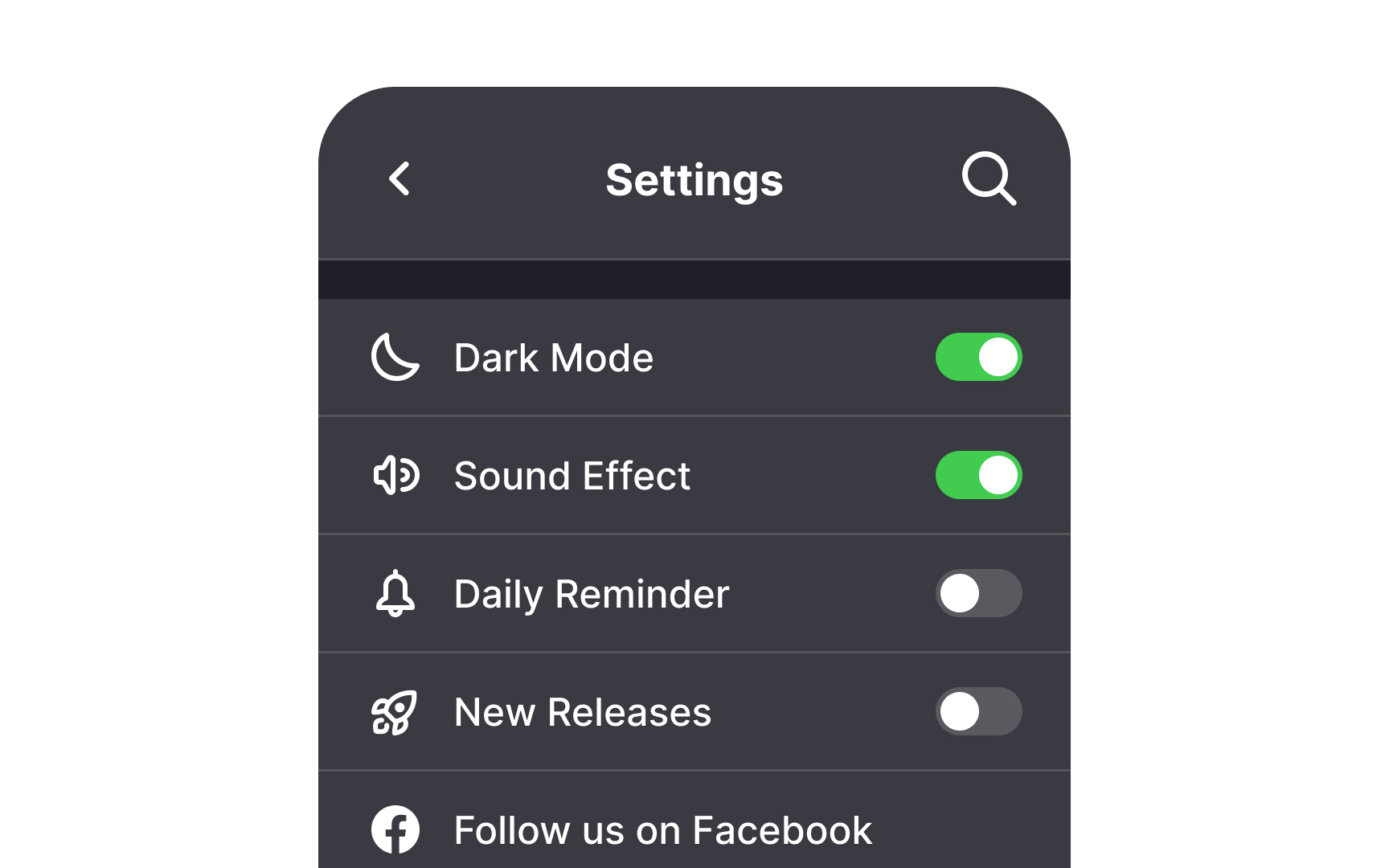
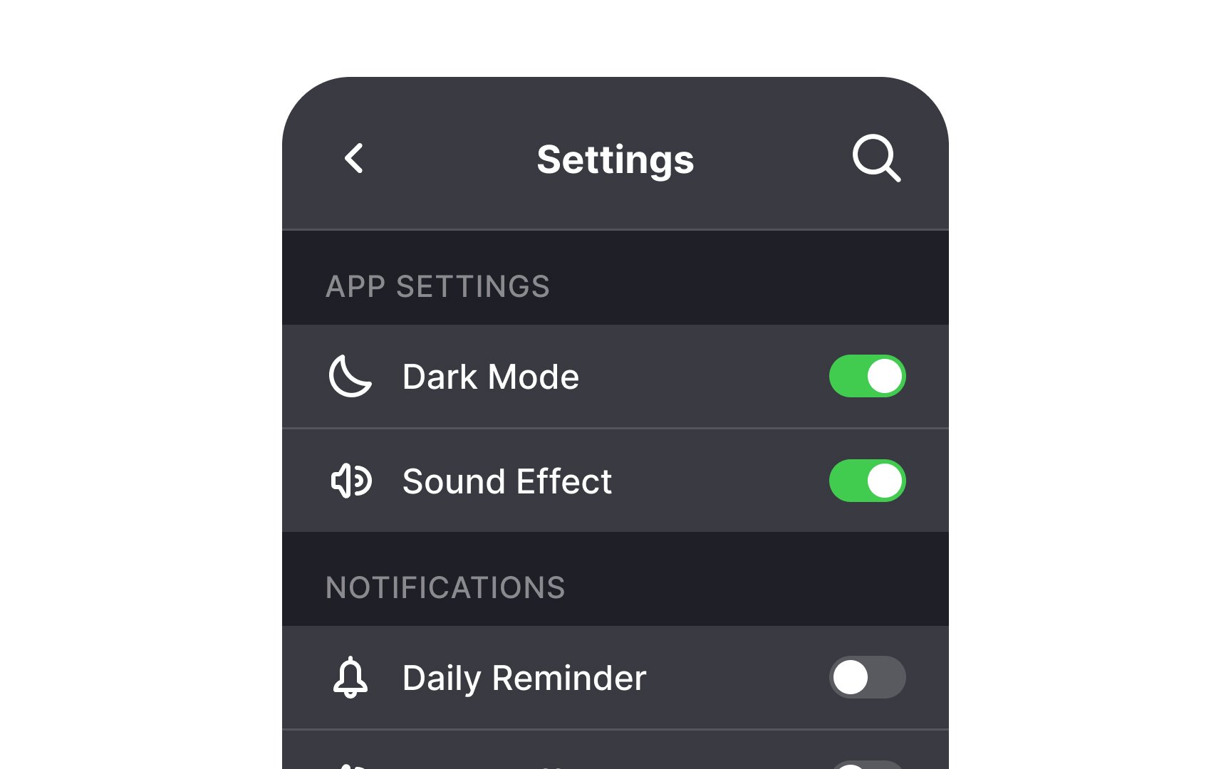
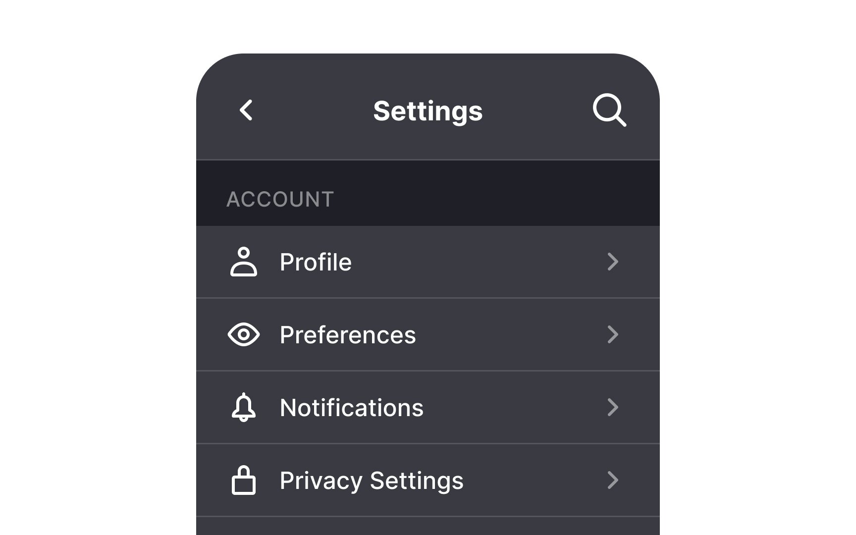
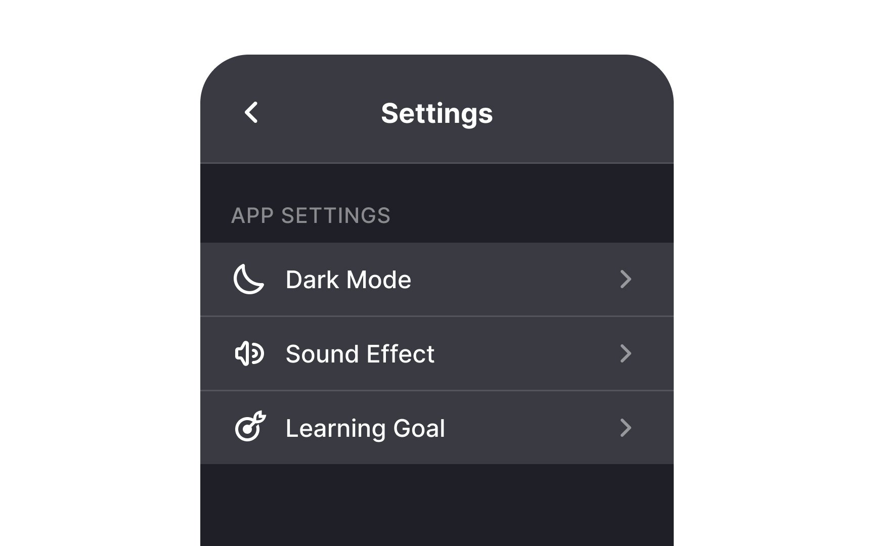
Grouping related
You can group settings by type — account details, security, time and date, etc. — or use case. Use white space, dividers, and headings to make the page easy to scan. When well-executed, this practice makes navigating settings a breeze.
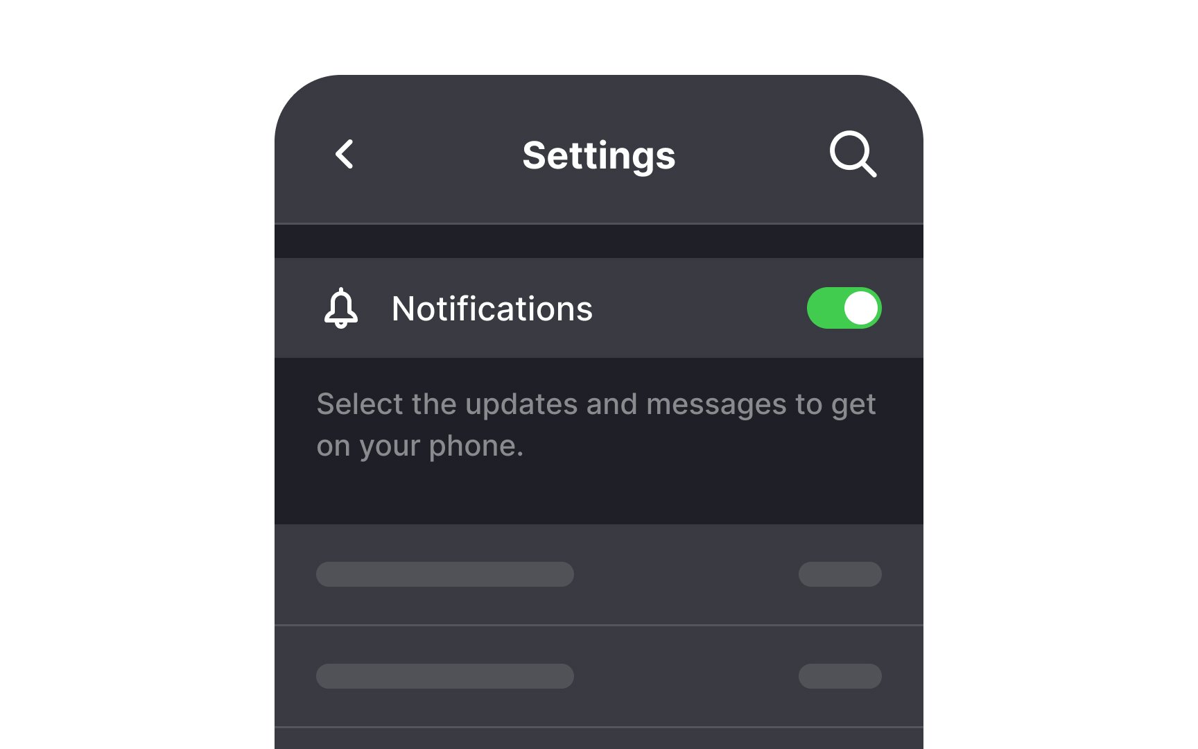
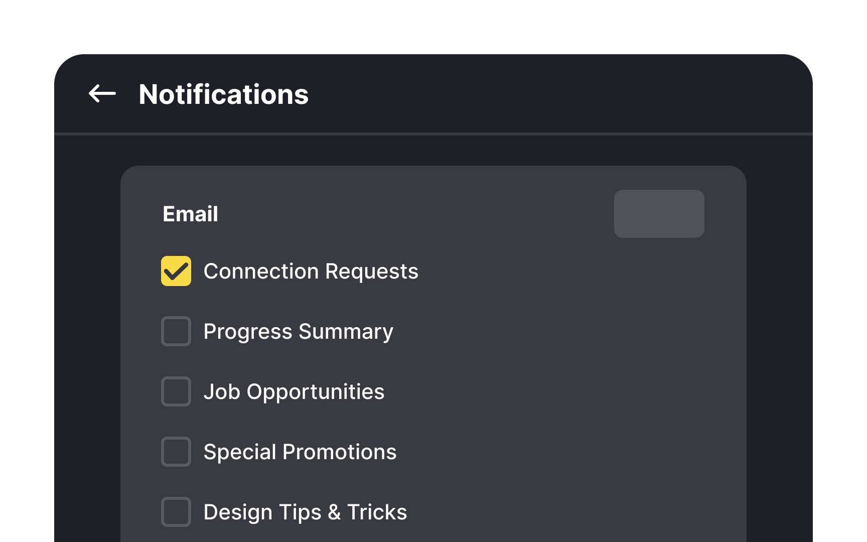
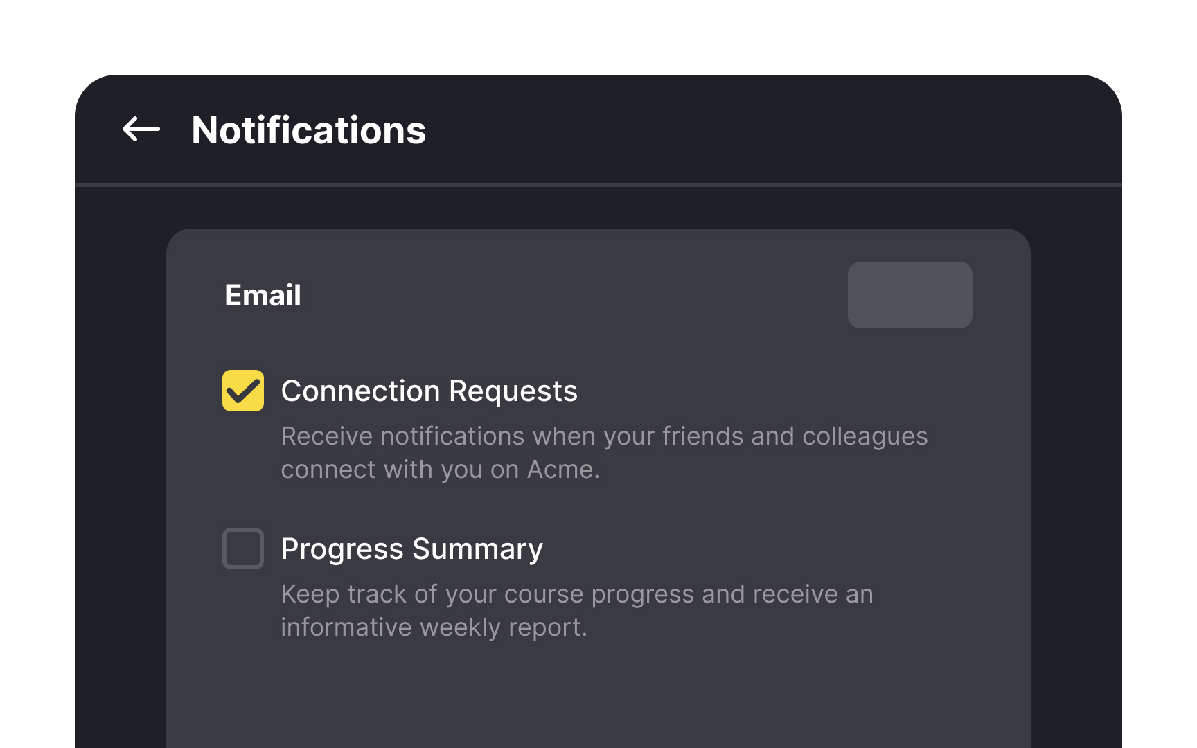
Use simple language when writing labels and helper text for your controls. Most of your users aren't developers — unless it's your target audience. Which means that they won't understand highly technical jargon.
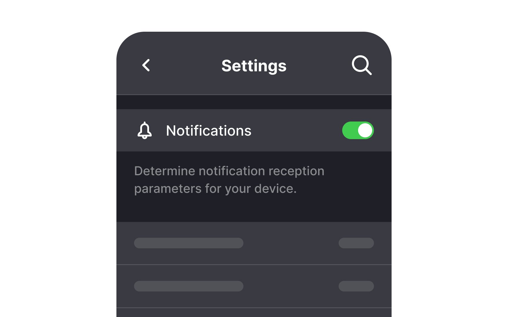
This is especially important when writing helper text. Explain in simple words what a particular control does. Aspire to write in a way your audience can understand the first time they read it.[1] This will help users gauge which controls they need to change without googling the issue.
Pro Tip: Use concise, straightforward descriptions for helper text.
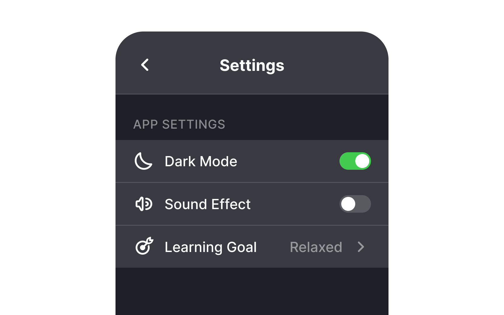
Display each setting's current status clearly beside its name. Use toggle switches to show whether
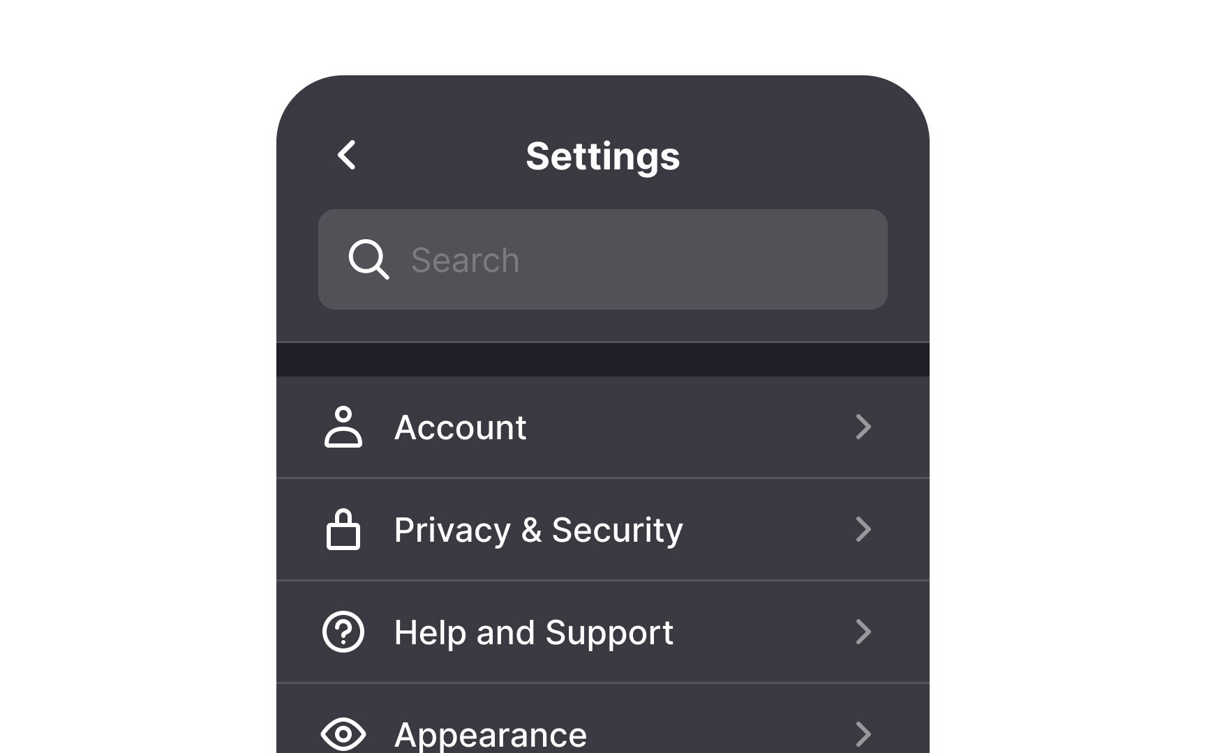
Consider adding
Users can waste valuable time scrolling to find the setting they’re looking for. This can be even more challenging if the
You can make this even better by showing related results, not just exact matches. For example, if someone searches “Siri” on iOS, the results can show where Siri appears in Accessibility,
Some
Keep in mind the proximity principle: related elements should be placed near one another. That principle is vital for helper text. Users shouldn’t be wondering which setting the helper text refers to.
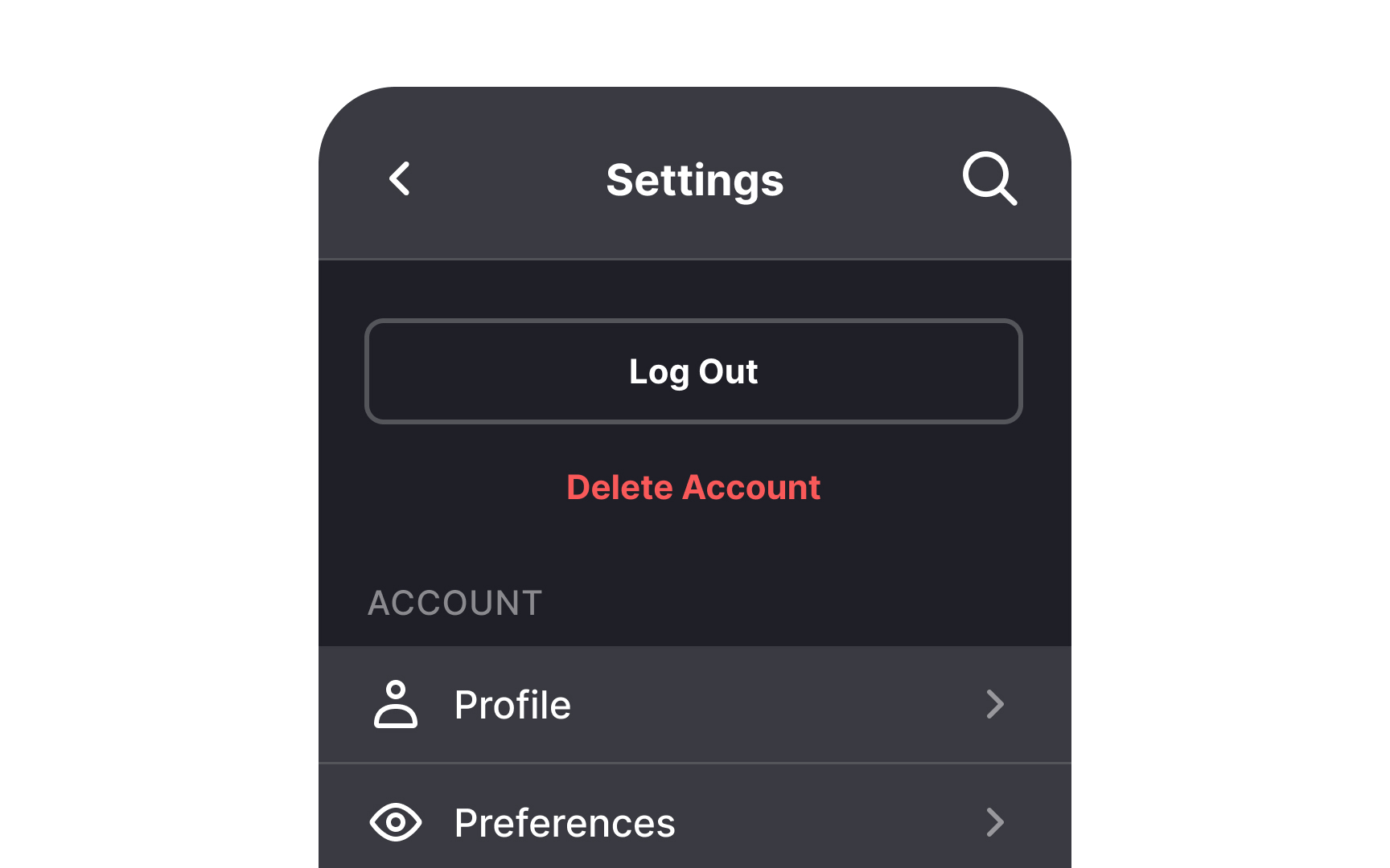
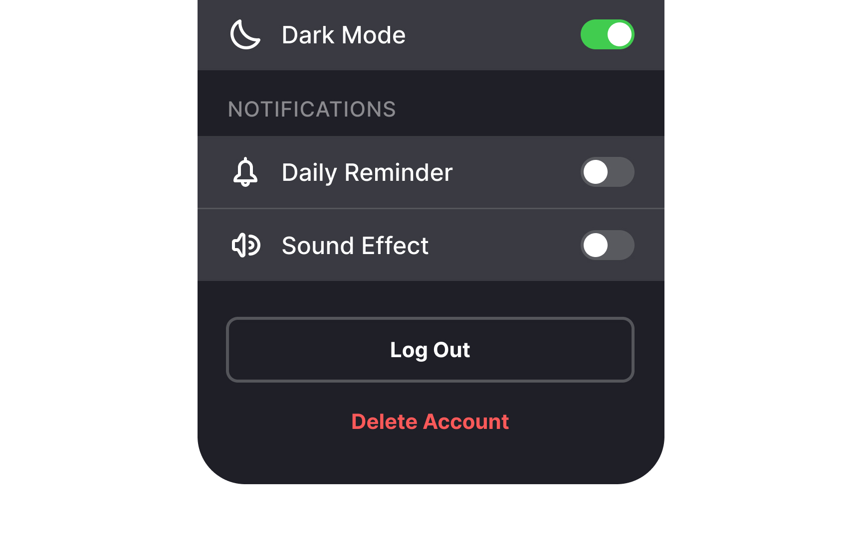
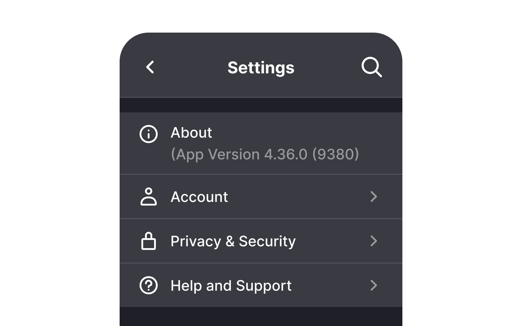
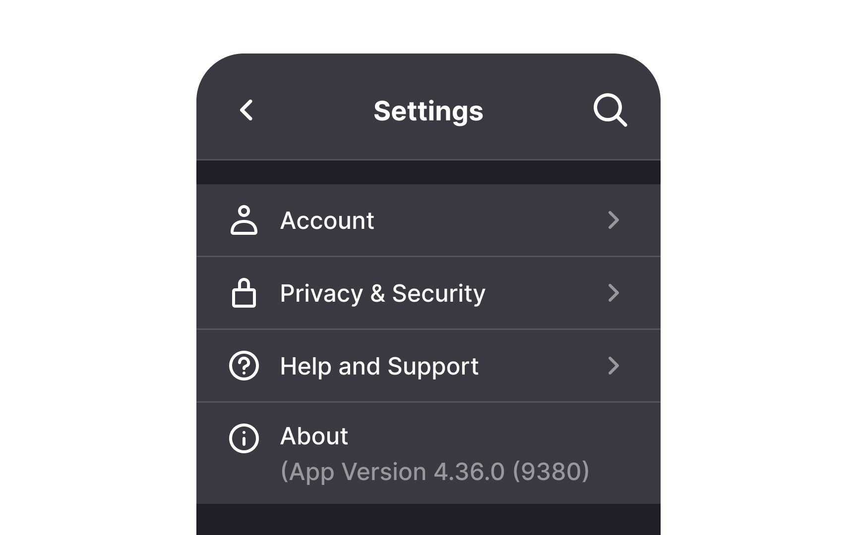
Place destructive actions like logging out or removing the account at the bottom. The rationale is simple — if you want to keep your users around for longer, don't make the exit the first thing they see.
Another concern is that users can accidentally click on destructive action
Pro Tip: Use a confirmation dialog for destructive actions to prevent data loss and user frustration.
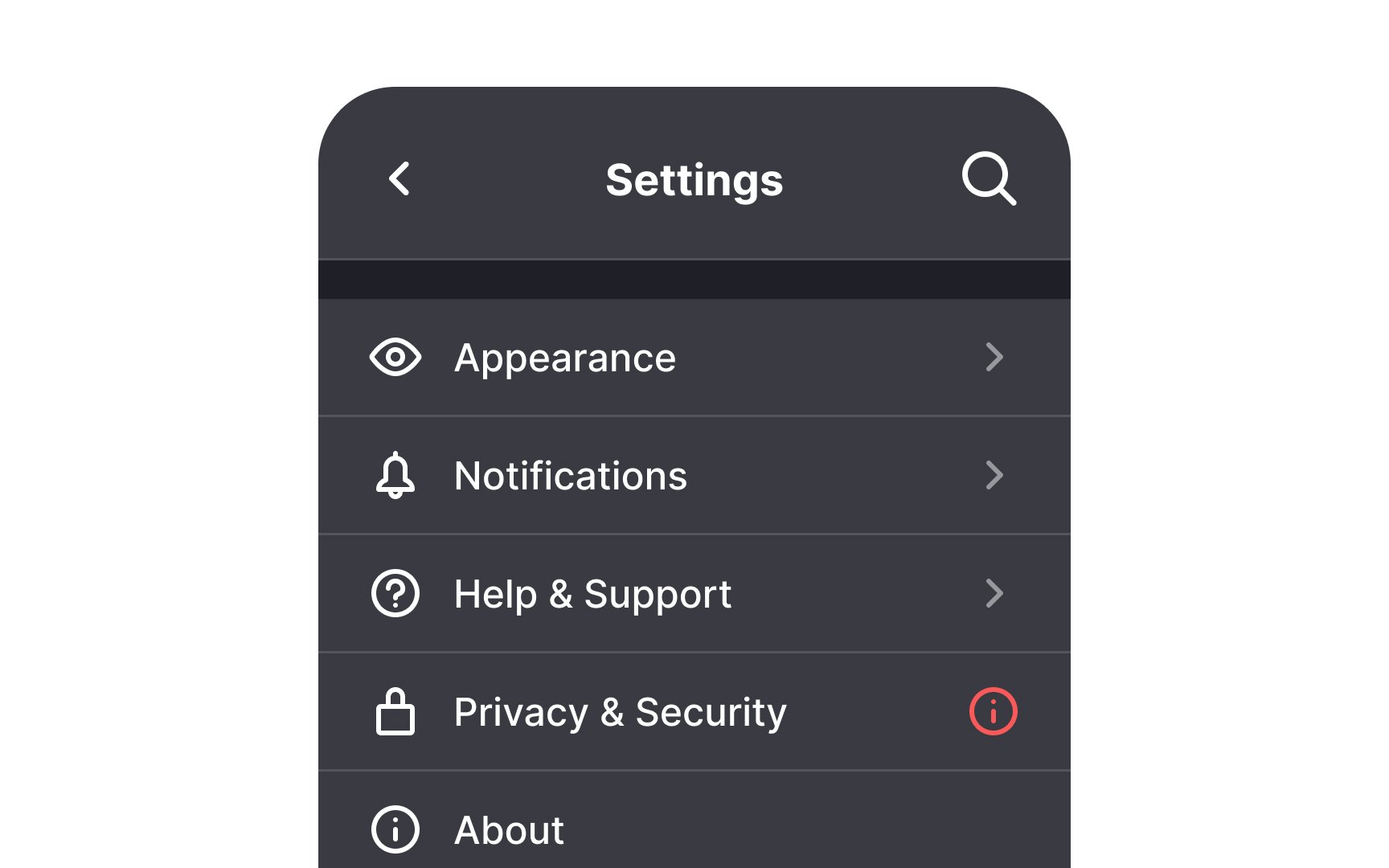
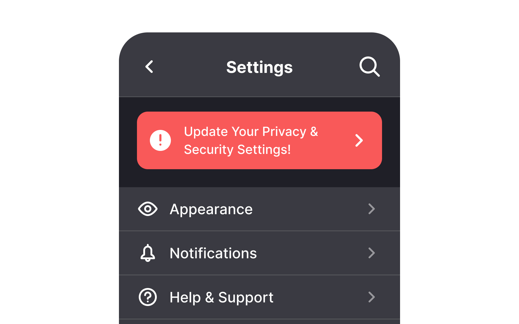
Make important alerts highly visible. Some elements like changes in privacy policy deserve to jump the queue. Draw attention to such changes by adding an alert
You can also use this type of alert to boost revenue by announcing things like plan upgrades. Other examples include an expiring trial or low remaining cloud storage space.
Pro Tip: To ensure visibility, use a contrasting badge color and the alert icon to draw users' attention.
References
- Plain Language for UX Writing | Medium
- Dangerous UX: Consequential Options Close to Benign Options | Nielsen Norman Group
Top contributors


Topics
From Course

Share


Similar lessons

Login & Signup Flows

User Onboarding
