Best Practices for Designing Pricing Pages
Create pricing experiences that reduce decision anxiety and drive conversions
Choosing a pricing tier shouldn't require a spreadsheet. Yet many pricing pages present options in ways that demand serious cognitive effort. Feature matrices with dozens of rows. Tier names that don't communicate value. Pricing that requires calculation to compare. Users facing this complexity often don't choose at all. They defer the decision indefinitely.
The patterns that work share a common principle: reduce decision friction. Limit options to a manageable number. Highlight the tier most users should choose. Make differences between plans immediately visible. Show prices in the same format for easy comparison. Address the fear of choosing wrong with money-back guarantees or easy plan changes. The pricing page that converts isn't necessarily the one with the best price, but the one where the right choice feels obvious and safe.
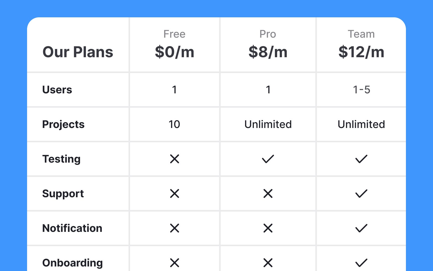
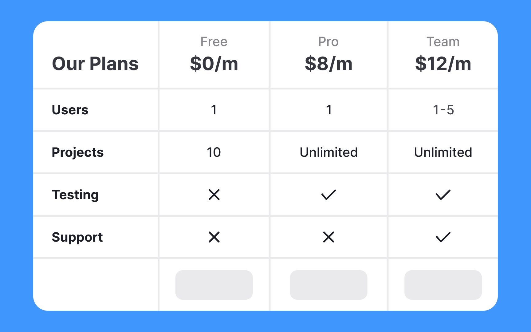
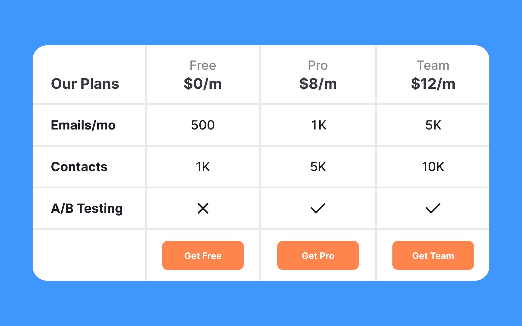
Overwhelming users with tons of features and various benefits within a
A better approach is to mention the most important features and cut off the less prominent ones. Don't forget to add enough space between options to make them stand out and enhance legibility. Add visual accents via fonts, color, and graphic elements to aid users in comparing and scanning pricing plans.
Pro Tip: If users need more detail, you can offer an expanded table through a button or link, or send them to a full pricing page with a deeper breakdown of all features.
If your
In
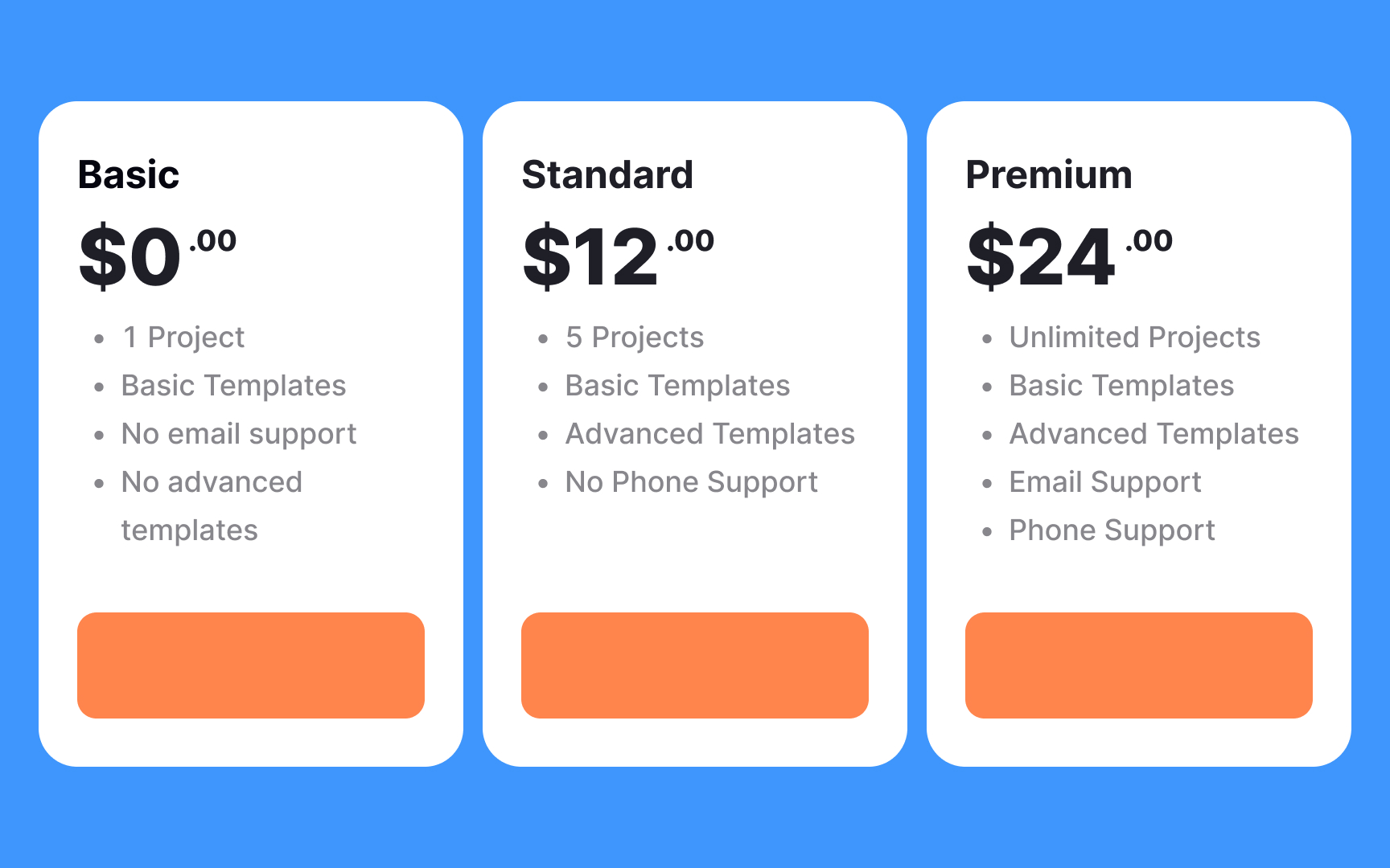
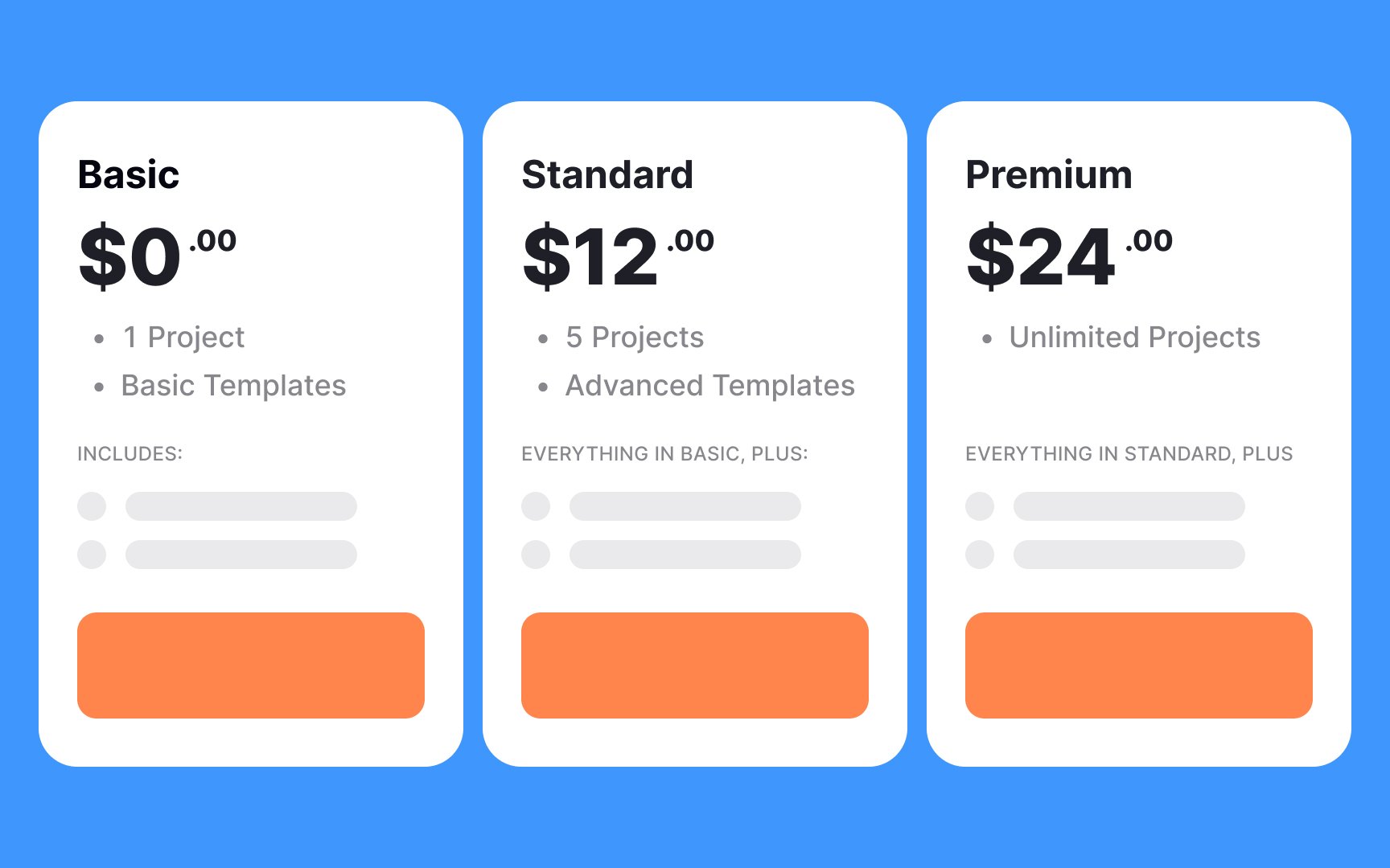
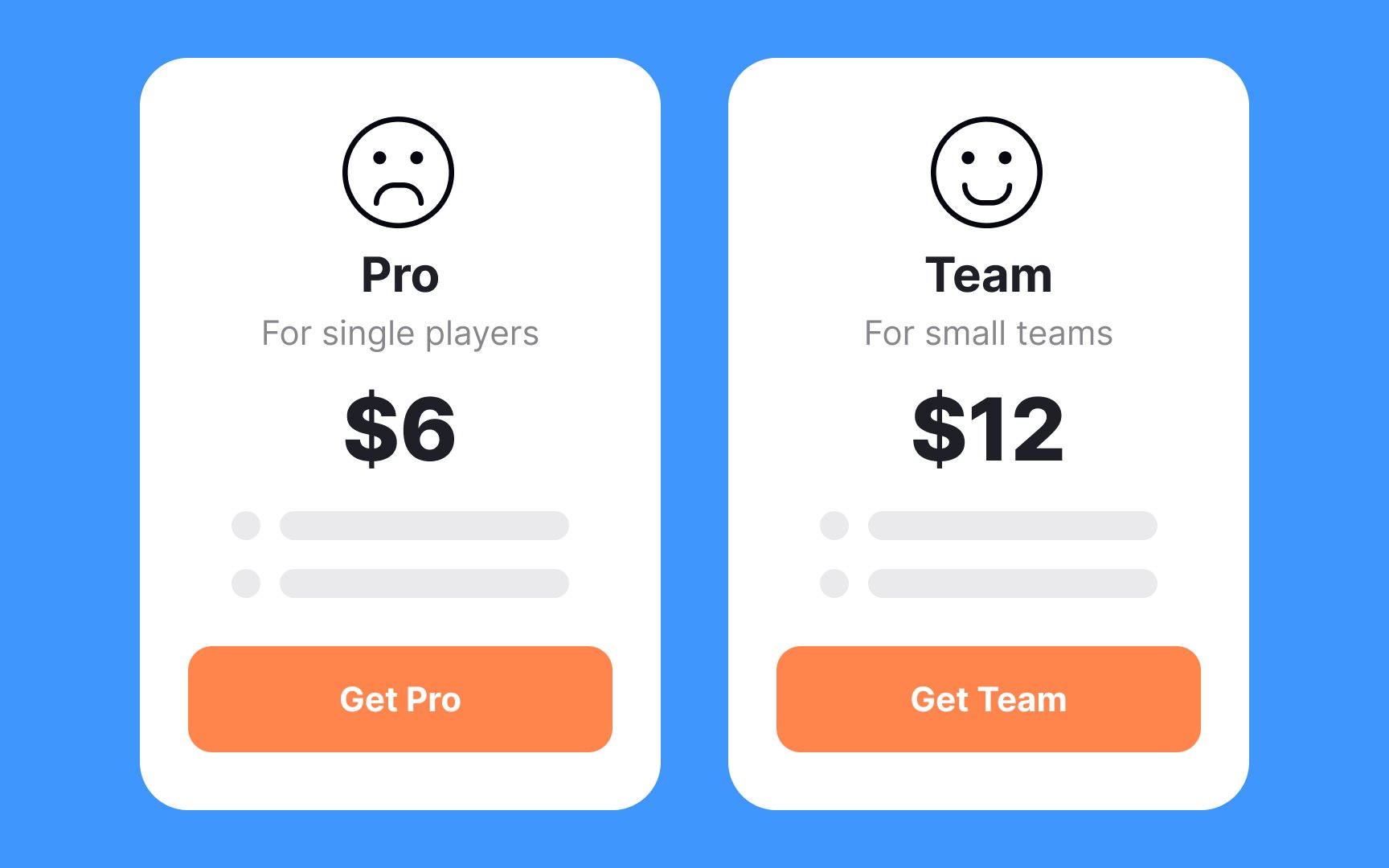
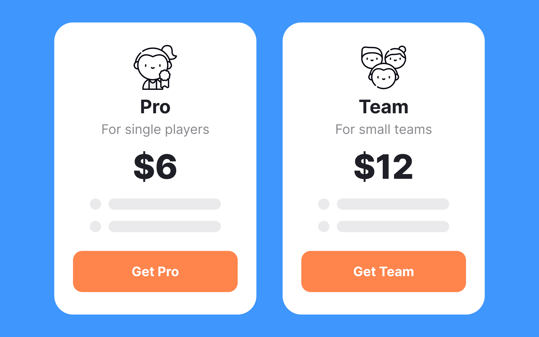
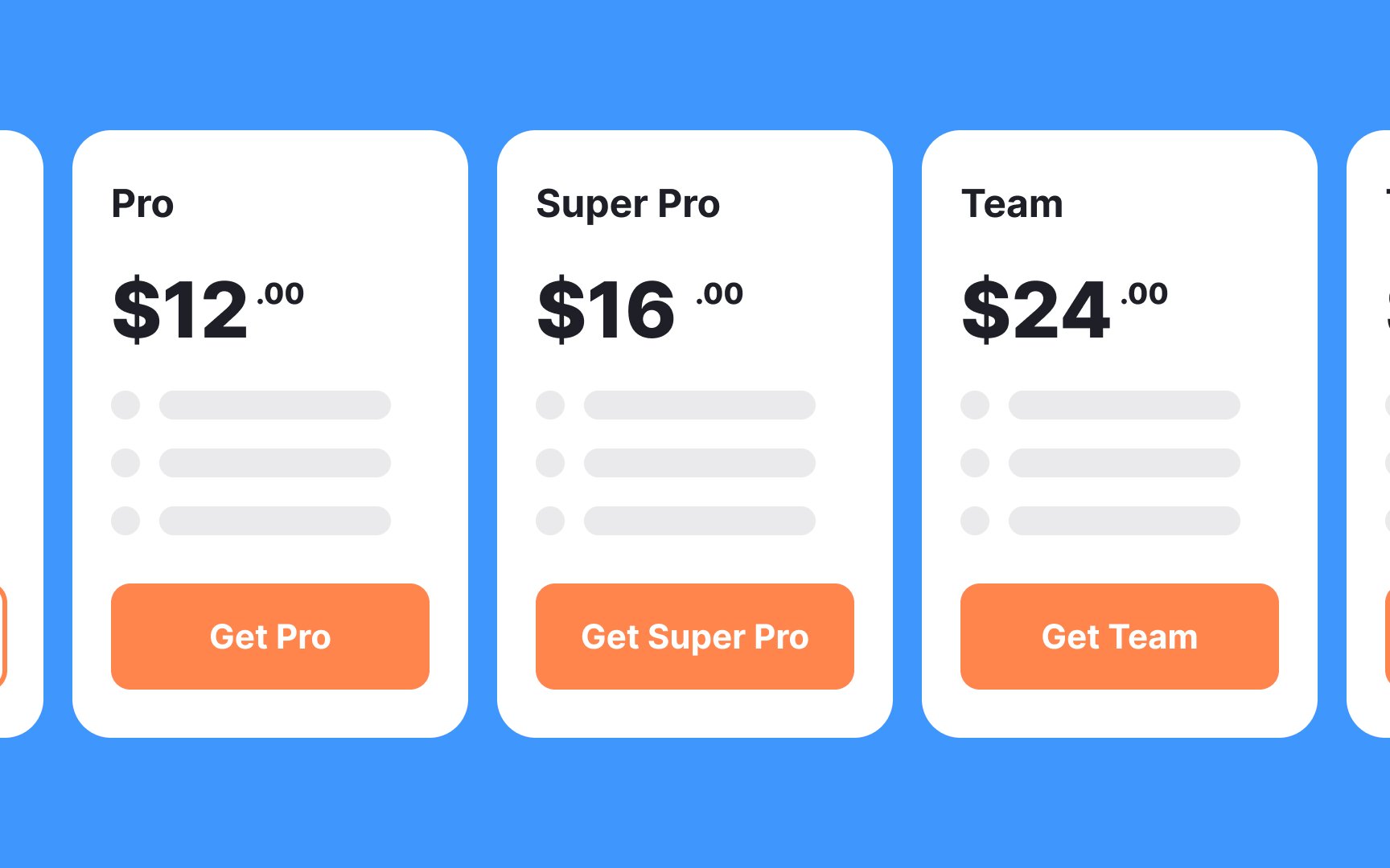
Below each plan, detail additional features that come with that specific tier. For example, the starter plan could include professional templates or advanced features not available in the free version. This method organizes information in a user-friendly way, making it easier for potential customers to understand the value they're getting at each level. By prioritizing differences and then expanding on the incremental benefits, you guide users towards the plan that best suits their needs, simplifying their decision-making process.[1]
Pro Tip: Make sure the feature list fits on a single page and isn't too long.
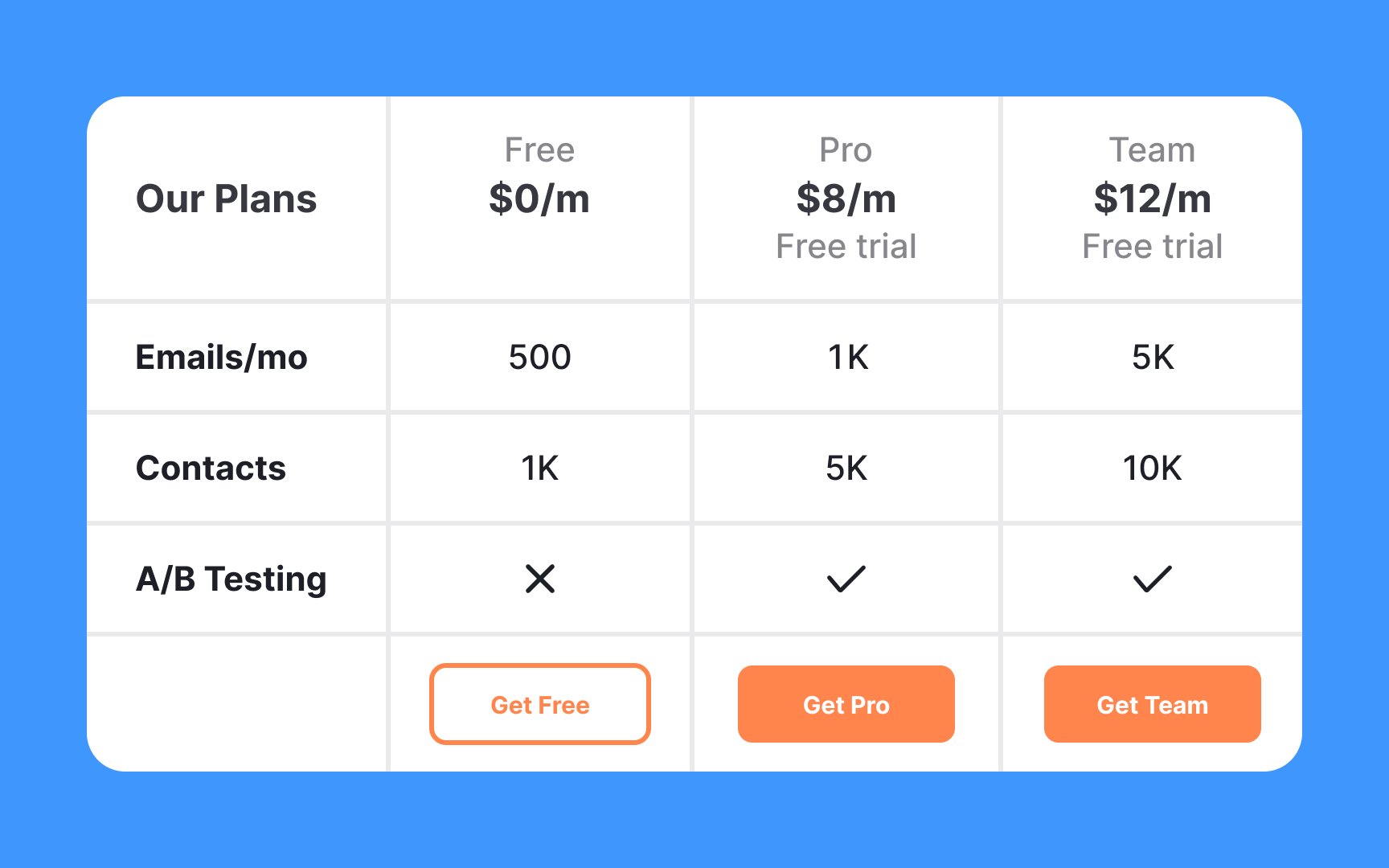
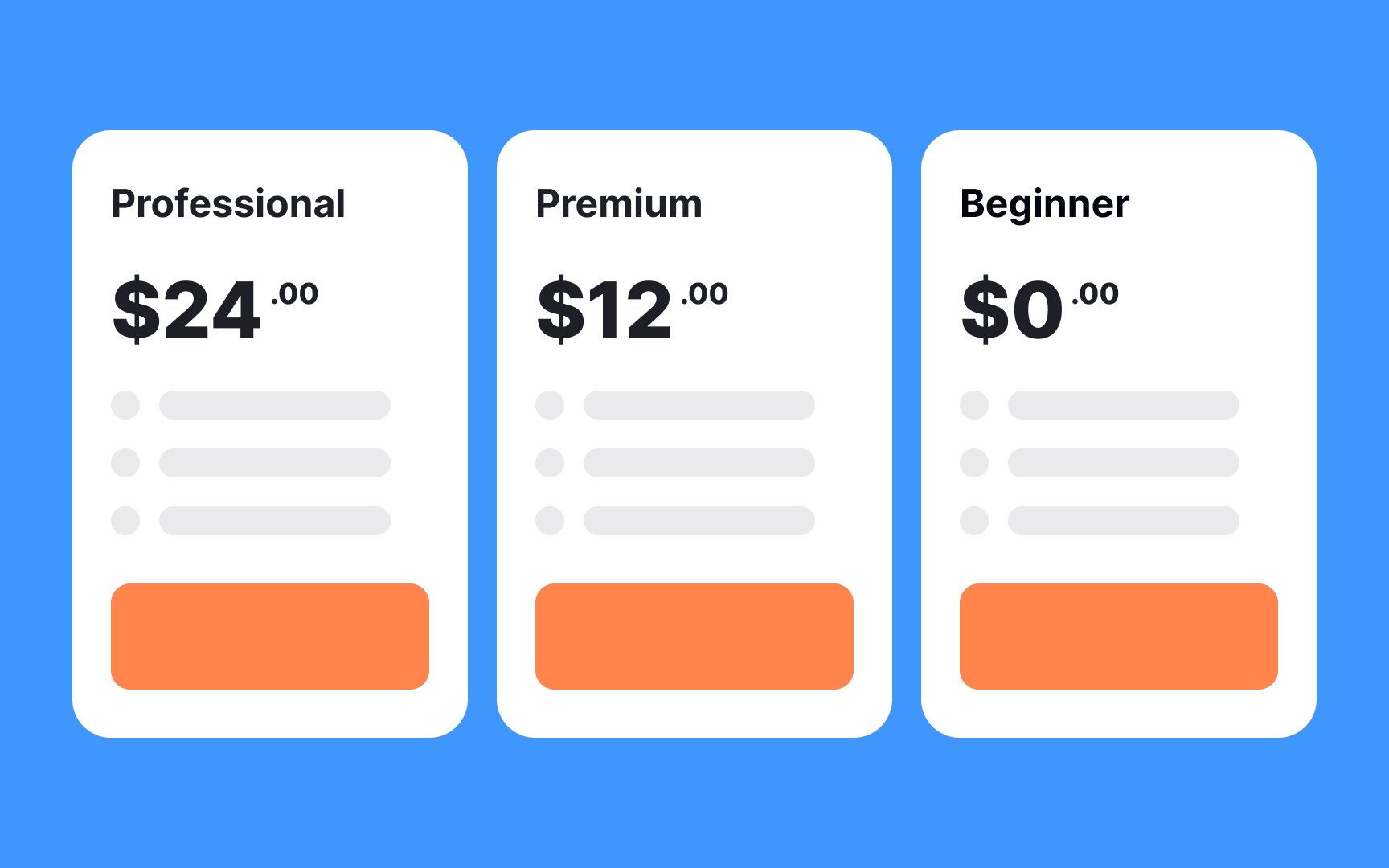
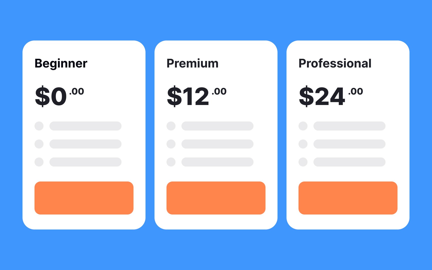
When it comes to choosing between
- The middle plan: This plan typically follows a free option, is priced lower than the premium one, and tends to be a popular choice. Users often gravitate towards something in between.
- The plan that fits most needs: Conduct thorough research and engage with your users to identify which plan aligns best with their requirements. Labeling it as the "Top Choice" can assist other users in making decisions more swiftly.
- The plan that offers a free trial: Offering a free trial is a proven way to capture user interest. Highlighting a plan with this feature demonstrates that you prioritize their experience and value, not just profit.
To ensure these choices stand out, adjust the font size and weight, apply a distinctive
Pro Tip: Don't overdo it by adding too many visuals and highlights. When everything seems important, nothing is important.
When a
To address this, aim for a simplistic design that eliminates visual clutter and keeps users focused on their primary goal. Opt for simple and legible
Graphics in
Moreover, incorporating elements of playfulness, such as interactive
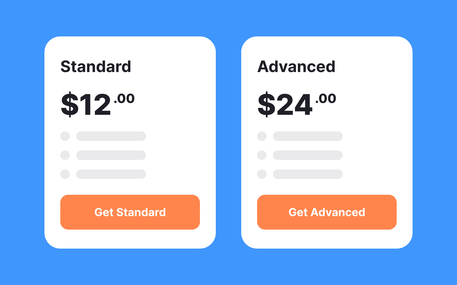
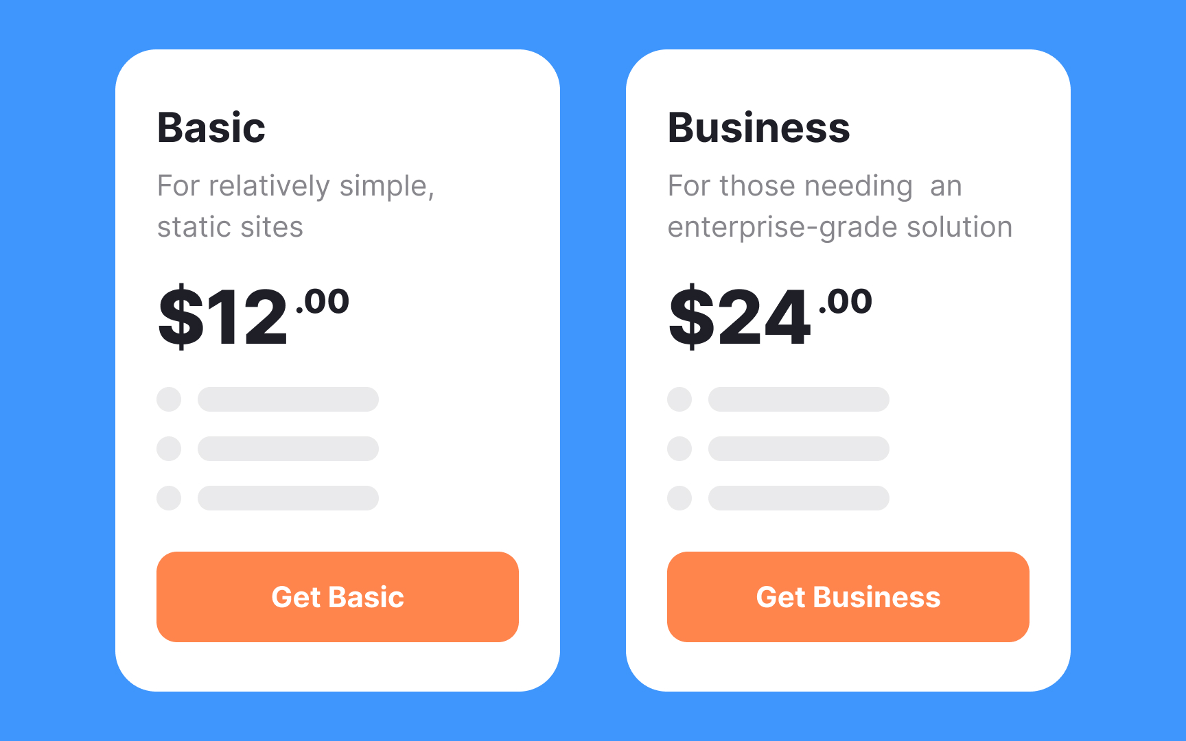
Using descriptive plan names and clear, concise descriptions is essential for guiding users to make informed decisions quickly. For instance, instead of labeling a plan as "Standard" or "Advanced," consider a name like "Basic Website" and "E-commerce Powerhouse." These names immediately convey the purpose and benefits of each plan.
Then, complement these names with straightforward descriptions, such as "Our Basic Website plan includes essential features for small businesses" and "The E-commerce Powerhouse plan is tailored for online stores with advanced tools for growth." Users can now grasp the differences and advantages of each plan more easily, enabling them to make conscious decisions that align with their specific needs.

While offering a wide array of
You might initially consider offering 3 plans, but even this is a somewhat arbitrary decision. A more effective approach is to engage in user testing. This involves seeking feedback from your audience to determine the optimal number of pricing plans.
Remember to focus on the value each plan provides and the factors that motivate users to make a purchase.
When designing
Incorporating clear, straightforward information about money-back guarantees and offering free trials also play a vital role. This not only demonstrates confidence in the product but also provides a safety net for users. It reassures them that their investment is risk-free and that their satisfaction is a top priority.
Remember, the goal is to make the pricing
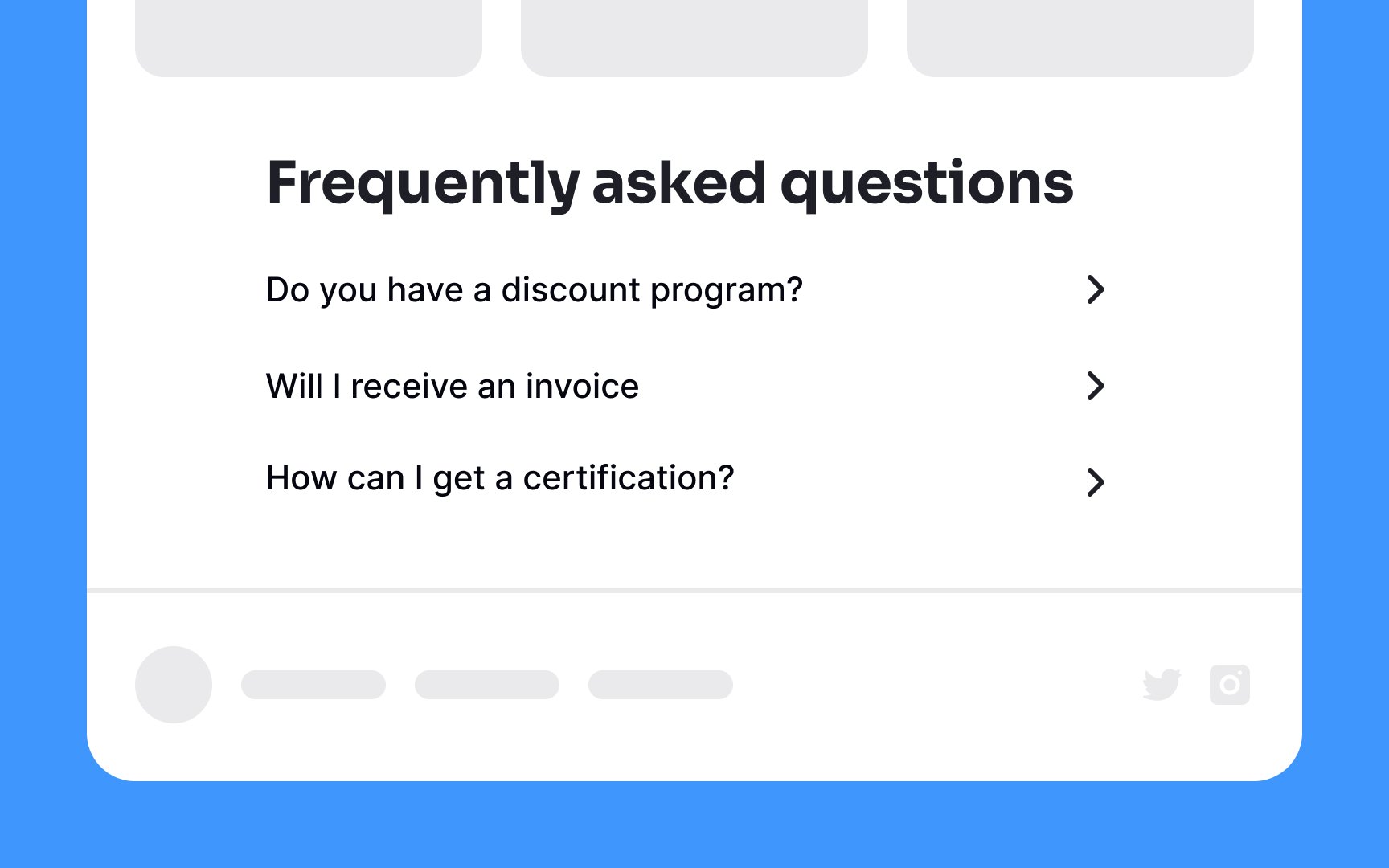
Pro Tip: For less common questions, encourage users to get in touch with you directly via email or phone or guide them towards a live chat for prompt assistance.
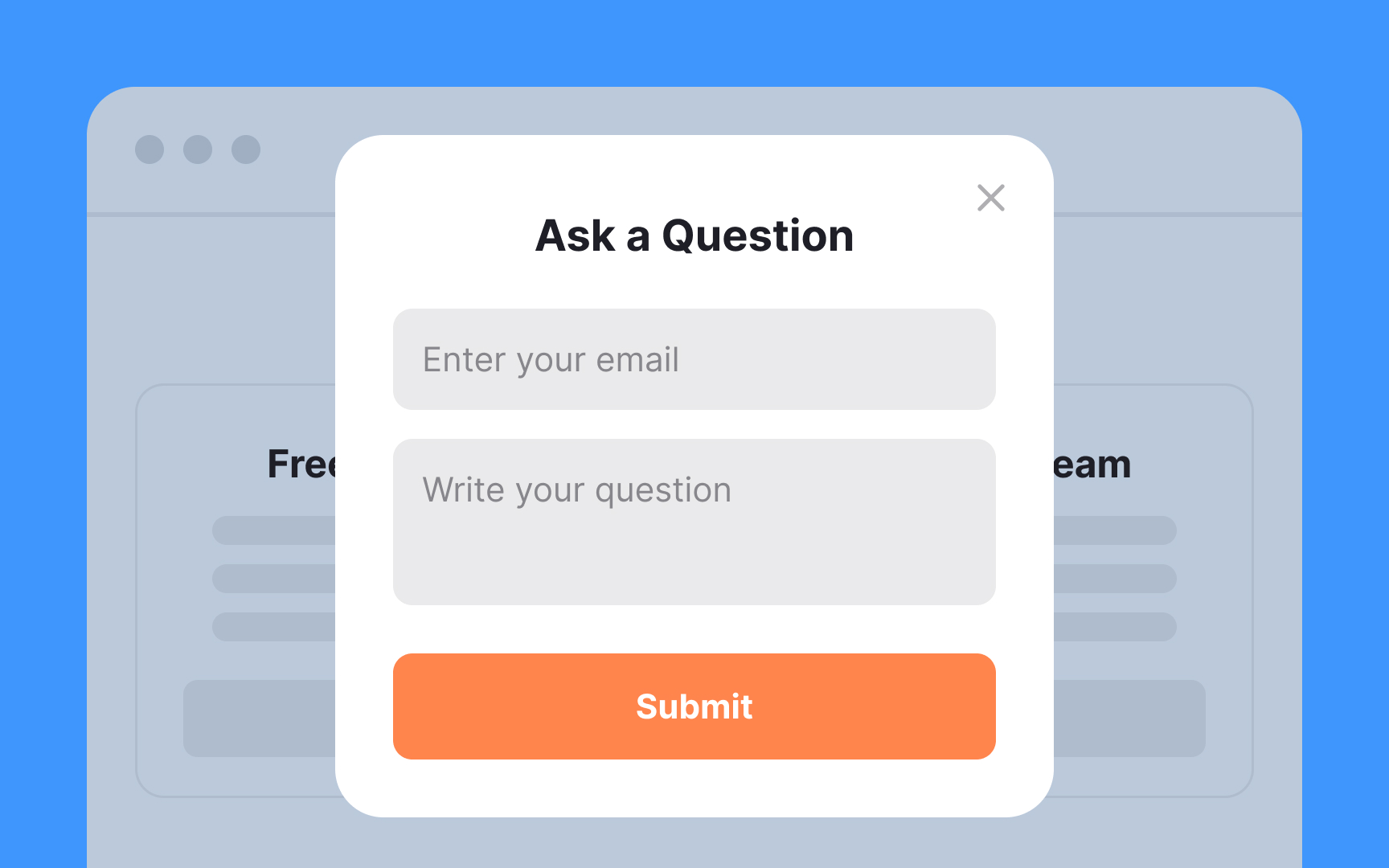
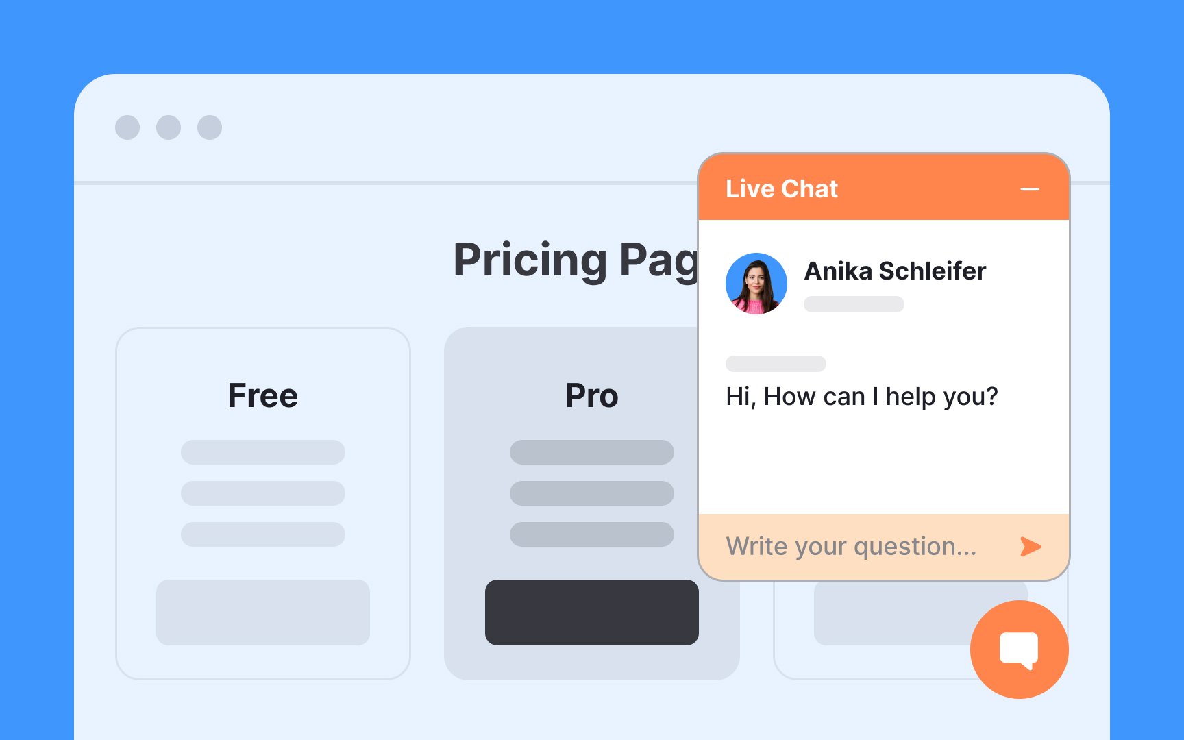
Live chat support is a powerful tool for providing users with immediate and professional assistance. It allows users the opportunity to carefully frame their questions in writing and even multitask while conversing with a representative. This tends to be more time-efficient compared to seeking support via email.
Along with live chat, it's also wise to provide a phone number for users who prefer verbal communication over written exchanges. This diverse approach ensures that users can reach out in the way that suits them best, fostering a sense of trust and reliability.
Instead, make decisions based on a more long-term approach. Arrange pricing plans based on the benefits and features that genuinely assist users in achieving their goals. This user-centric approach not only fosters trust but also demonstrates a commitment to providing value and support, ultimately strengthening the company's reputation in the eyes of its customers.
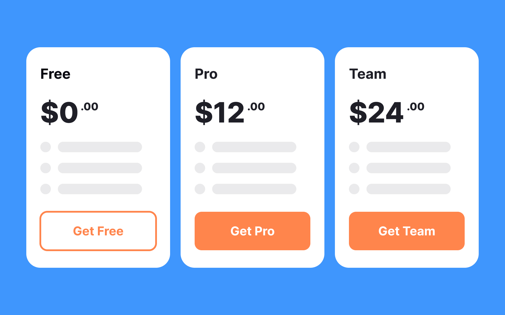
Opt for specific and value-driven
Moreover, it's crucial to ensure that the CTA button is easily noticeable, appears clickable, and doesn't overlap with other elements on the
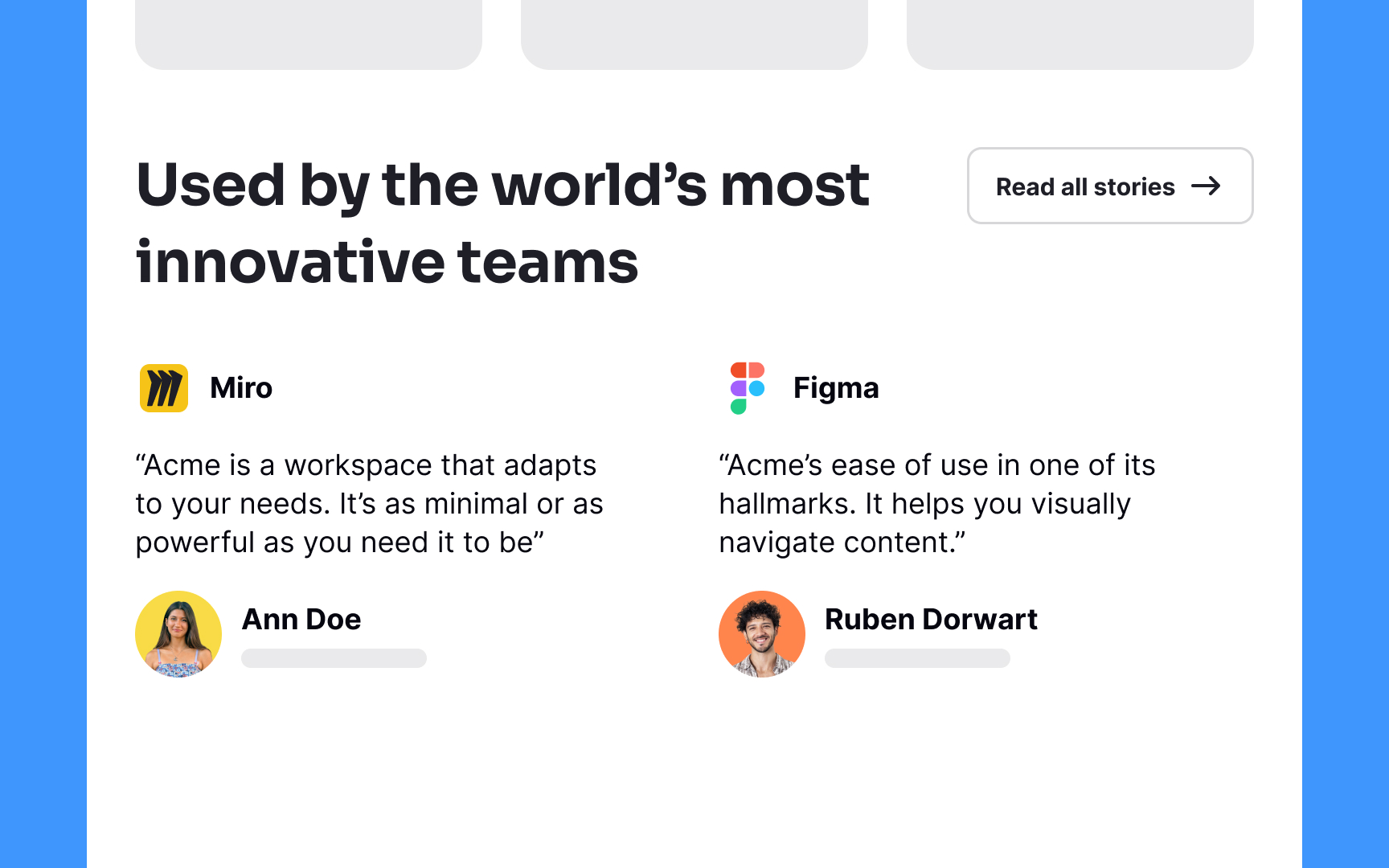
Testimonials act as powerful endorsements for your product or service, instilling confidence in potential customers. They serve as a stamp of approval, motivating users to make a purchase. A good testimonial is specific, highlights real results, and is attributed to a recognizable source.
Display testimonials prominently and consider using visuals like photos or videos to enhance credibility. Keep them concise and ensure they address common concerns or benefits to resonate with a wider audience.
References
- 13 Pricing Page Best Practices to Boost Conversion Rates [+ Examples] | Thoughts about Product Adoption, User Onboarding and Good UX | Userpilot Blog
Top contributors


Topics
From Course

Share


Similar lessons

Best Practices for Designing Login & Signup Flows

Best Practices for User Onboarding Flow Design
