Zapier sign-up page accessibility optimization

Hi everyone 👐! I'm excited to share my first project here on UXcel:
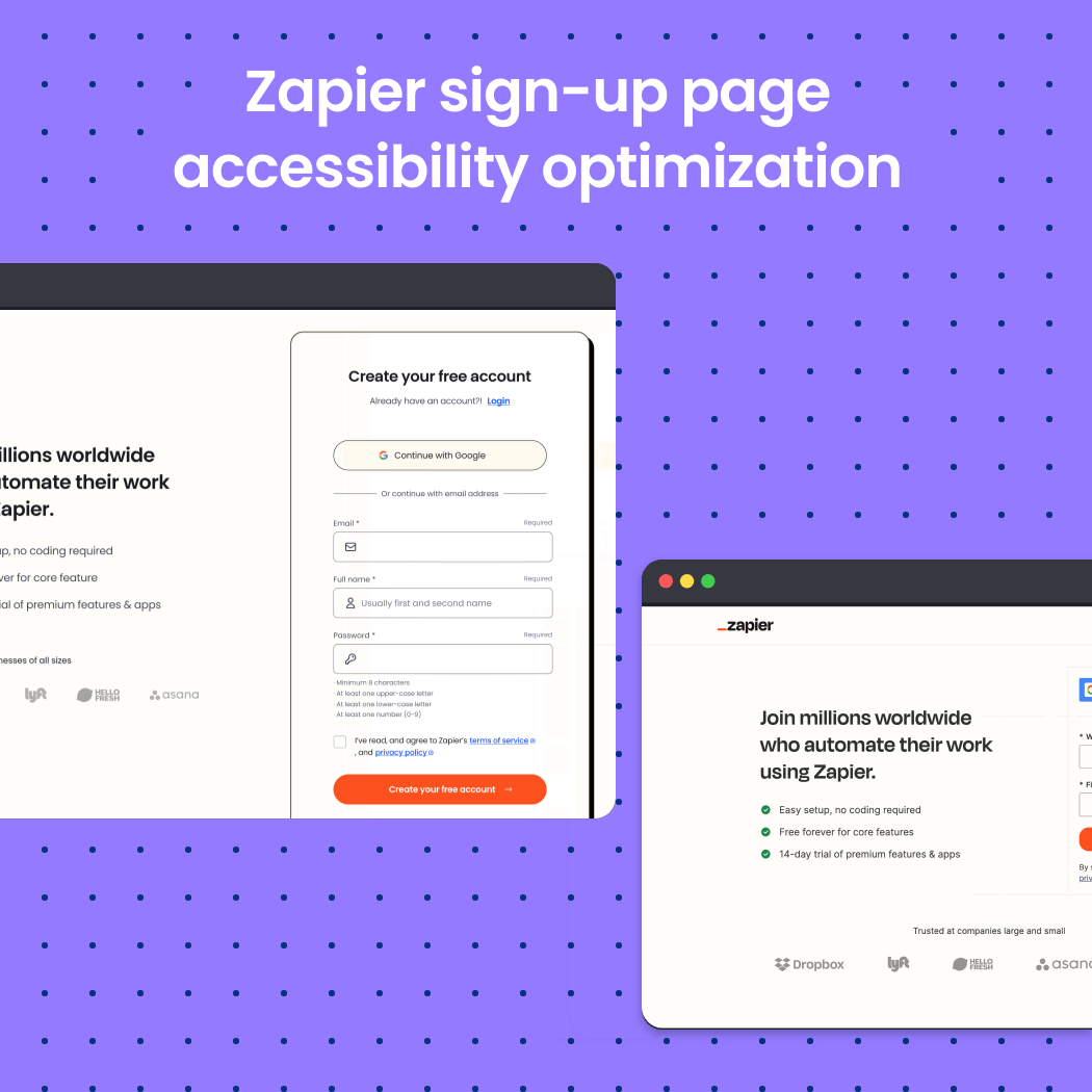
a Zapier signup form (Take a look) analyzed from an accessibility and usability perspective. I'd love to hear your thoughts and feedback!
The enhancements I've implemented:
- Simplified Process: I've transformed the two-step sign-up into a convenient single-step process, streamlining user entry and reducing time to activation.
- Unified Name Field: Consolidated the 'First Name' and 'Last Name' fields into a single 'Full Name' field to simplify data entry and minimize form complexity.
- Enhanced Navigation: Relocated the 'Login' link directly below the form title for better visibility, making it easier for returning users to access their accounts.
- Keyboard-Friendly Navigation: Enabled form auto-focus to facilitate navigation for users who rely exclusively on keyboard input.
- Emphasized Privacy: Repositioned the privacy policy links above the call-to-action (CTA) button, making them more prominent to underscore our commitment to your data security.
- Added Support: Introduced a 'Get Help' link, offering immediate assistance for any issues encountered during the sign-up process.
- Used multiple cues for error states, and didn't rely only on color, accommodating users with visual impairments.
- Clear and inline Error Feedback: Implemented explicit error messages that clearly explain how to correct entries inline, enhancing form completion rates and reducing user frustration.
- Distinguished Form Heading: Added a prominent heading to the form, increasing its visibility and focus within the page layout.
- Improved Visual Accessibility: Adhered to the WCAG 2.0 Level AA standards for contrast ratios on icons and input borders to ensure readability and accessibility.
- Replaced the previous password strength checker with a more intuitive indicator, providing real-time feedback as users create their passwords.

Reviews
1 review
I liked your redesign of the signup page. Your work effectively demonstrates how even seemingly simple pages like signup forms can significantly influence brand perception. The new page looks cleaner and more spacious. The touch target areas of interactive elements are larger, which is essential for accessibility.
The password requirements are straightforward and are presented before users begin typing, which helps anticipate and prevent errors—this is a great feature. The error message is clear and informative, though it’s quite long. A bit of effort to make it more concise could be beneficial.
You greatly articulated your design choices and provided a nice cover image that makes a nice first impression of your work. I enjoyed reviewing your submission — well done!
You might also like

Auction


Accessible Signup Form


Entrant - Analytical Dashboard


Transit Cairo — Digital Mobility Redefined


Babylon Balance - Designing Financial Clarity Through Constraint


Entrant Accessible Signup and Login Forms
Visual Design Courses

UX Design Foundations


Introduction to Figma

Design Terminology
