Optimized Login & Signup Page for Taxy – A Tax Assistance SaaS

Background: Taxy isn’t just a design project for me—it’s a passion project and part of my side hustle. I wanted to create a tool that simplifies tax filing, and this was the perfect opportunity to refine the login/signup experience while also making progress on something I genuinely care about.
Goal: The goal of this project was to make the login/signup experience for Taxy smooth, accessible, and user-friendly. Since Taxy helps people with their taxes, I wanted to create a stress-free and secure way for them to access their accounts.
Scope: Designed for both desktop & mobile users, with a focus on simplicity, accessibility, and ease of use.
Understanding the Users' Needs
Before jumping into design, I thought about what users really need when logging in or signing up:
- Simplicity – People want to log in quickly without any confusion.
- Accessibility – The design should follow WCAG 2.1 guidelines so that everyone, including people with disabilities, can use it.
- Security & Trust – Tax-related services deal with sensitive info, so the login should feel secure and reliable.
- Convenience – Many users prefer logging in with Google or Facebook instead of creating a new password.
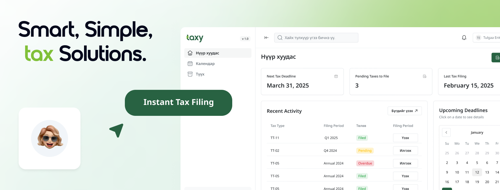
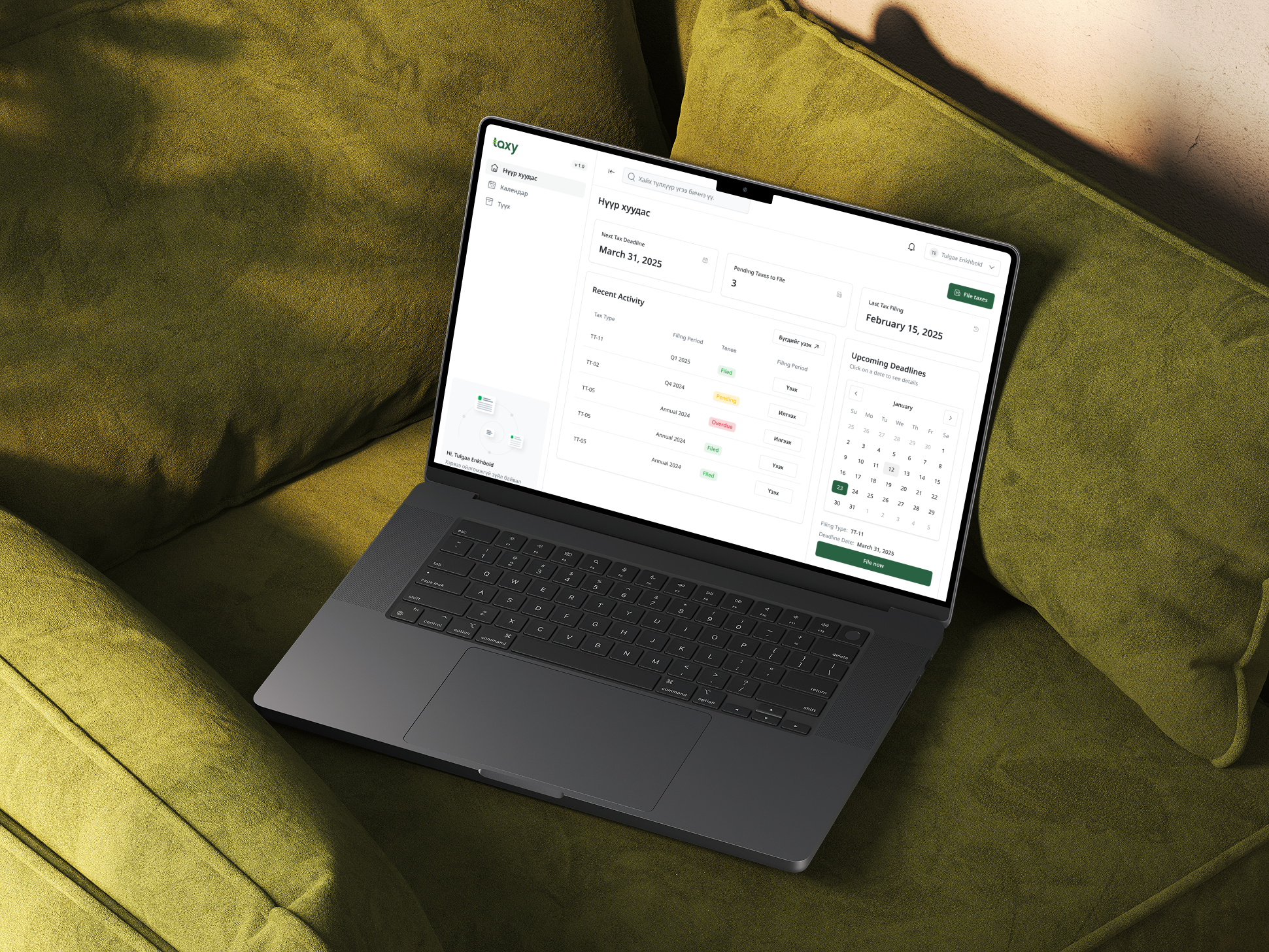
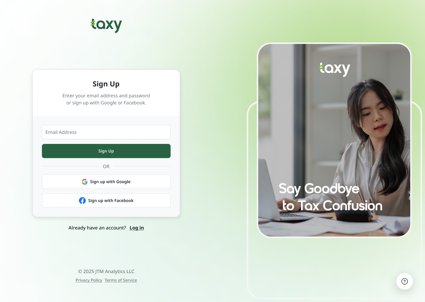
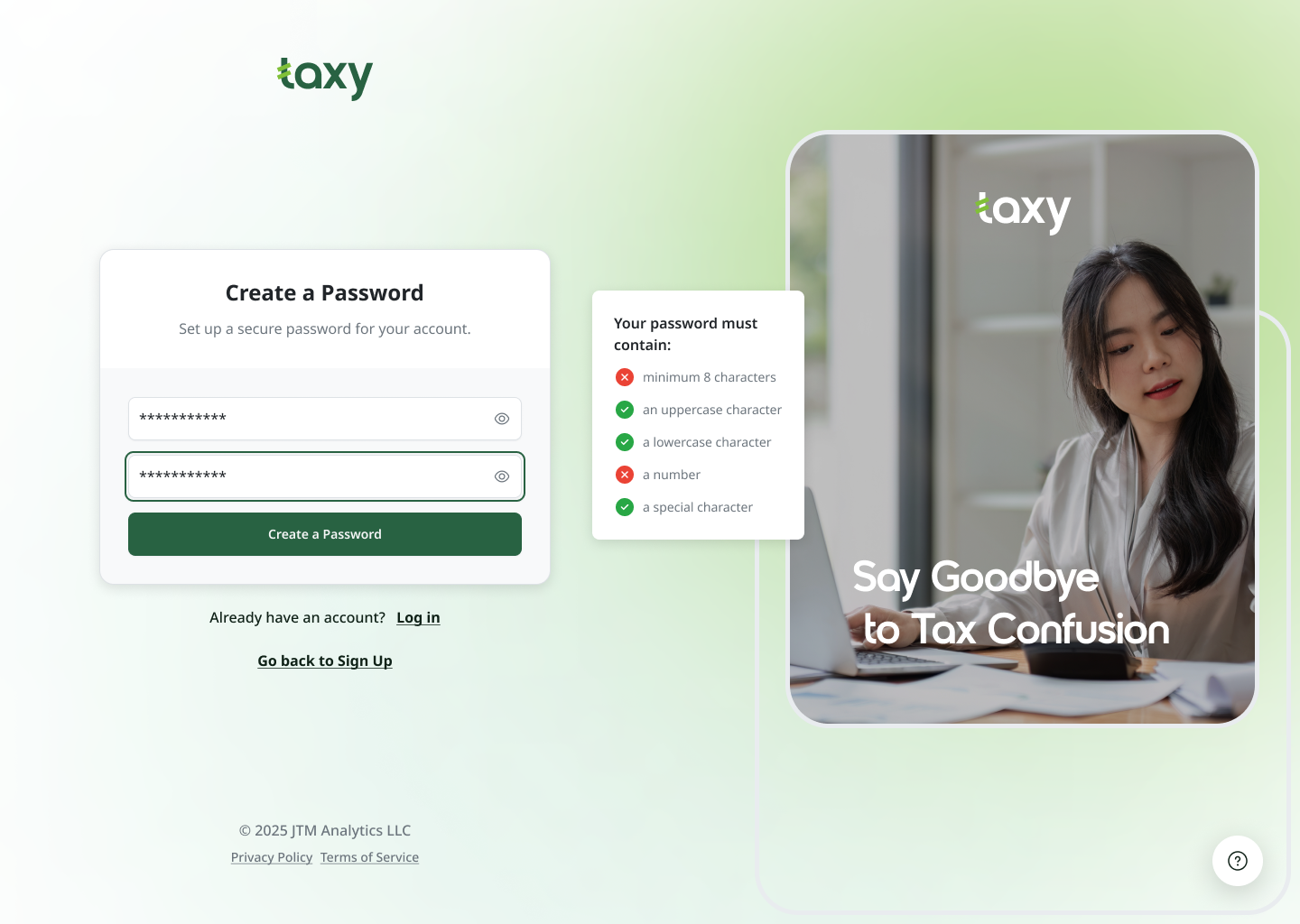
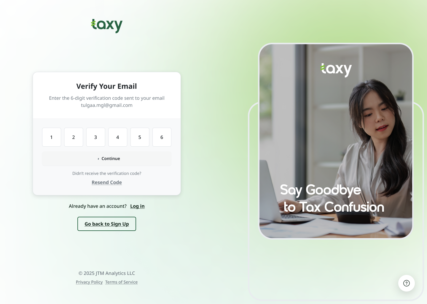
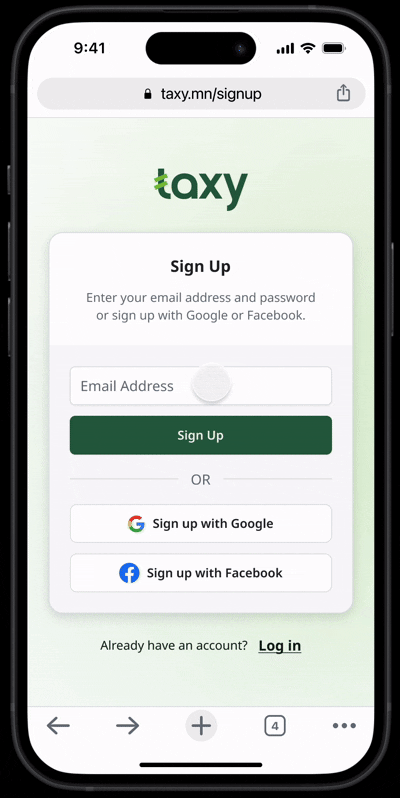
Simple and Trustworthy Design
- Clean, modern layout to keep things easy to follow.
- Green accents align with Taxy’s branding and create a calm, professional feel.
- Right-side panel with an image and tagline reinforces what Taxy does.
Form Improvements for Usability
- Clear input fields with proper labels and placeholders.
- Auto-focus on email input to help users start faster.
- Show Password toggle so users can check their entry.
- Password strength indicator to guide strong password creation.
- Real-time validation messages for errors (e.g., invalid email format).
- Google & Facebook login options for easier access.
Accessibility (WCAG 2.1 Compliance)
- High contrast colors for readability.
- Keyboard-friendly navigation so users can log in without a mouse.
- ARIA labels & screen reader support for inclusivity.
- Focus states on fields so users can see where they’re typing.
Responsive for All Devices
- Looks great on both desktop & mobile.
- Big tap targets for easy clicking on mobile.
- Optimized text sizes for readability on any screen.
Key Takeaways & Next Steps
- Main Lesson: Simple, accessible design makes a huge difference in user experience.
- What I Learned: Small tweaks like better contrast, focus states, and real-time feedback greatly improve usability.
- Next Steps: Conduct user testing to refine the design based on real feedback.

Tools used
From brief

Topics
Share
Reviews
3 reviews

Great the User Flow arrange with easier animation to take action the next step

Hi Tulgaa,
I love this design, it’s clean, modern, and super intuitive! The soft green tones create a fresh and trustworthy feel, perfect for a tax solution. The UI is well-structured with clear hierarchy and effortless navigation. The sign-up flow is simple yet effective, and the dashboard keeps things accessible without being overwhelming.
What really stands out is how smooth the prototyping and interactions feel—transitions are seamless, and every element responds naturally, making the experience feel polished and refined. The use of icons, colour coding for statuses, and subtle gradients add the perfect finishing touch.
Amazing work!

Looks great! The focus on simplicity, security, and accessibility makes the login/signup process super user-friendly.
Maybe adding a quick user flow or testing insights could show the impact even more.
Excited to see where this goes!
You might also like

Smartwatch Design for Messenger App


Bridge: UI/UX Rebrand of a Blockchain SCM Product


Pulse Music App - Light/Dark Mode


Monetization Strategy


Designing A Better Co-Working Experience Through CJM


Design a Settings Page for Mobile
Visual Design Courses

UX Design Foundations


Introduction to Figma

Design Terminology
