Minimal Button Design System - Dark / Light
This is a minimal button design system including Primary, Secondary and text versions, for different use cases.
The project includes light and dark mode to showcase how the buttons will handle different backgrounds.
Reviews
2 reviews
The design demonstrates a good grasp of colors, effectively employing buttons with distinct states and variants. The selected color palette reflects careful consideration.
Areas for improvement include incorporating the buttons into mock screens to provide context for their usage, thereby enhancing understanding of user interaction and the buttons' role within the interface.
Additionally, future iterations could explore integrating optional icon combinations with the buttons, enhancing functionality and visual appeal. Icons facilitate users' quick comprehension of each button's purpose.
Would be nice to create nested components. An option with a button that has an icon as well.
You might also like
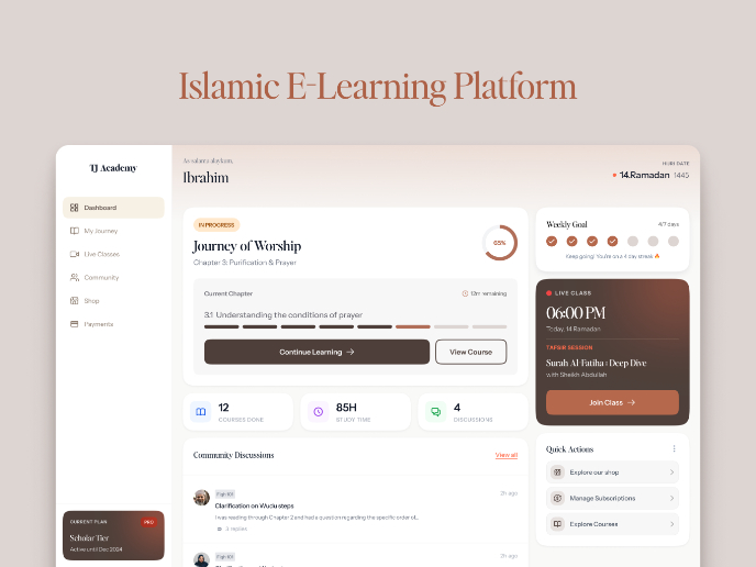
Islamic E-Learning Platfrom Dashboard
Pulse — Music Streaming App with Accessible Light & Dark Mode
SiteScope - Progress Tracking App

Mobile Button System

FlexPay
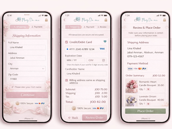
May.Da.Ma Candles & more
Visual Design Courses

UX Design Foundations

Introduction to Figma

