

Reviews
4 reviews

Hey Dania,
I would have loved to read a bit more about the project overall, especially how you approached the task and why you made certain design decisions. That context really helps others understand your thinking.
When it comes to consistency, I think there’s definitely room for improvement across several elements. Tightening that up would make the whole experience feel more intentional.
I noticed you mentioned using ChatGPT as a tool. Was that the only tool you relied on, or did you further refine and adjust things yourself afterward? It would be interesting to understand your process and how you balanced tool usage with your own design input.

Hi Dania!
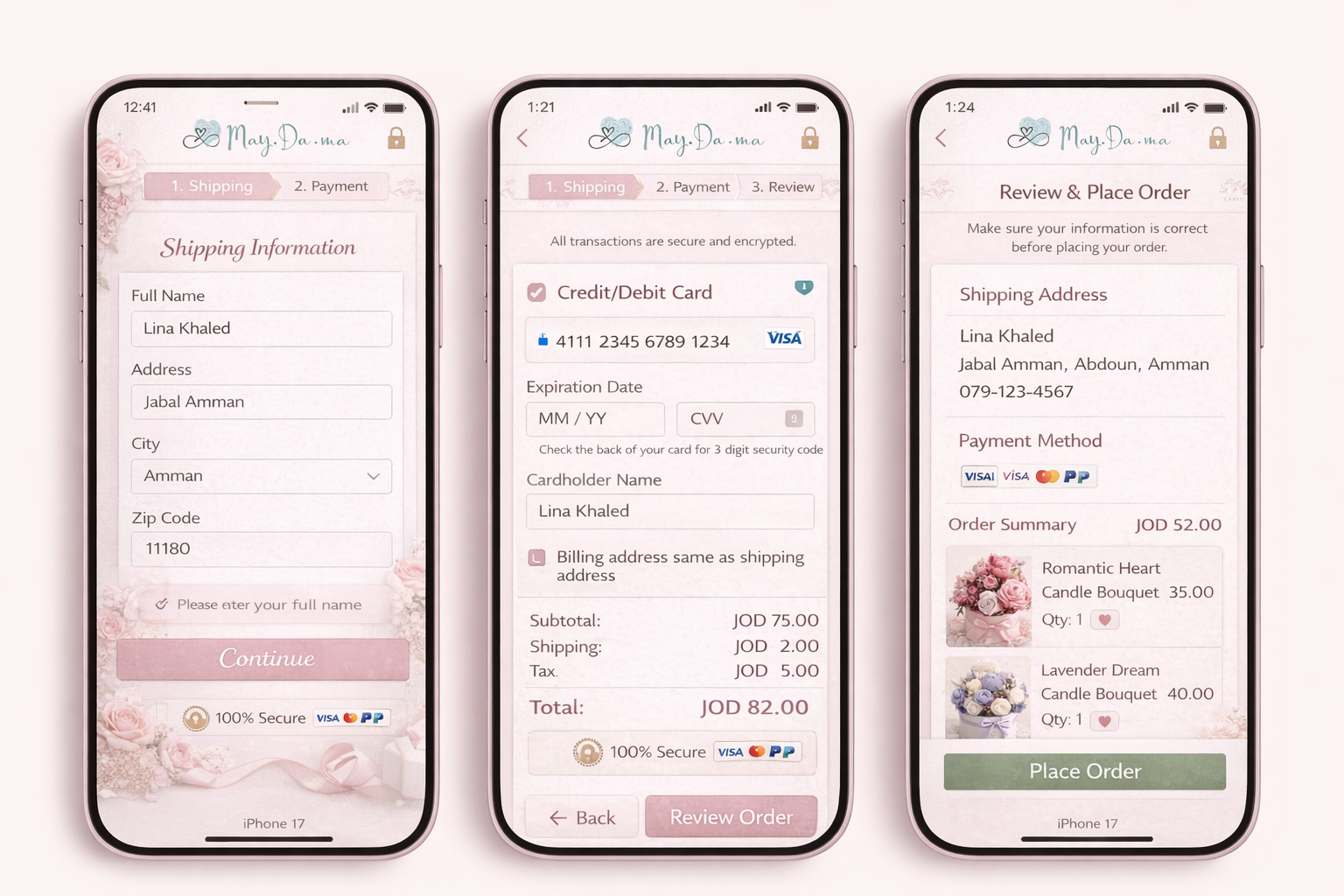
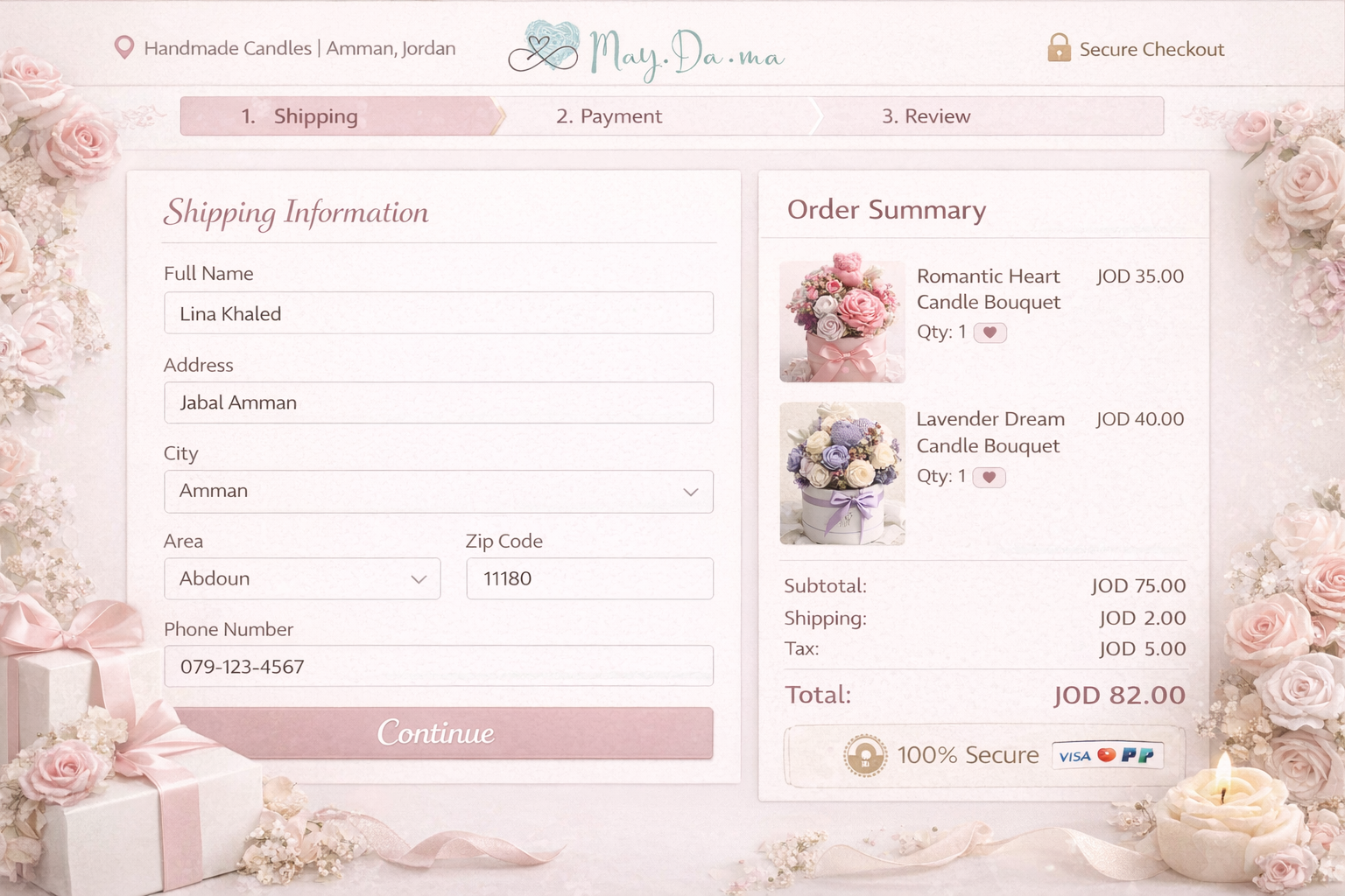
I can see how you've leaned into the flower shop vibe, and it's a fun direction! I do feel the background is taking over the design a little though. It's worth looking at other flower shop apps for inspiration and seeing how they've kept the theme without it feeling too on the nose.
A couple of UX things to work through:
- Although showing progress steps is great, new steps appearing mid-flow can actually feel frustrating for users rather than helpful. Show all three steps upfront so users know what to expect from the start.
- On the first screen, the "please enter your full name" error shows even though it looks like the user has entered one. Double check the logic there, and it's also worth making the error message itself a bit more visually prominent so it's harder to miss.
It's a nice start, and implementing this feedback alongside the other mentor notes will make a hufe difference. Looking forward to seeing the next version!

Hello Dania, your design has a really lovely concept — the soft pink palette fits the candle brand beautifully and creates a warm, feminine feel.
However, there are a few things worth paying attention to:
Contrast & Accessibility — the pink buttons with white text may not meet WCAG contrast standards. I'd recommend checking them with a contrast checker and increasing the contrast to ensure legibility for all users.
Icon clarity — the security icon in the top-right corner feels a bit unexpected in that placement. A cart icon would be more intuitive and familiar for users at this stage of the flow.
Context missing — the mockups look polished, but it's hard to fully understand the concept without a brief description. Adding a short text explaining the app idea and your design decisions would make this case study much stronger.
Overall, this is a promising direction that deserves further development and proper documentation. Keep going!
Nice concept and I like the 3-step structure, the review screen before placing the order is a thoughtful touch that builds trust.
A few things worth revisiting though. The progress bar changes between screens (2 steps, then 3, then disappears), which would feel confusing to a real user. There's also a math discrepancy, screen 2 shows JOD 75 subtotal but screen 3 shows JOD 52, so those need to match. The error message on screen 1 appears on a field that's already filled in, which is a bit contradictory.
The floral background looks lovely but makes the form text harder to read, decoration and legibility need to find a balance on functional screens like checkout.
I know you used chatGPT to generate those images directly because of the inconsistencies of the components, and I suggest next time use the images as a base but design your own in Figma to also get better and faster.
Overall the bones are solid, it just needs a pass where you walk through it as a user rather than a designer. That usually catches these things quickly!
You might also like

HealthFlow: Designing a Simple and Insightful Wellness Dashboard


Improving Dating App Onboarding: A/B Test Design

FORM Checkout Flow - Mobile


A/B Test for Hinge's Onboarding Flow


Accessibility Asse


The Fitness Growth Engine

Interaction Design Courses

UX Design Foundations


Introduction to Figma

Design Terminology
