
Reviews
3 reviews

You’ve got the story and feel nailed down. The brand comes across as strong, warm, real, and rooted in culture. The founder section hits the right emotion. The vibe is personal, not corporate. That’s rare. Feels like you know who you are and who you’re talking to.
But design-wise, it needs more consistency and polish.
Spacing feels uneven.
Some sections breathe well. Others feel crammed. FAQs and testimonials feel dense. Just add more vertical space. Keep things balanced across pages.
Too much font mixing.
You’ve used bold, script, and regular in one spot—it creates noise. The pink script font is playful, but you’re using it a lot. If you reduce it to one use per page, it’ll feel more intentional.
Repeat content hurts the experience.
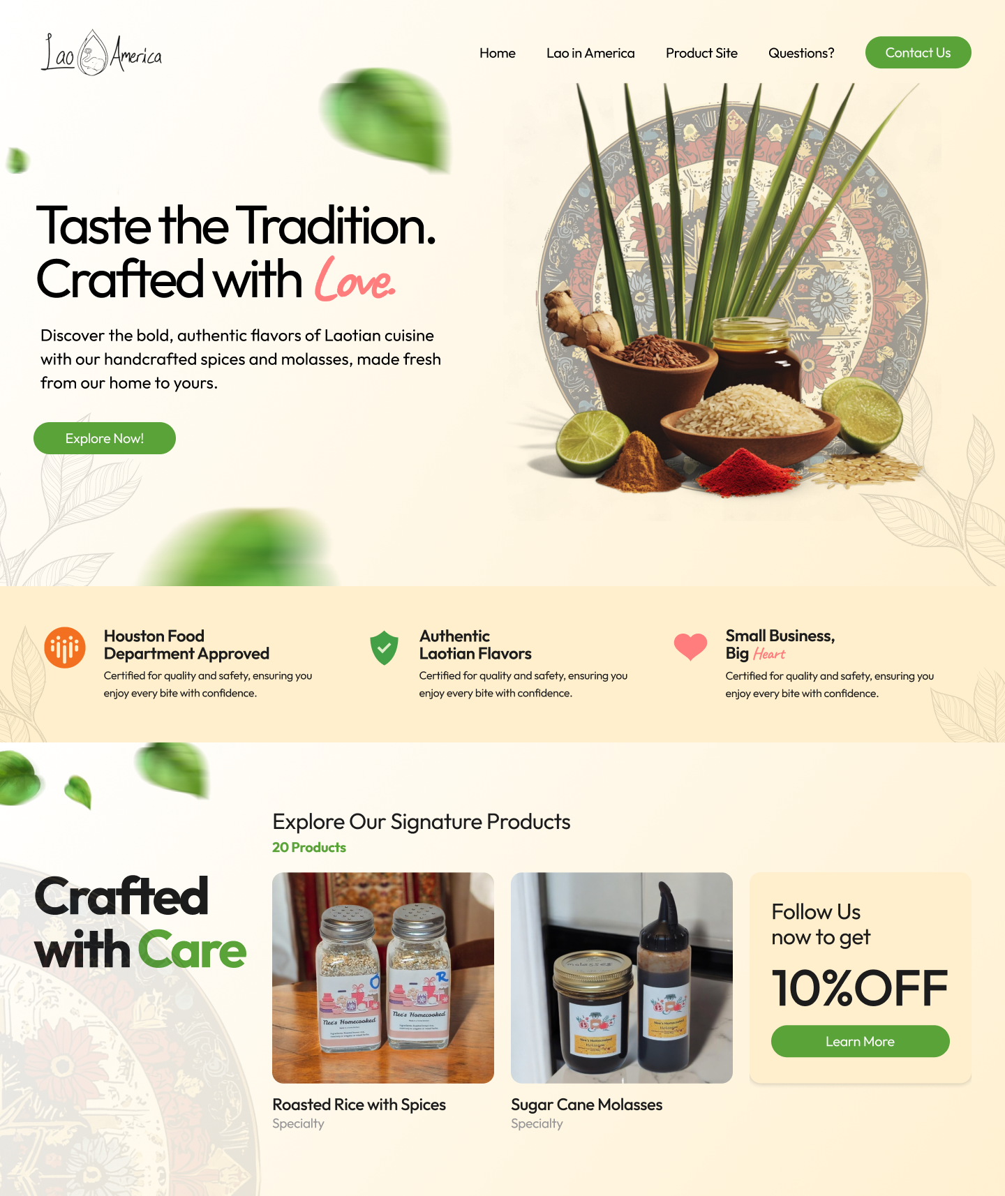
Same "Benefits of Using Lao in America Spices" block is everywhere. It’s solid, but gets repetitive. Try switching it with something lighter—maybe a quote, recipe, or product tip. Break the pattern.
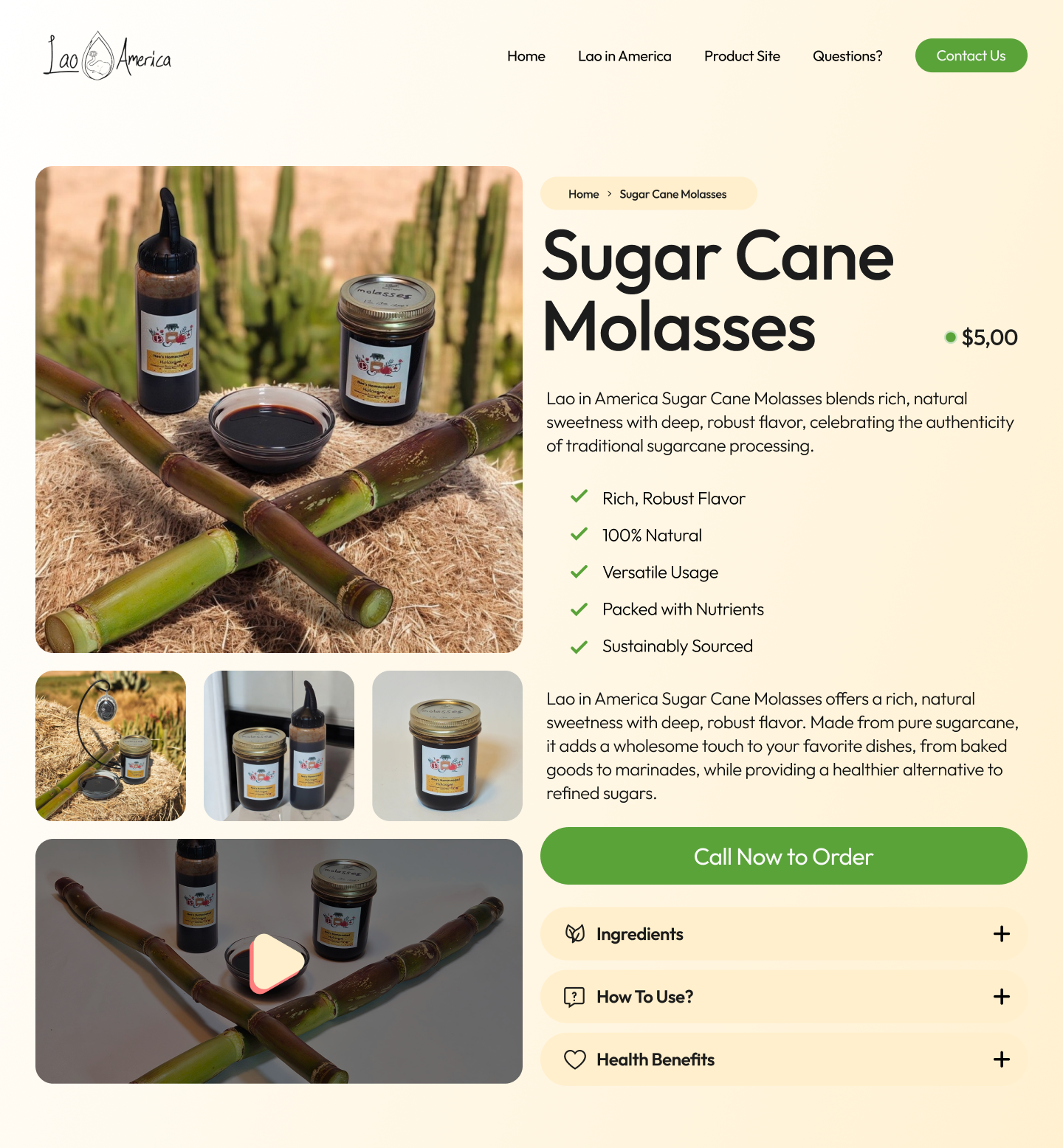
Product pages lack depth.
Clean layout, but not enough storytelling. Add something personal—just 2 lines like: “This blend reminds me of…”. Pull the dropdown info (Ingredients, How to Use) into the main layout so it’s more visible.
The contact form feels generic.
All placeholders say “John Doe.” Add proper labels. No confirmation after sending the form. A quick success message would help. CTA could be warmer—something like “Say Hello” or “Reach Out.”
The end section is overused.
“Ready to spice up your meals?” with the same image is on every page. Looks good the first time, but gets old fast. Rotate it with promos, featured products, or seasonal dishes.
You’re 85% there. It just needs cleanup—more rhythm, less repeat, and more personality in the product details. You already have the heart. Just sharpen the structure.

Hi there,
I just had the chance to explore your “Lao in America” project on Uxcel and dive deeper into your Figma file—and I have to say, I’m truly moved by the intention and care behind this work. This isn’t just a design project—it’s a heartfelt initiative to preserve culture, amplify voices, and create a space for Lao Americans to feel seen and connected. That’s powerful.
From the very first glance, it’s clear that you approached this project with empathy, respect, and a strong understanding of your audience. You’ve managed to balance storytelling with usability, creating a digital space that not only informs but feels personal and inviting.
🌟 What Stood Out to Me
1. A Mission-Driven Approach:
The heart of this project—preserving Lao American history and culture—shines through in every decision. Your homepage immediately communicates why this site matters, offering users a sense of belonging and importance. You’ve crafted a narrative that makes users feel like they’re part of something meaningful.
2. Clear Information Architecture:
The navigation structure is intuitive and thoughtful. From “Explore the Archives” to “Contribute Your Story,” you’ve designed clear paths for users to either absorb content or actively participate. It invites curiosity while empowering engagement.
3. Thoughtful Design Choices (Even at Lo-Fi):
Even though the Figma file is primarily low-fidelity, the layout decisions already suggest a user-friendly experience. Your use of space, content blocks, and sectioning makes it easy to imagine how the final visuals will feel—calm, respectful, and accessible.
4. Engagement Opportunities:
I love that you’ve made room for user contribution. Encouraging people to share their stories ensures this platform stays alive and relevant. It also fosters a sense of ownership and community.
💡 A Few Ideas to Strengthen It Further
1. Add Emotional Cues to Key Sections:
In the contribution flow, you could sprinkle in a few encouraging microcopy moments. For example, when users submit their stories, phrases like “Thank you for sharing your journey with us!” can make the process feel more personal and rewarding.
2. Include More Visual Storytelling (Future Iteration):
Once you move beyond lo-fi, I’d recommend incorporating visual elements like photos, textures, or patterns that reflect Lao heritage. This would enhance the emotional connection without overwhelming the content.
3. CTA Language with Heart:
Your calls-to-action could be framed a bit more warmly—something like “Share Your Story, Inspire Others” instead of a straightforward “Submit.” It ties back to the community feel you’re fostering.
4. Accessibility Considerations:
As you evolve the design, be mindful of contrast ratios, font sizes, and keyboard navigability to ensure that this space is welcoming to all users, including those with different accessibility needs.
🌱 Final Thoughts
This project is so much more than a website. You’re building a living archive, a cultural hub, and a community space. And even in its early stages, that heart and intention come through loud and clear.
Thank you for doing this kind of work—it’s the kind of design that truly makes an impact. I’m excited to see how this evolves and how many stories it helps bring to light.

First of all, thank you for the time and effort you put into creating these frames. The idea behind the design is amazing.
Here are my suggestions to help sharpen your skills and improve the quality of your designed frames:
- Grid Layout: I noticed there’s no clear grid system in your frames. Using an 8px rule can help establish hierarchy and consistency throughout your design.
- Typography: I suggest using a more readable typeface like Inter for body text and reserving Outfit for headings. Also, be mindful of letter-spacing—characters like “f” and “t” can stick together and reduce readability.
- Buttons: It would be beneficial to use more purposeful text for your buttons. For example, you used a phone number as a button label. Generic text doesn’t communicate what action will occur when the button is clicked. Additionally, consider incorporating icons to improve accessibility and clarity.
- Contact Form: Use appropriate placeholders for each input field. It’s also a good idea to add an asterisk symbol (*) to indicate required fields.
- Component-Based Approach: Make it a habit to build your frames using components. This practice increases efficiency, minimizes unnecessary changes, and improves consistency.
I believe these are the key areas worth addressing. I strongly recommend exploring other designers’ work for inspiration. Keep up the great work!
You might also like
SiteScope - Progress Tracking App


FlexPay


CJM for Co-Working Space - WeWork


Ubani Design System


Accessible Signup Form for SaaS Platform

Loginino

Popular Courses

UX Design Foundations


Introduction to Figma

Design Terminology
