Florish Accessibility Signup Form

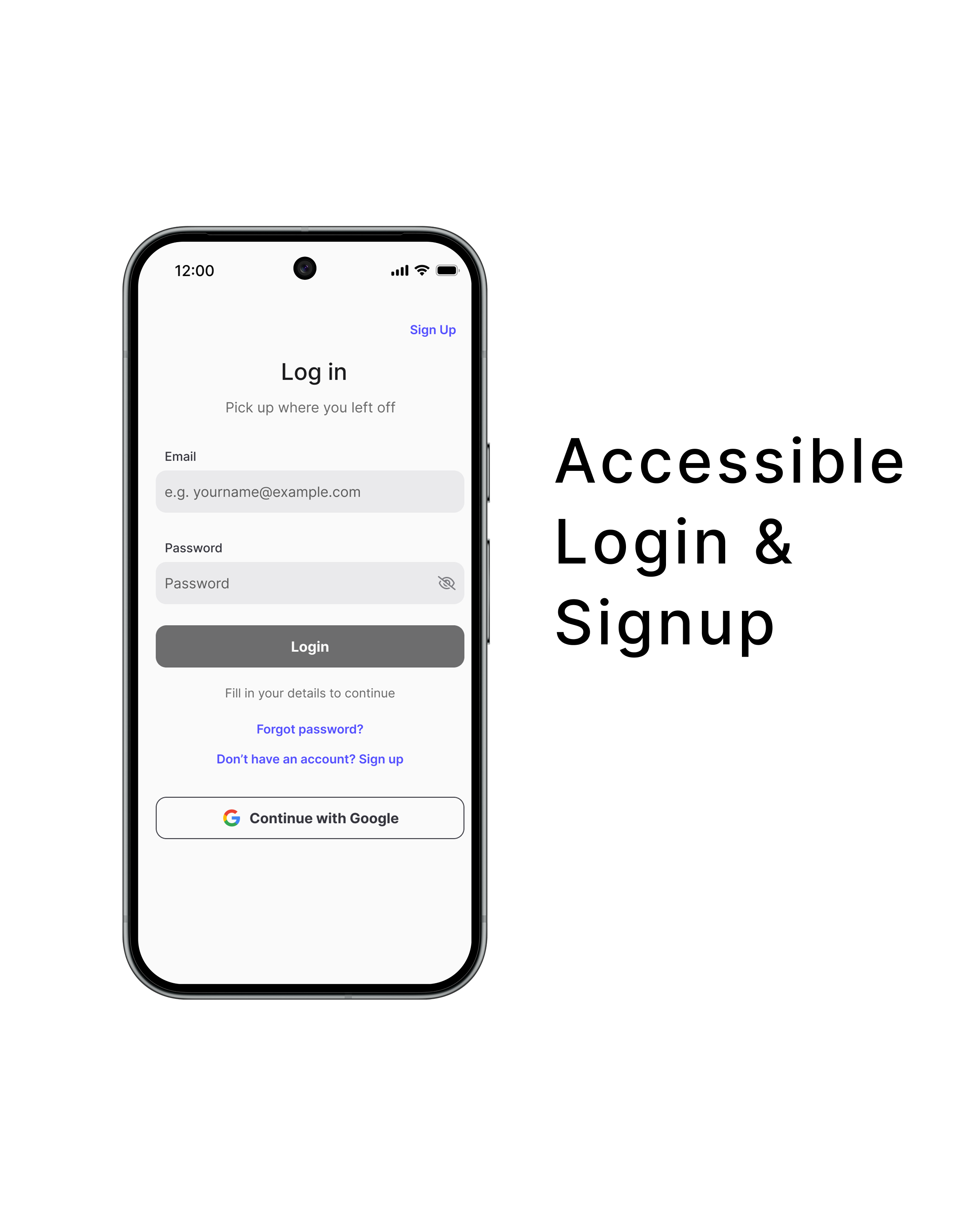
This project presents a mobile login and signup form for Florish, a SaaS platform, designed using WCAG 2.1 accessibility principles to support a wide range of users.
Platform & Device
- Platform: Florish (SaaS)
- Device: Mobile
Accessibility Considerations
- Visible labels for all input fields
- Adequate color contrast for text and actions
- Clear helper text to explain inactive states
- Descriptive error feedback not reliant on color alone
- Appropriately sized touch targets and spacing
- Password visibility toggle for input verification
- Logical navigation order with visible focus states
Rationale
The design applies accessible form patterns in a simple mobile layout, ensuring users can complete login and signup tasks clearly and efficiently.
Interaction
Includes disabled and enabled button states, focus indicators, and password visibility controls.

Reviews
6 reviews

The project looks very clean and has solid accessibility foundations - visible labels, proper contrast, and logical information hierarchy. I appreciate the thoughtful details like the password visibility toggle and helper text under the buttons.
However, I have one tiny issue. The "Pick up where you left off" appearing on both Login and Sign Up - that's odd because during registration the user hasn't done anything previously. For Sign Up, something like "Join Florish to get started" would fit better.
Overall, it's solid work with a good understanding of accessibility basics. After refining the messaging it'll be really strong. ❤️😊
Your design demonstrates your good consideration on accessibility issues. Contrast ratio sufficient, fonts legible. And prototype supports your design ideas in login/signup processes well. Great!
Going forward, would be better to make more room between "Login" button and "Forgot passport" link. In the prototype, they are overlapped after error notes appear under email and password.
Awesome job.

Great work! This login pattern is very clear and effectively guides users toward their goal. The contrast is excellent, and the option to log in with Google (social login) is a strong usability enhancement that simplifies the process.
I have a couple of small suggestions to further improve the experience:
- Consider increasing the spacing between the two secondary buttons, “Forgot Password” and “Sign Up”, to make them visually distinct.
- It might be helpful to move the “Forgot Password” button closer to the password field. This placement would make it easier for users to locate quickly when needed, enhancing efficiency and reducing friction.
Overall, the design demonstrates a thoughtful application of WCAG 2.1 principles and provides a very accessible and user-friendly mobile experience.

Amazing work! I've tried the prototype. I just realize that figma prototype can do auto fill like that. Could you tell me what is the method prototype to do it?
Btw, in sign in page on the prototype the login button are overlapping with the text below it when the apps showing wrong password text. Giving attention to the final prototype before publish it can be a good practice.
Good job! Waiting for your next showcase!

Great job on the detailed validations and error states. I also really like the animations you added in the prototype. Looks nice!
One thing I’m curious about is the decision to show the Sign up CTA twice on the Log in screen, while on the Sign up screen there is only one Log in CTA. I’d be interested to understand the reasoning behind that choice and whether it’s intentional or something worth revisiting.
Have you considered placing the “Forgot password” link closer to the password input fields ? Grouping it might make it feel more connected and easier to find, as part of the same logical group.

It was great to see a project which was focused on the accessibility aspect. I liked the use of error suggestions and also making them more transparent with the use of colours and icons. The interaction was shown quite well through animations. I liked the inclusion of Nielsen's heuristics, especially the minimalistic design, which caught my eye first. Sadly, the current solution doesn't conform to the WCAG standard 2.1 level AA yet.
Some noted issues:
The main issue is with the use of green and red colours. The green-white colour contrast is under 3:1, so it doesn't currently conform in any case. For example, the white checkmark needs to have enough contrast with its background. The red coloured text doesn't conform, as it needs to have a contrast of 4.5:1 with its background. Criterion 1.4.11 also gives examples of how some more general inputs should look. For text fields, it would be beneficial to add at least a minimal border on the bottom of the input, which would need to have a 3:1 contrast with the background.
Possible further improvements:
Improving the green-white contrast should also improve the green border of the input.
There has been a newer version of the WCAG 2.2 standard for some time, which adds some new criteria. From there, criterion 2.5.8 requires a target size of 24 by 24 pixels with some exceptions. The current solution "Sign up" link/button seems to have a really small height in pixels. It may fall under the spacing exception, but it is still better to achieve the required target size, especially on mobile, where 44 by 44 or 48 by 48 is more ideal minimum.
The email error suggestion is excellent, but the password correct format suggestions may cause confusion and should be a bit clearer. Better to write out the "min" as minimum, and it should be specified that "at least" one number/uppercase letter is needed.
From other things, clicking the password field made the login button overlap with the text below.
Overall, great effort! Good luck in discovering the world of accessibility.
You might also like

Smartwatch Design for Messenger App


Bridge: UI/UX Rebrand of a Blockchain SCM Product


Pulse Music App - Light/Dark Mode


Monetization Strategy


Designing A Better Co-Working Experience Through CJM


Design a Settings Page for Mobile
Visual Design Courses

UX Design Foundations


Introduction to Figma

Design Terminology
