Login/Sign up Form

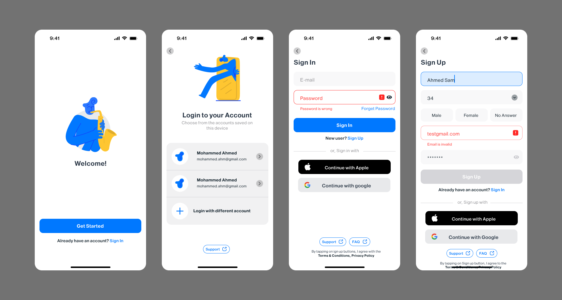
Features:
- Clear focus state
- Built-in autofill support
- Instant validation/feedback
- Smart register/sign-in switching*
- Social/guest access options
- WCAG standards compliant**
- Checks if your email is already in the system, skipping the old form-flipping routine.
This is just a preview of some solid UX design.
Tools used
From brief

Topics
Share
Reviews
4 reviews

This is a nice start, but I really would have liked a lot more context. It's not obvious through your visual design what this product is. A visual design that looks less generic would make this a lot stronger.
Also, it would be helpful to see more of your process (sketches, wireframes, design rationale, etc.) and more steps of the sign in process such as password recovery. Also, including the full project link would allow the viewers so see how you structured your files.
Good job thinking about errors states and other smaller details, this just needs a bit more of a push to come across as a polished case study.

Nice exploration. It would be good if you can give more attention to the margin and padding. Some of designs don't have margin and padding well. As example:
- For the back to previous screen icon, the size of the left chevron doest fit wit it's circular background.
- The state when user typing the input field looks like the top-padding is bigger than the bottom-padding.
- The button for continue with apple and google are not perfectly balance.
But this is first good step. Waiting you next amazing exploration.

Hey Omar.
I like that you included small but important elements like Support and the eye icon for the password field. These details are often overlooked, but they make the experience feel more complete and user friendly.
The first thing that stood out to me is the use of the terms Sign up and Sign in. Since they look and sound very similar, they can be confusing, especially for less experienced users. A common and clearer practice is to use Login and Register, because the difference between the actions is immediately obvious and reduces cognitive load.
For the gender selection, instead of using “No answer,” you could consider something like “Other.” If you want to be even more inclusive, a good practice is to allow users to enter their own value. That gives people more control and avoids forcing them into predefined options that may not fit them.

Great job, Omar! I really like how it looks. There are several strong aspects in your design:
- Easy login with existing accounts or social logins, which lowers the entry barrier.
- Visible Support and FAQ buttons that help users feel more confident.
- Clear input states that make the form easier to understand and use.
A few areas could be improved:
- Increase contrast for empty input fields so they are easier to distinguish at first glance.
- Add visible labels to inputs. Users may forget what they entered earlier, and without labels, it can feel confusing when they want to review or edit information.
- Clarify the Sign Up / Sign In terminology, as it can be confusing, especially during the registration flow.
- Review spacing and alignment. Some buttons and inputs appear centered, while others are not, which creates small inconsistencies in the layout. Aligning elements more consistently would make the interface feel more polished.
Keep designing!
You might also like

Beautify Login page WCAG principles


edX Sign-Up Page Redesign


Design Prioritization Workshop


Notion Login Page Accessibility Optimization


Sanyahawa - Landing page Design


Healthy Dashboard

Visual Design Courses

UX Design Foundations


Introduction to Figma

Design Terminology
