Notion - Accessibility Color System

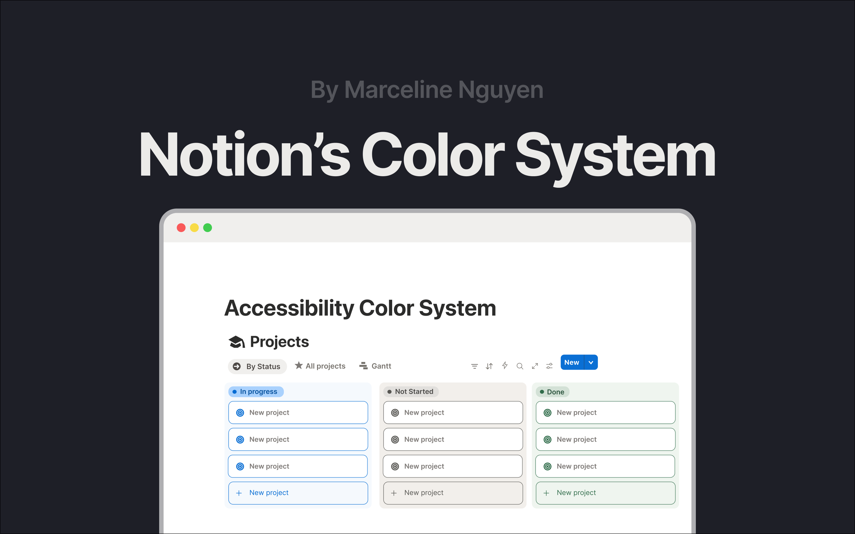
Hello! I'm Marceline, and I'm thrilled to introduce you to my first project - Notion's Color System in response to UXCEL's Create an accessible color system brief. This project focuses on redesigning Notion’s color system to balance aesthetics with accessibility.
Initial WCAG check
The initial WCAG check showed that while the neutral and pastel palette creates a visually calming and a cohesive experience, many color pairings lacked sufficient visibility across different viewing conditions.
Project's goals
On developing this project, my goal was to maintain Notion’s signature “pastel, calm, and collected” aesthetic while ensuring full alignment with WCAG accessibility guidelines.
Design process
I began with light research on the brand to understand the product’s personality and the value it delivers, followed by research into colour psychology. I then experimented with multiple color samples to assess whether the new palette aligned with my goals.
Challenges on developing the project
Some challenges I’ve encountered and would appreciate feedback on:
- Palette aesthetics:
I find it challenging to strike a balance between accessibility and aesthetic value. From a personal standpoint, I really appreciate Notion’s neutral aesthetic; however, after checking against WCAG guidelines, I realized that the interface can be difficult to navigate in practice. I’m interested in understanding how these accessibility–aesthetic trade-offs are commonly addressed in industry settings.
2. Process:
Since this is my first project, I believe I spent more time than necessary because I was also learning to use the tools (Figma) simultaneously. I’m curious about how designers structure their workflows to work faster and more efficiently, and how I might refine my own process for future projects.
3. Research limitations in a personal project:
As this is a personal project, my research options are limited. At the moment, I rely mainly on user feedback from platforms such as Reddit or personal blogs related to Notion. I’m still figuring out how to gather research more systematically and effectively in this context.
Overall, this project helped me better understand the real trade-offs behind accessibility-focused design, and I’d really appreciate any feedback or perspectives from the community to help me improve my future projects.
Tools used
From brief

Topics
Share
Reviews
4 reviews

You approached accessibility solidly and I can see you did the work with contrasts. The methodology is clear. Each color category has its justification and verified ratios compliant with WCAG. I particularly appreciate that you didn't stop at dry calculations but showed concrete problems in the current Notion UI (that poor visibility of the border and "New Project" was a good catch).
However, I have doubts about a few things. First, I don't see any user research here. Did anyone actually struggle with readability in Notion? Is this a problem based on data or just a theoretical observation? Second, I'm missing broader business context. How will this change affect brand recognition? Does the Notion team even want to change these pastel colors that are part of their DNA? And finally, there's no word about testing. Do these new colors actually work better in real conditions?
The project is well done from a technical standpoint and I can see you understand accessibility principles. It's a solid foundation for discussing how to actually approach this challenge in a real project.

Hey Marceline! 👋
Your color system strikes a great balance between the calm aesthetic of Notion and the practical needs of a productivity tool. The way you've documented accessibility considerations throughout shows real attention to how people will actually use these colors.
The secondary color improvements are noticeable. Switching from overly transparent containers to colors with proper contrast makes a tangible difference when it comes to scanning tasks and identifying areas of action. Boosting vibrancy while keeping the pastel foundation intact feels just right for Notion's personality. Your tertiary colors solve a real problem, too: they bring enough punch to make highlighted content pop without screaming for attention. 👏
One thing that could be refined: Figure 4 feels cluttered with all the connecting lines. Have you considered using color-coded circles with numbers instead? Also, your warning state doesn't meet WCAG standards. Replacing the light text with dark charcoal text would solve this issue without losing visual impact.
For your next iteration, consider showing all button states (hover, pressed, disabled, and focus) for each color role. This is an easy way to determine if you have enough shades in your palette to meet real-world component needs.

Hey Marceline!
Your work is great. All the details from your work represent your capability and that's amazing.
Waiting for your next amazing showcase!

Hello Marcelin,
You have delivered a highly detailed and professional color system redesign for Notion, effectively balancing the brand's aesthetic with strict WCAG Accessibility requirements. The documentation of all color categories and clear rationales for your choices are exceptional.
What's Good
🌟 The submission is exceptional in its documentation, strategic thinking, and adherence to accessibility standards.
- The design rigorously confirms WCAG compliance for nearly all color pairings, explicitly showing contrast ratios against their respective backgrounds for Primary, Tertiary, and Neutral colors. This strongly satisfies the Accessibility criterion.
- The choice of blue as the Primary color is well-justified by aligning with Notion’s "cool, calm and collected" brand personality and the color psychology associated with productivity.
- The analysis of the original design's flaws (dull CTA, faint borders) is excellent, and the redesign successfully addresses these by implementing higher contrast for action elements (4.5:1 ratio) while maintaining the aesthetic.
Areas for Improvement
While the project is very strong, the following areas could add nuance and enhance the Visual Design and Presentation of the System.
- The System Colors section notes an intentional "slight contrast reduction in the yellow toast" to keep icons visually consistent, accepting a 2.09:1 ratio. While you acknowledge this is low-severity, falling below the WCAG AA minimum of 4.5:1 for text (or 3:1 for non-text components) on a yellow background could still fail accessibility checks for key messaging.
- The Information State uses Notion's "On Surface" charcoal gray (#2C2C2B). While this reinforces brand identity, using a distinct color would differentiate system information from standard text/surface color, making the communication less ambiguous.
- The Tertiary section details the vibrant palette and high contrast ratios but the UI example (Figure 3) primarily shows the neutral navigation.
You might also like
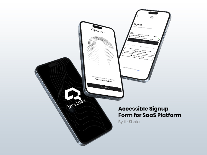
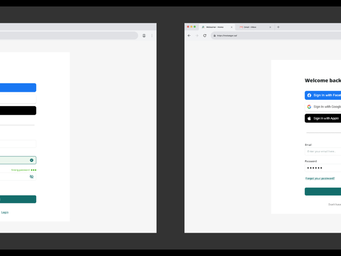
Accessible Signup & Login Experience — Brainex

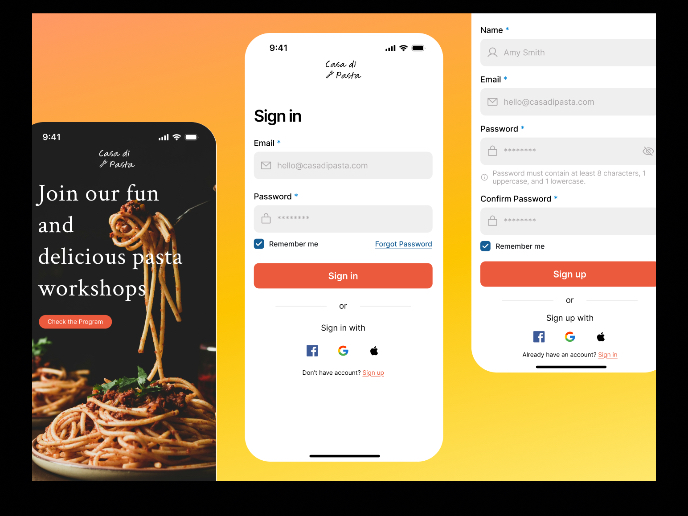
Mobile Onboarding: Casa di Pasta

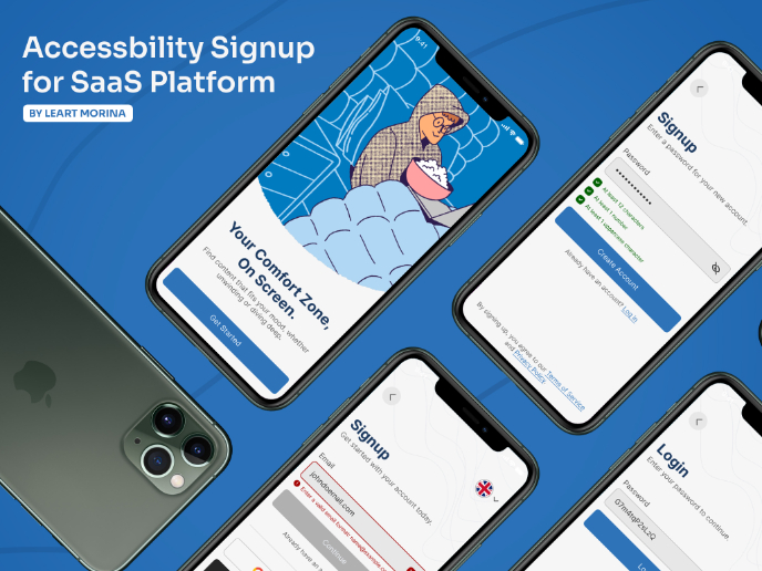
Accessible Signup Form

Auction

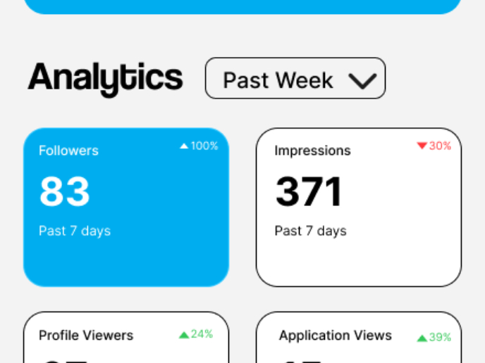
Entrant - Analytical Dashboard

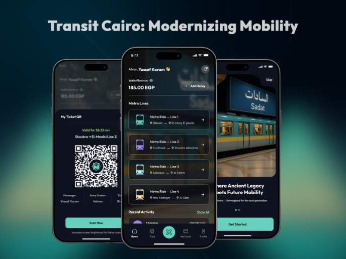
Transit Cairo — Digital Mobility Redefined

Visual Design Courses

UX Design Foundations


Introduction to Figma

Design Terminology
