HyperTask - Task Management

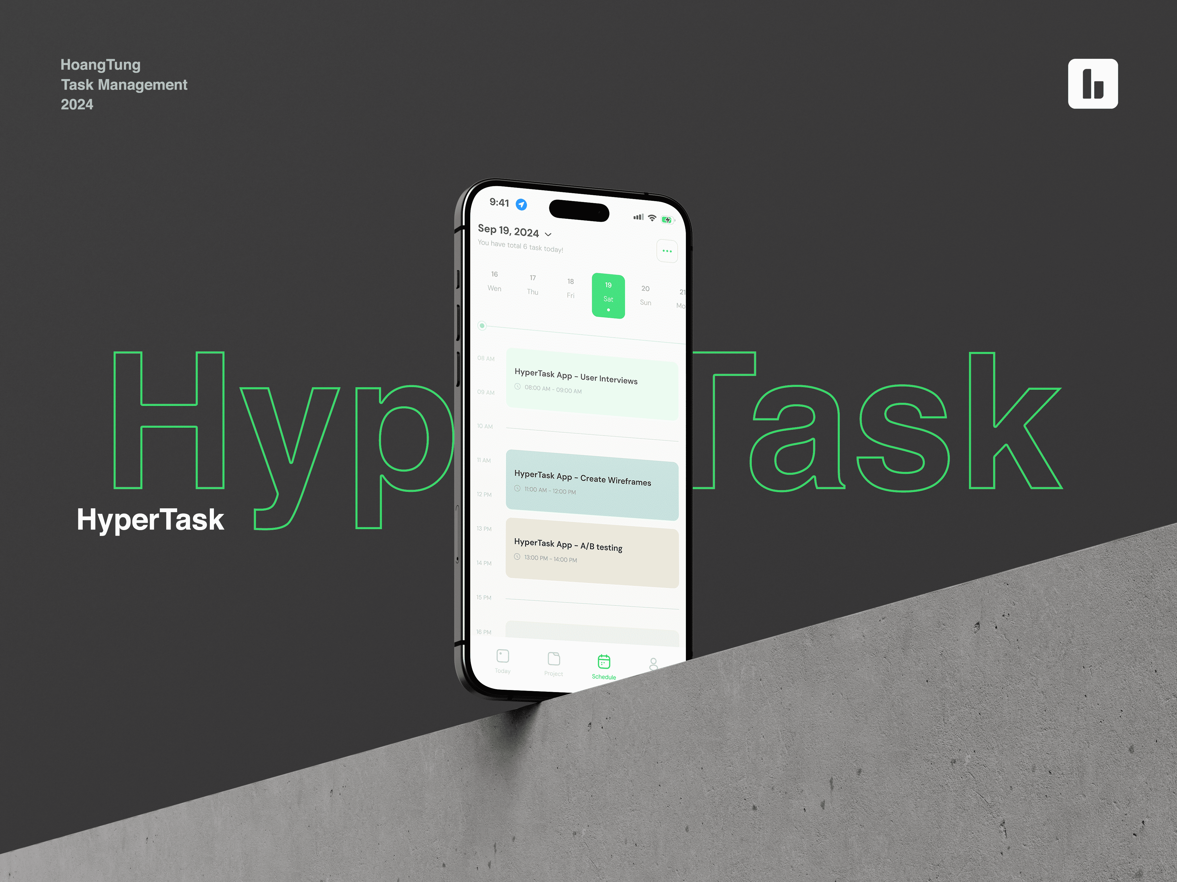
Hello everyone, today I would like to share a mini project of mine called HyperTask - a Task Management Application.
Please leave your comments, I would really appreciate hearing everyone's feedback to improve my skills further.
Reviews
5 reviews

Great work! I honestly really like this project with the UI, color palette, and overall aesthetic value. I'd be happy to test out the app if it were to be implemented :)
I have some comments regarding elements which I'd recommend looking at again:
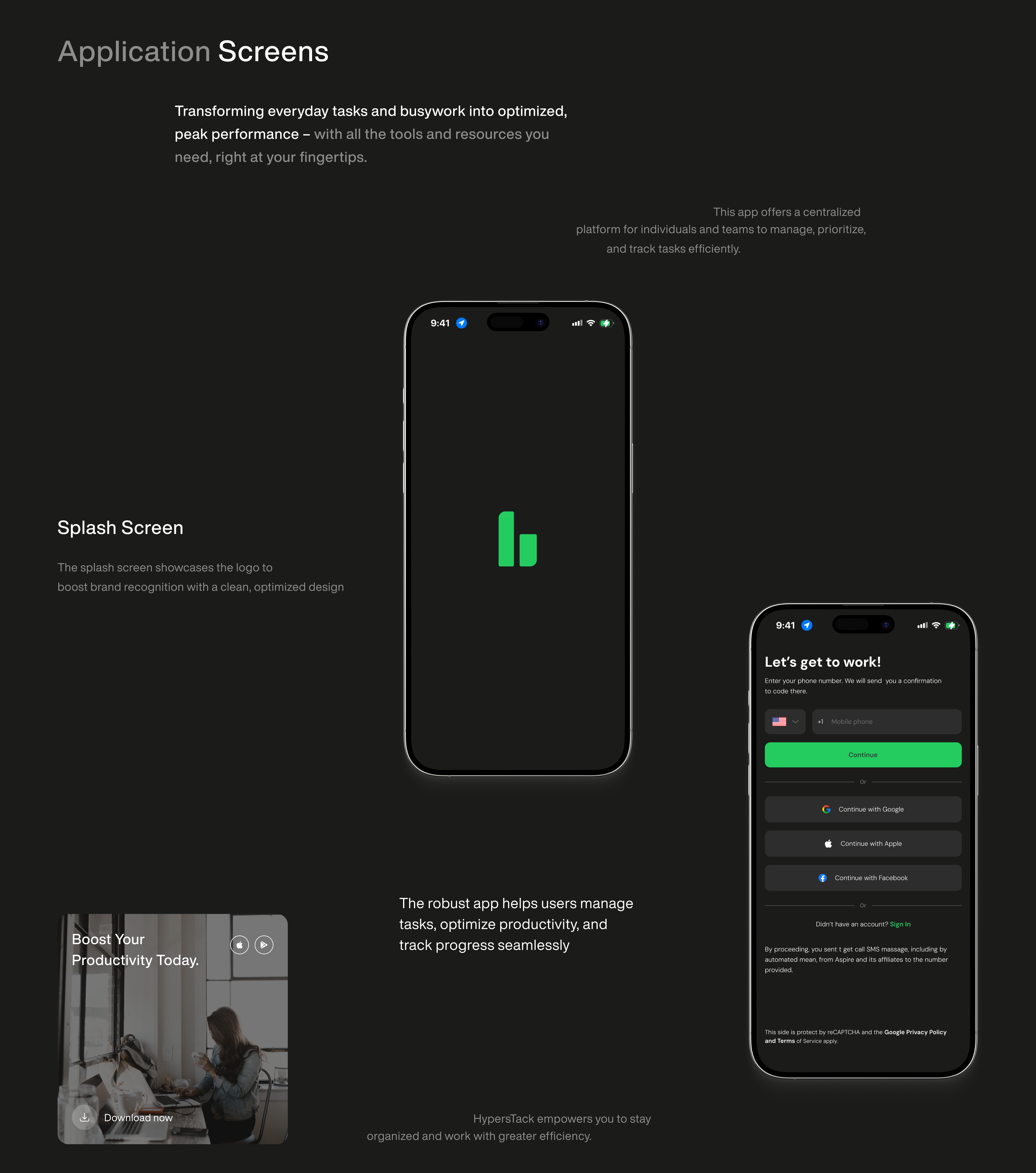
- One the main design frame we see a white calendar view, but in the remaining images you depict a dark mode design. To increase consistency, make sure to make all pages dark or light mode. If you anticipate the app to feature a dark/light mode switch, then it would be great to depict both modes on the designs in a way that the viewer can tell that all screens come in two version, dark & light. For now it isn't clear if it was intentional or a case of inconsistency.
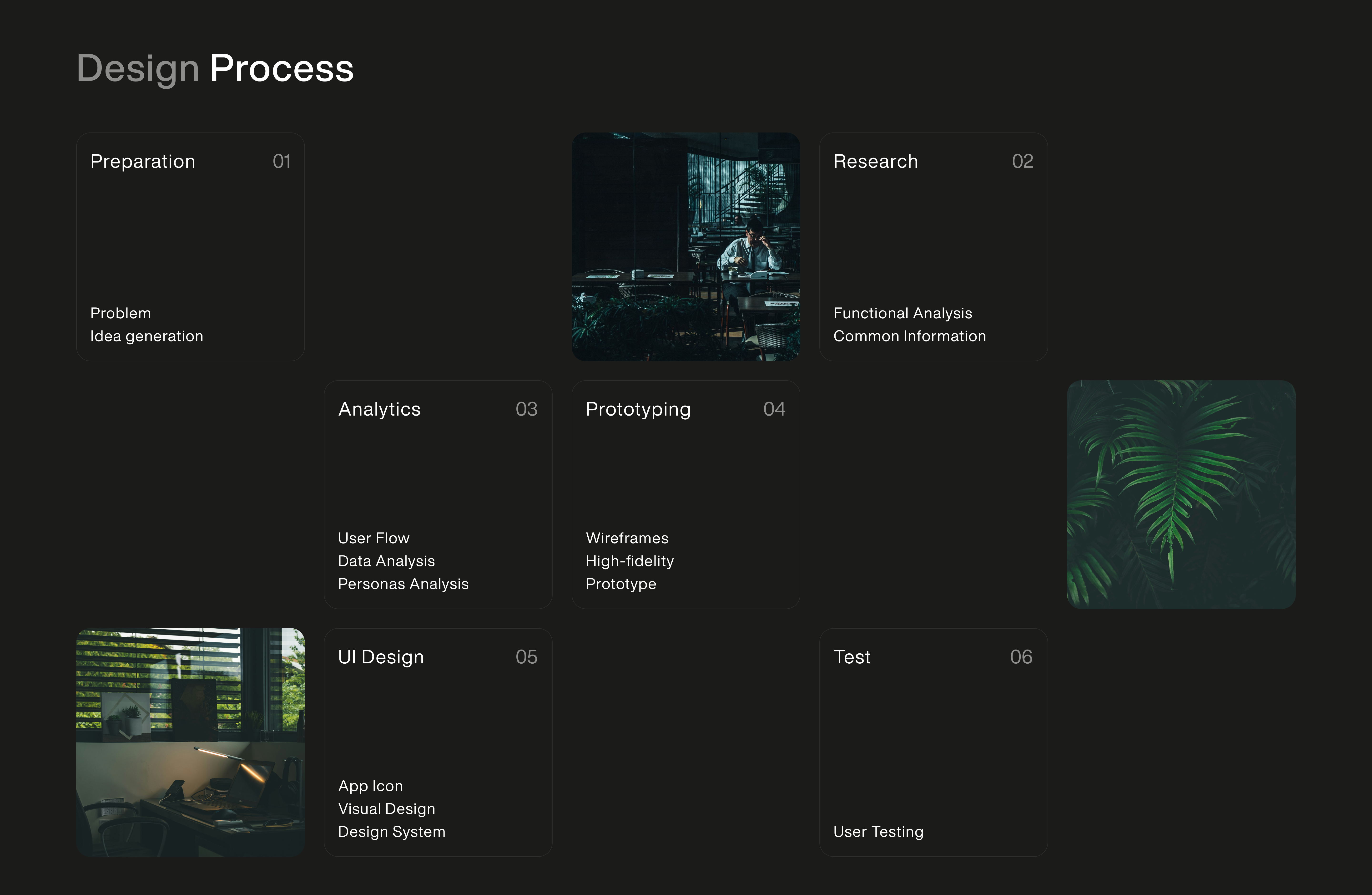
- On the "Design process" screen, it isn't very clear what that page depicts - I first thought that it's a funky calendar view from the app, only after some time while writing this review I realize that this is a part of your case study and not a full page design frame. It could be beneficial to title this something like "My project design process" with a subheading below that describes that the calendar below actually depicts on which days you completed which part of the design process. Additionally, the faint border around the squares is very difficult to see with a dim screen, so it's unclear if the numbers (eg. "1") is in the square with text or if it refers to the empty space to the right.
- On the log in page, I there are a lot of options and the main CTA is very high up on the screen, which would make it difficult to users to press on larger phones when using them with one hand. Main CTAs on mobile are most frequently placed on the bottom of the page, especially on log in pages. I'd consider looking at this page once again and perhaps moving the elements around to make this a more comfortable experience on mobile.
- A small, but impactful thing - always consider shortening copy as much as possible. For users scanning the page, it's much easier to read a sentence that is eg. 4 word long rather than 8. This concerns different aspects of the design, but one that I noticed - "You have total 6 tasks today" could be shortened to just "6 tasks today" or "6 tasks pending".
- Lastly, pay attention to WCAG color contrast requirements - in the element mentioned above ("You have total 6 tasks today"), it seems that the contrast may be too low and unclear to some users, that also concerns the font size which should never be smaller than 12px. It could already be correct, so just make sure it's compliant with those standards :)
Hope this helps and give you a new perspective on things! If you have any questions, let me know

HyperTask’s design feels like that coworker who always has their desk perfectly organized—clean, modern, and effortlessly efficient. Its layout and colour scheme say, "I'm professional, but I know how to have fun." The user experience is smooth enough to make even procrastinators feel productive (yes, even you with the 27 unfinished to-dos). However, while HyperTask checks all the basic boxes, it’s missing that quirky flair or standout feature that makes you go, "Wow, this app gets me."
Suggestions for Improvement (because great design is all about iterations, right?):
- Add AI-driven task prioritization, so users can finally stop asking, “What should I tackle first?” and just let the app decide (like a bossy but helpful project manager).
- Offer integrations with productivity tools—because who has time to copy-paste tasks across apps? Ain’t nobody got time for that.
- Create a user feedback system, so the app can ask, “Did I do that right?” and actually improve based on the answer.
- Throw in some analytics to make users feel like they’re winning at life (“You completed 5 tasks today—CEO material!”).
- Include collaborative features, because we all need that “shared task” to blame on someone else.
- Let users customize the app’s look—because sometimes you just need your vibe, whether it’s corporate chic or neon chaos.
With these additions, HyperTask could easily go from “just another productivity app” to the cool kid of task management, making procrastination a thing of the past (or at least a little more stylish).

Awesome work mate!
Hope to see more of your work in the future, really inspiring!
Hello Tung,
Your design looks modern and minimalistic, perfectly aligning with current UX/UI trends. The use of a dark background with vibrant green accents (your brand color) creates a professional and visually appealing style.
The mobile app presentation through phone mockups is executed neatly, providing a clear understanding of the interface's functionality. The primary focus on productivity makes the design especially attractive to professionals and business audiences.
The app logo and its integration into various materials, such as signage and mockups, effectively demonstrate versatility and a strong visual identity.
One area for improvement would be to pay closer attention to the white text on the green background. Considering more contrasting combinations would ensure better adherence to WCAG standards and enhance accessibility.
Overall, excellent work on thisp roject!

Awesome work Buddy
You might also like

Pulse — Music Streaming App with Accessible Light & Dark Mode


Islamic E-Learning Platfrom Dashboard

SiteScope - Progress Tracking App


Mobile Button System


FlexPay


CJM for Co-Working Space - WeWork

Popular Courses

UX Design Foundations


Introduction to Figma

Design Terminology
