Checkout Page for E-Commerce Platform

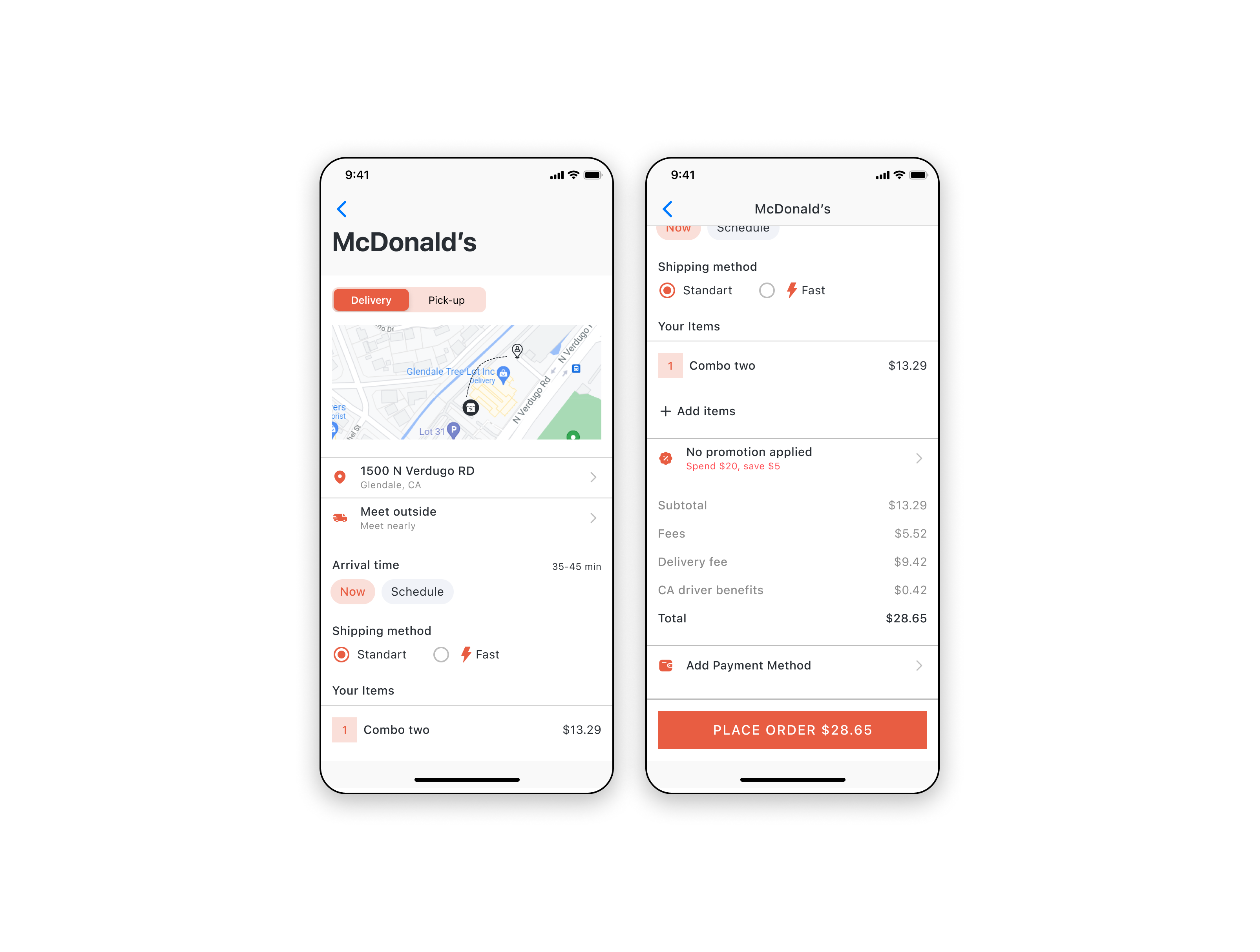
The design showcases a two-step checkout flow for a food delivery order from McDonald’s. The first screen displays the restaurant selection with delivery and pick-up options, while the second screen provides a detailed summary of the order before final confirmation.
Design Rationale:
• Intuitive and Friction-Free: The design ensures a smooth user experience by minimizing the number of steps and providing clear, concise information at each stage.
• Trust and Transparency: Users are given a detailed cost breakdown, which helps build trust. The inclusion of arrival time and delivery options provides a sense of control.
• Microcopy: Helpful microcopy is present throughout the interface, such as “Meet outside” for delivery convenience and clear labeling of fees and total costs.
• Visual Hierarchy: Important elements like the “Place Order” button and cost details are prominently displayed, guiding users toward completing their purchase.
Tools used
From brief

Topics
Share
Reviews
1 review
Thank you for your effort. However, the page could benefit from some additional work to enhance its overall effectiveness.
Firstly, the visual design feels a bit heavy. The use of horizontal dividers, a lack of white space, and inconsistent corner radii can make the page challenging to view and navigate. Addressing these elements could greatly improve the overall user experience.
Secondly, the checkout process might need some adjustments. It would be helpful to display the items that will be purchased, as this step seems to be missing. While the checkout is functionally intuitive, it can be a bit hard to scan. Enhancing the visual design in this area would make it more user-friendly and ensure that users can easily see and confirm their purchase items.
You might also like

Smartwatch Design for Messenger App


Bridge: UI/UX Rebrand of a Blockchain SCM Product


Pulse Music App - Light/Dark Mode

Uxcel Halloween Icon Pack


Monetization Strategy


Designing A Better Co-Working Experience Through CJM

Interaction Design Courses

UX Design Foundations


Introduction to Figma

Design Terminology
