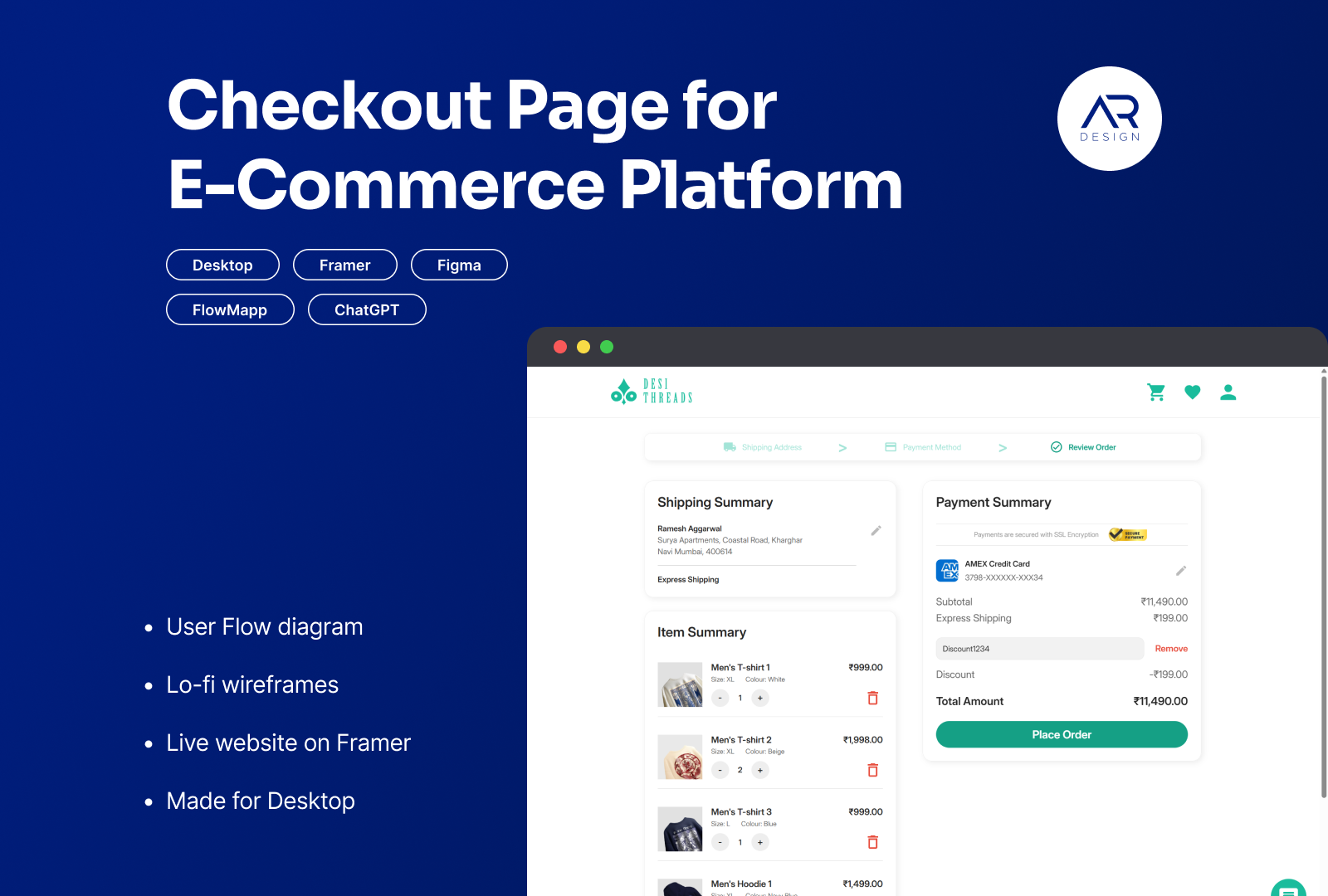
Checkout Page for E-Commerce Platform
🚨Important Links🚨
- Link to User Flow Diagram on FlowMapp
- Link to Wireframes on Figma
- Link to Prototype on Framer (Best viewed on Desktop)
Please note: The prototype website shared in this case study is not a fully finished website and lacks certain functionalities (such as responsiveness on mobile and tablets). This is primarily due to time restrictions and not wanting to be stuck in a loop of chasing perfection. However, as it is sufficient as a prototype for the purposes of this brief and to showcase the user journey in the checkout process, I decided to go ahead and post it here. I look to forward to all the valuable feedback, thoughts and suggestions on how I can improve my work. Thank you!
1. Intro
In this project, I reimagined the desktop checkout flow for Desi Threads, a fictional Indian fashion e-commerce website. The goal was to design an intuitive and friction-free desktop experience that instills trust and guides users smoothly from cart to order confirmation and prevent cart abandonment.
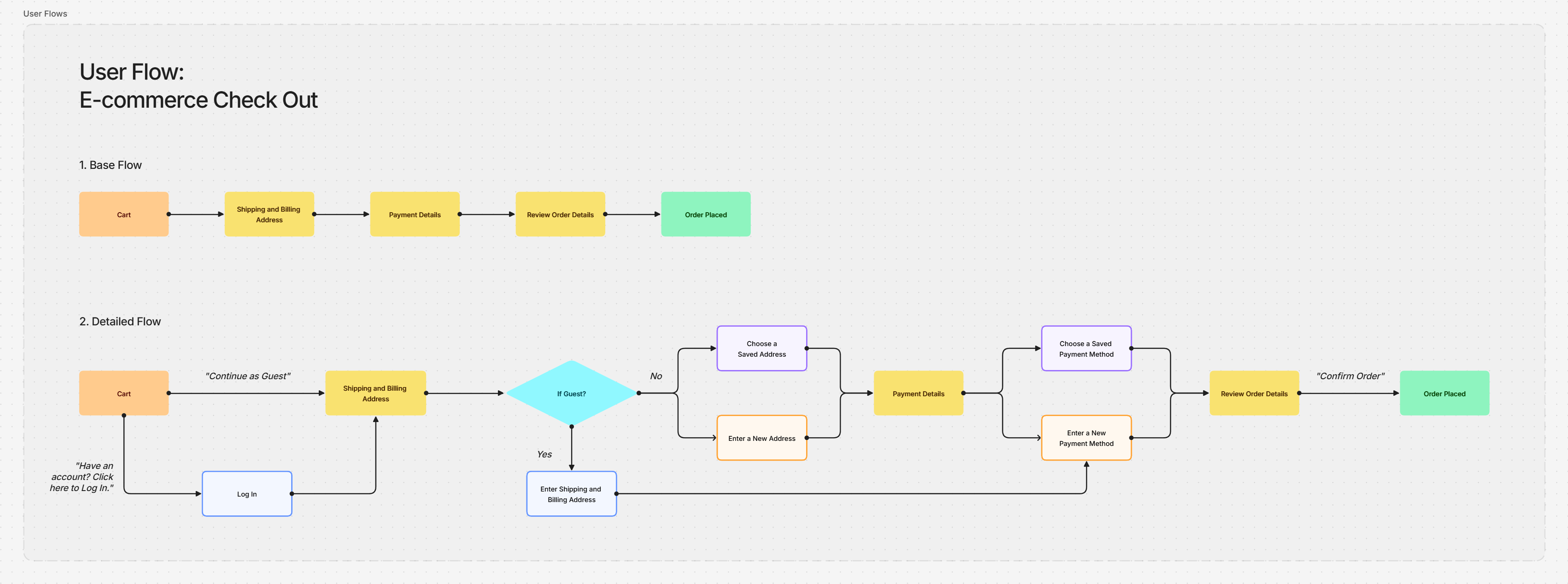
2. User Flow Diagram
>> Link to User Flow Diagram on FlowMapp
3. Rationale
In redesigning the desktop checkout flow, several guiding principles were used to reduce friction and build user trust:
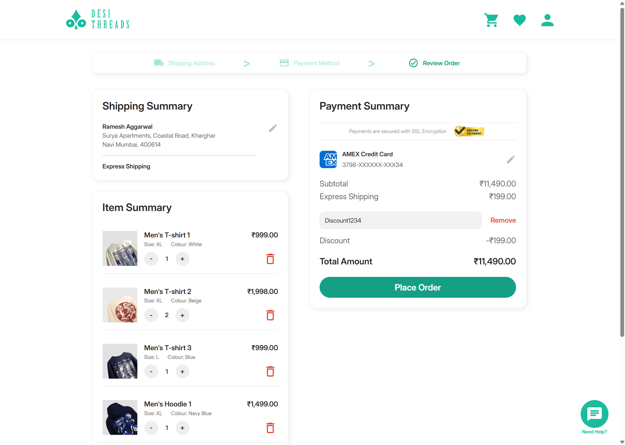
- Progressive Disclosure: Each checkout step displays only the information needed at that moment. By segmenting the process into clear stages (Shipping Address, Payment Method, Review Order), users can focus on one task at a time, lowering cognitive load and preventing confusion.
- Strong Visual Hierarchy: Bold section titles, clearly labeled “Continue” buttons, and consistent styling help users easily identify their current step. This consistency reduces guesswork and keeps the experience straightforward.
- Simplicity & Microcopy: Form fields are kept to a minimum, ensuring only essential data is requested. Short, helpful microcopy clarifies what is required in each field, easing anxiety and reducing errors.
- Help & Assistance: A persistent “Need help?” Floating Action Button is placed in the bottom-right corner, making support easily accessible should users encounter any issues.
- Localized Trust Cues: Utilizing familiar Indian payment options (such as UPI and Netbanking) alongside a visible security badge, reassures users during sensitive stages.
4. Wireframes
>> Link to Wireframes on Figma
5. Prototype
A high-fidelity interactive prototype was developed to simulate the entire desktop checkout experience.
>> Link to Prototype on Framer (Best viewed on Desktop)
Thank you for reading till here, please share your thoughts and feedback in the comments below.
Tools used
From brief
Topics
Share
Reviews
1 review
Hi Akshay Ramnani, glad to see your project. I really appreciate how details you put into the showcase when you included the context, user flow diagram, guiding principles, wireframes and even an interactive prototype in Framer. There are some personal opinions that I think would help the project be even better:
- In cart page: At the moment the "delete" icon is in read and noticeably catching attention. I think we could reduce the button size as well as adjusting the color a bit, may be changing to gray? At the end, we aim to not encouraging users to think too much about removing products from the cart.
- In "payment summary" page, the cart summary completely disappear. There might be a chance that the user want to double check the items selected just to be sure he/she missed nothing. How about including a collapsed item section where the user can have a quick glance to it if necessary?
- In "payment summary" page, it seems that the user can input multiple payment method. Is that intentional or just the limitation of Framer? If the user can only user 1 payment method, I think it's suitable to replace "+"/"-" icon with radio button.
- In "review order" page, after 3-step-long process of input shipping info and payment method, the item summary should be fixed so editing it is not necessary anymore.
What do you think about these suggestions. Looking to hearing from you :D
You might also like

Smartwatch Design for Messenger App

Bridge: UI/UX Rebrand of a Blockchain SCM Product

Pulse Music App - Light/Dark Mode

Monetization Strategy

Designing A Better Co-Working Experience Through CJM

Design a Settings Page for Mobile
Interaction Design Courses

UX Design Foundations

Introduction to Figma


