Food Item Checkout Mobile UI

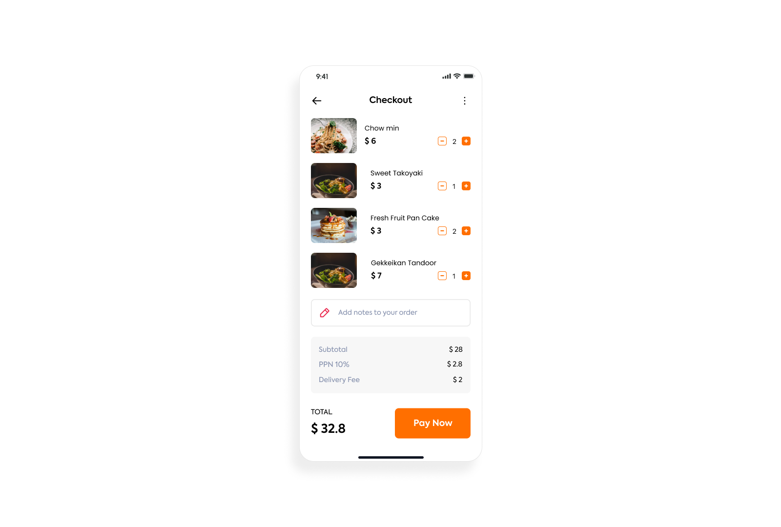
Key Components and Structure
- Header: At the top, there is a "Checkout" title centered, a back arrow on the left, and a three-dot menu/more options icon on the right.
- Order Items List: This is the main section, listing the selected food items. Each item includes:
- An image of the dish.
- The name of the dish (e.g., "Chow min").
- The individual price (e.g., "$6").
- A quantity selector with the current quantity displayed between a minus (decrement) and a plus (increment) button.
- The listed items are:
- Chow min (Quantity: 2)
- Sweet Takoyaki (Quantity: 1)
- Fresh Fruit Pan Cake (Quantity: 2)
- Gekkeikan Tandoor (Quantity: 1)
- The listed items are:
- Notes Section: Below the item list, there is a field labeled "Add notes to your order" with a small icon, allowing the user to input special instructions.
Tools used
From brief

Topics
Share
Reviews
3 reviews

Sayeed, they all look delicious 😋 but why is there text indentation for the rest of the order besides Chow Mein? Is it hierarchy, intentional, or a mishap?
…and perhaps there should be a limitation for the title text field to avoid overlaps with the quantity selector area (- 2 +)

The project has a solid foundation, but several things need refinement. The information hierarchy is clear, users can immediately see what they're ordering and how much they're paying. The food images help identify items, and the cost calculation is readable.
The +/- buttons for changing quantities are very small - on a mobile device it will be easy to accidentally order the wrong amount. This is a critical usability issue as it can lead to incorrect orders. Also notice the first dish - the padding from the top edge doesn't align consistently with the rest of the layout, which disrupts the visual rhythm of the entire interface.
The biggest problem, however, is that I only see one screen from the entire checkout process. Views for payment method selection, order confirmation, or success message are missing. A complete checkout flow typically consists of 3-4 screens, and here it's difficult to evaluate the entire user experience without the context of preceding and following steps.
Despite these comments, this is a good starting point. After refining the details and completing the missing screens, this will be a complete, functional purchasing process. ✌️😉

Great visual clarity and layout, navigation feels smooth and modern.
To strengthen this case study, consider adding a brief section on users, challenges, and your design decisions to reveal the strategy behind this redesign.
This will help other UXceles appreciate the thought process and impact behind your work.
You might also like

Smartwatch Design for Messenger App


Bridge: UI/UX Rebrand of a Blockchain SCM Product


Pulse Music App - Light/Dark Mode


Monetization Strategy


Designing A Better Co-Working Experience Through CJM


Design a Settings Page for Mobile
Interaction Design Courses

UX Design Foundations


Introduction to Figma

Design Terminology
