Banking App for Businesses

Hi everybody!
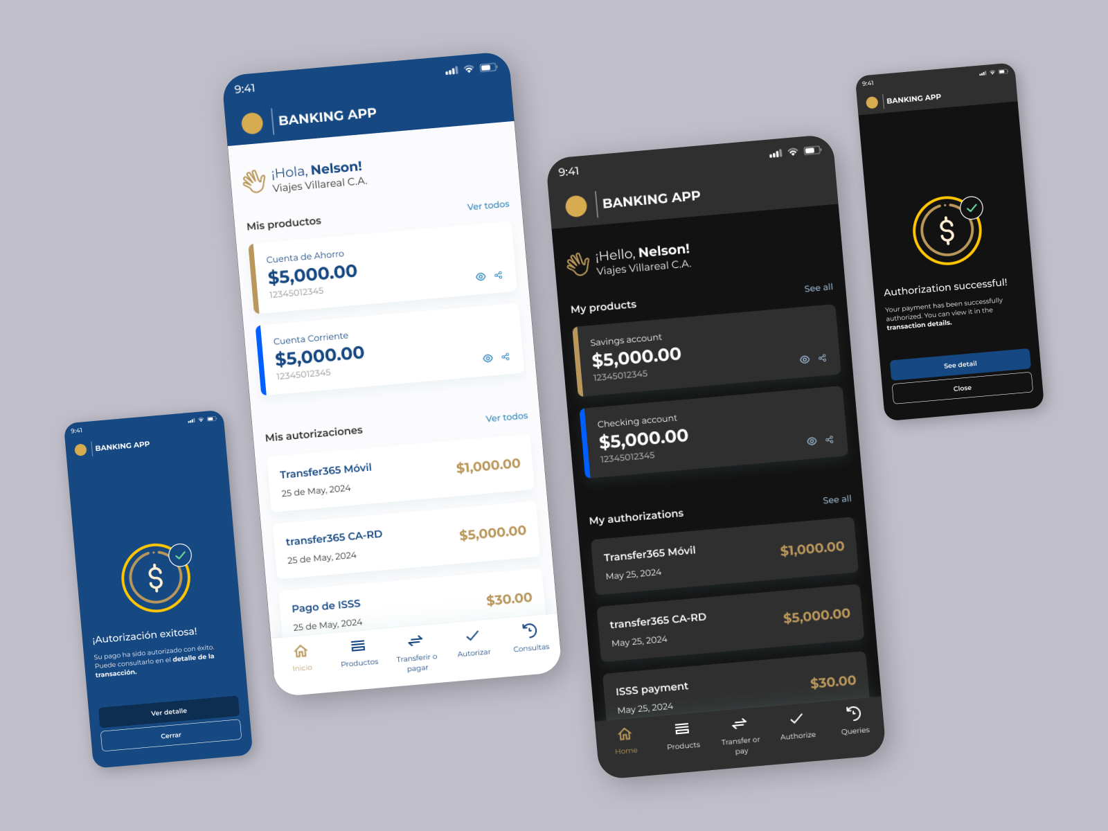
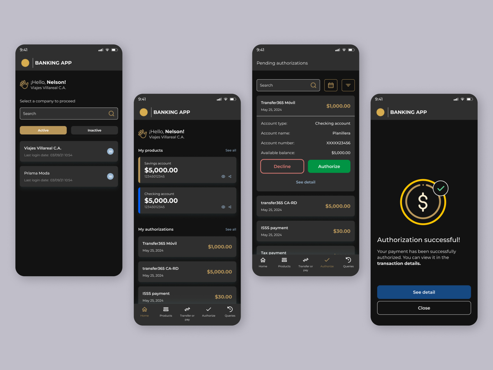
I’m excited to share with you my example of a Banking App for Businesses. This app is designed for banking purposes and includes two visual variants: light and dark mode. I used the Montserrat font because it offers great readability and works well for user interfaces. The App features elegant colors suitable for a professional environment.
Tools used
From brief

Topics
Share
Reviews
4 reviews

Raul! I really like that everything feels so consistent, even the language switch between light and dark mode. The subtle shadow in the company selection and “My Products” cards really elevates the hierarchy, and when it transitions to dark mode, it blends in naturally without losing depth.
My thoughts are on these:
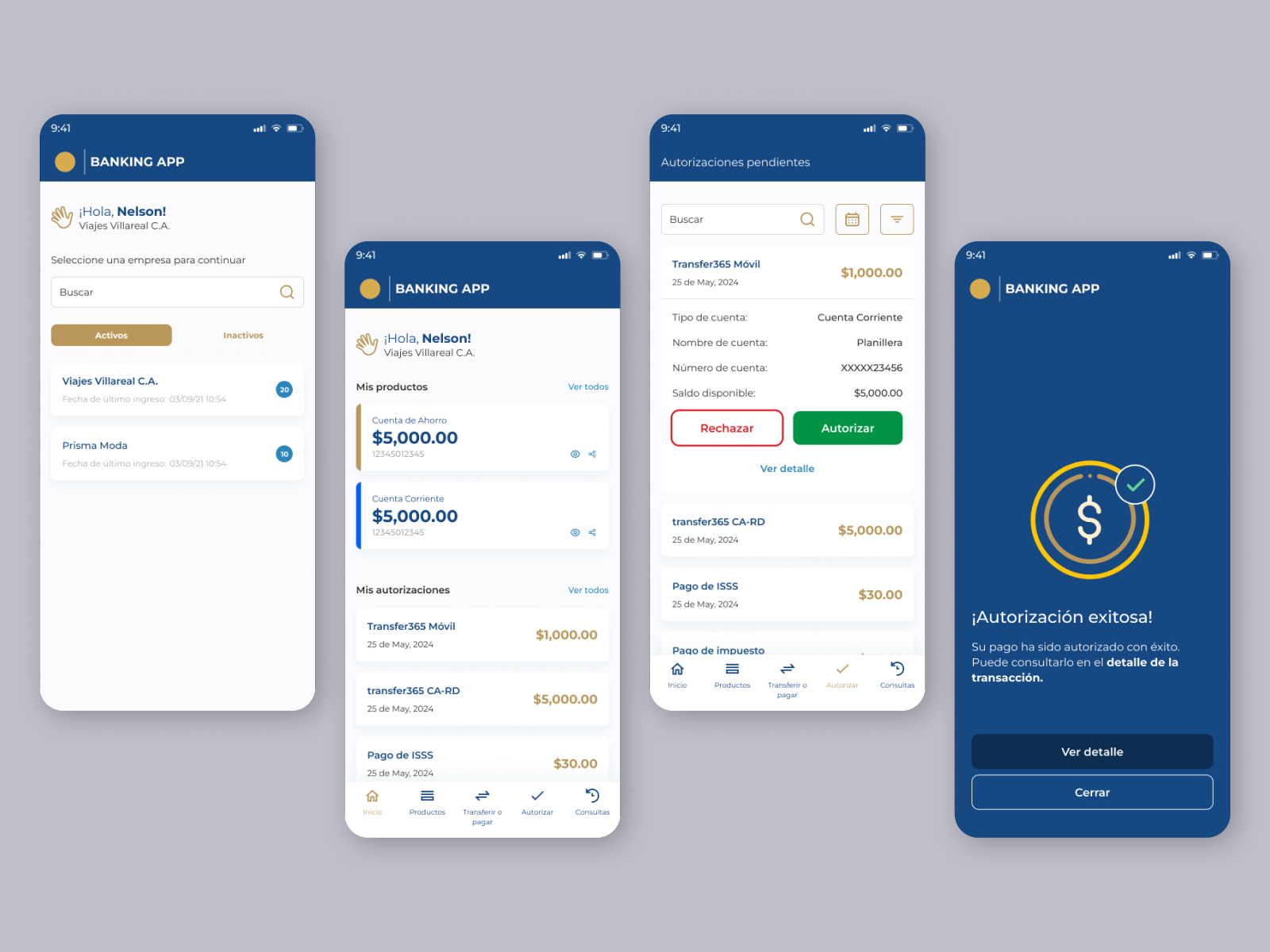
- Logo [⚫️ |BANKING APP], at first glance it looked a bit off-balance, and adding a small space before the logotype might make it more visually stable: [⚫️ | BANKING APP]. It’s a familiar alignment pattern that reads easier. That said, from a branding perspective, a slightly unconventional spacing can still work if it’s part of the brand’s rhythm and tone. Personally, I’d prefer the added space for clarity.
- Bottom navigation bar, consider making the Authorize icon match the visual weight of the others, or simplify all icons with a uniform single-stroke style. This small tweak would unify the iconography and feel more polished.
- “Transfer or pay” could be simplified to just “Transfer” or “Transaction.” It prevents “pay” from becoming a typographic orphan and keeps the navigation neat, with consistent one-line labels and extra breathing room on top.
- On the Transfer Authorization screen, increasing the spacing between the “See detail” and “Close” buttons would make interaction more comfortable, feel less cramped and more deliberate.
Everything here already feels reliable and carefully built. With just a few refinements in spacing, label clarity, and icon balance, this design could easily convey what business banking should always feel like: secure, confident, and effortless.

The project has solid foundations, but needs several key improvements to meet the brief requirements.
✅ What works well:
The interface is readable, information hierarchy is maintained, and the transition between modes shows consistency in color approach. Montserrat is a sensible typographic choice for banking.
⚠️ Main issues:
I don't see a mode switcher anywhere - that's a fundamental element of the assignment. Color contrast needs WCAG verification, especially the gold accents on dark background might be problematic (they seem too bright). In dark mode, there's no explanation of why these specific shades were chosen. The description says "for businesses," but the UX suggests retail banking instead - that's inconsistent. There's also no information about user flow or interactivity (even though the brief mentions it as a bonus).
🔧 What to improve:
Add the mode switcher, test contrast with WCAG tools, write more specifically about design decisions (not just "elegant colors"), clarify your target user.
You have a good starting point - after refining the details and better explaining your decisions, the project will be much stronger. You clearly understand the basics, now it needs better documentation.

Hi Raul!
Congrats for the work put into this! I see you created a clean, modern banking interface. I liked your personal touch, translating the interface too from spanish to english, besides switching to dark mode.
Your choice of colors of gold and blue conveys for me a premium, secure feel and I like how your spacing, typography and visual hirearchy are consistent and clear and make the interface easy to scan. I also appreciate the greeting to the user on the home screen (What I don't quite understand is how come the user already has a company below their name in the first screen where they have to choose a company to proceed).
Some details that you can look into and make this even better 🙌:
- Bottom navigation bar: Follow KISS rule and choose a shorter label for "transfer or pay" to avoid having pay alone on the second line and pushing everything else to the top. If you fix this, you will also be able to vertically center your buttons in the navigation bar.
- I would have loved to read more about your thought process and reasonings behind design decisions (like how you adapted not only the backgrounds for the mode switch, but also the foregrounds/main colors like gold and blue). When you mode switch, it is common practice that also some accent colors are switched. For example let's say you use gold-700 from your color system for the money amount in "transfer cards" in light mode. Then, when switching to dark mode, it's common practice to switch to gold-300, or from gold-600 to gold-400 (the idea is to use a lighter version on dark mode, to assure color contrast with the grey/black background).
- Looking at the requirements of the project, it says there it would be nice to show exactly the placement of the mode switch in the interface. Where you are thinking the user is doing this from, in your interface, which you didn't include.
- Overall, make sure you do contrast checks anytime you design light and dark modes. I see some areas that I have my doubts that are passing the WCAG color constrast guidelines - e.g. number & last login date info on company cards on first screen in dark mode, the color you chose for the icon buttons on "my products" cards in dark mode
- Speaking of those icons on my products cards, make sure they are tappable. You can follow the Human interface guidelines from Apple that say that every button should have a minimum of 44*44 in size.
- Last but not least keep the width of borders on your secondary butttons the same (I see decline seems to have a 2px border, vs close that seems to have a 1px border)
Cheers and good luck!

Nice work, Raul. I see you really nailed the design compositions for mobile design but there’s more to improve in this showcase. First one, the font size, I think some of small text need to be upsize little bit, you can read the best practice about how to implement font size in the mobile interface design. Second, it's the UX Writing, because I see some label that doesn't represent the component below, example, the label of My products and below is Saving account, etc (it doesn’t represent of what the label say).
Overall, it's a nice showcase, keep improving!
You might also like

Smartwatch Design for Messenger App


Bridge: UI/UX Rebrand of a Blockchain SCM Product


Pulse Music App - Light/Dark Mode


Monetization Strategy


Designing A Better Co-Working Experience Through CJM


Design a Settings Page for Mobile
Visual Design Courses

UX Design Foundations


Introduction to Figma

Design Terminology
