Color System
Platform & Context
I selected ClickUp for desktop redesign because work management platforms are primarily used on desktop for complex workflows. After analyzing ClickUp's existing interface, I identified their color system as too subtle, lacking the visual energy needed to inspire productivity. This became my catalyst for creating a differentiated, emotionally resonant color system.
Core Design Challenge: Energy Meets Calm
Work management tools exist in a unique emotional space - users need energy to take action but calm to make decisions without stress. This paradox drove my entire color strategy: create a system that motivates without overwhelming.
Color Selection & Strategic Rationale
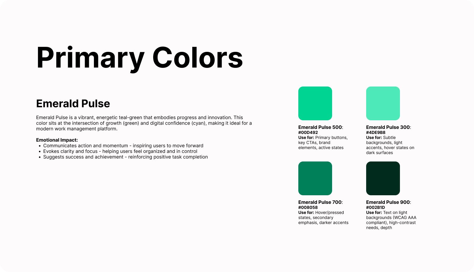
Primary: Emerald Pulse (#00D492) - Intelligence
I chose this specific teal-green because it sits at the edge of bright and calm. Green psychology conveys growth and progress (essential for productivity), while the teal undertone adds digital sophistication. Unlike pure bright greens (overwhelming) or muted greens (lifeless), this shade energizes without creating anxiety. It represents Intelligence - clear, smart, digitally native thinking.
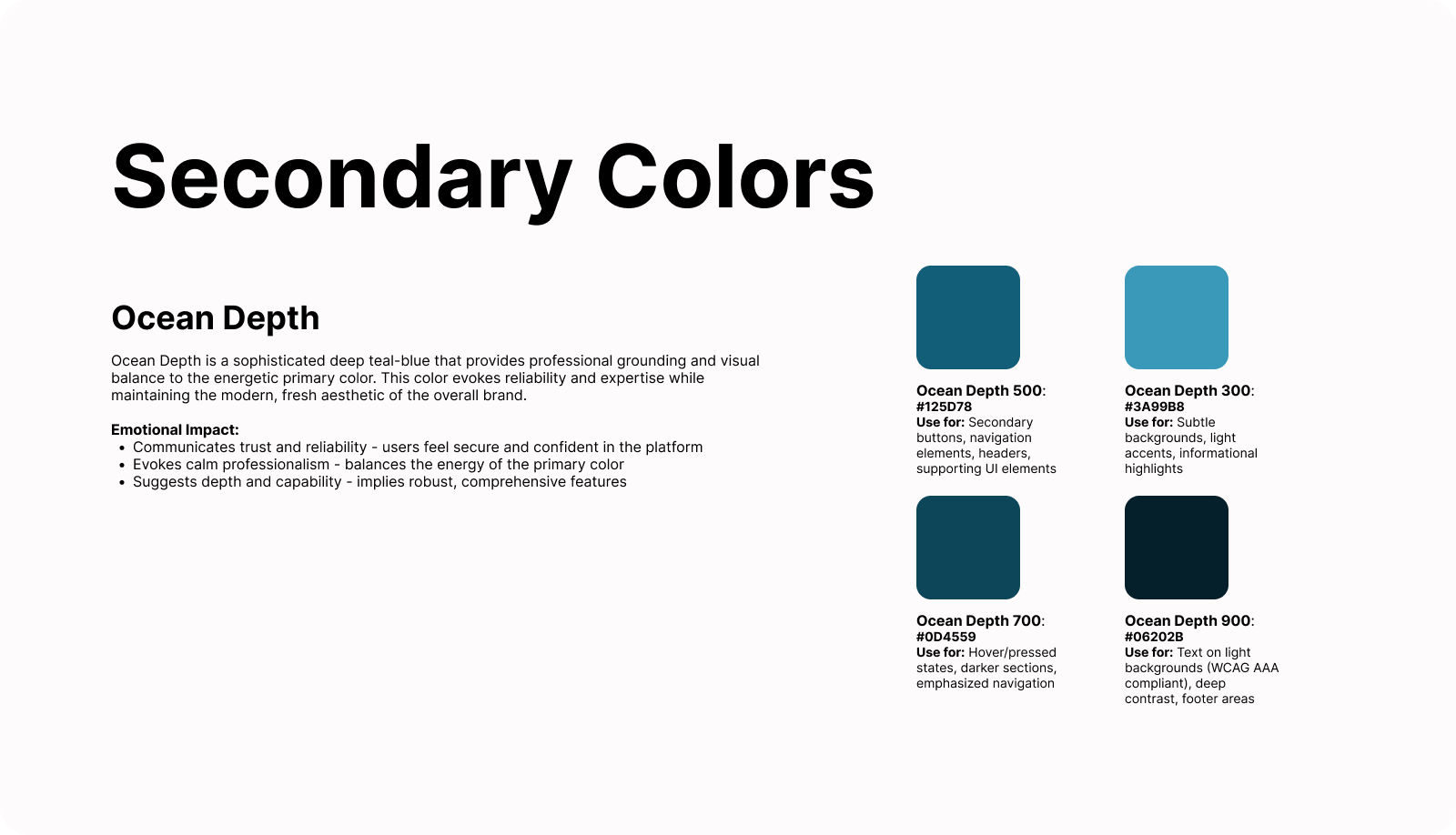
Secondary: Ocean Depth (#125D78) - Impact
This deep teal-blue imposes the calming tone that balances Emerald Pulse's energy. It grounds the interface, handles navigation and secondary actions, and provides professional credibility crucial for B2B tools. It represents Impact - depth, substance, and meaningful results. Together with the primary, it creates a visual ecosystem where action is always supported by stability.
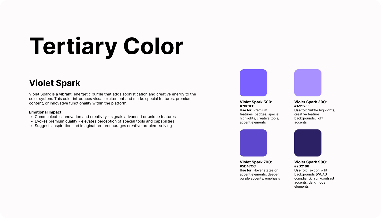
Tertiary: Violet Spark (#7B61FF) - Confidence
Purple adds sophistication and premium quality to the system, marking advanced features, AI tools, and special moments. It prevents the palette from becoming monotonous while signaling elevated functionality. It represents Confidence - bold, sophisticated decision-making capability. Used sparingly, it creates hierarchy and visual interest.
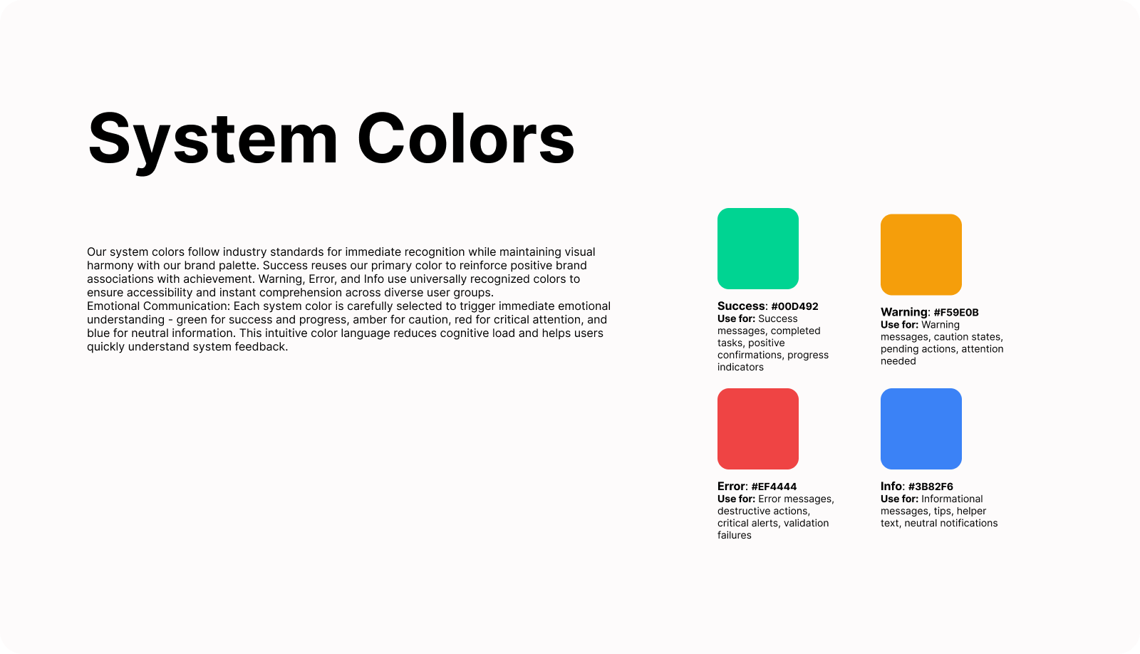
System Colors: Functional Intelligence
Success (#00D492): Reuses primary color to psychologically link our brand with achievement - every completed task reinforces positive brand association.
Warning (#F59E0B): Amber provides clear caution without alarm, maintaining emotional calm.
Error (#EF4444): Red ensures immediate attention for critical issues using universal conventions.
Info (#3B82F6): Blue delivers neutral information without emotional weight.
Weight Structure & Accessibility
I selected four weights (300, 500, 700, 900) to balance brand expression with accessibility. Since interfaces primarily use white backgrounds, I needed darker shades for text compliance:
- 300: Subtle backgrounds, dark mode text
- 500: Main UI elements, buttons, brand applications
- 700: Hover states, emphasis
- 900: Text on light backgrounds (WCAG AAA compliant)
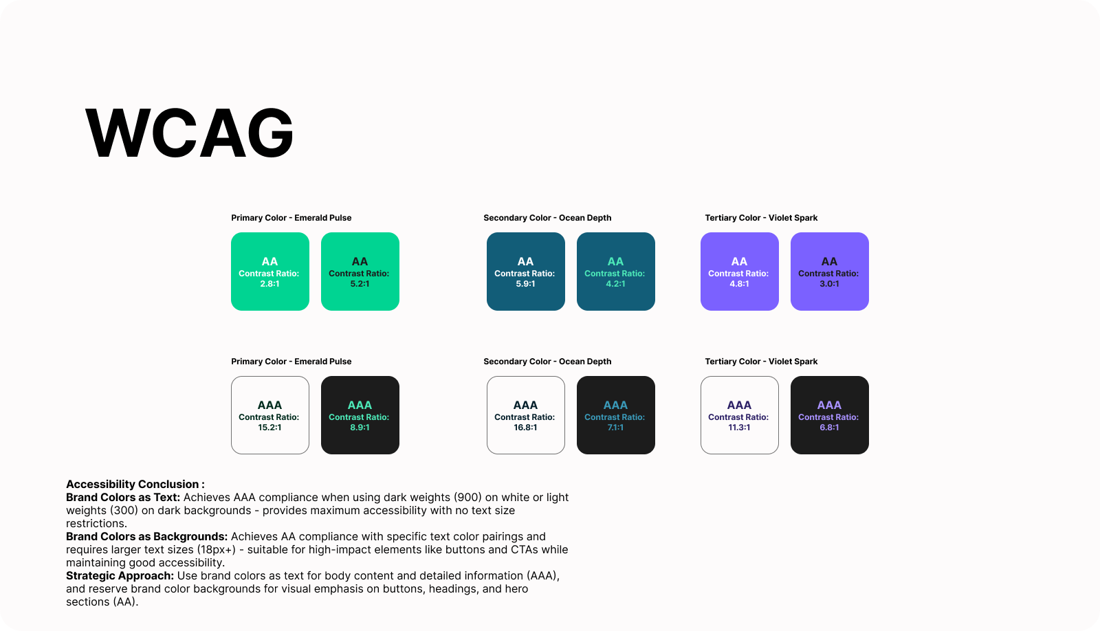
Process: I extracted emotionally resonant colors first, then iteratively tested WCAG compliance to find optimal balance. All text implementations achieve AA or AAA standards, with dark weights (900) reaching AAA for maximum inclusion.
Competitive Differentiation
While competitors default to blues and grays (Asana's muted palette, Monday's bright primaries, Trello's blues), this system differentiates through:
- Energizing teal-green leadership vs. corporate blue
- Strategic emotional balance through color pairing
- Sophisticated purple accents vs. playful secondary colors
- Professional credibility without sterility
Emotional Target & Impact
Target user emotion: Calmly confident and motivated
- Calm: Ocean Depth anchors, Emerald Pulse balances saturation
- Confident: Violet Spark sophistication, professional harmony
- Motivated: Emerald Pulse brightness drives action
This color system transforms ClickUp from a subtle interface into a vibrant, confidence-inspiring productivity platform that energizes users while maintaining the calm clarity essential for effective decision-making. It provides clear visual hierarchy, emotional resonance, accessibility leadership, and brand differentiation - all while supporting complex enterprise workflows through a scalable four-weight system.
Reviews
5 reviews
Your color palette choice looks well-thought-out, but I have some doubts about achieving the brief's goals. The main issue I see is in the emotional positioning – you wanted to create energy balanced with calm, but Emerald Pulse (#00D492) is a very intense, bright color that might overwhelm instead of motivate. Combined with Ocean Depth, it feels stronger than your planned "calm confidence." Violet Spark as a premium accent is a good idea, but I wonder if it creates too big an energy jump between colors.
The weight system is logical, but I'm missing examples of real UI usage - it's hard to judge whether these shades actually work in ClickUp's context. Your WCAG is well documented, that's a solid foundation. Regarding competitive differentiation - you're definitely avoiding standard blue, but does this palette really scream "productivity platform"? Teal might be more associated with healthcare, wellness, or fintech than project management.
You have good fundamentals and the research shows, but I'd refine the energy balance in the primary color and test this in actual UI components. There's potential here! 💪😊
Your colour strategy has a strong narrative, and you communicate the emotional intention clearly, but the execution does not fully match the story you are telling. The palette is conceptually positioned as energy meeting calm, yet the actual colour selections feel closer to a marketing palette rather than a functional product palette. This creates a gap between the emotional claim and the practical usability demands of a work management tool.
The primary green is described as balanced, but in application, it still appears very bright and may become visually tiring when used across an enterprise-scale interface. I do suggest doing a quick test to verify whether the green is actually suitable for this context, especially for the AA level, where the contrast ratio is slightly below the 3:1 requirement. The emotional intention is present, but the tuning can be adjusted to better support the calm and confident experience you are aiming for.
Your competitive analysis is clear, but it may help to expand on how this palette maintains long-term scalability.
Overall, the presentation and intention are compelling, but the system still needs more refinement to fully deliver the emotional balance you want while supporting the functional demands of a productivity platform.
Hey Mohamed,
I agree with Michał and Shyen that while your narrative is strong, the end result does not hit the same mark.
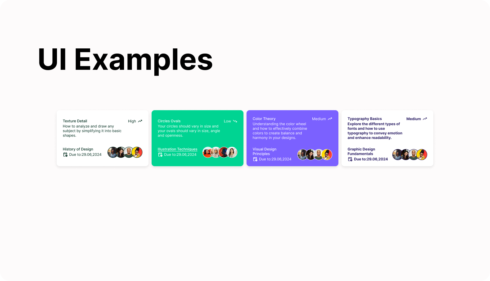
I would have loved to see more applications of your color system to ClickUp's interface to give you better feedback, but based on the application you made with those UI cards it clearly shows that the implementation is way too vibrant and lacking the intended pause and calm - which might be more suited for an advertising campaign or a marketing website rather than for a professional, productivity SaaS application. Your picks might still work fine, overall, but with a more strategic and mindful usage.
I'll finish with a word of warning on the usage of primary emerald over light text, as it does not pass WCAG guidelines and makes one of your cards unreadable.
Thanks for sharing! 🙌
great job!
Great choice of colors! I really like the look. I’d be interested to see how they work together across a full page. It’s also excellent that you’re checking contras, definitely keep applying this in practice!
You might also like

Smartwatch Design for Messenger App

Bridge: UI/UX Rebrand of a Blockchain SCM Product

Pulse Music App - Light/Dark Mode

Monetization Strategy

Designing A Better Co-Working Experience Through CJM

Design a Settings Page for Mobile
Visual Design Courses

UX Design Foundations

Introduction to Figma


