Booking & Checkout Flow

Project Overview
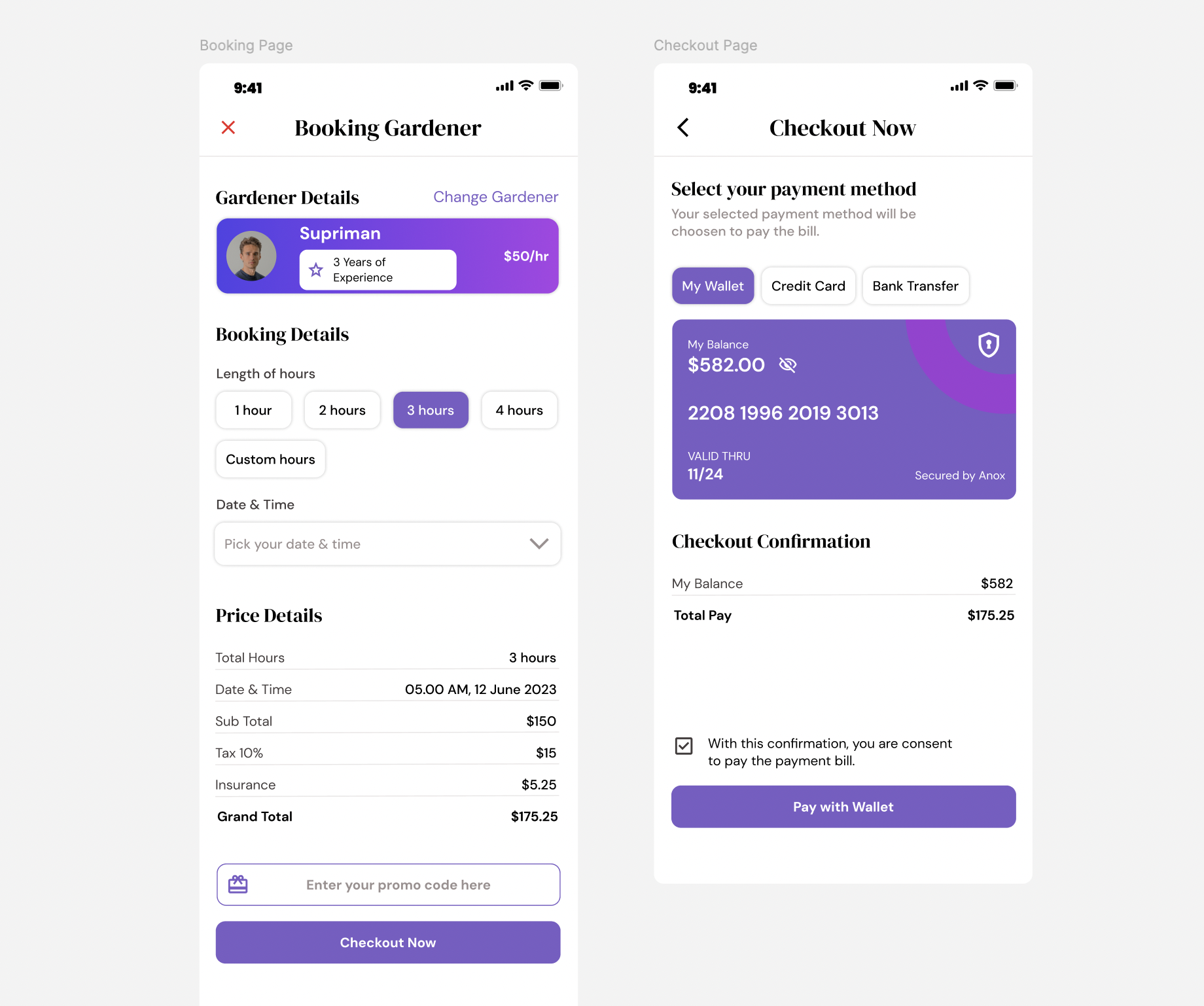
The goal of this project was to design a smooth and intuitive flow for users booking a service (in this case, a gardener) and completing their payment seamlessly. The focus was on clarity, ease of use, and trust-building throughout the user journey.
Key Decisions and Rationale
- Gardener Details: Displayed profile, experience, and rate upfront to build trust and confidence.
- Booking Flow: Provided quick hour selections and a custom option to balance speed and flexibility.
- Price Transparency: Clearly broke down costs (subtotal, tax, insurance) before checkout to avoid surprises.
- Promo Code Field: Encouraged user engagement by offering discounts.
- Payment Options: Wallet, credit card, and bank transfer tabs gave flexibility to users.
- Wallet View: Highlighted user balance and included a security badge to build trust.
- Consent Checkbox: Confirmed user agreement before payment for transparency and legal clarity.
- Visual Design: Used a modern, clean layout with consistent purple tones for a calm and professional look.
The main priority was simplicity, transparency, and user trust — ensuring a seamless and professional user experience from booking to payment.
Tools used
From brief

Topics
Share
Reviews
2 reviews

You nailed it on simplicity and user-friendliness, Maham!
But...
there’s a but.
May I argue a little bit on the visual design side here? Okay, first things first (what’s up with the extra bold status bar, 9:41?) 🤔 last time I checked, it’s usually slimmer than that on most devices.
Another thing I found unusual is the use of serif in a UI.
There’s a brutalist trend where designers mix several styles (if I remember correctly, examples like the former amie.so landing page, sublime.app, and Citationsy), but in UI, especially for functional apps, sans-serif is usually preferred because it supports faster readability, better scalability on different screen sizes, and creates a clean, modern user experience without distracting decorative strokes.
The good thing is, you already made the change in the Figma file! I definitely support the updated version you have there rather than what's shown in this screenshot, kudos for that.
Lastly, I’m pretty sure that Supriman could use a bit more white space (let him breathe!).
At the moment, there’s an uneven margin (especially at the bottom), and the layout between the profile picture, name, and experience feels a little… cramped? It could definitely benefit from a more balanced grid structure and consistent spacing.
All in all, awesome job. Just a few tweaks, and this could look even sharper and more polished!

Hi Maham 🥰
Thank you for sharing your work on the booking and checkout flow. You've prioritised clarity and transparency, which is essential for ensuring a smooth journey from booking to payment. I’ve gone through the design, and I’ve outlined a few areas where I believe the flow can be further refined to enhance both usability and consistency.
- It would be beneficial to see additional screens, especially showing different states of components (e.g., empty vs. filled fields, error states, etc.). This would provide a clearer understanding of how elements behave across the user journey, ensuring consistency.
- The primary CTA should always be the first item in the vertical alignment, above elements like "Enter your promo code here." Right now, it looks like a secondary button, possibly due to its placement. It’s also unclear whether it's a button or just a text input field. This should be clarified for a smoother user experience.
- The close button should not be red, as red is typically associated with error states in the system. It would be more appropriate to use a medium light grey to convey an informational tone instead of an action that could be seen as a mistake.
- I'd like to better understand your reasoning for using DM Serif Display for headers and Open Sans for headings. It seems like DM Serif Display could be used consistently for all titles, with Open Sans reserved for body text to maintain a clearer typographic hierarchy. This would help reinforce readability and consistency.
- All numbers appear to have the same weight. Since the total is one of the most important pieces of information for the user, it should stand out more. Instead of simply using bold, it might need a more prominent treatment to help it catch the user’s attention.
- The credit card component needs a field to enter the CVV number, which is likely best hidden by default for security. Make sure this is addressed for completion and security.
- There needs to be a consistent approach to capitalisation for headers and CTAs. For example, "Gardener Details" is capitalised, while "Select your payment method" is not. Similarly, CTAs like "Enter your promo code here" should either be consistent in their capitalisation or follow a specific style guide.
This is a strong starting point for a booking and checkout flow. With refinements in consistency, typography, and visual prominence of key elements (like the total price), this can become a highly intuitive and polished user experience.
Good work! 😌
You might also like

Smartwatch Design for Messenger App


Bridge: UI/UX Rebrand of a Blockchain SCM Product


Pulse Music App - Light/Dark Mode

Uxcel Halloween Icon Pack


Monetization Strategy


Designing A Better Co-Working Experience Through CJM

Interaction Design Courses

UX Design Foundations


Introduction to Figma

Design Terminology
